
Graphics Design
Master Color Theory for Graphic Designers with Practical Examples

Master Color Theory for Graphic Designers with Practical Examples
Color is the first thing a viewer notices before they read a single word of your design, and that is exactly why color theory sits at the very heart of graphic design education. Whether you are designing a logo, a website, a poster, or a full brand identity system, understanding color theory will change the way you make every visual decision. This guide is built to help beginners and working designers alike master color theory through practical, real-world examples rather than abstract art-class jargon. By the end of this article, you will understand not just what color theory is, but how to apply color theory confidently in your day-to-day design work.
Many designers assume color is something only fine artists need to study, but in reality color is one of the most commercially valuable skills a graphic designer can develop. Clients notice when a palette feels “off,” and users abandon apps and websites that misuse color without anyone being able to explain exactly why. That is the power — and the responsibility — that comes with knowing color deeply. This article walks through every major pillar of color including the color wheel, color harmonies, color psychology, warm and cool tones, contrast and accessibility, and how color applies differently to print versus digital design.
What Is Color Theory?
Color theory is the collection of principles and guidelines designers, artists, and scientists use to understand how colors interact, how they are created, and how they affect human perception and emotion. At its core, color theory explains three things: how colors are mixed and organized (the color wheel), how colors relate to one another (color harmony), and how colors make people feel (color psychology). Every professional designer who has mastered color theory is able to look at a color palette and immediately identify why it works — or why it doesn’t.
Color theory isn’t a rigid rulebook; it is closer to a toolkit. Just like typography and layout, color theory gives designers a shared vocabulary and a set of dependable starting points. When you understand color theory, you stop guessing which colors “look nice together” and start making intentional decisions rooted in how the human eye and brain actually process color. This is the single biggest shift that separates hobbyist design from professional design.
The Color Wheel: The Foundation of Color Theory

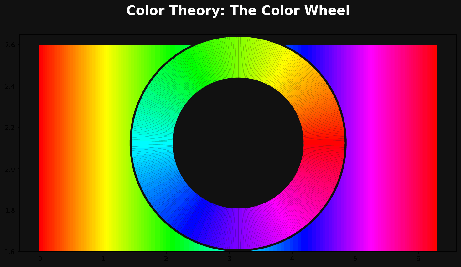
You cannot study color theory without starting at the color wheel, the circular diagram that organizes colors based on their relationships to one another. The modern color wheel used in color theory is typically divided into primary, secondary, and tertiary colors, and understanding these three categories is the first practical step toward mastering color theory.
Primary Colors
In traditional color theory, the primary colors are red, yellow, and blue. These are considered the “building block” colors because they cannot be created by mixing other colors together — every other color on the wheel is derived from them. For digital designers, it’s worth noting that screen-based color theory uses a different primary set (red, green, and blue light, known as RGB), which we’ll cover later in this guide.
Secondary Colors
Secondary colors are created by mixing two primary colors in equal parts. Orange (red + yellow), green (yellow + blue), and purple (blue + red) make up the secondary set in traditional color theory. Recognizing secondary colors helps designers understand how vibrant, high-energy palettes are typically built.
Tertiary Colors
Tertiary colors come from mixing a primary color with an adjacent secondary color, producing colors like red-orange, yellow-green, and blue-violet. Tertiary colors give a designer far more nuance and subtlety than the six colors above them, and skilled use of tertiary colors is often what separates an amateur palette from a sophisticated one. Mastering this layer of color theory allows you to create palettes with far more depth and realism.
Hue, Saturation, and Value: The Three Properties of Color Theory
Beyond the color wheel, color teaches us that every single color can be described using three core properties: hue, saturation, and value (sometimes called brightness or lightness).
- Hue refers to the pure color itself — red, blue, yellow, and so on — and is essentially the position of a color on the color wheel.
- Saturation describes the intensity or purity of a color. A highly saturated color looks vivid and bold, while a desaturated color looks muted, grayish, or washed out.
- Value describes how light or dark a color is, achieved by adding white (creating a “tint”) or black (creating a “shade”) to a hue.
Every professional conversation about color theory eventually touches on these three properties, because they are what allow you to take a single hue and generate an entire palette of tints, tones, and shades. For example, a brand’s primary blue can be extended into ten different values and saturations without ever needing a second hue, giving you a cohesive, flexible system rooted in solid color theory fundamentals.
Color Harmony: Applying Color Theory to Build Palettes

Once you understand the wheel and the three properties of color, the next stage of color theory is learning color harmony — the formulas designers use to combine colors in ways that are naturally pleasing to the eye. These harmonies are arguably the most practical, immediately usable part of color theory for any working graphic designer.
Complementary Colors
Complementary colors sit directly opposite each other on the color wheel — think blue and orange, or red and green. This is one of the highest-contrast relationships in color theory, and it’s why complementary palettes are so often used for call-to-action buttons, sports branding, and any design that needs to grab attention immediately. The tension between complementary colors creates energy, but designers need to balance the intensity carefully; a 50/50 split of two fully saturated complementary colors can feel visually aggressive, so seasoned designers typically let one color dominate and use its complement as an accent.
Analogous Colors
Analogous colors sit next to each other on the wheel, such as blue, blue-green, and green. This color theory harmony produces calm, cohesive, low-contrast palettes that feel natural, which is why analogous schemes are extremely common in wellness brands, nature-focused illustrations, and editorial design where a soothing reading experience matters more than grabbing attention.
Triadic Colors
A triadic scheme uses three colors evenly spaced around the color wheel, such as red, yellow, and blue. Triadic harmonies are vibrant and balanced at the same time, and this branch of color theory is a favorite among children’s brands, entertainment platforms, and any design that wants energy without the harsh tension of a complementary pair.
Split-Complementary Colors
A split-complementary scheme takes one base color and pairs it with the two colors adjacent to its complement, rather than the complement itself. This gives designers much of the visual interest of a complementary scheme in color theory, but with slightly less tension, making it a popular choice for beginners who want bold results without the risk of clashing.
Tetradic (Rectangle) Colors
Tetradic harmonies use two complementary pairs, forming four colors total. This is one of the more advanced applications of color theory because it requires careful balancing — usually one color is chosen as dominant, with the remaining three serving as supporting accents. Tetradic palettes show up frequently in complex data visualizations and multi-category product branding.
Monochromatic Colors
A monochromatic palette uses a single hue extended across multiple tints, tones, and shades. This is the safest and often most elegant application of color theory, producing a polished, cohesive look that’s incredibly popular in minimalist branding, tech startups, and premium product design.
Warm vs. Cool Colors in Color Theory

Another foundational concept in color theory is the division between warm and cool colors. Warm colors — reds, oranges, and yellows — are associated with energy, warmth, urgency, and passion. Cool colors — blues, greens, and purples — are associated with calm, trust, professionalism, and stability. This part of color theory is one of the fastest ways to set the emotional tone of a design before a viewer has even processed the content.
Understanding warm and cool relationships in color theory is especially useful for practical design decisions. A food delivery app might lean into warm reds and oranges to stimulate appetite and urgency, while a healthcare or finance brand will often lean into cool blues and greens to project trust and calm. Neither choice is arbitrary — both are grounded in the psychological principles that color theory has documented for decades.
Color Psychology: The Emotional Layer of Color Theory

Color theory doesn’t stop at combinations and contrast — it also covers how individual colors are perceived emotionally and culturally, a field commonly called color psychology. While reactions to color can vary across cultures, there are well-documented patterns that professional designers rely on constantly.
- Red signals urgency, passion, appetite, and danger, which is why it dominates food and clearance-sale branding.
- Blue signals trust, calm, and professionalism, making it the most common color in finance, healthcare, and tech logos.
- Yellow signals optimism and energy but can cause eye fatigue in large amounts, so it’s typically used as an accent.
- Green signals growth, health, and sustainability, and is the default choice for eco-friendly and wellness brands.
- Purple signals luxury and creativity, often used by beauty and premium lifestyle brands.
- Orange signals friendliness and enthusiasm, frequently used in call-to-action buttons because of its high visibility without the aggression of red.
- Black signals sophistication and authority, common in luxury fashion and high-end product branding.
No serious discussion of color theory is complete without acknowledging that context always matters more than any single rule. A red that reads as “urgent” on a checkout button might read as “romantic” on a Valentine’s Day card. This is why designers who understand color theory deeply always test their palette against the actual context of the product, not just the color in isolation.
Color Theory in Logo and Brand Identity Design
Brand identity is one of the most visible places where color theory does heavy lifting. A logo’s color palette is often the single fastest signal a customer receives about a brand’s personality, and that’s why brand guidelines almost always dedicate an entire section to color rules built directly from color theory principles.
Consider how differently two competing coffee brands might use color theory: one might choose warm earthy browns and oranges to emphasize comfort and craftsmanship, while a competitor might use bold reds and blacks to emphasize energy and boldness. Neither is “more correct” — both are legitimate applications of color, chosen to support a specific brand story. When building a logo, designers typically choose one dominant brand color rooted in color principles, then build a secondary and accent palette around it using one of the harmony models covered earlier in this guide.
A practical color exercise for logo design is this: pick your dominant brand color based on the emotion you want to trigger, then test it against a complementary, analogous, and monochromatic secondary palette before committing. This single exercise, grounded entirely in color, will save you from countless client revisions later.
Color Theory in UI/UX and Web Design
Digital product design has its own specific application of color theory, shaped heavily by usability, hierarchy, and accessibility. In interface design, color theory is used to establish clear visual hierarchy: primary buttons typically use the brand’s most saturated color, secondary actions use a muted or outlined version, and destructive actions (like “delete”) almost universally use red because of the psychological associations we discussed above.
One critical digital-specific piece of color is the difference between RGB and CMYK color models. RGB (red, green, blue) is an additive color model used for anything displayed on a screen — websites, apps, and social media graphics — where combining all three colors at full intensity produces white light. CMYK (cyan, magenta, yellow, black) is a subtractive color model used for print, where combining all colors absorbs light and produces black or near-black. Any designer working across both digital and print media needs to understand this distinction as a core part of applied color because a color that looks vibrant on-screen in RGB can look flat or muddy once converted to CMYK for print. Professional designers always proof their color palette in both color spaces before finalizing a project that will exist in both formats.
Color Theory and Accessibility
Modern color theory for digital design also has to account for accessibility. The Web Content Accessibility Guidelines (WCAG) set minimum contrast ratios between text and background colors so that users with low vision or color blindness can still read your content. This is a non-negotiable, practical application of color theory: a beautifully designed palette that fails a basic contrast check is a palette that excludes real users.
A simple rule of thumb from accessible color practice is to aim for a contrast ratio of at least 4.5:1 for normal body text and 3:1 for large text, and to never rely on color alone to communicate meaning (for example, marking form errors only in red without an icon or text label). Designers should also consider color blindness, which affects roughly 1 in 12 men and 1 in 200 women worldwide — testing your color palette through a color-blindness simulator is now considered a standard step in any professional design workflow.
Practical Color Theory Examples for Graphic Designers
Understanding color theory conceptually is one thing, but applying it under real project constraints is what actually builds skill. Here are several practical scenarios where color theory directly shapes design decisions.
Example 1 — A Restaurant Menu Redesign: A designer redesigning a menu for a family Italian restaurant might apply color theory by choosing a warm analogous palette of deep reds, terracottas, and mustard yellows to evoke comfort, tradition, and appetite, avoiding cool blues and greens that would clash with the “warm, homemade” brand story.
Example 2 — A Meditation App Interface: For a meditation and mindfulness app, color theory would point toward a monochromatic or analogous palette of soft blues, lavenders, and muted greens — colors scientifically associated with calm — paired with high contrast text to maintain accessibility without breaking the soothing mood.
Example 3 — A Children’s Educational Platform: Here, color theory supports a triadic scheme of primary reds, yellows, and blues, mirroring the same energetic, playful palette children’s brands like building-block toys have used for decades, because bright triadic combinations read as “fun” almost universally.
Example 4 — A Law Firm Website: A law firm’s rebrand would likely lean into color theory‘s association between navy blue and trust, pairing it with a single warm gold accent (a split-complementary approach) to suggest prestige and established authority without feeling cold or unapproachable.
Example 5 — A Fitness App Call-to-Action: For a fitness app’s “Start Workout” button, color favors a high-energy orange or red against a neutral dark background — a complementary or near-complementary relationship that draws the eye immediately and reinforces the urgency of taking action.
Each of these five examples shows how color isn’t an abstract art-school topic; it’s a decision-making framework that directly ties back to business goals, user psychology, and brand storytelling.
How to Build a Color Palette Using Color Theory: A Step-by-Step Process
- Start with your brand’s core emotion. Before opening any design tool, define the single feeling your project should evoke — trust, excitement, calm, luxury — because this is the anchor for every color theory decision that follows.
- Choose a dominant hue based on color psychology. Use the emotional associations covered earlier in this guide to select one base color that represents your brand’s personality.
- Pick a harmony model. Decide whether a complementary, analogous, triadic, split-complementary, tetradic, or monochromatic approach (all covered above) best fits your project’s energy level.
- Generate tints, tones, and shades. Use the hue/saturation/value properties of color to expand your one or two core colors into a full functional palette — typically a dominant color, a secondary color, an accent color, and several neutrals.
- Test contrast and accessibility. Run your palette through a contrast checker to confirm it meets WCAG standards, an essential final step of any responsible color theory workflow.
- Proof across mediums. If your project spans both digital and print, verify your color palette in both RGB and CMYK before final delivery.
Common Color Theory Mistakes Graphic Designers Make
Even experienced designers slip up on color theory basics under deadline pressure. Some of the most common mistakes include:
- Overusing fully saturated colors. A palette built entirely from maximum-saturation hues, without any tints or shades, often looks chaotic and amateurish — one of the fastest ways to violate good color theory practice.
- Ignoring cultural context. Color meanings shift across cultures (white symbolizes purity in some cultures and mourning in others), so global brands must research color theory implications for every target market.
- Relying on personal taste over strategy. Choosing “my favorite color” instead of a color chosen through color principles tied to brand psychology is one of the most common beginner mistakes.
- Failing accessibility checks. Skipping contrast testing is a color theory oversight that can alienate a significant portion of your audience.
- Too many competing dominant colors. Without a clear hierarchy (60% dominant, 30% secondary, 10% accent is a common color theory ratio), a palette can feel unbalanced and directionless.
Essential Color Theory Tools for Designers
Modern designers rarely build palettes by eye alone; there’s an entire ecosystem of tools built specifically to support color theory decisions:
- Adobe Color — lets you generate and explore color harmonies directly from the color wheel, a fast way to apply color theory rules visually.
- Coolors.co — a fast palette generator that can lock colors while shuffling others, useful for testing color theory harmony combinations on the fly.
- WebAIM Contrast Checker — verifies your palette against WCAG accessibility standards, an essential final step in any digital color theory workflow.
- Color blindness simulators — such as Coblis, which let you preview your color theory palette as it would appear to users with different types of color vision deficiency.
A Brief History of Color Theory
Understanding where color theory comes from helps explain why so many of its rules still hold up centuries later. The earliest formal ideas date back to Sir Isaac Newton, who in 1666 arranged the visible spectrum into a circular diagram — the first true color wheel — laying the mathematical groundwork for color theory as we know it today. In the early 1800s, German writer and scientist Johann Wolfgang von Goethe published “Theory of Colours,” one of the first texts to connect color to human emotion and perception rather than pure physics, effectively founding the psychological branch of color theory. Later, in the 20th century, artists like Josef Albers expanded color theory even further with his book “Interaction of Color,” demonstrating through hundreds of visual experiments how the same color can appear completely different depending on what surrounds it. This historical foundation matters because it shows that color theory isn’t a trend — it’s a body of knowledge refined over hundreds of years by scientists, artists, and designers, which is exactly why it remains so reliable in modern graphic design.
Color Theory and Typography: How They Work Together

Most discussions of color theory focus purely on palettes, but color and typography are deeply intertwined in real design work. The same typeface can feel completely different depending on the principles applied to it. A bold sans-serif headline in a deep, saturated red communicates urgency and confidence, while the identical typeface rendered in a soft pastel pink communicates warmth and approachability. This is why type and color decisions should never be made in isolation; a designer applying color theory correctly will always test headline and body text colors together, checking both emotional tone and legibility at the same time.
Another practical intersection between typography and color is hierarchy. Just as font weight and size establish visual hierarchy, color does the same job — often even faster, since the eye registers color before it registers shape. A pull-quote in a contrasting accent color, chosen through color theory harmony rules, draws attention within seconds, long before a reader consciously processes the words themselves. Designers who understand this relationship use color not just to pick a palette, but to guide the entire reading experience of a page.
Color Theory in Print vs. Digital Design: A Deeper Look
We touched on RGB and CMYK earlier, but there’s more nuance worth exploring, because this is one of the most common places where color theory knowledge directly prevents expensive mistakes. When a design lives only on screens, color decisions can rely on the full luminous range of RGB, which is capable of producing extremely vibrant colors like neon greens and electric blues that simply cannot be reproduced with ink. The moment that same design needs to be printed, has to account for the physical limitations of CMYK ink, which produces color through the subtractive absorption of light rather than the additive emission of it.
This is why professional print production always includes a color theory step called “soft proofing” — previewing how RGB colors will convert to CMYK before a job goes to press. Skipping this step is one of the most common and costly errors young designers make; a logo that looked electric and modern in RGB can print looking dull, muddy, or slightly off-brand once converted. Print designers who have internalized color also know to specify exact color values using systems like Pantone (PMS) for critical brand colors — such as a logo — to guarantee consistency across different printers, papers, and production runs, something that hex codes and RGB values alone cannot guarantee.
Color Theory Case Study: Rebranding a Small Business
To bring these ideas together, consider a hypothetical case study that shows color solving a real design problem. Imagine a small independent bookstore rebranding from a generic, outdated blue-and-white color scheme to something more distinctive. Applying the designer starts by defining the brand’s desired emotion: cozy, intellectual, and slightly old-fashioned, similar to sitting in a well-loved reading nook. Instead of blue, the designer chooses a deep forest green as the dominant color — a hue in color theory associated with calm, knowledge, and nature — paired with a warm cream background instead of stark white, softening the overall palette.
For the accent color, the designer applies a split-complementary approach from color selecting a muted burnt orange rather than a pure red, which would feel too aggressive for the brand’s cozy tone. This single accent is used sparingly — for a “Shop Now” button and a few illustrated details — following the 60/30/10 ratio described earlier in this guide. Finally, the designer runs the full palette through a contrast checker, confirming the cream-on-green combination for body text meets accessibility standards. The result is a palette built entirely through deliberate color theory decisions rather than trend-chasing, and it succeeds precisely because every choice can be traced back to a clear rationale.
Advanced Color Theory: Simultaneous Contrast and Optical Effects
Once a designer has mastered the basics, there’s a more advanced layer of color theory worth exploring: simultaneous contrast, a phenomenon first documented in detail by Josef Albers. Simultaneous contrast describes how a single color can appear to shift in hue, saturation, or value depending entirely on the colors surrounding it. A mid-gray square placed on a black background will appear noticeably lighter than the exact same gray square placed on a white background, even though the gray itself never changes. This is a critical piece of color theory for designers working on complex layouts, dashboards, or illustrations with many overlapping colors, because it means no color can truly be evaluated in isolation.
This advanced branch of color also explains why the same brand color can look inconsistent across different marketing materials if the surrounding background colors aren’t carefully controlled. A designer who understands simultaneous contrast will always test a key color against every background it will realistically appear on — white, black, and any brand-specific background colors — rather than approving a color swatch in isolation and assuming it will look identical everywhere.
Final Thoughts on Mastering Color Theory
Color theory is not a one-time lesson you memorize and forget — it’s a lens you apply to every single design decision for the rest of your career. From the earliest sketches of a logo to the final accessibility check on a shipped product, color quietly shapes how people feel about the things you design. The graphic designers who stand out are rarely the ones with access to more colors; they’re the ones who understand color deeply enough to make deliberate, purposeful choices with the colors they have. Keep practicing the concepts in this guide — the color wheel, harmony schemes, psychology, contrast, and the RGB/CMYK divide — and color theory will become second nature in your creative process.
Frequently Asked Questions About Color Theory
- What is color theory in simple terms?
Color is the set of principles that explains how colors are created, how they relate to each other on the color wheel, and how they influence human emotion and perception, giving designers a practical framework for building palettes.
- Why is color theory important for graphic designers?
Color theory helps designers make intentional, strategic color choices instead of relying on guesswork, ensuring that a design’s palette supports its brand message, usability, and emotional impact.
- What are the three primary colors in color theory?
In traditional color the three primary colors are red, yellow, and blue, while digital design relies on the RGB model (red, green, blue) instead.
- What is the difference between RGB and CMYK in color theory?
RGB is an additive color model used for screens and digital design, while CMYK is a subtractive model used for print — an essential distinction in applied color for designers working across both mediums.
- What is the best color harmony to use according to color theory?
There is no single “best” harmony in color theory — complementary schemes work well for high-energy, attention-grabbing designs, while analogous and monochromatic schemes suit calmer, more cohesive brand experiences.
- How does color psychology relate to color theory?
Color psychology is a branch of color theory focused specifically on the emotional and cultural associations tied to individual colors, such as red signaling urgency or blue signaling trust.
- What tools can help me apply color theory to my designs?
Popular tools for applying color theory include Adobe Color, Coolors.co, and WebAIM’s Contrast Checker, all of which help generate, test, and validate color palettes.
- How do I make sure my color theory palette is accessible?
Test your color theory palette using a contrast checker to confirm it meets WCAG minimum contrast ratios, and always verify your design using a color blindness simulator.
- Can I mix multiple color harmony types from color theory in one design?
Yes, many professional designers blend color harmonies — for example, using a monochromatic base with a single complementary accent color — as long as one color remains clearly dominant to preserve visual balance.
- How long does it take to master color theory?
Understanding the basics of color can take just a few hours of study, but truly mastering color through applied practice on real design projects is an ongoing process that improves throughout a designer’s career.
50 Essential Photoshop Shortcuts That Will Make You Work Faster
If you spend hours every week inside Adobe Photoshop, you already know how much time gets wasted clicking through menus. Learning the right Photoshop Shortcuts can completely change how you work, turning a slow, click-heavy workflow into a fast, fluid creative process. Whether you are a photographer retouching portraits, a graphic designer building layouts, or a digital artist painting illustrations, mastering Photoshop Shortcuts is one of the simplest ways to boost your productivity without buying new hardware or software.
In this guide, we will walk through 50 essential Photoshop Shortcuts that professionals use every single day. These are not obscure tricks that only power users know about. They are practical, real-world Photoshop Shortcuts that you can start using immediately, even if you are still relatively new to the software. By the end of this article, you will have a complete reference list of Photoshop Shortcuts organized by category, along with tips on how to actually remember them.
We have broken this article into clear sections so you can jump straight to the type of Photoshop Shortcuts you need, whether that is tool switching, selections, layers, navigation, or file management. Each section includes short, easy-to-read explanations so you are not stuck reading a giant wall of text. Let’s get started.
Why Learning Photoshop Shortcuts Matters
Before we dive into the list, it helps to understand why Photoshop Shortcuts are worth the effort to learn in the first place.
Every time you reach for your mouse to click through a menu, you lose a second or two. That might not sound like much. But across a full workday of editing, those seconds add up to minutes, and those minutes add up to hours over a month. Photoshop Shortcuts remove that friction entirely.

Beyond raw speed, they also help you stay in a creative flow state. When you are not constantly breaking your focus to hunt for a menu item, your brain stays locked into the creative task at hand. This is especially valuable for professionals who bill by the hour or need to hit tight deadlines. Fewer interruptions mean better quality work delivered faster.
Another reason to learn Photoshop Shortcuts is that they reduce physical strain. Constantly moving your mouse back and forth across the screen to click tiny menu items can contribute to wrist and hand fatigue over time. Using these keyboard commands keeps your hands in a more consistent, ergonomic position.
Finally, employers and clients notice speed. If you can turn around edits faster than someone else because you know your Photoshop Shortcuts inside and out, you become more valuable and more competitive in a crowded creative market.
There is also a learning-curve advantage that often gets overlooked. Once a handful of core commands become automatic, adding new ones to your repertoire becomes noticeably easier. The mental effort required to memorize your first ten shortcuts is usually much higher than the effort required for the next ten, simply because you have already built the underlying habit of reaching for the keyboard instead of the mouse. This snowball effect is one of the main reasons experienced editors seem to work at a completely different speed than beginners, even when using the exact same software and the exact same computer.
Essential Tool Selection Photoshop Shortcuts
Let’s start with the most basic and most-used category: switching between tools. These Photoshop Shortcuts let you jump between the tools you need without ever touching the toolbar.

- V — Move Tool This is one of the most frequently used Photoshop Shortcuts because you are constantly repositioning layers, selections, and objects. Pressing V instantly switches you to the Move Tool from anywhere.
- M — Marquee Tool Use this shortcut to quickly access the rectangular or elliptical marquee for making basic geometric selections.
- L — Lasso Tool Press L to grab the Lasso Tool for freehand selections. Hold Shift and press L again to cycle through Polygonal and Magnetic Lasso variants.
- W — Quick Selection / Magic Wand Tool This shortcut activates the Quick Selection Tool, one of the most useful commands for isolating subjects quickly based on color and edges.
- C — Crop Tool Pressing C brings up the Crop Tool instantly, letting you reframe your canvas without digging through menus.
- E — Eraser Tool This is a simple but essential shortcut for removing pixels from a layer.
- B — Brush Tool One of the most iconic Photoshop Shortcuts, pressing B gives you instant access to the Brush Tool for painting, retouching, and masking.
- S — Clone Stamp Tool Photographers rely on this shortcut constantly for removing blemishes and duplicating areas of an image.
- T — Type Tool Press T any time you need to add text to your document.
- I — Eyedropper Tool This shortcut lets you sample a color directly from your canvas, which is incredibly useful when matching tones.
- G — Gradient Tool Use this shortcut to quickly apply smooth color transitions across a layer or selection.
- Z — Zoom Tool While there are faster zoom shortcuts we will cover later, pressing Z gives you manual control over the Zoom Tool.
- H — Hand Tool This shortcut lets you pan around a zoomed-in canvas without switching away from your current tool permanently. Just hold the Spacebar for a temporary version of this same function.
Learning these tool-switching Photoshop Shortcuts first will give you the biggest immediate speed boost, since tool switching is something you do constantly during every single editing session.
It helps to think of these single-letter commands as a kind of muscle memory investment. In the beginning, you will likely still glance down at your keyboard to find the right key. After a week or two of consistent use, your fingers will simply know where V, B, or L are located without any conscious thought at all. This is the same process musicians go through when learning an instrument, and it applies just as well to software as it does to a piano keyboard.
A practical way to reinforce this habit is to remove your reliance on the toolbar entirely for a short trial period. Hide your tool panel using the Tab key and force yourself to switch tools only through the keyboard for an hour or two. It will feel awkward at first, but this kind of deliberate practice accelerates memorization far faster than passive exposure ever could.
Selection and Masking Photoshop Shortcuts
Selections are the backbone of precise Photoshop editing. These Photoshop Shortcuts help you create, modify, and refine selections without wasting time.

- Ctrl/Cmd + A — Select All Instantly selects the entire canvas area. This is one of the most basic Photoshop Shortcuts but gets used constantly.
- Ctrl/Cmd + D — Deselect Removes any active selection so you can work freely again.
- Ctrl/Cmd + Shift + I — Inverse Selection Flips your current selection, so whatever was not selected becomes selected. This is a favorite among photographers isolating subjects from backgrounds.
- Shift + Click — Add to Selection Holding Shift while making a new selection adds it to your existing one.
- Alt/Option + Click — Subtract from Selection Holding Alt or Option removes an area from your current selection.
- Ctrl/Cmd + Shift + R — Select and Mask This shortcut opens the Select and Mask workspace, giving you advanced controls for refining tricky edges like hair or fur.
- Q — Quick Mask Mode Toggling Quick Mask Mode lets you paint a selection using the brush tool, which many designers find more intuitive than dragging marquee shapes.
- Ctrl/Cmd + J — Copy Selection to New Layer Instantly duplicates your selected pixels onto a brand-new layer, keeping your original layer untouched.
These selection-based Photoshop Shortcuts are especially valuable for retouchers and compositing artists who spend most of their time isolating specific parts of an image.
Selections are also where beginners tend to lose the most time, since they often forget an active selection is still in place after moving on to the next step. This can lead to accidentally applying an adjustment or filter only to a small isolated area instead of the whole layer. Getting comfortable with the deselect shortcut as an automatic habit after finishing a task will save you from a surprising number of confusing mistakes down the line.
It is also worth mentioning that combining selection commands with layer commands unlocks a lot of speed. For instance, making a quick selection and then immediately copying it to a new layer is a two-step combo that many retouchers repeat dozens of times per project. Once both commands live in your muscle memory, this two-step process takes less than a second to execute.
Layer Management Photoshop Shortcuts
Working with layers efficiently is where a lot of time gets wasted if you are still relying on your mouse. These Photoshop Shortcuts will speed up nearly every layer-related task you perform.

- Ctrl/Cmd + Shift + N — New Layer Creates a brand-new blank layer with a naming dialog box, giving you full control before you start working.
- Ctrl/Cmd + J — Duplicate Layer When nothing is selected, this shortcut duplicates the entire active layer.
- Ctrl/Cmd + E — Merge Down Combines the active layer with the layer directly beneath it.
- Ctrl/Cmd + Shift + E — Merge Visible Flattens all currently visible layers into a single layer while leaving hidden layers untouched.
- Ctrl/Cmd + G — Group Layers Organizes selected layers into a folder, which is essential for keeping complex documents manageable.
- Ctrl/Cmd + Alt/Option + G — Create Clipping Mask Clips the active layer to the layer below it, a technique used constantly in text effects and photo compositing.
- Alt/Option + Click Layer Visibility Icon Hides every layer except the one you clicked on, which is a fantastic way to isolate and inspect a single layer quickly.
- Ctrl/Cmd + [ and Ctrl/Cmd + ] — Move Layer Down/Up Shifts the active layer one position down or up in the layer stack.
Mastering these layer-focused Photoshop Shortcuts is critical if you work on multi-layer compositions, since manually dragging layers around in the panel is one of the slowest ways to manage a document.
Complex composite images can easily contain fifty, a hundred, or even several hundred individual layers by the time a project is finished. Trying to manage that volume of content purely with a mouse quickly becomes overwhelming, and it is easy to accidentally click the wrong layer or drag something into the wrong group. Keyboard-driven layer management keeps your document organized and your workflow predictable, even as a project grows in scale and complexity.
Naming conventions paired with these shortcuts also matter more than most people realize. Grouping related layers together with a consistent naming pattern, combined with quick keyboard access to merging and duplication, makes it far easier to hand a file off to a collaborator or revisit an old project months later without getting lost in a sea of unlabeled layers.
Navigation and Zoom Photoshop Shortcuts
Getting around your canvas quickly is another area where Photoshop Shortcuts save enormous amounts of time, especially when working on large, high-resolution files.

- Ctrl/Cmd + “+” — Zoom In Quickly zooms into your canvas around your cursor position.
- Ctrl/Cmd + “-” — Zoom Out Zooms back out from your current view.
- Ctrl/Cmd + 0 — Fit Image on Screen Resizes your view so the entire canvas fits neatly within your window.
- Ctrl/Cmd + 1 — Zoom to 100% Instantly jumps to actual pixel-level zoom, useful for checking fine detail and sharpness.
- Spacebar + Drag — Pan Canvas Hold the Spacebar and drag with your mouse to move around the canvas without switching tools.
- Tab — Hide/Show Panels This shortcut hides all your toolbars and panels, giving you a clean, distraction-free view of your image. Pressing Tab again brings everything back.
- F — Cycle Screen Modes Cycles between Standard Screen Mode, Full Screen Mode with Menu Bar, and Full Screen Mode, which is great for presentations or focused editing sessions.
These navigation-related Photoshop Shortcuts are particularly useful when working with large canvases, high-resolution photography, or detailed illustration work where you are constantly zooming in and out to check details.
Working on a laptop trackpad makes these navigation commands even more valuable, since pinch-zoom gestures can feel imprecise compared to a dedicated keyboard shortcut. Editors who travel frequently or work primarily from a laptop often rely on these navigation commands even more heavily than desktop users with a full-size mouse and a scroll wheel dedicated to zooming.
Multi-monitor setups benefit from these shortcuts as well. Quickly toggling between Fit on Screen and 100% zoom lets you check both the overall composition on one display and pixel-level detail on a second display without repeatedly repositioning your canvas by hand.
Editing and Transform Photoshop Shortcuts
This category of Photoshop Shortcuts covers the core editing actions you perform on nearly every single project.

- Ctrl/Cmd + T — Free Transform One of the most powerful Photoshop Shortcuts, this activates the Free Transform box so you can scale, rotate, and skew a layer freely.
- Ctrl/Cmd + Z — Undo Steps backward one action, undoing your most recent change.
- Ctrl/Cmd + Shift + Z — Redo Moves forward again after an undo, reapplying the action you just reversed.
- Ctrl/Cmd + Alt/Option + Z — Step Backward Multiple Times Unlike the single-step undo, this shortcut lets you move back through your entire edit history one step at a time.
- Ctrl/Cmd + C and Ctrl/Cmd + V — Copy and Paste Standard but essential Photoshop Shortcuts for duplicating content between layers or documents.
- Ctrl/Cmd + X — Cut Removes the selected content and stores it on your clipboard for pasting elsewhere.
- Shift + Drag Transform Handle Holding Shift while dragging a Free Transform handle keeps the scaling proportional, preventing distortion.
File Management and Adjustment Photoshop Shortcuts
The final group of Photoshop Shortcuts covers saving, opening, and adjusting your images efficiently.

- Ctrl/Cmd + S — Save Saves your current document in its existing file format.
- Ctrl/Cmd + Shift + S — Save As Opens a dialog box letting you save a copy of your file under a new name or format.
- Ctrl/Cmd + Shift + Alt/Option + S — Export As Opens the Export As dialog, commonly used for exporting web-ready JPEGs and PNGs.
- Ctrl/Cmd + O — Open File Quickly opens the file browser to select a new image to work on.
- Ctrl/Cmd + N — New Document Opens the New Document dialog so you can start a fresh canvas.
- Ctrl/Cmd + L — Levels Adjustment Opens the Levels dialog box for adjusting brightness, contrast, and tonal range.
- Ctrl/Cmd + U — Hue/Saturation Adjustment Opens the Hue/Saturation dialog, letting you shift colors and adjust vibrance quickly.
These file and adjustment Photoshop Shortcuts round out your essential toolkit, covering everything from opening a new project to exporting your final polished image.
Saving frequently is a habit worth building regardless of how stable your computer or software feels. Power outages, crashes, and unexpected software hiccups happen to everyone eventually, and losing hours of work because you forgot to save is one of the most frustrating experiences a creative professional can have. Making a habit of pressing the save command every few minutes, or whenever you finish a meaningful step, protects your work with almost no effort.
The adjustment commands in this group are also worth pairing with adjustment layers rather than applying them directly to your pixels. Using an adjustment layer alongside these shortcuts keeps your edits non-destructive, meaning you can always go back and fine-tune the settings later without starting over from scratch. This is especially important for client work, where revisions are a normal part of the process.
How to Actually Memorize These Photoshop Shortcuts
Reading a list of Photoshop Shortcuts is one thing. Actually remembering them under pressure is another challenge entirely. Here are a few practical tips that work well.
Start small. Do not try to memorize all 50 Photoshop Shortcuts in one sitting. Pick five or six that match your most common tasks and use only those for a week.

Print a cheat sheet. Keep a small printed reference card near your desk listing your chosen Photoshop Shortcuts. Glancing at paper is often faster than searching online.
Force yourself to avoid the mouse. When you catch yourself reaching for a menu item that has a shortcut, stop and use the keyboard instead, even if it feels slower at first. Repetition builds muscle memory quickly.
Customize your own shortcuts. Photoshop lets you assign custom keyboard shortcuts under Edit > Keyboard Shortcuts. If a default shortcut does not feel intuitive to you, change it to something that does.
Practice on real projects. Abstract practice rarely sticks. Apply your new Photoshop Shortcuts on actual client work or personal projects so the muscle memory forms around real use cases.
Pair new commands with existing habits. Behavioral research on habit formation shows that new actions stick faster when they are attached to something you already do automatically. If you already open Photoshop first thing every morning, use that moment as a trigger to practice one new shortcut before diving into your actual task list for the day.
Track your progress loosely. You do not need a formal spreadsheet, but keeping a simple mental note of which commands still feel unfamiliar after a couple of weeks helps you focus your remaining practice time where it is actually needed, rather than continuing to drill shortcuts you have already mastered.
Benefits of Using Photoshop Shortcuts in Your Daily Workflow
By now it should be clear that Photoshop Shortcuts are not just a nice-to-have. They are a core productivity skill for anyone working seriously in Photoshop.
Using Photoshop Shortcuts consistently reduces the total time spent on repetitive tasks like selecting tools, adjusting layers, and navigating your canvas. Over a year of daily use, this time savings becomes substantial, freeing you up for more creative or billable work.
They also reduce cognitive load. When your hands already know where to go, your brain is free to focus entirely on the creative decisions in front of you rather than the mechanics of operating the software.
For teams and agencies, standardizing on common Photoshop Shortcuts also improves collaboration. When everyone on a design team uses the same efficient workflow, file handoffs and collaborative editing sessions move much more smoothly.
There is also a financial argument to be made here. Freelancers who bill hourly may worry that working faster reduces their income, but in practice the opposite tends to be true. Faster turnaround times mean you can take on more projects, build a stronger reputation for reliability, and often justify higher rates once clients recognize the quality and speed you consistently deliver. Agencies benefit in a similar way, since faster internal workflows translate directly into better profit margins on fixed-price projects.
New learners sometimes worry that leaning on shortcuts is somehow a shortcut in the negative sense, as if it skips real learning. The opposite is true. Every professional creative field rewards efficient tool use, and no client or employer has ever penalized someone for delivering excellent work faster than expected.
Photoshop Shortcuts for Different Types of Creative Work
Not every creative professional relies on the same set of commands. The shortcuts a wedding photographer uses most often are not necessarily the same ones a UI designer reaches for every day. Understanding how different roles prioritize their keyboard commands can help you decide which ones to master first.

Photographers, for example, tend to lean heavily on selection and masking commands, along with Levels and Hue/Saturation adjustments. Retouching skin, correcting exposure, and isolating subjects from backgrounds are daily tasks, so shortcuts like Ctrl/Cmd + L, Ctrl/Cmd + U, and Select and Mask become second nature very quickly. Cloning and healing tools also see heavy use, since removing blemishes or unwanted objects from a frame is a constant part of the retouching process.
Graphic designers, on the other hand, often spend more time inside the Type Tool, Free Transform, and layer grouping commands. Building layouts, adjusting text boxes, and organizing dozens of layers into folders means that Ctrl/Cmd + T and Ctrl/Cmd + G get used dozens of times per hour. Precision alignment and proportional scaling matter more here than pixel-level retouching.
Digital illustrators and concept artists typically prioritize brush-related commands, zoom controls, and undo history. Because illustration work involves constant experimentation, the undo and redo shortcuts become some of the most-used keys on the entire keyboard. Zooming in to add fine detail and zooming back out to check overall composition also happens dozens of times during a single painting session.
No matter which category best describes your work, the core list of fifty commands covered earlier in this guide will still apply. The difference is simply which subset you should prioritize memorizing first based on your specific workflow.
Building a Personal Photoshop Shortcuts Cheat Sheet
One of the most effective ways to lock these commands into memory is to build your own personalized reference sheet rather than relying purely on someone else’s list. While this article gives you a comprehensive starting point, your day-to-day work likely leans on a smaller subset of commands far more heavily than others.
Start by tracking your own habits for a few days. Pay attention to which menu items you click on repeatedly. Chances are good that most of them already have a keyboard equivalent. Write these down separately from the rest of the list, since these are the ones that will save you the most time once memorized.
Next, organize your personal cheat sheet by frequency rather than by category. Put the commands you use dozens of times a day at the very top, and push rarely used ones toward the bottom. This makes your reference sheet far more useful when you glance at it during an actual editing session.
Finally, revisit and update your cheat sheet every few months. As your work evolves, whether you move from photo retouching into compositing, or from static graphics into UI design, the specific commands you rely on most will shift too. Treat your personal shortcut list as a living document rather than something you create once and forget about.
Why Photoshop Shortcuts Rarely Change Between Versions
One reassuring fact for anyone investing time into learning these commands is that Adobe rarely changes the core keyboard mapping between major software updates. The letter and modifier combinations you learn today will likely still work several years and multiple version releases from now.
This consistency exists because Adobe understands how deeply ingrained these habits become for professional users. Changing a widely used command like Ctrl/Cmd + T for Free Transform would disrupt millions of workflows overnight, so Adobe tends to only add new commands for new features rather than reassigning existing ones.
That said, it is still worth checking the official keyboard shortcut reference inside Photoshop after a major update, just in case a new feature introduces a command that overlaps with something you already use. Reviewing Edit > Keyboard Shortcuts once or twice a year is a good habit regardless of how experienced you are.
Common Mistakes People Make With Photoshop Shortcuts
Even experienced users fall into a few common traps when it comes to these commands.
One mistake is trying to learn too many Photoshop Shortcuts at once. This usually backfires, leading to frustration and abandonment. Gradual, consistent practice works far better than cramming.
Another mistake is ignoring platform differences. Windows and Mac use different modifier keys, Ctrl versus Cmd being the most obvious example. If you switch between platforms, this can cause confusion until you build separate muscle memory for each.
Some users also forget that many of these commands are contextual. A shortcut might behave differently depending on which tool or panel is currently active. Always test a new shortcut in a low-stakes document before relying on it for client work.
A fourth mistake is never revisiting the default keyboard mapping. Many editors assume the out-of-the-box commands are fixed and never explore the customization menu, even when a particular combination feels awkward for their hand size or working style. Spending ten minutes remapping a handful of uncomfortable commands can pay off for years afterward.
A fifth mistake is relying entirely on memorized lists without ever practicing on real files. Passive reading rarely converts into muscle memory. The fastest path to fluency is always active repetition inside genuine projects, not repeated review of a static reference page.
Final Thoughts on Photoshop Shortcuts
Photoshop Shortcuts are one of the highest-return skills you can invest time into as a digital creative. They cost nothing to learn, work across every version of the software, and compound in value the longer you use them.
Start with the tool-switching commands covered earlier, since those get used the most often. From there, gradually layer in selection, layer management, navigation, and file-handling shortcuts until they become second nature.
The 50 Photoshop Shortcuts covered in this guide represent the core toolkit used by professional designers, photographers, and illustrators around the world. Bookmark this page, print it out, or save it as your personal reference sheet, and revisit it whenever you want to level up your speed inside Photoshop.
Frequently Asked Questions About Photoshop Shortcuts
- What are Photoshop Shortcuts? Photoshop Shortcuts are keyboard combinations that let you access tools, commands, and menu actions instantly, without needing to click through Photoshop’s interface manually.
- Are Photoshop Shortcuts the same on Windows and Mac? Most of them follow the same pattern on both platforms, but the modifier key changes. Windows uses Ctrl and Alt, while Mac uses Cmd and Option in place of those keys.
- How many Photoshop Shortcuts should I learn? There is no fixed number, but starting with the 15 to 20 shortcuts you use most often is a practical approach before expanding to the full list of 50 Photoshop Shortcuts covered in this article.
- Can I customize Photoshop Shortcuts? Yes. Photoshop allows you to create and edit custom keyboard shortcuts through the Edit menu, so you can tailor them to your personal workflow.
- Do Photoshop Shortcuts work the same way in every version of Photoshop? The vast majority of these core commands have remained consistent across versions for many years, though occasional new features may introduce new shortcut options.
- What is the fastest way to memorize Photoshop Shortcuts? Practicing on real projects, printing a cheat sheet, and intentionally avoiding the mouse for tasks you know have a shortcut are among the most effective ways to memorize Photoshop Shortcuts quickly.
- Do professional designers actually use Photoshop Shortcuts? Yes, nearly all professional designers, photographers, and retouchers rely heavily on Photoshop Shortcuts to speed up their daily editing workflow and meet tight deadlines.
- Where can I find a full list of Photoshop Shortcuts inside the software? You can view and edit the complete list of Photoshop Shortcuts by going to Edit > Keyboard Shortcuts within the Photoshop application itself.

10 Most Powerful Photoshop Tools for Graphic Design and Photo Editing
Adobe Photoshop has been the backbone of digital creativity for more than three decades. Whether you are a beginner learning the basics or a professional designer working on complex projects, understanding the right Photoshop tools can completely transform the quality of your work.
There are dozens of tools inside Photoshop, but not all of them are used equally. Some tools are simple and rarely touched, while others are used every single day by designers, photographers, and digital artists around the world. Knowing which Photoshop tools matter most can save you hours of editing time and help you produce professional results faster.
In this article, we will walk through the 10 most powerful Photoshop tools for graphic design and photo editing. We will explain what each tool does, how it works, and why it is considered essential by professionals. By the end of this guide, you will have a clear roadmap of which Photoshop tools to master first.
This guide is written for beginners and intermediate users who want a simple, practical breakdown of the most useful Photoshop tools. No confusing jargon, just clear explanations you can start using today.
Every designer starts somewhere. Most professionals did not begin by memorizing every single feature in the software. Instead, they focused on a handful of core instruments and practiced with them until the process felt natural.
That is exactly the approach we recommend here. Rather than overwhelming yourself with the entire panel, focus on the ten instruments below. Once you feel confident with these, the rest of the software becomes much easier to explore on your own.
We will also cover practical tips, common mistakes to avoid, and answers to frequently asked questions. This makes the guide useful whether you are opening the software for the first time or simply looking to sharpen your existing skills.
What Are Photoshop Tools?
Photoshop tools are the individual instruments found in the Tools panel on the left side of the Photoshop workspace. Each tool is designed for a specific task, such as selecting an area, painting a color, cropping an image, or retouching a photo.
Think of Photoshop tools like a carpenter’s toolbox. A hammer is not useful for cutting wood, and a saw is not useful for driving nails. In the same way, each Photoshop tool has a specific job, and using the right one at the right time makes your workflow smoother and your final output more polished.
Some Photoshop tools are used for selection, some for painting, some for retouching, and some for typography. Learning how these tools work together is the foundation of becoming skilled in Photoshop.
Most of these instruments can be accessed with a single click, and many also have a keyboard shortcut attached to them. Once you memorize the shortcuts for your most-used features, your workflow becomes noticeably faster.
It is also worth noting that many features hide additional variations underneath them. A small arrow in the corner of an icon usually means there are related options grouped together, giving you even more control once you dig a little deeper.
Now let’s explore the 10 most powerful Photoshop tools that every designer and photo editor should know.
1. Selection Tools (Marquee and Lasso)

Selection tools are among the most important Photoshop tools because almost every edit begins with a selection. Before you can change a color, remove a background, or apply an effect, you usually need to select the exact area you want to work on.
The Marquee tool lets you create simple rectangular or elliptical selections. This is useful when you need to isolate a specific shape, crop part of an image, or create a clean geometric selection quickly.
The Lasso tool, on the other hand, gives you freeform control. You can draw around irregular shapes by hand, which is helpful when working with objects that do not have straight edges. The Polygonal Lasso and Magnetic Lasso are variations that snap to edges or allow straight-line selections, making these Photoshop tools even more flexible.
Mastering selection tools is the first step toward becoming confident with more advanced Photoshop tools, since nearly every technique builds on the ability to select accurately.
Professional designers rely on precise selections daily. Whether isolating a product for an e-commerce listing or preparing a subject for a composite image, these Photoshop tools form the starting point of almost every project.
There is also the Quick Selection instrument, which behaves almost like a smart brush. You simply paint over the area you want, and the software automatically detects the edges based on color and texture differences.
For beginners, this can feel like magic compared to manually tracing a shape. However, it is not always perfect on busy or low-contrast images, which is why learning the more manual selection methods still matters.
Once a selection is made, you can refine its edges, feather them for a softer transition, or save the selection entirely so you can reuse it later without starting over. This flexibility is part of why selections remain such a central part of any editing session.
2. Move Tool

The Move tool might look simple, but it is one of the most frequently used Photoshop tools in any workflow. It allows you to drag layers, selections, and objects around your canvas with complete control.
If you are working with multiple layers, the Move tool becomes essential for arranging elements exactly where you want them. Designers use it constantly when building composites, adjusting layouts, or aligning text and graphics.
This tool also works with Photoshop’s alignment and distribution features, which help you line up multiple objects perfectly. This makes it one of the more underrated Photoshop tools for anyone doing layout-heavy design work like posters, banners, or social media graphics.
Combined with keyboard shortcuts, the Move tool speeds up your entire editing process, which is why it remains one of the most relied-upon Photoshop tools among professionals.
It also supports the arrow keys for fine, pixel-by-pixel nudging, which is incredibly useful when you need precise placement rather than dragging with a mouse. Holding shift while pressing an arrow key moves the object in larger increments, saving even more time.
When working with multiple layers, you can select several at once and move them together as a group. This is particularly handy when building templates, mockups, or multi-element compositions where objects need to stay aligned relative to each other.
Auto-select mode is another feature worth mentioning. It lets you click directly on an object in the canvas and automatically jump to its corresponding layer, removing the need to search through a long layers panel manually.
3. Brush Tool

The Brush tool is arguably one of the most creative Photoshop tools available. It allows you to paint directly on your canvas using customizable brush tips, sizes, opacity levels, and blending modes.
Digital artists use the Brush tool for illustration, concept art, and detailed retouching work. Photographers use it for dodging, burning, and painting on layer masks to control exactly where an edit appears.
One of the reasons the Brush tool stands out among other Photoshop tools is its flexibility. You can load custom brush sets, adjust hardness and flow, and even simulate traditional media like watercolor or charcoal.
For anyone serious about digital painting or photo retouching, mastering the Brush tool unlocks a huge range of creative possibilities within Photoshop.
Pressure sensitivity is another major advantage for artists using a graphics tablet. The harder you press, the thicker or more opaque the stroke becomes, mimicking the natural feel of painting with a real brush or pencil.
Blending modes take this feature even further. Setting a brush to modes like Multiply, Screen, or Overlay changes how the painted color interacts with the layers beneath it, opening up creative lighting and shading effects.
Many artists also build their own custom brush libraries over time, saving specific textures, patterns, or shapes they use often. This personal library becomes a signature part of their workflow and speeds up repetitive tasks significantly.
4. Clone Stamp Tool

The Clone Stamp tool is a favorite among photo retouchers and is considered one of the most powerful Photoshop tools for removing unwanted elements from an image. It works by copying pixels from one area of your image and painting them onto another.
This tool is commonly used to remove blemishes, distracting background objects, or damage in old photographs. Because it copies exact pixel information, it gives you precise control over how the retouched area blends with its surroundings.
Unlike some automated tools, the Clone Stamp requires a steady hand and practice, but the results can be extremely realistic. Many professional photo editors consider it one of the essential Photoshop tools for restoration work.
Combined with layer masks, the Clone Stamp tool becomes even more powerful, allowing non-destructive editing that can be adjusted later without damaging the original image.
Adjusting the brush hardness and opacity while cloning makes a significant difference in how seamless the final result looks. A softer edge usually blends more naturally into surrounding textures like skin, sky, or fabric.
Aligned mode is another setting worth understanding. When enabled, the source point moves along with your brush as you paint, keeping a consistent relationship between the copied area and where you are painting.
This feature is also frequently used in landscape photography to remove power lines, litter, or other distractions from an otherwise clean shot, helping the final image feel more intentional and polished.
5. Healing Brush and Spot Healing Brush

The Healing Brush and Spot Healing Brush are two of the most time-saving Photoshop tools for skin retouching and blemish removal. Unlike the Clone Stamp, these tools automatically blend the texture, lighting, and shading of the surrounding area.
This makes them perfect for quickly removing small imperfections like dust spots, wrinkles, or minor skin blemishes without leaving obvious edit marks. Portrait photographers rely heavily on these Photoshop tools during their editing process.
The Spot Healing Brush is even faster since it does not require you to select a source point first. With a single click, Photoshop analyzes the surrounding pixels and creates a natural-looking repair.
For anyone working in portrait or product photography, these healing tools are some of the most valuable Photoshop tools you can learn, since they drastically reduce editing time while improving image quality.
There is also the Patch tool, a close relative of the Healing Brush. It lets you select a larger damaged area and drag it toward a clean patch of texture, which the software then blends automatically.
This is especially useful for removing larger objects, such as a person in the background of a travel photo or a scratch running across an old scanned picture.
Because these features analyze surrounding pixels automatically, results can sometimes look slightly blurred on complex backgrounds. In those cases, switching briefly to the Clone Stamp for manual control often produces a cleaner outcome.
6. Pen Tool

The Pen tool is often considered one of the most difficult but rewarding Photoshop tools to master. It allows you to create precise paths and vector shapes using anchor points and curve handles.
Professionals use the Pen tool for detailed background removal, especially when working with complex shapes like hair, fabric edges, or intricate product photography. Unlike quick selection methods, the Pen tool gives you pixel-perfect control over every curve and corner.
Beyond selections, this tool is also used to create custom vector shapes, logos, and illustrations. Because paths created with the Pen tool remain fully editable, it is one of the more flexible Photoshop tools for professional design work.
While it has a learning curve, once mastered, the Pen tool becomes one of the most trusted Photoshop tools for achieving clean, professional-grade cutouts and illustrations.
Anchor points can be adjusted individually, and curve handles let you bend a line into smooth, organic shapes rather than harsh, straight edges. This level of control is difficult to achieve with any freehand selection method.
Many new users find this feature intimidating at first because it behaves differently from painting-style instruments. However, practicing on simple shapes like a coffee mug or a leaf is a great way to build muscle memory.
Once a path is created, it can be converted into a selection, filled with color, or saved for future use. This versatility is why illustrators and product photographers continue to rely on it despite the initial learning curve.
7. Type Tool

Typography plays a major role in graphic design, and the Type tool is one of the essential Photoshop tools for adding and styling text. It allows you to insert editable text layers directly onto your canvas.
With the Type tool, you can adjust font families, sizes, spacing, alignment, and color. Photoshop also allows text to follow custom paths, be warped into different shapes, or blended with layer styles like shadows and gradients.
Designers working on posters, social media graphics, flyers, and branded content use the Type tool constantly. It integrates smoothly with other Photoshop tools, allowing text to be layered, masked, or combined with images for creative effects.
Because text is often the first thing viewers read, the Type tool remains one of the most important Photoshop tools in any design project that requires clear, styled messaging.
Character and paragraph panels give you deeper control over kerning, tracking, and line height, which matters a lot when working on detailed layouts like magazine spreads or packaging design.
You can also convert text layers into shapes, allowing you to manipulate individual letterforms for a logo or custom lettering project. This bridges the gap between typography and illustration within a single workspace.
For anyone building marketing graphics, this feature pairs naturally with layer styles like drop shadows, strokes, and gradient overlays, letting text stand out clearly against busy background imagery.
8. Crop Tool

The Crop tool is one of the simplest yet most powerful Photoshop tools because it directly affects composition. It allows you to trim unwanted edges, straighten crooked photos, and resize your canvas to fit specific dimensions.
Photographers and designers use the Crop tool to improve framing, remove distractions, and prepare images for specific formats like social media posts, print materials, or website banners. Photoshop also offers preset aspect ratios, making this tool extremely convenient for standardized sizing.
The Crop tool also includes a straighten feature, which is useful for fixing slightly tilted horizons or angled shots. Among all Photoshop tools, this one has one of the most immediate visual impacts on the overall quality of an image.
Whether you are preparing content for Instagram or designing a print brochure, the Crop tool remains one of the most frequently used Photoshop tools in everyday workflows.
The rule-of-thirds overlay is another helpful feature built into this instrument. It divides the canvas into a grid, making it easier to position your subject according to classic composition principles used in photography and design.
Content-Aware crop is worth mentioning as well. When you expand the canvas beyond the original image borders, the software intelligently fills in the new space, which is useful when a photo needs to fit a wider frame than originally shot.
Because cropping is often one of the very last steps in an editing session, getting it right can make the difference between an average image and one that feels intentionally composed.
9. Liquify Tool

The Liquify tool is one of the most advanced Photoshop tools used for reshaping and adjusting the physical appearance of subjects in an image. It is especially popular in portrait retouching and fashion photography.
Using the Liquify tool, editors can subtly adjust body shapes, smooth clothing wrinkles, reshape facial features, or fix minor distortions caused by lens angles. The tool works through a push, pull, and smudge-like system that reshapes pixels naturally.
Because it offers such powerful transformation capabilities, the Liquify tool must be used carefully to maintain realistic results. Overuse can create unnatural distortions, so professional editors use subtle adjustments rather than extreme changes.
Among all Photoshop tools related to portrait editing, Liquify remains one of the most requested skills for photographers working in beauty, fashion, and commercial photography.
The Face-Aware feature is a standout addition, automatically detecting facial features like eyes, nose, and mouth. This allows for quick, targeted adjustments without manually pushing pixels around by hand.
Freeze mask is another useful option within this feature. It lets you protect specific areas of the image from being affected while you reshape the surrounding region, preventing accidental distortion of important details.
Because the effect can look unnatural if pushed too far, most experienced editors keep a “before and after” toggle open while working, checking frequently to make sure the changes still look believable.
10. Dodge and Burn Tools

The Dodge and Burn tools are classic Photoshop tools inherited from traditional darkroom photography techniques. Dodge lightens specific areas of an image, while Burn darkens them, allowing precise control over shadows and highlights.
These tools are widely used to add depth, dimension, and drama to photographs. Portrait photographers often use dodge and burn techniques to sculpt facial features, enhance skin tone, and create a more three-dimensional appearance.
Landscape and product photographers also rely on these Photoshop tools to guide the viewer’s eye toward the main subject by subtly brightening or darkening surrounding areas.
Although newer non-destructive methods exist using layers and blend modes, the traditional Dodge and Burn tools remain some of the most respected Photoshop tools for fine-tuning light and shadow in any image.
The range setting, which includes Shadows, Midtones, and Highlights, allows you to target a specific tonal zone rather than affecting the entire brightness of an area. This gives much finer control than a simple global adjustment.
Exposure strength can also be lowered significantly, letting you build up subtle changes gradually with multiple light passes instead of one strong stroke. This approach usually produces a more natural, believable result.
Many editors create a dedicated gray layer set to a soft-light blend mode, then paint dodge and burn effects onto that layer instead of the image directly. This keeps the process fully non-destructive and easy to adjust later.
Why Learning These Photoshop Tools Matters
Mastering these ten Photoshop tools gives you a strong foundation for almost any creative project, whether it is graphic design, photo retouching, digital art, or marketing content.
Each of these Photoshop tools serves a unique purpose, and understanding when and how to use them will dramatically improve both your speed and the quality of your final results.
Many professional designers did not start out as experts. They practiced consistently with these core Photoshop tools until the workflow became second nature. With time and repetition, you can achieve the same level of confidence.
How to Choose the Right Tool for Your Project
Not every project needs all ten instruments covered above. Understanding your goal first will help you decide which Photoshop tools actually matter for the task in front of you.
If you are working on a portrait retouch, the Healing Brush, Clone Stamp, Liquify, and Dodge and Burn features will likely make up the bulk of your session. Selection instruments and the Pen tool matter less unless you are also changing the background.
For graphic design work like posters or social posts, the Type tool, Move tool, and Crop tool tend to take priority. Painting and retouching features are used far less often in this kind of layout-focused work.
Product photography editing usually leans heavily on the Pen tool for clean cutouts, along with the Clone Stamp and Healing Brush for removing dust, scratches, or minor imperfections from a studio shot.
Thinking about your end goal before opening the software helps you avoid wasting time exploring irrelevant features. Instead, you can go straight to the instruments that actually move your project forward.
Common Mistakes When Using These Tools
One of the most common mistakes beginners make is skipping the practice of selection accuracy. Rushing through a selection often leads to rough edges that become obvious once an effect or background change is applied.
Overusing the Liquify feature is another frequent issue. Small, subtle adjustments almost always look more convincing than dramatic reshaping, which can quickly start to look artificial if pushed too far.
Many new users also forget to work non-destructively. Editing directly on the original image layer means mistakes are harder to undo later. Using layer masks and adjustment layers instead keeps your options open.
Ignoring keyboard shortcuts is another missed opportunity. Clicking through menus repeatedly slows down your workflow significantly compared to switching features with a single keystroke.
Finally, many beginners try to learn everything at once instead of focusing on a few core instruments first. Building confidence with the ten features covered in this article is a much more effective starting point than attempting to memorize the entire toolbox immediately.
Tips for Using Photoshop Tools Effectively
Add short and concise paragraphs for better readability and UX when writing tutorials or guides about these Photoshop tools, since this makes complex instructions easier to follow for readers of all skill levels.
Practice with real projects rather than random exercises. Applying Photoshop tools to actual design work, like a poster, a portrait edit, or a product photo, helps the skills stick faster than practicing in isolation.
Learn keyboard shortcuts for your most-used Photoshop tools. Shortcuts save significant time once you are comfortable switching between tools quickly during an editing session.
Use non-destructive techniques wherever possible, such as layer masks and adjustment layers, so you can always go back and refine your work without damaging the original image.
Watch tutorials, but also experiment on your own. Every designer develops a personal workflow over time, and hands-on experimentation with these Photoshop tools is one of the best ways to build real confidence.
Set up a simple practice routine. Spend fifteen minutes a day working with just one or two features rather than trying to cover everything in a single long session. Short, consistent practice tends to stick better than occasional long study sessions.
Study the work of designers you admire and try to reverse-engineer how a particular effect might have been achieved. This kind of analysis builds a much deeper understanding than passively watching a tutorial without applying it yourself.
Finally, do not be afraid to make mistakes. Every distorted Liquify edit or messy selection is part of the learning process, and each attempt gets you closer to a smoother, more confident workflow.
A Simple Workflow Example
To see how these features work together in practice, imagine editing a simple outdoor portrait. The process usually follows a predictable order, even though every editor develops their own personal variation over time.
First, you would crop and straighten the image to improve the framing and remove any distracting edges. This sets the composition before any detailed work begins, so later adjustments are made on a clean, final canvas.
Next, you might use the Healing Brush or Spot Healing Brush to clean up small blemishes, stray hairs, or dust spots on the lens. This early cleanup step makes the image easier to work with as you move into more detailed retouching.
If the background needs to be replaced or blurred, this is usually where a careful selection comes in, often with the Pen tool for the cleanest possible edge around hair and clothing. A rushed selection here tends to show up clearly once the background changes.
From there, subtle reshaping with the Liquify feature might be applied, followed by Dodge and Burn passes to add depth to the face and enhance natural highlights and shadows. Each pass is usually kept light, since small adjustments compound quickly.
Finally, text or a logo might be added using the Type tool if the image is being prepared for a poster, social media post, or advertisement. A last pass with the Move tool ensures everything is aligned correctly before exporting the finished file.
This kind of step-by-step approach shows why learning each feature individually matters so much. Once you understand what each one does on its own, combining them into a smooth, repeatable workflow becomes far easier.
Building Long-Term Skill
Getting comfortable with software like this is rarely about memorizing menus. It is about building muscle memory through repetition, so that reaching for the right feature becomes automatic rather than something you have to think about.
Many professionals recommend keeping a small personal project going at all times, whether it is a portfolio piece, a passion project, or simple daily practice files. This keeps your skills sharp even outside of paid client work.
Joining online communities can also accelerate your learning. Seeing how other artists approach the same problem, sometimes in a completely different order or using a different combination of features, often reveals techniques you would not have discovered alone.
Over time, the goal is not just knowing where each icon sits in the panel. It is developing an instinct for which approach will produce the cleanest, most efficient result for the specific image or design sitting in front of you.
Final Thoughts
Photoshop remains one of the most powerful platforms for graphic design and photo editing, largely because of the depth and flexibility of its tools. The 10 Photoshop tools covered in this article: Selection tools, Move tool, Brush tool, Clone Stamp, Healing Brush, Pen tool, Type tool, Crop tool, Liquify, and Dodge and Burn, represent the core skill set used by professionals every day.
If you are just starting out, focus on learning these Photoshop tools one at a time rather than trying to master everything at once. As your confidence grows, you will naturally begin combining multiple tools to create more advanced and polished results.
Whether your goal is graphic design, photo retouching, or digital art, investing time into these essential Photoshop tools will pay off in the quality and professionalism of your future work.
Start small, pick one feature this week, and build from there. Real progress comes from consistent, hands-on practice rather than trying to absorb everything at once from a single article or tutorial.
Bookmark this guide and revisit it as you grow more comfortable. What feels complicated today, whether that is the Pen tool’s curve handles or a subtle Dodge and Burn pass, will feel completely natural after a few weeks of regular use.
Frequently Asked Questions (FAQs)
- What are the most important Photoshop tools for beginners? Beginners should start with Selection tools, the Move tool, the Crop tool, and the Brush tool. These Photoshop tools form the foundation for almost every other technique in the software.
- Which Photoshop tool is best for removing backgrounds? The Pen tool offers the most precise control for background removal, especially with complex edges. For simpler images, Selection tools can also get the job done quickly.
- Are Photoshop tools different in the free trial version? No, the free trial of Photoshop includes the same full set of tools as the paid version, so you can practice with all major Photoshop tools before committing to a subscription.
- How long does it take to learn the main Photoshop tools? With consistent practice, most people can become comfortable with the core Photoshop tools within a few weeks. True mastery, however, often takes months or years of real-world project experience.
- Can I use these Photoshop tools on mobile devices? Photoshop offers a mobile app with a simplified toolset. While many essential Photoshop tools are available on mobile, the desktop version offers more advanced features and precision.
- What is the difference between the Healing Brush and Clone Stamp tool? The Healing Brush automatically blends texture and lighting for a natural repair, while the Clone Stamp copies pixels exactly as they are, giving you more manual control over the result.
- Do I need to learn every Photoshop tool to be a good designer? No, most professionals specialize in a core set of Photoshop tools relevant to their work, such as retouching tools for photographers or vector tools for graphic designers, rather than mastering every single one.
- What is the best way to practice using these features? Start with a real photo or design project rather than a random exercise file. Applying each feature to something you actually care about finishing tends to keep you motivated and helps the skills stick faster.
- Is it better to learn Photoshop through video tutorials or by reading guides? Both methods work well together. Written guides like this one are useful for understanding the purpose of each feature, while video tutorials help you see the exact clicks and movements involved in real time.
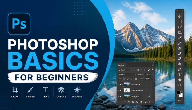
Photoshop Basics for Beginners: 25 Essential Skills You Need to Know (2026)
Learning Photoshop basics can feel overwhelming at first, especially when you open the software and see dozens of panels, tools, and menus staring back at you. But once you understand the core Photoshop basics, everything else becomes much easier to pick up. Whether you want to edit personal photos, design social media graphics, or start a career in digital design, mastering Photoshop basics is the first step toward becoming confident with this powerful tool.
In this guide, we are going to walk through 25 essential skills that make up the foundation of Photoshop basics for 2026. Each section is written in short, easy-to-read paragraphs so you can quickly scan, learn, and apply what you read without getting lost in technical jargon. By the end of this article, you will have a solid understanding of Photoshop basics and feel ready to start editing your own images with confidence.
Let’s dive into the 25 essential Photoshop basics every beginner should know in 2026.
1. Understanding the Photoshop Workspace

Before you touch a single tool, it helps to understand the layout of the software. The workspace is made up of the toolbar on the left, the options bar at the top, and various panels on the right such as Layers, Properties, and Adjustments.
Getting comfortable with this layout is one of the most important Photoshop basics because everything you do inside the program starts here. Spend a few minutes exploring each panel so you know where to find the tools you will use most often.
2. Creating and Managing Documents
Every project starts with a new document. Learning how to set the correct canvas size, resolution, and color mode (RGB for web, CMYK for print) is a core part of Photoshop basics that beginners often overlook.
Getting your document settings right from the start saves you from resizing or quality issues later. This small step is one of the easiest Photoshop basics to learn, but it has a big impact on your final results.
3. Using the Move Tool
The Move Tool lets you reposition layers, selections, and objects within your canvas. It sounds simple, but understanding how it interacts with different layers is an important part of Photoshop basics.
Practice dragging layers around, using arrow keys for precise movement, and holding Shift to constrain motion. These small habits build a strong foundation in Photoshop basics that will speed up your workflow later on.
4. Mastering Selection Tools

Selections are at the heart of almost everything you do in Photoshop. The Marquee Tool, Lasso Tool, and Magic Wand Tool each serve different purposes, and learning when to use each one is essential to Photoshop basics.
The Marquee Tool is great for simple rectangular or elliptical selections. The Lasso Tool allows freehand selections, while the Magic Wand selects areas based on color similarity. Combining these tools is a skill that grows naturally as you practice Photoshop basics.
5. Understanding Layers

Layers are arguably the single most important concept in Photoshop basics. Think of layers as transparent sheets stacked on top of each other, each holding a different part of your image.
Working non-destructively with layers means you can edit one part of your design without affecting the rest. This concept alone separates beginners from more advanced users, which is why it deserves extra attention when learning Photoshop basics.
6. Working with Layer Masks

Layer masks allow you to hide or reveal parts of a layer without permanently deleting pixels. This is one of the most valuable Photoshop basics because it keeps your editing flexible and reversible.
Using black to hide and white to reveal on a mask takes a bit of practice, but once it clicks, you will use this technique in almost every project. Many professional retouching workflows rely heavily on this core piece of Photoshop basics.
7. Using Adjustment Layers
Adjustment layers let you change brightness, contrast, color balance, and more without altering your original image. They sit on top of your layer stack and can be edited or removed at any time.
This non-destructive approach is a defining feature of good Photoshop basics habits. Instead of applying changes directly to pixels, adjustment layers keep your file flexible for future edits.
8. Exploring Blending Modes
Blending modes control how a layer interacts with the layers beneath it. Modes like Multiply, Screen, and Overlay can dramatically change the mood and tone of an image.
Experimenting with blending modes is a fun way to deepen your understanding of Photoshop basics. Try switching between different modes on a sample project to see how each one affects color, contrast, and lighting.
9. Getting Comfortable with the Brush Tool

The Brush Tool is used for painting, retouching, and creating custom effects. Adjusting brush size, hardness, and opacity gives you control over how your strokes appear on the canvas.
Spending time practicing with the Brush Tool builds hand-eye coordination that supports many other Photoshop basics skills, especially when it comes to masking and retouching work later in your learning journey.
10. Learning the Eraser Tool
The Eraser Tool removes pixels from a layer, which can be useful in specific situations, though many professionals prefer layer masks for non-destructive editing. Still, understanding how the Eraser works is a fundamental part of Photoshop basics.
Knowing when to erase versus when to mask is a judgment call that becomes easier with experience and practice.
11. Cropping and Straightening Images

The Crop Tool helps you remove unwanted areas of an image and adjust its composition. It also includes options to straighten tilted photos automatically.
Composition matters a great deal in photography and design, so learning to crop effectively is one of the more practical Photoshop basics skills you will use in almost every project you complete.
12. Using the Text Tool and Typography

Adding text to your designs opens up a world of possibilities, from social media graphics to posters and banners. The Text Tool lets you control font, size, color, spacing, and alignment.
Typography is a skill on its own, but understanding the technical side of the Text Tool is an essential piece of Photoshop basics that every designer needs to know.
13. Working with Shape Tools
Shape Tools allow you to create rectangles, ellipses, polygons, and custom vector shapes. These shapes are scalable without losing quality, which makes them useful for logos, icons, and layout elements.
Combining shapes with layer styles like shadows and gradients is a natural extension of learning Photoshop basics, and it opens the door to more advanced design work down the line.
14. Retouching with the Clone Stamp Tool

The Clone Stamp Tool copies pixels from one area of an image to another. It is commonly used to remove unwanted objects or duplicate parts of a photo.
This tool requires a steady hand and a good eye for detail, but it is a rewarding skill to develop as part of your Photoshop basics toolkit, especially for portrait and product photo editing.
15. Using Healing Brush and Spot Healing Tools
The Healing Brush and Spot Healing Brush automatically blend cloned pixels with the surrounding area, making them ideal for removing blemishes, dust spots, and small imperfections.
These tools are faster and smarter than the Clone Stamp in many situations, and knowing when to use each one rounds out your understanding of retouching within Photoshop basics.
16. Learning the Pen Tool and Paths

The Pen Tool is often considered one of the trickier parts of Photoshop basics to learn, but it is incredibly powerful once mastered. It allows you to create precise vector paths for selections, shapes, and clipping.
Practicing with anchor points and curve handles takes patience, but this skill unlocks professional-level precision in your selections and illustrations.
17. Zooming and Navigating Your Canvas
Efficient navigation saves time and reduces frustration. Learning keyboard shortcuts for zooming in and out, panning around the canvas, and fitting the image to your screen is a small but important part of Photoshop basics.
The Hand Tool and Zoom Tool, combined with shortcuts like Spacebar and Ctrl/Cmd + Plus or Minus, make navigating large documents much smoother.
18. Understanding Undo History and Snapshots
Mistakes happen, and Photoshop makes it easy to recover from them. The History panel keeps track of your recent actions, while snapshots let you save a specific state of your document to return to later.
Knowing how to use these recovery tools confidently is a safety net that every beginner should build into their Photoshop basics routine.
19. Applying Filters and Smart Filters

Filters can blur, sharpen, distort, or stylize your images in creative ways. When applied to a Smart Object, filters become editable and non-destructive, which is a major advantage.
Learning to combine filters with Smart Objects is an intermediate step that builds directly on your Photoshop basics foundation, giving you more creative control over your final output.
20. Color Correction with Levels and Curves

Levels and Curves are two of the most powerful tools for adjusting brightness, contrast, and color balance in your images. They give you precise control that basic brightness sliders simply cannot match.
Understanding how to read a histogram and manipulate curves is a slightly more advanced part of Photoshop basics, but it pays off enormously in the quality of your final edits.
21. Working with Smart Objects
Smart Objects preserve the original quality of an image or file, even after resizing, transforming, or applying filters. They act as containers that protect your source content from destructive changes.
Using Smart Objects consistently is a habit that separates casual users from more serious learners of Photoshop basics, since it keeps every project flexible for future edits.
22. Saving and Exporting Files Correctly

Knowing the difference between file formats like PSD, JPEG, PNG, and TIFF is essential. PSD preserves layers for future editing, while JPEG and PNG are better suited for sharing and web use.
Exporting correctly for the intended platform, whether it’s a website, social media, or print, is a practical skill that ties together everything you have learned about Photoshop basics.
23. Learning Essential Keyboard Shortcuts
Keyboard shortcuts dramatically speed up your workflow once you commit them to memory. Shortcuts for zooming, undoing, switching tools, and toggling panels save you countless hours over time.
Building shortcut habits early is one of the smartest investments you can make while learning Photoshop basics, since it allows you to focus on creativity instead of clicking through menus.
24. Using Guides, Grids, and Rulers
Guides, grids, and rulers help you align objects precisely and maintain consistent spacing throughout your design. They are especially useful for layout work, such as designing social media templates or print materials.
Turning on Smart Guides and snapping options is a simple adjustment that improves accuracy across every project you tackle as part of your Photoshop basics journey.
25. Basic Retouching Techniques
Bringing everything together, basic retouching combines selections, layers, masks, healing tools, and color correction to enhance photos naturally. This final skill ties together nearly everything covered in this guide.
Practicing basic retouching on your own photos is the best way to reinforce every concept in Photoshop basics and start building real, practical experience.
Add Short and Concise Paragraphs for Better Readability and UX
Throughout this article, you may have noticed that each section uses short, focused paragraphs rather than long blocks of text. This approach is intentional and directly tied to good Photoshop basics content writing practices for the web.
Short paragraphs improve readability, reduce bounce rates, and make it easier for readers to scan content on mobile devices. When writing your own tutorials or guides about Photoshop basics, keeping paragraphs concise helps readers stay engaged and find the information they need quickly, which also supports better SEO performance over time.
Final Thoughts on Photoshop Basics
Mastering Photoshop basics does not happen overnight, but by practicing these 25 skills consistently, you will build a strong foundation that supports everything else you want to do in the software. From understanding layers and masks to retouching and exporting files correctly, each skill builds on the last.
Keep practicing, keep experimenting, and revisit these Photoshop basics whenever you need a refresher. Over time, what feels complicated today will become second nature, and you will be ready to move on to more advanced techniques with confidence.
Frequently Asked Questions About Photoshop Basics
- What are the most important Photoshop basics to learn first? The most important Photoshop basics to start with are the workspace layout, layers, selection tools, and saving/exporting files. These four areas form the foundation for everything else you will learn.
- How long does it take to learn Photoshop basics? Most beginners can grasp core Photoshop basics within a few weeks of consistent practice, though becoming fully comfortable with all 25 skills covered here may take a couple of months depending on how often you practice.
- Do I need to buy Photoshop to learn these basics? Yes, Photoshop basics require access to the Adobe Photoshop software, which is available through a subscription. Adobe also offers free trials that are useful for beginners who want to test the waters first.
- Is Photoshop hard to learn for complete beginners? Photoshop basics can seem intimidating at first because of the number of tools and panels, but breaking the learning process into small, focused skills like the ones in this article makes it much more manageable.
- What is the difference between layers and layer masks in Photoshop basics? Layers hold separate pieces of your image or design, while layer masks control what parts of a layer are visible or hidden. Both concepts are core parts of Photoshop basics and often used together.
- Can I learn Photoshop basics for free online? Yes, there are many free tutorials, YouTube videos, and articles like this one that cover Photoshop basics in detail. Practicing alongside these resources is one of the most effective ways to learn.
- What file format should I use after learning Photoshop basics? It depends on your goal. Use PSD to keep your layers editable, JPEG for smaller web-friendly images, and PNG when you need transparency. Understanding this is a key part of Photoshop basics.
- Are keyboard shortcuts really necessary for Photoshop basics? While not mandatory, keyboard shortcuts significantly speed up your workflow and are considered a valuable part of solid Photoshop basics habits once you move beyond the beginner stage.
- What should I practice after mastering these 25 Photoshop basics? Once you are comfortable with Photoshop basics, you can move on to advanced retouching, compositing, digital painting, or specialized areas like UI design and photo manipulation.
- Is Photoshop basics knowledge useful for a design career? Absolutely. A strong grasp of Photoshop basics is often a prerequisite for jobs in graphic design, photo editing, digital marketing, and content creation, making it a valuable skill set to develop.
-

 Graphics Design2 years ago
7.Exploring the Importance of Color Theory Charts
-

 Graphics Design1 year ago
Top 10 Best Graphic Design Tools for Beginners in 2025 (Free & Paid)
-

 Graphics Design2 years ago
10 Stunning Gradient Design Trends You Need to Know in 2024
-

 Graphics Design1 year ago
15 Freelance Graphic Design Tips to Boost Your Career in 2025
-

 Graphics Design2 years ago
29.Retro Design Is Making a Comeback in Modern Spaces
-

 Graphics Design1 year ago
Best Laptops for Graphic Designers – 2025 Buying Guide
-

 Graphics Design2 years ago
2025 Logo Design Trends: What’s In, What’s Out?
-

 Graphics Design2 years ago
15.The Importance of Effective Flyer Design in Marketing