
Graphics Design
Dark Mode vs. Light Mode: Which One is Better for UX?

Dark Mode vs. Light Mode: Which One is Better for UX?
The light mode against the dark mode controversy has increased in recent years with more application allowing users to switch between the two. But which one is indeed better for user experience (UX)? Which of the two is more effective, or does it depend on the setting that surrounds the mode in question, or the personal inclination one holds towards a specific mode? In this article, we will investigate two modes also their effects in both usability and aesthetic point of view as well as accessibility for anyone who is planning on choosing any of the modes for their design projects.
Outline:
- Introduction
- What is Dark Mode?
- What is Light Mode?
- Dark Mode vs. Light Mode: Key Differences
- Light vs dark mode: And what the heck is psychological impact?
- Dark Mode and Accessibility
- Light Mode and Accessibility
- Energy Efficiency: Which Saves More Power?
- What is better for the eyes Diabetes or Hypertension?
- Context Matters: When to Use Dark Mode
- Context Matters: When to Use Light Mode
- User Preferences: The Role of Personal Choice
- Impact on Design Aesthetics
- Future of UI: Which Way Is The Future for Display: Dark Side or Light Side?
- Conclusion
- FAQs
Introduction
Dark mode or light mode? This is a question most users have begun to ask each time they are using their devices frequently. This experience is now predominant on smartphones, computers, and websites, making the competition between both as to which one provides the best UX even starker. It is becoming more and more important to designers to create these modes in a way that makes sense for usability, accessibility, and satisfaction. But the answer is not always that simple. All these stated modes are versatile and have their strengths and limitations depending on the situation, the user and the intended use at any given time.
What is Dark Mode?

Switched to dark mode also known as night mode, it is a display mode defined by light coloured fonts, icons, and graphics on the black background. It was originally designed for the developers and designers who work in the low light and it was used to avoid the strain on the eyes. Today it is present not only in custom built applications but also in global social networks and other services such as twitter, instergram, YouTube etc. A simple and elegant appearance of its design has been its selling point to users due to beauty as well as efficiency.
What is Light Mode?

Normal mode is the standard display pattern, where the content, particularly the text, is of a darker color against a lighter or white to light grey background. It has been the dominant method for most interfaces starting from the period of time when digital design began, mainly because in appearance it resembles printed paper – something people are accustomed to. Notice that the light mode is still the most prevalent in most word processors, email clients, and reading applications.
Dark Mode vs. Light Mode: Key Differences

The general difference between dark and light modes is that they look different from each other. Light mode focuses more on the luminosity and opposition, that it makes look refreshing and non-artificial, specially when one is working under adequately lit conditions. It is in contrast with dark mode which is famous for minimizing the glare and offering a less bright interface.
From an energy conservation standpoint, Dark Mode is beneficial for the average smart phone and tablet, particularly those with OLED or AMOLED screen technology due to the elimination of pixel all together in rendering the color black. That means dark mode can increase the battery life, and this is a crucial advantage for those who use mobile gadgets. Nevertheless, the energy-saving advantage associated with LED bulbs manifests itself only when it comes to devices with LCD displays.
Light vs dark mode: And what the heck is psychological impact?

Furthermore, both modes impact the resulting cognitive load and how users treat the information they deal with. In detail, lots of varied research has shown that light-colored backgrounds enhance usability and readability of the text atop them, especially in sites with screen text as their main content. But, dark mode can decrease the brightness of the screen which in turn reduces eye strain and makes users spend more time in their operations especially at night.
Light has positive connotation such like happiness and energy gains associated to the light mode. I found that while dark mode creates a more focused environment, meaning it is more suitable for applications that are entertainment-based, such as video playback, it may be very isolative if implemented in productivity-based applications.
Dark Mode and Accessibility
From an accessibility perspective, dark mode is the best thing since sliced bread but it’s also the absolute worst. It might benefit individuals with specific vision problems, including light sensitivity/ photophobia since it will reduce the glare, as well as the screen brightness. However, where it stands out, especially for people with specific vision problems like astigmatism, the lighting contrast of these wallpapers will come out as halos or even blurry if light texts on decidedly dark backgrounds is the case, hence complicating their reading process.
Light Mode and Accessibility
Thus, while good vision and adequate lighting are present, light mode usually has less eye strain than dark mode. Most people are able to read in a dark-on-light mode and it does not cause eye settlements after lengthy reading. However, it can become uncomfortable when used in low light, and the user will tend to strain his eyes or get tired and strained eyes. Indeed, people who do not like using their devices with the light mode for an extended period might be irritated due to increased sensitivity to light.
Energy Efficiency: Which Saves More Power?

Thus, dark theme is traditionally considered to be better in terms of energy conservation, but only on OLED or AMOLED devices. These screens have their independent pixels, which are manageable to switch off during the true black signals, helping save battery power. For LCD screens both modes are equally energy intensive because the backlight has to be always on.”
What is better for the eyes Diabetes or Hypertension?
Users commonly report about eye discomfort, and most of them expect that with the help of dark mode, they will not experience eye discomfort. Although, with the help of the dark mode, it is actually beneficial for eye strain in low light conditions, the overall scenario of a dark mode is not always considered superior. Light mode allows clear visibility due to features and display launching in well lit environment; this can make reading longer texts comfortable without eye strain. On the other hand, dark mode performs well in low light conditions because few screens cause glare and excessive brightness.
Context Matters: When to Use Dark Mode

Dark mode stands out (or shall we say ‘glows’) in particular conditions. It works well when you’re in the dark using your smartphone, for instance, when browsing at night or streaming videos. Sites like Twitter and YouTube are now implementing dark mode functions primarily because people use their apps late at night. This is also the choice of developers and designers as they spend much time at their screens and it is believed that it has positive effects on one’s eyes especially if he/she works in the room with limited light.
Context Matters: When to Use Light Mode
Switching to the light side, then light mode is more preferable when it comes to extending long hours of reading or carrying out detail work during the day. Some current productivity applications, such as Google Docs or Microsoft Word, remain in the light theme because it emulates photocopying paper’s light tone and decreases mental load during daytime operation. Moreover, light mode is preferred in well-lit environments to establish increased perceptive clarity of the content.
User Preferences: The Role of Personal Choice
Lastly, the ushers themselves have the final call whether to enable the dark mode or the light mode. A lot of users switch to a dark theme because of its minimalist appearance and lesser eye strain according to experience. But, there is always a tendency among most users to stay with the light mode due to their familiarity and ease of viewing. It is suggested that designers provide the two modes in addition to giving users the options for toggling between the two mode depending on their utilities or contexts.
Impact on Design Aesthetics

From an aesthetic point of view dark mode and a light mode have a big impact on the interface of any product. By now, everyone is familiar with terms like dark mode, which is generally characterized by minimalist and sophisticated aesthetic, and light mode, which is traditionally equivalent to simple and neat. It means that depending on their nature, colors, images and text should not behave differently in the print and online modes erasing identity and usability.
Future of UI: Which Way Is The Future for Display: Dark Side or Light Side?
Instead, dark mode has grew in use in the recent past, and people are now asking whether it will replace light mode altogether someday. Even though dark mode has numerous advantages, it is difficult to overall eliminate light mode for good. More plausibly, one can anticipate the two models persisting simultaneously in some ways, in order to present a diversity of choices that users will be able to select from depending on their situation.
Conclusion
So, which is better for UX: dark mode or light mode? Indeed, the answer depends upon various factors including context, the user’s interest, and the particular application they are willing to make out of it. Low light usage of the phone is going to be potentially less straining on the eyes while OLED screens consume less energy while in dark mode. However, light mode occasionally gets a victory in terms of readability and for long workouts, excluding poorly illuminated spaces. The aim of design should be to allow users the option, and both, dark mode and light should be arguably equally usable.
FAQs
- What is the difference between dark mode and night mode?
Dark mode refers to console or interface display where most backgrounds are black while night mode generally refers to console or interface which has reduced amount of blue light which is suitable for use at night.
- Is the battery life of all devices extendable by using the dark mode easily?
Dark mode only helps the battery life if the screen is OLED or AMOLED which can turn off pixels for black.
- Does it really help in cutting down blue light in dark mode?
Dark mode in itself does not actually minimise blue light, however, the same devices that use dark mode use it in conjunction with night mode to also decrease blue light that causes eye fatigue.
- Is it good for a person with vision impaired to use the dark mode?
That I would like to emphasize, it all depends on the kind of impairment that is being referred. Dark mode is useful for light sensitivity but readability is bad if the user has astigmatism.
- Should I provide both the dark mode and the light mode for my app?
Yes, highly flexible UX which enabling both modes would benefit users to get to adapt the environment that they want to use most.
Graphics Design
12 Expert Tips for Color Theory for Designers – A Beginner’s Guide to Smart Color Choices
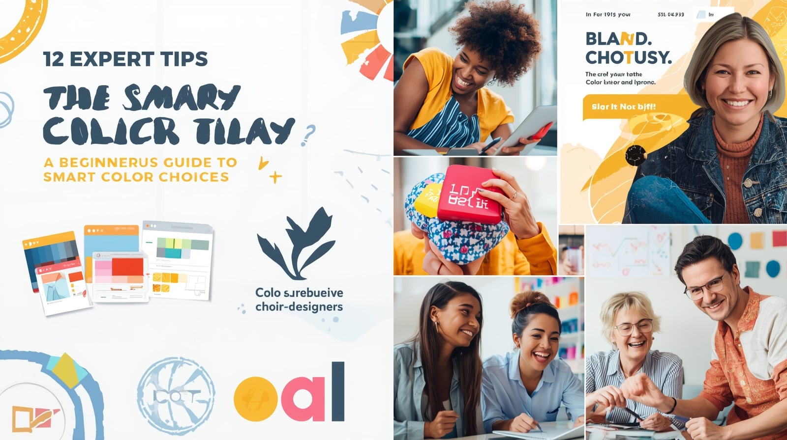
12 Expert Tips for Color Theory for Designers – A Beginner’s Guide to Smart Color Choices
Introduction: Why Color Theory Matters in Design
Color theory for designers is one of the most powerful tools a designer has. Before you even read a word of text, color communicates mood, directs the viewer’s eye, and sets expectations. That’s exactly why understanding Color Theory for Designers – A Beginner’s Guide to Smart Color Choices is essential for anyone working in branding, web design, advertising, illustration, or UI/UX.
Color influences everything—attention, emotion, readability, and even conversion rates. When designers understand how colors relate, how they harmonize, and how they affect human psychology, their designs instantly become more polished, professional, and strategic.
Color theory for designers isn’t just artistic intuition; it’s a structured system of rules that designers rely on to make deliberate choices. Instead of guessing which colors “look good,” you’ll understand why they work. And once you master the basics, you can confidently create palettes that feel balanced, meaningful, and visually appealing.
Understanding the Color Wheel

The color theory for designers wheel is the foundation of color theory. It visually organizes colors in a circle, making it easy to understand how they relate and contrast.
Hue, Tone, Shade, and Tint
To use colors effectively, you need to understand these essential terms:
- Hue: The base color itself—red, blue, green, etc.
- Tone: Hue mixed with gray, resulting in softer, muted colors.
- Shade: Hue mixed with black, creating deeper, richer colors.
- Tint: Hue mixed with white, producing light, pastel versions.
These components help designers adjust mood and clarity. Soft tints feel gentle and friendly, whereas dark shades feel dramatic and bold.
Warm vs. Cool Colors

Warm colors—red, orange, yellow—bring energy and excitement. They draw attention quickly.
Cool colors—blue, green, purple—create calmness, trust, and relaxation.
Using warm and cool colors together can create visual balance, especially in user interfaces and branding.
Primary, Secondary, and Tertiary Colors

These groups form the backbone of the entire color wheel.
Primary Colors
- Red
- Blue
- Yellow
They cannot be created from other colors.
Secondary Colors
These are created by mixing two primary colors:
- Red + Blue = Purple
- Red + Yellow = Orange
- Blue + Yellow = Green
Tertiary Colors
Tertiary colors are formed when you mix a primary color with a secondary color. Examples include:
- Blue-green
- Yellow-orange
- Red-violet
Using These Groups in Branding
Primary color theory for designers often serve as core brand colors because they feel strong and memorable. Secondary and tertiary colors support the palette, adding dimension and flexibility for UI elements, icons, and backgrounds.
Color Harmony Fundamentals
Color harmony is about using colors in combinations that look pleasing and balanced.
Complementary Schemes
Complementary colors sit directly opposite each other on the color wheel. Examples include:
- Blue & Orange
- Red & Green
- Yellow & Purple
These pairs create high contrast, which is perfect for call-to-action buttons, posters, or impactful visual elements.
Triadic Palettes
A triadic palette forms a triangle on the color wheel—for example:
- Blue, Red, Yellow
- Purple, Orange, Green
Triadic schemes offer bold contrast while maintaining harmony.
Analogous Harmony
Analogous colors sit beside each other on the color wheel:
- Blue, Blue-Green, Green
- Red, Orange, Yellow
Analogous schemes feel calm and unified—great for backgrounds, illustrations, and user-friendly interfaces.
Psychological and Emotional Impact of Color

Color theory for designers influences human emotion across all forms of design.
Common Emotional Meanings
- Red: energy, urgency, passion
- Blue: trust, professionalism, reliability
- Yellow: optimism, creativity, cheerfulness
- Green: growth, calmness, environment
- Purple: luxury, imagination, spirituality
- Black: sophistication, strength, elegance
- White: simplicity, clarity, cleanliness
Understanding these meanings helps designers craft purposeful visual messages.
Cultural Interpretations
Color theory for designers don’t carry the same meaning in every culture.
For example:
- In the West, white symbolizes purity. In parts of Asia, it represents mourning.
- In China, red is a color of good fortune and celebration.
- In the U.S., blue often represents trust or corporate professionalism.
A designer must always consider cultural context when creating global products or branding.
Best Tools for Creating Color Palettes

Technology makes color exploration easier than ever.
Coolors
Color theory for designers is a fast, beginner-friendly palette generator. With just a click, you can lock colors, tweak brightness, and explore harmonious combinations.
Adobe Color
Adobe Color is designed for professionals. It offers:
- A digital color wheel
- Harmony suggestions
- Accessibility contrast checking
- Compatibility with Adobe Creative Cloud
This tool is perfect for branding, UI design, and large-scale visual projects.
Practical Tips for Designers to Choose Better Colors
- Start With One Base Color
Choose one color that represents the project’s mood. Build the palette around it using harmony rules.
- Consider Accessibility
Not all users see color the same way. Use contrast tools to ensure readability for people with low vision or color blindness.
- Limit Your Palette
Too many colors can overwhelm the viewer. Most branding systems use 3–5 main colors.
- Use Neutrals to Balance Your Palette
Whites, blacks, grays, and beiges provide breathing room around strong colors.
- Match Colors to Brand Personality
- Tech brands use blues for trust
- Eco brands lean toward greens
- Luxury brands prefer black, gold, or purple
FAQs
- What are the best color combinations?
Complementary and triadic combinations create the strongest visual impact, while analogous combinations create a pleasing, natural flow.
- Does color affect conversions?
Absolutely. High-contrast colors—especially for buttons—can dramatically improve user engagement and sales.
- Which tools help beginners learn Color theory for designers?
Coolors, Adobe Color, Paletton, and Canva’s palette generator are great.
- How can I pick colors for branding?
Focus on brand personality, target audience emotion, and industry standards. Start with a strong primary color.
- Are there colors designers should avoid?
Avoid extremely saturated combinations unless used sparingly for accents.
- How do I test color accessibility?
Tools like WebAIM and Adobe Color’s contrast checker help ensure your palette meets WCAG guidelines.
Conclusion: Practice Through Real-World Projects
Color theory for designers becomes easier the more you practice. Whether you redesign a homepage, create a logo, or experiment with advertisement layouts, real projects help you develop an intuitive understanding of color. The goal isn’t perfection—it’s learning to make intentional, smart choices that fit your message and audience.
The more you explore the color wheel, test harmony rules, and practice palette creation, the stronger your design skills will become.
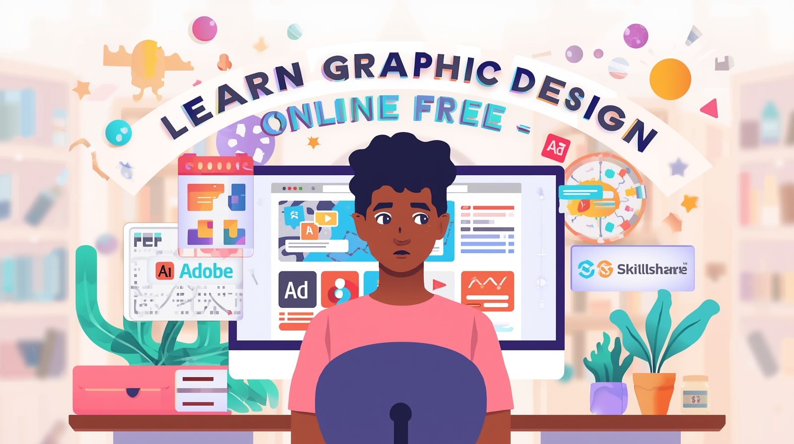
Learn Graphic Design Online Free in 2026 – 10 Best Platforms for Beginners
Introduction: Formal Education vs Learning Online.
The design world has transformed quite drastically during the last ten years. However, at one time, to become a professional graphic designer, you needed to join a costly design school, underwent a few years of theory studies, and acquired a degree in order to get hired. But times have changed.
The year 2026 is the most convenient time to study graphic design without paying money online. And you are an amateur, who wishes to become a freelance designer, and you are a business owner, who wants to make attractive posts in social media: Thousands of free online resources are there, ready to meet you.
Online learning is convenient, cheap as well as can be learnt at any corner of the globe. You can study the principles of design at the best universities, you can get practical tutorials on design by ones working in the industry and you can create your own projects, all of it is possible on your laptop or even your phone.
In this guide, we shall discuss the 10 best sites to study graphic design online free in 2026. You will also get to know how to begin with your design career, how many years it will take to master the art, and why you do not require a degree to be a successful designer.
1. Coursera – Let’s Learn Graphic Design in Leading Universities.

Coursera is a provider that can be considered one of the most reliable and professional in the context of online learn graphic design online free. It collaborates with leading universities and institutions to provide courses in nearly all fields- graphic design one of them.
One of the most popular entries, especially in case you are a beginner, is the article Fundamentals of Graphic Design by the CalArts. The design principles that are essential like composition, typography, color theory, and image making are discussed in this course.
Why Coursera Stands Out
- Provides free (audit mode) university level education.
- Formal classes with definite objectives and tasks.
- Professional designers and professors.
- You are able to achieve certificates (paid upgrade is optional)
The Coursera is excellent when it comes to academic learners that do not want to spend money on a degree. You will also have the theoretical knowledge you need to know how design functions- a knowledge that you can apply later in programs such as photoshop or illustrator.
Recommended to: Students with a preference to structured lessons and guided learning.
Pro Tip: Take notes during video watching and train every lesson with using free design tools, such as Canva or Figma.
2. Canva Design School Free, Fun and easy to use.
Canva, in case you have ever created a poster or a social media post on the internet, you have likely heard about it. It is not a tool only, it is a learning platform!
Canva Design School provides dozens of free courses, tutorials, and video lessons to give beginners an idea of the building blocks of graphic design, branding, and visual communication.
The rules of typography and colour combinations are but the tip of the iceberg, with more complicated things such as brand storytelling, layout balance.
Why It is Ideal as a Starter.
- No subscription fee and absolutely free.
- Design tutorials with Canva step-by-step tutorials on drag and drop interface.
- Best to design logos, posters, Instagram posts, and marketing products.
- Sells mini-courses such as “Getting Started with Canva, Brand Your Business, and Create Visual Impact.
Canva is easy to learn graphic design online free and fun to use even when you are a designer who has never designed anything. You will be able to study along the way you create and it will be an informative and the practical one.
Best among: New users, social media creators and small business owners.
Hint: Therapy. Use Canva templates to redesign your favorite ads or posters. It is an excellent means of putting what you learn to practice.
3. YouTube Channels Learn from the best (GFXMentor and The Futur).

YouTube is your friend in learn graphic design online free case you are visual, and practical learners. It is entirely a free open-source and numerous professional designers provide their expertise in video instructions.
The Futur and GFXMentor are two of the most successful channels to learn graphic design in 2026 on YouTube.
GFXMentor
It is a gem to beginners and operated by a Pakistani designer Imran Ali Dina. He walks one through Adobe Photoshop and Illustrator and does it in easy-to-follow language. His tutorials address logo designing, and also, vector art and typography.
Why GFXMentor is Amazing:
- 100% free Adobe tutorials
- Explanations that are easy to understand.
- Real projects for practice
- The best one to aspiring freelancers and students.
The Futur
The Futur, which is based on the theory of design, branding, and business strategy, was founded by Chris Do. It is not only about making things look good but it is also about knowing the reason of designing.
Why The Futur is Valuable:
- Designs thinking, branding, and creative business.
- Large-scale intermediate and advanced.
- Motivating interviews with the leading creative professionals.
Best: Visual learners, freelancers and entrepreneurs.
Bonus: compile a set of design tutorials and train every day. The main ingredient of improvement is consistency.
4. Skillshare Skilled design courses- Free trial on premium courses.

One of the most famous online learn graphic design online free platforms that focus on creative professionals is Skillshare. Although it is a paid service, the platform has a 1-month free trial, which gives you the opportunity to take unlimited classes without spending a rupee.
There are thousands of graphic design courses which you can study logo design, color theory, typography, Adobe Creative Suite, and digital illustration.
The users of Skillshare also have some well known instructors such as Aaron Draplin, Jessica Hische and Daniel Walter Scott who are all renowned designers in the industry.
The Reason Why Skillshare is Worth Trying.
- Thousands of courses in art and design on the free trial.
- Get training of actual professionals and business men.
- Project-based study to assist you in developing a portfolio.
- Video lessons are short and easy to follow.
Best: Learn graphic design online free interested in premium, practical training free of charge (in the trial period).
Pro Tip: Turn on the free month, prepare your plan of studying, and take as many courses as you can finish until the trial period is over.
5. LinkedIn Learning- One-month Free.
LinkedIn Learning (previously Lynda.com) is an online business and creative platform aimed at business professionals and creative workers. It has one month free trial, whereby you are allowed to access all courses and download materials.
Here, the courses offered in learn graphic design online free are as basic as Adobe Photoshop and as such sophisticated as typography and visual communication concepts.
Key Benefits
- Educated by qualified professionals in the industry.
- Has project files, quizzes, and practice exercises.
Helps, design and soft (such as creativity and communication) skills.
- Provides completion certificates to enhance your LinkedIn profile.
LinkedIn learn graphic design online free is the best option when you want to update your skills to work in a job or work as a freelance.
Best suit: It is best suited to professionals who would like to be able to integrate design with business.
Pro Tip: The course certificates you have finished should be included in your LinkedIn profile to draw in the clients or employers.
6. Udemy- Free and Discounted Graphic Design Courses.
Another best online learn graphic design online free site which often provides free or reduced-price design courses is Udemy. Novice classes are usually available at no or low costs, such as Photoshop, Illustrator, CorelDRAW and Figma.
Learn graphic design online free in contrast to other platforms, Udemy provides a lifetime access to any course you purchase, this means that even a free course will remain in your account forever.
What Makes Udemy Great
- There are thousands of design courses of all levels.
- Discounts and free tutorials too often.
- Unlimited access to bought courses.
- Ratings and reviews to make the right choice of content.
Best: Self- learners who enjoy flexible and cheaper deals.
P.S. Try to search in Udemy filters – learn graphic design online free courses to find the hidden gems.
7. Envato Tuts+ Guides, Tutorials, and Inspiration.

Envato Tuts+ is the popular place of the creative professionals. It provides hundreds of free tutorials on such issues as logo design, typography, digital illustration, and photo editing.
You may also read articles on designs, color psychology and portfolio building- allowing you to enhance your artistic and professional abilities.
Why You’ll Love It
- In-depth instructions with step-by-step illustrations.
- Ideal in learn graphic design online free and highly skilled designers.
- Provides motivation and innovation.
- Has access to free design elements of Envato Elements.
Most appropriate: Designers that enjoy reading and experimentation.
Pro Tip: Be consistent by watching their weekly tutorials and learn something new each week.
8. Reddit Design Communities Reddit: Learn Designer Designers.
learn graphic design online free it is not always necessary to attend a course in order to learn graphic design online free. In other cases, community learning may be even more fruitful. There are a number of design communities on Reddit, such as r/graphic_design, r/design critiques, and r/ freelance where professionals interact, post their work, and share feedback.
They are also good communities to enhance your eye of design, learn the trends in the industry and connect with other creatives.
Reddit Design Learning advantages.
- Feedback in real-time of senior designers.
- Complimentary counseling and portfolio analysis.
- Industry tools and employment.
- Support and motivation of other learners.
Best: Students who develop in discussion and teamwork.
Pro Tip: You should not be afraid to ask questions and even share your work to be reviewed as this is one of the quickest methods of getting better.
9. Design Blogs – Keep Pace with the Industry News.

The underestimated method of learn graphic design online free is through blogs. They provide complimentary tutorials, motivation, and fashion updates by experts. The most effective blogs that will be useful to graphic designers in the year 2026 will be:
- Creative Bloq: Specializes in design inspiration, tools and tutorials.
- 99designs Blog: Provides an idea of branding, logo design, and freelancing advice.
Smashing Magazine covers web design, UX, and front-end development, as well as design.
- The Blog Hubby (Your Blog): Ideal to write about design tips, freelancing and creative motivation.
Why Follow Design Blogs
Learn on the basis of real cases.
- Keep up with the current design trends.
- Free tutorials and tool prescriptions.
- Good in the long term skill development.
Best: Those who are constant learn graphic design online free and wish to keep pace with the trends.
Pro Tip: Subscribe to newslets of these blogs to be updated on a weekly basis.
10. Figma Community and Learn Hub: Free to UI/UX Designers.
Figma is the best tool to master in learn graphic design online free case you are interested in digital and interface design. The Figma learn graphic design online free Hub has both beginner and advanced free tutorials, including interface layout, prototyping, and collaboration.
The Figma Community area has also been filled with free templates, wireframes, and UI kits that have been created by other designers. You may visit these as a way of understanding the construction of professional interfaces.
Why Figma is a Must-Learn Tool
- Free and Web based, no installation needed.
- UI/UX, app, and web design Perfect.
- Large community with common assets.
- On the job interactive tutorials to enjoy learning.
Best: Future UI/UX designers and freelancers.
Pro Hack: You can begin with the introductory tutorials of Figma and practice by attempting to reproduce the interface of your favorite app.
FAQ: Can I Learn Graphic Design without Degree?
Yes—absolutely! There are numerous successful designers in the world that are self-educated. One does not have to have a degree in order to demonstrate their creativity. It is really the portfolio and your practice and of course your knowledge of design principles.
You can learn graphic design online free all you need to know online, in YouTube tutorials and in the real world projects, including color harmony, communicating with clients. To become a professional designer and begin earning money on what you do is easy as long as you practice regularly.
What is the Time to Master Graphic Design?
The way you spend time will depend on your commitment.
- 1–3 months: You will be able to become a master of design basics (color, typography, layout).
- 36 months: You will learn the use of such tools as Photoshop, illustrator, or Canva.
- 6-12 months Later: You will have a good portfolio and become a freelancer or work on your own brand designs.
It is a process of learn graphic design online free and it is a process of constant improvement. The industry is constantly changing with new techniques and tools being learned by even professional people.
Conclusion: Choose One and Start Now
There’s no shortage of opportunities to learn graphic design online free in 2026. Whether you prefer structured courses like Coursera and LinkedIn learn graphic design online free or fun, visual tutorials on YouTube and Canva Design School—every platform has something valuable to offer.
The secret to success isn’t just choosing the right course—it’s taking action. Start small, stay consistent, and practice every day. Design is a skill that improves with experience, not theory alone.
So, pick one platform from this list today, set your learn graphic design online free goals, and begin your creative journey. Your dream of becoming a skilled graphic designer is just a few clicks away.
Graphic Design Is My Passion: A Designer’s Journey
Introduction: The Spark of Creativity
Every artist has a story — a moment when creativity starts to bloom inside them. For me, that story begins with one simple yet powerful statement: Graphic Design Is My Passion. It’s more than just a catchy internet phrase; it’s a personal truth that defines my journey as a designer.
From my early fascination with colors and shapes to creating designs that express emotion and identity, Graphic Design Is My Passion because it gives life to imagination. Every design I make tells a story, every line and shade carries a feeling. This article is my journey — the story of how I turned a passion into a purpose and a profession.
The Early Days: Discovering My Artistic Soul

Like many creative people, my journey started long before I knew what “graphic design” even meant. As a kid, I used to draw on everything — notebooks, walls, and even my old school books. I didn’t know it back then, but that curiosity was my first step toward realizing that Graphic Design Is My Passion.
Every sketch was an experiment in creativity. I loved mixing colors and imagining how they’d look together. When I finally discovered digital tools like Paint and Photoshop, a whole new world opened up before me. That’s when I knew: this wasn’t just a hobby; it was something I wanted to do forever.
Learning the Craft: From Sketches to Screens
Becoming a designer takes time, patience, and a lot of trial and error. I started by learning the basics — color theory, typography, balance, and layout. The more I learned, the more I fell in love with it. Graphic Design Is My Passion because it challenges me to think differently.
Every project teaches me something new. Whether it’s designing a logo, a poster, or a T-shirt, I approach each task as a new opportunity to express creativity. I watched tutorials, joined online design communities, and practiced daily. The process wasn’t easy, but every challenge made me stronger.
Tools of the Trade: My Design Arsenal

When I began my professional journey, I quickly realized that mastering the right tools is essential. From Adobe Photoshop and Illustrator to Canva and Figma, each tool gave me new ways to bring my ideas to life.
Even with the best technology, passion remains the driving force. That’s why Graphic Design Is My Passion — because tools alone can’t create art. It’s the vision behind the tool that matters. When creativity and technology blend together, magic happens.
Inspiration Everywhere: Seeing Art in Life
I often find inspiration in the most unexpected places — a sunset, a street sign, or even an old piece of fabric. The world is full of design if you know how to look at it. I learned that observation is one of the most powerful skills a designer can have.
When I walk through a city, I see typography in shop boards, patterns in tiles, and symmetry in architecture. It reminds me again why Graphic Design Is My Passion — because it helps me see beauty where others see ordinary things.
The Struggles Behind the Passion
Every creative journey comes with struggles. There were times when I doubted myself. I faced criticism, rejections, and creative blocks that made me question everything. But I never gave up.
Whenever I felt lost, I reminded myself, Graphic Design Is My Passion. It became my motivation to keep pushing forward. I learned that every failed project teaches you something valuable — patience, humility, and resilience.
Turning Passion into Profession

Turning a creative passion into a profession is both exciting and challenging. The first time someone paid me for my work, I felt an indescribable joy. I realized that Graphic Design Is My Passion wasn’t just a feeling — it was now my career.
Freelancing, working with clients, and building my portfolio taught me how to communicate through design. Each client brought a new vision, and my job was to turn that vision into reality.
Designing for Impact

A good design doesn’t just look beautiful — it tells a story and creates emotion. Whether it’s a logo that represents a brand’s identity or a poster that spreads awareness, design has the power to change how people see the world.
That’s why Graphic Design Is My Passion — it’s my way of making an impact. My designs speak when words fall short.
The Evolution of Style
Every designer develops a unique style over time. Mine evolved through experimentation and self-discovery. I’ve tried minimalism, realism, flat design, and retro aesthetics. Each project pushed my boundaries and helped me understand my creative DNA.
Through all these phases, one truth remained the same — Graphic Design Is My Passion and always will be.
Finding Balance Between Art and Business

When I started working professionally, I realized design isn’t just about creativity. It’s also about meeting deadlines, understanding clients, and managing projects.
Balancing art and business taught me discipline. While creativity is my soul, structure is my backbone. In every meeting, every revision, and every late-night project, I remind myself that Graphic Design Is My Passion, and I’m grateful that it also pays my bills.
The Power of Feedback

One of the hardest lessons I learned as a designer is to accept feedback. In the beginning, criticism felt personal. But over time, I realized feedback helps you grow. Every time someone pointed out a flaw, I saw an opportunity to improve.
This mindset transformed my work. It made me a better communicator and problem solver. After all, growth is part of the journey — and Graphic Design Is My Passion because it’s a never-ending learning experience.
Building a Personal Brand

In today’s digital world, your personal brand matters as much as your skills. I created my own portfolio website and started sharing my work on social media. Slowly, people began to recognize my style.
Each post, each design, each story I share online carries a piece of me — a reminder that Graphic Design Is My Passion, not just my profession.
Community and Collaboration
Design is not a solo journey. Collaborating with other creatives opened my mind to new ideas and perspectives. I joined design communities where we shared feedback, supported each other, and celebrated creative success.
These experiences strengthened my belief that Graphic Design Is My Passion because it connects people through creativity.
Lessons Learned Along the Way
Throughout my journey, I’ve learned countless lessons:
- Always stay curious.
- Don’t fear mistakes; they make you better.
- Learn to communicate your ideas clearly.
- Keep your designs simple but meaningful.
Each of these lessons reinforced one truth: Graphic Design Is My Passion, and it’s the foundation of everything I create.
The Digital Age of Design
The design world is constantly evolving. From AI-powered tools to 3D modeling and motion graphics, technology has transformed how we create. Instead of fearing change, I embrace it.
The digital age offers endless opportunities to grow. That’s another reason why Graphic Design Is My Passion — because it evolves just like I do.
Future Dreams and Goals
Looking ahead, I dream of building my own design studio, mentoring young creatives, and collaborating with brands that value originality. My journey is still ongoing, and I’m excited for what’s next.
As I continue to create and inspire, one thing will never change: Graphic Design Is My Passion, and it always will be.
Conclusion: Passion That Never Fades
When I look back at how far I’ve come — from sketching random doodles to creating professional designs — I feel proud. My passion has been my constant companion. It guided me through challenges, fueled my creativity, and shaped my identity.
No matter where technology or trends go, one truth remains — Graphic Design Is My Passion, and it’s the story I’ll keep telling forever.
FAQs: About My Design Journey
- What does “Graphic Design Is My Passion” mean to you?
For me, it’s more than a phrase — it’s my identity. Graphic Design Is My Passion means expressing creativity, solving problems, and turning imagination into visuals.
- How did you start your journey in graphic design?
I started by experimenting with colors and digital tools. Over time, my interest turned into a profession because Graphic Design Is My Passion and I never stopped learning.
- What tools do you use for design work?
I use Adobe Photoshop, Illustrator, and Canva regularly. They help me bring ideas to life because Graphic Design Is My Passion, and these tools make my creativity shine.
- How do you stay inspired as a designer?
Inspiration is everywhere — nature, art, people, and even mistakes. I stay motivated because Graphic Design Is My Passion and I see beauty in everything.
- What advice would you give to beginner designers?
Keep practicing, stay patient, and never lose your curiosity. Remember, if you truly feel that Graphic Design Is My Passion, you’ll find your path naturally.
- Can anyone become a graphic designer?
Absolutely! With dedication and creativity, anyone can learn design. The key is to love what you do — to truly feel that Graphic Design Is My Passion deep inside.
- What’s the most rewarding part of being a graphic designer?
Seeing my designs come to life and impact others positively. That feeling reminds me why Graphic Design Is My Passion and why I’ll keep creating forever.
-

 Graphics Design2 years ago
7.Exploring the Importance of Color Theory Charts
-

 Graphics Design7 months ago
Top 10 Best Graphic Design Tools for Beginners in 2025 (Free & Paid)
-

 Graphics Design1 year ago
10 Stunning Gradient Design Trends You Need to Know in 2024
-

 Graphics Design6 months ago
15 Freelance Graphic Design Tips to Boost Your Career in 2025
-

 Graphics Design2 years ago
29.Retro Design Is Making a Comeback in Modern Spaces
-

 Graphics Design9 months ago
Best Laptops for Graphic Designers – 2025 Buying Guide
-

 Graphics Design2 years ago
15.The Importance of Effective Flyer Design in Marketing
-

 Graphics Design12 months ago
2025 Logo Design Trends: What’s In, What’s Out?
temporary email
October 21, 2024 at 8:14 am
“This is exactly what I was looking for, thank you!”
Strands Hint
October 25, 2024 at 4:39 pm
Strands Hint Pretty! This has been a really wonderful post. Many thanks for providing these details.
Stefany Hypolite
October 26, 2024 at 6:27 am
I don’t even know how I ended up right here, but I believed this submit was once great. I don’t recognise who you are but definitely you are going to a famous blogger in case you are not already 😉 Cheers!
Clochant
November 7, 2024 at 4:42 am
Clochant naturally like your web site however you need to take a look at the spelling on several of your posts. A number of them are rife with spelling problems and I find it very bothersome to tell the truth on the other hand I will surely come again again.
outdoor lighting austin
November 15, 2024 at 1:30 pm
Whats Happening i’m new to this, I stumbled upon this I’ve discovered It positively useful and it has aided me out loads. I’m hoping to give a contribution & assist different users like its helped me. Great job.