
Graphics Design
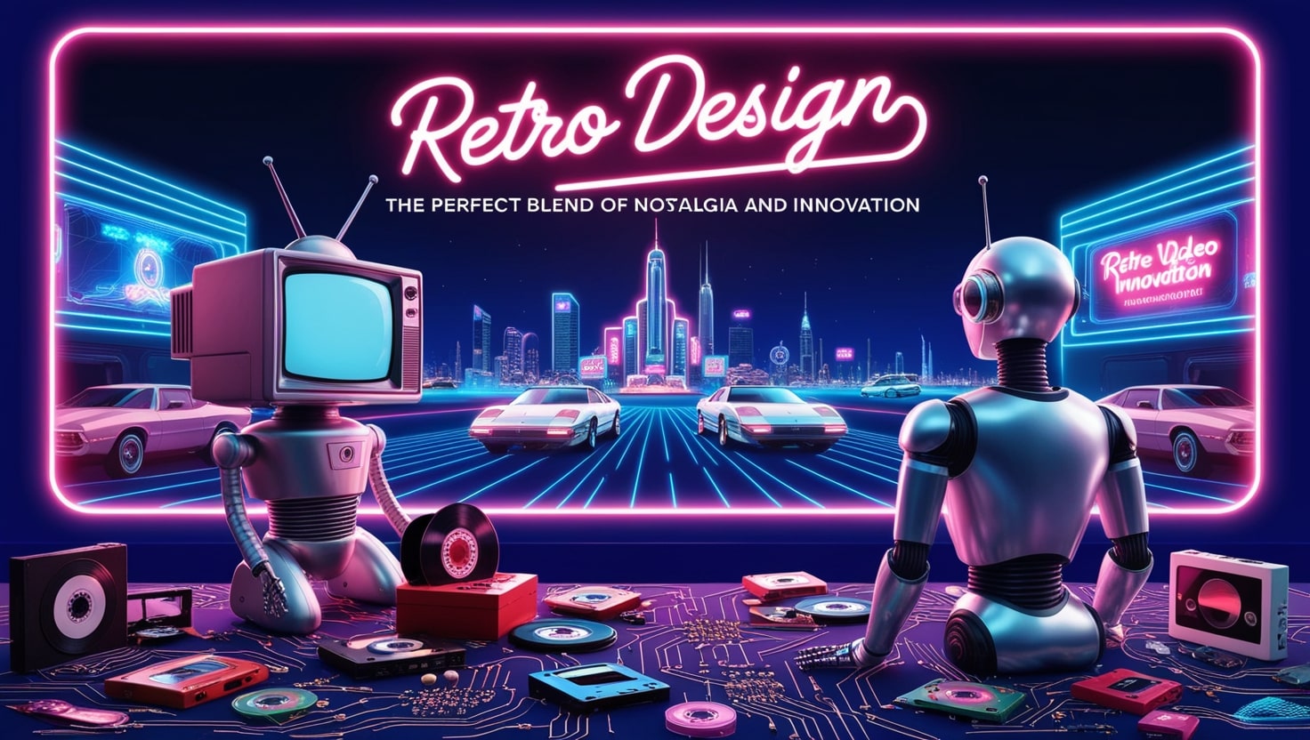
Why Retro Design is the Perfect Blend of Nostalgia and Innovation
Why Retro Design is the Perfect Blend of Nostalgia and Innovation
Retro Design art deco has been a dream for many over the years because it creats an interesting perspective of the past and present. It can be seen in fashion, home décor, product design, or in the tech world, the idea of referencing older designs, even the formal constraints, and integrating them into new products is far from deceased. But what made retro design so popular? Why does this blend of the old and new still light up our screens and pull at heartstrings, when one is always on the lookout for the new? So in this article we will discuss what is meant by Retro Design, why it exists, and why it is such a good mixture of the old and new.
Outline of the Article
- Introduction
- What is Retro Design?
Defining Retro Design
Legendary Time Periods which Define Retro Style
- The Psychology Behind Nostalgia in Retro Design
Why We Love Looking Back
Why Dunks are Considered to have an Emotional Appeal of nostalgia.
- Retro Design in Fashion
Refurbished Fashion Styles Based on the Old Vintage Fashion
Iconic Retro-Inspired Brands
- Retro Design in Home Decor
Mid-Century Modern: Interior Design Themes that stands the test of Time
Analysis of the Elements of Color and Texture in Retro Home Decor
- Retro Design in Product Design
High tech devices with low-tech looks
Vinyl Records and Polaroid Camera
- The Reto Concept in Graphic Design and Branding
Using Retro Type Designs, Logos, and Patterns
How Brand Unlock The Impact of Nostalgic Marketing
- Nostalgic Design and Function of Innovation
Combining Tradition with Technology: The Appeal of Using Vintage Styles
How Popular Design Themes are Applied
- Sustainability and Retro Design
The Sustainability Feature of Resurrecting Archive Silhouettes
Upcycling and Retro Look
- Remembering Why Retro Design is Not Just the Case of a Trend
Longevity and Timelessness
The Aspect of Culture Concerning the Retro
- Pitfalls of Using Retro Design
Avoiding Over-Saturation
Balancing Nostalgia with Modern Expectations
- Examples of Successful Retro Designs
Fashion: Converse Chuck Taylors
Technology: Nokia 3310 Relaunch
Home Decor: Eames Lounge Chair
- Conclusion
- FAQs
Introduction
This type of design is not a trend, it is cultural revolution that adduces the reminiscence of the past and present in modernity. Your old school sneakers may be your favorite pair of kicks, or a beautifully restored record player that can now connect to Bluetooth. In this article let me explain why retro design is exactly the best combination of the past and the future and why people still love it.
What is Retro Design?

Defining Retro Design
It means a style that deliberately looks back to when some trends, looks, and cultural artifacts that were popular before are revived. It covers all aspects of life, fashion, graphic, etc where objects from earlier periods namely between the 1920s and the 1980s and recycled or reborn, to fit today’s world.
Legendary Time Periods which Define Retro Style
The glamorous 50s, sexual revolution 70s and the eclectic 80s have showcased most of the retro style gen. Pin-up art, artefacts from the disco era such as the disco ball, all have been kept active in the modern design world by recycling.
The Psychology Behind Nostalgia in Retro Design

Why We Love Looking Back
Nostalgia is a weapon in the psychological warfare. It ties us to a period of which we were part and parcel—or a period which we have never witnessed but wish we were part of. Given the constant exacerbation of globalization and briefing of the world around us, retro design is something that comforts the eyes, with its desire to make a trip back to the good old days, at least on the graphic level.
Why Dunks are Considered to have an Emotional Appeal of nostalgia.
So when we speak of Retro design, feelings are appealed to, even if it nostalgically brought up that design is associated with the good times such as through the Retro looking Coke bottle or a video game arcade cabinet from the 1980s. All these elements create a sense of reminiscence, both, individual and shared, which leads, not just, to functional satisfaction, but also sentimental involvement.
Retro Design in Fashion
Refurbished Fashion Styles Based on the Old Vintage Fashion

Fashion may well be one of the areas most affected by the concept of retro-design. Starting from bell-bottom jeans in fashion now to platform shoes seen on most fashion shows, retro clothing is back. The key is often the modern twist: The new takes over new forms but in old aesthetics, remade with contemporary materials, technology or cuts.
Iconic Retro-Inspired Brands
One can see that virtually every major brand, including Levi’s, Converse, and Ray-Ban, has only benefited from the period approach. They mix the timeless look of some of their products with contemporary changes to cater for today’s market. The Converse Chuck Taylors: once a basketball shoe from the seventies, today’s society’s indispensable footwear.
Retro Design in Home Decor
Mid-Century Modern: Interior Design Themes that stands the test of Time
When it comes to nostalgic home decoration, however, nothing stands taller, or has a more passionate following than Mid-Century Modern design. This postwar style which has its roots in the early 1950s is associated with fine lines, flowing shapes and little decoration and its examples can still be described as luxurious today.
Analysis of the Elements of Color and Texture in Retro Home Decor
Strong hues such as mustard yellow, teal, avocado green hit the center of target among bespoke patterns of the typical American home décor and deep textiles like velvet, tweed, wooden panels. All these features introduce individuality and homely atmosphere into the interiors that can be perceived as quite formal in context of the modern architecture.
Retro Design in Product Design

High tech devices with low-tech looks
However, the nostalgic mood doesn’t apply solely to clothing and interior – it reigns in product design as well. Consider the revival of vinyl records or soft ware styled game consoles. These products combine the nostalgia to look and feel of today technology to provide total satisfaction for the users’ emotions and their need to use a product.
Vinyl Records and Polaroid Camera
Vinyl records and Polaroid cameras are two shining examples of products that are vintage inspired in form and are currently enjoying a revival like no other. The actual papers of these music and photographs are easier to access in digital form, however these products of past provide haptic feedback which a lot of consumers cannot do without.
The Reto Concept in Graphic Design and Branding

Using Retro Type Designs, Logos, and Patterns
In the sphere of branding most firms are seeking a niche by going for the retro trends. Fontage from the seventies, retro-style logos and fun references to the experience of youth culture remind the public that it is authentic.
How Brand Unlock The Impact of Nostalgic Marketing
Big beverage giants Pepsi and Coke, for instance, avail so-called ‘nostalgia’ packaging that creates a new avenue for the firms. From these illustrations, one can see that by temporarily going back to an older design, these firms not only rekindle memories of the past but also generate interest in their goods.
Nostalgic Design and Function of Innovation
Combining Tradition with Technology: The Appeal of Using Vintage Styles
As much as retro design can take inspiration directly from the past, it never dismisses what is achieved in the present. For instance, a radio that produces a vintage style may include interfaces that the original devices did not have such as Bluetooth interface or USB interfaces. This fusion of classic design with increased functionality allows retro design stay significant in the high-tech era.
How Popular Design Themes are Applied
It is therefore important to note that these pragmatic nostalgic devices are not relics of the past; they are not simply reissues of classic designs; they incorporate design advancements that render their antecedents marginal; they are better-engineered computational contrivances that elicit the aesthetics of the past but are built and designed to conform with futuristic standards. This way they’re not mere novelty items but utensils and gadgets that will remain useful for a reasonable amount of time.
Sustainability and Retro Design
The Sustainability Feature of Resurrecting Archive Silhouettes
They also said that retro design is more sustainable than fast-fashion or chasing the trends designs. We get to cut on the need to produce new products all the time this helps us save the environment and dilute further destruction of the environment.
Upcycling and Retro Look
Revival of old items of clothes and resusing them in a new way has been practiced in retro fashion by upcycling. Garments that were worn a few years ago are now redesigned with a contemporary look and people are playing their part in recycling othus preserving the retro style.
Remembering Why Retro Design is Not Just the Case of a Trend
Longevity and Timelessness
This mean’s however that unlike many trends, retro design seems to be sustainable as time progresses. It is timeless as it borrows the best of two eras: the old and the new. Starting from clothes and accessories up to the gadgets and gizmos retro design is a trend that will remain around for quite some time now.
The Aspect of Culture Concerning the Retro
It can also be added that retro design is also significant in culture. It gives the people an opportunity to look back at successes and enjoy some of the earlier fashion trends as well as continue living in the present. Such a connection with history helps to form a much-exalted perception of the present.
Pitfalls of Using Retro Design
Avoiding Over-Saturation
The first drawback for retro design is the tendency of over-popularization. However, when many brands or products, start using ‘retro’ experiences, it loses its peculiarity; there is nothing special or unique about it.
Balancing Nostalgia with Modern Expectations
Finding a right note to strike while making a product nostalgic and also giving client what he wants in the contemporary world is a major key. Although, everyone enjoys the use of such designs, people expect contemporary comfort, sustainability and presence of technology to be viewed and applied as well.
Successful Realisation of Retro Designs
Fashion: Why have Converse Chuck Taylors remained so popular today?
Technology: The newest version of the iconic Nokia 3310, which has both, nostalgia and new functions for today’s users.
Home Decor: The Eames Lounge Chair is one of the world’s most famous furniture designs – and continues to be popular in modern interiors.
Conclusion
Retro design is really a perfect blend of the old and the new, or as people like to say, vintage. It helps all of us satisfy our desire of nostalgia while at the same time providing practicality for the current generation’s products. Ranging from fashion to production designing and everything in between; retro design capability is the best of time and therefore is much more than mere.
It cannot be just a ‘fad’, implemented for a month or two as a result of being the newest ‘it’ thing—it’s a part of culture. At the same time, with the help of the desire which it touches and the need which it satisfies, retro design will remain fascinating and creative.
FAQs
- What is it about retro design that is popular today?
Retro design targets people’s feeling of longing to the good old days as well as compatibility with new technologies. This union can provide feelings and trustworthiness from which patrons feel they know and can turn to while satisfying modern demands.
- There are several eras that are most preferred for retro design but four of them are more common than the others.
Retro design is currently used in connection to design which is inspired by the period between nineteenth and twentieth century with emphasis on the 1920s to the 1980s, with more emphasis on the 1950s, 1960s, 1970s and the 1980s.
- Is retro design sustainable?
Yes, it is sometimes more sustainable, for example in clothing or furniture industries where objects are made based on old retro designs, and where is an opportunity to reuse already existing materials.
- What are some technologies that are mimicking the trends of the past?
Of course, some of them are the following: vinyl records; Polaroid cameras; retro phones with advanced facilities, such as the Nokia 3310.
- Retro design often a part of the marketing mix, but how does the concept really fit into it and how is it incorporated?
Marketing teams incorporate designs from the past for various logo designs, fonts, and packaging that can create such feelings relating to nostalgia.
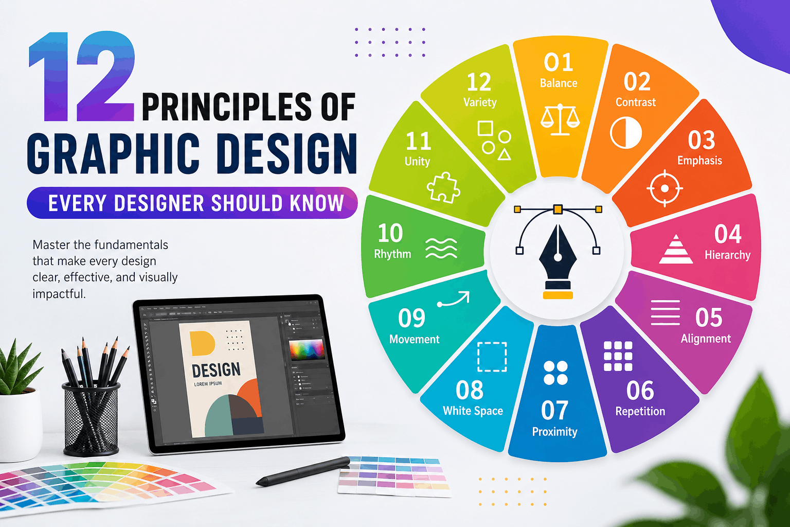
12 Principles of Graphic Design Every Designer Should Know
What Are the Principles of Graphic Design?
The Principles of Graphic Design are the fundamental rules that help designers organize visual elements effectively. Whether you are designing a logo, social media post, website, magazine, brochure, business card, or advertisement, understanding the Principles of Graphic Design is essential for creating attractive and functional designs.
These principles are not strict rules but proven guidelines that improve visual communication. They help designers arrange colors, typography, images, icons, shapes, and spacing in ways that naturally guide the viewer’s eye and create a professional appearance.
The Principles of Graphic Design work together to make designs visually balanced, easy to understand, and memorable. Even the most creative artwork relies on these principles to achieve clarity and impact.
Professional designers use the Principles of Graphic Design every day because they improve readability, strengthen branding, and increase audience engagement.
Why the Principles of Graphic Design Matter
Many beginners focus only on choosing attractive colors or trendy fonts. However, successful design goes far beyond appearance. The Principles of Graphic Design provide structure and purpose to every creative project.
Benefits include:
- Better visual communication
- Stronger branding
- Improved readability
- Higher user engagement
- Professional-looking layouts
- Better marketing performance
- More effective advertising
- Increased audience trust
Whether you work with Adobe Photoshop, Illustrator, CorelDRAW, Figma, Canva, or Adobe InDesign, mastering the Principles of Graphic Design will significantly improve your work.
Principle #1 – Balance
What Is Balance?

Balance refers to the distribution of visual weight across a design. It ensures that no single element overwhelms the composition, making the layout feel stable and harmonious.
Balance is one of the most important Principles of Graphic Design because it creates comfort for the viewer. Without balance, a design can feel awkward, cluttered, or unstable.
Types of Balance
Symmetrical Balance
Both sides of the design mirror each other. This creates a formal, elegant, and organized appearance.
Examples:
- Wedding invitations
- Government logos
- Luxury brand identities
Asymmetrical Balance
Different elements balance each other without mirroring.
Examples:
- Modern websites
- Creative posters
- Social media graphics
Radial Balance
Elements radiate outward from a central point.
Examples:
- Mandalas
- Circular logos
- Decorative patterns
Why Balance Matters
Balance improves:
- User experience
- Readability
- Visual stability
- Professional appearance
When applying the Principles of Graphic Design, always evaluate how visual weight is distributed across your layout.
Principle #2 – Contrast
What Is Contrast?

Contrast creates visual interest by emphasizing differences between design elements.
Contrast can be achieved using:
- Color
- Size
- Shape
- Typography
- Texture
- Position
- Brightness
Among all the Principles of Graphic Design, contrast is one of the fastest ways to attract attention.
Examples
- Black text on a white background
- Large headline with smaller body text
- Dark colors against light colors
- Bold fonts paired with thin fonts
Benefits
Good contrast:
- Improves readability
- Creates focus
- Highlights important information
- Makes layouts more dynamic
Poor contrast makes designs difficult to read and reduces accessibility.
Principle #3 – Emphasis
What Is Emphasis?

Emphasis directs the viewer’s attention to the most important element in a design.
Every successful layout should have a clear focal point. Without emphasis, viewers may not know where to look first.
The Principles of Graphic Design teach that emphasis can be created using:
- Larger size
- Bright colors
- Bold typography
- Isolation
- White space
- Contrast
- Positioning
Practical Examples
A sale poster might emphasize:
- “70% OFF”
- Product image
- Call-to-action button
A website homepage might emphasize:
- Hero image
- Main heading
- Signup button
Benefits of Emphasis
Effective emphasis:
- Improves communication
- Increases conversions
- Enhances readability
- Guides user attention
- Strengthens marketing messages
Designers who understand the Principles of Graphic Design know that emphasis should support the message rather than overwhelm the layout.
Principle #4 – Hierarchy
What Is Hierarchy?

Hierarchy is one of the most important Principles of Graphic Design because it determines the order in which viewers notice information. A well-designed hierarchy guides the eye naturally from the most important element to the least important one.
Without visual hierarchy, every element competes for attention, making the design confusing and difficult to understand.
Professional designers use hierarchy to make content easier to scan, especially on websites, posters, brochures, magazines, and social media graphics.
How to Create Visual Hierarchy
You can establish hierarchy using:
- Font size
- Font weight (Bold, Medium, Regular)
- Color contrast
- Placement
- White space
- Images
- Shapes
- Typography styles
For example:
- Main Heading: 48 px
- Subheading: 28 px
- Body Text: 18 px
- Caption: 14 px
This size difference immediately tells readers what to read first.
Real-World Example
Imagine an online store promoting a seasonal sale.
The design might include:
- 50% OFF (largest text)
- Summer Collection (medium text)
- Shop Now (button)
- Terms and Conditions (smallest text)
This layout follows the Principles of Graphic Design by directing attention to the most important message first.
Benefits of Hierarchy
A strong hierarchy:
- Improves readability
- Organizes information
- Creates better user experience
- Increases engagement
- Helps users make faster decisions
Common Mistakes
Avoid these errors:
- Making every heading the same size
- Using too many font styles
- Highlighting everything
- Poor spacing between sections
- Inconsistent typography
Following the Principles of Graphic Design ensures that hierarchy enhances communication instead of creating confusion.
Principle #5 – Alignment
What Is Alignment?

Alignment refers to arranging elements so they connect visually. Every object should appear intentionally placed rather than randomly positioned.
Among the Principles of Graphic Design, alignment creates order and professionalism.
Even when objects are separated by space, proper alignment makes them feel connected.
Types of Alignment
Left Alignment
The most common alignment used for paragraphs, articles, and websites.
Advantages:
- Easy to read
- Professional appearance
- Natural reading flow
Center Alignment
Best for:
- Invitations
- Quotes
- Certificates
- Logos
Use it sparingly because long centered paragraphs are difficult to read.
Right Alignment
Suitable for:
- Creative layouts
- Certain advertising designs
- Decorative typography
Justified Alignment
Often used in:
- Newspapers
- Books
- Magazines
Why Alignment Matters
Good alignment:
- Creates clean layouts
- Improves organization
- Makes content easier to scan
- Gives a polished appearance
- Builds trust with viewers
Practical Example
Imagine a business flyer.
Poor alignment:
- Logo randomly placed
- Uneven text
- Buttons scattered
Good alignment:
- Logo at the top
- Headings aligned
- Equal margins
- Consistent spacing
- Contact details neatly organized
The Principles of Graphic Design emphasize alignment because it brings structure to even the simplest designs.
Expert Tip
Use grids and guides in software like Adobe Illustrator, Photoshop, Figma, or CorelDRAW to maintain perfect alignment throughout your project.
Principle #6 – Repetition
What Is Repetition?

Repetition means consistently using the same visual elements throughout a design. It helps unify different sections and reinforces brand identity.
One of the most recognizable Principles of Graphic Design, repetition creates familiarity and consistency.
Elements That Can Be Repeated
- Colors
- Fonts
- Icons
- Shapes
- Patterns
- Buttons
- Borders
- Line styles
- Image treatments
Branding Example
A company’s brand identity may include:
- Blue primary color
- Rounded buttons
- Sans-serif typography
- Minimal icons
- Consistent logo placement
Repeating these elements across websites, brochures, advertisements, and social media builds strong brand recognition.
Why Repetition Is Important
Benefits include:
- Consistent branding
- Better user experience
- Strong visual identity
- Easier navigation
- Professional appearance
Practical Example
A website may repeat:
- Navigation style
- Footer design
- Button colors
- Typography
- Icon style
- Image borders
These repeated elements make the website feel cohesive and reliable.
Common Mistakes
Avoid:
- Using different fonts on every page
- Random color changes
- Inconsistent icon styles
- Different button shapes
- Uneven spacing
The Principles of Graphic Design encourage consistency while still allowing room for creativity.
Principle #7 – Proximity
What Is Proximity?

Proximity is the practice of placing related items close together while separating unrelated elements.
This principle helps viewers understand relationships without needing additional explanations.
Among the Principles of Graphic Design, proximity greatly improves clarity and organization.
Examples of Proximity
Related items include:
- Product image and price
- Name and job title
- Heading and paragraph
- Icon and label
- Contact information
These elements should be grouped together.
Benefits of Proximity
Proper proximity:
- Reduces clutter
- Improves readability
- Organizes information
- Creates logical flow
- Makes layouts easier to understand
Before and After Example
Poor Layout:
- Phone number far from contact heading
- Images separated from captions
- Buttons scattered randomly
Improved Layout:
- Contact details grouped together
- Captions directly below images
- Related content organized into sections
This simple adjustment makes the design significantly easier to scan.
Using White Space with Proximity
Proximity works hand in hand with white space.
Instead of adding unnecessary borders, designers can simply use spacing to show which elements belong together.
Common Mistakes
Avoid:
- Equal spacing between all elements
- Crowded layouts
- Large gaps within related content
- Mixing unrelated information
Applying the Principles of Graphic Design correctly ensures that viewers can instantly understand the structure of your design.
Key Takeaways from Part 2
In this section, you learned that:
- Hierarchy directs the viewer’s attention to the most important content.
- Alignment creates clean, professional, and organized layouts.
- Repetition builds consistency and strengthens brand identity.
- Proximity groups related elements to improve readability and understanding.
Together, these Principles of Graphic Design help designers create layouts that are visually appealing, functional, and easy to navigate.
Principle #8 – White Space (Negative Space)
What Is White Space?

White space, also called negative space, is the empty area between and around design elements. Despite its name, white space doesn’t have to be white—it can be any background color, texture, or image. One of the most valuable Principles of Graphic Design, white space allows a design to breathe and keeps it from looking overcrowded.
Many beginner designers think every inch of a layout should be filled with text or graphics. In reality, strategic empty space improves readability and gives important content room to stand out.
Types of White Space
Macro White Space
Large empty areas between major sections, images, or columns.
Examples:
- Website margins
- Banner spacing
- Magazine page layouts
- Landing page sections
Micro White Space
Small spaces between individual elements.
Examples:
- Line spacing
- Letter spacing
- Padding around buttons
- Space between icons and text
Benefits of White Space
Proper use of white space:
- Improves readability
- Highlights key information
- Creates a premium appearance
- Reduces visual clutter
- Improves user experience
- Makes content easier to scan
Real-World Example
Think about a luxury brand advertisement. Instead of filling the page with text, it often features one product image, a short headline, and plenty of empty space. This approach draws attention to the product and communicates elegance.
The Principles of Graphic Design encourage designers to treat white space as an active design element rather than wasted space.
Common Mistakes
Avoid:
- Overcrowding the layout
- Tiny margins
- Too many graphics
- Insufficient spacing between paragraphs
- Buttons placed too close together
Principle #9 – Movement
What Is Movement?

Movement is the visual path that guides a viewer’s eyes through a design. It doesn’t mean objects are physically moving; instead, the layout leads the audience naturally from one element to another.
Among the Principles of Graphic Design, movement is essential for storytelling and directing attention.
How Designers Create Movement
Movement can be achieved through:
- Lines
- Curves
- Directional arrows
- Contrast
- Size differences
- Repeated shapes
- Diagonal compositions
- Eye contact in photographs
Example
A website homepage may guide users through this sequence:
- Hero image
- Main headline
- Supporting text
- Call-to-action button
- Customer testimonials
- Footer
Each section naturally leads to the next without confusing the visitor.
Why Movement Matters
Effective movement:
- Keeps users engaged
- Improves navigation
- Supports storytelling
- Increases conversions
- Makes layouts feel dynamic
Common Mistakes
Avoid:
- Random placement of elements
- Competing focal points
- Poor spacing
- Distracting animations
- Overly complex compositions
The Principles of Graphic Design emphasize that movement should feel intentional and effortless.
Principle #10 – Rhythm
What Is Rhythm?

Rhythm refers to the repetition of visual elements in a way that creates flow and consistency. Just as music relies on rhythm to create harmony, design uses repeated patterns, colors, and spacing to establish a pleasing visual experience.
The Principles of Graphic Design use rhythm to connect different parts of a composition while keeping the viewer interested.
Types of Rhythm
Regular Rhythm
Elements repeat at equal intervals.
Examples:
- Grid layouts
- Product galleries
- Timelines
Alternating Rhythm
Two or more elements alternate repeatedly.
Examples:
- Alternating image and text sections
- Color variations
- Zigzag layouts
Progressive Rhythm
Elements gradually change in size, color, or shape.
Examples:
- Growing circles
- Fading colors
- Increasing font sizes
Random Rhythm
Repetition occurs with variation, creating a more organic appearance.
Examples:
- Abstract artwork
- Creative posters
- Artistic backgrounds
Benefits of Rhythm
Good rhythm:
- Creates consistency
- Adds visual interest
- Improves navigation
- Encourages exploration
- Makes designs memorable
Practical Example
An e-commerce website might repeat:
- Product cards
- Image sizes
- Button styles
- Typography
- Spacing
This repeated structure helps users browse products comfortably.
The Principles of Graphic Design show that rhythm creates familiarity while maintaining engagement.
Principle #11 – Unity
What Is Unity?

Unity means that all design elements work together as one cohesive composition. Every color, font, image, icon, and shape should support the same overall message.
Among the Principles of Graphic Design, unity is what makes a design feel complete and professional.
How to Create Unity
Use consistent:
- Typography
- Color palette
- Icon style
- Image treatment
- Layout structure
- Button styles
- Margins and spacing
Branding Example
A technology company may use:
- Blue and white color scheme
- Rounded icons
- Modern sans-serif fonts
- Clean layouts
- Consistent photography style
These repeated elements create a unified brand identity across websites, advertisements, packaging, and social media.
Benefits of Unity
Unity helps:
- Strengthen branding
- Improve user trust
- Create professional designs
- Increase visual harmony
- Make communication more effective
Common Mistakes
Avoid:
- Mixing unrelated fonts
- Random color combinations
- Inconsistent image styles
- Different icon designs
- Uneven spacing
The Principles of Graphic Design teach that unity doesn’t mean every page looks identical—it means every element belongs together.
Principle #12 – Variety
What Is Variety?

Variety introduces differences within a design to keep it visually engaging. While unity creates consistency, variety prevents the layout from becoming repetitive or boring.
One of the final Principles of Graphic Design, variety adds energy and creativity while maintaining balance.
Ways to Add Variety
You can introduce variety through:
- Different image styles
- Contrasting colors
- Unique shapes
- Typography combinations
- Icons
- Patterns
- Illustrations
- Layout changes
Real-World Example
A travel brochure may include:
- Large destination photos
- Colorful icons
- Bold headings
- Maps
- Infographics
- Highlight boxes
These varied elements maintain interest while supporting the same message.
Benefits of Variety
Variety:
- Attracts attention
- Prevents monotony
- Encourages exploration
- Supports creativity
- Enhances storytelling
Common Mistakes
Avoid:
- Using too many fonts
- Excessive colors
- Random decorative elements
- Inconsistent illustration styles
- Visual overload
Following the Principles of Graphic Design ensures that variety complements unity instead of creating chaos.
Real-World Application of the Principles of Graphic Design
Successful designers rarely rely on a single principle. Instead, they combine multiple Principles of Graphic Design to create visually compelling and effective work.
For example:
Logo Design
- Balance for stability
- Contrast for visibility
- Unity for consistency
- Variety for uniqueness
Website Design
- Hierarchy for content organization
- Alignment for clean layouts
- White space for readability
- Movement for user navigation
Social Media Graphics
- Emphasis for key messages
- Contrast for eye-catching visuals
- Repetition for brand recognition
- Variety for audience engagement
Print Design
- Rhythm for page flow
- Proximity for logical grouping
- Alignment for professionalism
- Unity for a cohesive appearance
By combining these Principles of Graphic Design, designers create projects that are both attractive and functional.
Common Mistakes Designers Make When Applying the Principles of Graphic Design
Even experienced designers occasionally make mistakes. Understanding these common issues can help you improve your workflow and create more effective designs.
- Ignoring Balance
One of the biggest mistakes is placing too many elements on one side of the layout. An unbalanced design feels awkward and can distract the viewer from the main message.
Solution:
- Distribute visual weight evenly.
- Use grids and guides.
- Review your design from a distance before finalizing.
- Using Too Many Fonts
Using four or five different fonts in one design creates inconsistency and reduces readability.
Best Practice:
- Use one font for headings.
- Use one complementary font for body text.
- Limit yourself to two or three font families.
This approach aligns with the Principles of Graphic Design by improving unity and readability.
- Poor Color Choices
Using random colors without a clear palette weakens branding and makes designs look unprofessional.
Solution:
- Choose a consistent color palette.
- Maintain sufficient contrast.
- Consider accessibility for color-blind users.
- Overcrowding the Layout
Trying to fill every available space with graphics or text is a common beginner mistake.
Solution:
- Embrace white space.
- Remove unnecessary elements.
- Focus on the most important message.
Remember, one of the key Principles of Graphic Design is that empty space is a valuable design element.
- Weak Visual Hierarchy
When every element looks equally important, viewers don’t know where to focus.
Solution:
- Make headlines larger.
- Use bold typography strategically.
- Highlight calls to action.
- Organize content by importance.
- Inconsistent Alignment
Randomly placed objects make designs appear messy.
Solution:
- Use grids.
- Align text and images consistently.
- Keep margins equal throughout the layout.
- Forgetting the Target Audience
A design should always serve its intended audience. A playful design may work for children’s products but not for a law firm or financial institution.
Before starting any project, ask:
- Who is the audience?
- What message should the design communicate?
- Which style best supports that message?
Applying the Principles of Graphic Design with your audience in mind leads to more successful outcomes.
Expert Tips to Master the Principles of Graphic Design
Mastering design takes practice. The following tips can help you apply the Principles of Graphic Design more effectively.
Practice Every Day
Create posters, social media graphics, logos, brochures, or website mockups regularly. The more you practice, the more naturally these principles become part of your design process.
Study Great Designs
Analyze successful work from well-known brands. Observe how they use balance, hierarchy, contrast, white space, repetition, and unity.
Learn Typography
Typography is a major component of effective design. Understanding font pairing, spacing, readability, and hierarchy will strengthen your layouts.
Build Strong Color Knowledge
Learn:
- Color theory
- Complementary colors
- Analogous color schemes
- Monochromatic palettes
- Color psychology
These concepts work alongside the Principles of Graphic Design to improve communication.
Use Grids
Professional designers rely on grids to maintain alignment, spacing, and consistency across layouts.
Seek Feedback
Share your work with other designers, mentors, or clients. Constructive feedback often reveals issues you may have overlooked.
Keep Designs Simple
Simplicity is often more effective than complexity. Focus on clarity rather than adding unnecessary visual elements.
Stay Updated
Design trends evolve, but the Principles of Graphic Design remain timeless. Continue learning about new tools, techniques, and user expectations while maintaining a strong foundation in these core principles.
Why the Principles of Graphic Design Matter in Different Industries
The Principles of Graphic Design are valuable across many fields, including:
Branding
- Logo design
- Brand identity
- Packaging
- Marketing materials
Web Design
- Landing pages
- User interfaces
- E-commerce websites
- Mobile applications
Print Design
- Magazines
- Books
- Flyers
- Business cards
- Brochures
Advertising
- Billboards
- Digital ads
- Social media campaigns
- Email marketing
Motion Graphics
- Animated videos
- Explainer videos
- Presentations
- Promotional content
No matter the industry, understanding the Principles of Graphic Design helps designers create work that is both attractive and effective.
Frequently Asked Questions (FAQs)
- What are the Principles of Graphic Design?
The Principles of Graphic Design are foundational guidelines that help designers organize visual elements effectively. They include Balance, Contrast, Emphasis, Hierarchy, Alignment, Repetition, Proximity, White Space, Movement, Rhythm, Unity, and Variety.
- Why are the Principles of Graphic Design important?
They improve communication, create visually appealing layouts, strengthen branding, enhance readability, and provide users with a better overall experience.
- What is the difference between design elements and design principles?
Design elements are the building blocks of a design, such as color, typography, lines, shapes, texture, and space.
The Principles of Graphic Design describe how those elements should be arranged to create effective compositions.
- Which principle is the most important?
There isn’t a single “most important” principle. Every project requires a combination of the Principles of Graphic Design, and their importance depends on the design’s purpose and audience.
- How can beginners learn the Principles of Graphic Design?
Beginners should:
- Practice regularly.
- Study professional work.
- Recreate existing layouts.
- Learn typography and color theory.
- Build personal projects.
- Request feedback from experienced designers.
- Can I apply these principles in Canva?
Yes. Whether you use Canva, Adobe Photoshop, Adobe Illustrator, CorelDRAW, Figma, or Adobe InDesign, the Principles of Graphic Design remain the same.
- How do the Principles of Graphic Design improve branding?
Consistent application of these principles creates recognizable visual identities, builds trust, and strengthens brand recognition across websites, social media, packaging, and print materials.
- Are these principles useful for UI and UX design?
Absolutely. UI and UX designers use the Principles of Graphic Design to improve navigation, readability, accessibility, and user satisfaction.
Final Thoughts
The Principles of Graphic Design form the foundation of every successful visual project. Whether you’re designing a logo, website, brochure, social media post, or advertisement, these principles help transform creative ideas into clear, engaging, and professional designs.
Mastering Balance, Contrast, Emphasis, Hierarchy, Alignment, Repetition, Proximity, White Space, Movement, Rhythm, Unity, and Variety takes time, but consistent practice will significantly improve your skills. Remember that great design is not just about aesthetics—it is about communicating a message effectively and creating meaningful experiences for your audience.
As you continue learning and experimenting, revisit these Principles of Graphic Design with each new project. Over time, they will become second nature, helping you create work that is visually appealing, functional, and memorable.
Top 7 Elements of Graphic Design Explained
Introduction
Every successful Elements of Graphic Design starts with a strong foundation. Whether you are creating a business logo, social media post, website layout, advertisement, packaging design, or digital illustration, understanding the Elements of Graphic Design is the first step toward becoming a professional designer.
The Elements of Graphic Design are the visual building blocks used in every creative project. They help designers organize information, communicate messages clearly, attract attention, and create visually appealing compositions. Without mastering these essential principles, even the most advanced software cannot produce effective designs.
Professional designers use the Elements of Graphic Design every day to balance layouts, create emphasis, guide viewers’ eyes, establish hierarchy, and improve user experience. These elements are universal and apply to print design, branding, UI/UX, advertising, digital marketing, and illustration.
Understanding the Elements of Graphic Design is not only important for experienced designers but also for beginners who want to build a strong creative career. Learning these concepts helps improve design decisions, increases creativity, and makes every project look more polished and professional.
In this complete guide, we will explore each element in detail with practical examples, expert techniques, and real-world applications. By the end of the article, you will know how to use the Elements of Graphic Design to create visually stunning and effective designs.
Why the Elements of Graphic Design Matter
Many people think graphic design is only about using software like Adobe Photoshop, Adobe Illustrator, or CorelDRAW. While these tools are important, software alone does not make someone a great designer.
The true strength of any designer lies in understanding the Elements of Graphic Design and applying them creatively.
These elements help designers:
- Build visual balance
- Improve readability
- Create emotional impact
- Organize information effectively
- Increase user engagement
- Develop professional branding
- Communicate ideas visually
- Improve marketing performance
Every famous logo, billboard, website, magazine cover, social media graphic, and product package is built using the Elements of Graphic Design. When these elements work together, they create harmony and improve the overall user experience.
Mastering the Elements of Graphic Design also helps designers solve visual problems more efficiently. Instead of guessing what looks good, they rely on proven design principles to create compelling and functional artwork.
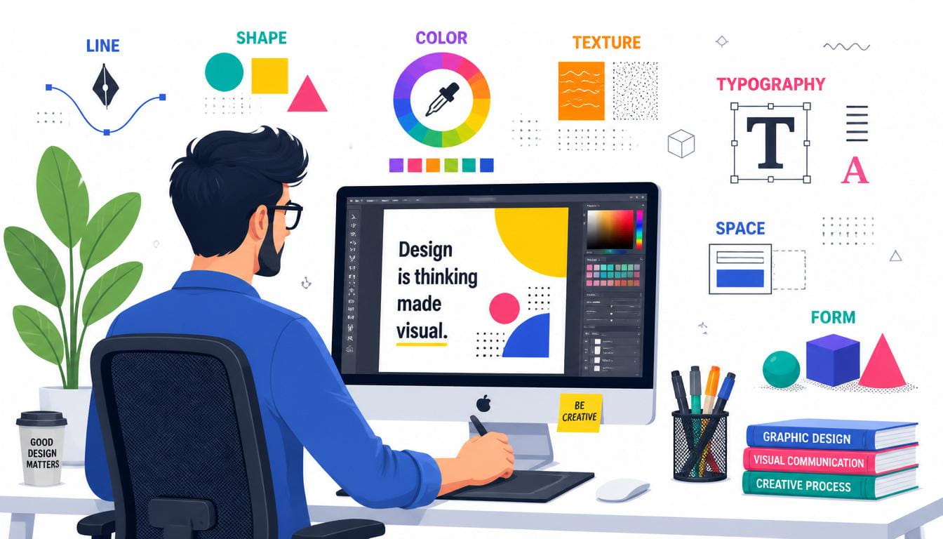
Overview of the Seven Elements
The seven fundamental Elements of Graphic Design are:
- Line
- Shape
- Color
- Texture
- Typography
- Space
- Form
Each element has a unique purpose, and when combined effectively, they create visually powerful designs. In this part, we will focus on the first two elements: Line and Shape.
Element #1 – Line
What Is a Line?

A line is the most basic and one of the most important Elements of Graphic Design. It is created when two points are connected and can vary in length, width, direction, and style.
Although simple, lines play a powerful role in guiding the viewer’s attention, separating content, creating movement, and adding structure to a design.
Designers use lines to establish order, improve readability, and create visual flow across a layout.
Types of Lines
Horizontal Lines
Horizontal lines represent stability, calmness, peace, and rest. They are commonly used in website layouts and modern branding.
Vertical Lines
Vertical lines symbolize strength, confidence, elegance, and professionalism.
Diagonal Lines
Diagonal lines create energy, excitement, movement, and action. They are often used in sports graphics and advertisements.
Curved Lines
Curved lines produce a soft, friendly, and elegant appearance. They are popular in beauty brands and lifestyle designs.
Zigzag Lines
Zigzag lines communicate excitement, creativity, and dynamic motion.
Dotted and Dashed Lines
These lines are often used in maps, infographics, packaging, and instructional designs.
Why Lines Matter
Among all the Elements of Graphic Design, lines are essential because they:
- Guide the viewer’s eye
- Divide sections
- Create alignment
- Build hierarchy
- Add decoration
- Connect visual elements
- Create emphasis
- Improve readability
Without effective use of lines, layouts may appear cluttered and difficult to navigate.
Real-World Examples
Lines are used in:
- Website navigation
- Magazine layouts
- Business cards
- Mobile applications
- Infographics
- Brochures
- Social media posts
- Posters
- Product packaging
For example, a website may use horizontal lines to separate different sections, while a brochure may use vertical lines to organize columns of information.
Best Practices for Using Lines
- Keep lines consistent throughout the design.
- Use thicker lines for emphasis.
- Avoid excessive decorative lines.
- Maintain proper spacing.
- Align lines with other visual elements.
- Use contrasting colors when necessary.
When used thoughtfully, lines enhance the overall composition and make the Elements of Graphic Design work together seamlessly.
Element #2 – Shape
What Is a Shape?

A shape is another fundamental part of the Elements of Graphic Design. Shapes are closed forms created by combining lines or defining boundaries with color and contrast.
Shapes are everywhere in graphic design—from logos and icons to buttons, illustrations, and layouts. They help organize content, create emphasis, and establish visual identity.
Understanding how shapes influence perception allows designers to communicate messages more effectively.
Types of Shapes
Geometric Shapes
These include:
- Circle
- Square
- Rectangle
- Triangle
- Pentagon
- Hexagon
Geometric shapes create a structured, modern, and professional appearance.
Organic Shapes
Organic shapes are inspired by nature. They include leaves, clouds, flowers, water splashes, and irregular forms.
These shapes add warmth, creativity, and a natural feel to a design.
Abstract Shapes
Abstract shapes simplify real-world objects into symbolic forms. They are commonly used in branding, icons, and modern logo design.
Psychological Meaning of Shapes
Different shapes evoke different emotions.
Circle
- Unity
- Friendship
- Protection
- Community
- Infinity
Square
- Stability
- Trust
- Reliability
- Security
Triangle
- Direction
- Growth
- Power
- Innovation
- Energy
Professional designers use these meanings strategically to strengthen visual communication.
Applications of Shapes
Shapes are widely used in:
- Logo design
- Mobile app icons
- Website buttons
- Social media graphics
- Packaging
- Infographics
- Advertisements
- Posters
- Brand identities
Because shapes are one of the core Elements of Graphic Design, they help viewers recognize brands quickly and understand information at a glance.
Tips for Using Shapes Effectively
- Combine geometric and organic shapes for visual interest.
- Maintain consistency across your design.
- Use shapes to create hierarchy.
- Avoid overcrowding the layout.
- Ensure shapes support the overall message.
- Balance filled and empty areas to improve composition.
Strong use of shapes allows designers to create memorable visuals while reinforcing the Elements of Graphic Design throughout every project.
Element #3 – Color
What Is Color?

Color is one of the most influential Elements of Graphic Design because it affects emotions, attracts attention, and communicates messages instantly. Designers use color strategically to establish brand identity, improve readability, create hierarchy, and guide users through a visual composition.
A well-planned color palette can transform a simple layout into a memorable design. On the other hand, poor color choices can confuse viewers and weaken your message. This is why mastering color is essential when learning the Elements of Graphic Design.
The Color Wheel
The color wheel helps designers understand relationships between colors.
Primary Colors
- Red
- Blue
- Yellow
These are the foundation of all other colors.
Secondary Colors
Created by mixing two primary colors:
- Green
- Orange
- Purple
Tertiary Colors
These result from mixing a primary color with a neighboring secondary color, creating a broader range of hues for creative projects.
Warm vs. Cool Colors
Warm Colors
Warm colors include:
- Red
- Orange
- Yellow
They create feelings of:
- Energy
- Excitement
- Passion
- Optimism
- Urgency
These colors are commonly used in food, entertainment, and promotional designs.
Cool Colors
Cool colors include:
- Blue
- Green
- Purple
They represent:
- Trust
- Calmness
- Professionalism
- Security
- Nature
Technology, healthcare, and financial brands frequently rely on cool color palettes.
Color Psychology
Understanding color psychology is a major part of mastering the Elements of Graphic Design.
| Color | Common Meaning |
| Red | Passion, power, urgency |
| Blue | Trust, professionalism, calm |
| Green | Nature, growth, health |
| Yellow | Happiness, optimism |
| Orange | Creativity, enthusiasm |
| Purple | Luxury, wisdom |
| Black | Elegance, sophistication |
| White | Simplicity, cleanliness |
Professional designers choose colors based on the emotions they want their audience to experience.
Color Harmony
Some popular color combinations include:
- Monochromatic
- Analogous
- Complementary
- Split Complementary
- Triadic
- Tetradic
Using harmonious color combinations helps all the Elements of Graphic Design work together in a balanced and visually pleasing way.
Best Practices for Using Color
- Limit your palette to 3–5 main colors.
- Maintain consistency throughout the project.
- Ensure sufficient contrast between text and background.
- Consider accessibility, including color blindness.
- Use accent colors sparingly to highlight important information.
When used thoughtfully, color strengthens the Elements of Graphic Design and improves the user experience.
Element #4 – Texture
What Is Texture?

Texture refers to the surface quality or visual feel of an object. It is one of the most creative Elements of Graphic Design, adding depth, realism, and personality to designs.
Texture can be physical, such as embossed paper, or visual, where digital effects create the illusion of different materials.
Adding texture prevents flat designs from appearing dull and helps capture the viewer’s attention.
Types of Texture
Physical Texture
Physical texture is tangible and can be felt. Examples include:
- Canvas
- Fabric
- Wood
- Leather
- Embossed paper
This type is common in packaging, print design, and luxury branding.
Visual Texture
Visual texture creates the illusion of texture through images or digital effects.
Examples include:
- Watercolor effects
- Noise overlays
- Grain
- Concrete
- Marble
- Paper backgrounds
Visual textures are widely used in digital illustrations, posters, and website backgrounds.
Why Texture Matters
Texture enhances the Elements of Graphic Design by:
- Creating visual depth
- Adding realism
- Improving visual interest
- Supporting storytelling
- Reinforcing brand personality
- Guiding focus
A subtle paper texture, for example, can make a digital invitation feel more elegant and handcrafted.
Common Uses of Texture
Designers use texture in:
- Product packaging
- Magazine covers
- Social media graphics
- Website backgrounds
- Posters
- Business cards
- Book covers
- Branding materials
Combining texture with other Elements of Graphic Design creates richer and more engaging visuals.
Tips for Using Texture
- Avoid excessive texture that distracts from content.
- Match texture to the project’s theme.
- Balance textured and clean areas.
- Keep text readable over textured backgrounds.
- Use high-resolution textures to maintain quality.
Thoughtful use of texture can make your designs feel more professional and visually appealing.
Element #5 – Typography
What Is Typography?

Typography is the art of arranging text to make written content readable, attractive, and meaningful. It is one of the most essential Elements of Graphic Design because nearly every design project includes text.
Good typography improves communication, while poor typography can make even the best designs difficult to understand.
Main Font Categories
Serif
Serif fonts have small decorative strokes.
Examples:
- Times New Roman
- Georgia
Best for:
- Books
- Newspapers
- Editorial layouts
Sans Serif
Sans-serif fonts have clean, modern lines.
Examples:
- Helvetica
- Arial
- Open Sans
Best for:
- Websites
- Mobile apps
- User interfaces
- Corporate branding
Script
Script fonts resemble handwriting.
Best for:
- Invitations
- Luxury branding
- Wedding materials
Use sparingly to maintain readability.
Display Fonts
Display fonts are bold, decorative, and designed to attract attention.
Ideal for:
- Headlines
- Posters
- Advertisements
Monospace Fonts
Each character occupies the same width.
Common uses include:
- Coding interfaces
- Technical documents
- Data tables
Typography Hierarchy
An effective hierarchy helps readers navigate content.
Typical structure:
- Heading 1
- Heading 2
- Heading 3
- Body text
- Captions
Clear hierarchy allows the Elements of Graphic Design to communicate information efficiently.
Typography Principles
Professional designers focus on:
- Font pairing
- Alignment
- Line spacing
- Letter spacing
- Contrast
- Consistency
- Readability
These principles improve both aesthetics and usability.
Common Typography Mistakes
Avoid:
- Using too many fonts
- Poor spacing
- Inconsistent alignment
- Tiny font sizes
- Excessive decorative fonts
- Low contrast between text and background
Eliminating these mistakes helps the Elements of Graphic Design function cohesively.
Expert Typography Tips
- Limit designs to two or three font families.
- Use bold fonts for headings.
- Maintain consistent spacing.
- Choose fonts that match your brand personality.
- Test readability on desktop and mobile devices.
- Use white space around text to improve clarity.
Strong typography supports the Elements of Graphic Design by ensuring your message is both attractive and easy to understand.
Element #6 – Space
What Is Space?

Space is one of the most overlooked yet powerful Elements of Graphic Design. It refers to the area between, around, above, below, and within design elements. Effective use of space helps create clean, organized, and visually appealing layouts.
Many beginners feel the need to fill every empty area with graphics or text. However, professional designers understand that empty space is not wasted space—it enhances readability and draws attention to important content.
Mastering space allows the Elements of Graphic Design to work together harmoniously, making designs easier to understand and more enjoyable to view.
Types of Space
Positive Space
Positive space is the area occupied by visible design elements, such as:
- Images
- Text
- Icons
- Shapes
- Logos
It forms the primary content of the composition.
Negative Space
Negative space, also known as white space, is the empty area surrounding or between design elements. It gives the layout breathing room and helps prevent visual clutter.
Why Space Matters
Space contributes significantly to the Elements of Graphic Design by:
- Improving readability
- Creating visual balance
- Directing the viewer’s eye
- Establishing hierarchy
- Enhancing focus
- Making designs appear more professional
Many luxury brands use generous white space to communicate elegance and sophistication.
Best Practices for Using Space
- Leave enough margins around content.
- Avoid overcrowding the page.
- Group related elements together.
- Use consistent spacing throughout the design.
- Increase white space around headings and call-to-action buttons.
By managing space effectively, designers strengthen the Elements of Graphic Design and create layouts that are both functional and attractive.
Element #7 – Form
What Is Form?

Form refers to three-dimensional objects or the illusion of depth created within a two-dimensional design. It is one of the advanced Elements of Graphic Design, helping designers produce realistic visuals and engaging compositions.
Unlike shapes, which are flat, forms possess height, width, and depth. Designers create the illusion of form using perspective, gradients, lighting, shadows, and highlights.
Types of Form
Geometric Forms
Examples include:
- Cube
- Sphere
- Cylinder
- Cone
- Pyramid
These forms are commonly used in product mockups, packaging, and architectural illustrations.
Organic Forms
Organic forms resemble objects found in nature, such as:
- Trees
- Human figures
- Animals
- Flowers
- Landscapes
They create a more natural and expressive visual style.
Why Form Is Important
Form enhances the Elements of Graphic Design by:
- Creating depth
- Increasing realism
- Making illustrations more engaging
- Improving product visualization
- Adding visual interest
Modern software such as Adobe Illustrator, Photoshop, Blender, and Figma enables designers to incorporate realistic forms into branding, advertising, and user interface designs.
Tips for Using Form
- Apply light and shadow consistently.
- Use perspective grids for accuracy.
- Avoid excessive 3D effects that distract from the message.
- Combine form with color and texture for realism.
- Keep the design clean and balanced.
When integrated thoughtfully, form completes the Elements of Graphic Design, giving your work a polished and professional appearance.
Comparison Table of the Seven Elements
| Element | Primary Purpose | Common Uses |
| Line | Guide the viewer and create structure | Layouts, dividers, illustrations |
| Shape | Organize information and build identity | Logos, icons, buttons |
| Color | Convey emotion and establish branding | Marketing, websites, advertising |
| Texture | Add depth and personality | Posters, packaging, backgrounds |
| Typography | Communicate information clearly | Websites, books, branding |
| Space | Improve readability and balance | All design layouts |
| Form | Create depth and realism | Product mockups, illustrations, 3D graphics |
Together, these Elements of Graphic Design provide the foundation for effective visual communication across both print and digital media.
How All Seven Elements Work Together
While each of the Elements of Graphic Design has its own role, their true strength lies in how they interact.
For example:
- Line guides the viewer through the layout.
- Shape organizes content into recognizable forms.
- Color attracts attention and creates emotional impact.
- Texture adds richness and personality.
- Typography communicates the message.
- Space keeps the composition clean and balanced.
- Form introduces depth and realism.
Professional designers rarely rely on a single element. Instead, they combine all the Elements of Graphic Design to create cohesive, visually appealing, and user-friendly designs.
Common Mistakes Beginners Make
Avoid these frequent mistakes when applying the Elements of Graphic Design:
- Using too many colors in one design.
- Choosing difficult-to-read fonts.
- Ignoring white space.
- Overusing textures and effects.
- Poor alignment and inconsistent spacing.
- Lack of visual hierarchy.
- Mixing unrelated design styles.
- Neglecting accessibility and contrast.
- Copying trends without understanding design principles.
- Forgetting the target audience.
Recognizing these issues early will help you build stronger design skills.
Expert Tips for Mastering the Elements of Graphic Design
If you want to become a professional designer, follow these recommendations:
- Study successful brand identities and analyze how they use the Elements of Graphic Design.
- Practice recreating posters, logos, and website layouts.
- Learn color theory and typography in depth.
- Build projects using grids and alignment systems.
- Seek constructive feedback from experienced designers.
- Keep your designs simple and purposeful.
- Stay updated with modern design trends while maintaining timeless design principles.
- Continuously refine your portfolio to demonstrate your understanding of the Elements of Graphic Design.
Consistent practice is the key to mastering these concepts.
Frequently Asked Questions (FAQs)
- What are the seven Elements of Graphic Design?
The seven Elements of Graphic Design are Line, Shape, Color, Texture, Typography, Space, and Form. These are the core visual components used to create effective and attractive designs.
- Why are the Elements of Graphic Design important?
The Elements of Graphic Design help designers communicate ideas clearly, establish visual hierarchy, improve readability, and create balanced, engaging compositions.
- Which element is the most important?
No single element is more important than the others. The best designs use all Elements of Graphic Design together to achieve harmony and communicate the intended message effectively.
- Can beginners learn the Elements of Graphic Design easily?
Yes. With regular practice, studying examples, and experimenting with design software, beginners can quickly develop a solid understanding of the Elements of Graphic Design.
- Are the Elements of Graphic Design used in web design?
Absolutely. Web designers rely on the Elements of Graphic Design to create intuitive interfaces, improve user experience, and strengthen visual branding.
- Which software is best for applying the Elements of Graphic Design?
Popular tools include Adobe Photoshop, Adobe Illustrator, CorelDRAW, Figma, Canva, Adobe InDesign, and Affinity Designer. These applications provide features that help designers apply the Elements of Graphic Design effectively.
- How can I improve my understanding of the Elements of Graphic Design?
Practice regularly, analyze professional work, follow design trends thoughtfully, and build real-world projects. The more you apply the Elements of Graphic Design, the more confident and skilled you will become.
Final Conclusion
The Elements of Graphic Design are the essential building blocks of every successful design. Whether you are creating a logo, website, poster, social media graphic, product package, or marketing campaign, these seven elements provide the structure, clarity, and creativity needed to communicate effectively.
By mastering Line, Shape, Color, Texture, Typography, Space, and Form, you can create designs that are visually appealing, easy to understand, and memorable. These principles are not limited to one style or industry—they are used across branding, advertising, publishing, UI/UX design, and digital content creation.
As you continue learning and practicing, you’ll discover that great design is not just about software skills but about understanding how the Elements of Graphic Design work together to solve visual problems and tell compelling stories. Invest time in these fundamentals, experiment with different projects, and refine your creative process. A strong foundation in the Elements of Graphic Design will help you produce professional-quality work and grow as a confident graphic designer.
Graphic Design Basics: The Ultimate Beginner’s Guide (2026 Edition)
Introduction
Graphic design Basics is everywhere. Every logo you recognize, every website you browse, every social media advertisement you scroll past, and every product package you purchase has been influenced by thoughtful design decisions. Understanding Graphic Design Basics is no longer reserved only for professional designers. Whether you want to become a freelancer, create content for social media, build a business, design T-shirts, or simply improve your creative skills, learning Graphic Design Basics is the first step toward producing visually appealing work that communicates effectively.
The design industry continues to evolve rapidly with the rise of artificial intelligence, better design software, and changing visual trends. Yet despite these technological advances, the foundation remains the same. Every successful designer relies on Graphic Design Basics before experimenting with advanced techniques. Learning these core principles helps beginners avoid common mistakes and creates a strong foundation for future growth.
This guide is designed to help complete beginners understand Graphic Design Basics in a practical and engaging way. Instead of overwhelming you with complicated terminology, this article explains each concept in simple language while providing real-world examples you can immediately apply to your own projects. By the end of this guide, you’ll understand how professional designers think, plan, and create visuals that attract attention and leave a lasting impression.
What is Graphic Design?

Graphic design is the art of combining images, typography, colors, shapes, and layouts to communicate information visually. Unlike fine art, which often focuses on personal expression, graphic design solves problems and delivers clear messages. Businesses use graphic design to build their brands, marketers use it to attract customers, educators use it to simplify complex ideas, and content creators use it to engage audiences across digital platforms.
Learning Graphic Design Basics begins with understanding that every design has a purpose. A restaurant menu should be easy to read, a business logo should be memorable, a website should guide visitors naturally, and a social media post should capture attention within seconds. Good design is not simply about making something look attractive; it is about helping viewers understand information quickly and effectively.
Modern graphic designers work across many industries, including advertising, publishing, web development, mobile applications, fashion, digital printing, gaming, and entertainment. The demand for skilled designers continues to increase because businesses rely heavily on visual communication to compete online. Even small businesses need logos, banners, brochures, product packaging, and social media graphics to reach customers.
Mastering Graphic Design Basics also improves your creative thinking. Instead of randomly placing elements on a page, you begin making intentional decisions based on balance, hierarchy, contrast, and readability. These principles transform ordinary graphics into professional designs that communicate confidence and quality.
Why Graphic Design Matters
Visual communication influences how people perceive brands, products, and ideas. Studies consistently show that people form first impressions within seconds, and design plays a major role in shaping those impressions. A clean, modern design instantly builds trust, while cluttered or inconsistent visuals can make even a great product appear unprofessional.
Understanding Graphic Design Basics helps businesses strengthen their identity. A recognizable logo, consistent colors, and professional marketing materials create familiarity among customers. Large global brands invest heavily in design because visual consistency builds long-term recognition and loyalty. Small businesses can benefit from the same principles by maintaining a cohesive visual identity across websites, packaging, advertisements, and social media platforms.
Graphic design also improves communication by making information easier to understand. Infographics simplify data, icons replace lengthy explanations, and effective layouts guide readers naturally through content. These techniques are valuable in education, healthcare, finance, technology, and nearly every other industry. Designers bridge the gap between information and understanding through thoughtful visual organization.
Learning Graphic Design Basics opens career opportunities as well. Freelancers, agency designers, in-house creatives, UI designers, branding specialists, and marketing professionals all rely on strong design skills. Even entrepreneurs benefit because creating professional graphics reduces costs while improving brand credibility.
Different Types of Graphic Design

One of the most exciting aspects of learning Graphic Design Basics is discovering the variety of specialties available. Graphic design is not limited to logos or posters. Instead, it includes numerous fields, each serving different purposes and audiences.
Brand identity design focuses on creating logos, business cards, typography systems, and color palettes that establish a company’s personality. Marketing and advertising design includes posters, flyers, brochures, banners, and digital advertisements designed to attract potential customers. Web and user interface design concentrates on creating intuitive websites and mobile applications that provide excellent user experiences while maintaining visual consistency.
Packaging design combines branding, illustration, typography, and product information into attractive packages that encourage customers to purchase products. Publication design covers magazines, newspapers, books, and digital publications where readability and layout play essential roles. Motion graphics introduce animation into visual communication, making advertisements and educational content more engaging.
Another rapidly growing area is social media design. Businesses now require eye-catching graphics for platforms such as Instagram, Facebook, LinkedIn, Pinterest, TikTok, and YouTube. Designers who understand Graphic Design Basics can easily adapt their skills across these platforms while maintaining consistent branding and high-quality visuals.
Although each specialization has unique requirements, they all rely on the same foundation. Balance, contrast, hierarchy, alignment, typography, and color theory remain the core principles that every successful designer uses regardless of industry.
The Core Principles of Graphic Design

Every outstanding design begins with a strong understanding of Graphic Design Basics, and the core principles form the heart of that foundation. These principles are universal guidelines that help designers organize visual elements in a way that is attractive, functional, and easy to understand. Without them, even the most beautiful images, expensive software, or creative ideas can result in confusing and ineffective designs.
Professional designers rarely rely on luck or random creativity. Instead, they carefully apply concepts such as balance, contrast, alignment, repetition, and hierarchy to guide the viewer’s eye and communicate information clearly. Think of these principles as the grammar of visual communication. Just as writers use punctuation and sentence structure to make their ideas understandable, designers use these principles to create order, consistency, and impact.
When beginners first learn Graphic Design Basics, they often focus too much on effects, filters, or trendy styles. However, experienced designers know that strong fundamentals matter far more than decorative elements. A simple design built on solid principles will almost always outperform a complicated design with poor structure. Mastering these concepts gives you the confidence to create logos, posters, websites, social media graphics, brochures, and digital advertisements that look polished and professional.
Balance: Creating Stability in Every Design

One of the first concepts every designer should master when learning Graphic Design Basics is balance. Balance refers to the visual distribution of elements within a design. Imagine placing objects on a weighing scale. If one side becomes much heavier than the other, the scale tips over. The same principle applies to design. A balanced composition feels stable, comfortable, and visually appealing, while an unbalanced design often appears awkward or confusing.
There are three primary types of balance used in professional graphic design:
| Balance Type | Description | Best Used For |
| Symmetrical | Equal visual weight on both sides | Corporate branding, invitations |
| Asymmetrical | Different elements balanced visually | Websites, posters, social media |
| Radial | Elements arranged around a center point | Logos, icons, patterns |
Symmetrical balance creates order and professionalism because both sides mirror each other. Luxury brands and formal businesses frequently use this style to communicate trust and elegance. Asymmetrical balance, on the other hand, creates excitement and movement. Designers may place a large image on one side and balance it with smaller text and shapes on the opposite side. Although the elements are different, the overall visual weight remains balanced.
When studying Graphic Design Basics, beginners often fill every empty space with graphics or text. This usually creates clutter. Professional designers understand that balance is not about making every section identical—it is about arranging visual weight so the viewer’s eyes move naturally across the composition. Whether you are designing a business card, a website homepage, or a social media banner, balanced layouts instantly make your work appear more polished and easier to understand.
Contrast: Making Important Elements Stand Out

Another essential concept in Graphic Design Basics is contrast, which helps viewers immediately identify the most important information. Contrast is created by placing opposing visual elements together, such as light and dark colors, large and small text, thick and thin lines, or modern and classic fonts. Without contrast, designs become flat and difficult to read because every element competes equally for attention.
Think about a website with light gray text on a white background. Even if the content is valuable, many people will struggle to read it. Now imagine the same text in black on a white background with bold headings. The information instantly becomes easier to scan. This simple example demonstrates why contrast is one of the most powerful tools in Graphic Design Basics.
Contrast is not limited to colors. Designers also use size, shape, texture, spacing, and typography to emphasize key information. A bold headline immediately attracts attention because it contrasts with smaller body text. A brightly colored call-to-action button stands out against a neutral background, encouraging users to click. Even white space contributes to contrast by allowing important elements to breathe.
Professional designers avoid excessive contrast that overwhelms viewers. Instead, they use it strategically to establish visual hierarchy and direct attention. Good contrast ensures that readers know exactly where to look first, second, and third, creating a smooth viewing experience that supports the overall message of the design.
Alignment: Organizing Visual Elements Professionall
Alignment is one of the most overlooked topics in Graphic Design Basics, yet it has a massive impact on professionalism. Alignment means arranging text, images, and graphics so they connect visually with one another. Rather than placing elements randomly across the page, designers create invisible lines that organize information into a clean, structured layout.
When elements align properly, viewers unconsciously recognize order and consistency. Poor alignment, however, creates confusion because nothing appears connected. Even high-quality images and attractive typography cannot compensate for a disorganized layout. This is why experienced designers spend considerable time adjusting spacing and positioning before considering decorative effects.
Most modern designs use one of four alignment styles:
- Left Alignment
- Center Alignment
- Right Alignment
- Justified Alignment
Left alignment remains the most common because it supports natural reading patterns in English. Center alignment works well for invitations, certificates, and minimalist posters but becomes difficult to read when used for long paragraphs. Right alignment is often reserved for special design effects, while justified text creates clean edges but requires careful spacing.
Learning alignment as part of Graphic Design Basics helps beginners produce cleaner work immediately. Whether designing brochures, presentations, business cards, or digital advertisements, consistent alignment creates harmony that viewers may not consciously notice—but they certainly appreciate.
Repetition: Building Consistency Across Designs
Repetition is another fundamental principle within Graphic Design Basics that strengthens brand recognition and improves user experience. Repetition involves consistently using colors, fonts, icons, button styles, spacing, and graphic elements throughout a design or across multiple marketing materials.
Imagine visiting a company’s website where every page uses different fonts, different colors, and different button styles. The experience feels chaotic and unprofessional. Now compare that with a brand where every page maintains the same typography, color palette, logo placement, and design language. The second brand instantly appears more trustworthy because repetition creates familiarity.
Brand guidelines exist largely because of repetition. Companies define specific colors, typography, logo spacing, and imagery so every advertisement, website, business card, and social media post communicates a unified identity. This consistency strengthens customer recognition and builds long-term trust.
As you continue learning Graphic Design Basics, repetition becomes increasingly valuable because it speeds up the design process. Rather than reinventing every layout, designers develop reusable systems that maintain visual consistency while allowing creative flexibility. This approach is particularly useful for social media campaigns, blog graphics, presentation templates, and eCommerce websites where large amounts of content must remain visually connected.
Visual Hierarchy: Guiding the Reader’s Attention

Visual hierarchy is one of the most powerful principles in Graphic Design Basics because it determines the order in which people consume information. Designers cannot control exactly where every viewer looks, but they can strongly influence attention through size, color, spacing, placement, and typography.
Consider a newspaper. The largest headline immediately attracts attention, followed by the subheading, featured image, and finally the body text. This arrangement is intentional. Without hierarchy, readers would struggle to identify the most important information. The same principle applies to websites, posters, advertisements, and presentations.
Professional designers establish hierarchy using several techniques:
| Technique | Purpose |
| Larger text | Emphasizes headings |
| Bold typography | Highlights important information |
| Bright colors | Draws attention |
| White space | Separates sections clearly |
| Positioning | Places priority elements first |
Mastering hierarchy ensures viewers understand your message quickly without feeling overwhelmed. Effective hierarchy also improves accessibility because readers can scan content more efficiently. Every successful website, magazine, and advertising campaign relies heavily on this principle.
When practicing Graphic Design Basics, always ask yourself: What should the viewer notice first? Once that question is answered, organize every remaining element to support that viewing order.
Understanding Color Theory

Color theory is one of the most exciting aspects of Graphic Design Basics because colors influence emotion, behavior, and brand perception. Choosing colors randomly often produces inconsistent results, while understanding how colors interact allows designers to create harmonious and memorable compositions.
The traditional color wheel includes primary, secondary, and tertiary colors. Designers use this wheel to create balanced color combinations such as complementary, analogous, monochromatic, and triadic palettes. Each combination produces a different emotional response.
For example:
| Color | Common Associations |
| Blue | Trust, stability, professionalism |
| Red | Energy, excitement, urgency |
| Green | Nature, growth, health |
| Yellow | Happiness, optimism |
| Purple | Creativity, luxury |
| Black | Elegance, sophistication |
| White | Simplicity, cleanliness |
Understanding these associations allows designers to match visuals with brand personality. A financial institution often prefers blue because it communicates trust, while a children’s brand may use bright yellow and orange to express fun and excitement.
Learning color theory as part of Graphic Design Basics also improves readability. High contrast between background and text enhances accessibility, while consistent color palettes strengthen brand identity. Instead of choosing your favorite colors, select combinations that reinforce the message you want to communicate.
Color Psychology: Influencing Emotions Through Design
Color psychology explores how different colors affect human emotions and decision-making. Although personal preferences and cultural differences exist, many color associations remain surprisingly consistent across industries. Successful brands carefully select colors because they understand how visual perception influences customer behavior.
When studying Graphic Design Basics, it becomes clear that color is far more than decoration. It can increase brand recognition, encourage purchases, improve user engagement, and shape emotional responses. Restaurants frequently use red and orange because these colors stimulate appetite and energy. Healthcare organizations often choose blue and green because they communicate calmness, trust, and wellness.
Color psychology also plays a major role in digital marketing. A brightly colored call-to-action button often receives more clicks than one that blends into the background. Luxury brands frequently rely on black, gold, and deep purple to create exclusivity, while environmentally focused companies emphasize greens and earthy tones to reinforce sustainability.
As you continue mastering Graphic Design Basics, remember that effective color choices are intentional. Rather than selecting colors based solely on appearance, think about the feelings and actions you want to inspire. The best designers understand that every color tells a story, and every successful design uses that story to strengthen communication.
Typography Basics: The Voice of Visual Communication

Typography is one of the most influential elements in Graphic Design Basics because it determines how easily people read and understand your content. While colors and images often grab attention first, typography keeps readers engaged by making information clear, organized, and visually appealing. Choosing the wrong font can make an excellent design look amateurish, whereas selecting the right typography instantly improves professionalism and credibility.
Typography includes much more than simply picking a font. It involves controlling font size, spacing, line height, letter spacing, alignment, weight, and hierarchy. Professional designers understand that typography creates personality. A playful handwritten font communicates something entirely different from a bold geometric sans-serif typeface. Every font choice should match the purpose of the design and the audience it serves.
When learning Graphic Design Basics, beginners often use too many fonts in one design. This creates visual clutter and weakens consistency. A better approach is to use two or three complementary fonts that work together harmoniously. One font may be used for headings, another for body text, and a third only for special highlights if needed.
Typography also affects accessibility. Clean, readable fonts ensure that people of different ages and abilities can comfortably consume your content. Whether you’re designing a website, a brochure, a T-shirt graphic, or a social media post, effective typography transforms ordinary layouts into professional communication tools.
Choosing the Right Fonts
Selecting fonts is one of the most enjoyable parts of learning Graphic Design Basics, but it is also one of the easiest areas to make mistakes. Every font has its own personality, and using the wrong one can confuse your audience or weaken your message. Professional designers rarely choose fonts based solely on appearance. Instead, they consider readability, brand identity, target audience, and the purpose of the project.
The four major font categories include:
| Font Type | Characteristics | Best Uses |
| Serif | Traditional and elegant | Books, newspapers, luxury brands |
| Sans Serif | Clean and modern | Websites, apps, business branding |
| Script | Decorative and handwritten | Invitations, logos, creative projects |
| Display | Bold and artistic | Headlines, posters, advertisements |
Sans-serif fonts have become increasingly popular in digital design because they remain highly readable on screens of all sizes. Serif fonts continue to dominate printed publications because the small decorative strokes help guide readers through long passages of text. Script fonts should be used sparingly since excessive decorative lettering reduces readability, especially in paragraphs.
A good rule within Graphic Design Basics is to prioritize readability over decoration. Fancy fonts may look attractive at first glance, but if readers struggle to understand the message, the design has failed. Always test fonts at different sizes and on different devices before finalizing your project.
Font Pairing: Combining Fonts Effectively
Font pairing is another important skill that strengthens your understanding of Graphic Design Basics. Combining two or more fonts allows designers to create visual hierarchy while maintaining consistency. The goal is not to use multiple attractive fonts, but rather to create contrast without causing conflict.
Successful font pairing follows several principles. First, choose fonts that complement each other rather than compete. For example, pairing a bold sans-serif heading with a clean serif body font often creates a balanced and professional appearance. Second, limit yourself to two or three font families. Using too many fonts makes designs look inconsistent and difficult to read.
Popular font combinations include:
- Montserrat + Merriweather
- Poppins + Lora
- Open Sans + Playfair Display
- Roboto + Roboto Slab
These combinations work well because each font serves a different purpose while maintaining visual harmony. The heading attracts attention, while the body text remains comfortable to read over longer passages.
As you continue practicing Graphic Design Basics, you’ll begin recognizing font relationships naturally. Rather than experimenting randomly, you’ll understand how typography influences emotion, professionalism, and readability, making your work more refined and effective.
Layout and Composition: Organizing Information with Purpose

Layout and composition are the frameworks that hold every design together. Even the most beautiful typography, colors, and illustrations lose their impact if they are arranged poorly. Understanding layout is therefore one of the most important parts of Graphic Design Basics because it determines how viewers navigate information.
A successful layout guides the viewer naturally from one element to another. Designers carefully decide where to place headings, images, body text, buttons, and supporting graphics so the eye follows a logical path. Every placement has a purpose. Rather than filling empty areas, professional designers think strategically about spacing, alignment, and visual relationships.
Composition also creates emotional impact. A centered layout often feels formal and balanced, while an asymmetrical composition feels modern and energetic. Large images create emphasis, while generous spacing creates elegance and sophistication. Every decision influences how audiences perceive the design.
When applying Graphic Design Basics, beginners should avoid overcrowding the page. More elements do not automatically create a better design. In many cases, removing unnecessary graphics actually strengthens communication because important information becomes easier to identify.
White Space: The Secret Behind Professional Design
White space, also known as negative space, is one of the most misunderstood concepts in Graphic Design Basics. Many beginners believe that every empty area should be filled with additional graphics or text. Professional designers understand the opposite. White space gives designs room to breathe, improving clarity and directing attention toward the most important elements.
White space does not have to be white. It simply refers to any empty area surrounding text, images, buttons, or graphics. This empty space creates separation, making content easier to read and visually less overwhelming. Luxury brands frequently use large amounts of white space because it communicates elegance, confidence, and simplicity.
The benefits of white space include:
| Benefit | Impact |
| Better readability | Easier to scan information |
| Improved focus | Highlights important content |
| Cleaner appearance | Looks more professional |
| Better user experience | Reduces visual fatigue |
When learning Graphic Design Basics, remember that empty space is not wasted space. Every gap between paragraphs, every margin, and every space around a logo contributes to the overall design quality. White space allows important elements to stand out rather than compete for attention.
Grid Systems: Building Consistent Layouts

Grid systems provide the invisible structure that keeps professional designs organized. They are one of the most valuable tools within Graphic Design Basics because they help designers align elements consistently across pages and screen sizes. Although viewers rarely notice grids directly, they immediately recognize the order and harmony grids create.
A grid divides the design area into columns, rows, and margins. Designers use these invisible guides to position images, text, icons, and other elements with precision. Newspapers, magazines, websites, mobile apps, and presentation slides all rely heavily on grid systems to maintain consistency.
Common grid types include:
| Grid Type | Best Applications |
| Manuscript Grid | Books and documents |
| Column Grid | Magazines and websites |
| Modular Grid | Dashboards and catalogs |
| Hierarchical Grid | Creative portfolios and landing pages |
Modern web design frequently uses 12-column grids because they provide flexibility across desktop, tablet, and mobile devices. Designers can easily divide these columns into different layouts while maintaining alignment and proportional spacing.
As your understanding of Graphic Design Basics grows, grids become second nature. Instead of randomly positioning content, you’ll build layouts that feel structured, balanced, and professional from the very beginning.
Common Mistakes Beginners Should Avoid
Even after learning Graphic Design Basics, many beginners make similar mistakes during their early projects. Recognizing these habits early can dramatically improve the quality of your work and accelerate your progress as a designer.
Some of the most common mistakes include using too many fonts, choosing inconsistent colors, ignoring alignment, overcrowding layouts, stretching images, and relying excessively on effects such as shadows, gradients, or filters. While these techniques can be useful when applied thoughtfully, they should never compensate for weak design fundamentals.
Another common mistake is copying trends without understanding the underlying principles. Trends come and go, but Graphic Design Basics remain timeless. Designers who master fundamentals can easily adapt to new styles because they understand the reasons behind effective visual communication.
Continuous practice is essential. Every project teaches something new, whether it’s improving spacing, refining typography, or experimenting with color combinations. The more you practice applying Graphic Design Basics, the more naturally these principles become part of your creative process.
Essential Design Software for Beginners

Learning Graphic Design Basics becomes much easier when using the right software. Fortunately, beginners have access to both professional applications and beginner-friendly tools depending on their goals and budget.
Some of the most popular graphic design software includes:
| Software | Best For |
| Adobe Photoshop | Photo editing and digital artwork |
| Adobe Illustrator | Vector illustrations and logos |
| CorelDRAW | Print design and vector graphics |
| Canva | Quick social media graphics |
| Figma | UI/UX and collaborative design |
| Affinity Designer | Affordable vector design |
While software is important, it is only a tool. Professional-quality work comes from understanding Graphic Design Basics, not from using expensive applications. A skilled designer can create outstanding work using simple tools because strong design principles matter far more than advanced features
Building an Effective Graphic Design Workflow

Once you understand Graphic Design Basics, the next step is developing a professional workflow. A structured workflow saves time, reduces mistakes, and produces consistent results. Professional designers rarely jump straight into software. Instead, they begin by understanding the client’s goals, identifying the target audience, gathering inspiration, and sketching ideas before creating digital designs.
A simple workflow looks like this:
| Step | Description |
| Research | Understand the project and audience |
| Brainstorm | Generate creative ideas |
| Sketch | Create rough layouts |
| Design | Build the design digitally |
| Review | Check alignment, typography, and colors |
| Export | Save files in the correct formats |
Following this process helps you apply Graphic Design Basics systematically rather than relying on guesswork. As you gain experience, your workflow will become faster and more efficient, allowing you to complete projects with greater confidence and consistency.
Creating Your First Graphic Design Portfolio

A strong portfolio is more valuable than a long résumé. Clients and employers want to see what you can create, not just what software you know. When applying Graphic Design Basics, your portfolio should demonstrate your understanding of typography, color, composition, branding, and layout through real or practice projects.
If you’re just starting, create sample work such as:
- Logo designs
- Social media posts
- Business cards
- Flyers
- Posters
- Website landing pages
- Packaging concepts
- T-shirt designs
Quality always matters more than quantity. Ten outstanding projects will impress potential clients far more than fifty average designs. Present each project professionally by explaining the objective, your design process, and the final outcome.
Popular portfolio platforms include personal websites and creative portfolio communities where designers showcase their best work. Updating your portfolio regularly demonstrates growth and keeps your skills relevant.
Graphic Design Trends in 2026
Graphic design continues to evolve, but the strongest designers combine new trends with timeless fundamentals. Industry forecasts for 2026 show increased use of AI-assisted workflows alongside a growing preference for authentic, human-centered visuals, expressive typography, handcrafted textures, and bold color palettes. Designers are also embracing motion-first content, layered compositions, and culturally inspired visual identities.
Some of the biggest trends include:
| Trend | Why It Matters |
| Human-centered design | Builds authenticity and trust |
| AI-assisted workflows | Speeds up creative production |
| Expressive typography | Creates memorable branding |
| Organic textures | Adds warmth and originality |
| Motion graphics | Increases engagement on digital platforms |
| Bold color palettes | Improves visual impact |
Although trends change every year, Graphic Design Basics remain constant. Balance, hierarchy, typography, alignment, spacing, and color theory continue to form the foundation of every successful design. Learning these fundamentals first makes it much easier to adapt to new styles as the industry evolves.
Career Opportunities After Learning Graphic Design Basics
One of the greatest advantages of mastering Graphic Design Basics is the wide range of career opportunities available. Every industry relies on visual communication, creating demand for skilled designers across both freelance and full-time roles.
Popular career paths include:
- Graphic Designer
- Brand Identity Designer
- Logo Designer
- Social Media Designer
- UI/UX Designer
- Packaging Designer
- Motion Graphics Designer
- Print Designer
- Marketing Designer
- Freelance Designer
Businesses of all sizes require professional design services to strengthen their brands and communicate effectively. Whether you choose to work remotely, join a creative agency, or build your own freelance business, a strong understanding of Graphic Design Basics provides the foundation for long-term success.
Conclusion
Learning Graphic Design Basics is one of the most valuable investments you can make if you enjoy creativity, problem-solving, and visual storytelling. Every professional designer begins with the same essential principles—balance, contrast, alignment, repetition, hierarchy, typography, color theory, layout, white space, and grid systems. These concepts remain relevant regardless of changing software or design trends.
The journey from beginner to professional requires patience and consistent practice. Start by recreating existing designs, experimenting with different layouts, and seeking constructive feedback. Focus on improving one skill at a time rather than trying to master everything at once. Over time, you’ll develop your own creative style while maintaining the strong foundation provided by Graphic Design Basics.
The future of graphic design is exciting. AI tools are helping designers work faster, but creativity, strategic thinking, and human insight remain irreplaceable. Designers who understand both modern technology and timeless design principles will continue to thrive in the years ahead. Keep learning, keep practicing, and let every project become another step toward becoming a confident and successful graphic designer.
Frequently Asked Questions (FAQs)
- What are Graphic Design Basics?
Graphic Design Basics are the fundamental principles of visual communication, including typography, color theory, balance, contrast, alignment, hierarchy, composition, and layout. These skills help designers create attractive and effective designs.
- Which software is best for beginners?
Popular beginner-friendly software includes Adobe Photoshop, Adobe Illustrator, CorelDRAW, Canva, Figma, and Affinity Designer. The best choice depends on your design goals.
- How long does it take to learn Graphic Design Basics?
With regular practice, most beginners can build a solid understanding of Graphic Design Basics within three to six months. Becoming highly skilled takes longer and depends on consistent real-world experience.
- Can I become a freelance graphic designer after learning the basics?
Yes. Many freelancers begin by mastering Graphic Design Basics, creating a professional portfolio, and gradually taking on client projects to build experience and credibility.
- Is graphic design still a good career in 2026?
Yes. Demand for graphic designers remains strong across branding, digital marketing, social media, UI/UX, e-commerce, packaging, and content creation. Designers who combine strong fundamentals with modern tools and AI-assisted workflows are particularly well positioned
-

 Graphics Design2 years ago
7.Exploring the Importance of Color Theory Charts
-

 Graphics Design1 year ago
Top 10 Best Graphic Design Tools for Beginners in 2025 (Free & Paid)
-

 Graphics Design2 years ago
10 Stunning Gradient Design Trends You Need to Know in 2024
-

 Graphics Design12 months ago
15 Freelance Graphic Design Tips to Boost Your Career in 2025
-

 Graphics Design2 years ago
29.Retro Design Is Making a Comeback in Modern Spaces
-

 Graphics Design1 year ago
Best Laptops for Graphic Designers – 2025 Buying Guide
-

 Graphics Design1 year ago
2025 Logo Design Trends: What’s In, What’s Out?
-

 Graphics Design2 years ago
15.The Importance of Effective Flyer Design in Marketing
Daniel Phebus
October 26, 2024 at 8:34 am
Hi, Neat post. There is a problem with your web site in internet explorer, would check this… IE still is the market leader and a huge portion of people will miss your fantastic writing due to this problem.
Ezippi
November 7, 2024 at 7:20 am
Ezippi naturally like your web site however you need to take a look at the spelling on several of your posts. A number of them are rife with spelling problems and I find it very bothersome to tell the truth on the other hand I will surely come again again.
double scorpio
November 13, 2024 at 12:39 am
I really enjoy looking through on this site, it contains superb blog posts. “The living is a species of the dead and not a very attractive one.” by Friedrich Wilhelm Nietzsche.