
Graphics Design
30.Exploring the Boundaries of Form and Function of Abstract Design

Exploring the Boundaries of Form and Function of Abstract Design
Here’s an overview:
- Origins of Abstract Design
- Early Influences
- Modernism and Beyond
- Principles of Abstract Design
- Form and Structure
- Color Theory
- Texture and Material
- Significance and Impact
- Emotional and Intellectual Engagement
- Influence on Various Fields
- Cultural and Social Commentary
- Echniques and Methods
- Painting and Drawing
- Digital Media
- Mixed Media and Collage
- Notable Artists and Designers
- Wassily Kandinsky
- Piet Mondrian
- Jackson Pollock
- Abstract Design in Contemporary Practice
- Interactive and Immersive Experiences
- Sustainable and Ethical Design
- Cross-Cultural Influences
- Conclusion
Exploring the boundaries of form and function of abstract design, a concept of art with forms, colours and textures in which the thing, place or person is not depicted or suggested, is a broad category of art which breaks the barriers of conventional artistic standards. Abstract design, on the other hand, is one that does not represent things in the real world, characters or event as we find in representational art but rather the formal qualities of the design items; the colors and patterns, lines and shapes, and their arrangement that can be interpreted in many ways. This article will explain the background, aims, and relevance of abstract design and will use examples to demonstrate how it remains relevant up to the present day to effectively explain its effects on art, architecture, and graphics.
Origins of Abstract Design-Exploring the boundaries of form and function of abstract design
Early Influences
Although exploring the boundaries of form and function of abstract design is perceived as being contemporary, it has actually been around for more than a century now, originating in the early twentieth century, due to societal, technical and cultural transformations. Some specific movements that contributed to the discussion of abstraction included the post Impressionists and later culminating in the Cubism movements by masterpiece artists such as Picasso, and Braque who were famous for reducing objects into geometric forms.
Modernism and Beyond

Exploring the boundaries of form and function of abstract design the interaction of art and ideas, that existed in the late 19th century, has actively contributed to the popularization of modernist abstract design during the early 20th century. A desire at a similar level of abstraction was promoted by pioneers such as Piet Mondrian and Kazimir Malevich on the verge of the suppression of any references to the outside world. For instance, Mondrian’s New York Composition with Red and Blue, popularized the compositional form of geometric form of abstraction. Malevich’s works such as White on White also pictures the new apex of geometrical image. It was perhaps during this era that the Design for Industry embraced abstract design.
Principles of Abstract Design

Form and Structure
Exploring the boundaries of form and function of abstract design in its purest form, Abstract design is all about play – play with form and structure. Abstract design, on the other hand, may take recourse to geometric or some bizarre forms to make a design more interesting unlike representational art. This balance created through the use of certain shapes, lines as well as spaces casts an imaginative structure that prods the onlooker into action.
Color Theory
Exploring the boundaries of form and function of abstract design in the case of abstract design, colour is particularly significant because it is normally the only element through which a feeling or message needs to be delivered. Knowing the desired reaction, the abstractions and designers combine the hue relationships, the oppositions, and the symphonies. A bright color scheme would help come up with a perception of activity and vigor, and conversely, low-intensity or single-hued colors would present an impression of serenity and reflection.
Texture and Material
Exploring the boundaries of form and function of abstract design additionally, aspects such as texture and materiality each pose another level of challenge to making an abstract piece of design. Particularly with the use of various textures in a painting, collage or through using a digital interface, artists can bring about feelings of touch that can help them captivate their senses. Material selection also affects the appearance and the types of materials by using a regular canvas and paper as well as using material such as metal, plastic among others.
Significance and Impact
Emotional and Intellectual Engagement
One of the most undeniable advantages of exploring the boundaries of form and function of abstract design is that it helps to bring out an emotion or thought in audience as well as elicit a reaction. Due to the nature of abstract design a lot of interpretations can be placed on the piece without having a distinct image in mind. Audience participants are encouraged to engage as they wish and express their subjective feelings and ideas towards the piece, which establishes intimacy between the artist and everyone else.
Influence on Various Fields

Exploring the boundaries of form and function of abstract design is not limited to the domain of fine arts for it has penetrated into other fields such as architecture, graphic design, fashion and the likes. Education, therefore, is not merely an abstract idea but an architectural creation in the form of modern depictions represented most especially in the minimalist and modernist architectural forms that are characterized by straight lines and large unobstructed spaces. For example in branding, advertising, and other communicates arenas graphic designers employ abstract features to compose aesthetic works. But in fashion, meanings are illustrated in abstract patterns and forms that are used in fabrics and construction of garments.
Cultural and Social Commentary
Exploring the boundaries of form and function of abstract design other than that it is also a form of abstract design that communicates culture and social messages. In this way, artists are free from traditional portrayals that indeed give them the ability to confront concept and issues in one-of-a-kind approach. However, abstract pieces are typically indicative of the spirit of an age, depicting the culture, politics, or society of an age. That such a concept is still relevant bears testimony to its ability to relay messages of deep significance.
Echniques and Methods
Painting and Drawing
Exploring the boundaries of form and function of abstract design drawing and painting skills have always been integral to the process of creation of any design and it is no different in abstract design. The painting techniques including splattering, dripping, and layering contributes to giving shape and texture to the work. A swift stroke or an unintentional smear may suggest action and/or passion within a piece of art; on the other hand, sharp angles and lines within specialized artwork can deliver structure.
Digital Media
Exploring the boundaries of form and function of abstract design digital technology lies at its recent sweeping changes where new tools and opportunities present themselves in abstract design. Computer technologies such as Adobe Illustrator and Photoshop help the designer to work more delicate when drawing shapes, color and texture. Digital media also allows for the making of entertainment designs that are more complex and engaging as a way of encouraging viewers.
Mixed Media and Collage
Exploring the boundaries of form and function of abstract design sculpt a picture and tapestry and paintings and sculpture include some form of integration of one or more categories of artwork to their respective abstract form. Media selected can include found objects, photographs, fabric, stencils or scrap, along with paint, contributed further depth to the interpretations of the creations made by artists. The advantages of this approach include more freedom and experimentation that cybertext engages in and the possibility of integrating various media.
Notable Artists and Designers
Wassily Kandinsky
Exploring the boundaries of form and function of abstract design described often as one of the fathers of abstract art, Wassily Kandinsky’s paintings can be appreciated by the intensity and acidity of hue and shape. According to Kandinsky, art was not supposed to be realistic but rather welfare and should have the ability to dictate spiritual and humane feelings. The dynamic acquebrie shapes thick with the dancing / celestial colore continue to dazzle abstract designers to this day.
Piet Mondrian
Exploring the boundaries of form and function of abstract design thus, the legacy of abstract design can be traced back to Piet Mondrian whose pictures include typical grid applications. The changes that Mondrian made in his artwork reflect his passion in attaining a state of complete abstraction and this shaped him into painting objects of nature with straight lines and vivid colors of primary. He has defined certain concepts that have influenced contemporary design not only in terms of its production but also in its appearance.
Jackson Pollock
Jackson Pollock, Exploring the boundaries of form and function of abstract design continuing the tradition of Kandinsky and others brought innovations into abstract style, moreover his technique of drip painting allowed using new opportunities and emotions inherent in an artwork. Action painting used commercial paint that was poured and dripped abundantly on canvases placed on the ground thus developing radical and complex patterns which broke the conventional techniques of art.
Abstract Design in Contemporary Practice
Interactive and Immersive Experiences
Today, exploring the boundaries of form and function of abstract design continues to entail technological inputs, which shape its form and function to provide engaging and interactive experiences. Places with the usage of moving light effects, sounds, and movements encourage the audiences to comprehend and appreciate notions that are more formal and direct. Two new areas, virtual reality (VR) and augmented reality (AR), extend the concept of abstract design into the optimum level, as they provide the possibility to plunge a user into the designed environment.
Sustainable and Ethical Design
It is also noticeable that the exploring the boundaries of form and function of abstract design form is part of the continuing expansion of conscientious design in sustainability and ethics. The authors are of the opinion that through an understanding of both form and function, then beautiful as well as environmentally conscious articles and the built environment can be developed. This approach has affinity with minimalism and modernism, as it both avoids frills and supports environmentally friendly practices.
Cross-Cultural Influences
Exploring the boundaries of form and function of abstract design rhrough globalization, the conception of abstract designs has been created and shared more frequently across different cultures. Modern abstract ones still may reference any type of tradition and practice and yield wonderful syntheses that are unique for their nature. It is useful for people in the field of abstract design as it opens an opportunity for countries to share more ideas and make a connection in the art world.
Conclusion
It worthwhile and stimulating to focus on the exploring the boundaries of form and function of abstract design kind of design as this type of concept is still actual and actively developing. This uniqueness predetermines it an infected possibility of form, colour and texture as a limitless reformation. While it stands in contrast to the traditional realistic art that can be read rather easily, abstract design challenges the viewers to search for a completely different layer of the meaning behind it. Harking back to the early years of the twentieth century and existing up to the present day, abstract design represents one of the most potent forms of creativity that will live on forever as a beacon of hope within the human spirit.
Typography Guide for Beginners: Master the Basics of Great Design
Every website, poster, book cover, and app screen you’ve ever looked at was shaped by one invisible force: typography. This complete Typography Guide is built for beginners who want to understand how letters, spacing, and font choices come together to create designs that feel professional, readable, and memorable. Whether you’re a blogger, a small business owner designing your own marketing materials, or a student stepping into graphic design for the first time, this guide will walk you through every foundational concept you need.
By the end of this Typography Guide, you’ll understand what typography actually is, why it matters so much in modern design, the different font categories available to you, how to pair fonts like a professional, and the common mistakes that make designs look amateurish. We’ve also included practical tips, tool recommendations, and a detailed FAQ section so this guide can serve as a reference you return to again and again.
Let’s dive into this beginner-friendly Typography Guide and start building real design confidence.
A Brief History of Typography

Understanding where typography came from makes it much easier to appreciate why the rules exist today. This part of the guide takes a short detour into history before moving into modern application.
Typography traces back to the invention of movable type in the 15th century, when Johannes Gutenberg’s printing press made mass-produced text possible for the first time. Before that, every letter in every book had been hand-copied by scribes, making written material rare and expensive. The arrival of standardized metal type introduced the earliest typefaces, many of which were modeled directly on the handwriting styles of the era, giving us the first serif fonts still referenced in typography theory today.
Over the following centuries, type foundries competed to create more legible, more elegant, and more distinctive letterforms. The 18th and 19th centuries introduced high-contrast serif styles, while the Industrial Revolution brought bold, attention-grabbing display fonts designed for advertising and signage. By the early 20th century, the rise of modernist design movements pushed typography toward simplicity, leading to the clean sans-serif fonts that now dominate digital interfaces.
The shift from print to digital screens in the late 20th century changed typography once again. Designers had to account for pixel density, screen glare, and varying device sizes, giving rise to typefaces specifically optimized for on-screen reading. Today’s typography sits at the intersection of centuries-old design theory and modern usability research, which is exactly why this Typography Guide treats both historical context and current best practices as equally important.
The Psychology Behind Typography Choices
Typography doesn’t just convey words, it conveys feeling. This section of the guide explores the psychological impact that font choice can have on a reader’s perception.
Research in design psychology consistently shows that readers form impressions about a brand’s trustworthiness, creativity, and professionalism within seconds of seeing its typography, often before reading a single word of actual content. Rounded, soft letterforms tend to feel friendly and approachable, which is why many children’s brands and casual lifestyle products favor them. Sharp, angular letterforms feel more assertive and modern, often appearing in technology and automotive branding.
Weight also carries psychological meaning. Heavier, bolder fonts project confidence and strength, while thinner, more delicate fonts suggest elegance or luxury. Spacing plays a role too: tightly packed text can feel urgent or crowded, while generously spaced text feels calm and premium. This Typography Guide encourages beginners to think of every typographic decision as an emotional signal sent to the reader, not just a visual preference.
What Is Typography?
Typography is the art and technique of arranging type to make written language legible, readable, and visually appealing when displayed. It covers everything from font selection to letter spacing, line height, alignment, and color. In this section of our guide, we’ll break down the core definition so you have a solid foundation before moving into more advanced topics.
At its heart, typography is about communication. A well-chosen typeface can make a reader trust a brand instantly, while a poorly chosen one can create confusion or even distrust before a single word is read. That’s the power this Typography Guide wants you to understand: design is never just decoration, it’s a silent conversation between the creator and the audience.
Typography existed long before computers. Ancient stone carvings, illuminated manuscripts, and the invention of the printing press all relied on careful letterforms to convey meaning. Today, typography has moved into digital screens, but the underlying principles remain the same, which is why this guide treats classic design theory as just as relevant as modern UI/UX practices.
Understanding typography isn’t just for professional designers. Anyone who writes a resume, builds a website, creates a presentation, or designs a social media graphic uses typography, whether they realize it or not. That’s exactly why this Typography Guide exists: to give beginners the vocabulary and confidence to make smarter typographic decisions in everyday projects.
Why Typography Matters in Design

Good typography does more than look nice. It guides the reader’s eye, establishes hierarchy, builds emotional tone, and reinforces brand identity. This section of the guide explains exactly why typography deserves your attention, even if you’re not a professional designer.
First, typography affects readability. If your audience struggles to read your text, they’ll abandon it, no matter how valuable the content is. A strong Typography Guide always emphasizes legibility as the number one priority, because a beautiful font that nobody can read defeats its own purpose.
Second, typography communicates personality. A bold, chunky sans-serif font feels modern and confident, while an elegant script font feels romantic or luxurious. Choosing the wrong personality for your brand can send mixed signals to your audience, which is why every guide worth following stresses matching font style to brand voice.
Third, typography creates hierarchy. Readers skim before they read in detail, so headings, subheadings, and body text need to be visually distinct. Without hierarchy, your design becomes a wall of text that nobody wants to engage with. This Typography Guide will show you exactly how to build that hierarchy step by step later on.
Finally, typography impacts credibility. Studies on user trust repeatedly show that clean, consistent typography increases perceived professionalism, while messy or mismatched fonts reduce trust almost instantly. If you take one lesson from this guide, let it be this: typography is not optional, it’s foundational.
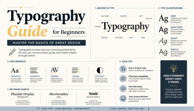
Key Elements of Typography Every Beginner Should Know

Before you can apply typography effectively, you need to understand its building blocks. This part of the Typography Guide introduces the essential vocabulary that will appear throughout the rest of the article.
Typeface vs. Font: A typeface is a family of designs (like Helvetica), while a font is a specific style and weight within that family (like Helvetica Bold 12pt). This guide uses both terms carefully so you can speak the same language as professional designers.
Baseline: The invisible line upon which most letters sit. Understanding the baseline helps you align text elements precisely, a small but important detail this Typography Guide recommends paying attention to.
X-height: The height of lowercase letters, excluding ascenders and descenders. Fonts with a larger x-height tend to feel more readable at small sizes, which is a useful tip from this guide for anyone designing mobile-friendly content.
Ascenders and Descenders: Ascenders are the parts of letters that rise above the x-height (like the top of a “b” or “d”), while descenders drop below the baseline (like the tail of a “g” or “y”). These details affect how airy or compact a font feels.
Leading: The vertical space between lines of text, borrowed from the days when printers used strips of lead to separate lines of metal type. Proper leading is one of the most overlooked aspects of design, and this Typography Guide will cover it in depth later.
Kerning and Tracking: Kerning adjusts space between two specific letters, while tracking adjusts spacing uniformly across a block of text. Both are essential skills covered later in this guide.
Mastering this vocabulary early makes the rest of this Typography Guide far easier to follow, so keep these terms in mind as you continue reading.
Types of Fonts: Serif, Sans-Serif, Script, and Display

Choosing the right font category is one of the most important decisions covered in any guide, because each category carries its own tone, history, and best-use scenarios.
Serif Fonts: Serif fonts have small decorative strokes, or “serifs,” at the ends of letters. Examples include Times New Roman, Georgia, and Playfair Display. Serif fonts often feel traditional, trustworthy, and formal, which is why so many newspapers, books, and legal documents rely on them. This Typography Guide recommends serif fonts for print materials, editorial content, and brands wanting a classic, established feel.
Sans-Serif Fonts: Sans-serif fonts lack those decorative strokes, giving them a clean, modern, minimalist appearance. Examples include Helvetica, Arial, and Montserrat. Because of their clarity at small sizes, sans-serif fonts dominate digital interfaces, and this guide strongly recommends them for websites, apps, and mobile-first designs.
Script Fonts: Script fonts imitate handwriting or calligraphy and range from elegant and flowing to casual and playful. Examples include Pacifico and Great Vibes. These fonts work best for accents, invitations, logos, and headlines rather than body text, since long paragraphs in script fonts quickly become unreadable. This Typography Guide advises using script fonts sparingly and strategically.
Display Fonts: Display fonts are bold, decorative, and designed to grab attention at large sizes, such as headlines or posters. They’re not built for body text, but they can define a brand’s personality when used correctly. This guide treats display fonts as accent pieces rather than workhorses.
Monospace Fonts: Every character in a monospace font takes up the same width, making these fonts ideal for coding environments, technical documentation, and anything requiring precise alignment. While niche, monospace fonts appear frequently enough that this Typography Guide includes them for completeness.
Understanding these five categories gives you the foundation to make confident font choices, a skill this guide considers essential for any beginner designer.
How to Choose the Right Font for Your Project

Selecting a font isn’t about picking whatever looks trendy. This section of the Typography Guide walks through a practical decision-making process you can apply to any project.
Start by considering your audience. A children’s brand calls for playful, rounded fonts, while a law firm calls for something serious and structured. This guide encourages you to research your audience’s expectations before opening a font library.
Next, think about the medium. Fonts that look great printed on a business card may not render well on a smartphone screen. Digital projects generally benefit from sans-serif fonts optimized for screens, a principle this Typography Guide repeats throughout.
Consider legibility at different sizes. Test your chosen font at the smallest size it will realistically appear, whether that’s a footer disclaimer or a mobile navigation menu. This guide suggests always testing typography in real-world conditions, not just in a design mockup.
Finally, think about licensing. Not every font is free for commercial use. Always check the license before publishing a project, since this Typography Guide wants to help you avoid costly legal issues down the road.
Font Pairing Basics for Beginners
One of the trickiest skills covered in this guide is font pairing, or combining two or more fonts harmoniously within a single design.
Rule 1: Contrast, don’t clash. Pair fonts that are different enough to create visual interest but similar enough in mood to feel cohesive. A common approach recommended by this Typography Guide is pairing a serif headline font with a sans-serif body font, since the contrast in structure creates clear hierarchy without feeling chaotic.
Rule 2: Limit yourself to two or three fonts. Using too many typefaces in one design creates visual noise and confusion. This guide suggests sticking to one font for headlines, one for body text, and optionally one accent font for special callouts.
Rule 3: Match the x-height. Fonts with similar x-heights tend to pair more naturally, since dramatic size differences between paired fonts can feel jarring. This is a subtle detail, but this Typography Guide considers it a mark of professional-level typography.
Rule 4: Consider mood consistency. A playful script font paired with a harsh, industrial sans-serif rarely works, because the emotional tones conflict. This guide recommends choosing fonts that tell the same emotional story.
Rule 5: Use pre-tested pairings when in doubt. Many design resources publish curated font pairing lists. Beginners following this Typography Guide can safely start with these proven combinations before experimenting with their own.
Understanding Typographic Hierarchy

Typographic hierarchy is the arrangement of text in a way that signals importance, guiding the reader’s eye naturally from the most important information to the least. This guide treats hierarchy as one of the most valuable skills a beginner can learn.
Size: Larger text naturally draws more attention. Headlines should be significantly larger than body text, and this Typography Guide recommends a clear, consistent size scale across your entire project (for example, 32px headlines, 20px subheadings, 16px body text).
Weight: Bold text stands out against regular-weight text, making it useful for emphasis without needing to change size. This guide suggests using bold sparingly, reserving it for genuinely important words or phrases.
Color: Darker or more saturated colors tend to draw the eye first, while lighter or muted colors recede into the background. This Typography Guide recommends using color intentionally to reinforce, not fight against, your hierarchy.
Spacing: Generous white space around important elements makes them feel more significant. Cramped text feels less important by comparison, a principle this guide applies to every layout decision.
Position: Elements placed at the top or center of a layout naturally receive more attention than those tucked into corners. This Typography Guide encourages beginners to sketch a rough hierarchy map before finalizing any design.
When all five factors work together, readers instinctively know where to look first, second, and third, without ever consciously thinking about it. That seamless experience is the ultimate goal of every guide focused on real-world usability.
Spacing: Kerning, Tracking, and Leading Explained
Spacing might be the most underrated topic in this entire Typography Guide, yet it has an enormous impact on readability and polish.
Kerning refers to adjusting the space between two individual letters to create visually even spacing. Certain letter combinations, like “AV” or “To,” can look awkward without kerning adjustments, since their natural shapes create uneven gaps. This guide recommends paying close attention to kerning in headlines and logos, where letters are large enough for spacing issues to become obvious.
Tracking applies uniform spacing adjustments across an entire word, line, or paragraph. Increasing tracking can make dense text feel more open and elegant, while decreasing it can fit more text into a tight space. This Typography Guide suggests using increased tracking for all-caps headlines, since capital letters often feel cramped at default spacing.
Leading controls the vertical distance between lines of text. Too little leading makes paragraphs feel claustrophobic and hard to read, while too much leading disconnects lines from each other, making it difficult for the eye to track from one line to the next. A commonly recommended starting point in this guide is setting leading to about 120–150% of your font size, then adjusting based on how the text feels in context.
Together, kerning, tracking, and leading form the invisible scaffolding of great typography. Mastering them is what separates amateur design from professional-quality work, a distinction this Typography Guide wants every beginner to achieve.
Alignment and Layout Principles
Alignment refers to how text lines up along an edge, and it dramatically affects how organized or chaotic a design feels. This guide covers the four main alignment types you’ll encounter.
Left alignment is the most common and readable option for most Western languages, since our eyes are trained to return to a consistent starting point on the left. This Typography Guide recommends left alignment as the safe default for body text.
Center alignment works well for short blocks of text like headlines, invitations, or quotes, but becomes harder to read in longer paragraphs since the starting point of each line shifts. This guide advises limiting center alignment to brief, impactful text.
Right alignment is less common but can be used stylistically for captions or design accents. This Typography Guide treats right alignment as a specialty tool rather than an everyday choice.
Justified alignment stretches text so both edges align evenly, which can look clean in print but sometimes creates awkward gaps between words in digital contexts. This guide recommends testing justified text carefully before using it at scale.
Beyond alignment, grid systems help maintain consistent spacing and structure across a layout. Using a grid ensures your typography feels intentional rather than randomly placed, a principle every Typography Guide worth reading will emphasize.
Color and Contrast in Typography

Color plays a bigger role in typography than most beginners realize. This section of the guide focuses on how color and contrast affect readability and accessibility.
Contrast between text color and background color determines whether your content is easy or difficult to read. Low-contrast combinations, like light gray text on a white background, might look trendy but often frustrate readers, especially those with visual impairments. This Typography Guide recommends checking your color contrast ratio against accessibility standards before publishing any design.
Color can also reinforce hierarchy and brand identity. Using your brand’s primary color for headlines and a neutral color for body text creates a cohesive visual system. This guide suggests limiting your color palette to two or three typography colors to avoid visual clutter.
Dark mode design has become increasingly popular, and typography behaves differently against dark backgrounds. Thinner font weights that look fine on white backgrounds can appear to “vibrate” or blur against black backgrounds, so this Typography Guide recommends testing your typography in both light and dark environments if your project supports both.
Typography for Web and Mobile Design
Digital typography introduces challenges that print designers never had to consider, and this section of the guide focuses specifically on web and mobile contexts.
Responsive type scaling ensures text remains readable across devices ranging from large desktop monitors to small smartphone screens. Rather than fixing font sizes at a single pixel value, modern web design uses relative units like “rem” or “em,” allowing text to scale proportionally based on the user’s device and accessibility settings. This Typography Guide recommends testing your layouts at multiple breakpoints before publishing any website.
Loading performance matters too. Custom web fonts must be downloaded before they render, and poorly optimized font files can slow down page load times, hurting both user experience and search rankings. This guide suggests limiting the number of font weights and styles loaded on any single page, and using modern font formats like WOFF2 for faster delivery.
Touch-friendly spacing becomes important on mobile devices, where fingers are far less precise than a mouse cursor. Line height and paragraph spacing often need to increase slightly on mobile to prevent text from feeling cramped on smaller screens. This Typography Guide encourages designers to physically test their typography on a real phone, not just a resized browser window.
Accessibility considerations should never be an afterthought. Sufficient contrast ratios, scalable font sizes, and clear hierarchy all help readers with visual impairments or cognitive differences navigate content more easily. This guide treats accessible typography as a baseline requirement, not an optional enhancement.
Common Typography Mistakes to Avoid

Even with good intentions, beginners often fall into predictable traps. This section of the Typography Guide highlights the most frequent mistakes so you can avoid them in your own work.
Using too many fonts: As mentioned earlier, more than two or three fonts in a single design usually creates confusion rather than interest. This guide recommends restraint above all else.
Ignoring line length: Lines of text that are too long or too short strain the reader’s eye. A commonly cited guideline in every Typography Guide is keeping lines between 45 and 75 characters for optimal readability.
Poor contrast: As discussed above, insufficient contrast between text and background makes content difficult to read, especially on mobile devices in bright sunlight.
Inconsistent hierarchy: Randomly changing font sizes and weights without a clear system confuses readers about what’s important. This guide recommends building a defined type scale before starting any project.
Overusing all caps: All-capital text is harder to read in long passages because it removes the varied letter shapes our brains use to recognize words quickly. This Typography Guide suggests reserving all caps for short labels or headlines only.
Neglecting mobile responsiveness: Typography that looks perfect on a desktop monitor can break down entirely on a small screen. This guide insists on testing every design across multiple device sizes.
Avoiding these common pitfalls will immediately elevate the quality of your design work, which is the entire purpose behind writing this Typography Guide.
Best Tools for Practicing Typography
Fortunately, you don’t need expensive software to start learning typography. This part of the guide highlights tools accessible to beginners at every budget level.
Google Fonts offers a massive free library of web-friendly fonts, complete with pairing suggestions, making it one of the most beginner-friendly resources referenced in this Typography Guide.
Canva provides a simple drag-and-drop interface for experimenting with typography in real design contexts, without needing advanced software skills.
Adobe Fonts integrates directly with Photoshop and Illustrator, giving more advanced users access to premium typefaces alongside professional design tools.
Figma has become a favorite among UI/UX designers for its collaborative features and precise typography controls, making it a natural next step once you’ve absorbed the basics of this guide.
Type scale generators help you calculate consistent font size ratios for headings and body text, removing the guesswork from building hierarchy.
Experimenting hands-on with these tools will reinforce everything covered in this Typography Guide far more effectively than reading alone.
Typography in Branding and Logo Design
Few applications of typography carry as much weight as branding. This part of the guide looks at how font choice shapes brand perception long before a customer reads any marketing copy.
A logo’s typeface often becomes synonymous with the brand itself. Think about how instantly recognizable certain company wordmarks are simply because of their letterforms, spacing, and weight. Custom or heavily modified fonts are common in logo design precisely because uniqueness helps a brand stand apart from competitors using stock typefaces. This Typography Guide encourages beginners designing a logo to start with an existing typeface, then customize spacing, weight, or individual letterforms rather than starting from a blank page.
Consistency across brand touchpoints matters just as much as the initial font choice. A brand that uses one typeface on its website, another in its print materials, and a third on social media creates a disjointed, unprofessional impression. Establishing a typographic style guide, specifying exact fonts, weights, and sizes for headlines, subheadings, and body text, ensures consistency no matter who is creating content for the brand. This is one of the most practical takeaways from this Typography Guide: document your typographic decisions once, then reuse them everywhere.
Scalability is another factor unique to branding typography. A logo needs to remain legible whether it’s displayed on a massive billboard or a tiny favicon in a browser tab. Overly detailed or thin typefaces that look elegant at large sizes can disappear entirely when shrunk down. This guide recommends testing any brand typography at both extremes, the largest and smallest realistic sizes, before finalizing a design.
Practical Tips for Typography Beginners
To wrap up the educational core of this guide, here are actionable tips you can apply immediately to your next design project.
Start simple. Choose one reliable font pairing and reuse it across your entire project before experimenting with anything more complex. This Typography Guide believes consistency beats novelty for beginners.
Study designs you admire. Take screenshots of websites, book covers, or posters you find visually appealing and analyze why the typography works. This guide treats real-world observation as one of the fastest ways to build design intuition.
Get feedback early. Show your designs to others and ask specifically about readability and hierarchy, not just general aesthetics. This Typography Guide recommends seeking feedback before a project is finalized, when changes are still easy to make.
Practice restraint. When in doubt, simplify. Remove an extra font, reduce a color palette, or increase white space. This guide consistently returns to the idea that clarity beats complexity.
Keep learning. Typography is a deep field with decades of established theory, and this Typography Guide is just a starting point. Follow design blogs, study classic typographic works, and keep experimenting with new projects.
Conclusion
Typography might seem like a small design detail, but as this guide has shown, it shapes nearly every visual interaction we have with written content. From choosing the right font family to mastering spacing, hierarchy, and color contrast, typography touches every layer of effective design.
As a beginner, you don’t need to memorize every rule in this Typography Guide overnight. Instead, focus on understanding the “why” behind each principle, and let your own eye develop through consistent practice. Revisit this guide whenever you start a new project, and over time these concepts will become second nature.
Great design isn’t about following every rule perfectly. It’s about understanding your reader, communicating clearly, and building visual systems that feel intentional. With the foundation from this Typography Guide, you’re well-equipped to start making smarter, more confident typography decisions today.
Frequently Asked Questions (FAQs)
- What is the difference between a font and a typeface? A typeface is a design family (like Helvetica), while a font is a specific style and size within that family (like Helvetica Bold 14pt). This distinction is one of the first things any guide should clarify for beginners.
- How many fonts should I use in one design? Most designers recommend limiting yourself to two or three fonts per project: one for headlines, one for body text, and optionally one accent font. This Typography Guide treats restraint as a core principle.
- What’s the best font for readability on websites? Sans-serif fonts like Arial, Helvetica, or Montserrat generally perform best on screens due to their clean, simple letterforms at small sizes.
- What is kerning in typography? Kerning is the adjustment of space between two individual letters to achieve visually balanced spacing, particularly important in logos and large headline text.
- Are serif fonts better than sans-serif fonts? Neither is universally “better.” Serif fonts often suit print and formal contexts, while sans-serif fonts tend to perform better on digital screens. The right choice depends on your project’s tone and medium.
- How do I pair fonts correctly? Pair fonts with enough contrast to create visual interest but similar enough mood to feel cohesive, such as combining a serif headline font with a sans-serif body font.
- What is typographic hierarchy? Typographic hierarchy is the organization of text using size, weight, color, and spacing to guide readers toward the most important information first.
- Is typography important for SEO? While typography itself isn’t a direct ranking factor, readable, well-structured typography improves user experience, reduces bounce rates, and keeps visitors engaged longer, all of which indirectly support SEO performance.
- What tools are best for beginners learning typography? Google Fonts, Canva, Figma, and Adobe Fonts are all excellent starting points for beginners looking to experiment with typography hands-on.
- How can I improve my typography skills over time? Study designs you admire, practice consistent font pairings, seek feedback on your work, and keep experimenting with real projects. Typography is a skill built through repetition and observation, not memorization alone.
- What line length is considered ideal for readability? Most typography experts recommend keeping lines of body text between 45 and 75 characters, including spaces. Lines shorter than this can feel choppy and disjointed, while longer lines make it harder for readers to track from the end of one line to the beginning of the next. This guide suggests testing your line length across different screen sizes, since what looks ideal on a desktop monitor may need adjustment on a narrower mobile viewport.
- Do I need to license fonts for commercial projects? In most cases, yes. Many fonts are free for personal use but require a paid license for commercial projects like client work, product packaging, or advertising. Always check the specific licensing terms attached to a font before using it in any paid or public-facing project, since licensing violations can lead to legal disputes down the line.
Master Color Theory for Graphic Designers with Practical Examples
Color is the first thing a viewer notices before they read a single word of your design, and that is exactly why color theory sits at the very heart of graphic design education. Whether you are designing a logo, a website, a poster, or a full brand identity system, understanding color theory will change the way you make every visual decision. This guide is built to help beginners and working designers alike master color theory through practical, real-world examples rather than abstract art-class jargon. By the end of this article, you will understand not just what color theory is, but how to apply color theory confidently in your day-to-day design work.
Many designers assume color is something only fine artists need to study, but in reality color is one of the most commercially valuable skills a graphic designer can develop. Clients notice when a palette feels “off,” and users abandon apps and websites that misuse color without anyone being able to explain exactly why. That is the power — and the responsibility — that comes with knowing color deeply. This article walks through every major pillar of color including the color wheel, color harmonies, color psychology, warm and cool tones, contrast and accessibility, and how color applies differently to print versus digital design.
What Is Color Theory?
Color theory is the collection of principles and guidelines designers, artists, and scientists use to understand how colors interact, how they are created, and how they affect human perception and emotion. At its core, color theory explains three things: how colors are mixed and organized (the color wheel), how colors relate to one another (color harmony), and how colors make people feel (color psychology). Every professional designer who has mastered color theory is able to look at a color palette and immediately identify why it works — or why it doesn’t.
Color theory isn’t a rigid rulebook; it is closer to a toolkit. Just like typography and layout, color theory gives designers a shared vocabulary and a set of dependable starting points. When you understand color theory, you stop guessing which colors “look nice together” and start making intentional decisions rooted in how the human eye and brain actually process color. This is the single biggest shift that separates hobbyist design from professional design.
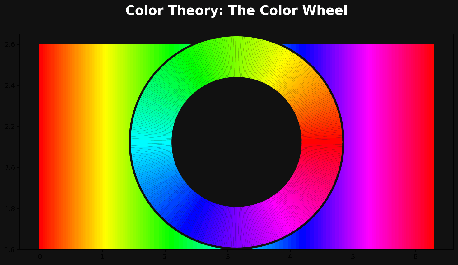
The Color Wheel: The Foundation of Color Theory

You cannot study color theory without starting at the color wheel, the circular diagram that organizes colors based on their relationships to one another. The modern color wheel used in color theory is typically divided into primary, secondary, and tertiary colors, and understanding these three categories is the first practical step toward mastering color theory.
Primary Colors
In traditional color theory, the primary colors are red, yellow, and blue. These are considered the “building block” colors because they cannot be created by mixing other colors together — every other color on the wheel is derived from them. For digital designers, it’s worth noting that screen-based color theory uses a different primary set (red, green, and blue light, known as RGB), which we’ll cover later in this guide.
Secondary Colors
Secondary colors are created by mixing two primary colors in equal parts. Orange (red + yellow), green (yellow + blue), and purple (blue + red) make up the secondary set in traditional color theory. Recognizing secondary colors helps designers understand how vibrant, high-energy palettes are typically built.
Tertiary Colors
Tertiary colors come from mixing a primary color with an adjacent secondary color, producing colors like red-orange, yellow-green, and blue-violet. Tertiary colors give a designer far more nuance and subtlety than the six colors above them, and skilled use of tertiary colors is often what separates an amateur palette from a sophisticated one. Mastering this layer of color theory allows you to create palettes with far more depth and realism.
Hue, Saturation, and Value: The Three Properties of Color Theory
Beyond the color wheel, color teaches us that every single color can be described using three core properties: hue, saturation, and value (sometimes called brightness or lightness).
- Hue refers to the pure color itself — red, blue, yellow, and so on — and is essentially the position of a color on the color wheel.
- Saturation describes the intensity or purity of a color. A highly saturated color looks vivid and bold, while a desaturated color looks muted, grayish, or washed out.
- Value describes how light or dark a color is, achieved by adding white (creating a “tint”) or black (creating a “shade”) to a hue.
Every professional conversation about color theory eventually touches on these three properties, because they are what allow you to take a single hue and generate an entire palette of tints, tones, and shades. For example, a brand’s primary blue can be extended into ten different values and saturations without ever needing a second hue, giving you a cohesive, flexible system rooted in solid color theory fundamentals.
Color Harmony: Applying Color Theory to Build Palettes

Once you understand the wheel and the three properties of color, the next stage of color theory is learning color harmony — the formulas designers use to combine colors in ways that are naturally pleasing to the eye. These harmonies are arguably the most practical, immediately usable part of color theory for any working graphic designer.
Complementary Colors
Complementary colors sit directly opposite each other on the color wheel — think blue and orange, or red and green. This is one of the highest-contrast relationships in color theory, and it’s why complementary palettes are so often used for call-to-action buttons, sports branding, and any design that needs to grab attention immediately. The tension between complementary colors creates energy, but designers need to balance the intensity carefully; a 50/50 split of two fully saturated complementary colors can feel visually aggressive, so seasoned designers typically let one color dominate and use its complement as an accent.
Analogous Colors
Analogous colors sit next to each other on the wheel, such as blue, blue-green, and green. This color theory harmony produces calm, cohesive, low-contrast palettes that feel natural, which is why analogous schemes are extremely common in wellness brands, nature-focused illustrations, and editorial design where a soothing reading experience matters more than grabbing attention.
Triadic Colors
A triadic scheme uses three colors evenly spaced around the color wheel, such as red, yellow, and blue. Triadic harmonies are vibrant and balanced at the same time, and this branch of color theory is a favorite among children’s brands, entertainment platforms, and any design that wants energy without the harsh tension of a complementary pair.
Split-Complementary Colors
A split-complementary scheme takes one base color and pairs it with the two colors adjacent to its complement, rather than the complement itself. This gives designers much of the visual interest of a complementary scheme in color theory, but with slightly less tension, making it a popular choice for beginners who want bold results without the risk of clashing.
Tetradic (Rectangle) Colors
Tetradic harmonies use two complementary pairs, forming four colors total. This is one of the more advanced applications of color theory because it requires careful balancing — usually one color is chosen as dominant, with the remaining three serving as supporting accents. Tetradic palettes show up frequently in complex data visualizations and multi-category product branding.
Monochromatic Colors
A monochromatic palette uses a single hue extended across multiple tints, tones, and shades. This is the safest and often most elegant application of color theory, producing a polished, cohesive look that’s incredibly popular in minimalist branding, tech startups, and premium product design.
Warm vs. Cool Colors in Color Theory

Another foundational concept in color theory is the division between warm and cool colors. Warm colors — reds, oranges, and yellows — are associated with energy, warmth, urgency, and passion. Cool colors — blues, greens, and purples — are associated with calm, trust, professionalism, and stability. This part of color theory is one of the fastest ways to set the emotional tone of a design before a viewer has even processed the content.
Understanding warm and cool relationships in color theory is especially useful for practical design decisions. A food delivery app might lean into warm reds and oranges to stimulate appetite and urgency, while a healthcare or finance brand will often lean into cool blues and greens to project trust and calm. Neither choice is arbitrary — both are grounded in the psychological principles that color theory has documented for decades.
Color Psychology: The Emotional Layer of Color Theory

Color theory doesn’t stop at combinations and contrast — it also covers how individual colors are perceived emotionally and culturally, a field commonly called color psychology. While reactions to color can vary across cultures, there are well-documented patterns that professional designers rely on constantly.
- Red signals urgency, passion, appetite, and danger, which is why it dominates food and clearance-sale branding.
- Blue signals trust, calm, and professionalism, making it the most common color in finance, healthcare, and tech logos.
- Yellow signals optimism and energy but can cause eye fatigue in large amounts, so it’s typically used as an accent.
- Green signals growth, health, and sustainability, and is the default choice for eco-friendly and wellness brands.
- Purple signals luxury and creativity, often used by beauty and premium lifestyle brands.
- Orange signals friendliness and enthusiasm, frequently used in call-to-action buttons because of its high visibility without the aggression of red.
- Black signals sophistication and authority, common in luxury fashion and high-end product branding.
No serious discussion of color theory is complete without acknowledging that context always matters more than any single rule. A red that reads as “urgent” on a checkout button might read as “romantic” on a Valentine’s Day card. This is why designers who understand color theory deeply always test their palette against the actual context of the product, not just the color in isolation.
Color Theory in Logo and Brand Identity Design
Brand identity is one of the most visible places where color theory does heavy lifting. A logo’s color palette is often the single fastest signal a customer receives about a brand’s personality, and that’s why brand guidelines almost always dedicate an entire section to color rules built directly from color theory principles.
Consider how differently two competing coffee brands might use color theory: one might choose warm earthy browns and oranges to emphasize comfort and craftsmanship, while a competitor might use bold reds and blacks to emphasize energy and boldness. Neither is “more correct” — both are legitimate applications of color, chosen to support a specific brand story. When building a logo, designers typically choose one dominant brand color rooted in color principles, then build a secondary and accent palette around it using one of the harmony models covered earlier in this guide.
A practical color exercise for logo design is this: pick your dominant brand color based on the emotion you want to trigger, then test it against a complementary, analogous, and monochromatic secondary palette before committing. This single exercise, grounded entirely in color, will save you from countless client revisions later.
Color Theory in UI/UX and Web Design
Digital product design has its own specific application of color theory, shaped heavily by usability, hierarchy, and accessibility. In interface design, color theory is used to establish clear visual hierarchy: primary buttons typically use the brand’s most saturated color, secondary actions use a muted or outlined version, and destructive actions (like “delete”) almost universally use red because of the psychological associations we discussed above.
One critical digital-specific piece of color is the difference between RGB and CMYK color models. RGB (red, green, blue) is an additive color model used for anything displayed on a screen — websites, apps, and social media graphics — where combining all three colors at full intensity produces white light. CMYK (cyan, magenta, yellow, black) is a subtractive color model used for print, where combining all colors absorbs light and produces black or near-black. Any designer working across both digital and print media needs to understand this distinction as a core part of applied color because a color that looks vibrant on-screen in RGB can look flat or muddy once converted to CMYK for print. Professional designers always proof their color palette in both color spaces before finalizing a project that will exist in both formats.
Color Theory and Accessibility
Modern color theory for digital design also has to account for accessibility. The Web Content Accessibility Guidelines (WCAG) set minimum contrast ratios between text and background colors so that users with low vision or color blindness can still read your content. This is a non-negotiable, practical application of color theory: a beautifully designed palette that fails a basic contrast check is a palette that excludes real users.
A simple rule of thumb from accessible color practice is to aim for a contrast ratio of at least 4.5:1 for normal body text and 3:1 for large text, and to never rely on color alone to communicate meaning (for example, marking form errors only in red without an icon or text label). Designers should also consider color blindness, which affects roughly 1 in 12 men and 1 in 200 women worldwide — testing your color palette through a color-blindness simulator is now considered a standard step in any professional design workflow.
Practical Color Theory Examples for Graphic Designers
Understanding color theory conceptually is one thing, but applying it under real project constraints is what actually builds skill. Here are several practical scenarios where color theory directly shapes design decisions.
Example 1 — A Restaurant Menu Redesign: A designer redesigning a menu for a family Italian restaurant might apply color theory by choosing a warm analogous palette of deep reds, terracottas, and mustard yellows to evoke comfort, tradition, and appetite, avoiding cool blues and greens that would clash with the “warm, homemade” brand story.
Example 2 — A Meditation App Interface: For a meditation and mindfulness app, color theory would point toward a monochromatic or analogous palette of soft blues, lavenders, and muted greens — colors scientifically associated with calm — paired with high contrast text to maintain accessibility without breaking the soothing mood.
Example 3 — A Children’s Educational Platform: Here, color theory supports a triadic scheme of primary reds, yellows, and blues, mirroring the same energetic, playful palette children’s brands like building-block toys have used for decades, because bright triadic combinations read as “fun” almost universally.
Example 4 — A Law Firm Website: A law firm’s rebrand would likely lean into color theory‘s association between navy blue and trust, pairing it with a single warm gold accent (a split-complementary approach) to suggest prestige and established authority without feeling cold or unapproachable.
Example 5 — A Fitness App Call-to-Action: For a fitness app’s “Start Workout” button, color favors a high-energy orange or red against a neutral dark background — a complementary or near-complementary relationship that draws the eye immediately and reinforces the urgency of taking action.
Each of these five examples shows how color isn’t an abstract art-school topic; it’s a decision-making framework that directly ties back to business goals, user psychology, and brand storytelling.
How to Build a Color Palette Using Color Theory: A Step-by-Step Process
- Start with your brand’s core emotion. Before opening any design tool, define the single feeling your project should evoke — trust, excitement, calm, luxury — because this is the anchor for every color theory decision that follows.
- Choose a dominant hue based on color psychology. Use the emotional associations covered earlier in this guide to select one base color that represents your brand’s personality.
- Pick a harmony model. Decide whether a complementary, analogous, triadic, split-complementary, tetradic, or monochromatic approach (all covered above) best fits your project’s energy level.
- Generate tints, tones, and shades. Use the hue/saturation/value properties of color to expand your one or two core colors into a full functional palette — typically a dominant color, a secondary color, an accent color, and several neutrals.
- Test contrast and accessibility. Run your palette through a contrast checker to confirm it meets WCAG standards, an essential final step of any responsible color theory workflow.
- Proof across mediums. If your project spans both digital and print, verify your color palette in both RGB and CMYK before final delivery.
Common Color Theory Mistakes Graphic Designers Make
Even experienced designers slip up on color theory basics under deadline pressure. Some of the most common mistakes include:
- Overusing fully saturated colors. A palette built entirely from maximum-saturation hues, without any tints or shades, often looks chaotic and amateurish — one of the fastest ways to violate good color theory practice.
- Ignoring cultural context. Color meanings shift across cultures (white symbolizes purity in some cultures and mourning in others), so global brands must research color theory implications for every target market.
- Relying on personal taste over strategy. Choosing “my favorite color” instead of a color chosen through color principles tied to brand psychology is one of the most common beginner mistakes.
- Failing accessibility checks. Skipping contrast testing is a color theory oversight that can alienate a significant portion of your audience.
- Too many competing dominant colors. Without a clear hierarchy (60% dominant, 30% secondary, 10% accent is a common color theory ratio), a palette can feel unbalanced and directionless.
Essential Color Theory Tools for Designers
Modern designers rarely build palettes by eye alone; there’s an entire ecosystem of tools built specifically to support color theory decisions:
- Adobe Color — lets you generate and explore color harmonies directly from the color wheel, a fast way to apply color theory rules visually.
- Coolors.co — a fast palette generator that can lock colors while shuffling others, useful for testing color theory harmony combinations on the fly.
- WebAIM Contrast Checker — verifies your palette against WCAG accessibility standards, an essential final step in any digital color theory workflow.
- Color blindness simulators — such as Coblis, which let you preview your color theory palette as it would appear to users with different types of color vision deficiency.
A Brief History of Color Theory
Understanding where color theory comes from helps explain why so many of its rules still hold up centuries later. The earliest formal ideas date back to Sir Isaac Newton, who in 1666 arranged the visible spectrum into a circular diagram — the first true color wheel — laying the mathematical groundwork for color theory as we know it today. In the early 1800s, German writer and scientist Johann Wolfgang von Goethe published “Theory of Colours,” one of the first texts to connect color to human emotion and perception rather than pure physics, effectively founding the psychological branch of color theory. Later, in the 20th century, artists like Josef Albers expanded color theory even further with his book “Interaction of Color,” demonstrating through hundreds of visual experiments how the same color can appear completely different depending on what surrounds it. This historical foundation matters because it shows that color theory isn’t a trend — it’s a body of knowledge refined over hundreds of years by scientists, artists, and designers, which is exactly why it remains so reliable in modern graphic design.
Color Theory and Typography: How They Work Together

Most discussions of color theory focus purely on palettes, but color and typography are deeply intertwined in real design work. The same typeface can feel completely different depending on the principles applied to it. A bold sans-serif headline in a deep, saturated red communicates urgency and confidence, while the identical typeface rendered in a soft pastel pink communicates warmth and approachability. This is why type and color decisions should never be made in isolation; a designer applying color theory correctly will always test headline and body text colors together, checking both emotional tone and legibility at the same time.
Another practical intersection between typography and color is hierarchy. Just as font weight and size establish visual hierarchy, color does the same job — often even faster, since the eye registers color before it registers shape. A pull-quote in a contrasting accent color, chosen through color theory harmony rules, draws attention within seconds, long before a reader consciously processes the words themselves. Designers who understand this relationship use color not just to pick a palette, but to guide the entire reading experience of a page.
Color Theory in Print vs. Digital Design: A Deeper Look
We touched on RGB and CMYK earlier, but there’s more nuance worth exploring, because this is one of the most common places where color theory knowledge directly prevents expensive mistakes. When a design lives only on screens, color decisions can rely on the full luminous range of RGB, which is capable of producing extremely vibrant colors like neon greens and electric blues that simply cannot be reproduced with ink. The moment that same design needs to be printed, has to account for the physical limitations of CMYK ink, which produces color through the subtractive absorption of light rather than the additive emission of it.
This is why professional print production always includes a color theory step called “soft proofing” — previewing how RGB colors will convert to CMYK before a job goes to press. Skipping this step is one of the most common and costly errors young designers make; a logo that looked electric and modern in RGB can print looking dull, muddy, or slightly off-brand once converted. Print designers who have internalized color also know to specify exact color values using systems like Pantone (PMS) for critical brand colors — such as a logo — to guarantee consistency across different printers, papers, and production runs, something that hex codes and RGB values alone cannot guarantee.
Color Theory Case Study: Rebranding a Small Business
To bring these ideas together, consider a hypothetical case study that shows color solving a real design problem. Imagine a small independent bookstore rebranding from a generic, outdated blue-and-white color scheme to something more distinctive. Applying the designer starts by defining the brand’s desired emotion: cozy, intellectual, and slightly old-fashioned, similar to sitting in a well-loved reading nook. Instead of blue, the designer chooses a deep forest green as the dominant color — a hue in color theory associated with calm, knowledge, and nature — paired with a warm cream background instead of stark white, softening the overall palette.
For the accent color, the designer applies a split-complementary approach from color selecting a muted burnt orange rather than a pure red, which would feel too aggressive for the brand’s cozy tone. This single accent is used sparingly — for a “Shop Now” button and a few illustrated details — following the 60/30/10 ratio described earlier in this guide. Finally, the designer runs the full palette through a contrast checker, confirming the cream-on-green combination for body text meets accessibility standards. The result is a palette built entirely through deliberate color theory decisions rather than trend-chasing, and it succeeds precisely because every choice can be traced back to a clear rationale.
Advanced Color Theory: Simultaneous Contrast and Optical Effects
Once a designer has mastered the basics, there’s a more advanced layer of color theory worth exploring: simultaneous contrast, a phenomenon first documented in detail by Josef Albers. Simultaneous contrast describes how a single color can appear to shift in hue, saturation, or value depending entirely on the colors surrounding it. A mid-gray square placed on a black background will appear noticeably lighter than the exact same gray square placed on a white background, even though the gray itself never changes. This is a critical piece of color theory for designers working on complex layouts, dashboards, or illustrations with many overlapping colors, because it means no color can truly be evaluated in isolation.
This advanced branch of color also explains why the same brand color can look inconsistent across different marketing materials if the surrounding background colors aren’t carefully controlled. A designer who understands simultaneous contrast will always test a key color against every background it will realistically appear on — white, black, and any brand-specific background colors — rather than approving a color swatch in isolation and assuming it will look identical everywhere.
Final Thoughts on Mastering Color Theory
Color theory is not a one-time lesson you memorize and forget — it’s a lens you apply to every single design decision for the rest of your career. From the earliest sketches of a logo to the final accessibility check on a shipped product, color quietly shapes how people feel about the things you design. The graphic designers who stand out are rarely the ones with access to more colors; they’re the ones who understand color deeply enough to make deliberate, purposeful choices with the colors they have. Keep practicing the concepts in this guide — the color wheel, harmony schemes, psychology, contrast, and the RGB/CMYK divide — and color theory will become second nature in your creative process.
Frequently Asked Questions About Color Theory
- What is color theory in simple terms?
Color is the set of principles that explains how colors are created, how they relate to each other on the color wheel, and how they influence human emotion and perception, giving designers a practical framework for building palettes.
- Why is color theory important for graphic designers?
Color theory helps designers make intentional, strategic color choices instead of relying on guesswork, ensuring that a design’s palette supports its brand message, usability, and emotional impact.
- What are the three primary colors in color theory?
In traditional color the three primary colors are red, yellow, and blue, while digital design relies on the RGB model (red, green, blue) instead.
- What is the difference between RGB and CMYK in color theory?
RGB is an additive color model used for screens and digital design, while CMYK is a subtractive model used for print — an essential distinction in applied color for designers working across both mediums.
- What is the best color harmony to use according to color theory?
There is no single “best” harmony in color theory — complementary schemes work well for high-energy, attention-grabbing designs, while analogous and monochromatic schemes suit calmer, more cohesive brand experiences.
- How does color psychology relate to color theory?
Color psychology is a branch of color theory focused specifically on the emotional and cultural associations tied to individual colors, such as red signaling urgency or blue signaling trust.
- What tools can help me apply color theory to my designs?
Popular tools for applying color theory include Adobe Color, Coolors.co, and WebAIM’s Contrast Checker, all of which help generate, test, and validate color palettes.
- How do I make sure my color theory palette is accessible?
Test your color theory palette using a contrast checker to confirm it meets WCAG minimum contrast ratios, and always verify your design using a color blindness simulator.
- Can I mix multiple color harmony types from color theory in one design?
Yes, many professional designers blend color harmonies — for example, using a monochromatic base with a single complementary accent color — as long as one color remains clearly dominant to preserve visual balance.
- How long does it take to master color theory?
Understanding the basics of color can take just a few hours of study, but truly mastering color through applied practice on real design projects is an ongoing process that improves throughout a designer’s career.
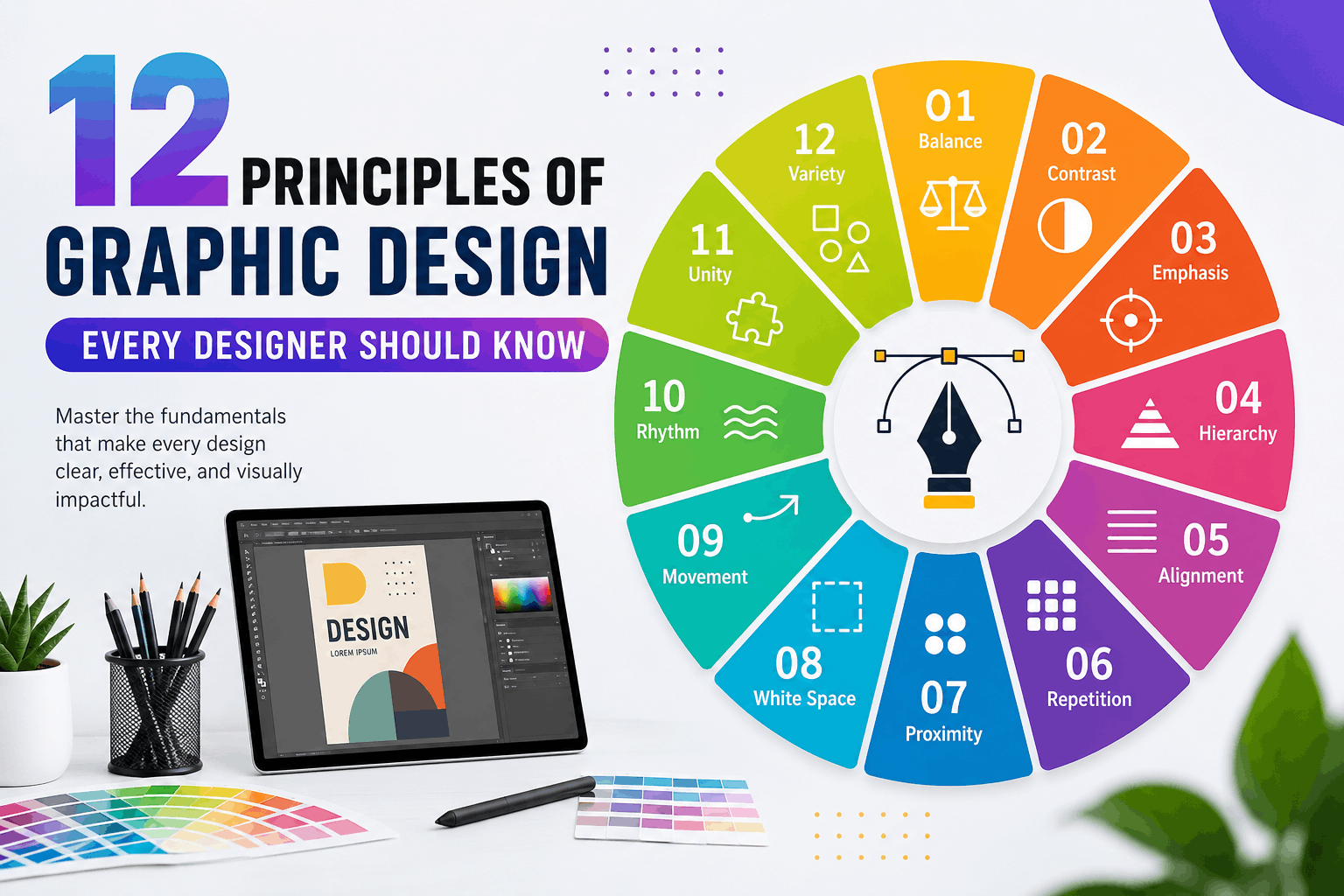
12 Principles of Graphic Design Every Designer Should Know
What Are the Principles of Graphic Design?
The Principles of Graphic Design are the fundamental rules that help designers organize visual elements effectively. Whether you are designing a logo, social media post, website, magazine, brochure, business card, or advertisement, understanding the Principles of Graphic Design is essential for creating attractive and functional designs.
These principles are not strict rules but proven guidelines that improve visual communication. They help designers arrange colors, typography, images, icons, shapes, and spacing in ways that naturally guide the viewer’s eye and create a professional appearance.
The Principles of Graphic Design work together to make designs visually balanced, easy to understand, and memorable. Even the most creative artwork relies on these principles to achieve clarity and impact.
Professional designers use the Principles of Graphic Design every day because they improve readability, strengthen branding, and increase audience engagement.
Why the Principles of Graphic Design Matter
Many beginners focus only on choosing attractive colors or trendy fonts. However, successful design goes far beyond appearance. The Principles of Graphic Design provide structure and purpose to every creative project.
Benefits include:
- Better visual communication
- Stronger branding
- Improved readability
- Higher user engagement
- Professional-looking layouts
- Better marketing performance
- More effective advertising
- Increased audience trust
Whether you work with Adobe Photoshop, Illustrator, CorelDRAW, Figma, Canva, or Adobe InDesign, mastering the Principles of Graphic Design will significantly improve your work.
Principle #1 – Balance
What Is Balance?

Balance refers to the distribution of visual weight across a design. It ensures that no single element overwhelms the composition, making the layout feel stable and harmonious.
Balance is one of the most important Principles of Graphic Design because it creates comfort for the viewer. Without balance, a design can feel awkward, cluttered, or unstable.
Types of Balance
Symmetrical Balance
Both sides of the design mirror each other. This creates a formal, elegant, and organized appearance.
Examples:
- Wedding invitations
- Government logos
- Luxury brand identities
Asymmetrical Balance
Different elements balance each other without mirroring.
Examples:
- Modern websites
- Creative posters
- Social media graphics
Radial Balance
Elements radiate outward from a central point.
Examples:
- Mandalas
- Circular logos
- Decorative patterns
Why Balance Matters
Balance improves:
- User experience
- Readability
- Visual stability
- Professional appearance
When applying the Principles of Graphic Design, always evaluate how visual weight is distributed across your layout.
Principle #2 – Contrast
What Is Contrast?

Contrast creates visual interest by emphasizing differences between design elements.
Contrast can be achieved using:
- Color
- Size
- Shape
- Typography
- Texture
- Position
- Brightness
Among all the Principles of Graphic Design, contrast is one of the fastest ways to attract attention.
Examples
- Black text on a white background
- Large headline with smaller body text
- Dark colors against light colors
- Bold fonts paired with thin fonts
Benefits
Good contrast:
- Improves readability
- Creates focus
- Highlights important information
- Makes layouts more dynamic
Poor contrast makes designs difficult to read and reduces accessibility.
Principle #3 – Emphasis
What Is Emphasis?

Emphasis directs the viewer’s attention to the most important element in a design.
Every successful layout should have a clear focal point. Without emphasis, viewers may not know where to look first.
The Principles of Graphic Design teach that emphasis can be created using:
- Larger size
- Bright colors
- Bold typography
- Isolation
- White space
- Contrast
- Positioning
Practical Examples
A sale poster might emphasize:
- “70% OFF”
- Product image
- Call-to-action button
A website homepage might emphasize:
- Hero image
- Main heading
- Signup button
Benefits of Emphasis
Effective emphasis:
- Improves communication
- Increases conversions
- Enhances readability
- Guides user attention
- Strengthens marketing messages
Designers who understand the Principles of Graphic Design know that emphasis should support the message rather than overwhelm the layout.
Principle #4 – Hierarchy
What Is Hierarchy?

Hierarchy is one of the most important Principles of Graphic Design because it determines the order in which viewers notice information. A well-designed hierarchy guides the eye naturally from the most important element to the least important one.
Without visual hierarchy, every element competes for attention, making the design confusing and difficult to understand.
Professional designers use hierarchy to make content easier to scan, especially on websites, posters, brochures, magazines, and social media graphics.
How to Create Visual Hierarchy
You can establish hierarchy using:
- Font size
- Font weight (Bold, Medium, Regular)
- Color contrast
- Placement
- White space
- Images
- Shapes
- Typography styles
For example:
- Main Heading: 48 px
- Subheading: 28 px
- Body Text: 18 px
- Caption: 14 px
This size difference immediately tells readers what to read first.
Real-World Example
Imagine an online store promoting a seasonal sale.
The design might include:
- 50% OFF (largest text)
- Summer Collection (medium text)
- Shop Now (button)
- Terms and Conditions (smallest text)
This layout follows the Principles of Graphic Design by directing attention to the most important message first.
Benefits of Hierarchy
A strong hierarchy:
- Improves readability
- Organizes information
- Creates better user experience
- Increases engagement
- Helps users make faster decisions
Common Mistakes
Avoid these errors:
- Making every heading the same size
- Using too many font styles
- Highlighting everything
- Poor spacing between sections
- Inconsistent typography
Following the Principles of Graphic Design ensures that hierarchy enhances communication instead of creating confusion.
Principle #5 – Alignment
What Is Alignment?

Alignment refers to arranging elements so they connect visually. Every object should appear intentionally placed rather than randomly positioned.
Among the Principles of Graphic Design, alignment creates order and professionalism.
Even when objects are separated by space, proper alignment makes them feel connected.
Types of Alignment
Left Alignment
The most common alignment used for paragraphs, articles, and websites.
Advantages:
- Easy to read
- Professional appearance
- Natural reading flow
Center Alignment
Best for:
- Invitations
- Quotes
- Certificates
- Logos
Use it sparingly because long centered paragraphs are difficult to read.
Right Alignment
Suitable for:
- Creative layouts
- Certain advertising designs
- Decorative typography
Justified Alignment
Often used in:
- Newspapers
- Books
- Magazines
Why Alignment Matters
Good alignment:
- Creates clean layouts
- Improves organization
- Makes content easier to scan
- Gives a polished appearance
- Builds trust with viewers
Practical Example
Imagine a business flyer.
Poor alignment:
- Logo randomly placed
- Uneven text
- Buttons scattered
Good alignment:
- Logo at the top
- Headings aligned
- Equal margins
- Consistent spacing
- Contact details neatly organized
The Principles of Graphic Design emphasize alignment because it brings structure to even the simplest designs.
Expert Tip
Use grids and guides in software like Adobe Illustrator, Photoshop, Figma, or CorelDRAW to maintain perfect alignment throughout your project.
Principle #6 – Repetition
What Is Repetition?

Repetition means consistently using the same visual elements throughout a design. It helps unify different sections and reinforces brand identity.
One of the most recognizable Principles of Graphic Design, repetition creates familiarity and consistency.
Elements That Can Be Repeated
- Colors
- Fonts
- Icons
- Shapes
- Patterns
- Buttons
- Borders
- Line styles
- Image treatments
Branding Example
A company’s brand identity may include:
- Blue primary color
- Rounded buttons
- Sans-serif typography
- Minimal icons
- Consistent logo placement
Repeating these elements across websites, brochures, advertisements, and social media builds strong brand recognition.
Why Repetition Is Important
Benefits include:
- Consistent branding
- Better user experience
- Strong visual identity
- Easier navigation
- Professional appearance
Practical Example
A website may repeat:
- Navigation style
- Footer design
- Button colors
- Typography
- Icon style
- Image borders
These repeated elements make the website feel cohesive and reliable.
Common Mistakes
Avoid:
- Using different fonts on every page
- Random color changes
- Inconsistent icon styles
- Different button shapes
- Uneven spacing
The Principles of Graphic Design encourage consistency while still allowing room for creativity.
Principle #7 – Proximity
What Is Proximity?

Proximity is the practice of placing related items close together while separating unrelated elements.
This principle helps viewers understand relationships without needing additional explanations.
Among the Principles of Graphic Design, proximity greatly improves clarity and organization.
Examples of Proximity
Related items include:
- Product image and price
- Name and job title
- Heading and paragraph
- Icon and label
- Contact information
These elements should be grouped together.
Benefits of Proximity
Proper proximity:
- Reduces clutter
- Improves readability
- Organizes information
- Creates logical flow
- Makes layouts easier to understand
Before and After Example
Poor Layout:
- Phone number far from contact heading
- Images separated from captions
- Buttons scattered randomly
Improved Layout:
- Contact details grouped together
- Captions directly below images
- Related content organized into sections
This simple adjustment makes the design significantly easier to scan.
Using White Space with Proximity
Proximity works hand in hand with white space.
Instead of adding unnecessary borders, designers can simply use spacing to show which elements belong together.
Common Mistakes
Avoid:
- Equal spacing between all elements
- Crowded layouts
- Large gaps within related content
- Mixing unrelated information
Applying the Principles of Graphic Design correctly ensures that viewers can instantly understand the structure of your design.
Key Takeaways from Part 2
In this section, you learned that:
- Hierarchy directs the viewer’s attention to the most important content.
- Alignment creates clean, professional, and organized layouts.
- Repetition builds consistency and strengthens brand identity.
- Proximity groups related elements to improve readability and understanding.
Together, these Principles of Graphic Design help designers create layouts that are visually appealing, functional, and easy to navigate.
Principle #8 – White Space (Negative Space)
What Is White Space?

White space, also called negative space, is the empty area between and around design elements. Despite its name, white space doesn’t have to be white—it can be any background color, texture, or image. One of the most valuable Principles of Graphic Design, white space allows a design to breathe and keeps it from looking overcrowded.
Many beginner designers think every inch of a layout should be filled with text or graphics. In reality, strategic empty space improves readability and gives important content room to stand out.
Types of White Space
Macro White Space
Large empty areas between major sections, images, or columns.
Examples:
- Website margins
- Banner spacing
- Magazine page layouts
- Landing page sections
Micro White Space
Small spaces between individual elements.
Examples:
- Line spacing
- Letter spacing
- Padding around buttons
- Space between icons and text
Benefits of White Space
Proper use of white space:
- Improves readability
- Highlights key information
- Creates a premium appearance
- Reduces visual clutter
- Improves user experience
- Makes content easier to scan
Real-World Example
Think about a luxury brand advertisement. Instead of filling the page with text, it often features one product image, a short headline, and plenty of empty space. This approach draws attention to the product and communicates elegance.
The Principles of Graphic Design encourage designers to treat white space as an active design element rather than wasted space.
Common Mistakes
Avoid:
- Overcrowding the layout
- Tiny margins
- Too many graphics
- Insufficient spacing between paragraphs
- Buttons placed too close together
Principle #9 – Movement
What Is Movement?

Movement is the visual path that guides a viewer’s eyes through a design. It doesn’t mean objects are physically moving; instead, the layout leads the audience naturally from one element to another.
Among the Principles of Graphic Design, movement is essential for storytelling and directing attention.
How Designers Create Movement
Movement can be achieved through:
- Lines
- Curves
- Directional arrows
- Contrast
- Size differences
- Repeated shapes
- Diagonal compositions
- Eye contact in photographs
Example
A website homepage may guide users through this sequence:
- Hero image
- Main headline
- Supporting text
- Call-to-action button
- Customer testimonials
- Footer
Each section naturally leads to the next without confusing the visitor.
Why Movement Matters
Effective movement:
- Keeps users engaged
- Improves navigation
- Supports storytelling
- Increases conversions
- Makes layouts feel dynamic
Common Mistakes
Avoid:
- Random placement of elements
- Competing focal points
- Poor spacing
- Distracting animations
- Overly complex compositions
The Principles of Graphic Design emphasize that movement should feel intentional and effortless.
Principle #10 – Rhythm
What Is Rhythm?

Rhythm refers to the repetition of visual elements in a way that creates flow and consistency. Just as music relies on rhythm to create harmony, design uses repeated patterns, colors, and spacing to establish a pleasing visual experience.
The Principles of Graphic Design use rhythm to connect different parts of a composition while keeping the viewer interested.
Types of Rhythm
Regular Rhythm
Elements repeat at equal intervals.
Examples:
- Grid layouts
- Product galleries
- Timelines
Alternating Rhythm
Two or more elements alternate repeatedly.
Examples:
- Alternating image and text sections
- Color variations
- Zigzag layouts
Progressive Rhythm
Elements gradually change in size, color, or shape.
Examples:
- Growing circles
- Fading colors
- Increasing font sizes
Random Rhythm
Repetition occurs with variation, creating a more organic appearance.
Examples:
- Abstract artwork
- Creative posters
- Artistic backgrounds
Benefits of Rhythm
Good rhythm:
- Creates consistency
- Adds visual interest
- Improves navigation
- Encourages exploration
- Makes designs memorable
Practical Example
An e-commerce website might repeat:
- Product cards
- Image sizes
- Button styles
- Typography
- Spacing
This repeated structure helps users browse products comfortably.
The Principles of Graphic Design show that rhythm creates familiarity while maintaining engagement.
Principle #11 – Unity
What Is Unity?

Unity means that all design elements work together as one cohesive composition. Every color, font, image, icon, and shape should support the same overall message.
Among the Principles of Graphic Design, unity is what makes a design feel complete and professional.
How to Create Unity
Use consistent:
- Typography
- Color palette
- Icon style
- Image treatment
- Layout structure
- Button styles
- Margins and spacing
Branding Example
A technology company may use:
- Blue and white color scheme
- Rounded icons
- Modern sans-serif fonts
- Clean layouts
- Consistent photography style
These repeated elements create a unified brand identity across websites, advertisements, packaging, and social media.
Benefits of Unity
Unity helps:
- Strengthen branding
- Improve user trust
- Create professional designs
- Increase visual harmony
- Make communication more effective
Common Mistakes
Avoid:
- Mixing unrelated fonts
- Random color combinations
- Inconsistent image styles
- Different icon designs
- Uneven spacing
The Principles of Graphic Design teach that unity doesn’t mean every page looks identical—it means every element belongs together.
Principle #12 – Variety
What Is Variety?

Variety introduces differences within a design to keep it visually engaging. While unity creates consistency, variety prevents the layout from becoming repetitive or boring.
One of the final Principles of Graphic Design, variety adds energy and creativity while maintaining balance.
Ways to Add Variety
You can introduce variety through:
- Different image styles
- Contrasting colors
- Unique shapes
- Typography combinations
- Icons
- Patterns
- Illustrations
- Layout changes
Real-World Example
A travel brochure may include:
- Large destination photos
- Colorful icons
- Bold headings
- Maps
- Infographics
- Highlight boxes
These varied elements maintain interest while supporting the same message.
Benefits of Variety
Variety:
- Attracts attention
- Prevents monotony
- Encourages exploration
- Supports creativity
- Enhances storytelling
Common Mistakes
Avoid:
- Using too many fonts
- Excessive colors
- Random decorative elements
- Inconsistent illustration styles
- Visual overload
Following the Principles of Graphic Design ensures that variety complements unity instead of creating chaos.
Real-World Application of the Principles of Graphic Design
Successful designers rarely rely on a single principle. Instead, they combine multiple Principles of Graphic Design to create visually compelling and effective work.
For example:
Logo Design
- Balance for stability
- Contrast for visibility
- Unity for consistency
- Variety for uniqueness
Website Design
- Hierarchy for content organization
- Alignment for clean layouts
- White space for readability
- Movement for user navigation
Social Media Graphics
- Emphasis for key messages
- Contrast for eye-catching visuals
- Repetition for brand recognition
- Variety for audience engagement
Print Design
- Rhythm for page flow
- Proximity for logical grouping
- Alignment for professionalism
- Unity for a cohesive appearance
By combining these Principles of Graphic Design, designers create projects that are both attractive and functional.
Common Mistakes Designers Make When Applying the Principles of Graphic Design
Even experienced designers occasionally make mistakes. Understanding these common issues can help you improve your workflow and create more effective designs.
- Ignoring Balance
One of the biggest mistakes is placing too many elements on one side of the layout. An unbalanced design feels awkward and can distract the viewer from the main message.
Solution:
- Distribute visual weight evenly.
- Use grids and guides.
- Review your design from a distance before finalizing.
- Using Too Many Fonts
Using four or five different fonts in one design creates inconsistency and reduces readability.
Best Practice:
- Use one font for headings.
- Use one complementary font for body text.
- Limit yourself to two or three font families.
This approach aligns with the Principles of Graphic Design by improving unity and readability.
- Poor Color Choices
Using random colors without a clear palette weakens branding and makes designs look unprofessional.
Solution:
- Choose a consistent color palette.
- Maintain sufficient contrast.
- Consider accessibility for color-blind users.
- Overcrowding the Layout
Trying to fill every available space with graphics or text is a common beginner mistake.
Solution:
- Embrace white space.
- Remove unnecessary elements.
- Focus on the most important message.
Remember, one of the key Principles of Graphic Design is that empty space is a valuable design element.
- Weak Visual Hierarchy
When every element looks equally important, viewers don’t know where to focus.
Solution:
- Make headlines larger.
- Use bold typography strategically.
- Highlight calls to action.
- Organize content by importance.
- Inconsistent Alignment
Randomly placed objects make designs appear messy.
Solution:
- Use grids.
- Align text and images consistently.
- Keep margins equal throughout the layout.
- Forgetting the Target Audience
A design should always serve its intended audience. A playful design may work for children’s products but not for a law firm or financial institution.
Before starting any project, ask:
- Who is the audience?
- What message should the design communicate?
- Which style best supports that message?
Applying the Principles of Graphic Design with your audience in mind leads to more successful outcomes.
Expert Tips to Master the Principles of Graphic Design
Mastering design takes practice. The following tips can help you apply the Principles of Graphic Design more effectively.
Practice Every Day
Create posters, social media graphics, logos, brochures, or website mockups regularly. The more you practice, the more naturally these principles become part of your design process.
Study Great Designs
Analyze successful work from well-known brands. Observe how they use balance, hierarchy, contrast, white space, repetition, and unity.
Learn Typography
Typography is a major component of effective design. Understanding font pairing, spacing, readability, and hierarchy will strengthen your layouts.
Build Strong Color Knowledge
Learn:
- Color theory
- Complementary colors
- Analogous color schemes
- Monochromatic palettes
- Color psychology
These concepts work alongside the Principles of Graphic Design to improve communication.
Use Grids
Professional designers rely on grids to maintain alignment, spacing, and consistency across layouts.
Seek Feedback
Share your work with other designers, mentors, or clients. Constructive feedback often reveals issues you may have overlooked.
Keep Designs Simple
Simplicity is often more effective than complexity. Focus on clarity rather than adding unnecessary visual elements.
Stay Updated
Design trends evolve, but the Principles of Graphic Design remain timeless. Continue learning about new tools, techniques, and user expectations while maintaining a strong foundation in these core principles.
Why the Principles of Graphic Design Matter in Different Industries
The Principles of Graphic Design are valuable across many fields, including:
Branding
- Logo design
- Brand identity
- Packaging
- Marketing materials
Web Design
- Landing pages
- User interfaces
- E-commerce websites
- Mobile applications
Print Design
- Magazines
- Books
- Flyers
- Business cards
- Brochures
Advertising
- Billboards
- Digital ads
- Social media campaigns
- Email marketing
Motion Graphics
- Animated videos
- Explainer videos
- Presentations
- Promotional content
No matter the industry, understanding the Principles of Graphic Design helps designers create work that is both attractive and effective.
Frequently Asked Questions (FAQs)
- What are the Principles of Graphic Design?
The Principles of Graphic Design are foundational guidelines that help designers organize visual elements effectively. They include Balance, Contrast, Emphasis, Hierarchy, Alignment, Repetition, Proximity, White Space, Movement, Rhythm, Unity, and Variety.
- Why are the Principles of Graphic Design important?
They improve communication, create visually appealing layouts, strengthen branding, enhance readability, and provide users with a better overall experience.
- What is the difference between design elements and design principles?
Design elements are the building blocks of a design, such as color, typography, lines, shapes, texture, and space.
The Principles of Graphic Design describe how those elements should be arranged to create effective compositions.
- Which principle is the most important?
There isn’t a single “most important” principle. Every project requires a combination of the Principles of Graphic Design, and their importance depends on the design’s purpose and audience.
- How can beginners learn the Principles of Graphic Design?
Beginners should:
- Practice regularly.
- Study professional work.
- Recreate existing layouts.
- Learn typography and color theory.
- Build personal projects.
- Request feedback from experienced designers.
- Can I apply these principles in Canva?
Yes. Whether you use Canva, Adobe Photoshop, Adobe Illustrator, CorelDRAW, Figma, or Adobe InDesign, the Principles of Graphic Design remain the same.
- How do the Principles of Graphic Design improve branding?
Consistent application of these principles creates recognizable visual identities, builds trust, and strengthens brand recognition across websites, social media, packaging, and print materials.
- Are these principles useful for UI and UX design?
Absolutely. UI and UX designers use the Principles of Graphic Design to improve navigation, readability, accessibility, and user satisfaction.
Final Thoughts
The Principles of Graphic Design form the foundation of every successful visual project. Whether you’re designing a logo, website, brochure, social media post, or advertisement, these principles help transform creative ideas into clear, engaging, and professional designs.
Mastering Balance, Contrast, Emphasis, Hierarchy, Alignment, Repetition, Proximity, White Space, Movement, Rhythm, Unity, and Variety takes time, but consistent practice will significantly improve your skills. Remember that great design is not just about aesthetics—it is about communicating a message effectively and creating meaningful experiences for your audience.
As you continue learning and experimenting, revisit these Principles of Graphic Design with each new project. Over time, they will become second nature, helping you create work that is visually appealing, functional, and memorable.
-

 Graphics Design2 years ago
7.Exploring the Importance of Color Theory Charts
-

 Graphics Design1 year ago
Top 10 Best Graphic Design Tools for Beginners in 2025 (Free & Paid)
-

 Graphics Design2 years ago
10 Stunning Gradient Design Trends You Need to Know in 2024
-

 Graphics Design12 months ago
15 Freelance Graphic Design Tips to Boost Your Career in 2025
-

 Graphics Design2 years ago
29.Retro Design Is Making a Comeback in Modern Spaces
-

 Graphics Design1 year ago
Best Laptops for Graphic Designers – 2025 Buying Guide
-

 Graphics Design1 year ago
2025 Logo Design Trends: What’s In, What’s Out?
-

 Graphics Design2 years ago
15.The Importance of Effective Flyer Design in Marketing
maturemousepads
August 21, 2024 at 5:40 am
Watch movies from the guy’s point of view to feel just like you’re right in the middle
of the action and get a good view! You can get
big booties in virtually any other category it is possible to think of!
Whether you’re into curvy teenagers, sexy MILFs, or thick Asians, they all have an area here.
Browse the bouncing, backshots, and amazing action in group sex, gangbangs,
anal, one-on-one, and many more. https://hot-pointiwjx257036.blogdigy.com/shocking-information-about-how-to-take-shower-nudes-uncovered-42646354
Techno rozen
August 26, 2024 at 11:11 am
Techno rozen There is definately a lot to find out about this subject. I like all the points you made
Muhammad Ubaid
August 26, 2024 at 9:10 pm
Thank you
BaddieHub
August 29, 2024 at 1:48 pm
BaddieHub This is my first time pay a quick visit at here and i am really happy to read everthing at one place
Muhammad Ubaid
August 30, 2024 at 9:56 am
Thank you
binance doporucení
September 5, 2024 at 1:03 am
I don’t think the title of your article matches the content lol. Just kidding, mainly because I had some doubts after reading the article.
zoritoler imol
October 21, 2024 at 12:15 am
Hello There. I found your blog the usage of msn. That is an extremely neatly written article. I will be sure to bookmark it and come back to learn more of your helpful information. Thank you for the post. I’ll definitely return.