Graphics Design
39.The Evolution and Influence of Modern Surrealism in Design
The Evolution and Influence of Modern Surrealism in Design
The evolution and influence of modern surrealism in design surrealism, an art movement from early twentieth-century, has remained alive and dynamically affecting different types of art. Launched by André Breton in 1924, the movement aimed to liberate the spirit using the principles of dream-like thinking with an emphasis on the irrational. Surrealism also went beyond the usual art mediums such as paintings and sculptures and has expanded up to literature, cinema, and specifically, design. Surrealistic design in contemporary world can be defined as aesthetics that incorporate elements from the world of dreams and distortions that are peculiar and recognizable at the same time.
The Origins of Surrealism
To make it easier to define modern surrealism in design, it is necessary to learn more about the history of the surrealist movement. Born out of disillusionment after the First World War, surrealism was a revolt against the social order of that era. This was because it attempted to liberate itself from the confines of reason and instead sought the truth in the ridiculous and the irrational. Like Freudians, surrealists assumed that the liberated human consciousness free from the rules of society can uncover the key to human existence.
The evolution and influence of modern surrealism in design is widely defined by such elements as dreamlike images, irony, and apparent nonsense. Prominent surrealists of the movement included Salvador Dalí, René Magritte and Max Ernst whose paintings featured ridiculous and surrealistic scenes. This complete break with tradition established the foundation for the surrealist impact on modern design.
From Art to Design

The evolution and influence of modern surrealism in design continued to spread throughout the 20th century and was not limited to the fine arts, but found its way into various walks of life such as; advertising, fashion and interior design. The change from surrealism as an art movement to one that affected design was a radical change of focus from the artist to the consumer. This led to the application of surrealist elements where designers started to employ surrealism in their products and constructively unique spaces.
The evolution and influence of modern surrealism in design shift was possible due to the influence of mass media, which expanded the viewership of surrealist images. Due to the ambiguous and rather cryptic nature of the surrealist art, it became perfect for designers seeking to grab the audience’s attention and make them wonder about additional details. Some companies started to create advertisements with surrealistic components based on placing two unrelated objects together and placing them into a dreamlike state. In fashion, designers started to use elements of surrealism, with material, form and motifs being exaggerated in various creations.
Aspects of Today’s Surrealism in Design

The evolution and influence of modern surrealism in design as used in the design field still encompasses most of these elements, but it has also taken into consideration present day requirements and advances in technology.
1. Dreamlike Imagery
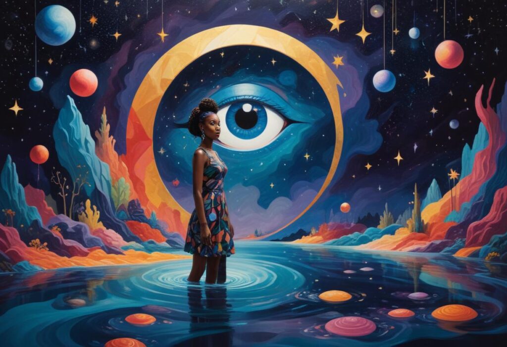
The evolution and influence of modern surrealism in design there are many elements that are associated with surrealism but perhaps the most striking one is the concept of dreams. This is normally reflected in design through the use of what can be described as celestial imagery capable of making the subject look as if it is not from this world. These designs may contain some features like objects floating in space, skewed points of view, etc., and nontraditional color schemes. The objective is to leave a note of awe and curiosity, inviting the viewer into a place which feels familiar but tipped off kilter.
For example, in the contemporary interiors, the space can be furnished with huge fun sofas which look like they are flying and the wallpapers may display unrealistic landscapes. Surrealism in graphic design can be observed in ads where there are clear juxtaposition of everyday items, or locations that are in some manner illogical.
2. Unexpected Juxtapositions
The evolution and influence of modern surrealism in design always welcomes the unexpected to happen at any given time. When designers put existing objects in unfamiliar environments they can easily come up with compositions that give the viewer pause for thoughts. This technique is particularly applied in today’s surrealistic visual design where one is allowed to see unexpected things.
For instance key practices of surrealism in graphic design include representation of natural and artificial elements as a single entity, for instance having a tree coming out of a head or a city built from fruits. These combinations are not only visually pleasing but they also force the viewer into re-interpretation of the connections between multiple aspects of their surroundings.
-
Distortion of Reality
A final characteristic of surrealism is the element of obsession with reality. This can be expressed in various forms, for instance, distortion of certain body parts, unrealistic constructions or structures, fusion of the human and animal figures. While in modern design these distortions are applied to cause the illusion of dizziness or to give a viewer a hidden meaning of design.
For example, in fashion, one can come up with clothing designs with odd shapes and structures that are not typical of usual fashion. In product design, objects are designed in such a way that they are contrary to what one would imagine, for example, designing chairs where they look like they are melting or lamps are designed to look like plants that are growing. These are not only utilitarian but artistic designs that people love to talk about and engage in unusual forms of identity.
4. Symbolism and Metaphor
The evolution and influence of modern surrealism in design is therefore associative as it uses a lot of symbolism and metaphor to express ideas or feelings. In modern design, this symbolic approach enables designers to construct objects and environments that include hidden meanings, which are not evident at first sight. Symbolic elements placed within a design are able to give the creator manipulate the thoughts, emotions, or memories that the viewer is to experience.
For instance, if the theme chosen is surrealism, then a logo might contain an image of melting clocks similar to those seen in Dalí’s “Persistence of Memory.” In interior design, there might be motifs of eyes and mirrors illustrating concepts of perception and self-awareness. In surrealist design symbolism is applied not only for the purpose of expressing multiple meanings but also to lure the viewer to pay attention to the artwork.
Surrealist Design and Technology
The evolution and influence of modern surrealism in design contribution looks at how this facet of digital technologies has influenced surrealism in design to progress. Computer software such as Adobe Photoshop, 3D designing software and virtual reality have paved way to new realms to produce and contemplate the surrealist designs. With the help of these technologies, designers can apply modifications to images and objects almost in a dramatic manner and this is spearheading to the creation of unique models.
1. Digital Surrealism
The evolution and influence of modern surrealism in design dawn of the digital era has provided surrealism with the proper context within the world of art and graphic design. Now, artists can engage and depict realistic details of real life together with fantasy in detail that is almost unbelievable. Digital applications help combine the different components organically to create artistic images that combine the elements of the meeting of two worlds and the use of relevant conventions.
It is also noticed in the world of advertisement that has become apparent in the way they use CGI and animation to depict bizarre fantasies enough to captivate the audience’s attention. Performing imagination from mirage-like commercials through the cyclonic terrains to colorful social media campaigns with outrageous looking graphics, digital technology has taken surrealist design to the commercial world.
2. Virtual Reality and Augmented Reality
The two relatively recent phenomena of virtual and augmented reality or VR and AR have gone even beyond the surrealist design in a way, allowing users to experience the surrealist environments firsthand. In VR, one can design the environment that lacks sense and physical reality as one observe the real world, VR offers an interactive environment that can be touched, felt and even smelled. These milieux can include unrealistic floating drinks, upside-down structures, fake landscapes or shapes-shifting figures where characters transform in real time.
The evolution and influence of modern surrealism in design, on the other hand, actually introduces the surrealistic features into reality by placing the digital assets into the physical one. This technology has been incorporated in to areas of design which includes retail design where customers are able to preview products in their living room and art designs in which people are able to ‘play’ with animations of products created in the living room which are in real life surreal animated creatures that are part of the surrounding environment.
Surrealism and Its Application to Modern Styles of Design
The evolution and influence of modern surrealism in design is still seen in today’s current worldwide trends in arts of design and the visual environment linked with fashion design, product design, architecture and graphics/net writing. This is particularly true for the contemporary designers who so keen on using their imagination and creating new trends, the movement gives clues to both, exploring the subconscious alter egos and the liberty of being aesthetically unique in the sea of today’s over populated products.
1. Fashion and Surrealism
The evolution and influence of modern surrealism in design, the designers have come up with new clothing styles including a touch of surrealism in the fashion items. This can be observed in outfits utilizing principles such as dramatic silhouettes, materials with surprising touch sensations and dramatic print and color combinations. That is why the application of surrealistic motifs in fashion can be considered as one of the most effective ways to return to the basic principles of fashion as an art movement as well as embrace new principles of thinking.
2. Architecture and Interior Design
The concept can also be seen in structures and designs in the modern world, including architecture and interior design. Surrealism remains in architectures of current spaces in the forms of broad structures, interiors that distort normal sight perception and spaces that instill dreamlike illustrative features. These designs may also Endeavour to produce aesthetic properties that make the occupants view the appearance of their environment from a different perspective.
3. Product Design
The evolution and influence of modern surrealism in designm has been Incorporated Into product design to come up with products that are both functional and illogical. Common items in a home include furniture, lightings, appliances and fixtures and they are either distorted by applying techniques or painted in a manner which makes them seem like they are melting, stretched or deformed like living organisms. The latter products can be utilized for practical purposes, but at the same time, they encourage users to interact with these objects in a somewhat less rational manner.
Conclusion:
Surrealism in Design Forecast
Continuing into the future, more and more surrealist elements can be seen thus asserting its powerful influence on the world of design. It strives to explore unknown ideas, creativity, innovation, and ongoing practices that make it relevant to designers of different generations. With the progression in technology which offers new opportunities for communication that are innovative channels for Surrealist design.
In the future of surrealism in design, their resources become more digital and physical, synchronizing the design, so the viewers immerse more and interact with what they see. Applying concepts of surrealist art to products of new media technologies such as virtual reality or augmented reality, to new forms of media, surrealism will remain a force that interrogates reality and tests the boundaries of what is achievable in the field of design.
In this way, modern surrealism in design remains true to the original spirit of the movement: As such, the play is a satire, a provocation in the sense of disturbing the current norms, and an exploration of the uncharted territories of the human brain.
Graphics Design
Top 5 Free AI Shirt Design Tools You Need to Try in 2025
Top 5 Free AI Shirt Design Tools You Need to Try in 2025
The rapid development in fashion shows us that AI tools now transform how designers make innovative and fashionable garments. Free AI Shirt Design tools from 2025 help various users ranging from experts to casual enthusiasts to create amazing t-shirt designs rapidly. Visitors can discover the five leading free AI Shirt Design tools included in this article which provides the latest 2025 software solutions.
These powerful features in the tools simplify t-shirt design creation beginning from creating artistic work to streamlining your output. Zealous designers together with business owners and anyone appreciating custom apparel execution should read further to select their optimal free AI Shirt Design software solution.
1. Canva AI Shirt Design
Why Choose Canva for AI Shirt Design?
Users can now use AI capabilities from Canva to design excellent Shirt Designs through its online design platform. Canva provides users with easy access to pre-made templates together with basic tools to build custom t-shirts.
The Main Features of Canva AI Shirt Design Include

- AI-generated design suggestions
- Drag-and-drop interface for easy customization
- Free templates for various t-shirt styles
- High-quality export options for printing
- Collaboration features for teams
How to Use Canva for AI Shirt Design?
- Users can establish a Canva account by registering for Free service.
- Video tutorials about AI Shirt Design templates can be found in the design library.
- Users can personalize their t-shirts through the selection of fonts and colors along with graphics.
- Print the design using any preferred material after downloading it from the platform.
The AI tools in Canva enable users to create t-shirts with a professional appearance without effort.
2. Deep Dream Generator
Why Choose Deep Dream Generator for AI Shirt Design?
People with a preference for abstract and artistic designs will find Deep Dream Generator to be an excellent Shirt Design platform. The tool applies neural networks to develop surreal and eye-grabbing t-shirt designs.
Deep Dream Generator AI Shirt Design includes three essential features for users.

- AI-powered artistic transformations
- AI Shirt Design offers users multiple art styles which enable them to create unique designs.
- Easy upload and processing of images
- Users can access the product without paying any usage fees only when they consume limited credits.
- Great for psychedelic and dreamlike t-shirt prints
How to Use Deep Dream Generator for AI Shirt Design?
- Users can input their image and select from an available gallery of images.
- You must apply one of the AI filters to create artistic transformations of images.
- Users should adjust the effect parameters to achieve maximum results.
- User can acquire the final AI Shirt Design for printing directly on a t-shirt.
Deep Dream Generator provides the ideal solution for users who seek artistic and aesthetically pleasing shirt designs.
3. Kittl AI Shirt Design Tool
Why Choose Kittl for AI Shirt Design?
Kittl is an excellent alternative to traditional design software, offering powerful AI-driven features specifically for Shirt Design. It provides vector graphics, typography effects, and AI-powered automation for seamless designing.
Key Features of Kittl AI Shirt Design Tool

- AI-assisted design creation
- Huge library of fonts, illustrations, and elements
- Non-destructive editing features
- Supports high-resolution exports for printing
- Free and premium versions available
How to Use Kittl for AI Shirt Design?
- Visit Kittl’s website and create a free account.
- Select the “AI Shirt Design” category to explore templates.
- Customize the design with text, graphics, and colors.
- Export the design in high resolution for t-shirt printing.
Kittl is a fantastic choice for both beginners and professionals looking for AI-powered creativity.
4. Designify AI Shirt Design
Why Choose Designify for AI Shirt Design?
Designify provides background removal services and image enhancement features which align well with projects about Shirt Design. Shirt Design users who want to develop neat and business-ready t-shirts can find an excellent solution in this tool.
The AI Shirt Design edition of Designify provides users with these essential features.

- AI-based background remover
- Smart color correction and enhancements
- Users can access this application free of charge while receiving basic service features.
- Ideal for e-commerce t-shirt sellers
- Easy export options for print-ready designs
How to Use Designify for AI Shirt Design?
- Upload your t-shirt design image.
- AI technology can eliminate backgrounds while you also modify color tones.
- The application lets users improve details to achieve a more precise appearance.
- The tool is available for free t-shirt printing projects through a direct download.
Users seeking fast professional t-shirt designs should utilize Designify because it automates their design work.
5. Deep Art Effects AI Shirt Design
Why Choose Deep Art Effects for AI Shirt Design?
Through its AI capabilities Deep Art Effects converts pictures or images into art masterpieces. The tool functions particularly well to develop original artistic prints for AI Shirt Designs.
The Deep Art Effects AI Shirt Design system offers various important functional elements for users.

- AI-powered artistic filters
- High-resolution output
- Multiple style options, from classic to modern
- Free version available with limited features
- Great for custom and trendy t-shirt designs
How to Use Deep Art Effects for AI Shirt Design?
- Users need to add an image to the platform’s system.
- Users can select various AI art styles through the platform.
- Users can improve their design by modifying the program settings.
- Users can obtain and print the t-shirt design from the platform.
The application serves as a top option to transform unexceptional images into eye-catching t-shirt designs.
FAQs About AI Shirt Design
- What is AI Shirt Design?
The process of producing t-shirt designs through the combination of artificial intelligence tools is known as AI Shirt Design. Users experience simplification in the design process because automated tools allow them to generate exceptional artwork.
- Shirt Design tools provide users with the option of using their services without any financial cost.
Yes! Shirt Design tools give users access to free basic functionalities through their cost-free editions. You can make superb designs without paying for AI Shirt Design tools even though the premium options provide more extensive functionalities.
- What should novice users look for in an Shirt Design software?
The combination of Canva and Kittl delivers effective tools for beginner users due to their AI templates alongside user-friendly design interfaces.
- Can professional users operated Shirt Design applications for business purposes?
The capability to use AI Drink Design tools depends on the individual tool you select for work. A number of AI-generated designs need users to obtain a commercial license before use. Review the contractual terms and conditions for your t-shirt sales specifically before distributing design merchandise.
- What functions drive Shirt Design tools to operate?
Artificial intelligence algorithms inside these tools create or boost design solutions after receiving user input. These tools examine existing patterns and utilize AI tools to enhance designs which results in attractive t-shirts.
- Shirt Design tools have the capability to replace human designers in certain situations or functions.
The strong capabilities of AI remain insufficient to substitute total human creativity. These tools serve as helpful resources which improve speed and efficiency during the design process.
Conclusion
The development of Shirt Design tools in 2025 has reached such high levels of advancement that any person can instantly make beautiful t-shirt designs without effort. Each artist can find their perfect AI design tool among the options including Canva for easy use and Deep Dream Generator for artistry and Designify for automatic enhancements.
All users including print-on-demand operators and fashion fans and individual small business owners have unlimited design freedom through free AI shirt platform tools. Test these tools now because they help you bring artistic t-shirts alive.
Your fashion leadership will benefit from AI technology to develop exceptional t-shirt designs along with professional standards through a process that requires no technical expertise at all. Happy designing!
Graphics Design
Top 10 Stunning Tools for NFTs Designing Like a Pro

Top 10 Stunning Tools for NFTs Designing Like a Pro
Global interest in NFTs designing has risen dramatically while drawing digital artists alongside creators and established brands to participate in blockchain-based art sector. Rising engagement around NFTs alters digital asset perspective while new tools for design creation and blockchain management become essential for makers in this exploding field. Every designer who uses their best available tools can reach groundbreaking NFTs creation levels both at professional and beginning skill levels.
This article highlights ten advanced tools that enable creators to achieve their NFT creation objectives. These tools will transform your digital art design process by enabling animated NFT releasing directly onto blockchain networks.
What Makes NFTs Designing Unique?
Non-fungible tokens (NFTs) function as distinctive digital assets which support ownership rights for art and music recordings or proprietary collectibles in addition to actual property. The characteristics of physical design separate NFTs from conventional artworks which enables creators to maintain ownership rights as buyers obtain standalone digital assets. NFTs designing demands creativity and programming skills which create blockchain integrations for your work while sustaining exclusive and tamper-proof uniqueness.
Being useful in this evolving field requires tools which bring together creative elements with functional features. The tools assist designers with concept development along with artwork optimization and produce blockchain-prepared assets so their designs rise above competition in the NFT market.
Key Features to Look for in NFTs Designing Tools
Before diving into the top tools, it’s essential to know what features to prioritize:
- User-Friendly Interfaces: Platform solutions need to accommodate novice users and experts on their design spectrum.
- Blockchain Integration: Seamless minting of NFTs directly from the design platform.
- High-Quality Output: Premium-quality renderings in your design work increase the likelihood of attracting buyers.
- Diverse Functionality: Tools which enable animation development alongside 3D artwork generation and multiple creative features are supported.
The following section reveals ten essential tools that fulfill these specifications to elevate your NFT design capability.
Photoshop: A Designer’s Staple

Photshop stands alone as the main tool for NFT designing. Digital artists have been relying on Photoshop for many decades because of its strong features which enable intricate design work and detailed image editing and spectacular visual effects for vibrant artwork.
Why Photoshop for NFTs Designing?
- Advanced Tools: Through its brushes and 3D tools Photoshop provides users boundless artistic freedom.
- Compatibility: The platform enables multiple file formats which work well for NFT marketplace operations.
- Animation Features: Design dynamic NFTs with GIFs and animations in your digital projects.
While its learning process takes effort it remains essential for professional designers because of its unparalleled power.
Illustrator: Vector Art at Its Best
Any creator making clean scalable NFT artwork counts Adobe Illustrator as their leading platform for design work. Vector art experts appreciate this tool because it lets designers manufacture exact and detailed visuals that remain flawless even when artwork experiences changes in size.Creating shapes and patterns and drawn illustrations demands high precision through this tool.Such platforms feature infinite scalability because they work exceptionally well for NFT collectibles. designing, no tool is as iconic as Photoshop. Trusted by digital artists for decades, Photoshop offers robust capabilities to create intricate designs, edit images, and add effects that make your art pop.
Standout Features for NFTs Designing:
- Precision in creating shapes, patterns, and illustrations.
- Infinite scalability, perfect for NFT collectibles.
- Seamless integration with Photoshop for combined workflows.
Blender: Dive into 3D NFTs Designing
Rock-solid 3D art creation abilities within Blender transform the NFTs design space into its essential component. You can achieve unmatched creative possibilities together with flexible design features in Blender when you work with animated 3D avatars and intricate models.You can utilize the platform for free since it operates through a source code model.NFT creators can access sophisticated animation features through the tool.designing, no tool is as iconic as Photoshop. Trusted by digital artists for decades, Photoshop offers robust capabilities to create intricate designs, edit images, and add effects that make your art pop.
What Makes Blender Exceptional?
- It’s completely free and open-source.
- Advanced animation tools for creating engaging NFTs.
- A thriving community with endless tutorials and add-ons.
With Blender artists can create outstanding NFT assets through their ability to perform sculpting and rendering operations.
Canva: Simplicity Meets Creativity
The NFTs designing process for beginners starts with excellent results using Canva. Users can take advantage of Canva’s conveniently simple interface through drag and drop to produce visually impressive outputs while avoiding technical limitations.
Why Canva for NFTs Designing?
- Thousands of templates to jumpstart creativity.
- Easy integration with stock images and icons.
- Your NFT collections can use Canva to create ideal marketing materials.
By lacking blockchain integration Canva serves well for designing promotional assets and creating basic NFTs.
Procreate: Ideal for Digital Illustrations
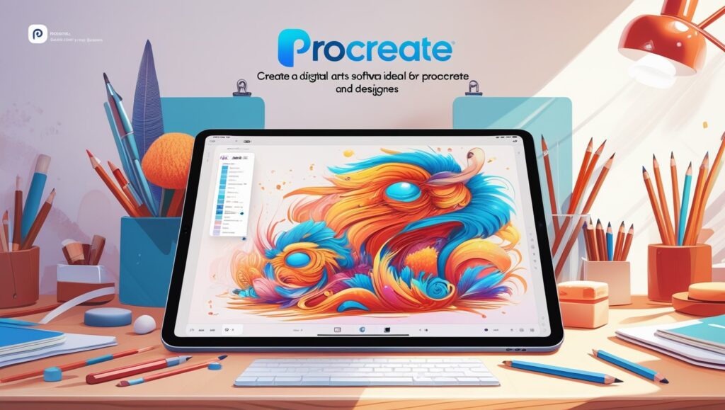
The iPad exclusive Procreate has taken its position as the primary tool of choice for digital illustrators entering NFT design spaces while focusing on iPad users. The tool has both an easy-to-use interface and genuine drawing efficiency which makes it suitable especially for art sketching and refinement work.Animation Assist enables users to create dynamic NFTs.nners venturing into NFTs designing, Canva is a fantastic starting point. Known for its drag-and-drop simplicity, Canva provides an accessible way to create eye-catching designs without needing advanced technical skills.
Procreate Features for NFTs Designing:
- Customizable brushes for unique styles.
- Animation Assist for creating dynamic NFTs.
- High-resolution canvas support for premium designs.
The digital platform appeals to artists because it provides realistic digital drawing solutions which emulate artwork from traditional media.
Figma: Collaborative NFTs Designing Made Easy
The collaborative features of Figma operate through its cloud infrastructure which leads to efficient team design workflows. The platform primarily serves UI/UX design but offers enough flexibility to work as a productive tool for NFTs designs primarily with collaborative teams.Users benefit from smooth creative workflows because Canva can connect to various additional creative tools.FTs designing, Canva is a fantastic starting point. Known for its drag-and-drop simplicity, Canva provides an accessible way to create eye-catching designs without needing advanced technical skills.
Figma’s Best Features for NFTs:
- Real-time collaboration for team projects.
- Scalability for vector-based designs.
- Integration with other creative tools for a streamlined workflow.
SketchAR: NFTs Designing with AI Assistance

Through its AI-driven features SketchAR turns your traditional drawings into elegant digital art designs suitable for NFT creation. Art creators who desire technical assistance with artistic production will find SketchAR to be their ideal mobile companion because it utilizes AI-based artistic functions.Users can produce augmented reality NFTs through the tool toolkit.tchAR bridges the gap between traditional art and NFTs designing by using AI to transform your sketches into stunning digital art. With its focus on AI-powered art creation, this app is perfect for creators who want a blend of technology and artistry.
Key Highlights of SketchAR:
- AI-based transformations of hand-drawn art.
- Tools for creating augmented reality (AR) NFTs.
- A beginner-friendly interface for quick learning.
ArtBreeder: A Tool for Generative NFTs
Generative art design trends in NFTs are led by ArtBreeder which is a powerful tool for creating generative pieces. AI transforms creator input by letting users modify elements including color and texture and style for creating unique pieces.The programm enables you to generate limitless variations of your design creations.Artists should use genetics-based design to create their unique artworks.R bridges the gap between traditional art and NFTs designing by using AI to transform your sketches into stunning digital art. With its focus on AI-powered art creation, this app is perfect for creators who want a blend of technology and artistry.
Why Use ArtBreeder for NFTs Designing?
- Create endless variations of your designs.
- Focus on genetics-based design to build unique art.
- Ideal for large NFT collections like profile picture series.
Rarible: Mint and Design in One Place
The NFT marketplace Rarible gives creators native capabilities to design and mint their artworks directly through the platform while maintaining marketplace connectivity. New NFT designers find the complete solution feature set attractive in choosing Rarible to create their digital collectibles.A basic interface lets users generate and mint NFTs.The tool provides support for numerous blockchain networks which enables flexible operation.ridges the gap between traditional art and NFTs designing by using AI to transform your sketches into stunning digital art. With its focus on AI-powered art creation, this app is perfect for creators who want a blend of technology and artistry.
Rarible’s Design Features:
- Simple interface for creating and minting NFTs.
- Community-driven platform for collaboration and exposure.
- Supports multiple blockchain networks for flexibility.
ArtBreeder: A Tool for Generative NFTs
Generative art has become a major trend in NFTs designing, and ArtBreeder is one of the best tools for this purpose. Using AI, it allows creators to generate unique pieces by tweaking variables such as color, texture, and style.
Why Use ArtBreeder for NFTs Designing?
- Create endless variations of your designs.
- Focus on genetics-based design to build unique art.
- Ideal for large NFT collections like profile picture series.
Affinity Designer: A Cost-Effective Alternative
Affinity Designer provides creators with professional-grade capabilities at an affordable one-time purchase price for designing NFTs. Affinity Designer becomes a cost-effective solution because it requires only a single payment for access to its professional design features.Indie creators benefit from its single payment method which provides budget support.reators who need powerful tools without subscription fees, Affinity Designer offers a compelling alternative for NFTs designing. With its one-time payment model, it’s budget-friendly while still delivering professional-grade features.
Why Choose Affinity Designer for NFTs?
- Excellent vector and raster design capabilities.
- Advanced grid systems for precise designs.
- One-time cost makes it accessible for indie creators.
FAQs
What is NFTs designing?
Digital artwork creation along with blockchain-ready tokenization of assets constitutes the process known as NFTs designing. Artistic creation meets blockchain compatibility requirements to make designs workable for blockchain platforms.
Building NFTs requires specialized creative assets yet tools for the process are not necessarily expensive.
Not necessarily. Free alternatives such as Blender and SketchAR offer traders and creators complete access to robust NFTs designing capabilities alongside premium tools like Photoshop and Illustrator.
The ability to produce NFTs works for individuals who lack coding ability.
Yes! Two popular platforms called Canva and Rarible have designed their interfaces so creators without programming expertise can easily create and mint NFTs.
What tool would be most suitable for novice NFT creators?
For beginner-level NFTs designing Procreate and Canva emerge as exceptional tools because they present easy-to-use interfaces together with general design capabilities.
What are generative NFTs?
Mounting artworks via generative NFTs includes algorithm-based production methods that generate distinctive variations of digital pieces. With its capabilities ArtBreeder operates specifically in the area of generating different types of NFTs.
Can mobile applications help users with the creation of NFTs?
Users can utilize Procreate through their iPads together with SketchAR to develop NFTs from any location.
Conclusion
The expansion of Non-Fungible Token design remains wide open but selecting appropriate tools shapes the ultimate outcome. All skill levels find appropriate tools between advanced tools like Photoshop and Blender and straight-forward tools like Canva and Rarible. NFT art creation through platform experimentation will help users develop original artwork which packs a memorable impact.
The digital art world continues to transform along with new possibilities that emerge for creators. Begin your NFT design evolution today by selecting any tool that suits you from the options available.
Graphics Design
Top 5 Exciting Social Media Post Design Ideas to Follow This Year
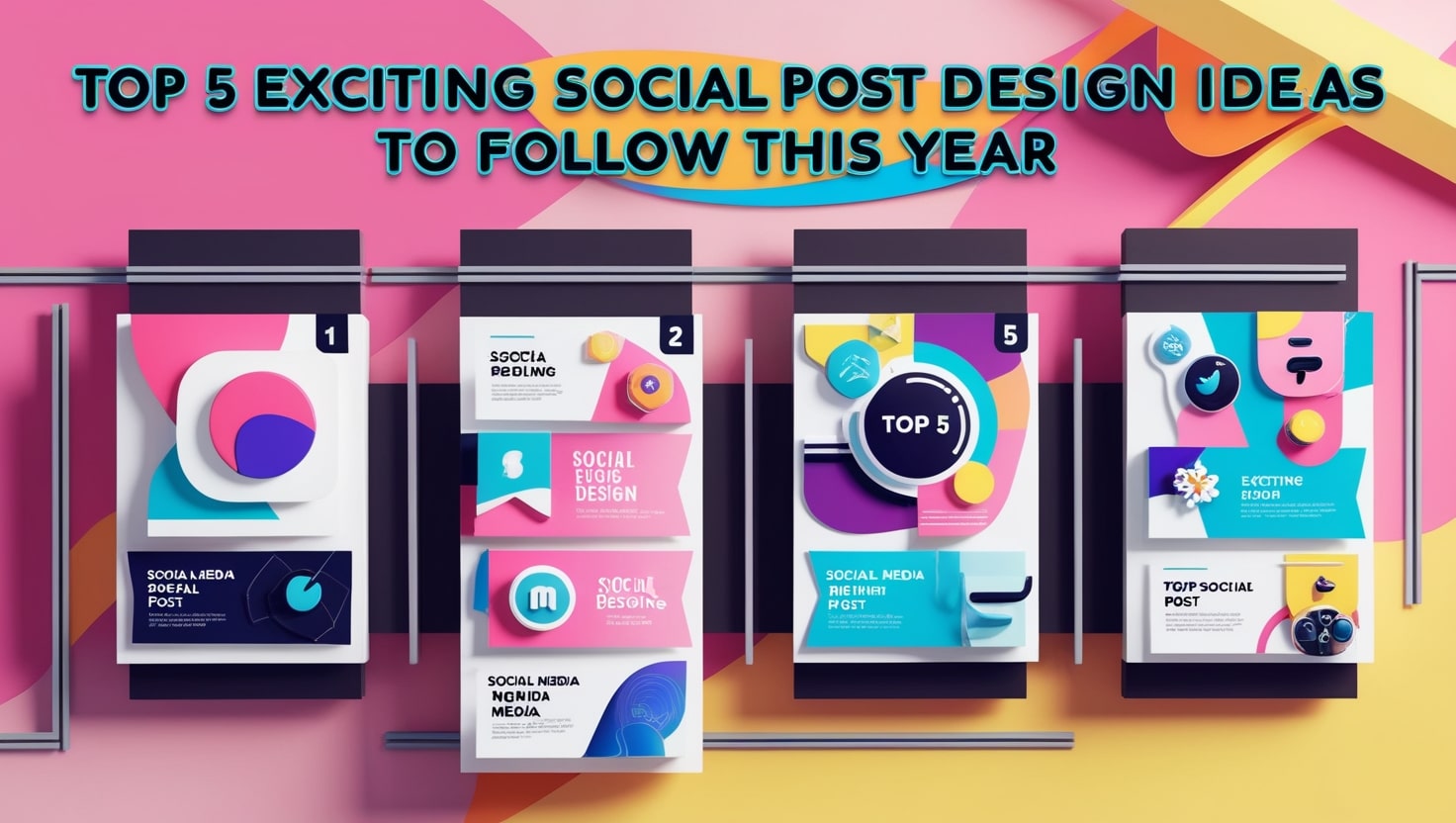
Top 5 Exciting Social Media Post Design Ideas to Follow This Year
Sites formerly used mostly for social media post design ideas purposes have evolved into interactive brainstorming arenas and narratives. It has become imperative that one cannot afford to lag behind in this type of a market environment; opting for creative approaches to social media post design being unavoidable. Regardless of whether you are a brand that wants to engage your consumers or an influencer who is seeking to expand your ability to reach people, aspects of design can greatly improve overall appeal.
Here are the top 5 sensational social media post design ideas that will make it possible for your content to attract the attention of your audience. But before we discuss how modern website designs can incorporate social media properly, we should talk about why this is important in the current state of the internet.
What is Social Media Post Design Importance in 2025?
Establishment of an effective social media post design ideas marketing plan entails much than just posting. It’s about the creation of a brand image that consumers can relate with. Here’s why social media post design ideas are indispensable:
- Visual Content Is King: Out of all the blog post shares, those with visuals have 94% more interaction as opposed to those that do not contain any images.
- Audience Retention: Post that are well designed will usually draw attention and people will spend a longer time looking at such posts.
- First Impressions Matter: Design goes to your approach to work and your dedication level on the projects you handle.
- Consistency Builds Recognition: When design is maintained in a consistent manner across a brand, people begin to have confidence in that brand.
Social media post design ideas well now it is time to dissect five sensational social media post design ideas that you can begin using this year.
1. The Emergence of Minimalist Style
No longer a simple design direction, minimalism has taken on the approach of a lifestyle and found its way to social media post design ideas. While feeds get crowded and noisy, fighting for consumers’ attention, a simplicity – free of distraction – is very welcome.
Why It Works
Social media post design ideas often it is characterized by simplicity and clarity and is used to deliver certain messages. When there is too much white space, if the font selection is clean, and the overall color palette is low contrast, the reader is more focused on the focal points of the post.
How best to apply minimalism to the design of social media post design ideas• Avoid the use of color that will incite or provoke emotions such as red, green, yellow, and orange.• Use current fonts such as sans-serif fonts to increase the readability of your font.• Use texts containing no more than 2–3 lines of actual text matter along with the picture.• When detailing is impossible, employ picture or simple icon images with a clear meaning. trend; it’s a lifestyle movement that has infiltrated the world of social media. With cluttered feeds vying for attention, a clean, minimalistic approach offers a refreshing change.
How to Implement Minimalism in Social Media Post Design
- Use neutral and pastel color palettes for a calming effect.
- Opt for sans-serif fonts for readability and modernity.
- Include concise copy with no more than 2–3 lines of text.
- Use icons or simple vector illustrations to replace detailed imagery.
Example
Think about it: A post with a stable pastel background, a represented product image, and one key message in the large clean typography. This style creates immediate impact without overstimulation of the senses or the application of a constant pressue of colour.
This idea of social media post design ideas based on minimalism is up-to-date with people’s tendency to consume only value adding content hence making it a perfect model for brands this year.
2. Carousel Posts: The Storyteller’s Best Friend
Carousel posts can be dynamic, engaging, and primarily used to tell a story. They enable creators to present an idea in separate slides, while entertaining the followers making them constantly swipe through.
All the Way with Carousel Posts
- Multi-Slide Format: Allows a writer to expand on ideas that they want to share with the reader as opposed to doing it in one single post.
- High Engagement: It was discovered that posts that contain several slide images get higher comments and save ratings as compared to those with fewer images.
- Versatility: Social media post design ideas for tutorials, product demonstrations and narration.
How to Master Carousel Post Design• Ensure coverage of all ideas by creating and labelling different slides, while using a single font, color and alignment technique.• This first slide should be attention grabbing.• This way it is understood that more content is available for swipe.• Enclose the description with a powerful CTA, like “Swipe up for more info” or “Stick this post somewhere you can easily find it.” and perfect for storytelling. They allow creators to break down complex ideas into multiple slides, offering an engaging way to keep followers swiping for more.
How to Master Carousel Post Design
- Maintain visual consistency across all slides by using a consistent font, color scheme, and layout.
- Start with a strong opening slide that piques curiosity.
- Use arrows or icons to indicate that there’s more content to swipe through.
- End with a strong CTA, such as “Swipe up for more details” or “Save this post for later.”
Example
A travel blogger can employ a carousel with the headline saying “5 Best Kept Secrets in Paris.” Each of the could be a separate place, along with stunning visuals and short descriptions. It is a good strategy to apply in post design on social media post design ideas with content that has value to the target market and trendy.
3. Interactive Posts: Polls, Quizzes, and More

Interactivity is arguably the biggest buzzword that defines social media post design ideas success, and that is what makes interactive posts possible. That is why incorporating interaction into your design not only raises engagement rates but also makes people feel like they are part of your community.
Top Ideas for Interactive Content
- Polls: You can ask your followers to do a poll and then deliver them the results in a rather elaborate manner.
- Quizzes: Post a quick personalities test or a trivia game with your own images.
- Countdowns: Use graphics of a countdown to build up people’s interest for an event or product release.
10 design tips for creating better interactive posts• In an English advertisement always try to use bright and strong colours as a tool of attraction.• Large, clickable buttons, or sliders must be included.• Use an easy design and navigation to increase the number of people willing to take part.rail of social media success, and interactive posts are designed to foster just that. Adding an interactive element to your design not only boosts participation but also creates a sense of community among your followers.
Example
Image a restaurant launching a simple poll on Instagram stories where the heading is, “Which one of these desserts should we promote this weekend?” This is a basic, yet powerful social media post design strategy that includes your audience.
4. It is integral to use a bold typography and text overlays.

Social media post design ideas actually, typography collectively refers to certain art forms and if applied properly it can simply enhance any post on social media platforms. This trend entails associating creative fonted texts with spectacular backgrounds that do not distract from the writing.• Can create an instant impact.• Delivers messages well, maybe at a glance.• Designates a contemporary look that is somewhat punk-rock.phy and Text Overlays
Typography is an art form in itself, and when used creatively, it can elevate any social media post design ideas. This trend involves pairing bold, artistic fonts with visually engaging backgrounds to make the text the star of the show.
Why Bold Typography Works
- Grabs attention immediately.
- Communicates messages effectively, even at a glance.
- Creates a modern, edgy vibe.
Social media post design ideas tips on How to Safely Incorporate Strong Typography in Social Media Design• Apply contrasting colorful combinations on the background to get a better result with the text.• You should be able to mix font to create a post that looks almost artistic but should not use more than two types of fonts in a single post.• Make sure that the characters of the text can be read on the different screens of the portable devices.an art form in itself, and when used creatively, it can elevate any social media post. This trend involves pairing bold, artistic fonts with visually engaging backgrounds to make the text the star of the show.
Why Bold Typography Works
- Grabs attention immediately.
- Communicates messages effectively, even at a glance.
- Creates a modern, edgy vibe.
Example
Social media post design ideas whenever you wish to offer a subtle reminder of something to your audience or where appropriate, an effective technique would be using a gradient background and large fonts to motivate your audience. When it is complemented with an attractive headline and amazing graphics and layout, your message is passed on across the population.
Prominent type is one of the simplest concepts you can apply into your social media post design concept especially if you are new in crafting such design.
5. Animated and Motion Graphics

Graphic designs on social media post design ideas are unique and meaningful, but animations and even the more basic motion graphics boost the social media design. It literally moves things around, and given the fact that it attracts attention to whatever it is it moving such that attention is held till the object or image has been moved, it is an important weapon that a brand needs.
Advantages of Animating social media post design ideas• Outcompetes other contents in the first glance in a news feed.• Your brand is likely to benefit from perceived innovations that speak more of our modern and technologically advanced world.• Can be utilized in an unlimited number of ways. posts are impactful, but animations and motion graphics bring a new dimension to social media design. Motion catches the eye and keeps it there longer, making it an essential tool for brands that want to stand out.
Benefits of Animation in Social Media Posts
- Captures attention quickly in a crowded feed.
- Makes your brand appear modern and tech-savvy.
- Offers endless creative possibilities.
As we’ve seen, motion graphics are very versatile, versatile, and can be creatively used in virtually any post on any social media post design ideas network.• Create an animated logo to grab the first attention of the audience by introducing your brand.• Get to the point in their videos, or make short GIFs or looping videos to promote products or an announcement.• Utilize bouncing icons or scrolling texts if you want your interface to have a more lively feel to it.otion graphics bring a new dimension to social media design. Motion catches the eye and keeps it there longer, making it an essential tool for brands that want to stand out.
How to Use Motion Graphics in Your Posts
- Animate your logo for a memorable brand introduction.
- Create short GIFs or looping videos to highlight products or announcements.
- Use animated elements like bouncing icons or scrolling text for a dynamic touch.
Example
Fashion brand could make an animated video where models are displaying new products – clothing – with muscular text descriptions of the suggested items. This brings the ideas of the design of your social media post design ideas into a different level that is almost impossible to achieve with simple static posts.
FAQs
Which social media post design ideas are appropriate for usage?
Canva, Adobe Spark, and Figma are few of many applications that allow advanced users with basic layouts, making the creation of beautiful social media post design ideas easy.
No matter how great a design scheme is, it requires changing in time: how often should I update it?
Due to this, it’s advisable to look for and transform the typical design approaches annually or at least on a quarterly basis to find the latest trending ideas of social media posts designs.
What can I do to get moreengagement in my posts?
Leverage on images and videos bringing balance by incorporating text that is brief and straightforward to avoid the perception of ‘text only’ content and infuse the use of some form of an interactive tool such as polls and quizzes.
How many pixels should a post be for social media post design ideas?
Facebook asks for 600 x 600 pixels and for Twitter the size is 1200 x 675 pixels, meanwhile for Instagram the common size is 1080 x 1080 pixels. Take advantage of the working platform every time.
We all have the debate on whether to be loyal to one style or to try different trends?
Although it is important for doing branding there may be some trends that are good to try from time to time in order to determine what is more effective in reaching out to the public.
Are these design ideas applicable for small business?
Absolutely! Regardless of the size of the business, well designed post will increase visibility and credibility to the intended viewers.
Conclusion
Social media post design ideas fun creating engaging posts has become a requirement more than a choice these days. When you incorporate the tips highlighted above about top 5 social media post design you’ll be able to design content that is visually appealing and highly effective. No matter what, whether it be minimalist design, carousel full of stories or motion graphics, there are plenty of opportunities to take.
Of course, it is essential to bear in mind that social media post design ideas are inextricably connected with the audience, and the brand itself. Remember the year is full of opportunities, take your chances and see the results, on your social sites.
-
 Graphics Design11 months ago
7.Exploring the Importance of Color Theory Charts
-

 Graphics Design10 months ago
15.The Importance of Effective Flyer Design in Marketing
-
 Graphics Design10 months ago
14.Mastering the Art of Print Design: Tips and Tricks
-
 Graphics Design10 months ago
13.Exploring the Latest Trends in Photo Editing Software
-

 Graphics Design8 months ago
29.Retro Design Is Making a Comeback in Modern Spaces
-

 Graphics Design12 months ago
1.The Transforming Power of Typography on Graphic Design
-

 Graphics Design11 months ago
8.The Evolution of Vector Graphics Software
-
 Graphics Design9 months ago
20.The Evolution of Responsive Design: Past, Present, and Future


La weekly
August 23, 2024 at 6:27 pm
La weekly Nice post. I learn something totally new and challenging on websites
miko69
October 21, 2024 at 11:14 pm
Thanks to my father who shared with me on the topic of this website, this weblog is truly awesome.
coloktoto
October 22, 2024 at 6:24 pm
This piece of writing will help the internet visitors for creating new weblog or even a blog from start
to end.
73 erek erek
December 21, 2024 at 12:49 pm
Hi there all, here every one is sharing these know-how, so it’s good to read this web site, and
I used to go to see this website everyday.