
Graphics Design
5 Common Mistakes in Fashion Graphic Design (And How to Avoid Them)
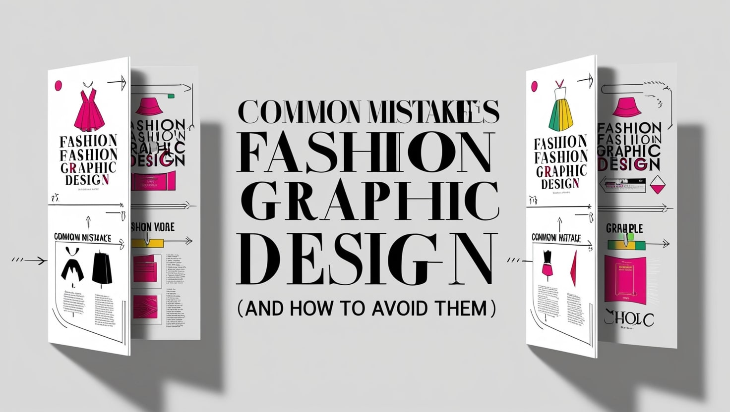
5 Common Mistakes in Fashion Graphic Design (And How to Avoid Them)
Fashion graphic design is one of the significant parts of the fashion business that connects aesthetics and design with other aspects of branding and utility. They decide how the brand’s message is to be conveyed; in reverence to apparel promotions or even retail packaging. Nevertheless, the best designers can also fall foul of certain pitfalls which negatively affect the effectiveness of their designs. Through being aware of such mistakes and knowing ways of overcoming them, there’s a better chance of creating designs that connect with the heart of their audience.
This article discusses the five common mistakes in fashion graphic design and gives detailed information and tips so you get it right.
Introduction: The Unspoken Part of Fashion Graphic Design
Fashion as we know it is a rationale of telling a story and graphic design as we understand it narrates that story. In this case, every logo from the huge letters adorning street-wear to the fine prints on a couture dress is a story in itself. They do not want to provide aesthetic value to what they do; they want to evoke a feeling, show, and tell who they are and what they do.
However, it is rather easy to make some mistakes when covering the topic, especially as far as the described branch is rather volatile. One little mistake in alignment, or print quality issues, or what the audience preferences can be significantly worse. Below is a rundown of what to do, and what not to do when the goal is to design messages that get attention and are memorable.
Mistake 1: Overcomplicating the Design

Complication and creativity are two different things and innovativeness does not just equal intricacy. In fashion graphic design, to much is indeed a bore, and when you crowd a given piece of work with too many elements say, different fonts, colors or shapes, the final result loses its effectiveness or value.
Why It’s Problematic
Complex designs confuse the viewers and lessen the chance of conveying a simple idea. This can be especially symptomatic in the sphere of fashion where minimalism reveals the most striking maximalism.
How to Fix It
- Never use more than two or three different fonts and make sure that you use the same color scheme.
- The negative space in graffiti should be used intentionally to maintain the design symmetrical and highlight the objects at the same time.
- Read the text you created aloud to small groups, and ask them how they like it. In fact, if they don’t get it, give the message in even simpler terms.
In fact, the opposite may be true: simplicity is not the opposite of pattern or flair or interest. It means paying attention to what matters most and provide the viewer with something they will remember, probably something that ‘hits’ them in the face.
Mistake 2: Ignoring the Brand’s Identity

Every fashion brand has a different attitude and the Graphic design for that brand should also embody the same feeling. Sometimes it is ignored by designers, and they come up with designs that are anathema to the brand.
Why It’s Problematic
Inconsistent designs of products defeat customers’ expectation and undermine the image of the brand. That is why their choice of fonts and colors would not be appropriate for a luxury brand like, say, Louis Vuitton to use cartoonish fonts or neon colors, would it?
How to Fix It
- Start with Research: Collect information about the company’s goals, the population it attracts and the aesthetic practices it applies currently.
- Stick to Guidelines: If the brand has specific style guidelines it’s important to stick strictly to them.
- Check Consistency: Make sure it complements other brand giants such as logos and advertisements.
Contrast brings familiarity which is crucial when it comes to fashion because people take time to recognize and trust brands.
Mistake 3: Lack of contemplation of Print Compatibility

The fashion graphic designs sometimes transcend the screen and are printed on fabrics. Failure to consider such a switch leads to dire consequences that perspective distortions, washed-out colors, and misaligned patterns.
Why It’s Problematic
The is because variations in the screen-to-print can easily destroy the quality of a design. Incorrect choice of colors, pixelation or low resolution all mean wasted materials and increased costs.
How to Fix It
- It is always best to work at 300 DPI or above as your image resolution.
- Do not work in RGB because it is more designed for screen colors, instead opt for the CMYK color mode.
Consult with your printer concerning the mechanical specifications of fabric printing. Always use the test samples, if possible, that will help enable your vision on the material is correctly executing the vision you have.
Mistake 4: Failing to Consider the Target Customer

Fashion graphic design is alway relative, since people of different age, sexes, and income levels prefer different types of clothes. There is always danger when creating something for people you do not know and design accordingly, you end up with more of a disconnect.
Why It’s Problematic
A design motivated by teenage users would closely work for middle age working population. Overlooking this factor is counterproductive as well as phasing out the desired target-group.
How to Fix It
- It will also help to make audience personas that consider the age, gender, style preference, and the culture of your target buyers.
- Reproduce currently trending fashion being operated by your target market.
- Get inspiration & Draw insights using tools such as Pinterest, Instagram within a real time context.
Audience analysis is always about getting it right every time your designs and creations are out there.
Mistake 5: Failing to Adapt to Trends
Because the fashion graphic design industry operates generally on trends, it was well equipped for the style shift. Although providing services with classic for all seasons look is desirable, ignoring changes can make the brand look like uninteresting and out of date.
Why It’s Problematic
Fashion graphic design consumers, particularly young ones, are likely to switch allegiance to the new ideas if you do not adapt, and this means losing their perception of you.
How to Fix It
Do not actually read current newspapers or magazines, watch the latest fashion shows, and listen to fashion bloggers and other influencers.
- Try out currently popular techniques such as the 3D design or creating an information and graphic space.
- It is crucial to marry style with tradition so that you don’t create a design that looks dated the moment it begins to show its age.
- In this way, you can be up-to-date to be able to bring trends into the creations you do without sacrificing the novelty of the creative efforts.
As I had earlier mentioned fashion graphic design plays a very important role in the current society.
Fashion graphic design is not just an art, it is a business . It helps improve a brand’s visibility in the market, increase customer allegiance, and make sales. With the right graphics, any piece of cloth becomes a statement and even handbills become something you cannot afford to overlook.
Thus, learning from these five pitfalls helps to turn an environment into a creative space free from the technical and performative hitches.
Top Tips Every Fashion Graphic Designer Should Follow
- Consistency is King: Keep consistency of your colours, fonts and logos to make sure they are not confusing your clients out there.
- Invest in Quality Tools: The best ones are available at a fee, and they include Adobe Illustrator and Adobe Photoshop.
- Focus on Versatility: Design for places where the audience can see your promotional signs, from websites to fabrics.
- Seek Feedback: Consult with your other team members before finalizing work in order to avoid mistakes.
FAQs
Fashion graphic design is an essential part of branding, but its function is not well understood.
Fashion graphic design works as an image missions the identity and prospect of the brand to the target market.
What measures should be taken to reduce common mistakes when designing fashion graphics?
What I found is that by not complicating designs, being faithful to brand image, and being relevant to the current trends, one can/minimize most mistakes.
It is for the above reasons that print compatibility is critical in fashion graphic design for the following reasons;
Color compatibility helps to guarantee that fabrics are printed with the highest possible quality thus eliminating chances of having to reprint materials that might not be as clear or accurate as intended on the fabric.
Creativity and brand identity seem like antithetical concepts: how does one synthesize an understanding of the two?
Any creative process needs boundaries it can play within. Start with the brand’s visual identity and extend creative concepts in line with it.
Fashion graphic design: tools of choice?
Adobe Illustrator and Photoshop are usually used in various fields. Others which are equally useful for specific purposes include Canva and Procreate.
In how many hours should you change your designs?
To maintain consistency in concept and looking while keeping up with trends and prospective customers’ preferences it is crucial to periodically update designs.
Conclusion: Elevating Your Craft
Fashion graphic design is dynamic art that continually undergoes changes based on needs and creativity, innovation, and closures. They can occur but they should not happen, and in fact they are completely avoidable if one follows the right procedures. Every tiny advancement you make towards enhancing your work output is going to have beautiful and developed designs as the output.
The path to mastery is not free from experience hence the best place to learn from experience is on the highway. By excluding these five mistakes, you will acquire more polished work and guarantee that your creations are unique in the current cutthroat fashion industry.
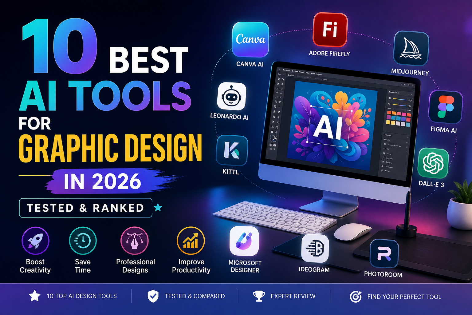
10 Best AI Tools for Graphic Design in 2026 (Tested & Ranked)
Artificial Intelligence has completely transformed the design industry. In 2026, graphic designers are no longer spending hours manually creating visuals — instead, they are leveraging powerful AI tools to automate workflows, generate ideas, and produce high-quality designs in minutes. The rise of AI-powered design platforms has made it easier for beginners, freelancers, and professionals alike to create stunning visuals without extensive technical skills.
In this comprehensive guide, we will explore the 10 Best AI Tools for Graphic Design in 2026. These tools are tested, ranked, and analyzed based on performance, features, ease of use, pricing, and real-world usability. Whether you are a beginner or an expert designer, this article will help you choose the best tool for your workflow.
Why 10 Best AI Tools for Graphic Design Are Essential for Designers in 2026
The demand for faster content creation has pushed designers toward AI-powered solutions. Today, AI tools can generate images, create layouts, remove backgrounds, and even design entire branding kits automatically.
According to recent industry insights, AI tools significantly reduce repetitive tasks such as resizing, editing, and generating design variations, allowing designers to focus more on creativity and strategy. (ToolChase)
This is why the 10 Best AI Tools for Graphic Design are becoming essential for anyone working in digital design, marketing, or content creation.
1. Canva AI (Magic Studio) — Best All-in-One Tool
Canva AI remains one of the 10 Best AI Tools for Graphic Design because of its simplicity and powerful features. It is perfect for beginners and professionals who want quick results.
Canva’s Magic Studio allows users to generate designs from text prompts, remove backgrounds, and even animate graphics instantly. With millions of templates and assets, it’s ideal for social media graphics, presentations, and branding. (tasarim.ai)
Key Features:
- Magic Design (AI-generated layouts)
- Text-to-image generator
- Background remover
- Drag-and-drop editor
Best For: Beginners and marketers
2. Adobe Firefly — Best for Professionals
Adobe Firefly is one of the most powerful tools in the 10 Best AI Tools for Graphic Design list, especially for professionals already using Adobe Creative Cloud.
It integrates seamlessly with Photoshop and Illustrator, offering generative fill, text-to-image, and advanced editing features. It is also trained on licensed data, making it safer for commercial use. (BuildPilot)
Key Features:
- Generative fill
- Style transfer
- Commercial-safe outputs
- Deep Adobe integration
Best For: Professional designers
3. Midjourney — Best for Creative Concepts
Midjourney is widely considered one of the 10 Best AI Tools for Graphic Design for generating high-quality artistic visuals.
Designers use it for mood boards, concept art, and creative exploration. Its ability to produce visually stunning images makes it a favorite among artists. (AI Tools Capital)
Key Features:
- High-quality image generation
- Style consistency
- Artistic rendering
Best For: Concept designers
4. Figma AI — Best for UI/UX Designers
Figma AI is a must-have in the 10 Best AI Tools for Graphic Design list for UI/UX professionals.
It helps designers generate layouts, automate design systems, and collaborate in real-time. It also integrates with plugins for enhanced productivity. (ToolChase)
Key Features:
- AI layout generation
- Real-time collaboration
- Design automation
Best For: UI/UX design
5. DALL·E 3 — Best for Beginners
DALL·E 3 is one of the easiest tools in the 10 Best AI Tools for Graphic Design category.
It allows users to generate images using simple text prompts, making it perfect for beginners who want quick results without technical knowledge. (AI Profit Labs)
Key Features:
- Text-to-image generation
- Easy prompt-based editing
- High-quality outputs
Best For: Beginners
6. Leonardo AI — Best Budget Option
Leonardo AI is among the 10 Best AI Tools for Graphic Design for those looking for affordability and flexibility.
It offers a free plan with daily credits and supports multiple design styles, including gaming assets and illustrations. (designshifu.com)
Key Features:
- Free plan available
- Multiple art styles
- Fast rendering
Best For: Budget users
7. Microsoft Designer — Best Free Tool
Microsoft Designer is a strong competitor in the 10 Best AI Tools for Graphic Design category, offering free AI-powered design features.
It allows users to create social media graphics, presentations, and marketing materials quickly using AI suggestions. (tasarim.ai)
Key Features:
- Free AI design tools
- Quick templates
- Easy interface
Best For: Free users
8. Kittl — Best for Typography Design
Kittl is one of the 10 Best AI Tools for Graphic Design known for its typography and logo design capabilities.
It provides advanced text editing tools and AI-powered design suggestions for branding projects.
Key Features:
- Typography tools
- Logo creation
- Vector editing
Best For: Branding designers
9. Ideogram — Best for Text-Based Designs
Ideogram stands out in the 10 Best AI Tools for Graphic Design for its ability to generate images with accurate text.
This makes it ideal for posters, ads, and social media content.
Key Features:
- Accurate text rendering
- AI-generated posters
- Creative layouts
Best For: Text-heavy designs
10. PhotoRoom — Best for Product Design
PhotoRoom completes the 10 Best AI Tools for Graphic Design list with its powerful product image editing features.
It is widely used for eCommerce and marketing visuals.
Key Features:
- Background removal
- Product mockups
- Batch editing
Best For: eCommerce
Comparison Table: 10 Best AI Tools for Graphic Design
| Tool | Best For | Pricing | Skill Level |
|---|---|---|---|
| Canva AI | All-in-one | Freemium | Beginner |
| Adobe Firefly | Professionals | Paid | Advanced |
| Midjourney | Concept art | Paid | Intermediate |
| Figma AI | UI/UX | Freemium | Advanced |
| DALL·E 3 | Beginners | Freemium | Beginner |
| Leonardo AI | Budget | Freemium | Intermediate |
| Microsoft Designer | Free tools | Free | Beginner |
| Kittl | Typography | Paid | Intermediate |
| Ideogram | Text design | Freemium | Intermediate |
| PhotoRoom | Product design | Freemium | Beginner |
How to Choose the Right AI Tool
When selecting from the 10 Best AI Tools for Graphic Design, consider these factors:
- Purpose: Social media, branding, UI/UX, or product design
- Skill level: Beginner vs professional
- Budget: Free vs paid tools
- Features: Automation, templates, integrations
Future of AI in Graphic Design
The future of design is heavily influenced by AI. Tools are becoming smarter, faster, and more intuitive. New advancements are focusing on automation, collaboration, and real-time editing.
However, AI is not replacing designers — it is enhancing their capabilities and allowing them to work more efficiently. (ToolChase)
Final Verdict
The 10 Best AI Tools for Graphic Design in 2026 offer something for everyone — from beginners to professionals. Tools like Canva AI and Adobe Firefly dominate the market, while Midjourney and Leonardo AI provide creative flexibility.
If you are just starting, go with Canva or DALL·E 3.
If you are a professional, Adobe Firefly and Figma AI are your best options.
Conclusion
The rise of AI has made graphic design more accessible than ever before. By using the 10 Best AI Tools for Graphic Design, you can create high-quality visuals, save time, and boost productivity.
Whether you are a freelancer, business owner, or content creator, these tools will help you stay ahead in 2026 and beyond.
Color Theory for Designers – A Beginner’s Guide to Smart Color Choices
Color plays a powerful role in graphic design. Whether you’re creating a logo, website, social media post, or t-shirt design, understanding color theory for designers helps you make smart, strategic decisions.
Color influences mood, brand perception, and even buying behavior. If you want your designs to look professional and communicate clearly, mastering color theory is essential.
In this beginner’s guide, you’ll learn the basics of the color wheel, color harmony, emotional color meanings, and the best tools to create stunning color palettes.
Why Color Theory Is Essential in Design
Color theory is the foundation of visual communication. It helps designers:
- Create visually balanced compositions
- Build strong brand identities
- Trigger emotional responses
- Improve readability and accessibility
- Increase conversions and engagement
For example, brands like use red to create excitement and energy, while uses blue to build trust and reliability.
When you understand color psychology and harmony, you design with intention—not guesswork.
The Color Wheel Basics
The color wheel is a circular diagram that organizes colors based on their relationships.
It was first developed by in the 17th century. The modern color wheel helps designers understand how colors interact with each other.
There are three main categories on the color wheel:
- Warm colors (Red, Orange, Yellow)
- Cool colors (Blue, Green, Purple)
- Neutral colors (Black, White, Gray, Brown)
Warm colors feel energetic and bold. Cool colors feel calm and professional.
Understanding the color wheel is the first step to mastering color harmony.
Primary, Secondary, and Tertiary Colors
1. Primary Colors
Primary colors cannot be created by mixing other colors.
- Red
- Blue
- Yellow
These are the base of all other colors.
2. Secondary Colors
Secondary colors are made by mixing two primary colors.
- Red + Blue = Purple
- Blue + Yellow = Green
- Red + Yellow = Orange
3. Tertiary Colors
Tertiary colors are created by mixing a primary and a secondary color.
Examples:
- Red-Orange
- Yellow-Green
- Blue-Purple
Using primary, secondary, and tertiary colors correctly helps create balanced and attractive designs.
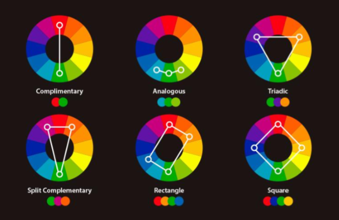
Color Harmony: Complementary, Triadic, and Analogous
Color harmony refers to combinations of colors that look pleasing together.
1. Complementary Colors
These are colors opposite each other on the color wheel.
Examples:
- Blue & Orange
- Red & Green
- Yellow & Purple
Complementary colors create high contrast and bold designs. Great for call-to-action buttons.
2. Triadic Colors
Triadic color schemes use three evenly spaced colors on the wheel.
Example:
- Red, Blue, Yellow
This combination creates vibrant and balanced designs.
3. Analogous Colors
Analogous colors sit next to each other on the color wheel.
Examples:
- Blue, Blue-Green, Green
- Red, Red-Orange, Orange
These create soft, harmonious, and natural-looking designs.
Choosing the right color harmony makes your design look professional and intentional.
Emotional Meaning of Colors
Color psychology plays a huge role in branding and marketing.
Here’s what common colors represent:
- Red – Energy, passion, urgency
- Blue – Trust, calm, professionalism
- Yellow – Happiness, optimism
- Green – Growth, health, nature
- Purple – Luxury, creativity
- Black – Power, elegance
- White – Simplicity, cleanliness
For example, luxury brands often use black and gold for a premium look. Eco-friendly brands prefer green to reflect sustainability.
Understanding emotional meaning helps designers choose colors that match the brand message.
Best Color Tools for Designers
Choosing the right colors becomes easier with professional tools.
1.
Coolors is a fast and easy color palette generator. You can lock colors and generate variations instantly.
2.
Adobe Color allows you to create palettes using color harmony rules like complementary, triadic, and analogous.
It also integrates smoothly with Adobe software like and .
These tools help you experiment and create professional color schemes quickly.
FAQ: What Are the Best Color Combinations?
There is no single “best” color combination. It depends on:
- Your target audience
- Brand personality
- Industry
- Cultural context
However, some popular combinations include:
- Blue & White (Clean and professional)
- Black & Gold (Luxury and premium)
- Purple & Yellow (Creative and bold)
- Green & Beige (Natural and organic)
The best approach is to test and refine your palette based on real design projects.
FAQ: Does Color Affect Conversions?
Yes, color significantly affects conversions.
Studies show that color can influence purchasing decisions and brand recognition. For example:
- Red creates urgency in sales banners
- Green encourages action (often used for CTA buttons)
- Blue builds trust on websites
Choosing the right call-to-action color can increase click-through rates and sales.
Conclusion: Practice Using Real Projects
Understanding color theory for designers is not just about learning rules—it’s about applying them.
Start practicing by:
- Redesigning a logo with different color harmonies
- Creating 3 social media posts using complementary colors
- Testing CTA button colors on your website
The more you experiment, the stronger your color instincts will become.
Smart color choices transform ordinary designs into powerful visual experiences.
Now it’s your turn—start creating with confidence! 🎨
Graphics Design
12 Expert Tips for Color Theory for Designers – A Beginner’s Guide to Smart Color Choices
12 Expert Tips for Color Theory for Designers – A Beginner’s Guide to Smart Color Choices
Introduction: Why Color Theory Matters in Design
Color theory for designers is one of the most powerful tools a designer has. Before you even read a word of text, color communicates mood, directs the viewer’s eye, and sets expectations. That’s exactly why understanding Color Theory for Designers – A Beginner’s Guide to Smart Color Choices is essential for anyone working in branding, web design, advertising, illustration, or UI/UX.
Color influences everything—attention, emotion, readability, and even conversion rates. When designers understand how colors relate, how they harmonize, and how they affect human psychology, their designs instantly become more polished, professional, and strategic.
Color theory for designers isn’t just artistic intuition; it’s a structured system of rules that designers rely on to make deliberate choices. Instead of guessing which colors “look good,” you’ll understand why they work. And once you master the basics, you can confidently create palettes that feel balanced, meaningful, and visually appealing.
Understanding the Color Wheel

The color theory for designers wheel is the foundation of color theory. It visually organizes colors in a circle, making it easy to understand how they relate and contrast.
Hue, Tone, Shade, and Tint
To use colors effectively, you need to understand these essential terms:
- Hue: The base color itself—red, blue, green, etc.
- Tone: Hue mixed with gray, resulting in softer, muted colors.
- Shade: Hue mixed with black, creating deeper, richer colors.
- Tint: Hue mixed with white, producing light, pastel versions.
These components help designers adjust mood and clarity. Soft tints feel gentle and friendly, whereas dark shades feel dramatic and bold.
Warm vs. Cool Colors

Warm colors—red, orange, yellow—bring energy and excitement. They draw attention quickly.
Cool colors—blue, green, purple—create calmness, trust, and relaxation.
Using warm and cool colors together can create visual balance, especially in user interfaces and branding.
Primary, Secondary, and Tertiary Colors

These groups form the backbone of the entire color wheel.
Primary Colors
- Red
- Blue
- Yellow
They cannot be created from other colors.
Secondary Colors
These are created by mixing two primary colors:
- Red + Blue = Purple
- Red + Yellow = Orange
- Blue + Yellow = Green
Tertiary Colors
Tertiary colors are formed when you mix a primary color with a secondary color. Examples include:
- Blue-green
- Yellow-orange
- Red-violet
Using These Groups in Branding
Primary color theory for designers often serve as core brand colors because they feel strong and memorable. Secondary and tertiary colors support the palette, adding dimension and flexibility for UI elements, icons, and backgrounds.
Color Harmony Fundamentals
Color harmony is about using colors in combinations that look pleasing and balanced.
Complementary Schemes
Complementary colors sit directly opposite each other on the color wheel. Examples include:
- Blue & Orange
- Red & Green
- Yellow & Purple
These pairs create high contrast, which is perfect for call-to-action buttons, posters, or impactful visual elements.
Triadic Palettes
A triadic palette forms a triangle on the color wheel—for example:
- Blue, Red, Yellow
- Purple, Orange, Green
Triadic schemes offer bold contrast while maintaining harmony.
Analogous Harmony
Analogous colors sit beside each other on the color wheel:
- Blue, Blue-Green, Green
- Red, Orange, Yellow
Analogous schemes feel calm and unified—great for backgrounds, illustrations, and user-friendly interfaces.
Psychological and Emotional Impact of Color

Color theory for designers influences human emotion across all forms of design.
Common Emotional Meanings
- Red: energy, urgency, passion
- Blue: trust, professionalism, reliability
- Yellow: optimism, creativity, cheerfulness
- Green: growth, calmness, environment
- Purple: luxury, imagination, spirituality
- Black: sophistication, strength, elegance
- White: simplicity, clarity, cleanliness
Understanding these meanings helps designers craft purposeful visual messages.
Cultural Interpretations
Color theory for designers don’t carry the same meaning in every culture.
For example:
- In the West, white symbolizes purity. In parts of Asia, it represents mourning.
- In China, red is a color of good fortune and celebration.
- In the U.S., blue often represents trust or corporate professionalism.
A designer must always consider cultural context when creating global products or branding.
Best Tools for Creating Color Palettes

Technology makes color exploration easier than ever.
Coolors
Color theory for designers is a fast, beginner-friendly palette generator. With just a click, you can lock colors, tweak brightness, and explore harmonious combinations.
Adobe Color
Adobe Color is designed for professionals. It offers:
- A digital color wheel
- Harmony suggestions
- Accessibility contrast checking
- Compatibility with Adobe Creative Cloud
This tool is perfect for branding, UI design, and large-scale visual projects.
Practical Tips for Designers to Choose Better Colors
- Start With One Base Color
Choose one color that represents the project’s mood. Build the palette around it using harmony rules.
- Consider Accessibility
Not all users see color the same way. Use contrast tools to ensure readability for people with low vision or color blindness.
- Limit Your Palette
Too many colors can overwhelm the viewer. Most branding systems use 3–5 main colors.
- Use Neutrals to Balance Your Palette
Whites, blacks, grays, and beiges provide breathing room around strong colors.
- Match Colors to Brand Personality
- Tech brands use blues for trust
- Eco brands lean toward greens
- Luxury brands prefer black, gold, or purple
FAQs
- What are the best color combinations?
Complementary and triadic combinations create the strongest visual impact, while analogous combinations create a pleasing, natural flow.
- Does color affect conversions?
Absolutely. High-contrast colors—especially for buttons—can dramatically improve user engagement and sales.
- Which tools help beginners learn Color theory for designers?
Coolors, Adobe Color, Paletton, and Canva’s palette generator are great.
- How can I pick colors for branding?
Focus on brand personality, target audience emotion, and industry standards. Start with a strong primary color.
- Are there colors designers should avoid?
Avoid extremely saturated combinations unless used sparingly for accents.
- How do I test color accessibility?
Tools like WebAIM and Adobe Color’s contrast checker help ensure your palette meets WCAG guidelines.
Conclusion: Practice Through Real-World Projects
Color theory for designers becomes easier the more you practice. Whether you redesign a homepage, create a logo, or experiment with advertisement layouts, real projects help you develop an intuitive understanding of color. The goal isn’t perfection—it’s learning to make intentional, smart choices that fit your message and audience.
The more you explore the color wheel, test harmony rules, and practice palette creation, the stronger your design skills will become.
-

 Graphics Design2 years ago
7.Exploring the Importance of Color Theory Charts
-

 Graphics Design12 months ago
Top 10 Best Graphic Design Tools for Beginners in 2025 (Free & Paid)
-

 Graphics Design2 years ago
10 Stunning Gradient Design Trends You Need to Know in 2024
-

 Graphics Design11 months ago
15 Freelance Graphic Design Tips to Boost Your Career in 2025
-

 Graphics Design2 years ago
29.Retro Design Is Making a Comeback in Modern Spaces
-

 Graphics Design1 year ago
Best Laptops for Graphic Designers – 2025 Buying Guide
-

 Graphics Design1 year ago
2025 Logo Design Trends: What’s In, What’s Out?
-

 Graphics Design2 years ago
15.The Importance of Effective Flyer Design in Marketing
commercial truck scales in Kirkuk
December 16, 2024 at 11:38 pm
Serving Iraq with pride, BWER supplies high-performance weighbridges designed to improve transport logistics, reduce inaccuracies, and optimize industrial processes across all sectors.