
Graphics Design
5 Best Graphic Design Software for MacBook Users in 2024


5 Best Graphic Design Software for MacBook Users in 2024
Graphic design software for MacBook refers to a process where one uses art and technology to pass message with the help of visuals. If you are a fan of MacBook you already know that Apple’s slim and effective machines are ideal for design. However, if you want to get the absolute best from your MacBook, then it is time to seek the proper graphic design software for MacBook. In 2024, there are various choices possible and each is equipped with proper set of tools and functionalities to suit the varied requirements of the design professionals.
And in this article, we are going to make a step by step **review of the five best graphic design software for MacBook ** and direct You to specific software for different levels, from a complete beginner to a professional.
Outline
- Introduction
- Top Considerations for Choosing Graphic Design Software
Compatibility with MacOS
Features and usability
Pricing
Learning curve
- 1. Adobe Photoshop
Key features
Pros and cons
Ideal for
Pricing
- 2. Adobe Illustrator
Key features
Pros and cons
Ideal for
Pricing
- 3. Affinity Designer
Key features
Pros and cons
Ideal for
Pricing
- 4. Sketch
Key features
Pros and cons
Ideal for
Pricing
- 5. CorelDRAW
Key features
Pros and cons
Ideal for
Pricing
- Which Software is Best for Beginners?
- Which Software is Best for Professionals?
- Free vs. Paid Graphic Design Software
- Conclusion
- FAQs
Introduction
Graphic design software for MacBook whether one is designing a logo or a website or illustrating a highly complex vector graphic, selection of the correct software is impeccable to one’s creativity. As on now there are lots of graphic design programs available in the market, and deciding which one will work with your MacBook as well as for your project, can really be confusing. That’s why, to help you avoid much searching and choice, we have found the **top 5 graphic design software for Mac, 2024**.
Graphic design software for MacBook here you will find out about more traditional software like Adobe Photoshop and Illustrator as well as newer tools ranging from Affinity Designer to Sketch. At the end of this tutorial, you’d be fully aware of the software that matches your design preferences and needs.
Top Considerations for Choosing Graphic Design Software

But, now let’s brief, what criteria you ought to take into consideration while opting for the best design software?
- Compatibility with MacOS: Make sure that the Graphic design software for MacBook is compatible with your Mac operational system.
- Features and Usability: Try to identify those that neatly sit in between being excessively complicated as well as being overly simplistic.
- Pricing: They may be costly, and some others are free, and others may be available only for a one-time payment.
- Learning Curve: Graphic design software for MacBook most importantly, the time it may take before one can master the software is determinable irrespective of the level of expertise one has.
Now, let’s look at the best Graphic design software for MacBook user in 2024.
1. Adobe Photoshop

Adobe Photoshop remains the market leader in graphic design software for MacBook and for a good cause. One great thing about this program is it is almost all comprehensive, providing a lot of tools useful for almost anyone – photographers, illustrators, web designers, and the like.
Key Features
- Advanced photo editing tools
- Supporting Layers, masks and blending modes
- 3D design capabilities
- This set includes a brush library for digital painting.
- Neural filters: the possibilities of AI in post-production
Pros
- Industry standard
- Evaluating relatively limitless online and tutorial materials
- Messages about everything from updated content to new features that are part of the application.
Cons
- Expensive subscription model
- Greater difference between performance novice and competitor
Ideal for
- These professions include; professional designers, photographers and digital artists.
Pricing
- Adobe Photoshop can be downloaded by using Adobe Creative Cloud, where it is the main program and the cost starts from $20.99 monthly.
2. Adobe Illustrator

Graphic design software for MacBook if you are into vector graphics, look no further, **Adobe Illustrator** is one for the books. Illustrator is especially suitable in producing anything starting from logos, up to intricate illustrations and accurate scalable vector images.
Key Features
- Vector-based drawing tools
- Blend with other Adobe products without any hitch
- Excellent typography tools
- It can be observed that bright, vivid colour and gradient capabilities are well established.
- Flexible art for both printed and electronic version
Pros
- Strong functions for the manipulation of vectors
- fit for logos, icons as well as illustrations
- Easy to use for professional Graphic designers
Cons
- Subscription-only model
- Data loading can be a bit demanding on the earlier versions of MacBooks.
Ideal for
- joint illustrators, artists of logo designs, and branding specialists
Pricing
- Accessible from Adobe Creative Cloud starting at $20.99 per month.
3. Affinity Designer

Affinity Designer is a graphic design software for MacBook cheaper version of Adobe Illustrator that allows its users to do almost as many things just without the monthly payments to use the tools. It doesn’t cost as much as some of its more mainstream counterparts and is particularly popular with freelancers and small studios.
Key Features
- Actual performance and non-degradation experience
- I can switch effortlessly from working in a vector workspace to a raster workspace and vice versa.
- Pay once and use the service without needing to pay for subsequent months or years.
- High power zoom for fine work
Pros
- Cost-effective
- Clean and intuitive interface
- Ideal to be used in both vector and raster environments
Cons
- Not as many modes as Illustrator.
- Does not have the rich set of plugins that Adobe does
Ideal for
- Independent workers, sole traders, and designers who work under cost constraints
Pricing
- It only costs $54.99 once to have access this database without any monthly fees to pay.
4. Sketch

Graphic design software for MacBook: Sketch is targeted to UI/UX designers and is on the list of the best tools to create websites and applications interfaces. Owing to its simplicity and ability to encourage the integration of groups working on a project, the tool fits well for teamwork in digital projects.
Key Features
- Tailored for UI/UX design
- Graphic user interface and it has features as in drag and drop type of interface.
- Integrated technologies that promote working together on a project in real time and with the inclusion of feedback features.
- CSS for collaborative academic work environments
Pros
- Intensively celebrities, focused and highly thus, guest and communities.
- Collaboration tools offered due to cloud computing
- Often replenished with new features related to UI/UX
Cons
- Reduced value for print or illustration graphic design
- Additional plugins may be needed for enhanced ability.
Ideal for
- This course will be suitable for UI/UX designers, web developers, and digital product designers
Pricing
- Instead, Sketch runs as a subscription service that costs $9 per month for the individual and $90 for the team.
5. CorelDRAW

**CorelDRAW** is a flexible tool for the graphic design containing vector illustration, layout, and photo editing tools. This is a long standing competitor to Adobe, which has a range of tools geared toward professional designers.
Key Features
- Useful interface elements for vectors
- Multiple Tiers and Multiple Pages
- Over color and typography, clients would be in a position to have very precise control.
- Assistance is provided in terms of both vector and raster graphic formats.
Pros
- User-friendly interface
- Ideal in managing vector and raster graphic designs as well.
- One-time purchase available
Cons
- Not very compatible with other graphical software applications
- Compared with cloud solutions, it has fewer collaborative applications.
Ideal for
- Working professionals who want a single design solution for both print and web design
Pricing
- Currently, there is an option to buy a license for $499 and choose charged $34.99 monthly subscription as well.
Graphic design software for MacBook while there are several great pieces of software for learning how to code, the better question might be, which software is best for beginners who hope to eventually transition to working at an experienced level in a code-intensive career?
Graphic design software for MacBook if you are just entering this realm, then two tools that are perfect for you are **Affinity Designer** and **Sketch**. Each of them is characterized by the simple navigation and relatively low cost, while not limiting in features. Sketch is most valuable if you work on digital/web design.
Which Software is Best for Beginners?

Graphic design software for MacBook for mature designers, **Adobe Photoshop** and **Illustrator** are still the hot applications. Due to their extensive tool palettes, sophisticated functionalities, and regular enhancements, they suit professionals requiring high Level performance. CorelDRAW is also another ideal software for those who do not want to work with subscriptions but rather have an ideal one-time purchase.
Which Software is Best for Professionals?
Graphic design software for MacBook for those who do not want to pay or are just starting their designing career, there are many options of free graphic design tools such as **GIMP** and **Inkscape**. However, paid software is often much more powerful, provides more comprehensive support and is updated regularly. If you are serious about a design career or any professional work, using paid software like **Adobe Creative Cloud** or **Affinity Designer** can enhance a lot of your work efficiency and results.
Conclusion
Graphic Design Software for MacBook selecting the app that is ideal for you in 2024 depends solely on your preferences, concentration on a specific kind of design, and the sum that you are willing to spend. **Adobe Photoshop** and **Illustrator** remains as the best if you want a full package option for the professional, while **Affinity Designer** gives a cheaper option for the new designers as well as for the professional who need a good graphic design tool. **Sketch** is preferred by the UI/UX designers, and **CorelDRAW** will be beneficial for designers who work in different fields. Go slow, work with campaigns, and locate the software that allows for the pinnacle of creativity.
FAQs
- What is the best free graphic design software Mac you can use today?
There are also free ones such as GIMP though it is more hard coded than many of the paid software.
- Are these programs compatible with older models of MacBook?
Yes, but working in programs such as Photoshop and Illustrator on old models and with large files, it may be slower.
- Does these software options have cloud storage?
Some apps have a native cloud storage like Adobe Creative Cloud and Sketch while others like Affinity Designer have their own cloud services.
- Which is the simplest program to use in graphic designing for a newbie?
Affinity Designer and Sketch the best graphic Design Software for MacBook are easy to use and can be recommended for everyone, particularly if you’re aimed towards vector or UI/UX design.
- Could these tools be used for the UI/UX context?
Yes, Sketch is used mostly for UI/UX designing, though Adobe XD and Illustrator often come into use in the same domain.

7 Freelance Graphic Design Mistakes That Can Cost You Clients
Landing your first few clients feels amazing. Keeping them is a different story.
Many talented designers lose work, not because their art is weak, but because of avoidable habits. Small mistakes in communication, pricing, and process quietly push clients away.
If you run a Freelance Graphic Design business, every client relationship is an asset. One lost client means lost income, lost referrals, and lost momentum.
The good news is that these problems are fixable. Once you know what to look for, you can protect your reputation and build a steady pipeline.
In this guide, you will learn seven common Freelance Graphic Design mistakes and exactly how to avoid them. Each section includes practical steps you can apply this week.
Whether you are new to Freelance Graphic Design or have years of experience, you will probably spot at least one habit that needs attention. Let’s get into it.
Why Mistakes Matter So Much in Freelance Graphic Design
Clients rarely complain out loud. They simply stop replying, choose another designer, or never refer you to a friend.
That silence is expensive. Studies of small business behavior consistently show that winning a new customer costs far more than keeping an existing one.
In Freelance Graphic Design, your service is the product. Clients judge you on creativity, but also on reliability, clarity, and how easy you are to work with.
Think of every project as a job interview for the next one. That mindset is powerful in Freelance Graphic Design. Each email, invoice, and file delivery tells the client whether you are a safe long-term choice.
Fixing the seven mistakes below will help you look more professional, earn better rates, and keep clients coming back.

Mistake 1: Skipping the Client Brief and Discovery Process
The fastest way to waste time is to start designing before you understand the project. That is true across all Freelance Graphic Design work.
Many beginners in Freelance Graphic Design are so eager to impress that they open their software the moment a client says yes. The result is usually a wrong direction and endless revisions.
What This Mistake Looks Like
A client sends a short message: “Need a logo for my bakery, something modern.” You reply with a quote and start sketching.
Weeks later, the client says the design feels cold, because they wanted a warm, family-style brand. You never asked who their customers were.
Why It Costs You Clients
Without a clear brief, you are guessing. Guessing leads to missed expectations, and missed expectations lead to unhappy clients.
Revision rounds multiply. Your profit shrinks, your patience wears thin, and the client starts doubting your skills.
Professional Freelance Graphic Design depends on strategy first and visuals second. A client who feels understood trusts you more.
How to Fix It
Create a simple discovery questionnaire and send it before every project. Keep it short so clients actually complete it.
Include questions like these:
- What does your business do, and who is your ideal customer?
- Which three words describe your brand personality?
- Which competitors or brands do you admire, and why?
- Where will the design be used, such as print, web, or social media?
- What is the deadline, and who approves the final design?
Follow up with a short call if answers are vague. Ten minutes of conversation can save ten hours of rework.
Also ask the client to share examples they like and dislike. Visual references reveal taste much better than adjectives.
Finally, summarize the brief in writing and ask the client to confirm it. This one habit protects both sides.

A Real-World Example
Imagine two designers who receive the same request for a bakery logo. The first starts designing immediately and sends three random concepts. The second sends a questionnaire, learns that the owner wants a cozy, handmade feel, and delivers one focused concept.
The second designer wins the project and a long-term client. This simple difference explains why discovery matters so much in Freelance Graphic Design.
Clients do not remember how many hours you spent. They remember whether you understood them.
Questions Worth Asking Every Time
Some questions uncover hidden expectations. Ask about budget range, brand values, and past design experiences. Ask what success looks like in six months.
These answers shape your creative decisions and help you justify your choices later. They also show that your Freelance Graphic Design process is organized and thoughtful.
If a client refuses to answer, explain that the brief protects their budget. Most will cooperate once they see the benefit.
Quick Takeaway
Never design blind. A strong brief is the foundation of every successful Freelance Graphic Design project and the easiest way to prevent revision headaches.
Mistake 2: Underpricing Your Work (or Not Knowing Your Worth)
Pricing is where many designers struggle most. Charging too little feels safe, but it often backfires. In Freelance Graphic Design, pricing mistakes are a common reason talented designers quit.
What This Mistake Looks Like
You quote a very low price to win the job. The client says yes immediately, which should be a warning sign.
Soon you are working long hours for a rate that barely covers your software subscriptions, taxes, and time.
Why It Costs You Clients
Low prices attract clients who value cheap work. These clients tend to demand more revisions, pay late, and leave when they find someone cheaper.
Underpricing also signals low confidence. Serious businesses often assume that a very low quote means low quality.
In Freelance Graphic Design, burnout is a real risk. When you are underpaid, you rush, your quality drops, and clients notice.
How to Fix It
Start by calculating your real costs. Add up software, equipment, internet, taxes, health expenses, and unpaid time for admin work.
Then decide the income you want. Divide that figure by the number of billable hours you can realistically work.
Here are practical ways to set prices with confidence:
- Use project-based pricing for clearly defined work like logos and brochures.
- Use hourly or retainer pricing for ongoing support and unclear scopes.
- Offer three packages, such as Basic, Standard, and Premium, so clients can choose.
- Raise your rates every six to twelve months, especially when your skills grow.
Do not apologize for your price. State it calmly and explain the value, including the outcome, the process, and what is included.
Clients pay for results, not hours. A logo that helps a business look trustworthy is worth far more than the time spent drawing it.

A Simple Pricing Example
Suppose you want to earn a modest monthly income and can realistically bill 80 hours each month. Divide your target by those hours, and you get your true hourly rate.
Many beginners skip this math, then wonder why Freelance Graphic Design feels exhausting. A little arithmetic can reveal that your current prices are far too low.
How to Talk About Price Confidently
When a client says your quote is too high, do not rush to discount. Ask which part of the project concerns them most.
Offer to adjust the scope instead of the price. Remove a deliverable, reduce the number of concepts, or extend the timeline. This keeps your rate intact and respects the client’s budget.
Confident pricing conversations are a core skill in Freelance Graphic Design, and they get easier with practice. Over time, you will attract clients who see your rates as fair.
Quick Takeaway
Fair pricing builds respect. Successful Freelance Graphic Design professionals price for value, protect their time, and attract clients who appreciate quality.
Mistake 3: Working Without a Contract or Clear Scope
A handshake and a friendly email are not enough. Without a contract, you are exposed. Every serious Freelance Graphic Design business needs written terms.
What This Mistake Looks Like
The client asks for a “small change.” Then another. Then a new version for Instagram, a banner for the website, and a brochure.
None of this was in the original quote, but nothing in writing says it was excluded. This problem is called scope creep.
Why It Costs You Clients
Scope creep creates resentment. You feel taken advantage of, and the client feels you are being difficult when you finally push back.
Disputes over payment, ownership, and deadlines can end the relationship overnight. In some cases, you may never get paid.
Contracts make Freelance Graphic Design safer and more professional. They show that you run a real business and respect the client’s investment.
How to Fix It
Use a simple written agreement for every project, no matter how small. It does not need to be filled with legal jargon.
A strong contract usually covers the following:
- A detailed description of deliverables and file formats.
- The number of included revision rounds.
- The timeline, milestones, and approval process.
- Total fees, deposit, and payment schedule.
- Ownership and usage rights after final payment.
- A clause for extra work, cancellations, and late fees.
Always request a deposit, commonly 30 to 50 percent, before starting. This confirms commitment and protects your time.
When the client asks for something outside the scope, respond politely. Say, “I’d be happy to help with that. Here is a quick quote for the additional work.”
This approach keeps the relationship friendly while protecting your income. If a project is large or complex, consider asking a lawyer to review your template once.

Contract Red Flags to Watch For
Some clients hesitate to sign anything. Others ask you to start work before agreeing on terms. Treat these moments as warning signs.
A client who respects your time will respect a contract. If someone pushes back on basic protections, consider whether the project is worth the risk in your Freelance Graphic Design business.
Payment Terms That Protect You
Use milestone payments for larger projects. For example, collect a deposit upfront, a second payment after concept approval, and the final payment before releasing source files.
Add a late fee to your invoices and state the due date clearly. Strong payment terms are one of the simplest ways to make Freelance Graphic Design sustainable.
Never hand over final files until payment is complete. This single rule prevents many headaches.
Quick Takeaway
A clear scope prevents arguments. In Freelance Graphic Design, the contract is your safety net, and good clients appreciate the clarity.
Mistake 4: Poor Communication and Slow Responses
Great design cannot save a project when the client feels ignored. In Freelance Graphic Design, silence is costly.
What This Mistake Looks Like
An email sits unanswered for three days. The client asks for an update, and you reply with a vague “working on it.”
Deadlines pass without warning. The client learns about delays only after asking.
Why It Costs You Clients
Most clients are not experts in design, so they judge you by how you communicate. Silence creates anxiety, and anxiety creates doubt.
Many clients say they would hire a slightly less talented designer who communicates well over a genius who disappears.
Reliable communication is a major competitive advantage in Freelance Graphic Design, because so many competitors fail at it.
How to Fix It
Set expectations from day one. Tell clients your working hours, your usual reply time, and your preferred communication channel.
Try these simple habits:
- Reply to messages within one business day, even if only to confirm receipt.
- Send a short progress update at each milestone.
- Warn the client early if a delay is possible, and offer a new date.
- Summarize calls in an email so decisions are documented.
- Keep all feedback in one thread or project tool to avoid confusion.
Use tools to stay organized. Project boards, shared folders, and proofing tools make feedback clear and traceable.
Be honest when problems appear. Clients forgive delays far more easily than surprises.
Tone matters too. Stay warm, concise, and professional, even when feedback feels harsh. A calm reply protects the relationship.

Setting Communication Boundaries
Being responsive does not mean being available at all hours. Share your working schedule and stick to it.
Clear boundaries make your Freelance Graphic Design services feel more professional, not less. Clients respect designers who manage their time well.
Handling Difficult Conversations
Sometimes you must deliver unwelcome news, such as a missed deadline or a request that exceeds the scope. Address it quickly and offer a solution.
Use a simple formula: state the issue, explain the impact, and propose the next step. This approach shows accountability and keeps trust intact.
Practicing honest communication will strengthen every part of your Freelance Graphic Design career, from small projects to large retainers.
Quick Takeaway
Communication is part of the service. Strong communicators turn one-time projects into long-term partnerships.
Mistake 5: Ignoring Your Portfolio and Personal Branding
Your portfolio is your sales page. If it is weak, outdated, or confusing, clients will move on within seconds. Freelance Graphic Design clients hire what they can clearly see.
What This Mistake Looks Like
Your website shows thirty random projects with no explanation. Some are school assignments, some are old, and some do not match the clients you want.
Your social profiles use different names, colors, and bios. Nobody can tell what you specialize in.
Why It Costs You Clients
Clients want proof that you can solve their kind of problem. A messy portfolio makes them unsure whether you can.
Generalists often compete on price, while specialists compete on expertise. A focused brand helps you charge more.
For Freelance Graphic Design, your own branding is the best demonstration of your skills. If your brand looks careless, clients assume your client work will too.
How to Fix It
Curate your portfolio. Show your best six to ten projects rather than everything you have ever made.
Turn each project into a short case study. Explain the client’s problem, your process, and the result.
Include these elements in each case study:
- The brief and goals.
- Your design decisions and why you made them.
- Before-and-after visuals or mockups.
- Measurable results, such as increased sales or engagement.
- A short testimonial from the client.
Choose a niche if you can, such as restaurants, startups, or healthcare. A clear niche makes marketing easier and referrals more likely.
Make sure your website loads fast, looks good on mobile, and includes a clear call to action. Add an easy contact form and an About page with your photo and story.
Keep your visual identity consistent across your portfolio, LinkedIn, Instagram, and Behance. Repeat the same name, tone, and style.

Where to Show Your Work
Do not rely on a single platform. Build your own website as a home base, then use social media and portfolio communities to drive traffic to it.
Share process posts, behind-the-scenes sketches, and client wins. These show how you think, which matters as much as the final design in Freelance Graphic Design.
Positioning Yourself Clearly
Write a one-sentence statement describing who you help and how. For example: “I design clean, friendly branding for local cafes and bakeries.”
A clear message helps search engines, social algorithms, and potential clients understand you. It also makes your Freelance Graphic Design services easier to recommend.
Update your portfolio at least twice a year, and remove work that no longer reflects your standard.
Quick Takeaway
Treat your portfolio like a product. A focused, professional presence helps Freelance Graphic Design clients choose you with confidence.
Mistake 6: Not Setting Revision Limits and Feedback Rules
Unlimited revisions sound generous, but they quietly destroy profit and relationships. This is a classic Freelance Graphic Design trap.
What This Mistake Looks Like
A client keeps asking for small tweaks: move the logo left, try another blue, make the text bigger, then bring back the first version.
Each round takes time, yet your fee stays the same. After the tenth round, you dread opening their emails.
Why It Costs You Clients
Endless revisions drain energy. You may start to resent the client, and the work quality suffers.
Clients may also feel stuck in a loop where nothing is ever finished. Projects drag on, and satisfaction drops for everyone.
Structure is essential in Freelance Graphic Design. Without it, feedback turns into opinion battles instead of progress.
How to Fix It
Include a fixed number of revision rounds in every proposal, commonly two or three. Explain that extra rounds are billed at your hourly rate.
Guide the feedback process, too. Ask clients to collect all comments from every stakeholder and send them together.
Teach clients how to give useful feedback:
- Refer to the project goals instead of personal taste.
- Be specific about what to change and why.
- Prioritize the biggest issues first.
- Avoid sending contradictory comments from different people.
Present your work with confidence. Explain your reasoning, so the client understands why you chose certain colors, fonts, and layouts.
Share work in stages, such as sketches, rough concepts, and final polish. Early approval prevents big changes at the end.
When a client goes beyond the agreed rounds, stay polite. Offer a fair quote and let them decide. Most reasonable clients understand.

Building a Feedback Process
Create a simple feedback form or checklist for clients. Include fields for what they like, what they would change, and how important each change is.
Structured feedback saves time and reduces emotional reactions. It also makes your Freelance Graphic Design workflow predictable.
When Clients Give Conflicting Feedback
If several people comment on one design, ask the main contact to consolidate and prioritize. Never try to satisfy every opinion at once.
Remind everyone of the original goal. A design succeeds when it solves the problem, not when it pleases every person in the room. Teaching this idea is part of being a professional in Freelance Graphic Design.
Quick Takeaway
Boundaries protect creativity. Limited revisions and guided feedback keep Freelance Graphic Design projects efficient and enjoyable.
Mistake 7: Neglecting Follow-Ups, Delivery, and Client Retention
Many designers disappear the moment the final files are sent. That is a missed opportunity. Retention is where Freelance Graphic Design income becomes stable.
What This Mistake Looks Like
You email a zip file, say “Thanks!” and move on. The client opens the files and finds missing fonts, confusing names, and no guidance on usage.
Months later, they need new materials, but they do not remember your name, so they search for a new designer.
Why It Costs You Clients
Poor delivery leaves a bad last impression, and the last impression is what clients remember.
Without follow-up, you lose repeat business and referrals. Repeat clients are cheaper to serve and usually pay better.
Strong retention is the secret behind sustainable Freelance Graphic Design careers. A handful of loyal clients can support a full income.
How to Fix It
Deliver files in an organized folder with clear names. Include versions for web, print, and social media where relevant.
Add a short style guide or usage notes. Explain logo spacing, color codes, and recommended fonts.
Consider including a final checklist:
- Final files in the formats promised in the contract.
- Source files, if they are part of the agreement.
- Font licenses or links.
- A one-page brand guide.
- An invoice with clear payment instructions.
Send a thank-you message and ask for a testimonial. Positive reviews are powerful social proof for future clients.
Follow up after two or four weeks. Ask how the design is working and whether they need anything else.
Stay in touch gently. Share a useful tip, a seasonal offer, or a new case study every few months.
Offer retainers for ongoing needs like social graphics, newsletters, and presentations. Retainers provide predictable income and deeper partnerships.
Ask satisfied clients for referrals. A simple “Do you know anyone who could use a designer?” can bring in your next project.

Turning Clients Into Advocates
Happy clients often forget to recommend you unless you ask. Make it easy by sending a short message with a link to your testimonial page or review profile.
Offer a small thank-you for referrals, such as a discount on their next project. Referral programs are low-cost marketing for Freelance Graphic Design professionals.
Creating a Client Care Routine
Set reminders in your calendar to check in with past clients. A simple quarterly message can keep you top of mind.
Mention a recent project, share a relevant idea, and invite them to reach out if they need help. This routine makes Freelance Graphic Design feel more like a partnership than a transaction.
Quick Takeaway
The relationship does not end at delivery. In Freelance Graphic Design, follow-up turns satisfied clients into repeat customers and referral partners.
Warning Signs a Client Is About to Leave
Clients rarely announce that they are unhappy. They show it through small changes in behavior.
Watch for slow replies, shorter messages, or sudden requests for discounts. Notice when a client stops sharing new projects or starts asking about your competitors.
Another sign is vague feedback such as “It just doesn’t feel right.” This often means the original goals were never clear.
Act early. Schedule a quick call, ask what is not working, and listen without defending yourself. Many problems in Freelance Graphic Design can be solved with one honest conversation.
Send a short check-in survey after each project. Ask clients to rate communication, quality, and timing from one to five, and invite comments.
Review these responses regularly to spot patterns. If several clients mention the same issue, you have found a process problem worth fixing.
Treat every warning sign as free consulting. Strong Freelance Graphic Design businesses learn from small signals before they become lost contracts.

How to Recover After Losing a Client
Even careful designers lose clients sometimes. What matters is how you respond.
Start by staying professional. Thank the client for the opportunity, deliver any remaining files, and settle the final invoice politely.
Then ask for honest feedback. A short message such as “I’d love to learn how I could improve” can reveal useful lessons.
Do not take criticism personally. In Freelance Graphic Design, every lost project is data that helps you refine your process.
Review the project from start to finish. Was the brief unclear? Was the price mismatched? Did communication slip at a key moment?
Write down what you learn and update your templates. Over time, your Freelance Graphic Design system becomes stronger and your losses become fewer.
Finally, leave the door open. Some clients return months later when their needs change, and a gracious exit makes that much more likely.
A 30-Day Action Plan to Fix These Mistakes
Reading advice is easy. Applying it is what changes your income. Use this simple plan to improve step by step.
Week 1: Discovery and pricing. Create your client questionnaire and calculate your true hourly rate. Update your price list and package options. These two changes alone can transform your Freelance Graphic Design results.
Week 2: Contracts and scope. Write or refine your contract template and your revision policy. Prepare a standard deposit invoice. Strong paperwork makes Freelance Graphic Design calmer and safer.
Week 3: Communication and portfolio. Set your working hours and reply rules. Then rewrite two portfolio projects as case studies with clear goals and results.
Week 4: Delivery and follow-up. Build a delivery folder template and a short style guide. Write a thank-you email and a testimonial request. Schedule check-ins with your past clients.
At the end of the month, review your progress. You will likely notice smoother projects and more confident conversations.
Keep refining the system every quarter. Consistent small upgrades are how Freelance Graphic Design careers grow into reliable businesses.

Tools That Make Professional Work Easier
The right tools reduce mistakes and save time. You do not need expensive software to get started.
Use a proposal and invoicing tool to send professional quotes and track payments. Add e-signature software so clients can approve contracts in minutes.
A project management board helps you track tasks, deadlines, and feedback. A proofing tool lets clients comment directly on your designs, which keeps revisions organized.
Cloud storage with shared folders makes delivery simple. Template libraries for emails and contracts save hours every month.
Choose a small set of tools you will actually use. A simple system you follow beats a complex system you ignore.
When your tools support your process, Freelance Graphic Design becomes more efficient, and you can focus on creative work.

Common Myths About Freelance Graphic Design
Some beliefs quietly hold designers back. Let’s clear up a few of them.
Myth 1: Talent alone wins clients. Talent opens the door, but reliability keeps it open. Clients in Freelance Graphic Design value process as much as creativity.
Myth 2: Lower prices win more work. Low prices win the wrong work. Premium Freelance Graphic Design clients look for confidence and clarity.
Myth 3: Contracts scare clients away. Professional clients expect them. A contract makes Freelance Graphic Design feel safe for both sides.
Myth 4: Marketing is only for beginners. Even busy designers need steady visibility. Successful Freelance Graphic Design businesses market all year.
Myth 5: Saying no is bad for business. Saying no to bad-fit projects protects your time for better ones. Smart Freelance Graphic Design professionals choose clients carefully.
Replacing these myths with better habits will make your Freelance Graphic Design business calmer and more profitable.
Your Final Pre-Project Checklist
Before you accept any new project, run through this short list:
- Is the brief written and confirmed?
- Does the price reflect the true workload?
- Is the contract signed and the deposit paid?
- Are revision rounds and deadlines clear?
- Do you know how and when you will communicate?
If you can answer yes to all five, your Freelance Graphic Design project is set up for success.
Print this list or save it in your project template. Repeating it every time turns good intentions into a reliable Freelance Graphic Design routine.
Why Fixing These Mistakes Pays Off
Every improvement you make compounds over time. Better briefs reduce revisions, and better pricing increases income.
Clear contracts protect your cash flow, and consistent communication builds trust. A strong portfolio brings in higher-quality leads.
Together, these upgrades change how clients see you. You stop looking like a hobbyist and start looking like a trusted partner in Freelance Graphic Design.
That shift lets you raise rates, choose better projects, and work with less stress. It is the difference between chasing work and being chosen.
Long-term success in Freelance Graphic Design comes from systems, not luck. Build yours one habit at a time.
Bonus Tips to Build a Stronger Freelance Business
Avoiding mistakes is only half the equation. You also need habits that attract better clients.
Here are a few extra ideas:
- Systemize your workflow with templates for proposals, invoices, and emails.
- Keep learning new tools, trends, and design principles.
- Track your time to understand which projects are profitable.
- Network with other designers, copywriters, and developers.
- Ask for feedback after each project and improve your process.
Automation helps too. Scheduling tools, invoicing software, and project dashboards give you more time to design.
Remember to look after yourself. A rested, healthy designer produces better work and communicates better. Self-care is part of sustainable Freelance Graphic Design.
Over time, these habits make Freelance Graphic Design more stable, profitable, and enjoyable.

Conclusion
Losing clients is rarely about talent. It is usually about process, pricing, and professionalism. In Freelance Graphic Design, those three things decide who thrives.
Let’s recap the seven mistakes: skipping the brief, underpricing your work, working without a contract, communicating poorly, ignoring your portfolio, allowing endless revisions, and neglecting follow-up.
Each one is fixable with simple systems. You do not need to change everything overnight.
Pick one mistake to tackle this week. Perhaps you will write a discovery questionnaire, or update your contract template.
As you improve, you will notice happier clients, smoother projects, and better income. That is the real reward of professional Freelance Graphic Design.
Clients remember how you make them feel. Treat them with clarity, respect, and reliability, and they will return with new projects and send friends your way.
Start applying these lessons today, and watch your reputation grow.
Frequently Asked Questions (FAQs)
- What is the biggest mistake in Freelance Graphic Design?
The most damaging mistake is starting without a clear brief. Misunderstood expectations cause revisions, delays, and frustrated clients. A short discovery process prevents most of these problems.
- How much should I charge for Freelance Graphic Design services?
Your rate depends on your experience, niche, and market. Calculate your expenses and desired income first, then set project-based or hourly prices that reflect your value. Review your rates regularly.
- Do I really need a contract for small projects?
Yes. Even small jobs can lead to payment disputes or scope creep. A simple one-page agreement covering deliverables, revisions, payment, and ownership is enough.
- How many revisions should I include?
Two or three rounds are standard for most projects. Clearly state this in your proposal and charge for additional rounds so your time stays protected.
- How can I find better clients as a freelancer?
Build a focused portfolio, choose a niche, and share case studies. Ask for referrals, use professional networks, and communicate clearly. Quality clients are attracted to confident, reliable designers. That is the heart of successful Freelance Graphic Design.
- How do I keep clients coming back?
Deliver organized files, follow up after the project, and offer ongoing support. Retainers, helpful check-ins, and fast communication encourage repeat business. These habits keep Freelance Graphic Design work steady.
- Is Freelance Graphic Design a good career?
It can be. It offers flexibility and strong earning potential when you price correctly, market yourself well, and maintain professional systems.
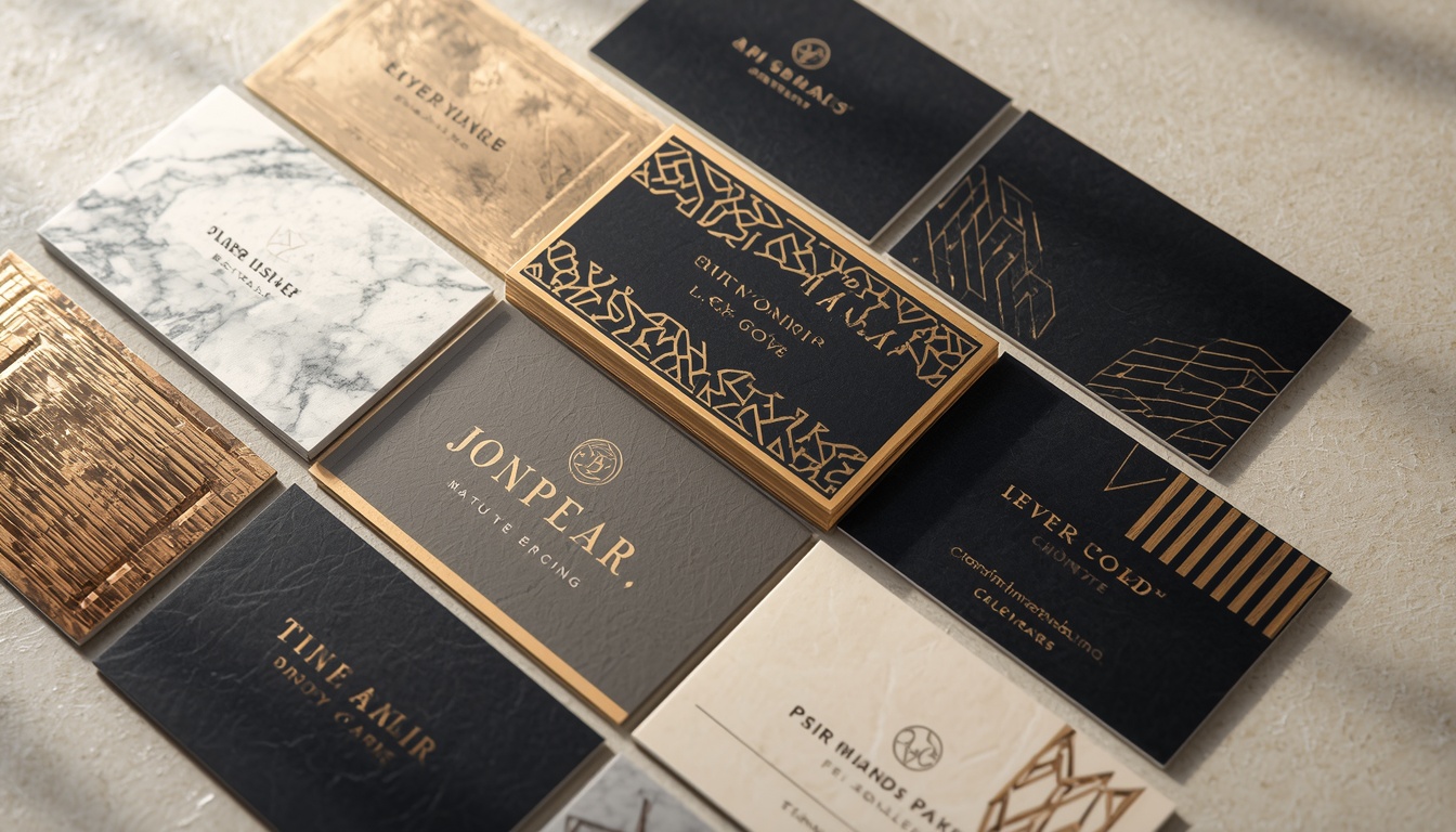
12 Creative Business Card Design Trends for a Premium Brand Identity
A single small rectangle can change how people see your company. Great business card design turns a quick handshake into a lasting memory, and in a digital-first world a physical card still feels personal and premium.
Premium brands understand this. They treat every business card design choice, from paper weight to finish, as part of a larger brand story.
In this guide, you will explore 12 creative business card design trends that help luxury and growth-focused brands stand out. Each trend includes practical tips you can apply right away.
Whether you are a freelancer, an agency, or a growing company, these ideas will help you create a card people keep instead of toss. By the end, you will know exactly how to approach business card design with confidence.
Why Business Card Design Still Matters for Premium Brands
Some people believe printed cards are outdated. Daily experience says otherwise. A well-made card creates a physical touchpoint that no email signature can match.
Strong business card design communicates quality before you say a word. Paper, color, typography, and finish all signal how much care your brand puts into its work.
A premium card also acts as a conversation starter. When someone feels an unusual texture or spots a clever layout, they ask questions. That moment opens the door to a real relationship.
Smart business card design also supports your digital presence. A QR code, a short URL, or a social handle links the physical and online worlds in seconds.
Cards are also remembered differently from digital contacts. A phone contact list is endless and forgettable, while a beautiful card sits on a desk or in a notebook and keeps reminding people of you.
Finally, a premium card shows consistency. When your card, website, packaging, and social profiles share one visual language, your brand feels trustworthy and established.
Keep this in mind as you read the trends below. The best business card design never follows a trend blindly. It adapts each idea to your brand voice, audience, and values.
Many of these trends also work together. You can combine a minimalist layout with foil, or a thick stock with an embossed logo. Mixing two or three ideas often creates the most distinctive result.
1. Minimalist Layouts With Generous White Space

Minimalism remains the most trusted route to a premium look. Fewer elements mean each element carries more weight.
A minimalist business card design usually features a logo, a name, a title, and two or three contact details. Everything else is removed.
White space is the real luxury here. It gives the eye room to rest and makes the card feel calm, confident, and easy to scan.
Choose a refined sans-serif or a light serif and keep type sizes consistent. Align every item to a clear grid so the layout feels deliberate rather than accidental.
Many luxury hotels, boutique studios, and high-end consultancies use this approach because it signals confidence. When a brand does not need to shout, customers notice. A clean layout also makes it easier to keep your printed card consistent with your website and social media graphics, which strengthens recognition every time someone sees your logo.
Because a minimalist business card design relies on fewer elements, you can invest your budget in better paper and finishing instead. A thick uncoated stock turns a simple layout into a statement.
Try printing your name slightly larger than the rest of the text. This simple hierarchy guides the eye naturally and helps people remember who you are before they read anything else.
If you want a modern business card design that ages gracefully, start with minimalism. Trends come and go, but clean layouts rarely look dated.
Pro tip: Limit your palette to one or two colors and let the paper itself act as a design element.
2. Thick Luxury Paper Stocks and Layered Cards

Weight communicates value. A card that feels substantial in the hand instantly suggests a premium brand.
Many brands now use 600gsm or heavier stocks, often called duplex or triplex cards. These are made by fusing two or three layers of paper into one thick sheet.
The layers can be different colors, which creates a bold colored edge. This detail turns a plain rectangle into a small collectible object.
Any serious business card design project should consider paper early, not as an afterthought. The right stock changes how color, ink, and finishes behave.
Edge painting is another luxurious detail. A colored stripe is painted along the sides of a thick card, creating a crisp line of contrast. It looks especially striking on black, navy, or white cards, and it gives the stack a signature appearance when displayed on a desk.
Cotton paper is another favorite. Its soft, tactile surface feels handmade and holds deep impressions beautifully.
A heavy stock can lift even a simple business card design into the premium category. Sometimes the paper is the entire concept.
Think about how the card will be handed over, too. A thick card feels solid in the hand and often stays in a wallet or on a desk much longer than a thin one.
Order paper samples before committing, because the right stock changes how every business card design decision looks and feels in real life.
Choose this trend when your brand sells high-value services such as law, consulting, architecture, or luxury real estate.
3. Soft-Touch Lamination and Matte Finishes

Matte finishes remain one of the most popular choices in modern business card design.
Soft-touch lamination adds a velvety, rubber-like surface. People often stroke the card without realizing it, which makes it memorable.
Matte black with a single bright accent is a classic combination. It feels bold, quiet, and expensive all at once.
Be careful with very dark matte cards, though. They can show fingerprints and scuffs, so test your finish before ordering a large batch.
Another benefit of matte surfaces is that they are easy to write on. If you often add a quick note or a personal message to your card, a lightly coated matte stock accepts pen ink well, while a glossy surface can smudge. This practical detail matters in client meetings where handwritten notes build warmth.
A matte base also pairs well with selective gloss. A shiny logo on a flat surface creates contrast without adding clutter. It is a simple way to elevate your business card design without overcomplicating the layout.
Matte also reduces glare, which makes the card easier to read under bright lights at conferences and trade shows.
Soft-touch coating is also a smart upgrade for a minimalist business card design, since it adds richness without adding visual noise.
Ask your printer how the coating behaves with foil and embossing, because not every combination works on every stock.
4. Foil Stamping in Gold, Silver, and Rose Gold

Foil stamping is the signature of luxury print. A thin metallic layer is pressed onto the paper, creating a reflective accent that catches the light.
Gold remains the classic choice, but rose gold, copper, silver, and holographic foils are growing fast.
Use foil sparingly. A foil logo or a single line detail is usually enough. Too much foil can look cheap instead of elegant.
The best foil-based business card design keeps text readable by using ink for contact details and foil only for the brand mark.
Foil is not limited to metallic shades. Matte black foil on glossy white paper, for example, creates a modern reverse effect that feels fresh and unexpected. Colored foils in pink, green, or blue are also appearing in creative industries, where brands want a luxurious touch with a playful edge.
Pair foil with dark or deep-colored paper for maximum contrast. Navy, forest green, and charcoal all look striking with gold.
Foil needs clean vector artwork. Very thin lines may not transfer well, so ask your printer for minimum line thickness and spacing guidelines before finalizing your business card design.
Budget tip: foil is usually applied to one or two areas, so cost depends on the size of the foiled area. A small logo stamp is far more affordable than foiling a whole surface.
A foil accent is also one of the easiest ways to make a simple business card design feel instantly more expensive.
5. Embossing, Debossing, and Letterpress Texture

Texture is the next level of premium print. Embossing raises your design above the surface, while debossing presses it into the paper.
Letterpress uses a similar pressing technique with ink, creating a crisp, tactile impression that feels classic and crafted.
These techniques invite touch, which makes your card more memorable than a flat printed one.
A blind emboss, which uses no ink at all, is a subtle way to add a hidden detail. Your logo appears only when light hits it at the right angle.
Texture-driven business card design works especially well for boutique brands, wedding professionals, and creative studios.
Letterpress has a long heritage. Early printers pressed metal type into paper, and the deep impression became a mark of quality. Today, photopolymer plates make the process more accessible, so even small studios can create cards with that handcrafted depth. Pair letterpress with a single ink color on cotton stock for an elegant, timeless result.
Because these methods need thick paper, combine them with the luxury stocks discussed earlier. A deep deboss on soft cotton is hard to beat.
Keep the artwork bold enough to press cleanly. Fine details can fill in, so a simple shape often performs better in business card design that relies on texture.
Consider adding a tiny deboss on the back as a surprise. Customers love discovering hidden details.
If you are unsure, ask for a physical sample. Seeing and touching the effect will tell you more than any mockup, and it helps you finalize your business card design with confidence.
6. Bold Typography and Oversized Name Layouts

Typography-led cards let letterforms do the heavy lifting. Instead of relying on images, the name itself becomes the visual centerpiece.
Oversized initials, stretched headlines, and expressive serif fonts are showing up across modern portfolios.
This trend suits creatives who want personality without adding illustrations. A strong font choice communicates tone instantly.
When planning typography-first business card design, keep contrast high and line spacing generous. Small text must still be legible at arm’s length.
Variable fonts and custom lettering are also gaining popularity. A hand-drawn signature or a custom monogram can make your name feel one of a kind. If a custom typeface is outside your budget, modify an existing font slightly by adjusting spacing or replacing one letter with a unique shape.
Limit yourself to two typefaces: one for display and one for details. Anything more starts to feel messy.
Pay attention to kerning, which is the space between letters. Tight or uneven spacing can make premium type look careless, while thoughtful adjustments make it look professionally crafted.
Check your font licenses too. Some free fonts do not allow commercial print use, and you do not want surprises after printing.
A bold type-driven business card design can work in a single color, which keeps printing costs low while still looking confident.
Try a mix of weights, such as a light first name and a bold last name. This small contrast adds rhythm to any business card design.
7. Rich Color Palettes: Deep Jewel Tones and Earthy Neutrals

Color sets mood faster than any other element. Premium brands are moving toward deep jewel tones such as emerald, sapphire, and burgundy.
Earthy neutrals like sand, clay, and olive are equally popular. They feel natural, calm, and sophisticated.
The key is restraint. Choose one dominant color, one supporting color, and one accent.
Strong business card design always starts with your brand color system. If your website uses a certain palette, your card should echo it so the experience feels consistent.
Gradients, once seen as unrefined in print, have returned in a softer form. Subtle tone-on-tone gradients, such as deep blue fading into slightly lighter blue, add depth without feeling flashy. They look especially good with a matte laminate and a metallic foil accent.
Screen colors and printed colors differ. Request a physical proof, and ask about Pantone matching for brand-critical shades.
Color psychology can guide your choice. Blue often signals trust, green suggests growth and balance, and black communicates authority and sophistication. Think about the emotions you want people to feel when they hold your card.
Full-bleed solid color backs are an easy way to add impact. Print the contact details on the front and let the back carry the color.
Contrast matters for accessibility, too. Light gray text on a cream card may look elegant on screen, but it becomes hard to read in real life, and unreadable text defeats the purpose of business card design.
Test your palette in different lighting before approval. A color that looks rich in the studio may feel flat under office lights, so always judge your business card design in natural daylight as well.
8. Spot UV and Selective Gloss Highlights

Spot UV applies a glossy coating to chosen areas of the card. The rest stays matte, and the contrast looks striking.
It works beautifully on logos, patterns, and large letters. Even a subtle pattern in gloss is revealed only when the card tilts.
This effect adds depth without adding color. That makes it ideal for brands that prefer a restrained palette.
Designers often use spot UV on a black matte card for a stealthy, high-end finish. The business card design looks simple at first glance but reveals more detail with movement.
Another popular approach is to apply spot UV over a printed pattern, such as stripes or a monogram repeat. The ink provides the base, and the gloss adds a second layer of visual interest. The result feels dimensional and polished without requiring any additional colors.
Share a separate mask layer with your printer so the coating is applied precisely. Misaligned UV can ruin an otherwise perfect card.
Soft-touch and spot UV together give a luxurious contrast of velvety and glossy surfaces, which many customers describe as irresistible to touch.
Spot UV is also a good choice when your logo is simple. A clean shape in gloss on a flat background makes a confident business card design that needs no extra decoration.
Keep the glossy areas purposeful. If everything shines, nothing stands out, and the effect loses its charm in a business card design.
9. Unique Shapes: Rounded Corners, Die-Cuts, and Custom Edges

A standard rectangle is safe, but a distinctive shape is memorable. Rounded corners offer a friendly, modern touch, while die-cut shapes add real personality.
Some brands cut a window into the card, revealing a layer below. Others use a notch, a curve, or a logo-shaped edge.
Shape-based business card design should still fit in a wallet or cardholder. A brilliant shape that does not fit practical storage often ends up in the bin.
Unique shapes also help your card survive the stack. At networking events, people collect dozens of rectangles, and the odd one out gets noticed first. A subtle curve or a notch in one corner can be enough to make someone pick your card up again later.
Die-cutting increases cost, so use it for roles where networking matters most, such as founders, sales leads, and creative directors.
Square cards are another option. They stand out in a stack, though you should confirm they fit your audience’s holders.
Think about the cutting tool, too. Custom dies need accurate vector paths, so supply clean, closed outlines to your printer and leave enough margin for small shifts.
Pair a custom shape with a restrained layout so the shape remains the hero of your business card design.
Rounded corners are the most budget-friendly way to try this idea. Even a slight curve changes the personality of a business card design from formal to approachable.
10. Sustainable and Eco-Friendly Materials

Luxury and sustainability now go hand in hand. Premium buyers increasingly value brands that care about the planet.
Recycled cotton, seed paper, FSC-certified stocks, and stone paper all deliver strong quality with a lighter footprint.
Plantable seed paper cards can be grown into wildflowers. It is a memorable gesture that reinforces your values.
Eco-friendly business card design should feel intentional, not rough. Use clean typography and a tidy layout so the material reads as premium rather than basic.
Tree-free alternatives like bamboo, hemp, and sugarcane paper are also growing. Each has a distinct texture and color that can enhance your brand story. A warm, fibrous paper can make a wellness or lifestyle brand feel authentic and grounded.
Soy-based inks and water-based coatings further reduce environmental impact.
Remember that sustainability is more than material. Efficient layouts, smaller print runs, and local printers all reduce waste and shipping emissions.
Mention your sustainability choice discreetly on the back. A short line such as “Printed on recycled cotton” builds trust without sounding preachy.
Sustainable business card design also appeals to younger clients and corporate buyers who track environmental goals.
Ask your printer for certifications so your claims are honest. Accurate details strengthen the credibility of your business card design and your brand.
11. Interactive Cards With QR Codes and NFC Technology

Modern premium brands blend print with technology. A QR code can link to a portfolio, booking page, or digital contact card.
NFC-enabled cards go further. A simple tap on a smartphone opens your profile without scanning or typing.
Make sure the QR code looks stylish. Match its color to your palette and give it plenty of quiet space around it.
The best tech-forward business card design keeps the physical card beautiful while using technology as a bonus, not a replacement.
Digital contact cards are getting better each year. Many allow you to update your details without reprinting, which helps if your role or phone number changes. The printed card becomes a stylish doorway to a living profile.
Always test every code before printing. Scan it on multiple devices and under different lighting.
Consider adding analytics to your link so you can see how many people scan it. This simple data helps you understand which events and conversations bring real engagement.
Link to a mobile-friendly page. A slow or broken destination damages the premium feeling you worked so hard to create.
Interactive business card design is especially useful for events, where people want to connect fast and may not have time to type your details.
Consider using a short, memorable URL alongside the code. Some people prefer typing, and this small backup keeps your business card design accessible to everyone.
12. Illustrated, Pattern-Driven, and Artistic Backs

The back of the card is valuable space. Premium brands use it for patterns, illustrations, or textured artwork.
Geometric patterns, line illustrations, and abstract shapes add personality while keeping the front clean.
This trend lets you tell a story. An architect may show a blueprint line, while a florist might use delicate botanical art.
Pattern-based business card design is also easy to extend across your brand, from packaging to stationery to social media.
Color-blocked backs are another option. Divide the back into two or three bold sections using your brand colors for a modern graphic look. Combine this with a small logo or a thin foil line for added polish.
Keep the pattern subtle enough that it does not compete with the logo. A low-contrast pattern often feels more luxurious than a loud one.
Photography can work too, if it is treated carefully. A softly textured macro shot of fabric, stone, or leaves adds mood without distracting from the main message.
Use vector artwork so the pattern stays sharp at any scale, and keep margins safe so important parts are not trimmed during cutting.
An illustrated back can turn a standard business card design into a mini piece of art that people proudly display.
If you work with an illustrator, discuss usage rights early. A custom pattern can become a signature element of your business card design for years.
How to Apply These Business Card Design Trends to Your Brand
Twelve trends can feel overwhelming, so start with strategy. Ask what your brand should feel like: bold, calm, playful, or refined.
Choose one hero feature, such as foil, texture, or a thick stock. Then support it with simple elements. This keeps your business card design focused instead of crowded.
Know your audience. A corporate lawyer and a street-fashion designer need very different cards, even if both want a premium look.
Set a realistic budget. Premium finishing can be costly, but one well-chosen upgrade often has more impact than five average ones. Smart business card design is about selective investment.
Work with a trusted printer. Experienced printers can warn you about bleed, safe zones, and color shifts, which protects your business card design from expensive mistakes.
Always request a proof. Check spelling, phone numbers, and alignment three times before approving a final print run.
Finally, remember the basics: a clear name, a readable title, and accurate contact details. Even the most creative business card design fails if people cannot contact you.
Use this simple checklist: purpose, audience, hero feature, budget, proof. Following it keeps every business card design decision tied to your brand goals.
Revisit your card once a year. As your brand evolves, your business card design should evolve with it.
Final Thoughts on Business Card Design
A premium card is a small object with a big job. It introduces your brand, supports your reputation, and leaves a physical reminder of your professionalism.
The 12 trends in this guide, from minimalism and luxury paper to foil, texture, sustainability, and smart technology, show how flexible modern business card design has become.
You do not need to use every trend. Pick the ideas that fit your brand voice and execute them with care. Quality always beats quantity in business card design.
Start by defining your brand personality, choose one standout feature, and test samples before printing. With the right approach, your business card design can become a powerful networking tool that works long after the meeting ends.
Ready to upgrade your cards? Begin with one trend from this list and build from there.
Frequently Asked Questions About Business Card Design
What makes a business card design look premium?
A premium look comes from restraint, quality materials, and precise execution. Thick paper, clean typography, generous white space, and one standout finish such as foil or embossing usually matter more than adding many elements.
Consistency with your brand colors and logo matters as well, so the card feels like part of a complete identity. When every business card design detail is intentional, the result feels expensive even if the layout is simple.
What is the best size for a business card design?
The standard size is 3.5 x 2 inches in the United States and 85 x 55 mm in much of Europe. Sticking to standard dimensions ensures your card fits wallets and holders.
If you want something unusual, consider rounded corners or a special finish rather than a completely different size. Always confirm bleed and safe zone requirements with your printer before finalizing your business card design.
Which colors work best for luxury business card design?
Deep navy, black, charcoal, emerald, burgundy, and warm neutrals are popular because they feel mature and refined. Metallic accents in gold or copper add a touch of richness.
The best choice always depends on your brand identity, so match your palette to your logo and website. Whatever you choose, keep the contrast high so the business card design stays easy to read.
How much text should a business card design include?
Keep it short. A name, job title, company, phone number, email, and website are usually enough. Add a QR code or one social handle if it supports your goals.
Crowded cards look less premium and are harder to read. A clear business card design lets people find the right contact detail in seconds.
Should I use both sides in a business card design?
Yes, if it adds value. Using the front for essential details and the back for a logo, pattern, or illustration creates balance. A bold back also makes your card more memorable.
If budget is tight, a single-sided card with a premium finish can still work well. The right approach to business card design depends on your goals and printing budget.
Is business card design still worth the investment in the digital age?
Yes. Digital sharing is useful, but a physical card creates a personal, tactile moment that apps cannot replicate. It works especially well at events, meetings, and client visits.
When combined with a QR code or NFC, a smart business card design connects the real world with your online presence.
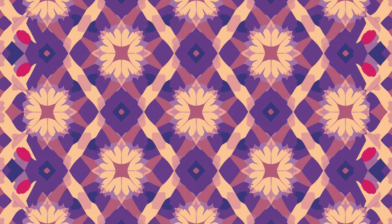
Creative Pattern Design Techniques to Transform Simple Shapes into Prints
Every great print begins with something small. A circle. A triangle. A wavy line. With the right approach, these humble forms can become repeating artwork that decorates fabric, wallpaper, packaging, stationery, and phone cases.
That transformation sits at the heart of pattern design. It blends art, math, and patience. It also rewards curiosity more than raw drawing talent.
In this guide, you will learn creative pattern design techniques that turn simple shapes into professional prints. We will cover tools, repeat types, scale, color, texture, seamless tiles, and file preparation.
If you have ever wondered how artists create those effortless, endlessly repeating surfaces, you are in the right place. Each section includes practical steps you can try right away.
By the end, you will have a clear workflow for building your own pattern design projects from scratch. You will also know how to avoid the mistakes that make prints look amateur.
Whether you are a beginner or a working illustrator, strong pattern design skills can open new creative and income opportunities. Let us start with the fundamentals.
What Is Pattern Design and Why Does It Matter?

The history of repeating ornament is long. Ancient builders carved geometric tiles into temples, and weavers have repeated motifs on cloth for thousands of years. Today the same instinct lives on in digital tools.
Modern pattern design simply uses new tools for an old human habit. Software lets you test a repeat in seconds instead of weeks.
You do not need a formal degree to begin. Curiosity, observation, and regular practice matter far more. Study the prints around you and ask why they work.
Over time, your eye will sharpen, and strong pattern design will feel more intuitive with every project you finish.
Pattern design is the craft of arranging motifs so they repeat in a pleasing, continuous way. A motif can be a flower, a dot, a geometric form, or an abstract brushstroke.
A pattern is simply a unit repeated across a surface. That unit is called a tile or a repeat. When the tile joins itself with no visible seams, the result is called seamless.
The main goal is rhythm. Your eye should travel across the surface without hitting awkward gaps or heavy clumps.
Pattern design is everywhere. Look at your clothes, your bedsheets, your coffee mug, or the wrapping paper on a gift. Someone planned each repeat with care.
For creators, pattern design is also a strong income path. Surface design licensing, print on demand, and stock marketplaces all reward people who can make appealing repeats.
Brands benefit as well. A signature print makes packaging memorable and builds recognition faster than a logo alone.
Learning the basics of pattern design gives you a foundation for every technique in this article.
Why Simple Shapes Are the Best Starting Point

Consider how little a classic polka dot print contains. One circle, one spacing rule, and two colors. Yet it has stayed fashionable for generations.
Mid-century atomic prints and Memphis style graphics also lean on basic geometry. They prove that simple forms never go out of style.
When you limit your vocabulary of forms, you focus on arrangement instead. That shift is the real lesson of pattern design.
It also makes your work easier to scale into collections. A set of matching prints built from the same shapes feels like a family, and a family of prints is a powerful way to present pattern design to buyers.
Beginners often believe they must draw complex illustrations first. The opposite is true.
Simple shapes are easy to control. They scale cleanly, rotate predictably, and combine in countless ways.
Think of a child building with blocks. A few forms create an entire city. Pattern design works the same way.
Shapes also keep your files light. Vector circles, squares, and triangles stay sharp at any print size, from a tiny label to a giant wall mural.
Another benefit is speed. You can test ten layouts in the time it takes to draw one detailed flower.
Finally, simple shapes train your eye. You learn spacing, balance, and contrast without distraction from fine detail.
Many iconic prints rely on a single basic form. Polka dots, stripes, checks, chevrons, and herringbone all prove the point. Strong pattern design often looks effortless because it is built on clarity.
Essential Tools and Setup for Pattern Design

Before you open a new file, organize your workspace. Create folders for sketches, tiles, exports, and mockups. A clean structure prevents lost files later.
Learn a few shortcuts in your chosen software. Duplicate, align, group, and transform commands will save hours.
Many beginners ignore the preview tools. Take advantage of live repeat previews, because they show seams and gaps instantly.
Consider saving a starter template with your favorite tile sizes and color modes. A ready template turns pattern design into a faster, calmer process.
If you are on a budget, free tools can still produce professional pattern design results when paired with strong ideas.
You do not need expensive gear to start. A computer and a free trial of good software are enough.
Vector software is the most popular choice. Adobe Illustrator offers a dedicated pattern tool that previews repeats live as you work. Affinity Designer and Inkscape are solid alternatives.
Raster software suits painterly textures. Photoshop and Procreate let you build hand-painted motifs with brushes.
Many artists combine both. They draw shapes in a vector app, then add texture in a raster app.
A drawing tablet helps with organic shapes but is not mandatory. A mouse works perfectly well for geometric work.
Useful extras include a color palette generator, a mockup template library, and a notebook for sketching ideas.
Set up your artboard with care. Choose a square tile such as 3000 by 3000 pixels, or a size that matches your print target. Work in CMYK for physical print and RGB for screens.
Good tools support your pattern design workflow, but ideas matter more than software.
Understanding Repeat Types in Pattern Design

Repeat types also affect how a product looks when cut and sewn. A half-drop repeat may flow beautifully across a dress, while a block repeat might look stiff on a curved surface.
Think about the final object before you choose. A mug wraps around a cylinder. A tote bag is flat. A phone case has tight edges.
Keep notes on which layout works best for each product. This habit builds your professional instincts.
Smart repeat choices are a hallmark of mature pattern design.
When clients see that you plan for the product, they trust your pattern design skills even more.
A repeat is the rule that decides how your tile spreads across a surface. Choosing the right one shapes the mood of the final print.
Block Repeat
This is the simplest option. Tiles line up in straight rows and columns like a grid.
It feels orderly and stable. It works well for checks, dots, and geometric prints.
Half-Drop Repeat
Each column shifts down by half the tile height. This hides the grid and creates a natural flow.
It is a favorite for wallpaper and fabric because it looks more organic than a block repeat.
Brick Repeat
This is similar to the half-drop but shifts sideways, like bricks in a wall. It suits wide, horizontal motifs.
Mirror Repeat
Motifs flip across an axis to create symmetry. It produces kaleidoscope, damask, and ornamental effects.
Tossed Repeat
Motifs scatter at different angles with no visible grid. It feels playful, casual, and spontaneous.
Learning these five layouts gives your pattern design extra range. One shape can look formal in a block repeat and relaxed in a tossed one.
Try placing the same circle into all five layouts. The difference will surprise you.
Build a Shape Library for Faster Pattern Design

Think of your library as a living collection. Each time you finish a project, add new shapes that worked well and delete those you never use.
Name your shapes clearly. A label such as small-arc or fat-leaf will save you from endless searching.
You can also build small groups, such as a flower made of three petals and a circle. Treat each group as a single unit in future layouts.
Sharing a library with a team helps keep style consistent across a brand.
Over time, a personal library becomes the signature of your pattern design and a major shortcut for every new pattern design brief.
Professionals keep a library of reusable motifs. It saves hours on every project.
Start by drawing twelve to twenty basic forms. Include circles, half circles, triangles, squares, arcs, leaves, drops, and zigzags.
Vary the proportions. Make tall ovals, fat ovals, thin rectangles, and chunky squares.
Add a few hand-drawn forms too. Slightly imperfect shapes bring warmth that perfect geometry lacks.
Save everything as symbols or swatches. Then you can edit one master shape and update the whole print at once.
Organize your library by theme. Useful folders include geometric, botanical, abstract, and retro.
A tidy library speeds up every pattern design project because you begin with proven pieces instead of a blank page.
One more tip: limit yourself to three or four shapes per print. Restraint creates cohesion, and cohesion sells.
Technique 1: Play With Scale for Visual Rhythm

Scale decisions also depend on viewing distance. A scarf is seen up close, so delicate shapes can shine. A feature wall is seen from across the room, so bold shapes work better.
Create a quick test by printing your tile on plain paper. Pin it to a wall, step back, and look again. Problems with scale show up fast.
You can also use the squint test. Blur your eyes and watch for blobs that dominate or areas that feel empty.
Thoughtful scale choices separate hobby pattern design from commercial pattern design, so give this step real attention.
Scale is your most powerful tool. Mixing sizes creates hierarchy, and hierarchy guides the eye.
Use one large hero shape, a few medium supporting shapes, and many tiny fillers. This three-tier approach keeps the viewer moving across the surface.
Avoid making every shape the same size. Uniform scale looks flat and mechanical.
Try a loose ratio of 3:2:1. Large shapes dominate, medium shapes support, and small shapes fill the gaps.
Zoom out often. A layout that works up close may look busy from a distance. Check it at thumbnail size.
Scale also changes how a print fits a product. Small repeats suit shirts, socks, and packaging. Large repeats suit wallpaper, curtains, and bold bags.
Mastering scale lifts any pattern design from amateur to polished.
Technique 2: Rotate, Reflect, and Build Radial Motifs

Mixing rotation with reflection opens up even more ideas. Take a simple quarter circle and rotate it four times to form a full circle. Reflect a leaf across a vertical line and you have a tidy symmetrical motif.
Keep a record of the angles that please you. Many artists settle on a few favorite angles and reuse them across collections.
Be careful with random rotation. Too much randomness can look messy, while a gentle limit keeps order.
Understanding these transformations is a major step forward in pattern design, and it will help you build unique motifs for any pattern design project.
Rotation adds energy. A row of identical triangles feels static. Turn them at different angles and they begin to dance.
Try rotating shapes in fixed steps such as 15, 30, or 45 degrees. Fixed steps keep order while adding variety.
Reflection builds symmetry. Duplicate a shape, flip it, and join the halves to create hearts, butterflies, and flower-like forms.
Radial repeats are another favorite. Rotate one shape around a center point to form a rosette. Then use that rosette as a brand new motif.
This trick turns a humble petal into a mandala. It is one of the quickest ways to make pattern design feel rich and complex.
Use your software’s transform tools to speed things up. Rotate with copies, then repeat the transformation until the circle closes.
Technique 3: Layer and Overlap With Transparency

Layering also works well with outlines and textures inside shapes. Place a tiny dot grid inside a large circle, then overlap it with a plain triangle. The simple contrast creates a fresh and modern feel.
Another idea is to stack shapes in a repeating order. Large shape at the back, medium shape in the middle, small shape on top. This builds a tidy rhythm.
Use a limited palette so the overlaps stay harmonious. Too many colors make transparent areas look muddy.
Layered effects can transform basic pattern design into something that feels custom, and they let you extend one pattern design into a full collection.
Overlapping shapes create new shapes where they meet. This is the secret behind many modern prints.
Set overlapping shapes to multiply mode or lower their opacity. Colors blend and produce fresh tones for free.
Layer big soft shapes under small sharp ones. The contrast adds depth without extra detail.
Try a stroke-only shape over a filled shape for a lively offset effect. Slight misalignment gives a charming risograph look.
Keep an eye on file complexity. Too many transparent layers can cause trouble at the printer. Flatten or expand effects when you finish.
Done well, layering gives pattern design a three-dimensional feel using only flat forms.
Technique 4: Use Negative Space Wisely

Negative space also helps a print work at different sizes. When gaps are generous, motifs stay readable even when reduced for small products.
Some of the world’s most memorable prints use very little ink. A few bold shapes on a plain field can feel confident and calm.
Try placing the same motif at two densities. One version with tight spacing, another with airy spacing. Compare the mood.
Learning to value empty space is a mark of mature pattern design, and it will improve your pattern design in every collection you create.
The empty areas between motifs matter as much as the motifs themselves. Artists call this negative space.
Aim for consistent gaps. Uneven gaps create rivers of white that distract the eye.
Try a reversed approach. Fill the background with color and let the shapes appear as cutouts.
Negative space can also form secondary shapes. Arrange circles so the spaces between them form diamonds or stars.
This hidden layer rewards close viewers and impresses clients.
Treat gaps as part of your composition, and your pattern design will breathe.
Technique 5: Build a Strong Color Palette for Pattern Design

Color psychology can guide your choices. Blue often feels trustworthy and calm. Yellow feels energetic. Green suggests nature and balance. Pink can feel soft or bold depending on its shade.
Think about your audience. A baby product needs gentle tones, while a streetwear brand may want strong contrast.
Seasonal trends matter too. Check color forecasts, but keep your personal taste in the mix.
Name your palettes and store them for reuse. A saved palette is a quick starting point for your next pattern design, and a smart way to keep your pattern design collections consistent.
Color decides mood in seconds. Soft pastels feel calm, while bright primaries feel joyful.
Start with three to five colors. More than that can overwhelm a simple shape.
Use the 60-30-10 rule. Sixty percent background, thirty percent main motif color, and ten percent accent.
Borrow palettes from nature, vintage posters, or photographs. Color pickers can extract harmonious swatches in seconds.
Test your print in grayscale. If the shapes still read clearly, your contrast is healthy.
Create alternate colorways as well. Buyers love choices, and three versions multiply the value of one pattern design file.
Remember print limits. Neon and very saturated tones may shift when converted to CMYK. Always proof before you finalize.
Technique 6: Add Texture and Handmade Touches

Texture can also be layered over the whole tile. Place a subtle paper grain above the shapes and lower the opacity until it whispers rather than shouts.
Before you merge layers, keep the texture on its own layer. This way you can adjust or remove it for different products.
Remember to repeat the texture seamlessly. A grain overlay that is not tiled correctly will show visible seams.
Combining clean geometry with tactile elements gives pattern design a special charm, and it helps your pattern design feel human in a digital world.
Perfect vector edges can feel cold. Texture adds soul.
Apply grain, halftone dots, or brush-edge effects to your shapes. Scan real paper, watercolor, or ink stamps for authentic texture.
Cut paper collage is a fun method. Cut shapes from colored paper, scan them, and arrange them digitally.
Linocut and block printing also translate well. Carve a simple shape, stamp it, and scan the result.
Keep texture subtle inside seamless tiles. Heavy texture can reveal the repeat edges.
A little imperfection makes handmade pattern design stand out in a crowded market.
Technique 7: Mix Grid and Organic Placement

One helpful trick is the offset grid. Place shapes on a grid, then shift every second row slightly. The result feels ordered but never rigid.
Another trick is to use random scatter tools, then manually clean up collisions. Automation gives you speed, and your eye provides taste.
Study natural patterns for inspiration. Leaves on a branch, pebbles on a beach, and ripples on water all show organized randomness.
Observing nature trains your instincts and improves your pattern design, which in turn makes your pattern design feel alive.
Grids give control. Organic placement gives life. Great prints often mix both.
Start with a loose grid to place shapes evenly. Then nudge individual shapes by small amounts.
Another method is scatter and fill. Place large shapes first, then add medium ones where gaps feel heavy.
Use guides and alignment tools for geometric prints. Use freehand placement for botanical looks.
Whichever you choose, avoid obvious clusters and straight lines. The viewer should not spot the repeat.
Balanced placement is the quiet skill behind professional pattern design.
How to Create a Seamless Tile in Pattern Design

Some software offers automatic seamless tools. Illustrator’s pattern editor, for example, lets you edit a tile while the surrounding repeat updates in real time. This is a huge time saver.
If you use a raster program, apply an offset filter that shifts the image by half its width and height. Then paint over the seams in the middle and offset again to confirm.
Keep a backup of your original tile before testing seams. A safe copy protects your hard work.
Mastering seamless tiles is the technical backbone of pattern design, and once you learn it, every pattern design idea becomes easier to build.
A seamless tile repeats with no visible edges. It is essential for fabric and wallpaper.
Here is a reliable method you can follow.
First, create a square artboard. Second, place your shapes inside it. Third, make sure any shape crossing an edge continues on the opposite edge.
Duplicate the shape and move it by exactly the tile width. The overflow now appears on the other side.
Next, crop with a clipping mask, or let your software’s pattern tool handle the math automatically.
Test the tile by arranging nine copies in a three by three grid. Look for seams, gaps, and unwanted lines.
Check for tangents too. Shapes that barely touch the edge can create awkward points.
Finally, export a clean tile and save the editable source file.
Many beginners rush this step. Spend time here and your pattern design will look professional on any product.
From Pattern Design to Print: Preparing Your Files

Think about color profiles when you export. Screens use light, while printers use ink, so colors may shift. Request a printed sample whenever possible and compare it to your screen.
Include a repeat guide with your files if you sell to manufacturers. A simple diagram showing how the tile repeats prevents confusion.
Offer different file formats for different buyers. A layered file, a flat PNG, and a vector version cover most needs.
Clear communication turns pattern design into a smooth business, and professional files help your pattern design earn repeat clients.
Now comes the exciting part. Your repeat becomes a real product.
For fabric, match the repeat size to printer requirements. Services such as Spoonflower publish exact dimensions and resolution guidelines.
For wallpaper, use larger repeats. A width of about 24 inches is common.
For packaging, check die lines and safe zones before you place key motifs.
Print on demand sites usually accept PNG files at 300 DPI. Make your file large enough for the biggest product you plan to offer.
Always create mockups. Show your print on tote bags, mugs, pillows, and notebooks. Mockups help buyers imagine the result.
Name files clearly and keep a color reference sheet. Future you will be grateful.
Good file preparation protects your pattern design from costly printing mistakes.
Common Mistakes to Avoid

Another mistake is forgetting the product. A print that looks stunning on screen may feel overwhelming on a large sofa or too faint on a small label.
Many creators also skip feedback. Show your work to friends, mentors, or online groups before you publish it.
Overediting is a risk too. Sometimes a print is finished, and extra details only make it worse. Learn when to stop.
Every mistake is a lesson. Keep notes on what you learn, and your pattern design skills will improve faster, because honest review is the engine of growth in pattern design.
Even skilled artists slip up. Watch for these common problems.
Too many motifs is the first. Stick to a limited set so the print feels unified.
Ignoring spacing is the second. Crowded areas and empty holes break the rhythm.
Visible repeats are the third. Rows or columns that pop out reveal the grid.
Weak contrast is the fourth. Shapes that blend into the background disappear at small sizes.
Skipping tests is the fifth. Always view your print at real size and as a tiny thumbnail.
Copying trends blindly is the sixth. Trends help, but a personal style sells for longer.
Avoiding these traps will strengthen every pattern design you make.
A Simple Step-by-Step Workflow You Can Follow Today

You can adjust the workflow to match your style. Some artists begin with color, and others begin with shapes. Neither approach is wrong.
Add a short review step at the end. Ask yourself whether the print has a clear focal point, balanced spacing, and strong contrast.
Keep a project log with dates and notes. Over time you will see which steps take longest and which ones you can speed up.
A written process turns pattern design from a mystery into a skill, and it gives beginners a map for pattern design that they can trust.
A repeatable process saves time and reduces stress. Use this workflow for each new print.
Step one is choosing a theme. Think of a mood, a season, or a product, such as a summer scarf or a kids notebook.
Step two is drawing three or four basic shapes. Keep them simple.
Step three is picking a color palette of three to five shades.
Step four is arranging the shapes with your preferred repeat type.
Step five is building the seamless tile and testing it in a three by three grid.
Step six is refining scale, spacing, and contrast. Zoom in and out often.
Step seven is exporting the file and creating mockups.
Run this routine a few times and it becomes second nature. Your pattern design speed will grow with every project.
Practice Ideas to Sharpen Your Skills

Try a themed collection challenge. Choose a theme such as ocean, desert, or kitchen. Create three coordinating prints: a main print, a smaller secondary print, and a simple filler. This is how professional collections are structured.
You can also explore constraint challenges. Use only two shapes, only three colors, or only straight lines. Constraints push you toward clever solutions.
Keep a sketchbook. Even quick doodles can inspire future pattern design ideas.
Regular practice is the fastest route to better pattern design, and every small experiment adds to your confidence.
Skill grows through repetition. Try a few small challenges.
Make a one-shape challenge. Create five prints using only a circle.
Try a one-color challenge. Use a single hue with light and dark tints.
Take a thirty-day challenge. Produce one small tile each day and share the results.
Recreate a favorite print from a shop or museum. Study how the original handles scale and spacing, then make your own version.
Join online communities and ask for feedback. Fresh eyes spot problems quickly.
These exercises keep your creative muscles active and give you a rich portfolio over time.
How to Share and Sell Your Prints

Think about your target audience when you pick marketplaces. Wedding stationery buyers look for different styles than children’s apparel brands. Match your prints to the right shoppers.
Use social media to show your process. Time-lapse videos of a shape becoming a seamless print are popular and build trust.
Collect email addresses so you can announce new releases. Loyal fans often become your best customers.
If you promote your work online, write helpful content about pattern design on your website to bring more visitors.
Once you have a few strong prints, share them. Build a simple portfolio website and post on social platforms.
Marketplaces like Creative Market, Etsy, and Spoonflower let you sell digital files or physical goods.
Licensing is another path. Brands pay for the right to use your artwork on their products.
Show prints in context. Buyers respond better to a mockup of a pillow than a flat tile.
Write clear titles and descriptions with helpful keywords. Good search terms bring steady traffic.
Be patient. Consistent uploads and steady improvement build a following over time.
Conclusion
Simple shapes hold surprising power. With careful scale, rotation, layering, color, and texture, a circle can become a signature print.
The key is practice. Build your shape library, learn the repeat types, and test every tile before you export.
Keep your paragraphs of ideas short, your palettes focused, and your layouts balanced. Those habits separate polished work from rushed work.
Now it is time to open your software and play. Start with one shape and let your next pattern design grow from there.
Frequently Asked Questions About Pattern Design
What software is best for beginners?
Adobe Illustrator is a top choice because its pattern tool previews repeats live. Affinity Designer and Inkscape are budget-friendly options. Procreate works well if you prefer drawing on a tablet.
How many shapes should I use in one print?
Three to five is a healthy range. Fewer shapes create a clean, cohesive look. You can add tiny filler elements for richness without making the print feel crowded.
What is a seamless pattern?
A seamless pattern is a tile that repeats in every direction without visible edges or breaks. It is vital for fabric, wallpaper, and wrapping paper.
Which repeat type should I choose?
It depends on the mood. Block repeats feel orderly, half-drop repeats feel natural, mirror repeats feel formal, and tossed repeats feel playful. Test a few before you decide.
What size should my tile be for print?
Many print on demand services prefer PNG files at 300 DPI. Check the specifications of each platform, and make the tile large enough for the biggest product.
Do I need to know how to draw?
No. Geometric shapes can be built with basic tools. Drawing skills help with organic motifs, but many successful prints use only circles, lines, and triangles.
How do I choose colors that work together?
Start with three to five colors and use the 60-30-10 rule. Borrow palettes from photographs or nature, then test your print in grayscale to confirm strong contrast.
Can I sell prints made from simple shapes?
Yes. Many best-selling prints use basic forms. Sell digital files, licensed artwork, or physical products through marketplaces and your own website.
How long does it take to learn this craft?
You can make your first seamless tile in an afternoon. Building a personal style takes months of steady practice, so keep creating and keep learning.
-

 Graphics Design3 years ago
7.Exploring the Importance of Color Theory Charts
-

 Graphics Design1 year ago
Top 10 Best Graphic Design Tools for Beginners in 2025 (Free & Paid)
-

 Graphics Design2 years ago
10 Stunning Gradient Design Trends You Need to Know in 2024
-

 Graphics Design1 year ago
15 Freelance Graphic Design Tips to Boost Your Career in 2025
-

 Graphics Design2 years ago
29.Retro Design Is Making a Comeback in Modern Spaces
-

 Graphics Design1 year ago
Best Laptops for Graphic Designers – 2025 Buying Guide
-

 Graphics Design2 years ago
2025 Logo Design Trends: What’s In, What’s Out?
-

 Graphics Design3 years ago
15.The Importance of Effective Flyer Design in Marketing
disposable Temporary Email
September 28, 2024 at 2:13 pm
I’m often to blogging and i really appreciate your content. The article has actually peaks my interest. I’m going to bookmark your web site and maintain checking for brand spanking new information.
Muhammad Ubaid
September 28, 2024 at 2:32 pm
Thank you so much
Can I create a backlink to my website on your website?
disposable Temporary Email
September 28, 2024 at 2:36 pm
Pretty! This has been a really wonderful post. Many thanks for providing these details.
Muhammad Ubaid
September 28, 2024 at 2:37 pm
Thank you
free temp mail
October 3, 2024 at 12:11 pm
Pretty! This has been a really wonderful post. Many thanks for providing these details.
Winfred Zaruba
October 26, 2024 at 8:18 am
I am often to running a blog and i actually respect your content. The article has actually peaks my interest. I’m going to bookmark your site and preserve checking for brand spanking new information.
Mountsinai
November 7, 2024 at 6:01 am
Mountsinai For the reason that the admin of this site is working, no uncertainty very quickly it will be renowned, due to its quality contents.