
Graphics Design
Why Retro Design is the Perfect Blend of Nostalgia and Innovation

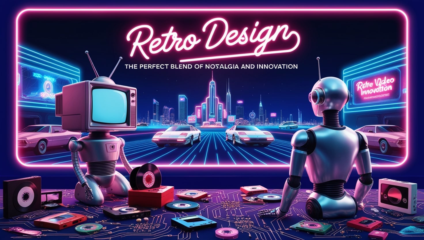
Why Retro Design is the Perfect Blend of Nostalgia and Innovation
Retro Design art deco has been a dream for many over the years because it creats an interesting perspective of the past and present. It can be seen in fashion, home décor, product design, or in the tech world, the idea of referencing older designs, even the formal constraints, and integrating them into new products is far from deceased. But what made retro design so popular? Why does this blend of the old and new still light up our screens and pull at heartstrings, when one is always on the lookout for the new? So in this article we will discuss what is meant by Retro Design, why it exists, and why it is such a good mixture of the old and new.
Outline of the Article
- Introduction
- What is Retro Design?
Defining Retro Design
Legendary Time Periods which Define Retro Style
- The Psychology Behind Nostalgia in Retro Design
Why We Love Looking Back
Why Dunks are Considered to have an Emotional Appeal of nostalgia.
- Retro Design in Fashion
Refurbished Fashion Styles Based on the Old Vintage Fashion
Iconic Retro-Inspired Brands
- Retro Design in Home Decor
Mid-Century Modern: Interior Design Themes that stands the test of Time
Analysis of the Elements of Color and Texture in Retro Home Decor
- Retro Design in Product Design
High tech devices with low-tech looks
Vinyl Records and Polaroid Camera
- The Reto Concept in Graphic Design and Branding
Using Retro Type Designs, Logos, and Patterns
How Brand Unlock The Impact of Nostalgic Marketing
- Nostalgic Design and Function of Innovation
Combining Tradition with Technology: The Appeal of Using Vintage Styles
How Popular Design Themes are Applied
- Sustainability and Retro Design
The Sustainability Feature of Resurrecting Archive Silhouettes
Upcycling and Retro Look
- Remembering Why Retro Design is Not Just the Case of a Trend
Longevity and Timelessness
The Aspect of Culture Concerning the Retro
- Pitfalls of Using Retro Design
Avoiding Over-Saturation
Balancing Nostalgia with Modern Expectations
- Examples of Successful Retro Designs
Fashion: Converse Chuck Taylors
Technology: Nokia 3310 Relaunch
Home Decor: Eames Lounge Chair
- Conclusion
- FAQs
Introduction
This type of design is not a trend, it is cultural revolution that adduces the reminiscence of the past and present in modernity. Your old school sneakers may be your favorite pair of kicks, or a beautifully restored record player that can now connect to Bluetooth. In this article let me explain why retro design is exactly the best combination of the past and the future and why people still love it.
What is Retro Design?

Defining Retro Design
It means a style that deliberately looks back to when some trends, looks, and cultural artifacts that were popular before are revived. It covers all aspects of life, fashion, graphic, etc where objects from earlier periods namely between the 1920s and the 1980s and recycled or reborn, to fit today’s world.
Legendary Time Periods which Define Retro Style
The glamorous 50s, sexual revolution 70s and the eclectic 80s have showcased most of the retro style gen. Pin-up art, artefacts from the disco era such as the disco ball, all have been kept active in the modern design world by recycling.
The Psychology Behind Nostalgia in Retro Design

Why We Love Looking Back
Nostalgia is a weapon in the psychological warfare. It ties us to a period of which we were part and parcel—or a period which we have never witnessed but wish we were part of. Given the constant exacerbation of globalization and briefing of the world around us, retro design is something that comforts the eyes, with its desire to make a trip back to the good old days, at least on the graphic level.
Why Dunks are Considered to have an Emotional Appeal of nostalgia.
So when we speak of Retro design, feelings are appealed to, even if it nostalgically brought up that design is associated with the good times such as through the Retro looking Coke bottle or a video game arcade cabinet from the 1980s. All these elements create a sense of reminiscence, both, individual and shared, which leads, not just, to functional satisfaction, but also sentimental involvement.
Retro Design in Fashion
Refurbished Fashion Styles Based on the Old Vintage Fashion

Fashion may well be one of the areas most affected by the concept of retro-design. Starting from bell-bottom jeans in fashion now to platform shoes seen on most fashion shows, retro clothing is back. The key is often the modern twist: The new takes over new forms but in old aesthetics, remade with contemporary materials, technology or cuts.
Iconic Retro-Inspired Brands
One can see that virtually every major brand, including Levi’s, Converse, and Ray-Ban, has only benefited from the period approach. They mix the timeless look of some of their products with contemporary changes to cater for today’s market. The Converse Chuck Taylors: once a basketball shoe from the seventies, today’s society’s indispensable footwear.
Retro Design in Home Decor
Mid-Century Modern: Interior Design Themes that stands the test of Time
When it comes to nostalgic home decoration, however, nothing stands taller, or has a more passionate following than Mid-Century Modern design. This postwar style which has its roots in the early 1950s is associated with fine lines, flowing shapes and little decoration and its examples can still be described as luxurious today.
Analysis of the Elements of Color and Texture in Retro Home Decor
Strong hues such as mustard yellow, teal, avocado green hit the center of target among bespoke patterns of the typical American home décor and deep textiles like velvet, tweed, wooden panels. All these features introduce individuality and homely atmosphere into the interiors that can be perceived as quite formal in context of the modern architecture.
Retro Design in Product Design

High tech devices with low-tech looks
However, the nostalgic mood doesn’t apply solely to clothing and interior – it reigns in product design as well. Consider the revival of vinyl records or soft ware styled game consoles. These products combine the nostalgia to look and feel of today technology to provide total satisfaction for the users’ emotions and their need to use a product.
Vinyl Records and Polaroid Camera
Vinyl records and Polaroid cameras are two shining examples of products that are vintage inspired in form and are currently enjoying a revival like no other. The actual papers of these music and photographs are easier to access in digital form, however these products of past provide haptic feedback which a lot of consumers cannot do without.
The Reto Concept in Graphic Design and Branding

Using Retro Type Designs, Logos, and Patterns
In the sphere of branding most firms are seeking a niche by going for the retro trends. Fontage from the seventies, retro-style logos and fun references to the experience of youth culture remind the public that it is authentic.
How Brand Unlock The Impact of Nostalgic Marketing
Big beverage giants Pepsi and Coke, for instance, avail so-called ‘nostalgia’ packaging that creates a new avenue for the firms. From these illustrations, one can see that by temporarily going back to an older design, these firms not only rekindle memories of the past but also generate interest in their goods.
Nostalgic Design and Function of Innovation
Combining Tradition with Technology: The Appeal of Using Vintage Styles
As much as retro design can take inspiration directly from the past, it never dismisses what is achieved in the present. For instance, a radio that produces a vintage style may include interfaces that the original devices did not have such as Bluetooth interface or USB interfaces. This fusion of classic design with increased functionality allows retro design stay significant in the high-tech era.
How Popular Design Themes are Applied
It is therefore important to note that these pragmatic nostalgic devices are not relics of the past; they are not simply reissues of classic designs; they incorporate design advancements that render their antecedents marginal; they are better-engineered computational contrivances that elicit the aesthetics of the past but are built and designed to conform with futuristic standards. This way they’re not mere novelty items but utensils and gadgets that will remain useful for a reasonable amount of time.
Sustainability and Retro Design
The Sustainability Feature of Resurrecting Archive Silhouettes
They also said that retro design is more sustainable than fast-fashion or chasing the trends designs. We get to cut on the need to produce new products all the time this helps us save the environment and dilute further destruction of the environment.
Upcycling and Retro Look
Revival of old items of clothes and resusing them in a new way has been practiced in retro fashion by upcycling. Garments that were worn a few years ago are now redesigned with a contemporary look and people are playing their part in recycling othus preserving the retro style.
Remembering Why Retro Design is Not Just the Case of a Trend
Longevity and Timelessness
This mean’s however that unlike many trends, retro design seems to be sustainable as time progresses. It is timeless as it borrows the best of two eras: the old and the new. Starting from clothes and accessories up to the gadgets and gizmos retro design is a trend that will remain around for quite some time now.
The Aspect of Culture Concerning the Retro
It can also be added that retro design is also significant in culture. It gives the people an opportunity to look back at successes and enjoy some of the earlier fashion trends as well as continue living in the present. Such a connection with history helps to form a much-exalted perception of the present.
Pitfalls of Using Retro Design
Avoiding Over-Saturation
The first drawback for retro design is the tendency of over-popularization. However, when many brands or products, start using ‘retro’ experiences, it loses its peculiarity; there is nothing special or unique about it.
Balancing Nostalgia with Modern Expectations
Finding a right note to strike while making a product nostalgic and also giving client what he wants in the contemporary world is a major key. Although, everyone enjoys the use of such designs, people expect contemporary comfort, sustainability and presence of technology to be viewed and applied as well.
Successful Realisation of Retro Designs
Fashion: Why have Converse Chuck Taylors remained so popular today?
Technology: The newest version of the iconic Nokia 3310, which has both, nostalgia and new functions for today’s users.
Home Decor: The Eames Lounge Chair is one of the world’s most famous furniture designs – and continues to be popular in modern interiors.
Conclusion
Retro design is really a perfect blend of the old and the new, or as people like to say, vintage. It helps all of us satisfy our desire of nostalgia while at the same time providing practicality for the current generation’s products. Ranging from fashion to production designing and everything in between; retro design capability is the best of time and therefore is much more than mere.
It cannot be just a ‘fad’, implemented for a month or two as a result of being the newest ‘it’ thing—it’s a part of culture. At the same time, with the help of the desire which it touches and the need which it satisfies, retro design will remain fascinating and creative.
FAQs
- What is it about retro design that is popular today?
Retro design targets people’s feeling of longing to the good old days as well as compatibility with new technologies. This union can provide feelings and trustworthiness from which patrons feel they know and can turn to while satisfying modern demands.
- There are several eras that are most preferred for retro design but four of them are more common than the others.
Retro design is currently used in connection to design which is inspired by the period between nineteenth and twentieth century with emphasis on the 1920s to the 1980s, with more emphasis on the 1950s, 1960s, 1970s and the 1980s.
- Is retro design sustainable?
Yes, it is sometimes more sustainable, for example in clothing or furniture industries where objects are made based on old retro designs, and where is an opportunity to reuse already existing materials.
- What are some technologies that are mimicking the trends of the past?
Of course, some of them are the following: vinyl records; Polaroid cameras; retro phones with advanced facilities, such as the Nokia 3310.
- Retro design often a part of the marketing mix, but how does the concept really fit into it and how is it incorporated?
Marketing teams incorporate designs from the past for various logo designs, fonts, and packaging that can create such feelings relating to nostalgia.
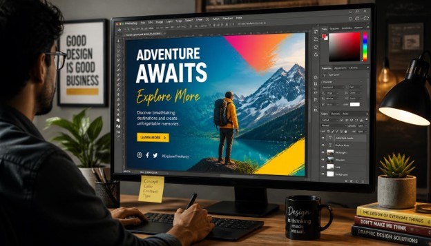
25 Amazing Photoshop Tips to Improve Your Designs and Fix Common Problems
Every designer hits the same walls in Adobe Photoshop. Edges look jagged, colors feel flat, files grow huge, and simple edits take far too long. The good news is that most of these problems have quick fixes.
This guide shares 25 practical Photoshop tips that help you work faster, design cleaner, and rescue projects that seem broken. Whether you are a beginner or a working professional, these Photoshop tips fit almost any workflow.
Each tip is short, actionable, and easy to test. You can read the article from top to bottom or jump straight to the problem you need to solve today.
Bookmark this page, because the best Photoshop tips are the ones you return to again and again.
Why Photoshop Tips Matter for Every Designer
Photoshop is deep. Even after years of use, most designers touch only a small part of what it can do.
Learning the right Photoshop tips saves hours every week. It also raises the quality of your work, because you spend less time fighting the software and more time making creative decisions.
Good habits like organizing layers, working non-destructively, and using shortcuts compound over time. Small Photoshop tips often create the biggest gains.
Below, the tips are grouped into five sections: workspace and workflow, selections and masks, retouching and color, design and typography, and export and automation.
Workspace and Workflow
1. Customize Your Workspace and Save It

A cluttered workspace slows you down. Go to Window > Workspace and choose a preset that matches your task, such as Photography, Graphics and Web, or Motion.
Then drag panels where you want them and save the layout with Window > Workspace > New Workspace. You can now reset it any time with a single click.
Many designers overlook this among Photoshop tips, yet it removes friction from every project. A tidy workspace also reduces eye strain during long sessions.
Keep only the panels you use daily, such as Layers, Properties, and Adjustments. Everything else can stay hidden until you need it. Building a workspace around your habits is one of the easiest Photoshop tips to apply today.
2. Learn Essential Keyboard Shortcuts

Shortcuts are the fastest way to speed up your work. Instead of hunting through menus, you trigger tools and commands in a fraction of a second.
Start with the basics. Ctrl/Cmd + J duplicates a layer, Ctrl/Cmd + T opens Free Transform, and Ctrl/Cmd + Z undoes your last step. Add Ctrl/Cmd + Alt/Option + Shift + E to stamp all visible layers into a new one.
Ask any veteran and they will name shortcuts as the most valuable of all Photoshop tips.
Learn five new shortcuts each week and practice them until they feel natural. You can also build custom keys under Edit > Keyboard Shortcuts. Over a month, these tiny Photoshop tips will noticeably shorten your editing time.
3. Use Smart Objects for Non-Destructive Editing

Resizing a normal layer again and again slowly destroys its quality. Each scale-down throws away pixels that you cannot get back.
Right-click a layer and choose Convert to Smart Object. Photoshop now stores the original data, so you can scale, rotate, and warp freely without losing sharpness.
Smart Objects also keep filters editable. Apply Gaussian Blur or Sharpen, and you can adjust or hide the filter later.
Among all Photoshop tips for quality control, this one prevents the most regret. Use it for logos, photos, and mockups.
If you place images with File > Place Embedded, they become Smart Objects automatically. That single habit is one of the smartest Photoshop tips for keeping projects flexible.
4. Use Adjustment Layers Instead of Direct Edits

Applying Brightness or Hue changes directly to pixels is permanent. Adjustment layers give you the same result with full control.
Click the half-black circle icon at the bottom of the Layers panel and choose an adjustment such as Curves, Levels, or Vibrance. Each one comes with its own mask, so you can paint the effect exactly where you want it.
You can lower the opacity, change the blend mode, or delete the layer whenever you like. Nothing in your original image is harmed.
Of all Photoshop tips for color work, this is the one professionals rely on daily. Repeat it on every project and your edits become far easier to revise.
Stacking several subtle adjustments usually looks better than one strong edit. These Photoshop tips reward patience.
5. Organize Layers With Names, Colors, and Groups

A file with 150 layers named “Layer 47” is a nightmare. Good organization saves you and your clients time.
Double-click a layer name to rename it. Press Ctrl/Cmd + G to group selected layers, and right-click to assign a color label such as red for text and blue for backgrounds.
Use groups for sections like Header, Content, and Footer. Collapse them when you are not working on them so the panel stays readable.
It may not sound exciting, but organization is one of the most underrated Photoshop tips. Handing off a clean PSD makes you look professional.
Search layers by name using the filter bar at the top of the Layers panel. Combined with naming, these Photoshop tips let you find any element in seconds.
Selections and Masks
6. Master Select Subject and the Object Selection Tool
Cutting out objects used to take forever. Today Photoshop can detect your subject with one click.
Choose Select > Subject and Photoshop uses AI to outline the main object. For more control, use the Object Selection Tool, draw a rough box around what you want, and let it snap to the edges.
Hold Shift to add to a selection and Alt/Option to subtract from it. Then refine with the Quick Selection Tool.
Selections are the foundation of compositing, and these Photoshop tips make them painless. Practice on photos with clear contrast first.
Once you feel confident, try complex images with hair or fur. Combining several Photoshop tips, such as Select Subject followed by Select and Mask, gives excellent results.
7. Refine Edges With Select and Mask

Rough cutouts are the biggest giveaway of a poor edit. Select and Mask helps you fix halos, jagged edges, and messy hair.
With a selection active, click Select and Mask in the top options bar. Use the Refine Edge Brush on hair and fuzzy edges, and adjust Smooth, Feather, and Shift Edge for a natural blend.
Turn on Decontaminate Colors to remove the colored fringe left from the old background. Output to a new layer with a layer mask for the safest workflow.
This is one of those Photoshop tips that turns an amateur cutout into a professional one. Take a minute to view your result on different backgrounds, both light and dark.
Using such Photoshop tips consistently will make your composites believable.
8. Use Layer Masks Instead of the Eraser
The Eraser tool deletes pixels forever. A layer mask hides them instead, and you can bring them back at any time.
Select a layer and click the Add Layer Mask button. Paint with black to hide areas, paint with white to reveal them, and use soft gray for partial transparency.
Press X to swap between black and white while painting. Use a soft brush for gentle transitions and a hard brush for crisp edges.
Non-destructive editing is a recurring theme among Photoshop tips, and masks are its best example. Every professional retoucher relies on them.
Try gradients on masks to blend two photos smoothly. These practical Photoshop tips instantly improve composites, shadows, and fades.
9. Use Clipping Masks for Clean Design Effects

A clipping mask makes one layer appear only inside the shape of the layer below it. It is perfect for placing photos inside text or shapes.
Place an image above a text or shape layer, then right-click it and choose Create Clipping Mask, or press Ctrl/Cmd + Alt/Option + G. The image now fills only the shape.
You can move the image around to choose the best crop, and the shape stays perfectly sharp. Add adjustment layers above and clip them too, so they affect only that one layer.
Designers love this trick for posters, thumbnails, and social graphics. It ranks high among Photoshop tips for creative layouts.
Try it with textures on lettering. Small Photoshop tips like this add polish with almost no effort.
10. Remove Distractions With Content-Aware Fill

Stray wires, people, or trash can ruin a great photo. Content-Aware Fill removes them and rebuilds the background automatically.
Draw a selection around the object with the Lasso Tool, expand it by a few pixels, then go to Edit > Content-Aware Fill. Check the green sampling area in the preview and adjust it if needed.
Output to a new layer so the edit stays reversible. For tiny blemishes, the Remove Tool or Spot Healing Brush is faster.
Removing distractions is among the most requested Photoshop tips from beginners. Results improve when your selection has a bit of breathing room around the object.
If the first attempt looks repetitive, try again with a different sampling area. Practicing these Photoshop tips builds confidence quickly.
Retouching and Color
11. Heal Blemishes With the Healing Brush and Clone Stamp
Skin blemishes, dust spots, and small flaws are easy to fix if you use the right tool for each job.
Use the Spot Healing Brush for small isolated marks. For larger areas or textured surfaces, use the Healing Brush, hold Alt/Option, and sample a clean area nearby.
The Clone Stamp is better when you need an exact copy of pixels. Always retouch on a separate empty layer and set the tool to Sample: Current & Below.
These are classic Photoshop tips for portrait work, and they keep skin looking natural instead of plastic. Keep brush hardness low and zoom in to about 100 percent.
Subtle edits beat heavy ones. Following these Photoshop tips prevents the over-smoothed look that clients dislike.
12. Fix Dull Colors With Curves

Flat, low-contrast images are one of the most common problems in digital photos and designs. Curves is the most powerful fix.
Add a Curves adjustment layer and pull the line into a gentle S-shape. Lift the highlights slightly and lower the shadows to add contrast without clipping detail.
You can also edit the Red, Green, and Blue channels separately to correct color or create a mood. Click the small hand icon to adjust tones directly on the image.
Learning Curves is one of the best Photoshop tips for anyone serious about color. It takes practice, but it rewards you with total control.
Keep adjustments small at first. Regular use of these Photoshop tips will train your eye to see tonal balance.
13. Use the Camera Raw Filter for Quick Enhancements
Even if your image is a JPEG or a flattened design, you can use the Camera Raw Filter. It gives you Lightroom-style sliders inside Photoshop.
Convert your layer to a Smart Object, then choose Filter > Camera Raw Filter. Adjust Exposure, Highlights, Shadows, Texture, and Clarity in one panel.
The masking tools inside Camera Raw let you brighten only the sky or the subject. Because you used a Smart Object, you can reopen the filter whenever you want.
This is one of the most efficient Photoshop tips for a quick, polished finish. It combines many separate edits into one place.
Add a subtle vignette or a bit of grain to finish. These beginner-friendly Photoshop tips can transform an average photo in minutes.
14. Correct Color Casts With the Gray Eyedropper
Indoor lighting often gives photos an unwanted yellow, green, or blue tint. Fixing it takes about ten seconds.
Add a Curves or Levels adjustment layer and pick the middle eyedropper, the gray point. Click on something in the image that should be neutral gray or white, and the tint disappears.
If the result is too cold or too warm, use Photo Filter or Color Balance to fine-tune it. Compare with the original by toggling the layer’s visibility.
Accurate color builds trust, especially in product photos. These Photoshop tips are essential for e-commerce and portrait work.
Try a few different sample points until it looks right. Practicing such Photoshop tips will make your images look consistent across a whole set.
15. Add Depth With Dodge and Burn

Dodging brightens and burning darkens. Together they shape light, add dimension, and make subjects stand out.
Create a new layer, fill it with 50 percent gray, and set the blend mode to Soft Light. Paint with a soft white brush at low opacity to lighten, and black to darken.
Use a flow of 5 to 10 percent and build the effect slowly. This method is fully reversible because the effect lives on its own layer.
Retouchers consider this one of the most artistic Photoshop tips in the entire program. It can sculpt faces, products, and landscapes.
Zoom out often to check the overall balance. When you master these Photoshop tips, your images will feel more three-dimensional.
16. Sharpen Smartly With the High Pass Filter
Standard sharpening filters can create ugly halos. High Pass sharpening keeps edges crisp and natural.
Duplicate your layer and convert it to a Smart Object. Go to Filter > Other > High Pass and set the radius between 1 and 3 pixels. Then change the blend mode to Overlay or Soft Light.
You can lower the opacity or add a mask to sharpen only the important areas, such as the eyes or product details.
This is a favorite among photographers and one of the most reliable Photoshop tips for final touches. Always sharpen at the end, after resizing.
If the image starts to look crunchy, reduce the radius. Repeating these Photoshop tips on every export improves clarity across your portfolio.
17. Reduce Noise in Low-Light Photos

Grainy photos are a common problem when shooting in low light. Photoshop offers a strong built-in fix.
Convert the layer to a Smart Object, then choose Filter > Noise > Reduce Noise. Increase Strength and Reduce Color Noise until the grain fades, then bring back detail with the Preserve Details slider.
For RAW-quality results, try Camera Raw’s Denoise feature in recent versions. It uses machine learning to clean noise while keeping textures.
Fixing grain quickly is among the most helpful Photoshop tips for event and night photography. Do not push the sliders too far or the image will look waxy.
Apply noise reduction before sharpening. Following these Photoshop tips in the right order gives the cleanest finish.
18. Use Generative Fill to Extend or Change Images
Generative Fill uses AI to add, remove, or replace content based on a text prompt. It is available in recent versions of Photoshop.
Make a selection with the Lasso or Marquee Tool, click Generative Fill in the contextual bar, and type what you want, such as “clear blue sky.” You can also leave the prompt empty to remove an object.
It is also great for extending a canvas. Use the Crop Tool to drag the edges outward, then click Generate to fill the new space.
Every generation creates a separate layer, so you can compare variations. Many creators now count this among the most exciting Photoshop tips.
Always review results at full size for odd details. Used carefully, these modern Photoshop tips can save hours of manual work.
Design and Typography
19. Use Character and Paragraph Styles for Consistent Text

Consistent text makes a design look professional. Styles let you apply the same formatting to many text layers at once.
Open Window > Character Styles and Paragraph Styles. Format a text layer the way you like, then click the plus icon to save it as a style. Apply it to other text layers with one click.
If you later edit the style, every layer using it updates automatically. That is a big time saver on brochures, menus, and web layouts.
Careful typography is one of the quiet Photoshop tips that separates polished layouts from rushed ones. Limit yourself to two or three fonts.
Adjust tracking and leading for readability. These simple Photoshop tips help your text look clean and intentional.
20. Align Perfectly With Guides, Smart Guides, and Grids

Misaligned elements are an instant sign of amateur work. Photoshop has several tools to keep everything neat.
Turn on View > Show > Smart Guides to see pink lines when objects align or share equal spacing. Drag guides from the rulers, or use View > New Guide Layout to create columns and margins.
Use the Align options in the top bar to line up selected layers, and Distribute to space them evenly. Turn on Snap so objects lock to guides.
Layout precision is one of the most practical Photoshop tips for web and print design. It creates balance and a clear visual hierarchy.
Leave generous white space between sections. These layout Photoshop tips make your designs easier to read and more attractive.
21. Create Depth With Layer Styles and Blend Modes

Layer Styles add shadows, strokes, glows, and gradients without permanent changes. Double-click a layer to open the Layer Style dialog.
Use Drop Shadow with low opacity and a large blur for a soft, realistic shadow. Add a subtle Gradient Overlay to give flat shapes some dimension.
Blend modes change how layers interact. Multiply darkens, Screen lightens, Overlay adds contrast, and Color applies hue. Cycle through them with Shift + plus or minus to see the effect live.
These are creative Photoshop tips for text effects, buttons, and lighting. Avoid overdoing them, since heavy effects can look dated.
Copy a style to other layers by right-clicking and choosing Copy Layer Style. Mastering these Photoshop tips will give your designs a modern, professional finish.
22. Design Logos and Icons With Vector Shapes

Pixels blur when scaled up, but vector shapes stay sharp at any size. That makes them ideal for logos, icons, and buttons.
Use the Rectangle, Ellipse, and Custom Shape tools with the mode set to Shape. Combine shapes with Path Operations, such as Unite, Subtract, and Intersect, to build unique forms.
Use the Pen Tool for custom curves. Keep paths simple, with as few anchor points as possible.
Working with vectors is one of the smartest Photoshop tips for anyone creating brand assets. You can also paste shapes from Illustrator as Smart Objects.
Export final logos as SVG or PNG for different uses. Applying these Photoshop tips keeps your branding crisp on screens and in print.
23. Save Time With Swatches and Creative Cloud Libraries

Using the same brand colors and assets across projects is easy with libraries. They keep everything in one shared place.
Open Window > Libraries and create a new library. Drag colors, character styles, logos, and graphics into it. They sync across Photoshop, Illustrator, and other Adobe apps.
You can also share a library with teammates so everyone uses the same approved assets. Save frequently used colors in the Swatches panel and organize them into groups.
Consistency builds brand recognition, which makes this one of the most business-friendly Photoshop tips. It also removes guesswork when picking hex codes.
Name your library items clearly. Small organizational Photoshop tips like these save minutes on every single project.
Export and Automation
24. Export Sharp Images With the Right Settings

Blurry exports and huge files frustrate clients. The right settings solve both problems.
Use File > Export > Export As for web images. Choose JPG for photos, PNG for graphics with transparency, and WebP for smaller files. Keep quality between 70 and 85 percent for a good balance.
Check your document size before exporting. For web, 72 PPI is enough, while print usually needs 300 PPI. Convert to sRGB so colors appear correctly in browsers.
Getting exports right is among the essential Photoshop tips for anyone who publishes online. Faster pages also help your website rank better.
Always zoom to 100 percent to check quality. Following these practical Photoshop tips prevents last-minute surprises.
25. Automate Repetitive Work With Actions and Batch

If you repeat the same steps on many images, let Photoshop do the work. Actions record your steps and replay them with one click.
Open Window > Actions, click New Action, and perform your edits while recording. Stop recording, then run the action on other files. To process a whole folder, use File > Automate > Batch.
Try actions for resizing, watermarking, sharpening, or applying a signature color grade. You can also use Image Processor to convert many files to JPG.
Automation is one of the most powerful Photoshop tips for busy professionals. It turns an hour of clicking into a few seconds.
Test your action on a single image first. These time-saving Photoshop tips are perfect for bloggers, photographers, and agencies.
Common Photoshop Problems and Quick Fixes
Even with great habits, problems pop up. Here are the most common ones and the fast solutions.
- Photoshop is running slowly: Increase the RAM allocation in Preferences > Performance, clear the cache, and merge or rasterize unused layers.
- Jagged edges on selections: Use Select and Mask, and add a small feather of 0.5 to 1 pixel.
- Blurry text or images: Check your document resolution and avoid scaling raster layers. Use Smart Objects.
- Colors look different after export: Convert to sRGB and check that your monitor is calibrated.
- File is too large: Delete hidden layers, flatten a duplicate copy, and save a compressed version for sharing.
Knowing a few troubleshooting Photoshop tips prevents panic when deadlines are close. Most issues come from settings, not from your skills.
Save a checklist of these fixes near your desk. Experienced designers use such Photoshop tips as a quick reference during busy projects.
Final Thoughts on Photoshop Tips
You now have 25 useful ways to work faster, edit smarter, and solve everyday design problems. You do not need to learn everything at once.
Pick three Photoshop tips from this list and use them on your next project. Once they feel natural, add three more.
Consistent practice is what turns these Photoshop tips into real skill. Over time, your designs will look cleaner, your files will stay organized, and your edits will take less time.
Remember that Photoshop rewards curiosity. Experiment, break things, and use the Undo command freely.
Keep this guide handy and share it with fellow designers. The more you apply these Photoshop tips, the more confident and creative you will become.
Frequently Asked Questions (FAQs)
What are the best Photoshop tips for beginners?
Start with layers, layer masks, and adjustment layers. Learn a handful of keyboard shortcuts, and use Smart Objects so your edits stay reversible. These basics support almost everything else you will do in the program.
How can I make Photoshop run faster?
Close unused documents, allocate more RAM in Preferences, and clear your cache regularly. Keep layer counts under control by merging or grouping layers. Using Smart Objects wisely and saving to a fast drive also helps.
What is the difference between a layer mask and the Eraser tool?
The Eraser permanently deletes pixels, while a layer mask only hides them. With a mask, you can paint white to bring the content back. That is why professionals prefer masks for nearly all edits.
How do I fix blurry images in Photoshop?
Use Filter > Sharpen > Smart Sharpen or the High Pass method for mild blur. Make sure you are not enlarging a small image too far. Sharpening cannot fully restore detail that was never captured, so start with the best source file available.
Are these Photoshop tips useful for professional designers too?
Yes. Many of these Photoshop tips, such as non-destructive editing, styles, and automation, are used daily by professionals. Even experts benefit from revisiting the fundamentals to work faster and stay consistent.
Which file format should I use to export from Photoshop?
Use JPG for photographs, PNG when you need transparency, and WebP for smaller web images. Choose PDF or TIFF for print. Always save a layered PSD copy so you can make changes later.
Graphics Design
Photoshop Brushes: 25 Powerful Brushes Every Designer Should Know to Avoid Common Mistakes (2026)
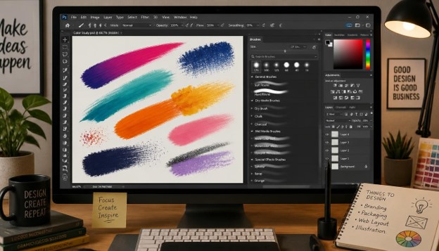
Photoshop Brushes: 25 Powerful Brushes Every Designer Should Know to Avoid Common Mistakes (2026)
If you have ever opened the Brush panel and felt overwhelmed by the sheer number of options, you are not alone. Photoshop Brushes are one of the most powerful tools inside Photoshop, yet most designers only ever use a tiny fraction of what these tools can actually do. The result is flat artwork, muddy textures, and hours wasted trying to fix mistakes that better brush choices could have avoided in the first place.
In this guide, we are going to walk through 25 of the most useful Photoshop Brushes that every designer, illustrator, and photo editor should have in their toolkit. Along the way, we will point out the common mistakes people make with Photoshop Brushes and show you how to avoid them. Whether you are retouching photos, designing concept art, building textures, or creating social media graphics, this list of Photoshop Brushes will give you a solid foundation to work from in 2026 and beyond.
Each brush type below comes with a short explanation of what it does, when to use it, and a quick tip to help you get better results. We have kept the paragraphs short and easy to scan, so you can quickly find the Photoshop Brushes that fit your current project without reading through walls of text.
What Are Photoshop Brushes and Why Do They Matter?
Photoshop Brushes are customizable tools that let you paint, draw, texture, and blend directly on your canvas. Unlike a plain round brush, a well-made brush can simulate watercolor, charcoal, fur, smoke, or even fabric stitching in a single stroke.
The difference between amateur-looking artwork and professional design often comes down to brush choice. A designer who understands Photoshop Brushes can add realism, depth, and mood to an image in seconds. Someone who ignores brush settings ends up with flat, lifeless results no matter how much time they spend.
Add short and concise paragraphs for better readability and UX. This is exactly why we have broken this article into small, scannable sections. Long blocks of text are hard to read on a screen, and readers scanning for Photoshop Brushes tips usually want quick, actionable answers rather than dense paragraphs.
Photoshop Brushes are not just for illustrators. Photographers use them for dodging and burning, retouchers use them for skin smoothing, and web designers use them to build textured backgrounds. Once you understand how brushes work, you will find new uses for them in almost every project.
Common Mistakes Designers Make With Photoshop Brushes
Before we get into the list, let’s talk about the mistakes that hold most people back when using Photoshop Brushes.
Mistake 1: Using default settings only. Many designers never touch the Brush Settings panel. They pick a brush, click it on the canvas, and move on. This ignores opacity jitter, scattering, and texture options that make Photoshop Brushes look natural instead of robotic.
Mistake 2: Ignoring pressure sensitivity. If you use a drawing tablet, failing to enable pen pressure for size and opacity is one of the biggest reasons strokes look stiff and uneven.
Mistake 3: Overusing hard round brushes. Hard edges work for some tasks, but relying on them for everything makes artwork feel flat. Mixing in textured Photoshop Brushes adds much-needed variation.
Mistake 4: Not organizing brush libraries. As you download more Photoshop Brushes, your panel can get cluttered fast. Without folders and clear naming, you waste time hunting for the right brush mid-project.
Mistake 5: Skipping brush resolution checks. Some brushes look great at low zoom but pixelate badly when scaled up for print. Always check a brush’s native resolution before committing to a large canvas.
Mistake 6: Forgetting to save custom presets. If you spend time tweaking a brush to get the perfect scatter and texture, save it as a preset. Otherwise, you will have to redo that work every single time.
Keep these mistakes in mind as you go through the list below. Each brush category comes with tips to help you sidestep these exact problems.
25 Powerful Photoshop Brushes Every Designer Should Know

1. Sketchy Pencil Brush
This is one of the most versatile Photoshop Brushes for concept artists and illustrators. It mimics the texture of graphite on paper, complete with slight grain and pressure-sensitive line weight.
Use it for quick thumbnails, rough layouts, or adding a hand-drawn feel to digital work. Pair it with a textured paper layer for an even more authentic look. Many designers keep this among their most-used brush types simply because it’s fast to sketch with and easy to erase cleanly during the planning stage of a project.

2. Watercolor Splash Brush
Watercolor brushes are among the most popular Photoshop Brushes because they add organic, unpredictable texture that is nearly impossible to fake with solid fills.
They work best when you lower the opacity and layer multiple strokes on top of each other. This builds up realistic pigment pooling, just like real watercolor paint. For book covers, invitations, and greeting cards, this style of brush has become a go-to choice because it instantly softens an otherwise digital-looking design.
3. Chalk Texture Brush
Chalk brushes give you a soft, slightly rough edge that’s perfect for vintage posters, hand-lettering, and rustic branding projects.
This brush type is great for adding texture to typography without needing a separate texture layer.
4. Charcoal Brush
Charcoal brushes produce heavy, expressive strokes with natural smudging. Among Photoshop Brushes, this one is a favorite for dramatic portrait sketches and moody concept art.
Combine it with the Smudge tool for even more realistic blending between light and shadow areas. Portrait artists often reach for this brush before switching to cleaner tools for final detailing, since the loose charcoal texture is ideal for blocking in values quickly.
5. Ink Splatter Brush
Ink splatter brushes add chaotic, organic energy to a design. They’re commonly used in grunge posters, band merchandise, and editorial illustration.
Because splatter patterns repeat if used carelessly, rotate and scale the brush between strokes to keep the pattern looking random and natural.

6. Smoke Brush
Smoke brushes are essential for anyone doing atmospheric compositing work, from movie posters to album covers. Good smoke brushes among Photoshop Brushes include soft edges and varied density.
Layer several smoke strokes at different opacities and blend modes like Screen or Lighten for the most convincing results. This makes smoke one of the more technically demanding brush types to master, but also one of the most rewarding once you get the layering right.
7. Cloud Brush
Cloud brushes save enormous time when building skies for matte paintings or landscape composites. Rather than painting every wisp by hand, a good cloud brush gives you a realistic base to build on.
Always match the light direction of your cloud brush strokes to the rest of your scene, or the composite will look off.
8. Grass and Foliage Brush
Foliage brushes let you quickly populate a landscape with grass, leaves, and shrubs. These are some of the most time-saving Photoshop Brushes for environment artists and photo editors.
Vary the size and rotation of each stroke to avoid an obvious repeating pattern. Landscape and environment artists rank foliage among the most time-saving brushes in their entire library, since manually painting individual leaves would take hours.
9. Hair Brush
Hair brushes are indispensable for portrait retouching and character illustration. They allow you to add fine, wispy strands that would take forever to paint manually with a standard round tip.
Set the brush to follow pen tilt and rotation if your tablet supports it, so each strand flows naturally with your hand movement.
10. Fur Brush
Similar to hair brushes, fur brushes simulate the texture of animal coats. These are popular Photoshop Brushes among character designers and creature artists.
Layer light and dark fur strokes to build volume, then finish with a few stray hairs along the silhouette edge for realism.

11. Splatter Paint Brush
Paint splatter brushes add bold, energetic marks that work well in sports branding, streetwear design, and music promotion graphics.
Because these brushes can look repetitive, always mix in at least two or three different splatter variations in a single design.
12. Grunge Texture Brush
Grunge brushes simulate scratches, dirt, and worn surfaces. They’re one of the most requested categories of Photoshop Brushes because they instantly age a design and add character.
Apply grunge texture on a separate layer set to Multiply so it interacts naturally with the colors beneath it. Streetwear and music merchandise designers lean on this texture constantly, since a worn, distressed look has stayed popular across multiple design trends over the years.
13. Light Leak and Lens Flare Brush
These brushes simulate the warm, hazy light leaks seen in analog photography. They’re a fast way to give digital photos a nostalgic, cinematic look.
Keep opacity low and place light leaks near a light source in the image so the effect looks believable rather than pasted on.
14. Snow and Rain Brush
Weather brushes let you add falling snow or rain streaks without manually painting thousands of individual particles. These practical Photoshop Brushes are widely used in seasonal marketing graphics.
Vary the brush size slightly between layers to create a sense of depth, with larger flakes or drops appearing closer to the viewer.
15. Fire and Flame Brush
Fire brushes are tricky to get right, but a well-made one saves huge amounts of time compared to painting flames by hand.
Use warm color layers underneath with a Screen blend mode, and always add a subtle glow layer behind the flame shapes for realism. Movie poster artists and album cover designers often build fire effects from several overlapping stroke variations rather than a single pass, since real flames rarely hold one consistent shape for long.

16. Dust and Particle Brush
Dust brushes add tiny floating specks that catch the light, which is a small detail that makes a huge difference in atmospheric compositions.
Scatter these particles more densely near light sources and sparsely elsewhere to mimic how dust behaves in real environments. A subtle motion blur applied to a duplicate particle layer can also help sell the illusion of depth, since faraway specks appear softer than ones close to the camera.
17. Concept Art Rock Brush
Rock and stone texture brushes are a staple for environment concept artists. They let you rough in cliffsides, boulders, and terrain quickly during the early stages of a piece.
Rotate and flip the brush frequently so repeated rock shapes don’t create an obviously tiled look across your terrain. These texture sets pair particularly well with a grungy overlay, which helps break up any remaining repetition and adds extra grit to cliff faces and canyon walls.
18. Cross-Hatching Brush
Cross-hatching brushes replicate the fine, overlapping line technique used in traditional pen-and-ink illustration. They’re excellent for comic book shading and editorial illustration styles.
Adjust line spacing and angle in the Brush Settings panel to control how dark or light the shaded area appears. Comic artists and editorial illustrators often keep several angle variations of this brush saved, treating it as one of the core Photoshop Brushes in their shading workflow.
19. Halftone Brush
Halftone brushes create the dotted pattern associated with vintage comics and screen printing. This style remains popular in modern streetwear and poster design.
Keep dot size consistent across a single design element, but vary spacing to create gradients of light and shadow. This effect works especially well on apparel graphics and gig posters, where a retro print aesthetic is often the whole point of the design.
20. Stitch and Fabric Brush
Stitch brushes simulate sewing lines and fabric textures, which is useful for mockups, patches, and apparel design projects.
Combine a stitch brush with a subtle drop shadow to make the thread appear slightly raised off the fabric surface. This small touch of dimension is often what separates a convincing apparel mockup from one that reads as obviously flat and digital.
21. Calligraphy Brush
Calligraphy brushes bring elegant, variable-width strokes to hand-lettering projects. These are some of the most refined Photoshop Brushes available, closely mimicking real brush pens and nibs.
Practice consistent pressure control, since uneven pressure is the most common reason digital calligraphy looks shaky compared to real ink work. Slowing down your stroke speed also helps, since rushing tends to produce thin, inconsistent lines that break the illusion of a real brush pen.

22. Abstract Geometric Brush
Geometric pattern brushes let you stamp shapes like triangles, hexagons, or dot grids quickly across a canvas. They’re useful for modern branding and background design.
Set these brushes to scatter along the path so the pattern feels dynamic rather than mechanically repeated. Try combining two contrasting shapes, like circles and triangles, on separate layers to build a more layered, modern pattern instead of relying on a single repeated motif.
23. Wood Texture Brush
Wood grain brushes add convincing texture to furniture mockups, rustic branding, and packaging design. They save the trouble of photographing or sourcing separate wood texture images.
Rotate the grain direction to follow the form of the object you’re texturing for a believable result. Adding a soft highlight layer along raised edges will also help sell the illusion of a real, physical wood surface rather than a flat digital pattern.
24. Skin Retouching Brush
Soft, low-opacity retouching brushes are essential in portrait photography workflows. They allow subtle smoothing without erasing natural skin texture entirely.
Always work on a duplicate layer with reduced opacity so retouching stays soft and doesn’t create an artificial, plastic look. Zoom out periodically while retouching, since smoothing that looks fine up close can appear excessive once you view the full image at normal size.
25. Starburst and Sparkle Brush
Sparkle brushes add small highlights and glints of light, commonly used in beauty, jewelry, and fashion photography retouching.
Use them sparingly. A handful of well-placed sparkles looks intentional, while too many scattered across an image looks cluttered. Placing sparkles along the edges of jewelry, glassware, or wet surfaces tends to look far more natural than scattering them randomly across the entire frame.

How to Choose the Right Photoshop Brushes for Your Project
With thousands of options available online, picking the right Photoshop Brushes can feel overwhelming. The key is to think about the outcome you want before you start browsing brush packs.
If you’re working on a photo-realistic composite, look for Photoshop Brushes with natural texture variation, like the smoke, cloud, or dust brushes covered earlier. These add believable atmosphere without requiring you to hand-paint every detail.
If your project leans toward branding or typography, calligraphy, grunge, and geometric brushes tend to be more useful. These Photoshop Brushes give you clean, controllable strokes that still carry personality and texture.
For illustrators working in concept art or character design, prioritize brushes with strong edge control, like the sketchy pencil, charcoal, and cross-hatching sets. These Photoshop Brushes give you the flexibility to move between loose sketching and detailed rendering in the same file.
It also helps to think about file size and performance. Extremely high-resolution Photoshop Brushes can slow down your canvas, especially when you’re stacking dozens of strokes on a single layer. If you notice lag, try flattening completed sections before continuing.
Finally, consider your own workflow speed. Some designers prefer a smaller set of versatile Photoshop Brushes they know inside and out, while others like having a huge library to pull from for every possible scenario. Neither approach is wrong, but knowing your own habits will help you build a collection that actually gets used instead of sitting untouched in a folder.
Photoshop Brushes for Different Design Niches
Different fields of design tend to gravitate toward different categories of Photoshop Brushes. Here’s a quick breakdown of what works best where.
Photography and retouching. Photographers rely heavily on soft, low-opacity Photoshop Brushes for dodging, burning, and skin smoothing. Sparkle and light leak brushes are also popular for adding a finished, editorial look to portrait work.
Illustration and concept art. Illustrators reach for sketchy pencil, charcoal, and cross-hatching brushes during the early stages of a piece, then switch to smoke, cloud, and foliage brushes when building out environments and atmosphere.
Branding and marketing. Marketing designers often use grunge, splatter, and calligraphy Photoshop Brushes to give otherwise clean, corporate layouts a more human, handcrafted feel. This is especially common in streetwear, food and beverage, and lifestyle branding.
Game and environment art. Concept artists building game worlds depend on rock, foliage, and fur brushes to quickly rough in terrain, vegetation, and creature designs before moving into detailed rendering.
Social media and content creation. Content creators frequently use snow, rain, and sparkle Photoshop Brushes to add seasonal or festive touches to thumbnails, banners, and promotional graphics without needing to source separate stock overlays.
No matter which niche you work in, the underlying principle stays the same: understanding how Photoshop Brushes behave under different settings will always produce better results than clicking a random brush and hoping for the best.
How to Install and Organize Photoshop Brushes
Once you’ve collected a solid set of Photoshop Brushes, installation is simple. Open the Brush Settings panel, click the menu icon, and choose Import Brushes. Select the .abr file you downloaded, and the new brushes will appear in your panel.
Organization matters more than most people realize. Create folders by category, such as Texture, Nature, Lettering, and Retouching. This makes it much faster to find the right brush when you’re in the middle of a project instead of scrolling through hundreds of thumbnails.
It’s also worth deleting brushes you never use. A cluttered brush panel filled with Photoshop Brushes you downloaded once and forgot about only slows you down.
Consider setting up a naming convention as well. Prefixing files with a category, like “TEX_grunge01” or “NAT_foliage03,” makes searching the panel far faster than scrolling through generic default names. If you work across multiple projects or clients, you might even keep separate brush libraries saved as individual .abr files, so you can load only the set relevant to the job at hand instead of cluttering your main panel with everything at once.
Backing up your brush library is another step people tend to skip until it’s too late. Store your .abr files in a cloud folder or external drive, especially if you’ve spent hours fine-tuning custom presets. Losing a carefully built collection to a computer crash or failed update is a frustrating, avoidable setback.
Photoshop Brush Shortcuts and Workflow Tips
Speed matters when you’re deep into a project, and a few keyboard shortcuts can save you significant time when switching between brush tools.
Pressing the bracket keys, [ and ], quickly decreases or increases brush size without needing to open any panel. Adding Shift to either bracket adjusts hardness instead, which is useful when moving between soft blending strokes and crisp detail work.
The number keys control opacity in ten percent increments, so tapping 5 instantly sets opacity to fifty percent. This is much faster than dragging a slider, especially when you’re building up layered textures like smoke or watercolor effects.
Holding Alt while clicking with a brush tool active temporarily switches to the Eyedropper, letting you sample a color from your canvas without switching tools manually. This is especially handy when working with skin tones during retouching or blending multiple texture layers together.
If you frequently reuse a specific combination of size, opacity, scatter, and texture settings, save it as a Tool Preset. This locks in your configuration so you can jump straight back into a familiar workflow instead of rebuilding settings from scratch every session.
Finally, get comfortable with the Brush Settings panel’s preview window at the bottom. It shows you exactly how your current settings will behave before you commit a single stroke to the canvas, which can save a lot of trial and error, especially with more complex texture-based tools.
Building these habits into your daily workflow pays off over time. What feels slow and deliberate at first becomes second nature after a few weeks of consistent practice, and you’ll find yourself reaching for the right tool almost automatically.
Tips for Getting the Most Out of Your Photoshop Brushes
Short paragraphs make this section easy to scan, so here are quick, practical tips you can apply right away:
- Always test a new brush on a blank layer before committing it to your main artwork.
- Adjust opacity jitter and size jitter in Brush Settings to avoid repetitive-looking strokes.
- Use a graphics tablet with pressure sensitivity whenever possible, since mouse-drawn strokes rarely look as natural.
- Save your favorite brush combinations as tool presets so you don’t have to reconfigure settings every session.
- Group similar Photoshop Brushes into folders so your panel stays organized as your collection grows.
- Check brush resolution before scaling artwork up for print to avoid pixelation.
- Rotate, flip, and resize texture brushes between strokes to prevent an obvious repeating pattern.
Following these habits will help you avoid the most common mistakes designers make and get consistently better results from any set of Photoshop Brushes you use.
It’s also worth revisiting your brush settings periodically. As you grow more comfortable, you’ll likely find new combinations of scatter, texture, and dual-brush settings that give your Photoshop Brushes an even more personalized feel. Many professional designers spend as much time refining brush behavior as they do actually painting, because a well-tuned brush can cut editing time dramatically.
Don’t be afraid to combine multiple Photoshop Brushes within the same piece of artwork. A landscape composite, for example, might use cloud brushes for the sky, foliage brushes for the ground, and dust particle brushes for atmosphere, all layered together with different blend modes. Mixing brush types is often what separates a flat digital painting from one that feels layered and dimensional.
Brush Presets vs. Custom Textures: Which Should You Use?
A common question designers run into is whether to rely on premade brush packs or build custom textures from scratch. Both approaches have a place, and understanding the trade-offs will help you decide which fits a given project.
Premade brush packs are fast. You can download a set, import it, and start painting within minutes. This is ideal for tight deadlines or exploratory work, where you need believable texture without spending hours crafting it yourself. High-quality packs from experienced artists also tend to include thoughtful scatter and jitter settings already dialed in, which saves you the trial and error of building those settings from zero.
Custom textures, on the other hand, give you full creative control. If you’re working on a signature style or branding for a client, a set of hand-built brushes can produce a look that no one else has access to. This matters most in competitive fields like editorial illustration or packaging design, where standing out visually is part of the job.
A practical middle ground many professionals land on is starting with premade brush sets and modifying them. Import a texture pack, then tweak the shape dynamics, scatter, and color dynamics settings until the strokes feel like your own. This gives you the speed of a ready-made resource with a layer of personalization that keeps your work from looking identical to everyone else using the same download.
If you do decide to build your own texture from scratch, start simple. Photograph or scan a real-world surface, like crumpled paper, tree bark, or fabric, then clean it up in Photoshop and define it as a brush preset. Natural, photographed textures often look more convincing than purely digital ones because they carry authentic imperfections that are hard to replicate by hand.
Whichever route you choose, keep testing on real projects. A texture that looks great in an isolated preview swatch doesn’t always behave the same way once it’s layered into a full composition with other elements, lighting, and color grading applied.
Final Thoughts
Photoshop Brushes are one of the most underrated tools in a designer’s kit. The difference between a flat, uninspired design and a polished, professional one often comes down to which brushes you reach for and how well you understand their settings.
The 25 brushes covered in this guide represent a well-rounded toolkit that covers illustration, photo retouching, texture work, and typography. Start by downloading a few categories that match your current projects, experiment with the settings, and build your own personal library of go-to Photoshop Brushes over time.
Avoiding the common mistakes we outlined, like relying only on default settings or skipping resolution checks, will save you time and frustration. With the right set of Photoshop Brushes and a bit of practice, you’ll notice a real difference in the depth and realism of your work.
Design trends shift constantly, but the underlying value of understanding your tools never really goes out of style. Software updates may add new panels, new AI-assisted features, and new shortcuts over the years, yet the fundamentals covered in this guide, choosing the right texture, adjusting settings thoughtfully, and organizing your library, will remain useful no matter how the interface changes around them.
If you’re just getting started, don’t feel pressured to master all 25 categories at once. Pick two or three that align with your current projects, spend a week or two really learning their settings, and expand from there. Skills built slowly and deliberately tend to stick far better than trying to absorb everything in a single afternoon.
Bookmark this guide and come back to it whenever you’re starting a new type of project. Having a quick reference for which brush category fits which situation can shave real time off your workflow, letting you spend less time hunting through menus and more time actually creating.
Frequently Asked Questions About Photoshop Brushes
- Where can I download free Photoshop Brushes? Many design communities and marketplaces offer free brush packs, including sites dedicated to digital art resources. Always check the license before using downloaded Photoshop Brushes in commercial projects.
- Are Photoshop Brushes compatible across different Photoshop versions? Most .abr brush files work across recent Photoshop versions, though very old brush sets may need reformatting. It’s a good idea to test new Photoshop Brushes after any major software update.
- Can I create my own custom Photoshop Brushes? Yes. You can turn any image or texture into a brush using the Edit menu’s “Define Brush Preset” option. This is a great way to build unique Photoshop Brushes tailored to your personal style.
- Why do my Photoshop Brushes look pixelated when I zoom in? This usually happens when a brush’s native resolution is lower than your canvas size. Always check the pixel dimensions of a brush before using it on a large or print-ready file.
- How many Photoshop Brushes should I actually keep in my library? There’s no fixed number, but quality matters more than quantity. A focused library of 50 to 100 well-organized Photoshop Brushes is usually more useful than thousands of unsorted, rarely-used ones.
- Do Photoshop Brushes work with a mouse, or do I need a tablet? Photoshop Brushes work with a mouse, but a pressure-sensitive tablet gives far more natural results, especially for texture and lettering brushes that rely on varying stroke width.
- What’s the biggest mistake beginners make with Photoshop Brushes? The most common mistake is never opening the Brush Settings panel. Default settings rarely produce the best results, and small adjustments to scatter, jitter, and texture can dramatically improve how natural your strokes look.
- Can Photoshop Brushes slow down my computer? Very large or high-resolution Photoshop Brushes can affect performance, especially on older machines. If you notice lag while painting, try flattening layers periodically or lowering the brush’s spacing setting to reduce processing load.
- Are paid Photoshop Brushes worth buying over free ones? Paid brush packs are often more polished and better organized, but plenty of free Photoshop Brushes are just as capable for everyday design work. It usually comes down to whether you need a specific, highly refined effect or a general-purpose set.
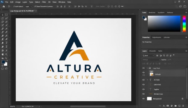
15 Tips Logo Design in Photoshop to Create Better Brand Identities
A logo is the face of a brand. It appears on websites, packaging, social media profiles, invoices, and storefronts, and people form an opinion about a business within seconds of seeing it. A weak logo can make a strong company look unprofessional, while a well-crafted one builds trust before a single word is read.
Many designers and business owners already own Adobe Photoshop, so it is natural to ask whether logo design in Photoshop is a smart choice. The answer is yes, as long as you understand its strengths and limits. Photoshop offers powerful shape tools, a precise Pen tool, flexible typography controls, and a non-destructive workflow that suits modern branding projects.
This guide shares 15 practical tips to help you get better results from logo design in Photoshop. Whether you are a beginner making your first mark or a freelancer refining your process, each tip is explained in short, clear paragraphs so you can apply it right away. By the end, you will know how to plan, build, test, and export a logo that supports a strong brand identity.
Why Logo Design in Photoshop Still Works
Photoshop is best known for photo editing, but it has grown into a capable design tool. Logo design in Photoshop gives you shape layers, vector paths, smart objects, layer styles, and advanced color management in one place. That means you can move from concept to mockup without switching software.
Another advantage is familiarity. Millions of creators already know the Photoshop interface, so the learning curve for logo design in Photoshop is gentler than starting from scratch in a new program. You can build on skills you already have.
It is worth being honest about one limit. Photoshop is primarily a raster program, which means pixel-based files can lose sharpness when scaled up. However, if you use shape layers, paths, and smart objects correctly, logo design in Photoshop can still produce clean, scalable results. The tips below show you how.
Tip 1: Start With Research and a Clear Brand Brief

Great logos begin long before you open Photoshop. Start by learning about the business: its mission, audience, values, and competitors. Ask what feeling the brand should create, whether that is trust, energy, luxury, or friendliness.
Write a short brand brief that answers these questions in plain language. Include the company name, tagline, target customers, and the words the brand wants to be associated with. This document becomes your compass throughout the project.
Next, study competitors. Note which colors, shapes, and styles dominate the industry, then decide how your design can stand apart. A logo that looks like everyone else’s will never be memorable.
Finally, gather a mood board with color samples, typography examples, and visual references. Doing this groundwork saves hours later, because your logo design in Photoshop will have a clear direction instead of random experimentation. Research turns creative guessing into confident decision making.
Tip 2: Sketch Ideas on Paper Before Opening Photoshop

It is tempting to jump straight into the software, but paper is faster for generating ideas. A pencil lets you explore ten concepts in the time it takes to build one digital layout. Sketching also frees you from technical distractions.
Draw small thumbnails, dozens of them if possible. Try wordmarks, symbols, monograms, and combinations. Do not judge them yet; the goal is quantity first, quality second.
After a round of sketching, circle the three strongest ideas. Look for concepts that are simple, distinctive, and connected to the brand brief. Weak ideas usually reveal themselves quickly when you view them side by side.
When you finally begin logo design in Photoshop, you can scan or photograph your best sketch and place it on a layer as a reference. Lower its opacity and trace over it using shape tools or the Pen tool. This hybrid method keeps the human touch of hand drawing while delivering the precision of digital work.
Tip 3: Set Up the Right Document From the Start

Your document settings shape everything that follows. For logo design in Photoshop, create a large canvas, such as 3000 by 3000 pixels, at 300 pixels per inch. A big canvas gives you room to zoom in on fine details and export high-resolution versions later.
Choose RGB color mode for logos that will mainly appear on screens, such as websites and social media. If the logo will be printed, you may need a CMYK version too, but it is usually best to design in RGB first and convert carefully at the end.
Set the background to transparent. A transparent canvas ensures your logo can be placed over any color or photo without an ugly white box around it.
Turn on rulers and guides right away. They help you keep elements aligned and centered as you work. Taking two minutes to prepare the document properly will prevent frustrating problems, especially when logo design in Photoshop becomes complex with many layers.
Tip 4: Use Shape Tools for Clean, Vector-Based Elements

Shape layers are the foundation of scalable logo design in Photoshop. Unlike painted or brushed pixels, shapes are vector-based, which means their edges stay crisp at any size. Always choose the Shape option rather than Pixels when using the Rectangle, Ellipse, Polygon, or Custom Shape tools.
Many famous logos are built from basic geometry. Circles, squares, and triangles combine into surprisingly sophisticated marks. Try overlapping shapes and using the path operations, such as Combine, Subtract, Intersect, and Exclude, to carve out new forms.
The Properties panel lets you adjust corner radius, stroke, and fill numerically. This precision matters because logos rely on consistent proportions. A corner radius that is off by a few pixels can make a design feel sloppy.
Practicing with shapes is one of the fastest ways to improve your logo design in Photoshop. Start with simple combinations, then gradually build more complex icons as your confidence grows.
Tip 5: Master the Pen Tool for Custom Shapes

When basic shapes are not enough, the Pen tool gives you complete control. It creates paths made of anchor points and curve handles, allowing you to draw any custom outline. For serious logo design in Photoshop, this tool is essential.
The secret to smooth curves is using as few anchor points as possible. Too many points create lumpy, uneven edges. Place points at the extremes of a curve, then pull the handles to shape the line.
Use the Direct Selection tool to refine your work. You can move individual points, adjust handles, and fix small errors without redrawing everything. Zooming in to 200 or 300 percent helps you spot flaws that would be invisible at normal size.
The Pen tool takes practice, so be patient. Trace over simple objects, letters, and your own sketches until the process feels natural. Once you are comfortable, your logo design in Photoshop will feel more like drawing and less like fighting the software.
Tip 6: Use Smart Objects for Non-Destructive Editing

Clients love revisions, so your workflow should make changes easy. Smart Objects protect your original artwork while letting you scale, rotate, and transform it repeatedly without losing quality. Converting logo elements into Smart Objects is one of the smartest habits in logo design in Photoshop.
Right-click a layer and choose Convert to Smart Object. You can then resize it up and down as many times as needed with no degradation. You can also double-click it to edit the contents in a separate window.
Smart Objects are especially useful for mockups. You can place your finished logo inside a Smart Object, then reuse it across business cards, signage, and packaging templates. Update it once and every mockup refreshes automatically.
Pair Smart Objects with adjustment layers and smart filters for a fully non-destructive workflow. When feedback arrives, you can change a color or effect in seconds instead of starting over. This flexibility makes logo design in Photoshop far more efficient.
Tip 7: Choose Typography That Matches the Brand Personality

Typography carries as much personality as any symbol. A bold sans-serif feels modern and confident, while a delicate serif suggests elegance and tradition. Script fonts can feel personal, but they risk poor readability at small sizes.
When working on logo design in Photoshop, limit yourself to one or two typefaces. Too many fonts create visual noise and weaken the brand. A common approach is to pair a distinctive display font for the name with a simple, readable font for the tagline.
Pay close attention to kerning, which is the space between individual letters. Default spacing is rarely perfect, especially in a wordmark. Adjust it manually so the gaps look even, and check pairs like “AV” or “TY” that often need tightening.
Also confirm the font license. Many free fonts are not cleared for commercial use, and using them in a logo can cause legal trouble later. Finally, consider converting text to shapes so the logo looks the same everywhere. Careful type choices elevate any logo design in Photoshop.
Tip 8: Build a Purposeful Color Palette

Color triggers emotion faster than shape or text. Blue often signals trust and stability, red suggests energy and urgency, green connects to nature and growth, and yellow feels optimistic. Choose colors that reflect the brand’s personality and appeal to its audience.
Keep the palette small. Most effective logos use one to three colors. This restraint makes the design easier to reproduce and easier to remember.
Use the Color Picker and Swatches panel to save your exact values. Record the hex codes, RGB numbers, and, if needed, CMYK equivalents so the brand can stay consistent across every platform. Consistency is a big part of professional logo design in Photoshop.
Do not forget accessibility. Check that your colors have enough contrast against both light and dark backgrounds. A beautiful palette that cannot be read is a failed palette. Testing color combinations early will save you from redesigning later in your logo design in Photoshop project.
Tip 9: Use Grids, Guides, and Alignment for Balance

Professional logos feel balanced because their proportions are deliberate. Grids and guides help you achieve that. In logo design in Photoshop, you can enable the grid from the View menu and drag guides from the rulers.
Use circles and squares as construction aids. Many iconic marks are built on geometric grids, where every curve and angle relates to another. Even a simple set of guides can make your design look more harmonious.
The Align and Distribute options in the toolbar are powerful allies. Select multiple layers and align their centers or edges with a single click. Manual dragging, by contrast, often leaves tiny gaps that look careless once zoomed in.
Optical balance matters too. Sometimes mathematically centered elements look off, and a small nudge fixes it. Trust your eyes as well as your tools. Combining grids with intuition gives your logo design in Photoshop a polished, deliberate look.
Tip 10: Keep the Design Simple and Memorable

Simplicity is the golden rule of branding. The most recognizable logos in the world use very few elements, and you can sketch them from memory. Complexity makes a logo harder to recognize, print, and scale.
During logo design in Photoshop, ask yourself whether every element earns its place. If removing a detail does not hurt the message, remove it. Gradients, textures, and tiny decorative lines often add clutter rather than value.
A useful test is the squint test. Step back or squint at your logo. If the basic shape and idea are still clear, the design is strong. If it turns into a blur, it is too complicated.
Memorability also comes from a unique twist, such as a clever negative space or a hidden shape. Aim for one clear idea rather than many competing ones. Simple, focused logo design in Photoshop produces marks that people remember and recognize instantly.
Tip 11: Organize and Name Your Layers

A messy layers panel slows you down. Layers named “Shape 47 copy 3” become impossible to manage when a client asks for a change. Good organization is a hallmark of professional logo design in Photoshop.
Give every layer a clear, descriptive name, such as “Icon Circle,” “Wordmark,” or “Tagline.” Group related layers into folders, and use color labels to separate sections of the design. This structure makes revisions quick and painless.
Save multiple versions of your file as the project evolves. Names like “logo-v1,” “logo-v2,” and “logo-final” protect you if you need to return to an earlier idea. Also consider keeping alternate layouts, such as horizontal and stacked versions, in separate groups.
If you collaborate with another designer or hand files to a client, organized layers show respect for their time. Clean files are easier to understand, edit, and reuse. Strong organization supports every stage of logo design in Photoshop.
Tip 12: Use Layer Styles and Effects Sparingly

Photoshop offers drop shadows, bevels, glows, and gradient overlays, and it is easy to overuse them. Heavy effects can date a logo quickly and cause problems when printing or embroidering. A strong logo should work in flat color first.
When you do use layer styles in logo design in Photoshop, keep them subtle. A gentle gradient or soft shadow can add depth for digital use, but the core design must stand on its own without them.
Consider creating two versions: a flat primary logo and an enhanced version for special uses like web banners or app icons. The flat version becomes your dependable workhorse for signage, stamps, and merchandise.
Remember that effects can hide weaknesses in the underlying design. If the logo only looks good with a glow or bevel, the concept probably needs improvement. Restraint keeps logo design in Photoshop timeless and versatile.
Tip 13: Test Your Logo in Black and White and at Small Sizes

A logo must work everywhere, not just on a large monitor. Before finalizing your logo design in Photoshop, test the design in pure black, pure white, and grayscale. If it loses its impact without color, the structure needs work.
Shrink the logo to favicon size, around 32 by 32 pixels, and to the size of a social media profile picture. Fine lines and small text often disappear at these sizes. If details vanish, simplify them or create a compact version of the logo.
Test on different backgrounds too. Place your logo on white, black, and busy photographic backgrounds to see how it behaves. You may need a reversed version for dark surfaces.
Many brands maintain a logo family: a full version, a stacked version, an icon-only mark, and a monochrome version. Planning this system during logo design in Photoshop makes the brand flexible across websites, packaging, and print.
Tip 14: Present Your Logo in Realistic Mockups

Clients find it easier to approve a logo when they can see it in real life. Mockups place your design on business cards, storefronts, shirts, mugs, and websites, showing how the identity will actually look. This is a major strength of Photoshop.
Use mockup templates with Smart Objects. Double-click the Smart Object layer, paste your logo, save, and the mockup updates instantly. It takes only a few minutes to produce a professional-looking presentation.
Show a variety of applications, but do not overwhelm the client. Three to five well-chosen mockups are usually enough. Include both light and dark contexts so they understand how the logo adapts.
Good presentation also builds your credibility as a designer. Explaining the reasoning behind your choices, tied back to the brand brief, turns opinions into informed decisions. Mockups are the final step that makes logo design in Photoshop feel real and convincing.
Tip 15: Export Your Logo in the Right Formats

Delivering the right files is just as important as designing the logo. Export a transparent PNG for web and digital use, a JPG for situations that need a solid background, and a PDF for print. Use File, Export, Export As to control size and format.
Photoshop can also export shape layers as SVG, which is useful for websites. Keep in mind that complex effects, pixel layers, and some text settings may not carry over perfectly, so always check the exported file in a browser.
For professional printing, large signage, or vehicle wraps, many designers rebuild or refine the final master in a dedicated vector program such as Adobe Illustrator. Being upfront about this with clients is a sign of professionalism, not weakness.
Finally, package everything neatly: the layered PSD, exported files in several sizes, color codes, font names, and a short usage guide. A complete delivery gives the client confidence and ensures your logo design in Photoshop project ends on a strong note.
Common Mistakes to Avoid in Logo Design in Photoshop
Even experienced designers fall into a few traps. The most frequent mistake is using raster brushes or low-resolution images, which leads to blurry edges. Always build with shapes and paths whenever possible.
Another error is copying trends without thinking. Popular styles fade quickly, and a logo tied to a fad may look outdated in two years. Focus on timeless principles instead of temporary fashion.
Some designers also skip the testing phase. A logo that has never been viewed small, in black and white, or on different backgrounds can fail in real use. Careful testing is a required step in logo design in Photoshop, not an optional one.
Finally, never use stock icons, clip art, or unlicensed fonts as the core of a logo. Originality and legal safety are essential. Avoiding these mistakes will make your logo design in Photoshop work stronger and more professional.
Frequently Asked Questions (FAQs)
- Is Photoshop good for logo design?
Yes, Photoshop can be very effective when used correctly. Its shape layers, Pen tool, and Smart Objects make logo design in Photoshop practical for many projects. For very large print applications, some designers finalize the file in a vector program.
- What canvas size should I use for logo design in Photoshop?
A canvas of 3000 by 3000 pixels at 300 PPI is a solid starting point. It provides enough resolution for high-quality exports while keeping the file manageable. Always use a transparent background.
- Can I create a vector logo in Photoshop?
You can create vector shapes and paths using the Shape and Pen tools, and you can export SVG files. However, Photoshop is mainly pixel-based, so complex projects may benefit from Illustrator. Using shape layers keeps logo design in Photoshop as scalable as possible.
- Which tools are most important for logo design in Photoshop?
The Shape tools, Pen tool, Type tool, and Smart Objects are the most important. Guides, grids, and the Align options also help you achieve precision. Mastering these tools improves the quality of your logo design in Photoshop quickly.
- What file formats should I deliver to a client?
Deliver a layered PSD, transparent PNGs, a JPG, and a PDF at minimum. Add an SVG when suitable for web use. Providing multiple versions makes your logo design in Photoshop project complete and useful.
- How many colors should a logo have?
Most strong logos use one to three colors. Fewer colors make the design easier to reproduce and more memorable. Always test a single-color version as part of your logo design in Photoshop process.
- How long does it take to design a logo in Photoshop?
A simple logo may take a few hours, while a full brand identity with research, concepts, and revisions can take days or weeks. Planning and sketching reduce the time spent in the software. Efficient logo design in Photoshop depends on preparation.
- Can beginners learn logo design in Photoshop?
Absolutely. Start with shape tools, simple typography, and basic color theory. With regular practice and the tips in this guide, beginners can produce professional-looking work through logo design in Photoshop.
Conclusion
A great brand identity begins with a thoughtful logo, and the tips above show that logo design in Photoshop is more capable than many people assume. By researching the brand, sketching first, setting up your document correctly, using shapes and paths, and staying non-destructive with Smart Objects, you build a strong foundation.
Typography, color, grids, and simplicity then shape the personality of the mark. Organized layers, restrained effects, thorough testing, convincing mockups, and proper exports make sure the logo works in the real world.
Practice these 15 tips consistently, and your logo design in Photoshop skills will grow with every project. Start with one small idea today, apply what you have learned, and watch your brand identities become clearer, stronger, and more memorable.
-

 Graphics Design3 years ago
7.Exploring the Importance of Color Theory Charts
-

 Graphics Design1 year ago
Top 10 Best Graphic Design Tools for Beginners in 2025 (Free & Paid)
-

 Graphics Design2 years ago
10 Stunning Gradient Design Trends You Need to Know in 2024
-

 Graphics Design1 year ago
15 Freelance Graphic Design Tips to Boost Your Career in 2025
-

 Graphics Design2 years ago
29.Retro Design Is Making a Comeback in Modern Spaces
-

 Graphics Design1 year ago
Best Laptops for Graphic Designers – 2025 Buying Guide
-

 Graphics Design2 years ago
2025 Logo Design Trends: What’s In, What’s Out?
-

 Graphics Design2 years ago
15.The Importance of Effective Flyer Design in Marketing
Daniel Phebus
October 26, 2024 at 8:34 am
Hi, Neat post. There is a problem with your web site in internet explorer, would check this… IE still is the market leader and a huge portion of people will miss your fantastic writing due to this problem.
Ezippi
November 7, 2024 at 7:20 am
Ezippi naturally like your web site however you need to take a look at the spelling on several of your posts. A number of them are rife with spelling problems and I find it very bothersome to tell the truth on the other hand I will surely come again again.
double scorpio
November 13, 2024 at 12:39 am
I really enjoy looking through on this site, it contains superb blog posts. “The living is a species of the dead and not a very attractive one.” by Friedrich Wilhelm Nietzsche.