
Graphics Design
Top 7 Essential Ways to Make T-Shirt Painting Design

Top 7 Essential Ways to Make T-Shirt Painting Design
T-Shirt Painting Design can be a great tool of creativity or creation of a fashion identity or even a business. T-Shirt Painting can be a gateway to unending crafts no matter whether this would be your first or fourth attempt in painting. In this article, we are going to guide you on the 7 best methods on how to make t-shirt painting design stand out, how to do it, what to use, what style, and some tips on how to make custom t-shirt painting better without fail.
What is T-shirt Painting Design?
T-Shirt Painting Design is a decoration process of painting or ink on a piece of cloth, generally t-shirt, to come up with a unique picture. It is a form of clothing art in which an artist, fashion admirer or hobbyist can express themselves creatively in something that they can use daily. T-shirt painting design can express mood, culture, personality and even be used to champion a cause; miniature paintings to splashes of abstract colors.
DIY trend, sustainability and fashion individuality have rocketed the popularity of the t-shirt painting within the past years. Well, now we are to see the seven most useful techniques that can help you to master this exciting art.
1. Select The Appropriate T Shirt Base and Fabric

A t-Shirt Painting Design is the basis of every magnificent t-Shirt Painting. The choice of the material influences the quality of the adhesion of the paint, the hues of the palette and the durability of the design once washed.
The ideal fabrics of T-Shirt painting design:
- 100 percent Cotton: Trapping moisture is high on the scale and paint adhesion can also be achieved as well.
- Cotton-Poly Blend: Less absorbent and more long lasting.
- Bamboo or Organic cotton: an environmental-friendly and sustainable t-shirt painting design material.
Ensure that the t-shirt has already undergone a process of washing in order to draw away any factory treatment or shrinking. Get the finest painting experience on a smooth, non wrinkly surface.
2. Gather the Right Supplies
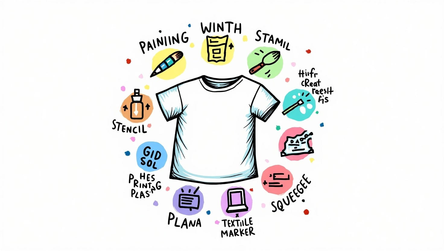
Without proper tools, even the most creative ideas for a t-shirt painting design can fail. Here’s a checklist of essential supplies:
Basic Materials:
- Fabric Paint (Acrylic-based or Water-based)
- Fabric Medium (optional, helps paint bond better)
- Paintbrushes of varying sizes
- Sponges or Rollers
- Palette or Mixing Tray
- Fabric Markers
- Pencil/Chalk (for sketching)
- Cardboard Insert (to avoid bleed-through)
These materials ensure your t-shirt painting design stays sharp, professional, and vibrant.
3. Sketch and Plan Your Design

Before you dip a brush into paint, sketch your t-shirt painting design on paper or use a digital mockup tool. Planning is critical, especially for intricate designs.
Tips for Sketching:
- Start with light outlines.
- Consider color placement and negative space.
- Use stencils if you’re aiming for precision.
Planning your t-shirt painting design reduces mistakes and speeds up the painting process. You can even use transfer paper to trace your design onto the fabric if you’re not confident in freehand sketching.
4. Learn Different Painting Techniques
There are multiple ways to apply paint to a t-Shirt Painting Design. Understanding the right technique for your t-shirt painting design will make your artwork more dynamic.
Popular Painting Techniques:
- Freehand Brush Painting:
- Great for artistic expression and detailed artwork.
- Stencil Painting:
- Perfect for logos, patterns, or text. Ensures consistency.
- Sponge Painting:
- Adds texture and gradient effects to your t-shirt painting design.
- Splatter Technique:
- Offers a trendy, modern vibe. Use with contrasting colors.
- Block Printing:
- Involves carving a design into a stamp and repeating the pattern.
Each technique contributes something unique to the final look of your t-shirt painting design. Don’t hesitate to mix methods for a layered effect.
5. Learn to Use colors

The color theory is very relevant in the area of painting t-shirts. Navigating a basic design with the compulsory color palette can turn a design to a work of art.
Know How to Select Colour:
- Take bold contrast by using complementary colors.
- Similar tints to bring out harmonious vibes.
- Apply white or black to make outlines/highlights.
Bear in mind that not all colors can be similar on textile and paper. Always test a small patch in case you want complete painting of t-shirt.
6. Use Fixing and Heat Fixing Methods
When you have painted your masterpiece that is the time to put the colors on so that they can be washed and worn.
T-Shirt Painting Design: Fixing Methods:
- Ironing: Apply a cloth or parchment paper on the painted area and press using medium heat setting on the iron within 3 to 5 minutes.
- Air-Drying: Leave your t-shirt painting design to dry up at least 24-48 hours.
- Heat Press: professional way of commercial-grade finish.
The paint is then sealed under the heat setting so it does not crack or fade, thus sealing into the fibers of your t-shirt painting design.
7. Care of Your Painted T Shirts
When the t-shirt painting is properly taken care of, then you get a long lasting life of the design and it remains vibrant.
Cleaning & Storing Information:
- Inside out wash in cold water.
- Never use bleach or strong detergents.
- Line dry or tumble low or machine dry.
- Iron inside-out, as required.
Once you have made something really well, you can be sure that your t-shirt painting design will keep shining all through the years.
Some Creative Ideas to Design T-Shirt Painting
Are you short of ideas? The popular t-shirt painting design themes are the following:
Minimalist Quotes
- Nature-based Patterns
- Graffiti and Street Style Painting
- The pop culture and Anime
- Geometric designs
- Motifs Tribal and Ethnic Motifs
- Personalized Name/Initials
The ideas can assist you to stimulate creativity and reach out to the target audience or customers.
The reason T-Shirt Painting Design is ideal with small businesses

T-shirt painting design is also beautiful since the cost is cheap with high profit margin. These designers, painters, and designers are turning the ability to make money by selling personalized tees either online or in local fairs.
The advantages of T-Shirt painting Design as Business:
- No huge stock-out is needed.
- It is possible to tailor every design to the targeted niches.
- Handmade and green-friendly.
You may even provide customized t-shirt painting design services to such platforms as Etsy, Instagram, or your WordPress online store.
Questions and answers on T-shirt painting design
Q1. What should I use as a medium to paint t-shirt painting design, can I use normal acrylic paint?
Sure but in some fabric medium so that it does not crack and leave a soft finish.
Q2. How do I avoid loosing the paint in the washing?
After getting your paint design on your t-shirt completely dry, always take it and heat set it using an iron or heat press.
Q3. Which is the best color of t-shirt to be used?
T-shirts that are white and light in color are ideal for colored effects, but another to get dramatic effects is to use black t-shirts and use opaque or metallic paints.
Q4. What is the lifespan of painted t-shirt?
Well improvised t-shirt painting design will take a long time even after a lot of washings before it will begin to fade away.
Q5. Are children allowed to do t-shirt painting designs?
Absolutely! Just use paint that is washable and non toxic and monitor them as they set the heat.
Conclusion
The t-shirt painting design can be mastered by all types of artists, hobbyists, and business people. Selecting the appropriate fabric, preparing the design, printing it on, and employing the final heat fix, there are tips and methods to every process, which makes the result a beautiful and lasting t-shirt painting design. These 7 methods will determine what colorful and professional results you would achieve when creating a one-off work of your own or planning to launch a fashion brand.
The more you practice regularly and creatively, the more you will master t-shirt painting designs, and welcoming the world of art and even money.
Photoshop Poster Design: 15 Techniques to Create Eye-Catching Posters
Posters remain one of the most powerful tools in visual marketing, and mastering Photoshop Poster Design is the fastest way to turn a blank canvas into a scroll-stopping visual. Whether you are promoting a concert, launching a product, or building a personal portfolio, the right approach to Photoshop Poster Design can be the difference between a poster that gets ignored and one that gets shared.
In this guide, we will walk through 15 practical, tested techniques that professional designers use every day. Each section focuses on a specific part of the workflow, so you can apply these ideas immediately, whether you are a complete beginner or someone looking to sharpen existing skills. By the end of this article, you will have a complete roadmap for creating posters that stand out in a crowded feed or a busy street corner.
Short and focused paragraphs are used throughout this article so that the information is easy to scan, easy to digest, and easy to put into action right away.
What Is Photoshop Poster Design?
Photoshop Poster Design refers to the process of using Adobe Photoshop to plan, build, and finalize promotional or artistic posters. It combines typography, color theory, image editing, and composition into a single flat design that communicates a message quickly.
Unlike a website or an app interface, a poster has only a few seconds to capture attention. This makes Photoshop Poster Design a discipline that rewards clarity, bold choices, and strong visual hierarchy over subtlety.
Understanding this foundation is essential before diving into the specific techniques below, because every technique in Photoshop Poster Design exists to serve one goal: getting the viewer’s attention and holding it long enough to deliver the message.
1. Start With a Clear Concept Before Opening Photoshop

Every strong piece of Photoshop Poster Design begins away from the software itself. Before you touch a single tool, define the purpose of the poster. Is it selling a product, announcing an event, or expressing a mood?
Sketch rough thumbnails on paper or in a notes app. This step feels slow, but it saves hours later because you will not be redesigning the layout halfway through your Photoshop Poster Design session.
Collect reference images and build a simple mood board. Reference material keeps your Photoshop Poster Design grounded in a consistent visual direction instead of drifting from idea to idea.
Once the concept is locked, write down three words that describe the feeling you want the poster to communicate — bold, playful, elegant, urgent, and so on. These words will guide every decision you make in your Photoshop Poster Design process, from color to font choice.
2. Choose the Correct Canvas Size and Resolution

One of the most overlooked steps in Photoshop Poster Design is setting up the canvas correctly from the start. A poster meant for print needs a much higher resolution than one meant only for social media.
For print work, set your resolution to at least 300 pixels per inch (PPI) and use the CMYK color mode. For digital-only Photoshop Poster Design projects, 72 PPI in RGB mode is generally sufficient and keeps file sizes manageable.
Always add bleed if the poster will be professionally printed. A standard bleed of 0.125 inches on each side prevents white edges from appearing after trimming.
Getting this step right early in your Photoshop Poster Design workflow avoids the frustrating experience of discovering blurry or pixelated output after hours of work.
3. Build a Strong Color Palette

Color is one of the fastest ways to communicate mood in Photoshop Poster Design. A poster with a chaotic, unplanned color scheme feels unfinished, while one built on a deliberate palette feels professional immediately.
Limit yourself to two or three primary colors plus a neutral for text and background support. This restraint is a hallmark of experienced Photoshop Poster Design work and keeps the composition from feeling cluttered.
Use Photoshop’s color picker alongside external tools like Adobe Color to generate complementary or analogous palettes. Save these swatches so they stay consistent throughout your entire Photoshop Poster Design file.
Consider the psychology of color as well. Warm tones like red and orange tend to feel urgent and energetic, which works well for event posters, while cool tones like blue and green feel calm and trustworthy, better suited for wellness or corporate themes.
4. Choose Typography That Matches the Message

Typography carries as much weight as imagery in Photoshop Poster Design. The font you choose sets an immediate tone before a single word is even read.
Pair no more than two typefaces: one bold display font for the headline and one simpler font for supporting text. This pairing strategy is a core principle of effective Photoshop Poster Design and prevents visual noise.
Adjust tracking and leading manually rather than relying on default settings. Tight tracking on a large headline often looks more intentional and confident in Photoshop Poster Design compositions.
Avoid overused system fonts when possible. A distinctive typeface instantly elevates the perceived quality of any Photoshop Poster Design project, even when the rest of the layout is simple.
5. Establish a Clear Visual Hierarchy

Visual hierarchy guides the viewer’s eye in the correct order: headline first, supporting details second, fine print last. This is one of the most important structural techniques in Photoshop Poster Design.
Use size, weight, and contrast to separate these three levels. A common mistake in Photoshop Poster Design is making too many elements the same size, which forces the eye to work harder than necessary.
Try squinting at your canvas or reducing the zoom level. If the headline is not the first thing you notice, your hierarchy needs adjustment before moving forward in the Photoshop Poster Design process.
Whitespace also plays a role here. Giving elements room to breathe is often more effective in Photoshop Poster Design than adding more graphics to fill empty space.
6. Organize Your Work With Layers and Groups

As a poster grows in complexity, an unorganized layers panel becomes a serious obstacle. Professional Photoshop Poster Design work always relies on clean, labeled layer groups.
Group layers by section: background, imagery, typography, and effects. This structure makes it far easier to make quick edits later in your Photoshop Poster Design file without hunting through dozens of unnamed layers.
Use color-coded labels for layers that need special attention, such as elements still awaiting client approval. This small habit saves significant time in any Photoshop Poster Design project with multiple revisions.
Lock background layers once they are finalized. This prevents accidental changes while you continue refining the rest of the Photoshop Poster Design composition.
7. Experiment With Blending Modes

Blending modes allow layers to interact with each other in creative, often unexpected ways. They are one of the most underused tools in beginner Photoshop Poster Design work.
Modes like Multiply, Screen, and Overlay can merge textures with color layers to create atmosphere without extra manual painting. This technique adds depth to Photoshop Poster Design projects quickly.
Try applying a texture layer set to Overlay at reduced opacity over a flat color background. This single trick can transform a plain Photoshop Poster Design layout into something that feels tactile and rich.
Do not be afraid to cycle through every blending mode on a layer to see what happens. Some of the best discoveries in Photoshop Poster Design happen through experimentation rather than planning.
8. Use High-Quality Images and Textures

Low-resolution or poorly lit images will undermine even the best layout. Sourcing high-quality visuals is non-negotiable in professional Photoshop Poster Design.
Use reputable stock photo sites or your own photography whenever possible. Stretching a small image to fit a large canvas is a common mistake that instantly signals amateur Photoshop Poster Design work.
Textures such as grain, paper, or fabric can add realism and warmth. Layering a subtle grain texture over a digital illustration is a popular trick in modern Photoshop Poster Design trends.
Always check licensing terms before using any image commercially. This protects your project and your client from legal issues tied to unauthorized use in Photoshop Poster Design work.
9. Apply the Rule of Thirds and Grid Systems

Composition theory did not disappear with the move to digital tools. The rule of thirds remains one of the most reliable techniques in Photoshop Poster Design for balanced, natural-feeling layouts.
Turn on Photoshop’s built-in grid or guides (View > Guides) and divide your canvas into thirds both horizontally and vertically. Placing key elements along these lines creates instinctively pleasing compositions in Photoshop Poster Design.
Grid systems also help align multiple text blocks and images consistently. A poster built on a hidden grid feels more polished, even if the viewer never consciously notices the structure behind the Photoshop Poster Design.
Break the grid occasionally for emphasis. A single element that intentionally ignores the rule of thirds can draw extra attention, a technique advanced Photoshop Poster Design artists use sparingly and deliberately.
10. Color Grade With Adjustment Layers

Adjustment layers let you fine-tune the overall mood of a poster without permanently altering the original pixels. This non-destructive approach is central to efficient Photoshop Poster Design.
Curves and Color Balance are two of the most versatile adjustment layers. A gentle S-curve can add contrast and punch to any Photoshop Poster Design composition in seconds.
Use a Gradient Map on a low opacity Overlay blend to unify colors across the whole poster. This is a fast way to make a Photoshop Poster Design piece feel cohesive, even when it combines several different image sources.
Clip adjustment layers to specific groups when you only want the effect applied to one section. This level of control is what separates amateur output from refined Photoshop Poster Design results.
11. Add Depth With Shadows and Lighting

Flat elements can make a poster feel lifeless. Adding directional shadows and light sources brings a sense of three-dimensional depth to Photoshop Poster Design layouts.
Use the Drop Shadow layer style with a low opacity and a soft edge for a natural look. Harsh, high-opacity shadows are a common beginner mistake in Photoshop Poster Design work.
Painting soft light with a low-opacity white brush on a new layer set to Soft Light can simulate glow around a focal point. This technique instantly draws the eye in Photoshop Poster Design compositions.
Keep a single consistent light direction throughout the poster. Mismatched shadows are one of the quickest ways to break the illusion of depth in any Photoshop Poster Design piece.
12. Create Custom Shapes and Vector Elements
Custom shapes give a poster a distinctive identity that stock elements cannot match. The Pen Tool remains one of the most valuable skills for advanced Photoshop Poster Design.
Practice drawing simple geometric shapes before attempting complex illustrations. Confidence with vector paths opens up far more creative options in Photoshop Poster Design work.
Combine shapes using the Path Operations menu (Union, Subtract, Intersect) to build unique icons or decorative elements. These custom touches make a Photoshop Poster Design piece feel original rather than templated.
Keep shape layers editable as vectors for as long as possible. This flexibility allows quick resizing without quality loss later in the Photoshop Poster Design process.
13. Use Smart Objects for Non-Destructive Editing

Smart Objects preserve the original quality of an image or layer even after resizing or applying filters. This is one of the most important habits to build in Photoshop Poster Design.
Convert any imported image to a Smart Object immediately (right-click > Convert to Smart Object). This single step prevents quality loss throughout the rest of your Photoshop Poster Design session.
Smart Filters applied to Smart Objects remain fully editable. This means you can adjust a Gaussian Blur or Sharpen filter at any point without redoing the effect from scratch in your Photoshop Poster Design file.
Linked Smart Objects are especially useful when the same logo or graphic appears across multiple poster variations. Updating one file updates every linked instance across your Photoshop Poster Design series.
14. Add Text Effects and Filters Thoughtfully
Text effects can add excitement to a headline, but overusing them is a common trap in Photoshop Poster Design. Restraint usually produces a more professional result than piling on every available filter.
Layer styles like Gradient Overlay, Stroke, and Bevel & Emboss can be combined subtly to give text texture and dimension. A well-executed effect enhances a Photoshop Poster Design headline without overwhelming it.
Warp Text and Puppet Warp allow headlines to follow curves or dynamic shapes, useful for event posters that need extra energy. Used sparingly, this technique adds personality to Photoshop Poster Design work.
Always test text effects at both full size and thumbnail size. An effect that looks great zoomed in can disappear entirely when the Photoshop Poster Design is viewed small on a phone screen.
15. Export and Optimize for Print and Web
The final step of any Photoshop Poster Design project is exporting correctly for its intended use. A beautifully designed poster is only useful if it displays or prints properly.
For print, export as a high-resolution PDF or TIFF in CMYK, keeping the 300 PPI resolution intact. Skipping this step can ruin months of Photoshop Poster Design work at the printing stage.
For web and social media, use “Export As” to create optimized JPG or PNG files in RGB at 72 PPI. Compressing file size without sacrificing visible quality keeps your Photoshop Poster Design assets loading quickly online.
Save a master PSD file with all layers intact before flattening anything. This backup ensures you can revisit and edit the Photoshop Poster Design project months or years later without starting over.
Bringing It All Together
Mastering Poster Design is less about memorizing shortcuts and more about combining fundamentals: strong concept, disciplined color and type choices, careful composition, and a non-destructive workflow. Each of the 15 techniques above builds on the others, and together they form a repeatable process you can apply to any project.
Start small. Pick two or three techniques from this list and apply them to your next Photoshop Poster Design project before trying to use all fifteen at once. Skills like layer organization and Smart Objects will quickly become second nature, freeing up mental space to focus on the creative side of Poster Design.
With consistent practice, what once felt like a complicated, multi-step process will become an intuitive part of your creative workflow, and your posters will start to reflect the professional polish that strong Poster Design is known for.
Frequently Asked Questions About Photoshop Poster Design
- Is Photoshop good for poster design? Yes. Photoshop remains one of the most flexible tools available for poster design because it combines photo editing, typography, and vector-style shape tools in one workspace, making it ideal for both print and digital output.
- What size should I use for a poster in Photoshop? Standard print poster sizes include 18×24 inches and 24×36 inches at 300 PPI in CMYK. For digital posters meant for social media, common sizes are 1080×1350 pixels at 72 PPI in RGB.
- Do I need Illustrator as well as Photoshop for poster design? Not necessarily. Photoshop’s Pen Tool and shape layers cover most vector needs for a typical poster project. Illustrator becomes more useful for complex logos or illustrations that require extensive vector editing.
- How can I make my poster look more professional in Photoshop? Focus on strong visual hierarchy, a limited color palette, thoughtful typography pairing, and non-destructive editing with Smart Objects and adjustment layers. These fundamentals matter more than any single filter or effect.
- What resolution is best for printing a poster from Photoshop? 300 PPI is the industry standard for high-quality print output. Anything lower can result in a blurry or pixelated final product once printed at full size.
- How long does it take to design a poster in Photoshop? This varies widely based on complexity, but a simple poster can take one to three hours, while a highly detailed composite design with custom illustrations may take several days from concept to final export.
- Can beginners learn poster design in Photoshop quickly? Yes. The core techniques covered in this guide — layout, color, typography, and layers — can be learned within a few weeks of regular practice, even though full mastery takes longer.
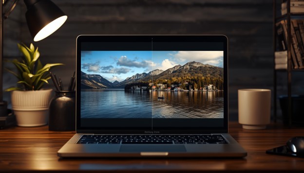
Photo Editing for Beginners: 15 Essential Techniques to Improve Your Photos
Photo editing has become one of the most valuable skills for anyone who takes pictures, whether you’re a hobbyist, a small business owner, or an aspiring content creator. With the right approach to photo editing, even an average shot can be transformed into something that looks professional and polished. This guide walks you through 15 essential photo editing techniques that every beginner should learn.
Good photo editing isn’t about making drastic changes. It’s about small, thoughtful adjustments that bring out the best in your original image. Once you understand the fundamentals of photo editing, you’ll be able to fix common issues, enhance colors, and create images that truly stand out on social media, websites, or in print.
Let’s dive into the essential photo editing techniques that will take your images from ordinary to extraordinary.
1. Understanding Basic Photo Editing Tools

Before you start any photo editing project, it helps to understand the tools available to you. Most photo editing software, whether it’s Adobe Lightroom, Photoshop, Snapseed, or a free online editor, shares a similar set of core features.
These typically include exposure sliders, cropping tools, color correction panels, and retouching brushes. Familiarizing yourself with these basic photo editing tools will make every other technique on this list much easier to apply.
Beginners often feel overwhelmed by the number of options in professional photo editing apps. Start simple. Learn one tool at a time, practice on a few photos, and slowly build your skillset. This patient approach to photo editing will save you time and frustration in the long run.
2. Adjusting Exposure and Brightness

Exposure is one of the very first things to check during photo editing. An underexposed photo looks dark and muddy, while an overexposed photo looks washed out and loses detail in the highlights.
Most photo editing apps offer a simple exposure slider. Move it slightly to the right if your image is too dark, or to the left if it’s too bright. The goal of this photo editing step is to find a natural balance where details are visible in both shadows and highlights.
Brightness adjustments work hand in hand with exposure. While exposure affects the overall light in the image, brightness fine-tunes the midtones. Combining both during your photo editing workflow gives you more control over the final look of your picture.
3. Correcting White Balance

White balance determines whether your photo looks warm (yellow/orange) or cool (blue). Getting the white balance right is a crucial part of editing because it directly affects how natural your colors appear.
If your photo was taken indoors under artificial light, it might have an unwanted yellow or orange tint. Outdoor shade photos often come out too blue. Photo editing software allows you to correct this using a white balance tool, often represented by an eyedropper you click on a neutral gray or white area of the image.
Adjusting the temperature and tint sliders manually is another effective photo editing method. Slide toward blue to cool down a photo, or toward orange to warm it up. Practicing white balance correction is one of the fastest ways to improve your photo editing results.
4. Enhancing Contrast

Contrast refers to the difference between the darkest and lightest parts of your image. A photo with too little contrast looks flat and dull, while excessive contrast can make an image look harsh.
During photo editing, gently increasing contrast can add depth and dimension to your photos. Most editing apps have a simple contrast slider, but more advanced tools let you adjust contrast using curves for finer control.
A useful photo editing tip is to zoom in and compare your before and after images side by side. This helps you avoid over-editing, which is a common mistake beginners make when learning editing for the first time.
5. Cropping for Better Composition

Cropping is one of the simplest yet most powerful editing techniques. It allows you to remove distracting elements from the edges of your frame and improve the overall composition of your photo.
A popular composition guideline used in photo editing is the rule of thirds. Imagine your image divided into a 3×3 grid; placing your subject along these lines or at their intersections creates a more visually pleasing photo.
Cropping can also help you fix awkward spacing, remove unwanted objects at the edges, or change the aspect ratio for different platforms like Instagram, Pinterest, or your website. This photo editing step is quick, but it makes a noticeable difference in how professional your final image looks.
6. Straightening Crooked Photos

Nothing distracts a viewer faster than a tilted horizon or a crooked building in your photo. Straightening is an essential photo editing technique that beginners often overlook.
Most photo editing software includes a straighten tool, sometimes combined with the crop tool. Simply align a horizontal or vertical reference line in your photo, like a horizon or a building edge, and the software will rotate the image accordingly.
This small editing adjustment instantly makes your photos look more intentional and professional. It’s especially important for landscape photography, architecture shots, and any image with clear straight lines.
7. Removing Blemishes and Spots
Whether you’re editing a portrait or a product photo, removing distracting spots, blemishes, or dust particles is a fundamental photo editing skill. Most editing apps offer a spot healing or clone tool for this purpose.
The spot healing brush works by sampling nearby pixels and blending them over the area you want to fix. This makes it one of the easiest editing tools for beginners, since it requires minimal manual adjustment.
For more complex photo editing tasks, like removing a person from the background or fixing larger imperfections, the clone stamp tool gives you more precise control. Practice on a few test photos before working on important images, since this editing technique takes a bit of hand-eye coordination to master.
8. Sharpening Images

Sharpening enhances the edges and fine details in your photo, making it appear crisper and more defined. This photo editing technique is especially useful for images that were shot slightly out of focus or need a final polish before publishing.
Be careful not to over-sharpen your photos during editing. Too much sharpening creates a harsh, grainy look with visible halos around edges. A subtle approach to this photo editing step usually produces the most natural-looking results.
Different photo editing tools offer sharpening in different ways, some through a simple slider, others through more advanced masking options that let you sharpen only specific areas of the image, like the subject’s eyes in a portrait.
9. Reducing Noise

Noise appears as grainy speckles in your photo, most commonly in images shot in low light or at a high ISO setting. Reducing noise is an important editing step for cleaning up your final image.
Most editing software includes a noise reduction tool that smooths out grain while trying to preserve detail. Applying too much noise reduction, however, can make your photo look blurry or plastic-like, so it’s best to find a balance.
A helpful photo editing trick is to zoom in to 100% while adjusting noise reduction, so you can clearly see the effect on fine details like hair, texture, and edges.
10. Adjusting Saturation and Vibrance

Saturation and vibrance both affect the intensity of colors in your photo, but they work slightly differently. Saturation boosts all colors equally, while vibrance intelligently enhances muted colors while protecting skin tones from looking unnatural.
Understanding this distinction is important in photo editing, especially when working with portraits. Boosting vibrance rather than saturation often gives a more natural-looking result during photo editing sessions.
Over-saturating an image is a common beginner mistake in editing. Colors that are too vivid can look unrealistic and distracting. Aim for subtle, controlled adjustments that enhance rather than overpower your original photo.
11. Using Filters and Presets
Filters and presets are pre-made editing settings that apply a consistent style to your images. They’re a great starting point for beginners who are still learning how individual editing tools work.
Many editing apps, like Lightroom, VSCO, and Snapseed, offer built-in filters or downloadable presets created by professional photographers. Applying a preset gives your photo editing workflow a quick, cohesive look, especially useful if you’re editing a batch of photos for a consistent social media feed.
However, presets shouldn’t be applied blindly. Every photo is different, so after applying a filter, take time to fine-tune exposure, contrast, or color balance. This extra photo editing step ensures the preset complements your specific image rather than overpowering it.
12. Mastering the Dodge and Burn Technique
Dodging and burning is a classic photo editing technique borrowed from traditional darkroom photography. Dodging lightens specific areas of your image, while burning darkens them, allowing you to guide the viewer’s eye toward your subject.
This editing method is particularly effective for portraits, where you might dodge the eyes to make them pop or burn the edges of the frame to create a subtle vignette effect.
Using a soft brush at low opacity is key when practicing dodge and burn in editing. Building up the effect gradually, rather than applying it all at once, creates a more natural and professional-looking result.
13. Removing or Blurring Backgrounds
A distracting background can take attention away from your main subject. Background removal and blurring are popular photo editing techniques used in portrait, product, and e-commerce photography.
Many editing tools now use AI-powered background removal, which automatically detects your subject and separates it from the background with a single click. This has made what used to be a complex photo editing task accessible to complete beginners.
Alternatively, applying a blur effect to the background, mimicking a shallow depth of field, keeps the background in the scene while softening it. This editing technique draws focus naturally to your subject without completely removing the setting.
14. Adding Text and Watermarks
If you’re editing photos for a business, blog, or portfolio, adding text or a watermark is a practical editing step worth learning. Watermarks help protect your work from unauthorized use, while text overlays are useful for social media graphics, quotes, or promotional images.
Most photo editing software lets you customize font, size, color, and opacity for your text or watermark. Keep it subtle. A watermark that’s too large or opaque can distract from the photo itself, defeating the purpose of good photo editing.
Positioning also matters. Placing your watermark in a corner, rather than the center, keeps the focus on your image while still marking it as your work. This small photo editing detail adds a professional touch to your final output.
15. Exporting and Saving in the Right Format
The final step in any editing workflow is exporting your image correctly. Choosing the wrong file format or resolution can undo all your hard work, resulting in a blurry or oversized file.
For web use, JPEG is usually the best format, offering a good balance between quality and file size. If you need transparency, such as for a logo, PNG is the better choice. When you want to preserve every editing detail for future adjustments, saving a layered file, like a PSD or TIFF, keeps your photo editing work flexible.
Pay attention to resolution and dimensions too. A photo optimized for website use loads faster, while a print-ready photo editing export needs a much higher resolution to look sharp on paper. Getting this last step right ensures your editing efforts actually shine through in the final result.
Bringing It All Together
Learning editing is a journey, not a one-time task. Start by practicing one or two techniques at a time rather than trying to master everything at once. As you become more comfortable with basic photo editing tools, you’ll naturally start combining techniques, like adjusting exposure, correcting white balance, and cropping, into a smooth, efficient workflow.
Remember that the best photo editing enhances a photo without making it look artificial. Subtle, well-considered adjustments almost always outperform heavy-handed edits. With consistent practice, these 15 essential techniques will become second nature, and you’ll be able to transform your photos with confidence every time you sit down to edit.
Frequently Asked Questions
- What is the best software for photo editing beginners? Popular options include Adobe Lightroom, Photoshop Elements, Snapseed, and Canva. Free tools like Snapseed and Canva are great starting points before moving to more advanced photo editing software.
- How long does it take to learn photo editing? Basic editing skills can be learned in a few weeks of consistent practice. Mastering advanced techniques, however, can take months or years of ongoing learning.
- Is photo editing necessary for every photo? Not every photo needs heavy editing, but small adjustments like exposure and color correction almost always improve the final result, even for casual, everyday shots.
- Can I do photo editing on my phone? Yes. Many mobile apps, such as Snapseed, Lightroom Mobile, and VSCO, offer powerful photo editing tools that rival desktop software for most everyday needs.
- What’s the difference between photo editing and photo retouching? Photo editing usually refers to overall adjustments like exposure, color, and cropping, while retouching focuses on detailed fixes like removing blemishes or smoothing skin.
- How much should I edit my photos? A good rule of thumb in editing is to enhance, not transform. If your edits make the photo look unnatural, you’ve likely gone too far.
- Are there free photo editing tools available? Yes, tools like GIMP, Photopea, Snapseed, and Canva offer free, beginner-friendly photo editing features without requiring a paid subscription.
How to Remove Background in Photoshop: 5 Fast & Easy Methods Without Hassle
If you have ever opened a product photo, a portrait, or a random snapshot and wished the messy remove background in photoshop would simply disappear, you already understand why so many people search for ways to Remove Background in Photoshop every single day. Whether you are an online seller who needs clean product shots, a graphic designer preparing a poster, or a hobbyist editing family photos, learning how to Remove Background in Photoshop is one of the most useful skills you can pick up in the world of digital editing.
The good news is that you do not need years of experience to get professional-looking results. In this guide, we will walk through five different ways to Remove Background in Photoshop, ranging from beginner-friendly one-click tools to more advanced, pixel-precise techniques. Each method has its own strengths, so by the end of this article you will know exactly which approach fits your image, your skill level, and your deadline.
This article is written to be short, scannable, and easy to follow. Every section uses short paragraphs so you can skim the steps quickly, copy the workflow, and get straight back to editing. Let’s get started.
Why You Might Need to Remove Background in Photoshop
Before we jump into the methods, it helps to understand why so many creators, marketers, and small business owners need to Remove Background in Photoshop on a regular basis.
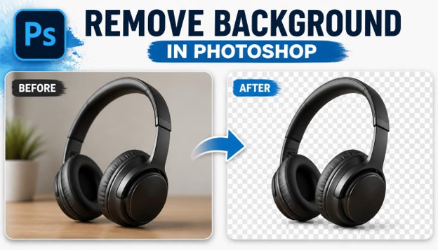
E-commerce sellers often need pure white or transparent backgrounds for product listings on Amazon, Etsy, or Shopify. A clean background makes the product look professional and consistent across the entire catalog.
Photographers and portrait editors frequently need to Remove Background in Photoshop so they can swap in a new backdrop, place a subject into a studio-style scene, or simply clean up a distracting environment.
Marketers and social media managers use background removal to create eye-catching graphics, transparent PNG logos, and layered designs for ads and banners.

Whatever your reason, the ability to Remove Background in Photoshop quickly and cleanly saves hours of manual work and gives your images a polished, professional finish.
What You Need Before You Start
To follow along with these methods, you will need Adobe Photoshop installed on your computer, either the desktop version or the current Creative Cloud subscription. Most of the tools described below are available in Photoshop CC 2021 and later, although older versions can still Remove Background in Photoshop using the more traditional selection tools.
It also helps to work with a good quality image. Photos with clear contrast between the subject and the background are much easier to edit, and the AI-powered tools in Photoshop tend to perform better on sharp, well-lit pictures.
Finally, always duplicate your original layer before you start. This way, if something goes wrong while you Remove Background in Photoshop, you can always undo your changes without losing the original file.
Method 1: Remove Background in Photoshop Using the Quick Selection Tool
The Quick Selection Tool is one of the fastest ways to Remove Background in Photoshop, especially for images with a clear subject and a relatively simple background.

Step 1: Open Your Image
Open the photo you want to edit in Photoshop. Duplicate the background layer so your original stays untouched while you Remove Background in Photoshop.
Step 2: Select the Quick Selection Tool
Choose the Quick Selection Tool from the toolbar, or press the W key on your keyboard. This tool lets you paint over the area you want to select, and Photoshop automatically detects the edges of your subject.
Step 3: Paint Over Your Subject
Click and drag over the subject you want to keep. Photoshop will expand the selection intelligently, following contrast and color differences. This step is where most of the work happens when you Remove Background in Photoshop with this method.
Step 4: Refine the Edge
Go to Select and Mask to fine-tune your selection. Use the Refine Edge Brush around hair, fur, or fine details so the selection looks natural. This is a critical step if you want to Remove Background in Photoshop without leaving harsh, jagged edges.
Step 5: Delete or Mask the Background
Once your selection is accurate, press Delete to remove the background, or add a layer mask to keep your edit non-destructive. Non-destructive masking is always the safer choice when you Remove Background in Photoshop for client work.
This method works best on images with a clear subject, like portraits, products, or simple objects on a plain backdrop. It is quick, intuitive, and a great starting point for anyone learning how to Remove Background in Photoshop.
Method 2: Remove Background in Photoshop With the Background Eraser Tool
The Background Eraser Tool is another classic option to Remove Background in Photoshop, and it works especially well when your subject has soft or complicated edges, like hair or fabric.

Step 1: Select the Background Eraser Tool
Find the Eraser Tool group in the toolbar and choose the Background Eraser. This tool erases pixels based on color sampling, which makes it useful when you need to Remove Background in Photoshop around uneven or textured edges.
Step 2: Adjust the Brush Settings
Set the brush size to match the detail level you are working with. Adjust the tolerance and sampling options in the top toolbar so the tool only erases the background color and not your subject.
Step 3: Trace Around the Edges
Slowly trace along the outline of your subject. The crosshair in the center of the brush tells Photoshop which color to erase, so keep it centered on the background as you Remove Background in Photoshop pixel by pixel.
Step 4: Zoom In for Detail Work
Zoom into tricky areas like hair strands or thin edges. Working slowly here makes a big difference in the final quality of this manual editing method.
Step 5: Clean Up Leftover Pixels
After the main background is gone, use a regular eraser or layer mask to clean up any stray pixels. This final polish step ensures your image looks crisp once you Remove Background in Photoshop completely.
The Background Eraser Tool takes more patience than the Quick Selection Tool, but it gives you more control, which is helpful when you need to Remove Background in Photoshop around complex, detailed subjects.
Method 3: Remove Background in Photoshop Using the Pen Tool for Precision
When accuracy really matters, professionals often choose the Pen Tool to Remove Background in Photoshop. This method takes more time, but it produces the cleanest, most precise edges of any technique in this guide.

Step 1: Select the Pen Tool
Press P on your keyboard or click the Pen Tool icon. Make sure the mode is set to Path in the options bar before you start tracing.
Step 2: Trace the Outline of Your Subject
Click to create anchor points along the edge of your subject, using curved handles for rounded areas. This is the most time-intensive part of learning how to Remove Background in Photoshop with the Pen Tool, but it offers unmatched precision.
Step 3: Close the Path
Connect your last anchor point back to the first one to close the path completely. A closed path is required before you can convert it into a selection.
Step 4: Convert the Path to a Selection
Right-click the path and choose Make Selection. Add a small feather value, usually around 0.5 to 1 pixel, so the edge blends naturally when you Remove Background in Photoshop.
Step 5: Apply a Layer Mask
With your selection active, click the Add Layer Mask icon at the bottom of the Layers panel. This hides the background without deleting any pixels, which is the safest way to Remove Background in Photoshop for professional projects.
Because the Pen Tool creates vector-based paths, it is ideal for product photography, logos, and any image where sharp, geometric edges are important. Many professional retouchers rely on this method whenever they need to Remove Background in Photoshop for print or high-resolution use.
Method 4: Remove Background in Photoshop Automatically With Select Subject
If you want speed without sacrificing too much quality, the Select Subject feature is one of the smartest ways to Remove Background in Photoshop. This tool uses Adobe’s built-in AI to detect your subject in a single click.

Step 1: Open the Select Menu
Go to the Select menu at the top of your screen and click Subject. Photoshop will instantly analyze your image and generate a selection around the main subject.
Step 2: Review the Automatic Selection
Check how accurate the automatic selection is. On most modern photos, this single click gets you 80 to 90 percent of the way toward a clean edit when you Remove Background in Photoshop.
Step 3: Fine-Tune With Select and Mask
Open Select and Mask to smooth edges, adjust the contrast slider, and clean up any spots the AI missed. This refinement step is essential if you want a truly polished result when you Remove Background in Photoshop.
Step 4: Output Your Selection
Choose to output as a new layer with a layer mask. This keeps your edit flexible in case you need to adjust anything later while you Remove Background in Photoshop for a client or project.
Step 5: Add a New Background
Once the old background is hidden, drop in a new background layer underneath your subject. Blend the lighting and shadows so the composite looks realistic after you Remove Background in Photoshop.
Select Subject is one of the fastest ways to Remove Background in Photoshop, and it keeps improving with every Photoshop update, making it a favorite among beginners and busy professionals alike.
Method 5: Remove Background in Photoshop With Neural Filters and One-Click Tools
The fifth method leans on Photoshop’s Neural Filters and Adobe’s cloud-based AI tools, which is now one of the most popular ways to Remove Background in Photoshop for beginners who want near-instant results.

Step 1: Open the Neural Filters Panel
Go to Filter and select Neural Filters. Photoshop will load a panel of AI-powered tools, some of which can help isolate subjects and simplify how you Remove Background in Photoshop.
Step 2: Use Remove Background in the Properties Panel
On an image layer, open the Properties panel and click Remove Background. This one-click feature is one of the quickest ways to Remove Background in Photoshop without touching a single selection tool.
Step 3: Check the Transparency Result
Photoshop will automatically create a transparent background using a layer mask. Zoom in to check the edges, especially around hair or transparent materials like glass.
Step 4: Touch Up With the Brush Tool
Use a soft brush on the layer mask to paint back any areas that were removed by mistake, or hide any background bits that were left behind. This quick manual pass ensures accuracy when you Remove Background in Photoshop with AI tools.
Step 5: Export as PNG
Save your file as a PNG to preserve transparency. This format is essential whenever you Remove Background in Photoshop and plan to layer the subject onto a different scene later.
This AI-driven approach is perfect for people who need to Remove Background in Photoshop quickly, in bulk, or without advanced editing experience. It will not always be perfect on complex images, but for most everyday photos, it delivers fast, reliable results.
Quick Comparison: Which Method Should You Use?
Choosing the right way to Remove Background in Photoshop depends on your image and your goals.
If you need speed and your image has a simple background, Select Subject or the one-click Remove Background feature will save you the most time.
If your subject has fine details like hair or fur, the Quick Selection Tool combined with Select and Mask usually gives the best balance of speed and accuracy.
If you are working with complex, textured edges, the Background Eraser Tool offers more manual control.
If you need pixel-perfect precision for print or professional product photography, the Pen Tool remains the gold standard, even though it takes longer to Remove Background in Photoshop this way.
Common Mistakes to Avoid When You Remove Background in Photoshop
Even experienced editors can run into trouble when they Remove Background in Photoshop. Here are a few mistakes worth avoiding.
Working directly on your original layer is risky. Always duplicate your layer first so you have a safety net while you Remove Background in Photoshop.
Ignoring the zoom level is another common issue. Many rough edges only become visible once you zoom in, so always inspect your work closely before finishing your edit.
Ignoring feathering and edge smoothing is another common issue. A hard, jagged edge instantly makes a composite look fake, so take the time to smooth and refine your selection whenever you Remove Background in Photoshop.
Skipping the Select and Mask workspace is a mistake many beginners make. This panel contains powerful tools like Decontaminate Colors, which removes leftover background tints from the edges of your subject.
Finally, forgetting to save a transparent PNG is a common oversight. If you plan to reuse your subject on different backgrounds, always export your file in a format that preserves transparency after you Remove Background in Photoshop.
Tips to Get Better Results Every Time
Good lighting in your original photo makes every method easier. High-contrast images are simpler to work with whenever you Remove Background in Photoshop.
Working at a higher zoom level, especially around hair, fur, or transparent objects, will noticeably improve your final result.
Using layer masks instead of deleting pixels keeps your workflow flexible and non-destructive, which is especially useful if you Remove Background in Photoshop for revisions or client feedback.
Batch processing with actions or scripts can save serious time if you regularly need to Remove Background in Photoshop for large volumes of product photos.
Practicing on a variety of images, from portraits to products to pets, will help you understand which method works best for each situation, making the entire editing process faster and more intuitive over time.
Building a Repeatable Editing Habit
Like any creative skill, precision and speed come with repetition. The first few times you sit down to isolate a subject, expect the process to feel slow, especially around tricky edges like hair, fine jewelry, or reflective surfaces.
Keep a personal reference file of settings that worked well for specific situations, such as the ideal feather value for portraits or the brush size that works best for detailed product shots. Over time, this small habit turns into a personal cheat sheet you can return to on every new project.
It also helps to review finished work with fresh eyes after a short break. Edges that looked acceptable in the middle of a long editing session often reveal small flaws once you return to the image later, giving you a chance to polish the final result before delivering it to a client or publishing it online.
Sharing your work with peers for feedback can also speed up your learning curve. A second pair of eyes often catches subtle edge issues or color fringing that are easy to miss after staring at the same image for too long, and constructive feedback from other designers can help you refine your personal workflow much faster than trial and error alone.
Final Thoughts
Learning how to Remove Background in Photoshop does not have to be complicated. With these five methods, from the beginner-friendly Quick Selection Tool to the AI-powered Neural Filters, you now have a complete toolkit for handling almost any image.
Start with the simpler, faster tools for everyday tasks, and move to the Pen Tool when precision really matters. With a little practice, you will be able to Remove Background in Photoshop quickly, confidently, and without the usual hassle.
Best Practices for E-commerce Product Photography
Online stores live and die by how professional their product images look. A cluttered or inconsistent backdrop can make even a great product feel low quality, while a clean, uniform backdrop instantly builds trust with shoppers.
Most marketplaces, including Amazon, have strict guidelines requiring a pure white backdrop for the main product image. Isolating the product cleanly and dropping it onto a solid white canvas is one of the most common daily tasks for e-commerce editors.
Consistency matters just as much as cleanliness. If every photo in your catalog uses the same lighting, angle, and backdrop color, your store feels polished and professional, which can directly improve conversion rates.
Batch actions are a lifesaver here. Once you have a workflow you trust, recording it as a Photoshop action lets you apply the same steps to hundreds of product shots in a fraction of the time it would take to edit each one by hand.
Shadows deserve special attention too. A soft, subtle drop shadow beneath a product adds realism and depth, making the image feel grounded instead of floating awkwardly on a flat white canvas.
Using Background Isolation for Social Media and Marketing Graphics
Social media managers rely heavily on clean cutouts to build scroll-stopping graphics. A product, a person, or a logo isolated from its original photo can be dropped into countless new designs, from Instagram carousels to YouTube thumbnails.
Transparent PNG files are the backbone of this workflow. Once a subject is isolated, designers can layer it over branded colors, gradients, or promotional text without worrying about a messy backdrop showing through.
Ad creatives especially benefit from this technique. Placing a cut-out product next to bold typography, on a bright colored background, tends to perform better in ad testing than photos with busy, distracting environments.
Consistency across a content calendar also matters. Brands that isolate their subjects and place them on a recognizable, on-brand backdrop build stronger visual identity over time, which helps audiences recognize their content at a glance.
Comparing Photoshop to Other Background Removal Tools
Photoshop is not the only option on the market, and it is worth understanding how it compares to lighter, more automated alternatives.
Online tools that use a single AI model can isolate a subject in seconds with zero manual input. They are convenient for quick, low-stakes edits but often lack the fine control needed for tricky images with fur, glass, or complex lighting.
Mobile apps offer similar one-tap convenience, which is great for social media posts created on the go, but they rarely match the precision available in a full desktop editing suite.
Photoshop sits in a different category entirely. It combines automated AI detection with manual refinement tools, giving you the best of both worlds: speed when you need it, and precision when the image demands it.
For casual users, a free online tool might be enough. For professionals who need repeatable, high-quality results across thousands of images, Photoshop remains the industry standard.
A Quick Workflow Recap
Here is a simplified checklist you can follow for almost any image:
- Duplicate your original layer before making any changes.
- Choose a method based on your subject: Quick Selection for simple shapes, Background Eraser for detailed edges, Pen Tool for precision, or an AI tool for speed.
- Refine your selection using Select and Mask, paying close attention to hair, fur, and semi-transparent areas.
- Apply a layer mask instead of deleting pixels, keeping your file flexible for future edits.
- Export as a PNG if you need transparency, or flatten onto a new backdrop if the image is finished.
Following this checklist consistently will help you produce reliable, professional results every time you sit down to edit.
Optimizing Background-Removed Images for Your Website
Once your image is ready, a little extra care during export can improve both site speed and search visibility. Compress your PNG or WebP file so it loads quickly without noticeably harming quality, since large image files can slow down page speed and hurt rankings.
Always add descriptive alt text to your images. Alt text should describe what the image actually shows, which helps search engines understand your content and improves accessibility for visually impaired visitors.
Name your image files descriptively before uploading them. A file named with relevant, readable words is far more useful for search engines than a generic camera-generated filename.
Finally, keep an eye on your overall page weight. A gallery full of unoptimized, oversized images is one of the most common reasons product pages and blog posts load slowly, which can quietly hurt both user experience and search rankings.
Troubleshooting Difficult Images: Hair, Glass, and Smoke
Some subjects are simply harder to isolate than others, and it helps to know what to expect before you start editing.
Hair and fur are the most common challenge. A single hard-edged selection almost never looks convincing, so it is worth spending extra time with a soft-edged brush in Select and Mask, using the Decontaminate Colors option to remove any leftover background tint clinging to individual strands.
Glass and other transparent or reflective materials add another layer of difficulty, since part of the background is visible through the object itself. In these cases, working on multiple layers, and only partially reducing opacity in the reflective areas, tends to look far more realistic than a flat, fully opaque cutout.
Smoke, steam, and other soft, translucent effects rarely respond well to hard selections at all. A gentler approach, using layer blending modes like Screen or Lighten on a duplicated layer, often preserves the natural, wispy quality of these effects far better than a traditional cutout.
Fine jewelry, lace, and net fabrics behave similarly to hair. Zooming in significantly and working with a very small, soft brush during refinement usually produces the cleanest, most believable results on these delicate subjects.

A Short History of Background Removal Tools in Photoshop
It is worth appreciating how far these tools have come. In early versions of Photoshop, isolating a subject meant relying almost entirely on the Pen Tool, the Lasso Tool, and manual channel masking, all of which demanded significant time and skill.
The introduction of the Magic Wand and later the Quick Selection Tool made simple selections dramatically faster, opening the door for casual users to attempt edits that once required a trained retoucher.
Refine Edge, which eventually evolved into the modern Select and Mask workspace, was a major leap forward for handling hair and soft edges, giving ordinary users access to techniques that were once considered professional secrets.
More recently, Adobe’s investment in machine learning brought us Select Subject and the one-click cutout feature, both of which can analyze an image and produce a usable selection in under a second.
Understanding this progression helps explain why there are so many different tools available today. Each one was built to solve a specific limitation of the techniques that came before it, and together they give modern users an impressive amount of flexibility.
Helpful Keyboard Shortcuts for Faster Editing
Speed matters, especially when you are working through a large batch of images. A few shortcuts worth memorizing include pressing W to quickly access the Quick Selection and Magic Wand tools, P for the Pen Tool, and Ctrl or Cmd plus J to duplicate a selected layer instantly.
Holding Alt or Option while using most selection tools lets you subtract from an existing selection, which is useful for correcting small mistakes without starting over from scratch.
Pressing Ctrl or Cmd plus Backspace fills a selection with your background color, which can speed up simple flat-backdrop replacements considerably.
Learning even a handful of these shortcuts can shave meaningful time off every editing session, especially once your workflow becomes second nature.
A Simple Case Study: Editing a Product Photo Step by Step
Imagine a small business owner photographing a ceramic mug on a wooden table for an online store listing. The wood grain in the background is distracting and does not match the clean, minimal aesthetic of the rest of the catalog.
Starting with Select Subject, the editor gets a solid initial selection covering roughly ninety percent of the mug’s outline correctly. A quick pass in Select and Mask smooths the slightly jagged edge along the handle, where the automatic detection struggled with the thin, curved shape.
After confirming the selection looks accurate at full zoom, the editor adds a layer mask and drops in a plain white backdrop underneath. A subtle, softly blurred shadow is painted beneath the mug to keep it from looking like it is floating in space.
The finished image is exported as a compressed PNG, named descriptively, and uploaded to the store with clear, relevant alt text. The entire process takes only a few minutes once the workflow becomes familiar, yet it transforms an average snapshot into a listing-ready product photo.
Frequently Asked Questions (FAQs)
- What is the fastest way to Remove Background in Photoshop?
The fastest way to Remove Background in Photoshop is usually the one-click Remove Background feature found in the Properties panel, or the Select Subject tool under the Select menu. Both use AI to detect your subject almost instantly.
- Can I Remove Background in Photoshop without losing quality?
Yes. Using layer masks instead of deleting pixels keeps your original image data intact. This non-destructive approach lets you Remove Background in Photoshop while preserving full image quality for future edits.
- Which Photoshop tool works best for hair and fine details?
The Select and Mask workspace, combined with the Refine Edge Brush, is the best option when you need to Remove Background in Photoshop around hair, fur, or other fine, wispy details.
- Do I need Photoshop CC to use these methods?
Some AI-powered features, like Select Subject and Neural Filters, require a newer version of Photoshop CC. However, older versions can still Remove Background in Photoshop using the Pen Tool, Quick Selection Tool, and Background Eraser Tool.
- What file format should I use after I Remove Background in Photoshop?
Save your file as a PNG if you want to preserve transparency. This is essential when you Remove Background in Photoshop and plan to place your subject onto a new background later.
- Is the Pen Tool really necessary if AI tools exist?
For most everyday images, AI tools are fast and accurate enough. However, professionals still use the Pen Tool to Remove Background in Photoshop when they need perfectly sharp, geometric edges, such as for packaging or print design.
- Why does my background removal look rough around the edges?
Rough edges usually happen when feathering or edge refinement is skipped. Spending extra time in Select and Mask will help you Remove Background in Photoshop with smoother, more natural-looking results.
- Can I automate background removal for multiple images at once?
Yes. Photoshop actions and batch processing can help you Remove Background in Photoshop across dozens or even hundreds of images at once, which is especially useful for e-commerce product photography.
- What is the difference between deleting a background and masking it?
Deleting permanently removes pixels, while masking hides them without deleting anything. Masking is the recommended approach whenever you Remove Background in Photoshop, since it keeps your edit fully reversible.
- Which method is best for beginners?
Beginners usually find the most success with Select Subject or the one-click Remove Background feature, since these let you Remove Background in Photoshop in just a few clicks with minimal manual work.
- Is it possible to isolate a subject on a phone instead of a desktop?
Yes, mobile apps like Photoshop Express and Lightroom offer simplified cutout tools, but for detailed, professional-grade work, the full desktop version gives you far more control and accuracy.
- How long does it usually take to isolate a subject from its backdrop?
Simple images with clear edges can be finished in under a minute using AI tools, while complex photos with fine detail, like hair or fur, may take several minutes of manual refinement to get right.
- Can this process damage or lower the resolution of my original photo?
No, as long as you work non-destructively with layer masks and avoid flattening or compressing your file too aggressively, your image resolution and quality stay fully intact.
- What is the best backdrop color to use for product photography?
Pure white is the most common choice for marketplaces and catalogs, but light gray or soft gradient backdrops are also popular for lifestyle-style product shots that need a bit more visual warmth.
- Do I need a subscription to access the AI-powered tools mentioned in this guide?
Most of the AI features, including Select Subject and Neural Filters, are included with an active Creative Cloud subscription, while older perpetual-license versions rely more on manual selection tools.
-

 Graphics Design3 years ago
7.Exploring the Importance of Color Theory Charts
-

 Graphics Design1 year ago
Top 10 Best Graphic Design Tools for Beginners in 2025 (Free & Paid)
-

 Graphics Design2 years ago
10 Stunning Gradient Design Trends You Need to Know in 2024
-

 Graphics Design1 year ago
15 Freelance Graphic Design Tips to Boost Your Career in 2025
-

 Graphics Design2 years ago
29.Retro Design Is Making a Comeback in Modern Spaces
-

 Graphics Design1 year ago
Best Laptops for Graphic Designers – 2025 Buying Guide
-

 Graphics Design2 years ago
2025 Logo Design Trends: What’s In, What’s Out?
-

 Graphics Design2 years ago
15.The Importance of Effective Flyer Design in Marketing
jalalive fifa
July 6, 2025 at 1:11 am
Great job simplifying something so complex.