
Graphics Design
How to Create Strong Visual Hierarchy in Graphic Design

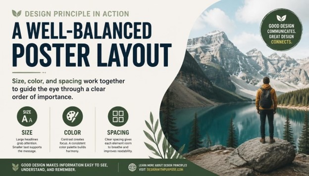
How to Create Strong Visual Hierarchy in Graphic Design
Every great design tells the eye where to look first, where to look next, and where to rest last. This invisible roadmap is called Visual Hierarchy, and it is one of the most important skills any designer can master. Whether you are designing a poster, a website, a mobile app, a brochure, or a full brand identity, understanding how this ordering system works will completely change how your audience experiences your work.
In this guide, we will explore what this concept really means, why it matters so much in every branch of design, and exactly how you can build a strong, intentional structure of importance in your own projects, step by step. By the end, you will have a complete, practical framework you can apply immediately to your next design, no matter what software or medium you work in.
If you have ever looked at a design and felt confused about where to start reading, or noticed yourself skipping over important information without realizing it, you have experienced poor ordering of importance firsthand. On the other hand, when a design feels effortless to scan, understand, and act on, that is the sign of a thoughtful structure at work behind the scenes. This article is written for beginners taking their first steps into design, as well as experienced professionals who want to sharpen their instincts and refine how they organize information visually.
Design is, at its core, a form of communication, and communication only works when the message arrives in the right order. A headline that gets lost among smaller text, a button that blends into the background, or a page so cluttered that nothing stands out are all symptoms of the same underlying problem: a lack of intentional structure. Learning to fix this is one of the highest-leverage skills you can develop as a creative professional.
What Is Visual Hierarchy?

Visual Hierarchy refers to the arrangement or presentation of design elements in a way that clearly implies importance. It is the system designers use to guide a viewer’s eye through a composition in a specific, intentional order, rather than leaving the audience to guess what matters most. A strong version of this system tells people exactly where to look first, second, and third, simply through visual cues like size, color, contrast, spacing, and placement.
Think about a newspaper front page. The biggest headline draws your attention first, followed by a large photo, then a subheading, and finally the smaller body copy underneath. This layered structure is a textbook example of intentional ordering in action. Without it, every element would compete equally for attention, and the reader would have no clear starting point at all.
This ordering system is not just about aesthetics; it is fundamentally about communication. A design can be visually beautiful, but if it lacks a clear sense of priority, it fails at its most basic job, which is helping the viewer understand information quickly and comfortably. This is why the concept is considered one of the foundational principles of graphic design, sitting right alongside balance, contrast, unity, and alignment.
Designers create this sense of order using several visual tools, including:
- Size and scale of elements
- Color and contrast
- Typography and font weight
- Placement and alignment
- Whitespace and spacing
- Repetition and pattern
- Direction and visual flow
Each of these tools plays a distinct role in shaping how the eye moves across a page, screen, or layout. When used together thoughtfully, they combine to create Visual Hierarchy that feels natural, almost invisible, yet remains incredibly effective at directing attention exactly where it needs to go.
Why Visual Hierarchy Matters in Design

Every design has a purpose, whether it is to sell a product, share information, tell a story, or guide someone through an application. A clear structure of importance is what makes that purpose achievable. Without it, even the most creative ideas can fall flat because the audience simply does not know where to focus their attention first.
Here are some of the key reasons this concept matters so much in modern design work.
It improves readability and comprehension. A clear order of importance breaks down complex information into digestible pieces, making it easier for people to read and understand content quickly. This matters enormously in a world where attention spans are short and most people skim rather than read every single word on a page.
It guides user behavior. In web design and app design, Visual Hierarchy is directly tied to conversion rates and engagement metrics. A call-to-action button that stands out because of thoughtful size and color choices is far more likely to get clicked than one that blends quietly into the background of the page.
It creates emotional impact. The order in which someone processes a design affects how they feel about it overall. A strong sense of priority can build anticipation, highlight emotion, or emphasize urgency, all of which shape the viewer’s emotional response to the finished piece.
It builds trust and professionalism. Cluttered, confusing designs with a weak sense of order often feel unprofessional or untrustworthy, even when the underlying content is genuinely solid. A clean, organized structure signals competence and care, which in turn builds credibility with an audience.
It saves the viewer’s time and energy. People do not want to work hard to understand a design. A well-planned Visual Hierarchy does the thinking for them, presenting information in the most logical and efficient order possible so the viewer can absorb it effortlessly.
Because of all these benefits, a strong ordering system is not an optional nice-to-have; it is a core requirement for effective design across every medium, from print advertising to mobile interfaces and everything in between.
Core Principles That Build Visual Hierarchy
To create a strong Visual Hierarchy, you need to understand the individual tools and principles designers use to establish order and importance. Let’s break down each one in detail, with practical guidance you can apply right away.
1. Size and Scale

Size is one of the most powerful and immediate ways to establish order in a composition. Larger elements naturally draw more attention than smaller ones, which is why headlines are bigger than body text, and hero images are bigger than thumbnails. When building this kind of structure through size, think carefully about which element truly deserves to be the largest on the page. It should be the single most important message or focal point in the entire design.
Scale also works in relative terms, not just in absolute numbers. It is not simply about making one thing big; it is about the size relationship between every element on the page. A strong structure uses a clear, consistent scale system, sometimes based on a type scale or an underlying grid, so that size differences feel deliberate rather than random or accidental.
2. Color and Contrast

Color is another major driver of importance in a layout. Bright, saturated, or warm colors tend to attract more attention than muted or cool tones. Contrast, meanwhile, refers to the difference between elements, such as a dark button set against a light background. High contrast naturally draws the eye and reinforces the intended order by making key elements pop against their surroundings.
When designers want to create strong Visual Hierarchy using color, they often reserve their boldest, most saturated color for the single most important action or message on the page, while keeping the rest of the palette more subdued and quiet. This selective, disciplined use of color keeps the composition clean and prevents visual competition between elements that should not be fighting for the same level of attention.
3. Typography and Font Weight

Typography plays an enormous role in establishing a clear order of importance, especially in text-heavy designs like websites, reports, and editorial layouts. Font size, weight, style, and even letter spacing all contribute to how important a piece of text feels to the reader. A bold, large headline signals top-level importance, while lighter, smaller text signals supporting or secondary information further down the ladder.
A well-designed structure typically uses no more than two or three font weights and sizes across headings, subheadings, and body copy. Keeping the typographic system consistent helps reinforce the overall Visual Hierarchy without overwhelming the viewer with too many competing styles fighting for attention at once.
4. Alignment and Placement

Where you place an element on a page has a direct impact on how important it feels. Elements positioned at the top, center, or along natural eye-scanning paths, such as the familiar F-pattern or Z-pattern, tend to be noticed first. Designers use alignment, grids, and strategic placement to control the exact order in which the eye discovers information, reinforcing the intended structure of the piece.
Consistent alignment also creates a sense of order and stability, which subtly strengthens the overall Visual Hierarchy by making the layout feel organized and easy to follow rather than chaotic or accidental.
5. Proximity and Grouping

The principle of proximity states that elements placed close together are perceived as related, while elements spaced further apart are seen as separate or unrelated. This grouping behavior directly supports a clear ordering system because it helps viewers quickly understand which pieces of information belong together, and which stand alone as more important, standalone messages worth noticing on their own.
For example, a price and a product name grouped tightly together read as a single unit, while a call-to-action button placed with generous space around it reads as a separate, more prominent action, strengthening the overall sense of priority across the page.
6. Whitespace and Breathing Room
Whitespace, or negative space, is the empty area around and between elements. Far from being wasted space, whitespace is a critical tool for building strong Visual Hierarchy. Generous whitespace around an element makes it stand out and feel more important, while cramped, tight spacing can bury even the boldest design choices under visual noise.
Minimalist designs often rely heavily on whitespace to create a clean, confident sense of order where every element has room to breathe and be noticed clearly on its own terms, without distraction.
7. Repetition and Consistency
Repetition of certain visual elements, such as consistent button styles, heading treatments, or color coding, helps train the viewer’s eye to recognize patterns over time. This consistency reinforces the structure of importance across multiple pages or screens, so users always know exactly where to look for specific types of information, such as navigation, headings, or calls to action.
8. Direction and Visual Flow
Lines, arrows, the gaze direction of people in photographs, and even the natural reading pattern of a language all influence how the eye moves through a design. Designers can guide attention deliberately by using directional cues that lead the viewer toward the next important element, further reinforcing a strong, deliberate order from start to finish across the entire piece.
How to Create Strong Visual Hierarchy: A Step-by-Step Process
Now that we have covered the core principles, let’s walk through a practical, step-by-step process for building strong Visual Hierarchy into your own design projects, from the very first sketch to the final polished file.
Step 1: Define Your Priority Order
Before opening any design software, list out every element that needs to appear in your design and rank them by importance. What is the single most important message? What comes second? What is merely supporting information that can sit quietly in the background? This priority list becomes the blueprint for your entire structure, and skipping this step is one of the most common reasons designs end up feeling flat, confusing, or directionless.
Step 2: Choose a Focal Point
Every strong composition needs one clear focal point, the element that captures attention first. This could be a headline, a hero image, or a key call-to-action button. Make sure only one element holds this top position; if everything is competing to be the focal point, your overall sense of order will collapse into visual noise that exhausts the viewer.
Step 3: Establish a Size and Type Scale
Create a scale system for your text and design elements, from largest to smallest, that mirrors your priority list from Step 1. This scale becomes the backbone of your Visual Hierarchy, ensuring size differences feel deliberate and proportionate rather than arbitrary or inconsistent across the design.
Step 4: Apply Strategic Color and Contrast
Decide which colors will represent high-priority elements versus supporting elements. Reserve your most vibrant or contrasting color for the top of your structure, and use muted tones for lower-priority content further down the page. This selective approach keeps the composition clear and prevents color from becoming a distracting, confusing element in its own right.
Step 5: Use Grids and Alignment
Set up a grid system to organize your layout from the very beginning. Consistent alignment along this grid reinforces order and structure, which strengthens your design by making the entire composition feel intentional, calm, and easy to scan at a glance.
Step 6: Group Related Elements with Proximity
Review your layout carefully and make sure related items are grouped closely together, while unrelated or more important standalone elements have extra space around them. This spacing strategy is essential for a clean, readable structure that respects the viewer’s time and attention.
Step 7: Add Whitespace Generously
Resist the urge to fill every empty space on the page. Generous whitespace around your most important elements will make your Visual Hierarchy feel more premium, confident, and easy to navigate, rather than cluttered, cramped, and overwhelming to look at.
Step 8: Try the Squint Test
A classic technique used by professional designers to evaluate their layout is the squint test. Squint your eyes while looking at your design; the blurred shapes and contrasts that remain visible should reveal your intended priority order clearly. If the wrong elements stand out during this quick test, your structure needs further adjustment before moving forward.
Step 9: Get Feedback and Iterate
Show your design to someone unfamiliar with the project and simply ask what they notice first, second, and third, without giving them any hints. Their honest answers will tell you whether your Visual Hierarchy is working as intended, or whether certain elements need to be resized, recolored, or repositioned before final delivery.
Step 10: Refine for Different Devices and Contexts
If your design will appear across multiple platforms, such as desktop, mobile, or print, make sure your structure adapts appropriately to each context. What works as a size-based order on a large poster may need to rely more heavily on color and contrast on a small mobile screen where space is limited and every pixel counts.
Visual Hierarchy Across Different Design Disciplines

This ordering principle applies across nearly every design discipline, though the specific tools used may vary slightly depending on the medium and the audience.
In web and UI design, Visual Hierarchy is critical for guiding users toward conversion goals, such as signing up, purchasing a product, or clicking a specific call-to-action. Designers rely heavily on button color, generous whitespace, and typographic scale to build an order that feels intuitive and reduces unnecessary user friction along the way.
In print design, including posters, brochures, and packaging, this same principle often depends more on size, contrast, and composition since there is no scrolling or interactivity for the viewer to rely on. Everything must be communicated within a single static view, making a strong sense of order absolutely essential to the design’s success.
In branding and identity design, Visual Hierarchy helps establish which elements of a logo or brand system should stand out most, whether that is a wordmark, a symbol, or a tagline, ensuring instant brand recognition happens within seconds of first contact.
In editorial and publication design, this structure organizes complex information such as articles, headlines, pull quotes, and captions into a system readers can navigate comfortably, even across dozens or hundreds of pages in a single publication.
In advertising design, a strong sense of order ensures that the core selling message or offer is the very first thing a viewer notices, even in a crowded, distraction-filled environment like a busy social media feed or a cluttered city street.
Common Mistakes That Weaken Visual Hierarchy
Even experienced designers can fall into habits that quietly damage their layout’s sense of order. Here are some of the most common mistakes worth watching for in your own work.
Too many focal points. When everything on the page is bold, colorful, or oversized, nothing truly stands out, and the entire structure breaks down completely under the weight of competing elements.
Inconsistent typography. Using too many font sizes, weights, or styles at once confuses the reader and weakens the intended order the designer was trying to create in the first place.
Ignoring whitespace. Cramming too many elements together without breathing room makes it hard for any single piece to stand out, flattening the entire sense of priority across the page.
Poor color contrast. Low contrast between important and unimportant elements makes it difficult for viewers to distinguish priority at a glance, undermining the whole system of order.
Lack of a clear grid. Random placement without an underlying structure creates visual confusion and prevents a coherent, readable order from ever forming properly.
Designing without a priority list. Jumping straight into visuals without first deciding what matters most is one of the fastest ways to end up with weak, confusing Visual Hierarchy in the final piece.
Tools That Help You Build Visual Hierarchy

Several design tools can help you plan, test, and refine your sense of order throughout a project. Grid and layout tools in software like Adobe InDesign, Illustrator, and Figma allow you to set up consistent alignment systems from the very first draft. Typography scale generators help you establish proportional font sizes for a clean, readable structure. Color contrast checkers ensure your color choices remain accessible and effective at reinforcing importance across different screens and devices. Additionally, simple techniques like grayscale previews and the squint test remain some of the most reliable, tool-free ways to evaluate whether your Visual Hierarchy is genuinely working before you ship the final file.
Real-World Examples of Strong Visual Hierarchy

Think about the homepage of a major technology company. The headline is large and bold, the supporting text is smaller and lighter, and a single, brightly colored button invites you to take action, all classic signs of a deliberate, well-planned structure. Or consider a movie poster, where the title looms large across the top, the lead actor’s face draws the eye toward the center, and the release date sits quietly at the bottom, each element carefully placed to create a clear order that tells a complete story in just a few seconds. These everyday examples show just how universal and essential a strong sense of Visual Hierarchy really is, across every corner of visual communication.
A restaurant menu offers another familiar example. Well-designed menus often highlight a handful of signature dishes with larger text, a small icon, or a boxed border, while the rest of the offerings sit in a quieter, more uniform list below. This selective emphasis is not accidental; it is a deliberate ordering choice designed to nudge diners toward specific, often higher-margin items without them even realizing they are being guided.
Mobile banking apps rely on a similarly disciplined structure. Your account balance usually appears in the largest, boldest text on the screen, since it is the single piece of information most users open the app to check. Secondary actions, such as transferring money or viewing recent transactions, are typically smaller or placed in a row of icons beneath the balance, while settings and less-frequently used features are tucked away in a menu the user has to actively seek out. This layered approach ensures that even a complex financial app feels simple and approachable at a glance.
Visual Hierarchy vs Other Design Principles
It helps to understand how this concept relates to other fundamental design principles like balance, unity, and rhythm. Balance is about distributing visual weight evenly across a composition, while Visual Hierarchy is specifically about establishing an order of importance among elements. A design can be perfectly balanced yet still lack clear priority, leaving the viewer unsure where to look first. Unity, meanwhile, refers to how well all the elements feel like they belong to the same family of design choices, which supports a strong structure but is not the same thing as it.
Rhythm, created through repeated patterns and spacing, can also reinforce a sense of order by establishing predictable visual beats that a viewer’s eye can follow naturally. When all of these principles work together, alongside a deliberate structure of importance, the result is a composition that feels both cohesive and easy to navigate. Understanding these relationships helps designers avoid treating Visual Hierarchy as an isolated technique and instead see it as one thread in a larger, interconnected system of design decisions.
The Business Case for Strong Visual Hierarchy
Beyond aesthetics, there is a genuine business argument for investing time in a strong sense of order within your designs. Companies that prioritize clear structure in their marketing materials, websites, and product interfaces consistently see better engagement, lower bounce rates, and higher conversion numbers. A landing page with confused priorities forces visitors to work harder to find what they need, and many will simply leave rather than search for the answer themselves.
For freelancers and agencies, being able to explain and demonstrate strong Visual Hierarchy to clients is also a valuable communication skill. Clients often cannot articulate why a design feels “off,” but a designer who can point to specific issues, such as competing focal points or inconsistent typography, and offer a clear fix builds trust and credibility much faster. In this sense, mastering this principle is not just a creative exercise; it is a practical business advantage that pays off across client relationships, portfolio quality, and long-term career growth.
A Quick Checklist for Reviewing Your Visual Hierarchy
Before you finalize any design, it helps to run through a short checklist to confirm your structure is working the way you intended. Ask yourself whether there is exactly one clear focal point, whether your size and type scale reflects the true priority of each element, and whether your color choices reinforce or accidentally distract from that priority. Check that related items are grouped closely through proximity, that whitespace is generous around your most important content, and that your grid and alignment feel consistent throughout the entire layout.
It also helps to step back from the screen entirely and view the design at actual size, from a normal viewing distance, rather than zoomed in on your monitor. Many issues with Visual Hierarchy only become obvious once you view a design the way a real audience will encounter it, whether that is a phone held at arm’s length, a poster viewed from across a room, or a webpage seen on a laptop during a quick scroll. Running through this checklist regularly, especially before sending final files to a client or pushing a design live, will help you catch weak spots before they ever reach your audience.
Finally, keep a personal reference library of designs you admire and study why their sense of order works so well. Screenshot landing pages, posters, and app screens that catch your attention effectively, and take a few minutes to break down exactly how size, color, typography, and spacing are being used together. Over time, this habit will sharpen your instincts and make building strong Visual Hierarchy feel far more natural and automatic in your own work.
Conclusion
Mastering Visual Hierarchy is one of the most valuable skills any designer can develop over the course of their career. It transforms a simple collection of shapes, colors, and text into a clear, purposeful story that guides the viewer exactly where they need to go, without confusion or wasted effort. By understanding the core principles, size, color, typography, alignment, proximity, whitespace, repetition, and direction, and by following a structured process to prioritize and test your work at every stage, you can build a genuinely strong sense of order into every design you create from now on. Whether you are designing a website, a poster, a mobile app, or a complete brand identity, a thoughtful, well-executed structure of importance will always make your work more effective, more professional, and far more memorable to the people who see it.
FAQs About Visual Hierarchy
- What is Visual Hierarchy in simple terms? It is the arrangement of design elements in order of importance, using tools like size, color, and spacing to guide the viewer’s eye through a composition in a specific sequence.
- Why is Visual Hierarchy important in graphic design? This structure helps viewers quickly understand what matters most in a design, improving readability, guiding user behavior, and making the overall composition feel professional and easy to navigate.
- What are the main elements used to create Visual Hierarchy? The main elements include size and scale, color and contrast, typography, alignment, proximity, whitespace, repetition, and directional flow across the page.
- How does color affect this kind of ordering? Bright, saturated, or high-contrast colors draw more attention, so designers use color strategically to highlight the most important elements and support a clear overall structure.
- Can this principle be applied to web design and apps? Yes, Visual Hierarchy is essential in web and app design, where it guides users toward key actions like clicking a button, signing up, or completing a purchase.
- What is the squint test used for? The squint test involves blurring your vision while looking at a design to see which shapes and contrasts remain visible, helping you evaluate whether your Visual Hierarchy is working as intended.
- What are common mistakes that ruin this kind of structure? Common mistakes include having too many competing focal points, inconsistent typography, poor use of whitespace, low color contrast, and designing without a clear priority order from the start.
- How many levels should a strong structure have? While there is no fixed rule, most effective designs use around three to five levels of importance, such as primary, secondary, and tertiary elements, to avoid overwhelming the viewer.
- Does this matter in print design as much as digital design? Yes, Visual Hierarchy is just as important in print design, where designers rely more heavily on size, contrast, and layout since there is no scrolling or interactivity to guide the viewer along.
- How can beginners practice building better structure into their work? Beginners can practice by listing design priorities before starting a project, studying real-world examples closely, and using the squint test to check whether their Visual Hierarchy successfully highlights the most important elements first.
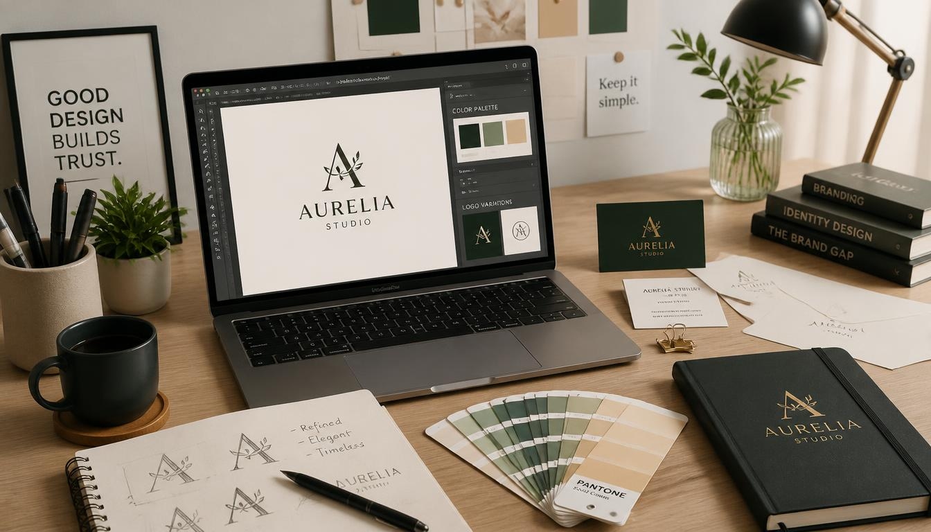
Build a Strong Brand: 7 Essential Things Every Graphic Design Business Needs
Introduction
Every successful graphic design business begins with the same spark: a passion for turning ideas into visuals that people remember.
But passion and talent alone do not build a lasting company.
Thousands of designers use the same software, follow the same trends, and offer similar services. So what makes one graphic design business thrive while another struggles to find clients?
The answer is brand.
A strong brand tells potential clients who you are, what you stand for, and why you are worth the investment. It builds trust long before you send a proposal. It also lets you charge confidently instead of competing on price.
Many designers spend years creating beautiful brands for other people while neglecting their own. They have no clear message, an outdated website, and no system for attracting clients. The result is unpredictable income and constant stress.
This guide will change that. You will learn the seven essential things every graphic design business needs to build a brand that attracts ideal clients, earns premium rates, and grows year after year.
Whether you are a freelancer working from a spare room or a small agency with a growing team, these steps will help your graphic design business stand out in a crowded market.
Here is what we will cover:
- A clear brand identity and positioning
- A memorable visual identity
- A professional portfolio website
- A defined service menu and transparent pricing
- Smooth processes, contracts, and client experience
- Consistent marketing and visibility
- Social proof and a strong reputation
Think of this article as a practical roadmap. Each section gives you actions you can start today, no matter how small your graphic design business is right now.
Remember, a graphic design business without a brand is simply a folder of nice files.
1. Define a Clear Brand Identity for Your Graphic Design Business

Before you design your own logo, answer a bigger question: who are you as a company?
Brand identity is the personality, purpose, and promise behind your work. It is not just a logo or a color palette. It is the reason clients choose you over every other option.
Choose a Clear Niche
Generalists struggle to be remembered. “I design everything for everyone” sounds flexible, but it also sounds forgettable.
A niche gives your graphic design business a sharp position in the market. You might focus on packaging for food brands, pitch decks for startups, or social media graphics for fitness coaches.
Specialists are easier to refer. They also charge more, because clients pay a premium for deep experience in their exact problem.
Do not worry that a niche will limit you. It simply makes your marketing clearer and your reputation stronger.
Know Your Ideal Client
Picture the one client you would love to work with again and again. What industry are they in? What is their budget? What frustrates them about hiring designers?
When you understand your ideal client, every decision becomes easier. Your messaging, pricing, and portfolio all speak directly to them.
Write a short profile of this person and keep it beside your desk.
Write a Mission and Vision
Your mission explains why your graphic design business exists today. Your vision describes where you want it to go.
For example: “Our mission is to help small ethical brands look as professional as global companies.”
Keep both statements short and honest. If they do not excite you, rewrite them until they do.
Define Your Brand Values
Values guide how you work when no one is watching. Common examples include creativity, honesty, reliability, and simplicity.
Choose three to five values and give each one a practical meaning. “Reliability” might mean always delivering on the agreed date. “Honesty” might mean telling a client when an idea will not work.
These values shape your communication, your contracts, and even the projects you decline.
Craft a Unique Value Proposition
Your unique value proposition is a single sentence that explains the benefit clients receive. A simple formula works well:
“I help [specific audience] achieve [specific result] through [your unique approach].”
For instance: “I help wellness startups attract loyal customers through warm, story-driven brand design.”
Place this sentence on your homepage, your social profiles, and your proposals. Your graphic design business should be able to repeat it in seconds.
Decide How You Want to Sound
Brand voice is how your company speaks. Are you friendly and playful, or polished and formal?
Consistency matters more than style. A warm website followed by a stiff email confuses clients and weakens trust.
Describe your voice in three words, then check every piece of writing against them.
Why Positioning Matters
Positioning is the place your graphic design business holds in the client’s mind. It answers one question: why you?
Strong positioning reduces price comparison. When clients see you as the obvious expert, they stop asking for discounts and start asking for availability.
A well-positioned graphic design business also attracts better referrals, because people know exactly what to say when they recommend you.
Take an hour this week to write your niche, ideal client, mission, values, and value proposition on one page. That page becomes the compass for your entire graphic design business.
2. Create a Memorable Visual Identity

Once your strategy is clear, it is time to give it a face. Visual identity is how your brand looks everywhere people meet it.
Clients are visual people who hire visual people. If your own branding looks careless, they will assume your client work does too.
Your graphic design business sells vision, so it must look the part.
A Distinctive Logo
Your logo is the anchor of your graphic design business’s visual identity. It should be simple, scalable, and memorable.
Test it at small sizes, such as a social media avatar, and at large sizes, such as a banner. Check it in black and white as well as in color.
Prepare several versions: a primary logo, a horizontal version, a stacked version, and a small icon. A flexible logo system serves every platform.
A Signature Color Palette
Color triggers emotion faster than words. Blue suggests trust. Orange suggests energy. Green suggests growth. Black suggests luxury.
Choose one or two primary colors and two or three supporting colors. Record their HEX, RGB, and CMYK values so they stay accurate across screens and print.
A restrained palette looks confident. Too many colors look messy.
Typography That Fits
Fonts carry personality too. A bold sans-serif feels modern. An elegant serif feels classic.
Pick one font for headings and another for body text. Make sure both are legible and licensed for commercial use.
Limit yourself to two families. Consistency is what makes a graphic design business look established.
Imagery, Icons, and Graphic Style
Decide the style of your images. Will you use bold illustrations, minimal icons, or real photography?
Create simple rules for each. For instance, all icons might share the same line weight and rounded corners.
Visual rules turn random designs into a recognizable system.
Create Brand Guidelines
Brand guidelines are your rulebook. Even a simple one-page PDF is powerful.
Include your logo versions, clear-space rules, colors, fonts, image style, and examples of correct and incorrect use.
Guidelines protect your graphic design business from inconsistency, especially when you hire freelancers or work with a team.
They also show professionalism. Clients who see your guidelines understand that you practice what you preach.
Apply Your Identity Everywhere
Your visual identity should appear on every touchpoint:
- Website and portfolio
- Social media profiles and post templates
- Email signature and newsletter
- Proposals, invoices, and contracts
- Business cards and packaging
- Presentation decks
When every touchpoint matches, your graphic design business feels organized and trustworthy.
Avoid Common Visual Branding Mistakes
Many designers fall into the same traps:
- Copying trends that do not fit their audience
- Using too many fonts or colors
- Redesigning the logo every six months
- Neglecting mobile appearance
- Ignoring accessibility, such as low-contrast text
Good branding is evolution, not constant reinvention. Refine slowly and keep the core recognizable.
Treat Yourself Like a Client
Run your own branding project with the same discipline you apply to paying clients. Write a brief, set a deadline, and present options to a trusted peer.
A strong visual identity does not need to be expensive. It needs to be intentional. When your graphic design business looks as skilled as it is, clients arrive already convinced.
3. Build a Professional Portfolio Website

Your website is your hardest-working salesperson. It never sleeps, never forgets a detail, and meets potential clients at any hour.
For a graphic design business, the website is also the biggest proof of skill. It must be fast, beautiful, and easy to use.
Make Your Homepage Crystal Clear
Visitors decide within seconds whether they are in the right place. Your homepage should answer three questions immediately:
- What do you do?
- Who do you do it for?
- What should I do next?
Use a strong headline, a short supporting sentence, and one clear call to action, such as “Book a Free Discovery Call.”
Show Your Best Work, Not All Your Work
Quality beats quantity. Six to ten outstanding projects are far more persuasive than fifty average ones.
Choose projects that match the clients you want. If you want to design for restaurants, show restaurant work first.
Remove anything that no longer represents your standard. Your graphic design business is judged by its weakest visible project.
Turn Projects Into Case Studies
Images alone do not explain your value. Case studies do.
For each featured project, tell a short story:
- The problem: What did the client struggle with?
- The process: How did you research, sketch, and refine?
- The result: What changed after the design launched?
Numbers help. “Sales increased 30 percent after the new packaging” is far stronger than “the client loved it.”
Write an About Page People Remember
Clients hire people, not logos. Your About page should show your face, your story, and your values.
Explain why you started your graphic design business and what drives your work. Keep it warm and personal, then link back to how you help clients.
Make Contact Effortless
Add a simple contact form, an email address, and links to your social profiles. Do not hide them.
Every extra click costs your graphic design business inquiries. Place a contact button in your header and at the bottom of every page.
Prioritize Speed and Mobile Experience
Most visitors will view your site on a phone. Test it on several devices.
Compress images, use modern formats, and avoid heavy animations that slow loading. A slow portfolio makes a graphic design business look unprofessional.
Add SEO Basics
A beautiful website is useless if nobody finds it. Learn the fundamentals of search engine optimization:
- Write clear page titles and meta descriptions
- Use descriptive headings
- Add alt text to portfolio images
- Publish helpful blog posts that answer client questions
- Link related pages together
A blog about branding tips, design trends, and project stories can bring steady traffic to your graphic design business. Over time, search visibility becomes one of your most reliable sources of leads.
Build Trust With Small Details
Add your location, a professional email address, a privacy policy, and a clear list of services. These details signal that your graphic design business is real, reliable, and ready for serious clients.
4. Define Your Services, Packages, and Pricing

Confusion kills sales. If potential clients cannot tell what you offer or what it costs, they move on.
A strong graphic design business presents services clearly and prices them with confidence.
Create a Clear Service Menu
List the core services you provide, such as logo design, full brand identity, social media graphics, packaging, and brand guidelines.
Describe each one in plain language: what is included, who it is for, and what the client receives at the end.
Avoid long lists of everything you could do. Focus on what your graphic design business does best.
Offer Packages Instead of Only Custom Quotes
Packages make buying easier. A common structure includes three tiers:
- Starter: A logo and basic brand files
- Standard: Logo, color palette, typography, and social media kit
- Premium: Complete brand identity with guidelines, stationery, and templates
Three options help clients self-select and make the middle choice feel like a smart decision.
You can still offer custom projects, but packages give your graphic design business a predictable foundation.
Move Beyond Hourly Billing
Hourly rates punish efficiency. The faster you become, the less you earn.
Value-based pricing focuses on the result. A logo that helps a company win larger customers is worth more than the hours it took to draw.
Ask clients about their goals and budget during discovery. Then price according to the value you will deliver.
Define Scope, Revisions, and Timelines
Many pricing problems are actually scope problems. Define what each package includes before work begins:
- Number of concepts
- Number of revision rounds
- Final file formats
- Delivery timeline
- Extra costs for additional changes
Clear boundaries protect your time and your relationship with the client.
Use Deposits and Payment Schedules
Ask for a deposit, often 30 to 50 percent, before starting. It confirms commitment and covers early costs.
Split remaining payments across milestones or at final delivery. A good payment structure keeps cash flow healthy in your graphic design business.
Add Retainers and Upsells
Ongoing support creates stable income. Offer monthly retainers for social media graphics, marketing materials, or brand maintenance.
Upsells also help. After a logo project, suggest brand guidelines, business cards, or website graphics.
Retainers turn one-time projects into long-term relationships, which is the healthiest way to grow a graphic design business.
Review Your Prices Regularly
If you are always booked, your prices are probably too low. Raise them gradually for new clients, and give existing clients fair notice.
Higher prices often attract more serious clients to a graphic design business, because they signal quality and expertise.
5. Set Up Professional Processes, Contracts, and Client Experience

Clients remember how working with you felt long after they forget the exact colors you chose.
A smooth, professional experience is one of the strongest brand assets a graphic design business can build. It creates repeat work and enthusiastic referrals.
Start With a Discovery Call
Before quoting, learn about the client. A short discovery call helps you understand their goals, audience, competitors, and budget.
Ask questions such as:
- What problem are we solving?
- Who is your ideal customer?
- Which brands do you admire, and why?
- What does success look like in six months?
This conversation shows you care about results, not just aesthetics.
Use a Creative Brief
A written brief keeps everyone aligned. It should summarize the project goals, target audience, tone, deliverables, deadlines, and budget.
Ask the client to review and approve it. A good brief prevents misunderstandings and protects your graphic design business from endless changes later.
Send a Clear Proposal
A proposal should feel like part of your brand. Use your colors, fonts, and voice.
Include an overview of the problem, your proposed solution, the timeline, the investment, and the next steps. Keep it short, visual, and easy to approve.
Never Skip the Contract
Contracts are not unfriendly. They are a sign of professionalism. A solid agreement protects both sides and sets expectations.
Make sure it covers:
- Scope of work and deliverables
- Payment terms and late fees
- Number of revisions
- Ownership and usage rights
- Cancellation or kill fee
- Confidentiality
- Project timeline
Every graphic design business should use a written agreement for every project, even for friends and family. Consider asking a qualified legal professional in your country to review your template.
Organize Projects With the Right Tools
Choose simple tools and use them consistently. A project management app, a shared cloud folder, and a scheduling link can handle most needs.
Give each client one place to find files, feedback, and updates. Organized systems make a small graphic design business look like a well-run agency.
Manage Feedback Professionally
Feedback can make or break a project. Set a clear process from the start.
Present your work with a short explanation of your thinking, not just the visuals. Ask clients to consolidate feedback into one list. Respond calmly, even when comments feel subjective.
When feedback conflicts with the brief, gently remind the client of the original goals. This keeps decisions grounded in strategy instead of personal taste.
Communicate Proactively
Silence creates anxiety. Send regular updates, even when there is no big news.
Set boundaries too. Share your working hours and typical reply times, so clients know what to expect.
Predictable communication builds confidence in your graphic design business.
Finish Strong
A great ending is as important as a great start. Deliver organized files with clear names, usage notes, and brand guidelines.
Send a thank-you message and request a testimonial while the client is happiest. Then check in a few weeks later to see how the new brand is performing.
Small gestures like these turn one-time customers into advocates.
6. Market Your Brand With Consistency and Purpose

Even the best brand stays invisible without marketing. Clients cannot hire you if they have never heard of you.
The secret is not doing everything. It is doing a few things consistently. Every graphic design business has limited time, so focus matters.
Choose Your Main Platforms
Pick one or two channels where your ideal clients spend time. Popular options include:
- Instagram and Pinterest for visual storytelling
- LinkedIn for B2B clients and corporate work
- Behance and Dribbble for showcasing and discovery
- YouTube for tutorials and process videos
Do not try to be everywhere. Master a platform before adding another.
Share Content That Helps
Selling constantly pushes people away. Teaching attracts them.
Share branding tips, before-and-after transformations, design breakdowns, and behind-the-scenes process videos. Explain why a color or layout works.
Helpful content positions your graphic design business as an expert and keeps you visible in your audience’s feed.
Create a Simple Content Calendar
Consistency beats intensity. Plan a realistic schedule, such as three posts per week and one newsletter per month.
Batch your work. Spend one afternoon creating several posts, then schedule them in advance.
A modest calendar you can maintain is better than a bold one you abandon.
Build an Email List
Social platforms change their algorithms, but your email list belongs to you.
Offer a useful freebie, such as a brand checklist, a color palette guide, or a set of templates. Then send helpful emails and occasional updates about your services.
Email is one of the most effective ways for a graphic design business to stay in touch with future clients.
Use SEO and Blogging
Search engines send visitors who are already looking for help. Write articles that answer real questions, such as “How much does a logo cost?” or “What is included in a brand identity?”
Use clear headings, short paragraphs, and helpful images. Update older posts to keep them fresh.
Over time, your blog can become a steady source of leads for your graphic design business.
Build Partnerships
Many of your best referrals will come from people who serve the same clients. Connect with web developers, copywriters, photographers, marketers, and business coaches.
Offer to collaborate on projects or share each other’s work. Partnerships widen your reach without increasing your advertising costs.
Network Online and Offline
Join local business groups, creative meetups, and online communities. Show up consistently and contribute value instead of pitching.
Relationships take time, but they compound. One strong connection can send work to your graphic design business for years.
Try Thoughtful Outreach
Reach out directly to businesses that could benefit from better design. Personalize every message. Mention something specific about their brand and offer a clear idea for improvement.
Generic mass emails get ignored. Thoughtful outreach feels like help, not spam.
Measure and Improve
Track what works. Review website traffic, inquiry sources, and engagement every month.
Double down on the channels that bring real clients, and drop the ones that do not. Marketing for a graphic design business should always be guided by data, not guesswork.
7. Build Social Proof and a Reputation Clients Trust

People trust other people more than they trust advertising. Social proof is the evidence that others have hired you and been happy.
For a new graphic design business, collecting proof early is one of the smartest investments you can make.
Collect Testimonials Consistently
Ask every satisfied client for a testimonial. The best time is right after delivery, when excitement is high.
Make it easy. Send three short questions:
- What problem were you facing before we worked together?
- What was it like working with me?
- What results have you seen since?
Specific stories are far more convincing than general praise.
Display Testimonials Strategically
Place testimonials where visitors make decisions: on your homepage, service pages, and proposals.
Add the client’s name, company, and photo if they agree. Real faces build credibility.
A short video testimonial can be even more powerful for a graphic design business.
Publish Detailed Case Studies
Case studies show your thinking and your results. They answer the unspoken question every client has: “Can this designer solve my problem?”
Include the challenge, your process, the final design, and the measurable outcome. Share them on your website, social media, and newsletter.
Build a Strong Online Presence on Review Platforms
Claim your profile on relevant platforms, such as Google Business Profile, Clutch, or industry directories. Encourage happy clients to leave honest reviews.
Respond to every review with gratitude. If you receive criticism, reply politely and focus on solutions.
How you handle a difficult review can strengthen the reputation of your graphic design business.
Create a Referral System
Referrals are often the best clients: they arrive trusting you already.
Make asking easy. Add a line to your final email, such as “If you know anyone who needs design help, I would love an introduction.” Some studios offer a small thank-you gift or discount.
Always thank people who refer you.
Earn Authority
Authority grows when others recognize your expertise. Look for chances to:
- Write guest articles for industry blogs
- Speak at workshops or webinars
- Appear on podcasts
- Teach classes or share templates
- Enter design awards
Each mention strengthens trust in your graphic design business and improves your visibility online.
Protect Your Reputation
Reputation takes years to build and seconds to damage. Deliver on promises, communicate clearly, and fix mistakes quickly.
Keep your work ethical. Credit collaborators, respect copyright, and be honest about what you can do.
When people know they can count on you, your brand becomes your most valuable asset.
Bonus: Common Branding Mistakes That Hold Back a Graphic Design Business

Even talented designers make avoidable errors. Watch out for these common traps:
- Skipping strategy. Jumping straight to visuals leads to pretty but unfocused branding for your graphic design business.
- Inconsistent messaging. A different tone on every platform confuses clients and weakens trust.
- Low prices attract difficult clients and quickly burn out the owner of a graphic design business.
- Ignoring your own marketing. Client work always comes first, until the pipeline runs dry.
- Saying yes to everything. Projects outside your niche dilute your message and slow down your graphic design business.
- Copying competitors. Learn from them, but never imitate them. Your graphic design business needs its own voice.
Most of these mistakes come from being too busy to step back. That is why a regular review matters.
Once every quarter, set aside an hour for a simple brand audit. Ask whether your website, pricing, and messaging still reflect where you are heading. Check whether your newest projects belong in your portfolio. Look at your inquiries and notice which ones feel like a perfect fit.
Small corrections prevent big problems later, and they keep your graphic design business moving in the right direction.
Remember that a brand is never finished. It grows with you, so review it often and your graphic design business will stay sharp.
Conclusion
A strong brand is not a luxury for a creative studio. It is the foundation that turns skill into a sustainable company.
Let’s recap the seven essentials every graphic design business needs:
- A clear brand identity and positioning
- A memorable visual identity
- A professional portfolio website
- Defined services, packages, and pricing
- Professional processes, contracts, and client experience
- Consistent marketing and visibility
- Social proof and a trusted reputation
You do not need to complete everything at once. Start small.
This month, write your positioning statement and refresh your portfolio. Next month, create your service packages and a simple contract. After that, build a content plan and begin collecting testimonials.
Small, consistent actions compound. Within a year, your graphic design business can look and feel completely different: clearer, more confident, and far more profitable.
Your clients are searching for a designer they can trust. Build the brand that makes you the obvious choice, and your graphic design business will keep attracting the right people.
Frequently Asked Questions (FAQs)
1. How do I start a graphic design business with no clients?
Start by defining your niche and building a small portfolio of strong projects. Create a few self-initiated or pro bono projects if you need samples. Then set up a simple website, share your work online, and reach out to local businesses. Your first clients often come from your personal network.
2. How much does it cost to start a graphic design business?
Costs vary, but a lean graphic design business can start with a computer, design software, a domain name, and hosting. Many designers begin for a few hundred dollars and invest more as income grows. Legal registration and insurance costs depend on your country.
3. Do I need a degree to run a graphic design business?
No. Clients care about your portfolio, results, and professionalism more than a certificate. However, courses, mentorship, and continuous practice help you sharpen your skills and stay current with trends.
4. What software does a graphic design business need?
Most designers use Adobe Photoshop, Illustrator, and InDesign, though tools like Figma, Affinity, and Canva are also popular. Add a project management tool, an invoicing app, and cloud storage to keep your graphic design business organized.
5. How do I find my first clients?
Tell friends, family, and former colleagues what you do. Share your work on social platforms, join local business groups, and contact small companies with outdated branding. Freelance marketplaces can help too, though building direct relationships usually pays better.
6. How much should I charge for design services?
Research your market, consider your experience, and price based on value, not just hours. Packages with clear deliverables work well. Increase your rates as demand grows and your results improve.
7. How long does it take to build a strong brand?
You can create a basic brand identity in a few weeks. Building recognition and trust takes longer, often six to twelve months of consistent effort. Patience and consistency are the real keys for any graphic design business.
8. Should I register my graphic design business?
Requirements depend on where you live. Many freelancers start as sole proprietors, while others form a company for liability and tax reasons. Speak with a local accountant or legal professional to choose the right structure for your graphic design business.
9. How can my graphic design business stand out from competitors?
Choose a niche, show real results, and deliver an excellent client experience. Share your expertise through helpful content, collect testimonials, and keep your branding consistent. Stand-out brands are specific, reliable, and easy to remember.
10. Can I run a graphic design business from home?
Yes. Many successful studios begin at a kitchen table or a spare room. What matters is a reliable internet connection, organized systems, and a professional presentation. As your graphic design business grows, you can hire help or rent a studio space.
7 Passive Income Ideas for Designers Who Want to Earn Beyond Client Work
Introduction: Why Designers Need More Than Client Work
Most designers begin their careers by trading time for money. You take a brief, deliver the files, send the invoice, and start all over again with the next client.
That model works, but it has a ceiling. There are only so many hours in a week, and a single slow month can shake your confidence and your bank balance.
This is why more creatives are searching for passive income. The idea is simple. You create something once, then sell it again and again while you focus on other work.
In this guide, you will discover seven practical ways to build passive income using skills you already have. Each idea explains how it works, what you need to start, where to sell, and which mistakes to avoid.
A steady stream of passive income will not replace your client work overnight. What it can do is give you stability, creative freedom, and the confidence to say no to projects that do not fit.
You will also find a realistic timeline, a short action plan, and a full FAQ section. If you have ever wanted to earn beyond client work, this article is the right place to begin.
What Passive Income Really Means for Designers
Before we dive into the ideas, it helps to define the term. Passive income is money you earn with little ongoing effort after the initial work is complete.
For designers, that usually means a digital product, a license, or a piece of content that keeps selling long after you published it. You do the heavy lifting up front. After that, sales arrive with only light maintenance.
It is important to be honest here. Passive income is rarely completely hands-off. Most products still need marketing, updates, and customer support from time to time.
Think of it as front-loaded work. You might invest several weeks or even months, and the payoff arrives gradually over the following years.
That said, the payoff can be very real. Many designers now earn a steady monthly amount from products they built long ago. This kind of passive income becomes a financial cushion, and it makes freelancing far less stressful.
Why Designers Are Perfectly Placed to Build Passive Income
Designers have a major advantage over most people who want to earn passive income. You already know how to create things that other people want to buy.
Logos, layouts, icons, mockups, and illustrations are always in demand. Small businesses, creators, and students all need good design, but many cannot afford a fully custom project.
A ready-made product solves that problem at a lower price. Better still, you get to sell the same file to hundreds of buyers instead of just one client.
Marketplaces and creator platforms also make selling easier than ever. You do not need your own website to start, although having one helps a lot in the long run.
There is one more benefit worth mentioning. Every product you sell works as a public sample of your style. That can bring better clients to your door, so your passive income and your client work can grow together.
How to Choose the Right Idea for You
Seven ideas can feel like a lot. You do not need to try them all at once. In fact, trying everything at the same time is one of the fastest ways to burn out.
Instead, ask yourself three simple questions.
What do I enjoy making? You will be creating for months, so pick a format you genuinely like.
What do I already have? Old client work, unused sketches, and personal projects can often be turned into products with very little extra effort.
How fast do I want results? Templates and assets can start generating passive income within weeks. Courses and content channels take longer, but they often pay more in the long run.
Pick one idea, finish it, and publish it. Then move on to the next. Building passive income works best when you treat it like a series of small launches rather than one giant project.
Idea 1: Sell Design Templates

Templates are one of the most popular passive income ideas for designers, and for good reason. They are fast to create, easy to price, and always in demand.
A template is a pre-made design that buyers can edit to fit their own needs. Think social media kits, resumes, pitch decks, brand style guides, invoices, menus, and Notion dashboards.
How it works
You design the template in a tool such as Photoshop, Illustrator, Figma, or Canva. Then you upload it to a marketplace or your own store and set a price.
Buyers download the file, customize it, and use it right away. Every sale after that is passive income, because the product is already built.
What you need to start
- A clear niche, such as templates for coaches, restaurants, or real estate agents
- Five to ten polished templates to launch with
- Attractive preview mockups that show the product in real use
- A simple license explaining how buyers may use the files
Where to sell
Popular options include Creative Market, Etsy, Gumroad, Envato, and the Canva creator program. Each platform has different fees and a different audience, so test a few before you commit.
Choose the platform that best fits your passive income goals, not just the one with the biggest crowd.
Tips for success
Focus on one niche and go deep. A pack of thirty wedding templates will usually outsell a random mix of unrelated designs.
Add clear instructions and links to free fonts. Good support reduces refunds and earns better reviews, which helps you build lasting passive income.
Idea 2: Create Print-on-Demand Products

Print-on-demand lets you sell physical products without holding any inventory. It is a smart way to turn your artwork into passive income without ever visiting a post office.
You upload a design, choose a product, and a partner prints and ships each order for you. The customer pays, the partner takes the base cost, and you keep the profit.
How it works
Services like Printful, Printify, and Redbubble connect to online stores. When a customer orders a t-shirt, mug, or poster, the partner handles printing, packing, and delivery.
Because the partner handles fulfillment, this is one of the most hands-off passive income models for beginners. Your margin is the difference between the base cost and your selling price.
What sells well
- Typography designs and slogans for specific communities
- Minimalist posters and wall art
- Pattern designs for phone cases, tote bags, and notebooks
- Niche humor for hobbies and professions
Evergreen designs tend to earn passive income all year, while seasonal designs create nice spikes around holidays.
Tips for success
Research before you design. Look at what is already selling in your niche, then find a gap you can fill with your own style.
Order samples first. Checking print quality protects your reputation and prevents unhappy buyers.
Be patient with this one. Print-on-demand is slow to build at first, but a large catalog can create steady passive income as each design collects a few sales every month.
Idea 3: Sell Fonts, Icons, and Graphic Assets

If you love the fine details of design, selling digital assets can be very rewarding. Fonts, icon sets, textures, brushes, and vector packs all belong in this category.
These products are used by other designers, so buyers already understand their value. They also make excellent passive income because a single asset can sell for years with very little upkeep.
Types of assets you can sell
- Typefaces and font families
- Icon sets in several styles
- Photoshop brushes, actions, and textures
- Vector illustration packs and mockup scenes
How to get started
Start small. A set of fifty consistent icons is easier to finish than a complete font family, and it can still sell very well. Even a small asset pack can become a dependable source of passive income.
Study the bestsellers on marketplaces to learn which styles and file formats buyers prefer. Include PNG, SVG, and editable source files whenever possible.
Why licensing and bundles matter
Offer clear license tiers, such as personal, commercial, and extended use. Higher tiers let you charge more for the exact same product.
Bundles are another smart move. Grouping related items raises the average order value and strengthens your passive income without extra design work.
Keep your catalog fresh
Update your assets from time to time. A refreshed bundle can bring old customers back, and it can boost your passive income during slow seasons.
Idea 4: Launch an Online Course or Workshop

Teaching is one of the strongest ways to earn beyond client work. If you can explain how you design, someone is willing to pay to learn it.
A recorded course is a classic example of passive income. You film it once, then sell it for as long as the content stays useful.
Topics that work well
- Logo design in Photoshop or Illustrator
- Branding basics for freelancers
- Procreate illustration for beginners
- Figma for UI design
- Portfolio building and pricing
How to build your course
Start with an outline of five to eight lessons, each solving one clear problem. Short lessons keep students engaged and help them finish.
Record screen tutorials with simple tools, then add worksheets, project files, and a certificate. A course that teaches one specific skill can bring in passive income for years, especially if you refresh it once or twice a year.
Where to sell
Skillshare, Udemy, Teachable, Gumroad, and Podia are popular choices. Udemy brings built-in traffic, while your own platform gives you better margins and direct contact with students. Choose based on how much control you want over your passive income.
Tips for success
Offer a free lesson to build an email list. People who finish a free lesson are far more likely to buy the full course, and that grows your passive income over time.
Idea 5: Sell Ebooks, Guides, and Printables

Designers know how to make information look beautiful. That skill turns simple knowledge into products people happily pay for.
Ebooks, guides, planners, checklists, and workbooks are cheap to produce and easy to deliver. They also fit neatly into a long-term passive income plan because the files never run out of stock.
Product ideas
- A brand style guide workbook for small business owners
- A freelance pricing guide with contract templates
- Printable planners, journals, and wall calendars
- A color palette and font pairing handbook
How to create them
Choose a problem you can solve in under fifty pages. Write clear, short sections, and design the layout with the same care you give client work.
Export a polished PDF and, if relevant, a printable version. Once it is published, the ebook becomes passive income with no stock to manage.
Where to sell
Gumroad, Etsy, Payhip, and your own website all work well. Etsy is especially strong for printables, since many shoppers search there for planners and wall art. Delivery is automatic, which makes this a clean passive income model.
Tips for success
Write a strong sales page with a clear preview of the inside pages. Buyers want to see what they are getting before they click the buy button.
Release a new edition each year. An updated planner or pricing guide can revive interest and keep passive income flowing.
Idea 6: License Your Artwork and Patterns

Licensing means you keep ownership of your artwork while a company pays to use it on products. Those products might include fabric, stationery, home decor, packaging, or greeting cards.
It can be one of the most rewarding forms of passive income, because one strong design may appear on many products and sell for years.
How it works
You create a collection of related patterns or illustrations. Then you pitch it to brands or upload it to agencies and marketplaces. If a company likes it, they sign an agreement and pay you a royalty or a flat fee.
After the contract is signed, payments arrive without extra design work. That is exactly what passive income should feel like.
What you need to start
- A cohesive portfolio of ten to twenty pieces in one style
- A basic understanding of repeat patterns and color palettes
- A simple licensing agreement or a trusted agent
- Patience, because deals can take months
Where to find buyers
Stock marketplaces such as Adobe Stock and Shutterstock pay per download. They are a beginner-friendly way to start earning passive income. You can also approach fabric brands, stationery companies, and licensing agents directly.
Tips for success
Follow trends in color and theme, but stay true to your style. A recognizable look makes brands remember you.
Keep records of every agreement. Knowing who has the rights to what will protect you and make it easier to manage passive income from several partners.
Idea 7: Grow a Blog, YouTube Channel, or Newsletter

Content is the long game of passive income. A helpful tutorial can attract visitors for years, and each visit is a chance to earn.
You can make money through ad revenue, affiliate links, sponsorships, and by sending readers to your own products. In fact, content often becomes the engine that turns readers into customers for your other passive income products.
Content that works for designers
- Step-by-step software tutorials
- Design tool reviews and comparisons
- Before-and-after case studies
- Beginner guides with free downloadable resources
How affiliate income works
Many software companies and marketplaces pay a commission when someone buys through your link. This is a natural form of passive income for creators who already teach and review tools.
Always disclose affiliate links, and recommend only tools you genuinely use.
How to get started
Pick one channel and post consistently for at least six months. Search-friendly topics, such as how to design a logo in Photoshop, tend to keep attracting traffic long after publication.
Be patient. Results come slowly, but a library of strong content can become a dependable source of passive income that grows with every new post.
Essential Tools for Building Passive Income as a Designer
Having the right tools makes every idea easier. You do not need expensive software to begin, but a few essentials will save you hours.
Design software: Photoshop, Illustrator, Figma, Affinity, and Canva all work well for creating products.
Mockup tools: Placeit, Smartmockups, and free Photoshop mockup files help you present your products professionally.
Selling platforms: Gumroad, Etsy, Creative Market, and Shopify let you accept payments and deliver files automatically. Automation is the backbone of passive income, so choose tools that send files and receipts without you.
Email tools: Mailchimp, ConvertKit, and MailerLite help you build an audience you own, which is vital for long-term passive income.
Analytics: Google Analytics and platform dashboards show which products earn the most, so you can build more of what works.
Keep your setup simple. A lean toolset keeps your passive income business easy to run, and a small stack you understand beats a large one you never learn.
How to Market Your Products Without Burning Out
Even the best product will not sell if nobody sees it. Marketing is the part of passive income that most designers underestimate.
The good news is that you only need a few reliable channels.
Search engine traffic
Optimize your product pages and blog posts with keywords that buyers actually search for. Clear titles, descriptions, and image alt text help your listings appear on Google and inside marketplaces.
Over time, search traffic can become the most dependable driver of passive income.
Pinterest and Instagram
Visual platforms suit designers perfectly. Pin your product mockups and link them to your store. Pinterest posts keep circulating for months, which fits a hands-off business model well.
Your email list
Offer a free mini template pack in exchange for an email address. Then send occasional updates about new releases and discounts.
An email list turns one-time buyers into repeat customers, and it is the one audience no algorithm can take away.
Collaborations and partnerships
Partner with bloggers, educators, and other creators who serve the same audience. A single mention can send hundreds of visitors to your shop.
Spend a few hours each week on marketing, and your passive income will compound much faster.
A Realistic Timeline and Earnings Expectations
Let us be realistic. Nobody becomes wealthy from a single template pack in the first week. Building passive income is a gradual process, and most designers see their first sales within a month or two.
Here is a typical pattern:
- Months 1 to 3: You create and launch your first products. Sales are small and sporadic.
- Months 4 to 6: You learn what sells, improve your listings, and add new items.
- Months 7 to 12: A growing catalog and a small audience produce steadier results.
- Year two and beyond: Older products keep selling while new ones add to the total.
Earnings vary widely. Some designers make only a few extra dollars of passive income each month, while others replace a full salary. The difference usually comes from consistency, niche focus, and the number of quality products published.
Treat your first year as an investment. The passive income you build in year one can support you for many years to come.
Track your numbers monthly. Knowing your revenue, best sellers, and traffic sources helps you decide where to spend your time.
Avoid comparing yourself to screenshots online, since those rarely show the full story. Building passive income is a personal journey.
Common Mistakes to Avoid
Even talented designers stumble when building passive income. Here are the mistakes that come up most often.
1. Launching too many things at once
Spreading yourself thin leads to unfinished products and weak launches. Finish one thing, learn from it, then continue.
2. Ignoring licensing and copyright
Always check the license for fonts, images, and mockups you use inside your products. One mistake can lead to refunds, takedowns, or legal trouble. Protecting your work also means protecting your passive income.
3. Skipping market research
Do not guess what people want. Browse bestseller lists, read reviews, and study customer questions before you design.
4. Underpricing your work
Low prices attract buyers but erode your profit. Price based on the value you deliver, not on fear.
5. Quitting too early
Most products need time to gain traction. If you give up after a month, you will never see what compounding passive income can do.
6. Neglecting customer support
Quick, friendly replies protect your reviews. Good reviews drive more sales, and more sales mean more passive income.
Your 30-Day Action Plan
Ready to begin? Use this simple plan to take your first step this month.
- Week 1: Choose one idea from this list and one specific niche. Research ten competitors.
- Week 2: Design your first product. Aim for quality over quantity.
- Week 3: Create mockups, write your listing, and set up your store or marketplace account.
- Week 4: Launch, share on social media, and email friends or followers. Collect early feedback.
After launch, spend one hour a week improving your listing and one hour creating the next product. Small, steady effort is how passive income grows.
By day 30, you will not be rich, but you will have something far more valuable: a real product in the market and a clear path forward. Remember that every successful passive income stream started with a single published product.
Final Thoughts
Client work will always have its place, and it is a wonderful way to grow your skills. But relying on it alone puts your income at the mercy of deadlines, budgets, and other people’s decisions. That is why building passive income is such a powerful goal for creatives.
The seven ideas in this guide give you a way out of that cycle. Whether you sell templates, courses, or artwork licenses, each path can turn your talent into passive income.
Choose one idea, start small, and stay consistent. Over time, your products will work for you even when you are not at your desk. That is the real promise of passive income, and it is within reach for any designer willing to start.
Frequently Asked Questions
What is passive income for designers?
It is money earned from design products or content that you create once and sell repeatedly, such as templates, fonts, courses, or licensed artwork. It takes upfront effort but little daily work after launch.
How much can designers earn from passive income?
Results vary. Many beginners earn small amounts in their first months, while creators with large catalogs can earn a full-time income. Your niche, product quality, and marketing effort make the biggest difference.
Which passive income idea is best for beginners?
Templates and graphic assets are usually the easiest place to start. They are quick to make and sell on established marketplaces. Print-on-demand is another low-risk option.
Is passive income really passive?
Not entirely. After the initial work, you will still handle updates, marketing, and customer questions. However, the time required drops dramatically compared with client projects.
How long does it take to see results from passive income?
Most designers see their first sales within one to three months. Meaningful earnings usually take six to twelve months of consistent effort.
Do I need a website to earn passive income as a designer?
No. Marketplaces like Etsy, Creative Market, and Gumroad let you start without a website. Still, your own site gives you control, better margins, and long-term search traffic.
Can I keep freelancing while building passive income?
Yes, and that is the smartest approach. Use client work to fund your time, and invest a few hours each week in building products until they can support you.
Do I need to pay taxes on passive income?
Yes. In most countries, earnings from digital products and licenses are taxable. Keep clear records and consult a local accountant for advice specific to your situation.
Graphics Design
From First Contact to Project Approval: 10 Proposal Templates That Make an Impression
From First Contact to Project Approval: 10 Proposal Templates That Make an Impression
Introduction
Every client relationship starts with a first contact. It might be a quick email, a discovery call or a referral from a friend. What happens next decides whether that spark becomes a signed contract or fades away.
In most cases, what happens next is a proposal. It is your chance to show that you listened, understand the problem and can deliver a clear result.
Good proposal templates save you hours every week. They also keep your pitch consistent, professional and easy to scan.
In this guide, you will find 10 proposal templates that cover the full journey from first contact to project approval. Each of these proposal templates is built for a specific situation, so you can pick the right one quickly.
You will also learn what every proposal needs, how to price with confidence, how to customize your documents, which mistakes to avoid and how to follow up. Whether you freelance, run an agency or sell consulting, the right proposal templates can shorten your sales cycle.
Why Your Proposal Format Matters More Than You Think
A proposal is not just a price list. It is a sales document, a project plan and a first impression rolled into one.
Clients often compare several offers at once. The one that is clearest, most relevant and easiest to approve usually wins, even when it is not the cheapest.
This is where well-built proposal templates help. They give your ideas a proven structure, so you spend your energy on the client instead of layout and formatting.
Strong proposal templates also build trust. Consistent branding, tidy sections and predictable pricing tables signal that you run a reliable business.
Speed is another benefit. Replying quickly while interest is high often improves your chances. With ready-made proposal templates, you can send a tailored offer on the same day.
A consistent format also reduces mistakes. Missing terms, wrong dates and forgotten deliverables are easier to avoid when every offer follows the same checklist. Teams that rely on proposal templates also find onboarding new sales staff much easier.
Finally, a consistent format makes your results easier to measure. When you use the same proposal templates again and again, you can see which sections get questions and which ones close deals.
In short, proposal templates turn a stressful writing task into a repeatable process.

The Core Elements Every Proposal Needs
Before we look at the ten options, it helps to know the building blocks. Nearly all effective proposal templates share the same core elements.
- Cover page: Your name, the client’s name, the project title and the date.
- Executive summary: A short overview of the problem and your solution.
- Scope of work: What you will do, and what you will not do.
- Timeline: Key milestones and delivery dates.
- Pricing: Clear costs, payment terms and optional extras.
- About you: Relevant experience, results and testimonials.
- Terms and next steps: What the client must do to say yes.
You do not need every element every time. A one-page quote needs fewer sections than a six-figure consulting plan. The best proposal templates let you add or remove sections in minutes.
Keep one rule in mind: write for the decision maker. That person is often busy and not an expert in your field, so plain language wins. When you review your own proposal templates, ask whether a stranger could understand each section in ten seconds.

10 Proposal Templates That Make an Impression
Each of the following proposal templates matches a different stage of the client journey. Read them in order, or jump straight to the one that fits your next project.
1. The One-Page Quick Pitch Proposal

This is the lightest of all proposal templates. It fits on one page and works best right after a first call, when the client wants a fast, simple answer.
Include a headline promise, a three-line summary of the problem, a short scope list, one price and a clear approval line.
It works because it respects the reader’s time. Freelancers often keep it as the default in their proposal templates for small jobs and repeat clients.
Pro tip: End with one question, such as “Shall we start on Monday?” It nudges the reader to act. Add a one-page version to your proposal templates library even if you mostly write long documents.
2. The Discovery Follow-Up Proposal

Use this format straight after a discovery call. Among the proposal templates in this list, it is the most conversational.
Open by repeating what you heard: goals, worries, budget range and deadlines. Then present your plan as the answer to those points.
Clients feel heard, and that feeling is powerful. It shows you did not paste in a generic offer. Good proposal templates of this kind leave space for your call notes.
Pro tip: Use the client’s own words in your headings. Then send the document within 24 hours, while the conversation is fresh. Even simple proposal templates feel personal when the timing is right.
3. The Problem-Solution Proposal
This classic structure suits clients who already know their pain. It moves in three steps: define the problem, show the cost of ignoring it, then present your fix.
Of all proposal templates, this one is strongest for persuasion because it builds a clear story.
Back the story with one or two numbers, such as lost leads, wasted hours or missed revenue. Even rough estimates help the reader see the stakes. Sales teams that build proposal templates around this story often report faster approvals.
Pro tip: Keep the problem section short. Two paragraphs are plenty. Strong proposal templates spend more space on the solution than on the complaint.
4. The Creative Services Proposal

Designers, photographers, writers and video teams need a layout that shows style as well as process. This format adds a visual portfolio section and a creative approach page.
Many creative proposal templates also include a revision policy and a usage rights clause, which prevents arguments later.
Let your visuals lead. A strong cover, a few project samples and a clean pricing table do most of the work. Visual proposal templates should still stay light enough to open quickly on a phone.
Pro tip: Show before-and-after examples where possible. They prove your value faster than a long description, and they make your proposal templates stand out from plain text offers.
5. The Web Design and Development Proposal

Web projects have many moving parts, so this format focuses on clarity. It lists pages, features, integrations, content responsibilities and testing steps.
Among technical proposal templates, this one should include a phased timeline and a change request process. Scope creep is the biggest risk in web work.
Add a short “what we need from you” section covering logos, text, images and logins. It prevents delays. Save a tested version in your library of proposal templates so every new project starts with a proven scope.
Pro tip: Break pricing into phases. Smaller approvals feel easier than one large number. Developers who adopt proposal templates with phased pricing often see fewer payment disputes.
6. The Marketing and SEO Services Proposal

Marketing clients care about results. This layout puts goals and measurement first, followed by strategy, channels, deliverables and reporting.
Good proposal templates for marketing explain how success will be tracked, such as traffic, leads or sales, and how often you will report.
Be honest about timelines. SEO and content work often take months to show results, and setting expectations early avoids disappointment. Agencies that use proposal templates with clear reporting sections build longer relationships.
Pro tip: Offer three packages. Many buyers choose the middle one. Tiered proposal templates also make upselling feel natural rather than pushy.
7. The Consulting Engagement Proposal

Consultants sell expertise, which is hard to see. This format makes it tangible with a diagnostic phase, a roadmap and clear outcomes.
Senior buyers read these proposal templates carefully, so include methodology, assumptions, team roles and risk notes.
Focus on business outcomes rather than hours. Clients buy results, not time. The best proposal templates for consultants translate every activity into a benefit.
Pro tip: Include a short case study with a measurable result, then add it to your proposal templates so it is ready for the next pitch.
8. The Business Partnership Proposal

Not every proposal sells a service. Sometimes you are inviting another company to collaborate, co-market or share a project.
These proposal templates should explain shared goals, each side’s responsibilities, how revenue or costs will be split and how the partnership will be reviewed.
Tone matters here. Aim for balanced and respectful, not salesy. Both sides need to feel they gain. Well-written proposal templates for partnerships read like an invitation, not a pitch.
Pro tip: Suggest a small pilot first. Low-risk starts are easier to approve, and they let you refine your proposal templates before a larger commitment.
9. The Grant and Nonprofit Funding Proposal

Funders follow strict criteria, so this format is more formal. It includes a need statement, objectives, activities, a budget narrative and an evaluation plan.
Strong proposal templates in this category mirror the funder’s own guidelines, using the same headings and terminology.
Be specific about impact. Say how many people you will serve, over what period and how you will measure change. Grant-focused proposal templates should also leave room for a clear budget justification.
Pro tip: Have someone outside your team read the draft. Clarity beats jargon. Nonprofit proposal templates work best when they are tested with a neutral reader.
10. The Retainer and Ongoing Services Proposal

Retainers turn one-off work into predictable income. This format explains a monthly scope, response times, reporting and renewal terms.
Of the ten proposal templates here, this one needs the clearest boundaries. State what is included, what costs extra and how unused hours are handled.
Show the long-term value with a three or six-month plan. Clients should see progress, not just activity. Review your proposal templates every quarter and update pricing as your skills grow.
Pro tip: Offer a short trial period before a longer commitment. Many service businesses use proposal templates with a trial clause to lower the client’s risk.
How to Choose the Right Format for Each Client

With ten options available, which one should you pick? Start with the client’s stage, budget and decision process.
A small business owner who wants a fast answer rarely needs twenty pages. Send a quick pitch or a discovery follow-up. A large company with several reviewers may expect more detail, so choose the consulting or partnership layout.
Ask yourself three questions. Who approves the deal? How much risk does the buyer feel? How much information do they need?
Many professionals keep a small library of proposal templates and mix sections from different ones. That is perfectly fine. A problem-solution opening with a retainer pricing table can be very effective.
Whatever you choose, test it. Track which proposal templates lead to the most signed deals, and improve the weaker ones.
A simple scoring sheet can help. Rate each of your proposal templates on response rate, approval rate and average deal size. After a few months, the winners become obvious.
Do not be afraid to retire outdated proposal templates. A shorter, sharper library is easier to maintain than a crowded folder.
Pricing Your Proposal with Confidence

Price is the part of every proposal that readers jump to first. Presenting it well can make the difference between a quick yes and a long silence.
Start by anchoring the price to value. Explain what the client gains before they see the number, so the cost feels like an investment rather than an expense.
Offer clear options. A good, better, best structure lets buyers choose their comfort level without leaving the conversation. Most people prefer choosing between options over answering a simple yes or no.
Be specific about what each price includes. List deliverables, revision rounds and support periods. Vague scopes lead to awkward conversations later.
Explain payment terms in plain language. A deposit, milestone payments or monthly billing all work, as long as the schedule is easy to understand.
Finally, add an expiry date. An offer that stays valid for fourteen days gently encourages a decision without applying pressure.
How to Customize Proposal Templates Without Losing Your Voice

A template is a starting point, not a finished product. Clients can tell when a document was copied without care.
Begin with the basics. Replace every placeholder, check the client’s name and confirm the dates. This sounds obvious, yet small errors cost deals.
Next, rewrite the opening. Mention something specific, such as the client’s goal, their industry or a point from your call. Even two sentences of personal detail change the tone.
Adjust the language to match the audience. A creative startup may enjoy a friendly tone, while a law firm expects formal wording. Customizing proposal templates this way takes only about twenty minutes once your library is organized.
Then update your proof. Choose the testimonial, case study or sample closest to this client’s situation.
Finally, simplify. Cut any section that does not help this buyer decide. Good proposal templates are flexible enough to shrink or grow as needed.
Your own voice is your biggest advantage. When your proposal templates sound like a real person, clients remember you.
Add one personal line before the signature, such as why you are excited about the project. Small human touches make proposal templates feel less like forms and more like conversations.
Design and Formatting Tips for a Professional Look
Design will not rescue a weak offer, but poor design can sink a strong one. Keep it clean.
Use a consistent font pair, plenty of white space and your brand colors in moderation. Headings should be easy to spot.
Short paragraphs and bullet lists help busy readers scan. A pricing table should fit on one screen when possible.
Add visuals with purpose. Icons, simple charts and a timeline graphic explain ideas faster than text alone.
Export as a PDF so the layout stays intact, or use an online tool that tracks views. Most modern proposal templates are available in Word, Google Docs, Canva and dedicated proposal software.
Whatever format you choose, name the file clearly, for example “ClientName-Website-2026”. Clear naming looks professional and helps clients find your document later. Good proposal templates often include naming and versioning guidance for exactly this reason.
Common Mistakes That Weaken Proposals

Even great proposal templates cannot fix careless habits. Watch out for these common errors.
- Talking only about yourself: Clients care about their problems first. Shift the focus from “we” to “you”.
- Hiding the price: Vague pricing creates doubt. Be clear and offer options.
- Overloading with jargon: If the reader needs a dictionary, they will stop reading.
- Ignoring the deadline: Late proposals feel like late projects.
- Skipping the call to action: Tell the client exactly how to approve, whether that is signing, replying or booking a call.
Avoiding these errors makes even basic proposal templates perform better. Review each draft against this list before you press send, and update your proposal templates whenever you spot a repeated slip.
Quick Checklist Before You Hit Send

A two-minute review can save a deal. Run through these questions every time.
- Is the client’s name spelled correctly everywhere?
- Does the opening mention a specific goal or pain point?
- Is the scope clear about what is included and excluded?
- Are prices, dates and payment terms consistent throughout?
- Is there a visible next step and a clear deadline?
- Have you read it aloud and tested every link?
- Is the file named clearly and exported as a PDF?
A Simple Walkthrough: From First Email to Signed Approval

To see how everything fits together, imagine a fictional freelance designer named Maya. She receives an email from a local bakery asking for a new brand identity.
Maya replies within two hours and books a twenty-minute discovery call. During the call she asks about goals, customers, budget and timing, and she takes careful notes.
That same evening she sends a discovery follow-up. It restates the bakery’s goals in their own words, outlines three phases of work and offers two pricing options.
Two days later, the owner asks about the timeline. Maya answers by phone, adjusts one deliverable and sends an updated version.
The owner approves the smaller package and signs digitally. Maya sends an invoice for the deposit and a short onboarding form within the hour.
Nothing in this story is complicated. The result came from speed, listening, clear structure and a simple next step. You can repeat the same pattern in almost any industry.
How to Follow Up After You Send Your Proposal

Sending is not the finish line. Many deals are won in the follow-up.
Message the client within a day to confirm they received it and offer a short call to walk through it. Many people prefer talking over reading.
If you hear nothing, follow up after three or four days with a helpful note, not a pushy one. Share a relevant article, answer a likely question or offer a small adjustment.
Keep a simple tracker with sent dates, views and next steps. Over time, you can see which proposal templates get the fastest responses.
When the answer is yes, move quickly. Send the contract, schedule the kickoff and welcome the client warmly. Pair your proposal templates with a ready-made contract and onboarding checklist so approval flows straight into kickoff.
Final Thoughts
The path from first contact to project approval is shorter when your documents are clear, relevant and easy to say yes to.
The ten proposal templates in this guide cover the most common situations, from one-page pitches to long-term retainers. Choose the one that fits, adapt it with care and keep improving it.
Strong proposal templates are never finished. Each client conversation teaches you something new. Update your library regularly, and your win rate will follow.
Start with one layout today. Send it, learn from the response and watch your proposal templates improve with every send.
Frequently Asked Questions
What are proposal templates?
They are ready-made documents with pre-written sections for your pitch, scope, pricing and terms. You fill in the client details and adjust the wording instead of starting from a blank page.
Why should I use proposal templates for my business?
Proposal templates save time, keep your branding consistent and reduce errors. They also make it easier to send offers quickly, which can improve your chances of winning the work.
What should every proposal include?
At minimum, include a cover page, an executive summary, the scope of work, a timeline, pricing, a short bio with proof of results and clear next steps.
How long should a proposal be?
As long as it needs to be and no longer. A small project may need one page, while a consulting or grant application may need ten or more. Always lead with a short summary.
Are free proposal templates good enough?
Free options are a fine starting point. Customize the wording, add your branding and have a professional review the terms before you rely on them for large contracts.
Which software works best for creating proposals?
Word and Google Docs are simple and flexible. Canva suits visual work, and dedicated proposal software adds e-signatures and view tracking. Choose the tool your clients find easiest to open and sign.
How often should I update my proposal templates?
Review them every three to six months, or after any project that taught you something new. Refresh pricing, testimonials and case studies regularly.
Can better documents help me win more clients?
Yes. Clear, personalized and well-structured offers show professionalism, answer questions early and make approval easy, all of which improve your close rate.
-

 Graphics Design3 years ago
7.Exploring the Importance of Color Theory Charts
-

 Graphics Design1 year ago
Top 10 Best Graphic Design Tools for Beginners in 2025 (Free & Paid)
-

 Graphics Design2 years ago
10 Stunning Gradient Design Trends You Need to Know in 2024
-

 Graphics Design1 year ago
15 Freelance Graphic Design Tips to Boost Your Career in 2025
-

 Graphics Design2 years ago
29.Retro Design Is Making a Comeback in Modern Spaces
-

 Graphics Design2 years ago
Best Laptops for Graphic Designers – 2025 Buying Guide
-

 Graphics Design2 years ago
2025 Logo Design Trends: What’s In, What’s Out?
-

 Graphics Design3 years ago
15.The Importance of Effective Flyer Design in Marketing
Pingback: Why Your Canva Posters Look Amateur — 12 Design Mistakes to Fix - The Designing Fashion