Graphics Design
Top 7 Collage Design Tools Every Graphic Designer Should Know
Top 7 Collage Design Tools Every Graphic Designer Should Know
Graphic designers are always at work in look-often writing, and collage designs have become an indispensible tool in their arsenal. Whether you are designing lively social media posts or creating mood boards or complex ART, it’s important that you use the right tools for the job. Collages help designers place images, textures, and illustrations of interest together to form attractive compositions. However, software is now a broad field with many options to consider and not everyone knows which tools will be effective for his business. This article will present the **7 best collage design tools a graphic designer should be aware of** and how they can add value to your creations.
1. Adobe Photoshop: Today there is very little variation from the Industry Standard for graphic design.

Adobe Photoshop is all but unspoken when it comes to graphic design software. Popular for many reasons, this all-in-onner is perfect for designing the most complex and high-quality collage design.
Key Features:
Layer control: Through the use of collage design, Photoshop offers designers the ability to manipulate different layers of the image hence get total control of each component of the picture.
Blend modes: Different blend modes in Photoshop avail you to blend different textures, colors and images with ease.
Advanced masking: The excellent products allow you to mask objects from images with a considerable degree of accuracy to ensure that it’ll perfectly fit within the collage you’re creating.
Smart objects: Being able to work with smart objects is useful in Photoshop because edits can be made without compromising on their quality – scaling, transformation and applying effects.
Why It’s Essential:
The complexity of features that Photoshop offers accounts to why it is widely used among professional graphic design artists. It has an ability to offer flexibility and precision which are untouched in other similar programs and this makes you have the full control on your collages.
2. Canva: The Convenient Way of Creating Simple Collages
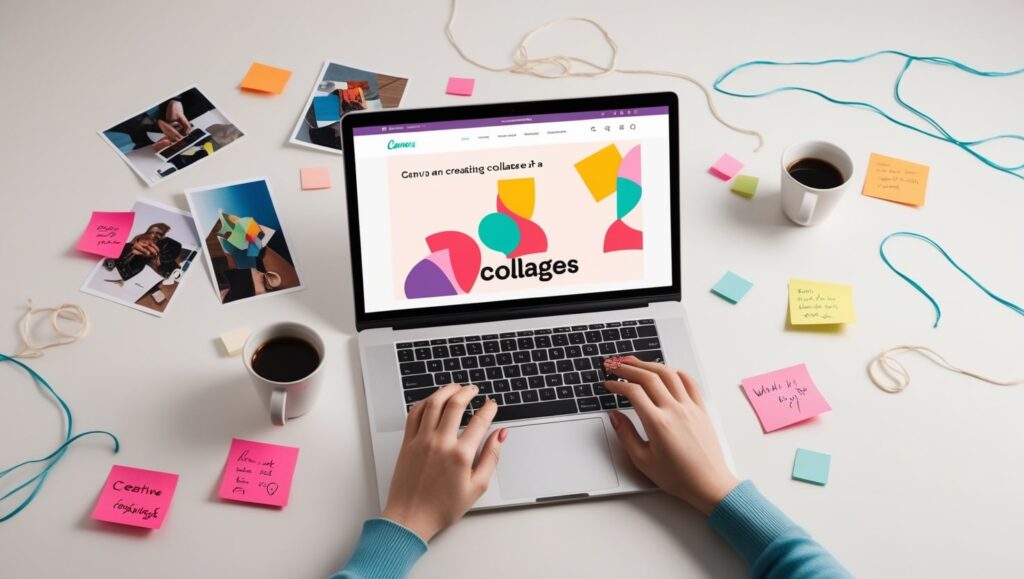
Those of you who want a quick and easy to use tool that enables you to create stunning collages design should consider using **Canva**. Being a tool that allows easy drag and drop of objects onto the canvas, Canva is not necessarily a weak application when it comes to design.
Key Features:
Templates: Canva for instance has thousands of templates, thus it does not take one a long time to get to work.
Stock images and elements: Next to images and illustrations, Canva has a vast gallery of elements that you can add to your collage without any problems.
Collaborative design: One of the most important features Canva has is collaborative editing which makes it preferable for teamwork.
Why It’s Essential:
This light and intuitive design does not affect the quality of the platform. It is ideal for those designers who have to create a perfect collage design with the alternative of using a sophisticated application.
3. Adobe Spark: Collage Creation in a Flash
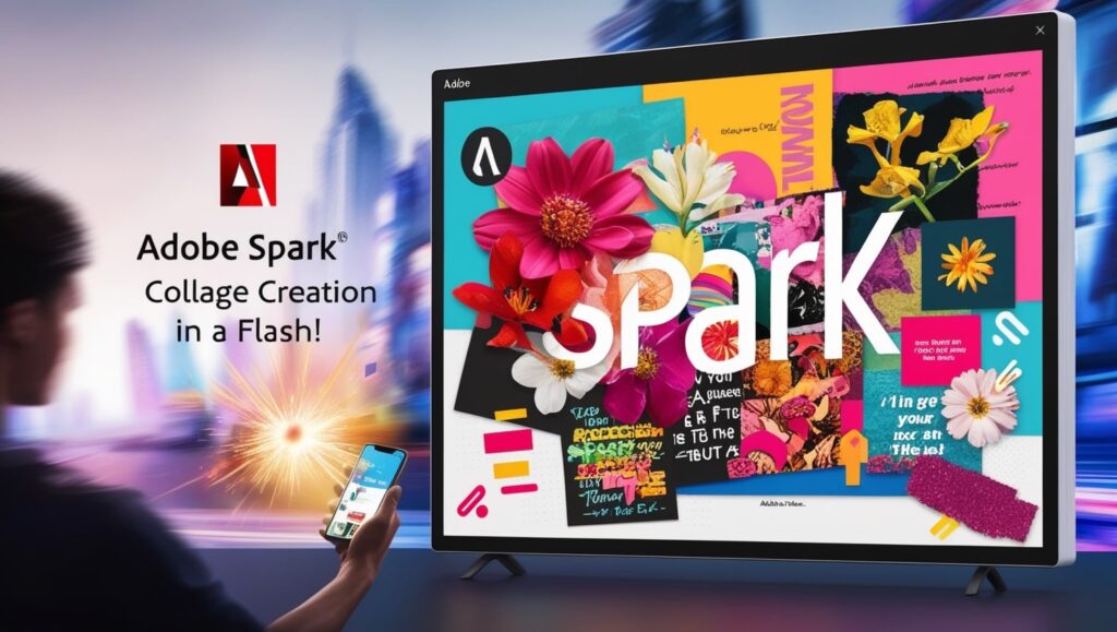
Adobe Spark is another great option, especially if you’re already in the Adobe world. It simplifies Adobe’s design tools and brings the best in an easy-to-use platform.
Key Features:
Simple interface: Spark comes with intuitive and simple visuals and the tools are quick as all of this makes it perfect for a beginner.
Pre-made templates: To a large extent, Adobe Spark resembles Canva, and for this reason, it also has a set of templates for users to begin with.
Instant sharing: You can share collage design as soon as you would like to social networks, or export collages to various formats.
Why It’s Essential:
Adobe Spark can be useful if you’re creating content for social networks or other digital platforms, and need a collage urgently. One of its simplest features is, that it can easily be interchanged with other programs like more complex projects in Photoshop or Illustrator.
4. Fotor: The Online Collage Creator
**Fotor** is web-based photo editor that has recently attracted a lot of users thanks to the simplicity that it offers in terms of collage design. That makes it suitable for those people who are uncomfortable with software installations.
Key Features:
Collage templates: Fotor gives the designers an opportunity to select from a number of given collage templates than can be adjusted to the preferred one.
Easy photo editing: collage design fotor also comes equipped with a photo editor that let the user adjust the brightness, contrast, saturation and the likes before actually putting the photo right into the collage.
Filters and effects: Use filters effects, and borders for style and personality for your pictures.
Why It’s Essential:
Fotor is useful when you maybe you are a designer and you need to do some touch ups on the move. It is an online based platform hence can be accceded from any where and for anyone with busy schedule as per their studies or job.
5. PicMonkey: Easy Casual mPatting of Multimedia Collages

The PicMonkey is one of the most enjoyable and powerful tools with many features that are quite appropriate between the professional and the layman. Of course, its emphasis on collages and the simplicity of the interface are the primary reasons the software works well for newcomers as well as vetted designers.
Key Features:
Customizable layouts: A collage design is fully customizable at PicMonkey and it is up to the designers to arrange every single design.
Easy layering: The collage design features that are available in PicMonkey help to rearrange various aspects of the collage through layering of tools.
Photo editing tools: As with Fotor, PicMonkey has an array of photo editing options available to optimize your pictures before placing them in your application.
Why It’s Essential:
In general PicMonkey has balance of fun and usefulness. Its collage design tool is as basic as it gets for quick designs, however, if you need to go a level deeper there are additional tools that are available.
6. PiZap: A Collage Tool that is Best Experienced Through a Mobile Device
PiZap is one of the best collage design tools for those who prefer mobile design. That’s why it’s a perfect choice for those who need to make collages on the go since it has a very straightforward yet engaging design.
Key Features:
Mobile and desktop versions: The convenience of heterogeneity is supplemented to the users- PiZap is also a mobile application but also the desktop application.
Text and sticker options: With PiZap it is also possible to add character to the collage through the available stickers and filters and the text available in the site and.
Pre-set templates: As in the case of Canva, there exists so much choice by way of the templates available at PiZap.
Why It’s Essential:
I would recommend PiZap to graphic designers who use their devices or tablet to collage design and to those designers who design simple collage design in a rush and without a computer. Because of its entertainment-oriented features, it could be used effectively by casual designers.
7. Affinity Photo: The Professional Equivalent to Adobe
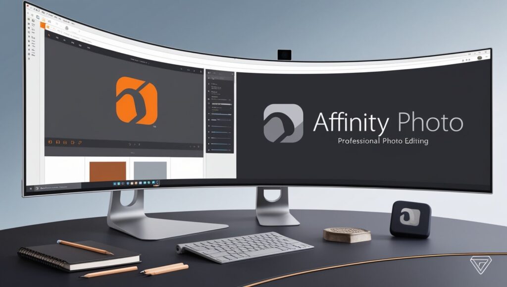
When it comes to search for a strong competitor to Adobe Photoshop, **Affinity Photo** deserves to be mentioned. It has professional tools for photo editing and collage design amid more affordable compared to competitor software.
Key Features:
Advanced editing tools: Raw photo editing can be done through the use of live filters, brushes and blend mode which competes with those of the photoshop.
Non-destructive editing: Like smart objects of Photoshop, Affinity Photo provides non-destructive editing for its collage, as it lets you try different aspects of your image.
Performance: Affinity Photo has a reputation for its momentum, and this program is perfect for working with large files and collages, for example.
Why It’s Essential:
Affinity Photo has been collage design for graphic designers, who seek professional outcomes but do not wish to pay for a subscription to Adobe. Its one-time purchase makes it affordable without sacraficing quality and it is loaded with lots of features.
Conclusion
I know it is quite obvious to say so, but when it comes to collage design, the point depends on instruments you choose. From the powerful tool of **Adobe Photoshop** to the simplicity of **Canva** and **Adobe Spark** every single tool on this list is as useful and as different as the other depending on a users’ level of proficiency. If you’re an experienced designer or new to the profession, the choice of the collage design tools will allow you to create bright and interesting visual information.
FAQs
- Is it possible to design professional collage using only free tools?
Indeed there are free and quite effective tools, such as Canva and Fotor, which can be used to make professional collages. Yet, you may get even more refined tools and looks if you subscribe to a pro edition of the software.
- To answer the question which one is better for a new-comer to use I’ll list them below.
Canva is one of the best tools for beginners because its interface is quite simple, and a huge number of templates are available. That is why Adobe Spark and PicMonkey can also be helpful for beginners.
- Is it necessary to learn Photoshop in order to make collages?
Although Photoshop is the best when it comes to designer-specific software because of the powerful tools it’s equipped with, you don’t have to use it to make wonderful collages. It is a strong advantage to use the simplest online applications, such Canva, Fotor and PicMonkey as they do not need some skills.
- Is it only for the mobile pal user?
Not at all, collages can be made from the mobile or desktop version of PiZap depending on the user’s www. But it is very convenient for those who like to design on the move..
- That brings us to the question of what major benefit can be derived from Affinity Photo compared to Photoshop?
Affinity Photo has significantly more professional tools than any of Apples software at a fraction of the cost of Photoshop with its monthly subscription base. If you are interested in a product that is reasonable in price while being excellent in quality, then Affinity Photo will be for you.
Graphics Design
Creative Graphic Design Ideas for Small Business Owners

Creative Graphic Design Ideas for Small Business Owners
Creative graphic design ideas due to the rise of digital businesses, every entrepreneur now needs a visually appealing and professional brand image to thrive. You can use Creative Graphic Design Ideas to make your company stand out, be it just beginning or in the process of improving. Using images and design is useful for communication, storytelling and creating emotions in your audience.
Your brand’s strategy relies on graphic design to shape logos, packaging, social media and websites. Here, I will cover real-life and useful Creative Graphic Design Ideas suitable for small businesses to help shape your business look without spending all your advertising budget.
Here’s how Graphic Design is Important for Small Business Owners
It is wise to start by understanding why being creative in design plays a major role. A thoughtfully made design is able to:
- Develop a professional image for your business.
- Make the brand more recognizable.
- Help attract and keep customers.
- Clarify what your brand is about.
The risks are much bigger for small business owners. With very little money and lots of companies, your creative graphic design ideas needs to be efficient rather than extremely hard-working. Using creative design helps you keep up with bigger names and touch your audience in a personal way.
1. The foundation of brand identity is logos.
A main Creative Graphic Design Ideas for owners of small businesses is designing a distinctive logo. A logo is generally the first thing customers see when they see your brand. It needs to:
- Easy to recall but not meaningless.
- Proof of your corporate beliefs.
- Can be viewed on a number of media platforms.
You can make an effective logo without expensive help from a big agency. Many small business owners use Canva, Looka and Adobe Express for the templates they need to create unique designs.
2. A consistent brand image is shown on all the platforms the company uses.
Sticking to one brand style makes a strong idea for Creative graphic design ideas. Your brand’s palette of colors, type of text, icons and images must be the same everywhere.
Social networks
- Websites
- Packaging
- Having business cards
- Advertising content
Keeping your brand regular and the same helps your audience become familiar with it. This type of design is simple and affordable, so even businesses getting launched can use it.
3. Tell your stories using Infographics.
Small business owners frequently have to break down complex ideas or highlight what makes their business valuable. To present data in a way that people find interesting, infographics are some of the best Creative Graphic Design Ideas.
They suit these needs best:
- Evaluating products.
- Tutorials
- Researchers study statistics and case studies
Make your infographics look like a professional by using design tools such as Piktochart or Visme. Improving the graphics in educational materials improves your authority and holds your audience’s attention.
4. Standout Visual Design on Social Media
To be seen on social media, your profile should be different from a sea of competitors. Engaging and designed visuals are a great Creative Graphic Design Ideas for improving how users connect and your follower count. Designing is something that you can achieve:
- Telling a story with the same Instagram template.
- Posts that list relevant quotes from the brand.
- Posting banners to advertise sales or the start of a new product.
For social media posts, try using Canva or Crello which have templates that are adjusted for the different social networks. Such tools help you play around with various Creative Graphic Design Ideas in an easy and efficient manner.
5. Salespeople can use Professional Business Cards That Make a Statement
Even with all the digital options, business cards are still helpful. Good design on your business card helps others easily remember you. Some creative graphic design ideas for business cards that businesses might use are:
- Websites with a minimal look and big text.
- Shapes cut into paper by a die.
- QR codes that let you talk straight to the business.
Pick sharp colors and clear fonts so the design challenges users and looks creative. If you design your business card well, it can introduce your brand to others anywhere.
6. Distinct Packaging
For physical products, your packaging can display the character of your company. Small businesses usually pay less attention to packaging, but it is highly effective at affecting buyers’ decisions.
Consider:
- Biodegradable, marked wrapping paper.
- Labels and thank-you notes can be created just for the event.
- Script and swirly fonts to make everything unique.
The right packaging can encourage a buyer to become a regular loyal customer. Graphic design concepts for packaging raise the perception of your products’ value.
7. Website Graphics and Banners
A website that looks nice helps gain credibility and influences how guests use it. It’s not possible to ignore the state of your digital store. Ensuring Creative Graphic Design Ideas in your website helps you:
- Easy to use navigation.
- Using a visual hierarchy so readers can read the page more easily.
- Direct users to take action with call-to-action (CTA) buttons and interactive banners.
Using WordPress or Shopify, you can include custom visuals. Improve the experience for visitors and the performance of your SEO by using banner templates, stock photos and pictures of your business.
8. Email Marketing Visuals Made to Convert
Email remains a top digital strategy that companies use. Improve interest by using Creative Graphic Design Ideas in:
- Email headers are part of the email header section.
- Specially made illustrations.
- Call-to-Action buttons that include visual elements.
Having a strong design for your email helps readers notice, view and react. Try to work in your branding material so customers remember your business.
9. Content Made by User with Cool Stylizing
Customers creating content is good for both your business and them. Creating a design identity for the page transforms users’ content into advertisements for your company. Choose Creative Graphic Design Ideas for:
- Post photos sent in by customers, with a unique branded layer over them.
- Make testimonials look great on the page.
- craft UGC contests that are centered around certain visual concepts.
It lets community leaders connect with people and lets your target audience know who you are.
10. Seasonal and occasion-themed Offers

Designs for social media posts can also be based on the current time of year or nearby events. As a result, develop new Creative Graphic Design Ideas for:
- Products photographed with a Christmas theme.
- Valentine’s Day sale signs and posters.
- Festivals and days organized in the community.
Both timely and well-planned designs can draw in more visitors and boost how actively people interact if they are promoted strategically.
11. Taking product photos as well as custom mockups
Online product sales require eye-catching pictures and designs. Try Creative Graphic Design Ideas instead of plain stock photographs.
- Pictures with a branded background.
- Regular use of the same filters.
- Photos showing a lifestyle with written text.
By using a smartphone and editing apps, it is possible to take professional-looking photos. Mix pictures with graphic elements to create interesting ads or catalogues.
12. Animated Graphic and Brief Videos
Motion draws the eye. Apps like Adobe Express and Canva Pro make it straightforward to make animated graphics. Examples of great Creative Graphic Design Ideas for animation are:
- Animation in logos.
- Videos that describe things with straightforward animations.
- Products can be displayed with movements between them.
Using motion graphics, small businesses can interact better with their audience on Instagram and TikTok.
13. Interactive Content
They get to play a role in the experience with interactive designs. A few creative graphic design ideas can be seen here:
- Quizzes that come with unique pictures or graphics.
- Timelines that let users interact.
- The presence of interactive graphics.
They amuse and manage to attract a larger audience to interact. They help the most in digital settings and when generating leads.
14. Developing flyers or posters through print.
Print media is not vanishing. Using flyers and posters is still a good option for local businesses. Updating your logo involves using Creative Graphic Design Ideas which can include
- Text that is bold and placed over images.
- Gradients in the colors used.
- Using wide open spaces and adding vivid, prominent highlights.
Various local print shops or sites like Vistaprint exist to create your ideas into printed documents without breaking the bank.
15. Design inspirational quotes for use online.
Quotes are popular topics for people to share. Use creative ways in graphic design so your quotes match the core values of your business. For example:
- A bakery distributing encouraging food messages.
- A fitness coach giving examples of encouraging quotes.
- A fashion brand giving advice on style.
Use bits of your brand colors and logos in the background so that people will share your quotes while also promoting your brand.
Frequently asked questions (FAQs)
- What tools should small business owners focus on for graphic design?
Among the tools, you can use Canva, Adobe Express, Figma, Visme and Piktochart without paying anything or only a small fee. Every one includes useful templates and features made for using Creative Graphic Design Ideas.
- How might I think of fresh and interesting design ideas?
Begin by looking into the competition and the people you want to sell to. Designers use mood boards, collections of colors and typography combinations for ideas. Base your creative graphic ideas on popular trends but use your company’s unique identity to create something distinctive.
- Can template designs work or do I need to create everything myself?
If you do not have design experience, using templates is a good thing to do. Personalize the emails with your brand’s colors, typefaces and logos to fit your brand. It is still possible to create many Creative Ideas with the help of a template.
- How regularly should I revise my website’s designs?
Update the designs in your store when a new season arrives or for major campaigns. Making regular changes ensures your brand looks up-to-date and interesting. Come up with fresh Creative Graphic Design Ideas every couple of months or whenever a new product/service is launched.
5. Do images have greater importance than written information?
There are many ways in which yes. Images are processed by the brain much more quickly than what is read. It means well-designed material can draw people in and message them right away. Having a mix of great visuals and established copy is the secret to effective Creative Graphic Design.
Conclusion
Smart, well-done design can help small owners make big changes to their brand and its marketing. If you apply these 15 Creative Graphic Design Ideas, your brand’s look will be better and you’ll also increase how much customers engage with and rely on your company.
Don’t worry if you’re not a professional, because you can still use these tips. Clever Graphic Design Ideas and suitable resources allow small business owners to enhance their company successfully.
Use this resource to help you and look into the Graphic Design concepts that are suitable for your business. Creating a logo for the first time, starting a fresh campaign or designing product packaging always allows you to think creatively.
Graphics Design
How to Create Stunning Social Media Graphics for Free

How to Create Stunning Social Media Graphics for Free
Social media graphics should be captivating and attention-grabbing to improve your visibility on the internet, whether you belong to a brand, work as an influencer or manage a small business. You won’t have to purchase high-level software or find a graphics designer to create beautiful visuals. Here, we will cover everything you should know about designing your social media graphics for free. On top of design strategies, you will also study tips and recommendations to create visuals that your followers will like.
The importance of using social media graphics.
You will see social media graphics posted on Facebook, Instagram, Twitter and LinkedIn among other platforms. They are a fast way to share information and ensure viewers or readers pay attention. Having quality graphics can encourage more people to interact with your business, recognize your brand and visit your site. Social media graphics are crucial for any marketing strategy because we process them almost 60,000 times faster than we process text.
Programs for Creating Social Media Graphics for Free
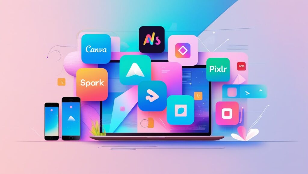
Simple tools are all you need to design pro-quality images for your social media. Here is a list of top-quality free tools you can try:
- With Canva, you can find different kinds of templates for most popular social media sites. Easy interactions with the interface.
- Crello (VistaCreate) enables you to use animated designs and create your own templates.
- Adobe Express – A free offer from Adobe that allows users to design graphics easily.
- With Pixlr, you can modify images and make various social media graphics instantly on the web.
- You can use GIMP instead of Photoshop, as it offers strong editing options and is available free of charge.
Such tools are free to use, so you can play around with templates, various fonts and different colors for your social media graphics posts until you achieve your desired look. You may access their libraries of photos and illustrations which saves your budget and keeps your posts interesting.
Understanding What You Need
Every social media graphics site might need a unique size of graphics:
Facebook Posts require images that are 1200 pixels wide and 630 pixels tall.
- For Instagram, set your photos to 1080 x 1080 pixels.
- Posts on Twitter should be 1024 x 512 pixels
- The optimal size for your LinkedIn Posts is 1200 x 628 pixels.
Choose the right size for your graphics to prevent your art from being distorted and looking unprofessional. When your graphics are similar on all your social media platforms, people are more likely to remember your brand. Since more people use mobile devices to access social media, it’s wise to set up your graphics for better viewing on them.
Guidelines for Creating Amazing Graphics for Social Media
- Opt for high-quality images to make sure your graphics are eye-catching.
- Be sure to use the same colors, fonts and logo in all your graphics.
- Focus on keeping things simple; most people enjoy easy-to-use websites.
- Use fonts that are easy to read on mobile devices.
- Arrange Content Differently – Put content in various layouts and notice which one the audience interactes with most.
- Group the essential information with different font sizes or colors that stand out.
- Let your images communicate a message that is in line with your brand.
- Add Some Icons – Decorate your visuals with icons suitable for the event.
- Try using contrast and vibrant colors to make your content visible among other posts.
- Ensure Your Design is Aligned and Has Balanced Spaces for a Professional Look.
Good Methods for Social Media Graphics
- Put the most important text in the places where it will be most visible.
- Choose tones that are opposite of each other to emphasize the topics of your UI.
- Allow your design to look clean and comfortable by including unoccupied space.
- Use the same colors and fonts to ensure your brand is instantly recognizable.
- Always test your designs on social media to find out what’s most effective.
- Adapt the appearance of your graphics to different cultures if your target customers are from various countries.
- Display Your Logo or Watermark: Use them to make your brand more recognizable.
Tips for Designing for Mobile and Tablet
The design approach depends on the platform used. For example:
- Instagram: Prioritize bright photos and telling stories. Stars, extra attention to text and interactive stickers are excellent ways to get your followers more involved.
- On Facebook, ensure your messages are easy to read and that your headers are noticeable. Carousel posts and event banners are the best types to use on Instagram.
- Twitter: Make your post clear and in plain language. I find that bold statements and quotes are effective when used in graphics.
- On LinkedIn, ensure your profile is work-related and displays your brand. More people focus on infographics and professional announcements.
- On Pinterest, choose tall images that are well-suited for infographics and tutorials.
Using Graphics to Attract Customers
The objective of social media graphics is to get your audience interested. Bring attention to your posts by including motivating phrases, engaging features and attractive designs. Social media graphics that attract attention are generally shared, widening your brand’s audience. Try using polls, question stickers and headlines to help your viewers interact and comment.
Templates ensure your work always has the same style.
They are effective in helping a company maintain its brand identity. With platforms such as Canva and Crello, you can select one of their pre-made designs and edit it to reflect your colors and fonts. It saves you money and time and it also helps maintain a similar look for your graphics in every place.
Making graphics in bulk to improve efficiency.
Batching your graphic designs can help you manage your social media accounts easily. If you schedule a time each week to design many graphics, you can stay consistent and avoid rushing at the last moment. Both Canva and Adobe Express enable you to reproduce designs and easily adjust them to use on various services, saving you time.
Important Tips on Making Social Media Graphics for Free
- It is possible to create impressive social media graphics without spending money?
Of course, you can use CSS within a LinkedIn account. You can create high-quality graphics for free with Canva, Crello (VistaCreate), Adobe Express, Pixlr and GIMP. They provide you with a range of templates, fonts and images to help you create your designs.
- What is a great program that I can use for free to make social media graphics?
Even though all the tools are effective, Canva becomes the top choice due to its user-friendliness, wide range of templates and broad design options. No matter how experienced you are, using Adobe Photoshop can help you excel in design.
- Should I make my social media graphics large or small?
How big a group should be on a platform varies from platform to platform.
- Facebook posts should be 1200 px wide and 630 px high.
- You should upload photos with a size of 1080 x 1080 pixels for Instagram.
- Your Twitter posts should be at most 1024 x 512 pixels.
- You should post photos on LinkedIn that are 1200 pixels wide and 628 pixels tall.
- The size of a Pinterest Pin is 1000 pixels wide by 1500 pixels high.
Ensure the size of your designs is correct so that there is no pixelation or parts of the image are strangely cropped.
- What strategies do I use to ensure my brand’s style is maintained on social media?
Make sure your logo, color palette and fonts appear the same on all your designs. With Canva, you can create a brand kit to ensure your designs always look consistent.
- Will I need to be a graphic designer to make social media graphics?
In fact, virtual tours aren’t limited to this situation. There are many online tools available for people who lack design skills. Thanks to predesigned templates, simple drag-and-drop options and tutorials, creating professional designs is quite simple.
- Can I schedule my social media images before I post?
Yes, Buffer, Hootsuite and Canva’s Content Planner provide a way to schedule your social media graphics for future publishing. This aids in creating a regular schedule and spares you time each day.
- How do I create social media graphics that people find engaging?
To encourage people to be more active:
- Include pictures that are eye-catching and clear
- In addition, add a call-to-action (CTA) message.
- Try using stickers that get people involved or polls.
- Design infographics that can be shared.
- Utilize stylish lettering and attractive article headings.
- Should I adapt my graphics for every game console and PC?
All the platforms offer different suggestions for image and design sizes. Every time you change your graphics for a different platform, they will look organized and professional.
- How many new graphics should I publish on social media every day?
It is best to publish around 3 to 5 times a week, unless your marketing strategy calls for something else. If you create your designs in batches, it will save you time and help you stick to your style.
- How will I determine the effectiveness of my graphics on social media?
Your graphics can be evaluated by watching the following trends:
- Measurement of likes, shares and comments
- Number of people clicking on the link if it opens a website
- These terms relate to how many times an ad is served and seen.
- Conversions are important aspects of a marketing campaign.
Metrics such as these can be evaluated with analytics tools from Facebook, Instagram, Hootsuite and Buffer.
Graphics Design
Best Laptops for Graphic Designers – 2025 Buying Guide

Best Laptops for Graphic Designers – 2025 Buying Guide
Though talent is a must, coming out on top in the world of graphic design requires the ability to use the right devices to enable creative vision. In the year 2025, there is unheard of demand of laptops geared specifically towards the needs of graphic designers, by the technology sector. The fact that your career in graphic design is mature or you’re still starting, can affect your efficiency and output greatly if you have the best laptop for graphic design.
Throughout this guide, we are going to drill down on the best laptops for graphic designers in 2025. With intense research on the specs, efficiency, build and pricing of the laptops, you will be able to determine the best fit for your graphic design workflow.
Choosing the best laptop is important for achieving most proficiency as a graphic designer.

Graphic design tasks are resource-intensive. Creating workflows that incorporate Adobe Photoshop, Illustrator, CorelDRAW and 3D designs requires high speed processors, bright images and ample RAM to perform best. Laptops for graphic designers a properly chosen laptop allows you to do complex projects without interruption, and allows you to have uninterrupted creativity.
Having the right laptop means:
- Faster rendering times
- Smooth multitasking with heavy software
- Vivid and clear visuals for better control of color.
- Enhanced flexibility and mobility, as well as, increased battery utilization time for mobile design work.
Top features that can be considered to choose laptops to design Graphic Designers.

It’s important to understand which key strengths are the most valuable before reducing your options…<<
- Processor (CPU): The heart of any laptop. In graphic designing, you should choose a processor, which is as strong as Intel i7 or i9 or AMD Ryzen 7 or 9.
- Graphics Card (GPU): A graphics card like the NVIDIA GeForce RTX or AMD Radeon will ensure optimal results and a sleek rendering of 3D designs work.
- RAM: For most graphic design jobs, a minimum of 16gb is recommended but 32gb is highly recommended for multitasking and efficiency with large projects.
- Storage (SSD): Choosing 512GB or greater of fast SSD storage substantially reduces boot times and offers better organization of files.
- Display Quality: laptops for graphic designers screen should support at least 1920×1080 resolution, showing true colours (100% sRGB), and bright images.
- Portability and Battery Life: Select a light and energy efficient machine that will enable designers to work comfortably, off desk.
- Connectivity Options: Ensure that it is compatible with relevant peripherals through ports like USB-C, HDMI and even a built-in SD card reader.
Top Laptops for Graphic Designers in 2025
Below, we’ve curated a list of the best Laptops for Graphic Designers this year, covering various budgets and performance needs:
- Apple MacBook Pro 16″ (2025)
- M3 Max Chip with 16-core GPU
- 32GB RAM, 1TB SSD
- Liquid Retina XDR display with ProMotion
- Perfect for color accuracy and heavy rendering tasks
- Dell XPS 17 (2025)
- Intel i9 14th Gen Processor
- NVIDIA RTX 4070 GPU
- 32GB RAM, 1TB SSD
- InfinityEdge 4K display for crisp visuals
- HP Spectre x360 (2025)
- Intel i7 14th Gen Processor
- Intel Iris Xe Graphics
- 16GB RAM, 512GB SSD
- 2-in-1 convertible design with a 4K OLED display
- Asus ProArt StudioBook 16
- AMD Ryzen 9 7945HX
- NVIDIA GeForce RTX 4080
- 32GB RAM, 1TB SSD
- 16-inch 3.2K OLED display with 100% DCI-P3
- Microsoft Surface Laptop Studio 2
- Intel i7 14th Gen Processor
- NVIDIA GeForce RTX 4060
- 32GB RAM, 1TB SSD
- Dynamic woven hinge design and PixelSense display
- Razer Blade 18 (2025)
- Intel i9 14th Gen Processor
- NVIDIA GeForce RTX 4090
- 64GB RAM, 2TB SSD
- 18-inch QHD+ display with 240Hz refresh rate
- Lenovo ThinkPad X1 Extreme Gen 5
- Intel i9 14th Gen Processor
- NVIDIA RTX 4080
- 32GB RAM, 1TB SSD
- 4K display with Dolby Vision HDR
- Acer ConceptD 7 Ezel
- Intel i7 14th Gen Processor
- NVIDIA GeForce RTX 4070
- 32GB RAM, 1TB SSD
- Convertible 4K display with touch support
- MSI Creator Z16
- Intel i7 14th Gen Processor
- NVIDIA GeForce RTX 4060
- 32GB RAM, 1TB SSD
- 16-inch QHD+ display
- LG Gram 17 (2025)
- Intel i7 14th Gen Processor
- Intel Iris Xe Graphics
- 16GB RAM, 1TB SSD
- Ultra-lightweight with a 17-inch WQXGA display
Overview top laptops for graphic designers professionals’
We evaluated each of them with respect to processing capability, prevalence of visuals, battery efficiency, and carrying convenience. Through mentioning these comparisons you’ll manage to find the best Laptops for Graphic Designers in 2025 based on your personal needs.
Frequently Asked Questions about Laptops that are for Graphic Designers
1.What criteria around the specifications should I be looking for if I want to do graphic design?
- Choose a laptop with a powerful CPU, skills to run a dedicated GPU, 16GB RAM or more, and the SSD for no interruption workflow.
2.Do graphic designers need to use graphics processing units?
- Yes, it enables project file generations with a faster rate and has improved support for high resolution uses.
3.A suggested amount of RAM for graphics software is at least 16GB, but 32GB is preferable to run multiple applications at once.
- Laptops for graphic designers at least 16 GB RAM is aggravated but 32GB offers great multiplication functions.
4.Is graphic design a stronger suit for MacBooks than for Windows laptops?
- Both are excellent; When compared by software ability, display and color accuracy it is the MacBook which comes out on top while the software is the one known in the market for greater availability in models.
5.For best design work, the recommended screen size is between 15 to 17 inches.
- Best working conditions laptops for graphic designers are displays between 15–17 inches with high resolution.
-

 Graphics Design1 year ago
7.Exploring the Importance of Color Theory Charts
-

 Graphics Design9 months ago
10 Stunning Gradient Design Trends You Need to Know in 2024
-

 Graphics Design1 year ago
15.The Importance of Effective Flyer Design in Marketing
-
 Graphics Design1 year ago
14.Mastering the Art of Print Design: Tips and Tricks
-
 Graphics Design1 year ago
10.The Latest Trends in Web Design and Development
-
 Graphics Design1 year ago
13.Exploring the Latest Trends in Photo Editing Software
-

 Graphics Design1 year ago
29.Retro Design Is Making a Comeback in Modern Spaces
-

 Graphics Design4 months ago
2025 Logo Design Trends: What’s In, What’s Out?


Javier Lefurgy
October 26, 2024 at 7:49 am
The next time I read a blog, I hope that it doesnt disappoint me as much as this one. I mean, I know it was my choice to read, but I actually thought youd have something interesting to say. All I hear is a bunch of whining about something that you could fix if you werent too busy looking for attention.