
Graphics Design
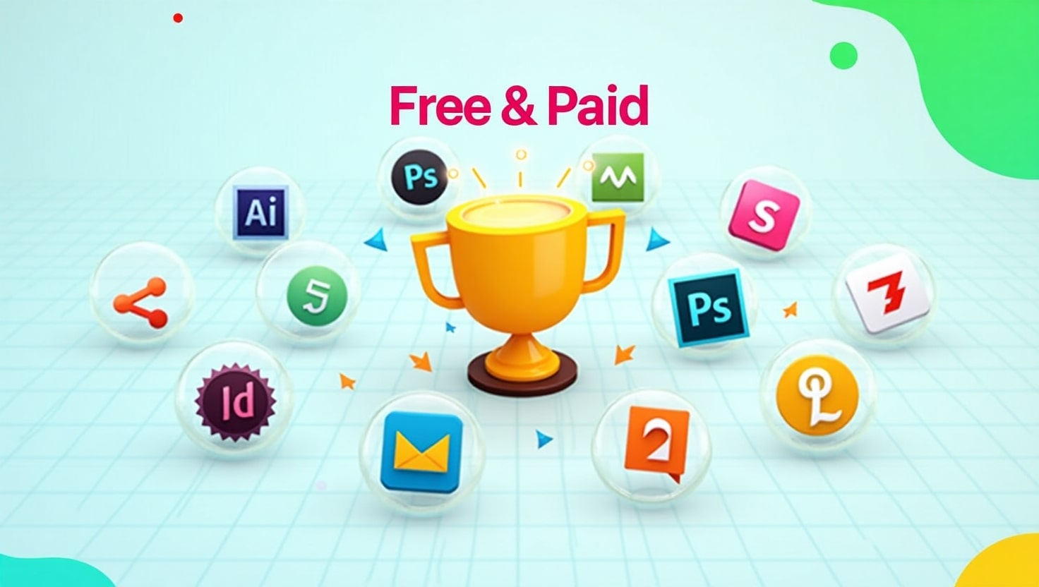
Top 10 Best Graphic Design Tools for Beginners in 2025 (Free & Paid)

Top 10 Best Graphic Design Tools for Beginners in 2025 (Free & Paid)
Introduction: Why Beginners Need the Right Tools
Best graphic design tools for beginners can be exciting but also overwhelming. With so many tools available, it’s easy to get lost in the options. As a beginner, you need graphic design tools that are easy to learn, affordable, and feature-rich enough to help you grow. Whether you’re designing logos, social media posts, or website graphics, the right software can make all the difference.
In this article, we’ve handpicked the top 10 best graphic design tools for beginners in 2025, including both free and paid options. Whether you’re looking to go pro or just explore your creativity, there’s a tool here for you.
1. Canva – Best for Simplicity
Type: Free & Paid
Platform: Web, iOS, Android
Canva is best graphic design tools for beginners who want to dive into design without the steep learning curve. With drag-and-drop features, pre-made templates, and an intuitive interface, Canva allows anyone to create professional-looking graphics in minutes.
Key Features:
- Thousands of free templates
- Easy-to-use interface
- Perfect for social media posts, presentations, and posters
- Team collaboration options
Why it’s great for beginners: You don’t need design experience to use Canva. It’s as simple as choosing a template and customizing it.
2. Adobe Illustrator – Industry Standard

Type: Paid (Free trial available)
Platform: Windows, macOS
If you’re serious about pursuing best graphic design tools for beginners professionally, Adobe Illustrator is the go-to tool. It’s used by top designers around the world for creating logos, icons, typography, and complex illustrations.
Key Features:
- Precision vector design
- Integration with other Adobe apps
- Extensive typography tools
- Custom brushes and effects
Why it’s great for beginners: Though it has a steeper learning curve, beginners can start with tutorials and gradually master this powerful tool.
3. Figma – Collaborative Design

Type: Free & Paid
Platform: Web-based (with desktop apps)
Figma is a browser-based UI and best graphic design tools for beginners that’s widely used for interface design and collaboration. It’s especially ideal if you’re working in a team or planning to get into UX/UI design.
Key Features:
- Real-time collaboration
- Cloud-based autosave
- Works on any platform
- Design + prototyping in one tool
Why it’s great for beginners: It’s free to get started and encourages team-based design, which is perfect for learning in a group setting or classroom.
4. Gravit Designer – Browser-Based Versatility

Type: Free & Paid (Gravit Designer Pro)
Platform: Web, Windows, macOS, Linux, Chrome OS
Gravit Designer offers a clean interface with essential tools for vector design. It’s ideal for creating UI designs, presentations, and illustrations, all from your browser.
Key Features:
- Works online and offline
- Modern user interface
- Cloud syncing
- Easy export options
Why it’s great for beginners: The learning curve is gentle, and it doesn’t require a powerful computer to run.
5. Vector – Free Vector Tool
Type: Free
Platform: Web, Windows, macOS, Linux
Vector is a completely free vector graphic design tool with a simple interface. It’s great for basic logos, icons, and infographics.
Key Features:
- Real-time sharing
- Simple and clean interface
- Free tutorials available
- Lightweight and fast
Why it’s great for beginners: Best graphic design tools for beginners without getting overwhelmed by advanced features.
6. Inkscape – Open Source Alternative

Type: Free (Open source)
Platform: Windows, macOS, Linux
Inkscape is a powerful free vector graphics editor that’s often compared to Adobe Illustrator. As an open-source tool, it has a strong community and regular updates.
Key Features:
- Advanced drawing tools
- Layer support
- File compatibility (SVG, AI, PDF)
- Custom extensions and add-ons
Why it’s great for beginners: Great for those who want full control over their design tools without paying for software.
7. Affinity Designer – Professional Quality at One-Time Cost

Type: Paid (One-time purchase)
Platform: Windows, macOS, iPad
Affinity Designer is a cost-effective alternative to Adobe Illustrator, offering professional features at a one-time price.
Key Features:
- Smooth vector and raster integration
- Responsive and lightweight
- Grid, snapping, and alignment tools
- Cross-platform performance
Why it’s great for beginners: Once purchased, you get lifetime updates. It’s a great investment without a subscription.
8. Pixlr – Easy Photo Editing
Type: Free & Paid
Platform: Web, iOS, Android
Pixlr is a lightweight photo editing tool that runs right in your browser. It’s perfect for beginners who want to edit images quickly for social media or blogs.
Key Features:
- AI-powered one-click edits
- Web-based—no downloads required
- Supports layers and effects
- Simple interface
Why it’s great for beginners: You can start editing without creating an account. Very beginner-friendly.
9. Krita – Digital Painting & Illustration

Type: Free (Open source)
Platform: Windows, macOS, Linux
Krita is best suited for digital illustration and painting, but it also offers graphic design tools for layout and composition.
Key Features:
- Brush customization
- Layer management
- Animation support
- Tablet-friendly interface
Why it’s great for beginners: Excellent for beginners interested in drawing and concept art.
10. Desygner – Mobile-Friendly Graphic Design
Type: Free & Paid
Platform: Web, iOS, Android
Desygner is a drag-and-drop graphic tool aimed at social media creators, bloggers, and marketers. It’s one of the easiest tools to use on a smartphone.
Key Features:
- Pre-made social media templates
- Mobile-first design
- Royalty-free image library
- Branding kit support
Why it’s great for beginners: If you’re creating graphics on the go, this is a must-have.
Tips on Choosing the Right Tool

Choosing the best graphic design tools for beginners tool depends on your goals and workflow. Here are a few tips to guide your decision:
- Start Free: Explore tools like Canva, Vectr, and Inkscape to learn the basics without investment.
- Consider Your Goals: If you want to go professional, tools like Adobe Illustrator or Affinity Designer are worth learning.
- Try Before You Buy: Use free trials to test paid tools before committing.
- Use Community Resources: Many tools have active communities, free tutorials, and forums to help you learn faster.
- Match Tool to Task: Photo editing? Use Pixlr. UI design? Try Figma. Logo creation? Go with Illustrator or Vectr.
FAQ
What is the best free graphic design tool?
Canva is the best graphic design tools for beginners widely considered the best graphic design tools for beginners due to its ease of use, professional templates, and accessibility on all devices. For vector design, Inkscape is a top free choice.
Are paid tools worth it for beginners?
Yes, Best graphic design tools for beginners if you’re committed to building a career or serious hobby in graphic design. Tools like Adobe Illustrator and Affinity Designer offer features you’ll eventually need as your skills grow. However, you should explore free tools first to see what suits your style.
Conclusion: Start Simple, Grow Gradually
Every graphic designer starts somewhere. The key is to start simple—best graphic design tools for beginners, explore its features, and grow your skills at your own pace. Whether you begin with Canva, dive into Figma, or experiment with Inkscape, the most important thing is to keep creating.
Once you’re comfortable, consider investing in professional tools that open up even more creative possibilities. With the right tools and consistent practice, you’ll be creating stunning graphics in no time.
How to Create Strong Visual Hierarchy in Graphic Design
Every great design tells the eye where to look first, where to look next, and where to rest last. This invisible roadmap is called Visual Hierarchy, and it is one of the most important skills any designer can master. Whether you are designing a poster, a website, a mobile app, a brochure, or a full brand identity, understanding how this ordering system works will completely change how your audience experiences your work.
In this guide, we will explore what this concept really means, why it matters so much in every branch of design, and exactly how you can build a strong, intentional structure of importance in your own projects, step by step. By the end, you will have a complete, practical framework you can apply immediately to your next design, no matter what software or medium you work in.
If you have ever looked at a design and felt confused about where to start reading, or noticed yourself skipping over important information without realizing it, you have experienced poor ordering of importance firsthand. On the other hand, when a design feels effortless to scan, understand, and act on, that is the sign of a thoughtful structure at work behind the scenes. This article is written for beginners taking their first steps into design, as well as experienced professionals who want to sharpen their instincts and refine how they organize information visually.
Design is, at its core, a form of communication, and communication only works when the message arrives in the right order. A headline that gets lost among smaller text, a button that blends into the background, or a page so cluttered that nothing stands out are all symptoms of the same underlying problem: a lack of intentional structure. Learning to fix this is one of the highest-leverage skills you can develop as a creative professional.
What Is Visual Hierarchy?

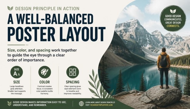
Visual Hierarchy refers to the arrangement or presentation of design elements in a way that clearly implies importance. It is the system designers use to guide a viewer’s eye through a composition in a specific, intentional order, rather than leaving the audience to guess what matters most. A strong version of this system tells people exactly where to look first, second, and third, simply through visual cues like size, color, contrast, spacing, and placement.
Think about a newspaper front page. The biggest headline draws your attention first, followed by a large photo, then a subheading, and finally the smaller body copy underneath. This layered structure is a textbook example of intentional ordering in action. Without it, every element would compete equally for attention, and the reader would have no clear starting point at all.
This ordering system is not just about aesthetics; it is fundamentally about communication. A design can be visually beautiful, but if it lacks a clear sense of priority, it fails at its most basic job, which is helping the viewer understand information quickly and comfortably. This is why the concept is considered one of the foundational principles of graphic design, sitting right alongside balance, contrast, unity, and alignment.
Designers create this sense of order using several visual tools, including:
- Size and scale of elements
- Color and contrast
- Typography and font weight
- Placement and alignment
- Whitespace and spacing
- Repetition and pattern
- Direction and visual flow
Each of these tools plays a distinct role in shaping how the eye moves across a page, screen, or layout. When used together thoughtfully, they combine to create Visual Hierarchy that feels natural, almost invisible, yet remains incredibly effective at directing attention exactly where it needs to go.
Why Visual Hierarchy Matters in Design

Every design has a purpose, whether it is to sell a product, share information, tell a story, or guide someone through an application. A clear structure of importance is what makes that purpose achievable. Without it, even the most creative ideas can fall flat because the audience simply does not know where to focus their attention first.
Here are some of the key reasons this concept matters so much in modern design work.
It improves readability and comprehension. A clear order of importance breaks down complex information into digestible pieces, making it easier for people to read and understand content quickly. This matters enormously in a world where attention spans are short and most people skim rather than read every single word on a page.
It guides user behavior. In web design and app design, Visual Hierarchy is directly tied to conversion rates and engagement metrics. A call-to-action button that stands out because of thoughtful size and color choices is far more likely to get clicked than one that blends quietly into the background of the page.
It creates emotional impact. The order in which someone processes a design affects how they feel about it overall. A strong sense of priority can build anticipation, highlight emotion, or emphasize urgency, all of which shape the viewer’s emotional response to the finished piece.
It builds trust and professionalism. Cluttered, confusing designs with a weak sense of order often feel unprofessional or untrustworthy, even when the underlying content is genuinely solid. A clean, organized structure signals competence and care, which in turn builds credibility with an audience.
It saves the viewer’s time and energy. People do not want to work hard to understand a design. A well-planned Visual Hierarchy does the thinking for them, presenting information in the most logical and efficient order possible so the viewer can absorb it effortlessly.
Because of all these benefits, a strong ordering system is not an optional nice-to-have; it is a core requirement for effective design across every medium, from print advertising to mobile interfaces and everything in between.
Core Principles That Build Visual Hierarchy
To create a strong Visual Hierarchy, you need to understand the individual tools and principles designers use to establish order and importance. Let’s break down each one in detail, with practical guidance you can apply right away.
1. Size and Scale

Size is one of the most powerful and immediate ways to establish order in a composition. Larger elements naturally draw more attention than smaller ones, which is why headlines are bigger than body text, and hero images are bigger than thumbnails. When building this kind of structure through size, think carefully about which element truly deserves to be the largest on the page. It should be the single most important message or focal point in the entire design.
Scale also works in relative terms, not just in absolute numbers. It is not simply about making one thing big; it is about the size relationship between every element on the page. A strong structure uses a clear, consistent scale system, sometimes based on a type scale or an underlying grid, so that size differences feel deliberate rather than random or accidental.
2. Color and Contrast

Color is another major driver of importance in a layout. Bright, saturated, or warm colors tend to attract more attention than muted or cool tones. Contrast, meanwhile, refers to the difference between elements, such as a dark button set against a light background. High contrast naturally draws the eye and reinforces the intended order by making key elements pop against their surroundings.
When designers want to create strong Visual Hierarchy using color, they often reserve their boldest, most saturated color for the single most important action or message on the page, while keeping the rest of the palette more subdued and quiet. This selective, disciplined use of color keeps the composition clean and prevents visual competition between elements that should not be fighting for the same level of attention.
3. Typography and Font Weight

Typography plays an enormous role in establishing a clear order of importance, especially in text-heavy designs like websites, reports, and editorial layouts. Font size, weight, style, and even letter spacing all contribute to how important a piece of text feels to the reader. A bold, large headline signals top-level importance, while lighter, smaller text signals supporting or secondary information further down the ladder.
A well-designed structure typically uses no more than two or three font weights and sizes across headings, subheadings, and body copy. Keeping the typographic system consistent helps reinforce the overall Visual Hierarchy without overwhelming the viewer with too many competing styles fighting for attention at once.
4. Alignment and Placement

Where you place an element on a page has a direct impact on how important it feels. Elements positioned at the top, center, or along natural eye-scanning paths, such as the familiar F-pattern or Z-pattern, tend to be noticed first. Designers use alignment, grids, and strategic placement to control the exact order in which the eye discovers information, reinforcing the intended structure of the piece.
Consistent alignment also creates a sense of order and stability, which subtly strengthens the overall Visual Hierarchy by making the layout feel organized and easy to follow rather than chaotic or accidental.
5. Proximity and Grouping

The principle of proximity states that elements placed close together are perceived as related, while elements spaced further apart are seen as separate or unrelated. This grouping behavior directly supports a clear ordering system because it helps viewers quickly understand which pieces of information belong together, and which stand alone as more important, standalone messages worth noticing on their own.
For example, a price and a product name grouped tightly together read as a single unit, while a call-to-action button placed with generous space around it reads as a separate, more prominent action, strengthening the overall sense of priority across the page.
6. Whitespace and Breathing Room
Whitespace, or negative space, is the empty area around and between elements. Far from being wasted space, whitespace is a critical tool for building strong Visual Hierarchy. Generous whitespace around an element makes it stand out and feel more important, while cramped, tight spacing can bury even the boldest design choices under visual noise.
Minimalist designs often rely heavily on whitespace to create a clean, confident sense of order where every element has room to breathe and be noticed clearly on its own terms, without distraction.
7. Repetition and Consistency
Repetition of certain visual elements, such as consistent button styles, heading treatments, or color coding, helps train the viewer’s eye to recognize patterns over time. This consistency reinforces the structure of importance across multiple pages or screens, so users always know exactly where to look for specific types of information, such as navigation, headings, or calls to action.
8. Direction and Visual Flow
Lines, arrows, the gaze direction of people in photographs, and even the natural reading pattern of a language all influence how the eye moves through a design. Designers can guide attention deliberately by using directional cues that lead the viewer toward the next important element, further reinforcing a strong, deliberate order from start to finish across the entire piece.
How to Create Strong Visual Hierarchy: A Step-by-Step Process
Now that we have covered the core principles, let’s walk through a practical, step-by-step process for building strong Visual Hierarchy into your own design projects, from the very first sketch to the final polished file.
Step 1: Define Your Priority Order
Before opening any design software, list out every element that needs to appear in your design and rank them by importance. What is the single most important message? What comes second? What is merely supporting information that can sit quietly in the background? This priority list becomes the blueprint for your entire structure, and skipping this step is one of the most common reasons designs end up feeling flat, confusing, or directionless.
Step 2: Choose a Focal Point
Every strong composition needs one clear focal point, the element that captures attention first. This could be a headline, a hero image, or a key call-to-action button. Make sure only one element holds this top position; if everything is competing to be the focal point, your overall sense of order will collapse into visual noise that exhausts the viewer.
Step 3: Establish a Size and Type Scale
Create a scale system for your text and design elements, from largest to smallest, that mirrors your priority list from Step 1. This scale becomes the backbone of your Visual Hierarchy, ensuring size differences feel deliberate and proportionate rather than arbitrary or inconsistent across the design.
Step 4: Apply Strategic Color and Contrast
Decide which colors will represent high-priority elements versus supporting elements. Reserve your most vibrant or contrasting color for the top of your structure, and use muted tones for lower-priority content further down the page. This selective approach keeps the composition clear and prevents color from becoming a distracting, confusing element in its own right.
Step 5: Use Grids and Alignment
Set up a grid system to organize your layout from the very beginning. Consistent alignment along this grid reinforces order and structure, which strengthens your design by making the entire composition feel intentional, calm, and easy to scan at a glance.
Step 6: Group Related Elements with Proximity
Review your layout carefully and make sure related items are grouped closely together, while unrelated or more important standalone elements have extra space around them. This spacing strategy is essential for a clean, readable structure that respects the viewer’s time and attention.
Step 7: Add Whitespace Generously
Resist the urge to fill every empty space on the page. Generous whitespace around your most important elements will make your Visual Hierarchy feel more premium, confident, and easy to navigate, rather than cluttered, cramped, and overwhelming to look at.
Step 8: Try the Squint Test
A classic technique used by professional designers to evaluate their layout is the squint test. Squint your eyes while looking at your design; the blurred shapes and contrasts that remain visible should reveal your intended priority order clearly. If the wrong elements stand out during this quick test, your structure needs further adjustment before moving forward.
Step 9: Get Feedback and Iterate
Show your design to someone unfamiliar with the project and simply ask what they notice first, second, and third, without giving them any hints. Their honest answers will tell you whether your Visual Hierarchy is working as intended, or whether certain elements need to be resized, recolored, or repositioned before final delivery.
Step 10: Refine for Different Devices and Contexts
If your design will appear across multiple platforms, such as desktop, mobile, or print, make sure your structure adapts appropriately to each context. What works as a size-based order on a large poster may need to rely more heavily on color and contrast on a small mobile screen where space is limited and every pixel counts.
Visual Hierarchy Across Different Design Disciplines

This ordering principle applies across nearly every design discipline, though the specific tools used may vary slightly depending on the medium and the audience.
In web and UI design, Visual Hierarchy is critical for guiding users toward conversion goals, such as signing up, purchasing a product, or clicking a specific call-to-action. Designers rely heavily on button color, generous whitespace, and typographic scale to build an order that feels intuitive and reduces unnecessary user friction along the way.
In print design, including posters, brochures, and packaging, this same principle often depends more on size, contrast, and composition since there is no scrolling or interactivity for the viewer to rely on. Everything must be communicated within a single static view, making a strong sense of order absolutely essential to the design’s success.
In branding and identity design, Visual Hierarchy helps establish which elements of a logo or brand system should stand out most, whether that is a wordmark, a symbol, or a tagline, ensuring instant brand recognition happens within seconds of first contact.
In editorial and publication design, this structure organizes complex information such as articles, headlines, pull quotes, and captions into a system readers can navigate comfortably, even across dozens or hundreds of pages in a single publication.
In advertising design, a strong sense of order ensures that the core selling message or offer is the very first thing a viewer notices, even in a crowded, distraction-filled environment like a busy social media feed or a cluttered city street.
Common Mistakes That Weaken Visual Hierarchy
Even experienced designers can fall into habits that quietly damage their layout’s sense of order. Here are some of the most common mistakes worth watching for in your own work.
Too many focal points. When everything on the page is bold, colorful, or oversized, nothing truly stands out, and the entire structure breaks down completely under the weight of competing elements.
Inconsistent typography. Using too many font sizes, weights, or styles at once confuses the reader and weakens the intended order the designer was trying to create in the first place.
Ignoring whitespace. Cramming too many elements together without breathing room makes it hard for any single piece to stand out, flattening the entire sense of priority across the page.
Poor color contrast. Low contrast between important and unimportant elements makes it difficult for viewers to distinguish priority at a glance, undermining the whole system of order.
Lack of a clear grid. Random placement without an underlying structure creates visual confusion and prevents a coherent, readable order from ever forming properly.
Designing without a priority list. Jumping straight into visuals without first deciding what matters most is one of the fastest ways to end up with weak, confusing Visual Hierarchy in the final piece.
Tools That Help You Build Visual Hierarchy

Several design tools can help you plan, test, and refine your sense of order throughout a project. Grid and layout tools in software like Adobe InDesign, Illustrator, and Figma allow you to set up consistent alignment systems from the very first draft. Typography scale generators help you establish proportional font sizes for a clean, readable structure. Color contrast checkers ensure your color choices remain accessible and effective at reinforcing importance across different screens and devices. Additionally, simple techniques like grayscale previews and the squint test remain some of the most reliable, tool-free ways to evaluate whether your Visual Hierarchy is genuinely working before you ship the final file.
Real-World Examples of Strong Visual Hierarchy

Think about the homepage of a major technology company. The headline is large and bold, the supporting text is smaller and lighter, and a single, brightly colored button invites you to take action, all classic signs of a deliberate, well-planned structure. Or consider a movie poster, where the title looms large across the top, the lead actor’s face draws the eye toward the center, and the release date sits quietly at the bottom, each element carefully placed to create a clear order that tells a complete story in just a few seconds. These everyday examples show just how universal and essential a strong sense of Visual Hierarchy really is, across every corner of visual communication.
A restaurant menu offers another familiar example. Well-designed menus often highlight a handful of signature dishes with larger text, a small icon, or a boxed border, while the rest of the offerings sit in a quieter, more uniform list below. This selective emphasis is not accidental; it is a deliberate ordering choice designed to nudge diners toward specific, often higher-margin items without them even realizing they are being guided.
Mobile banking apps rely on a similarly disciplined structure. Your account balance usually appears in the largest, boldest text on the screen, since it is the single piece of information most users open the app to check. Secondary actions, such as transferring money or viewing recent transactions, are typically smaller or placed in a row of icons beneath the balance, while settings and less-frequently used features are tucked away in a menu the user has to actively seek out. This layered approach ensures that even a complex financial app feels simple and approachable at a glance.
Visual Hierarchy vs Other Design Principles
It helps to understand how this concept relates to other fundamental design principles like balance, unity, and rhythm. Balance is about distributing visual weight evenly across a composition, while Visual Hierarchy is specifically about establishing an order of importance among elements. A design can be perfectly balanced yet still lack clear priority, leaving the viewer unsure where to look first. Unity, meanwhile, refers to how well all the elements feel like they belong to the same family of design choices, which supports a strong structure but is not the same thing as it.
Rhythm, created through repeated patterns and spacing, can also reinforce a sense of order by establishing predictable visual beats that a viewer’s eye can follow naturally. When all of these principles work together, alongside a deliberate structure of importance, the result is a composition that feels both cohesive and easy to navigate. Understanding these relationships helps designers avoid treating Visual Hierarchy as an isolated technique and instead see it as one thread in a larger, interconnected system of design decisions.
The Business Case for Strong Visual Hierarchy
Beyond aesthetics, there is a genuine business argument for investing time in a strong sense of order within your designs. Companies that prioritize clear structure in their marketing materials, websites, and product interfaces consistently see better engagement, lower bounce rates, and higher conversion numbers. A landing page with confused priorities forces visitors to work harder to find what they need, and many will simply leave rather than search for the answer themselves.
For freelancers and agencies, being able to explain and demonstrate strong Visual Hierarchy to clients is also a valuable communication skill. Clients often cannot articulate why a design feels “off,” but a designer who can point to specific issues, such as competing focal points or inconsistent typography, and offer a clear fix builds trust and credibility much faster. In this sense, mastering this principle is not just a creative exercise; it is a practical business advantage that pays off across client relationships, portfolio quality, and long-term career growth.
A Quick Checklist for Reviewing Your Visual Hierarchy
Before you finalize any design, it helps to run through a short checklist to confirm your structure is working the way you intended. Ask yourself whether there is exactly one clear focal point, whether your size and type scale reflects the true priority of each element, and whether your color choices reinforce or accidentally distract from that priority. Check that related items are grouped closely through proximity, that whitespace is generous around your most important content, and that your grid and alignment feel consistent throughout the entire layout.
It also helps to step back from the screen entirely and view the design at actual size, from a normal viewing distance, rather than zoomed in on your monitor. Many issues with Visual Hierarchy only become obvious once you view a design the way a real audience will encounter it, whether that is a phone held at arm’s length, a poster viewed from across a room, or a webpage seen on a laptop during a quick scroll. Running through this checklist regularly, especially before sending final files to a client or pushing a design live, will help you catch weak spots before they ever reach your audience.
Finally, keep a personal reference library of designs you admire and study why their sense of order works so well. Screenshot landing pages, posters, and app screens that catch your attention effectively, and take a few minutes to break down exactly how size, color, typography, and spacing are being used together. Over time, this habit will sharpen your instincts and make building strong Visual Hierarchy feel far more natural and automatic in your own work.
Conclusion
Mastering Visual Hierarchy is one of the most valuable skills any designer can develop over the course of their career. It transforms a simple collection of shapes, colors, and text into a clear, purposeful story that guides the viewer exactly where they need to go, without confusion or wasted effort. By understanding the core principles, size, color, typography, alignment, proximity, whitespace, repetition, and direction, and by following a structured process to prioritize and test your work at every stage, you can build a genuinely strong sense of order into every design you create from now on. Whether you are designing a website, a poster, a mobile app, or a complete brand identity, a thoughtful, well-executed structure of importance will always make your work more effective, more professional, and far more memorable to the people who see it.
FAQs About Visual Hierarchy
- What is Visual Hierarchy in simple terms? It is the arrangement of design elements in order of importance, using tools like size, color, and spacing to guide the viewer’s eye through a composition in a specific sequence.
- Why is Visual Hierarchy important in graphic design? This structure helps viewers quickly understand what matters most in a design, improving readability, guiding user behavior, and making the overall composition feel professional and easy to navigate.
- What are the main elements used to create Visual Hierarchy? The main elements include size and scale, color and contrast, typography, alignment, proximity, whitespace, repetition, and directional flow across the page.
- How does color affect this kind of ordering? Bright, saturated, or high-contrast colors draw more attention, so designers use color strategically to highlight the most important elements and support a clear overall structure.
- Can this principle be applied to web design and apps? Yes, Visual Hierarchy is essential in web and app design, where it guides users toward key actions like clicking a button, signing up, or completing a purchase.
- What is the squint test used for? The squint test involves blurring your vision while looking at a design to see which shapes and contrasts remain visible, helping you evaluate whether your Visual Hierarchy is working as intended.
- What are common mistakes that ruin this kind of structure? Common mistakes include having too many competing focal points, inconsistent typography, poor use of whitespace, low color contrast, and designing without a clear priority order from the start.
- How many levels should a strong structure have? While there is no fixed rule, most effective designs use around three to five levels of importance, such as primary, secondary, and tertiary elements, to avoid overwhelming the viewer.
- Does this matter in print design as much as digital design? Yes, Visual Hierarchy is just as important in print design, where designers rely more heavily on size, contrast, and layout since there is no scrolling or interactivity to guide the viewer along.
- How can beginners practice building better structure into their work? Beginners can practice by listing design priorities before starting a project, studying real-world examples closely, and using the squint test to check whether their Visual Hierarchy successfully highlights the most important elements first.
Design Composition Explained: A Complete Beginner’s Guide (2026)
Every image, poster, app screen, and room you have ever found visually pleasing owes its success to one thing: strong Design Composition. Whether you are a graphic designer, a UI/UX beginner, a photographer, or someone who simply wants to understand why some designs “feel right” while others feel messy, understanding Design is the single most important skill you can learn in 2026. This guide breaks down everything you need to know about Design Composition in plain, beginner-friendly language, with examples, visuals, and actionable steps you can start using today.
In this complete guide, we will explore what Design actually means, why Design matters so much in every creative field, the core elements and principles that make up great Design Composition, how Design Composition is applied differently across graphic design, UI/UX, photography, and interior design, and finally a step-by-step process to help you master Design even if you have zero prior experience. By the end of this article, you will not only understand Design conceptually but also know exactly how to apply it to your own projects.
What Is Design Composition?
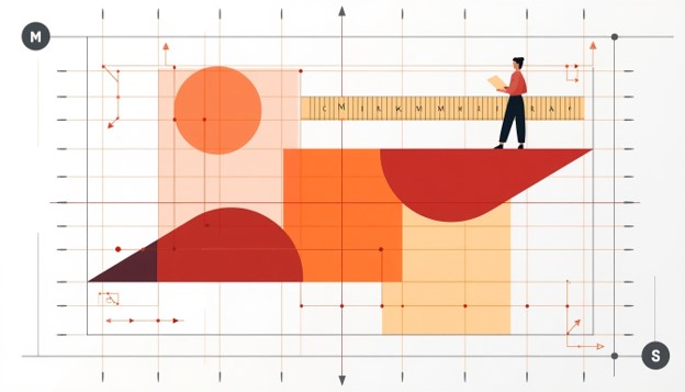
Design refers to the way individual visual elements — such as lines, shapes, colors, textures, and space — are arranged together to create a unified, purposeful, and visually appealing whole. Think of Design Composition as the architecture behind any visual work. A painting, a website homepage, a magazine cover, a mobile app screen, or even a living room layout all rely on Design Composition to guide the viewer’s eye, communicate a message, and create emotional impact.
At its core, Composition is about arrangement and relationships. It is not just about making something “look nice” — it is about making deliberate decisions on where every element sits in relation to every other element. Good Composition answers questions like: What should the viewer notice first? Where should their eyes travel next? What feels balanced, and what feels chaotic? Every professional designer, illustrator, photographer, and architect uses the principles of Design every single day, whether they realize it consciously or not.

Beginners often assume Design is only relevant to graphic design software like Photoshop or Illustrator, but that is a misconception. Design Composition is a universal visual language. It applies to logo design, website layouts, social media graphics, packaging design, film cinematography, photography, painting, and even furniture arrangement in interior design. Anywhere visual elements are placed together intentionally,Composition is at work.
Why Design Composition Matters So Much
Understanding Design is not optional if you want to create work that communicates clearly and looks professional. Poor Design Composition results in cluttered, confusing, or unbalanced designs that fail to hold attention or convey a message effectively. On the other hand, strong Design immediately signals professionalism, clarity, and intentionality — even before a viewer reads a single word of text.
From a business perspective, Design Composition directly impacts user engagement, conversion rates, and brand perception. A website with poor Design will confuse visitors and increase bounce rates, while a website built on solid Design principles guides visitors naturally toward calls to action. In marketing materials, good Design determines whether a potential customer’s eye lands on your brand message or gets lost in visual noise. In photography and film, Composition is what separates an amateur snapshot from a striking, gallery-worthy image.
Learning Design also improves your ability to critique your own work. Once you understand the underlying rules of Design Composition, you stop guessing whether something “looks off” and instead can pinpoint exactly why — whether it’s a lack of contrast, poor alignment, or an imbalance of visual weight. This diagnostic ability is what separates beginners from professionals, and it all starts with a solid grounding in Design Composition.
A Brief History of Design Composition
The principles behind Design are not new inventions of the digital age — they date back centuries. Renaissance painters used geometric structures like the golden ratio to arrange their subjects, laying early groundwork for what we now call Design. Classical architecture relied heavily on symmetry and proportion, concepts that remain central to modern Design Composition theory. In the 20th century, the Bauhaus movement formalized many of the grid-based and functional approaches to Design that graphic designers still use today.
As design moved into digital spaces, Design Composition evolved to include new considerations like scrolling behavior, responsive layouts, and interactive hierarchies. However, the fundamental goals of Design — clarity, balance, and intentional visual flow — have remained unchanged. Understanding this history helps beginners appreciate that Design Composition is a time-tested discipline, not just a trendy design buzzword.
The Core Elements Used in Design Composition
Before diving into the principles of Design Composition, it’s important to understand the raw building blocks designers use. Every strong Design is built from a combination of the following elements:
Line – Lines guide the eye and create structure within a Design Composition. They can be straight, curved, thick, thin, implied, or explicit, and they often define boundaries or pathways for the viewer’s gaze.
Shape – Shapes form the basic containers of visual information in any Design Composition. Geometric shapes feel structured and modern, while organic shapes feel natural and soft.
Color – Color is one of the most emotionally powerful tools in Design Composition. It creates mood, establishes hierarchy, and draws attention to focal points.
Texture – Texture adds depth and tactile interest to a Design Composition, whether it’s a literal texture in a photograph or a simulated texture in a digital design.
Space (Negative Space) – Space, particularly negative space, is often the most overlooked element of Design Composition. It gives elements room to breathe and prevents visual clutter.
Form – In three-dimensional contexts like product design or interior design, form refers to the physical volume and structure that contributes to overall Design Composition.

Mastering how these elements interact is the first practical step toward understanding Design at a professional level. Every principle discussed in the next section is essentially a rule for how to combine these elements effectively within any Design Composition.
The Core Principles of Design Composition
Now that we understand the building blocks, let’s explore the actual principles that govern great Design Composition. These principles apply universally, regardless of whether you’re designing a poster, a mobile app, or a photograph.
- Balance
Balance is one of the most fundamental principles of Graphic Design. It refers to the distribution of visual weight across a layout. There are two primary types of balance used in Design: symmetrical balance, where elements mirror each other around a central axis, and asymmetrical balance, where different elements of varying size and visual weight are arranged to feel equally distributed without being identical. Symmetrical Design feels formal, stable, and calm, while asymmetrical Design Composition feels dynamic and modern. Understanding when to use each type of balance is a core skill for anyone learning Design Composition.
- Contrast
Contrast in Design Composition refers to the difference between elements — in size, color, shape, or texture — used to create emphasis and visual interest. Without contrast, a Design feels flat and monotonous. Designers use contrast strategically to highlight the most important element in a layout, such as a call-to-action button on a website or the subject of a photograph. Strong contrast is often what makes a Design feel bold and confident rather than timid and forgettable.
- Alignment
Alignment is the invisible thread that holds a Design together. When elements are aligned along shared edges or axes, the entire Design feels organized and intentional, even if the viewer doesn’t consciously notice the alignment itself. Poor alignment is one of the most common reasons a Design Composition feels amateurish, so mastering grids and alignment tools is essential for beginners.
- Proximity
Proximity in Design refers to grouping related elements close together so viewers instinctively understand they belong to the same category or idea. Effective use of proximity reduces cognitive load and helps a Design Composition communicate information more efficiently, especially in interfaces with lots of text or data.
- Repetition
Repetition reinforces consistency throughout a Design Composition. Repeating colors, fonts, shapes, or spacing patterns creates rhythm and helps unify a Design into a cohesive whole, especially across multi-page documents, websites, or branding systems.
- Visual Hierarchy
Visual hierarchy determines the order in which a viewer’s eyes move through a Design Composition. By manipulating size, color, contrast, and placement, designers control what gets noticed first, second, and last. Strong visual hierarchy is arguably the most important outcome of good Design Composition, especially in UI/UX design, where hierarchy directly impacts usability.

- White Space (Negative Space)
White space, sometimes called negative space, is the empty area surrounding elements in a Design Composition. Beginners often mistakenly try to fill every inch of a canvas, but skilled designers understand that white space is an active ingredient in Design, not an absence of design. Generous white space makes a Design feel premium, readable, and calm.
- Movement
Movement refers to the path the eye takes through a Design Composition, often guided by lines, diagonal elements, or a sequence of shapes that lead the viewer’s gaze from one focal point to another. Strong movement keeps a Design Composition feeling dynamic rather than static.
- Scale and Proportion
Scale and proportion govern the relative size of elements within a Design Composition. Playing with scale — making one element dramatically larger than others — is a powerful way to establish hierarchy and drama within a Design Composition.
- Unity and Harmony
Unity is the ultimate goal of any Design Composition: the sense that all elements belong together as a single, cohesive piece, rather than a random collection of parts. Achieving unity requires balancing all the other principles of Design Composition discussed above.
The Role of Color Theory in Design Composition
Color is one of the most emotionally charged tools available to anyone working on a layout, and it plays an outsized role in shaping how a composition is perceived. When color choices are aligned with the goals of the overall arrangement, the result feels intentional and polished; when they clash, even a technically well-structured layout can feel amateurish. A warm palette tends to draw the eye forward and create energy, while cooler tones recede and create calm, both of which are useful strategies depending on what the arrangement is trying to achieve. Complementary colors — those sitting opposite each other on the color wheel — create vibrant contrast that naturally guides attention toward a chosen focal point, while analogous colors sitting near each other create a softer, more harmonious feel. Beginners often overlook how much color temperature and saturation affect the perceived weight of an element; a small but highly saturated shape can visually outweigh a much larger, muted one. Learning to control this relationship is a critical extension of everything discussed so far, since color decisions ultimately reinforce or undermine the hierarchy and balance already built into a layout. Before finalizing any project, it helps to convert it to grayscale temporarily; if the hierarchy and balance still read clearly without color, the underlying structure is strong, and the color palette is simply adding polish rather than doing all the heavy lifting.
The Role of Typography in Design Composition
Typography deserves its own dedicated discussion because text is present in the overwhelming majority of real-world layouts, from posters to app interfaces to packaging. The way headlines, subheadings, and body copy are sized, spaced, and positioned relative to one another directly reflects the same hierarchy and alignment principles covered earlier. A common beginner mistake is choosing too many typefaces within a single project, which fractures the sense of unity that a cohesive arrangement depends on. A safer approach is to limit a project to two typefaces — one for headlines and one for body text — and rely on weight, size, and spacing variations within those two families to create contrast and hierarchy. Line length, line height, and letter spacing all influence readability and, by extension, the perceived quality of the overall structure. Large, bold headlines paired with generous surrounding space immediately signal confidence and clarity, while cramped, inconsistently sized text creates the same cluttered feeling that comes from overcrowding visual elements. Treating typography as a structural element, rather than an afterthought added at the end, is one of the fastest ways for a beginner to level up their results.
Real-World Case Studies of Strong and Weak Composition
Looking at real examples makes abstract principles far easier to internalize. Consider two versions of the same event flyer: in the weak version, the date, location, headline, and decorative graphics are all roughly the same size and scattered without a clear grid, forcing the viewer to hunt for information. In the strong version, the event name is dramatically larger than everything else, the date and location are grouped tightly together in a secondary tier, and generous margins frame the entire piece — the same information, but now instantly scannable because of deliberate hierarchy and spacing decisions. A similar contrast appears in mobile app onboarding screens: a weak screen crams an illustration, three paragraphs of text, and two buttons into a single crowded view, while a strong screen isolates one clear message per screen, uses a single dominant illustration, and places a single obvious call-to-action button with room to breathe around it. In photography, comparing a snapshot where the subject is dead-center and cluttered by background distractions against a reframed shot using the rule of thirds and a simplified background shows exactly how repositioning elements within the same frame can transform a forgettable photo into a striking one. These examples all reinforce the same lesson: the raw content rarely changes between a weak and a strong version — what changes is the arrangement, spacing, and hierarchy applied to that content.
Design Composition Trends to Watch in 2026
Visual trends shift over time, and staying aware of current directions helps beginners create work that feels current rather than dated. In 2026, asymmetrical and broken-grid layouts continue to gain popularity across websites and social graphics, replacing the rigid, centered layouts that dominated earlier design eras, while still relying on the same underlying balance principles to avoid feeling chaotic. Bold, oversized typography paired with minimal supporting imagery is increasingly common in digital marketing, reflecting a broader shift toward clarity and fast scannability on small mobile screens. Muted, earthy color palettes combined with occasional high-saturation accent colors are trending across branding projects, replacing the flat, overly bright palettes popular a few years earlier. In UI/UX work specifically, generous white space and simplified single-focus screens continue to dominate, driven by accessibility standards and the reality that most users interact with interfaces on small mobile devices. Regardless of which surface-level trend is currently popular, the underlying fundamentals of balance, contrast, hierarchy, and unity remain the constant foundation that every trend is built on top of — which is exactly why learning these fundamentals first will keep your skills relevant no matter how visual styles evolve.
Design Composition and Accessibility
An often-overlooked dimension of building strong layouts is accessibility — ensuring that the arrangement of elements works for people with visual impairments, color blindness, or cognitive differences. Sufficient color contrast between text and background is not just an aesthetic choice but a functional requirement that affects whether a large portion of your audience can actually read your content. Clear hierarchy and logical reading order become even more important for users relying on screen readers, since a jumbled or purely decorative arrangement can make navigation genuinely difficult rather than just visually unappealing. Generous spacing between interactive elements, such as buttons and links, prevents accidental taps and improves usability for people with motor impairments. Treating accessibility as a core requirement, rather than an afterthought, ultimately produces stronger, clearer work for every single viewer, not just those with specific needs — reinforcing once again that clarity and intentional structure benefit everyone.
A Quick Checklist Before Finalizing Any Layout
Before calling a project finished, it helps to run through a short checklist to catch common issues. Ask whether there is one unmistakable focal point that draws the eye first. Check whether elements share consistent alignment along visible or invisible grid lines. Confirm that related items are grouped closely together while unrelated items have clear separation between them. Verify that color and size contrast are being used purposefully to reinforce hierarchy rather than randomly scattered across the piece. Make sure there is enough breathing room around key elements so nothing feels cramped or overwhelming. Finally, step back and view the piece from a distance, or shrink it down on screen, to confirm that the overall shape still feels balanced and unified even without focusing on individual details. Running through this checklist consistently, project after project, is how the underlying instincts eventually become automatic.
Design Composition Across Different Creative Fields
One of the most powerful things about learning Design Composition is that the skill transfers across multiple creative disciplines. Let’s look at how Design Composition is applied differently depending on the medium.
Design Composition in Graphic Design
In graphic design, Design Composition governs how logos, posters, brochures, and branding materials are laid out. Graphic designers rely heavily on grids, typography hierarchy, and color theory to achieve strong Design Composition across static visual materials.

Design Composition in UI/UX Design
In UI/UX design, Design Composition takes on added complexity because it must account for user interaction, responsiveness across devices, and accessibility. A well-structured Design Composition in an app or website reduces friction, improves usability, and increases conversions. UI/UX designers use Design Composition principles like hierarchy and proximity to guide users naturally through onboarding flows, forms, and checkout processes.
Design Composition in Photography
In photography, Design Composition is expressed through techniques like the rule of thirds, leading lines, framing, and symmetry. Photographers physically move themselves or their subjects to achieve strong Design Composition within the camera’s frame, rather than adjusting elements after the fact in software.

Design Composition in Interior Design
In interior design, Design Composition extends into three-dimensional space. Furniture placement, lighting, color palettes, and negative space within a room all reflect the same underlying principles of Design Composition used in two-dimensional graphic work.

Design Composition in Architecture
Architects apply Design Composition at massive scale, balancing structural elements, facades, and spatial flow to create buildings that feel both functional and visually striking. The same rules of balance, proportion, and rhythm found in smaller-scale Design Composition work apply directly to architectural planning.
Step-by-Step Guide to Creating a Strong Design Composition
If you are a beginner looking to practically apply everything discussed above, here is a step-by-step process for building your own effective Design Composition, whether you’re working in Photoshop, Figma, Canva, or even with a pencil and paper.
Step 1: Define Your Focal Point Before touching any tool, decide what the single most important element of your Design Composition will be. Every strong Design Composition has one clear focal point that anchors the entire layout.
Step 2: Choose a Grid or Structure Set up a grid system to guide alignment throughout your Design Composition. Even loose, asymmetrical layouts benefit from an underlying invisible grid.
Step 3: Establish Hierarchy Decide the order in which you want viewers to notice elements, and use size, color, and placement to reinforce that hierarchy throughout your Design Composition.
Step 4: Balance Your Elements Step back and evaluate whether your Design Composition feels visually balanced. Ask yourself if one side feels heavier than the other, and adjust size or spacing accordingly.
Step 5: Add Contrast Strategically Use contrast in color or size sparingly to draw attention to your focal point without overwhelming the rest of the Design Composition.
Step 6: Leave Room to Breathe Resist the urge to fill every space. Generous white space is often what separates a beginner’s cluttered attempt from a polished, professional Design Composition.
Step 7: Review for Unity Finally, zoom out and check whether your Design Composition feels like one cohesive piece. If any element feels out of place, revisit the principles above until the entire Design Composition feels unified.
Common Mistakes Beginners Make in Design Composition
Even with a solid understanding of theory, beginners frequently make certain mistakes when applying Design Composition in real projects. Recognizing these mistakes early can save you countless hours of frustration.
One of the most common mistakes is overcrowding a Design Composition with too many competing elements, leaving no clear focal point. Another frequent issue is ignoring alignment, which makes a Design Composition feel sloppy even if individual elements are well-designed. Beginners also often misuse color contrast, either making everything the same intensity (resulting in a flat Design Composition) or using too many competing bright colors (resulting in visual chaos). Finally, many beginners neglect white space entirely, mistakenly believing that a busier Design Composition looks more impressive, when the opposite is usually true.
Tools That Help You Practice Design Composition
Fortunately, you don’t need expensive software to start practicing Design Composition in 2026. Free tools like Canva and Figma offer built-in grid systems and alignment guides that make experimenting with Design Composition accessible to complete beginners. Adobe Photoshop and Illustrator remain industry standards for more advanced Design Composition work, particularly in professional graphic design and branding. Photographers can practice real-world Design Composition using nothing more than a smartphone camera with a grid overlay enabled to apply the rule of thirds. For interior design, free room-planning apps allow you to experiment with spatial Design Composition before committing to physical furniture placement.
Tips to Improve Your Design Composition Skills Over Time
Improving your eye for Design takes consistent, deliberate practice rather than passive study. Start by analyzing designs you admire and try to identify exactly which principles of Design Composition are at play — is it strong contrast, clever use of negative space, or a clear hierarchy? Recreate simple layouts from memory to train your instincts around Design without relying on a reference image. Study the work of established designers, photographers, and architects, since exposure to high-quality Design examples trains your visual instincts faster than theory alone. Finally, seek feedback on your own Design attempts from more experienced designers, since an outside perspective often catches balance or hierarchy issues you may not notice yourself.
Practice Exercises to Build Your Eye for Design Composition
Theory only goes so far without deliberate practice, so here are a few simple exercises anyone can start today, regardless of skill level. First, try the “one-hour recreation” exercise: pick a poster, website homepage, or photograph you admire, and attempt to recreate its layout structure using only basic shapes and placeholder text, focusing purely on matching the proportions, spacing, and hierarchy rather than the exact content. This trains your eye to see structure independently of subject matter. Second, try the “subtraction exercise”: take one of your own recent layouts and remove one element at a time, asking after each removal whether the piece feels stronger or weaker — this quickly reveals which elements are essential and which were simply adding clutter. Third, practice the “five-second test”: show a layout to a friend for exactly five seconds, then ask what they remember; if they can’t identify the main focal point or message, the hierarchy needs work. Fourth, try constraint-based practice by limiting yourself to only two colors and one typeface for an entire project, which forces you to rely on spacing, contrast, and scale rather than decoration to create visual interest. Finally, keep a running folder of layouts, photographs, and interfaces you personally find effective, and periodically revisit it to identify recurring patterns — over time, you’ll notice the same handful of structural decisions appearing again and again across otherwise very different pieces, which is exactly the kind of pattern recognition that separates confident, intuitive work from guesswork.
Repeating these exercises regularly, even for just twenty or thirty minutes a week, compounds quickly. Most beginners are surprised at how fast their instincts sharpen once they start actively analyzing structure instead of passively consuming finished work. The goal is not to memorize rigid rules but to internalize a flexible sense of what makes an arrangement feel balanced, clear, and intentional — a sense that, once developed, applies automatically to any new project you take on, whether it’s a client brief, a personal photography series, or redesigning your own living room.
Conclusion
Design Composition is the invisible framework behind every successful visual creation, from a simple social media graphic to a full architectural masterpiece. By understanding the core elements — line, shape, color, texture, and space — along with the guiding principles of balance, contrast, alignment, hierarchy, and unity, you now have the foundational knowledge needed to evaluate and create strong Design in any medium. Remember that mastering Design is a gradual process built through consistent practice, critical observation, and a willingness to revise your work until it feels truly unified. Whether you’re designing your first logo, laying out a website, framing a photograph, or arranging a living room, the principles of Design Composition covered in this guide will serve as your foundation for years to come.
Frequently Asked Questions (FAQs)
Q1: What is Design Composition in simple terms? Design Composition is the arrangement of visual elements — such as lines, shapes, colors, and space — into a balanced, purposeful, and visually appealing layout.
Q2: Why is Design Composition important for beginners to learn? Learning Design Composition helps beginners understand why certain designs look professional and others look cluttered, giving them the tools to diagnose and fix issues in their own work.
Q3: What are the main principles of Design Composition? The main principles include balance, contrast, alignment, proximity, repetition, visual hierarchy, white space, movement, scale, and unity.
Q4: Does Design Composition apply to photography as well as graphic design? Yes. Design Composition applies universally, and photographers use specific techniques like the rule of thirds and leading lines to achieve strong composition within the camera frame.
Q5: What tools can I use to practice Design Composition as a beginner? Free tools like Canva and Figma, along with smartphone camera grid overlays, are excellent starting points for practicing Design Composition without any prior experience.
Q6: How long does it take to get good at Design Composition? There is no fixed timeline, but consistent practice — analyzing existing designs and recreating simple layouts — can noticeably improve your Design Composition skills within a few months.
Q7: Is Design Composition the same as graphic design? No. Design Composition is one core component within graphic design, but it also applies to photography, UI/UX design, interior design, and architecture.
Q8: What’s the difference between balance and symmetry in Design Composition? Symmetry is one specific type of balance where elements mirror each other exactly, while balance more broadly includes asymmetrical arrangements where different-sized elements still feel evenly distributed in visual weight.
Q9: Can good Design Composition fix weak content or a weak photo subject? Strong Design Composition can significantly improve how content is perceived and often rescues an otherwise average subject, but it cannot fully replace the need for a genuinely interesting subject or message.
Q10: Should beginners follow Design Composition rules strictly, or is it okay to break them? Beginners benefit from learning the standard rules first, since understanding why a rule works makes it far easier to break intentionally later for creative effect, rather than breaking it out of confusion.
100 Graphic Design Terms You Should Know
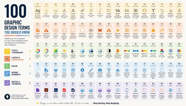
Graphic Design Terms whether you are a beginner exploring visual communication for the first time or a marketing professional trying to speak the same language as your design team, understanding common Graphic Design Terms is essential. The world of design is full of specialized vocabulary, and if you do not know what a term means, it becomes difficult to brief a designer, review a project, or even choose the right freelancer for your brand. This guide walks through Graphic Design Terms in a simple, practical way so that anyone, regardless of experience level, can follow along and start using these words confidently.
In this article, we have organized Graphic Design Terms into logical categories including typography, color theory, layout and composition, branding, print design, digital and UI/UX design, and software-related vocabulary. By the end, you will have a working knowledge of 100 Graphic Design Terms that appear constantly in creative briefs, portfolios, job descriptions, and client conversations. Let’s get started.
Why Learning Graphic Design Terms Matters
Before diving into the list, it helps to understand why learning Graphic Design Terms is so valuable. Design is a visual discipline, but it is communicated through language. When a client says they want something “minimalist” with good “whitespace” and a strong “visual hierarchy,” a designer needs to understand exactly what those Graphic Design Terms mean in order to execute the vision correctly. Similarly, when a business owner reviews a logo concept, knowing the difference between a wordmark and a brandmark helps them give more precise feedback.
Many people struggle to communicate their creative needs simply because they do not know the correct vocabulary. Learning Graphic Design Terms bridges that gap. It allows non-designers to collaborate more effectively with creative teams, helps students build a stronger foundation before entering design school or a bootcamp, and gives freelancers and agencies a shared language to work faster with fewer revisions. In short, mastering Graphic Design Terms saves time, reduces miscommunication, and results in better final designs for everyone involved.
Typography Graphic Design Terms

Typography is one of the most important pillars of design, and many Graphic Design Terms come directly from this category.
- Typeface – A typeface is the overall design of a set of characters, such as Helvetica or Garamond. It is one of the most frequently used Graphic Design Terms because every project involves choosing one.
- Font – Often confused with typeface, a font refers to a specific weight and style within a typeface family, such as Helvetica Bold Italic at 12pt.
- Serif – A serif is a small line or stroke attached to the end of a letter, commonly seen in traditional, print-friendly fonts like Times New Roman.
- Sans-serif – Sans-serif fonts lack these small strokes, giving them a cleaner, more modern look often used in digital interfaces.
- Kerning – Kerning refers to the spacing between two individual letters, adjusted to improve visual balance and readability.
- Tracking – Tracking is similar to kerning but applies uniform spacing across an entire word or block of text rather than between just two letters.
- Leading – Leading is the vertical space between lines of text, named after the strips of lead once used in traditional printing presses.
- Baseline – The invisible line upon which most letters sit, excluding descenders like the tail of a “y” or “g.”
- X-height – The height of lowercase letters, excluding ascenders and descenders, which greatly affects a typeface’s readability and personality.
- Ligature – A ligature combines two or more letters into a single glyph, such as the “fi” or “fl” combination in many serif fonts.
- Typographic Hierarchy – This describes the arrangement of text by size, weight, and placement to guide the reader’s eye through content in order of importance.
- Widow and Orphan – These typographic problems occur when a single word or short line is isolated at the top or bottom of a text block, disrupting visual flow.
- Drop Cap – A large, stylized capital letter used at the beginning of a paragraph, often seen in editorial and book design.
- Justified Text – Text that is aligned evenly along both the left and right margins, commonly used in newspapers and formal documents.
- Font Pairing – The practice of combining two or more typefaces that complement each other, a skill every designer must master when working with Graphic Design Terms related to text.
Color Theory Graphic Design Terms

Color is emotional, strategic, and technical all at once, which is why so many Graphic Design Terms revolve around it.
- Color Wheel – A circular diagram showing the relationships between primary, secondary, and tertiary colors, forming the foundation of color theory.
- Complementary Colors – Colors that sit opposite each other on the color wheel, creating high contrast and vibrant energy when paired.
- Analogous Colors – Colors that sit next to each other on the wheel, producing a harmonious, low-contrast palette.
- Triadic Color Scheme – Three colors evenly spaced around the color wheel, offering a balanced yet vibrant combination.
- Hue – The pure form of a color, such as red, blue, or yellow, without any tint or shade applied.
- Saturation – The intensity or purity of a color, ranging from vivid and bold to dull and muted.
- Tint – A color created by adding white to a hue, producing a lighter version of that color.
- Shade – A color produced by adding black to a hue, producing a darker version.
- Tone – A color created by adding gray to a hue, softening its intensity without changing lightness dramatically.
- CMYK – A color model used in print design, standing for Cyan, Magenta, Yellow, and Key (black).
- RGB – A color model used for digital screens, combining Red, Green, and Blue light to produce a wide spectrum of colors.
- Pantone (PMS) – A standardized color matching system used to ensure color consistency across different printers and materials.
- Color Palette – A curated selection of colors used consistently throughout a design project or brand identity.
- Monochromatic – A color scheme built from variations of a single hue, using different tints, shades, and tones.
- Color Psychology – The study of how colors affect human emotion and behavior, a concept every brand designer applies when selecting Graphic Design Terms related to palette choices.
Layout and Composition Graphic Design Terms

Layout determines how elements are arranged on a page or screen, and this category contains some of the most practical Graphic Design Terms for daily design work.
- Grid System – A structural framework of intersecting lines used to align and organize content consistently across a design.
- Whitespace – The empty or negative space around design elements, which improves readability and gives content room to breathe.
- Visual Hierarchy – The intentional arrangement of elements to show their order of importance, guiding the viewer’s eye naturally.
- Alignment – The positioning of elements in relation to each other, creating order and a polished, professional appearance.
- Balance – The distribution of visual weight in a composition, which can be symmetrical, asymmetrical, or radial.
- Contrast – The use of differing elements, such as light and dark or large and small, to make certain parts of a design stand out.
- Proximity – A design principle stating that related items should be grouped together to create clear relationships between elements.
- Repetition – The consistent use of visual elements, such as colors or shapes, throughout a design to build unity.
- Rule of Thirds – A compositional guideline dividing an image into nine equal parts to create more balanced and interesting placement of focal points.
- Focal Point – The area of a design that draws the viewer’s attention first, often the most important message or image.
- Margin – The blank space between the content and the edge of a page or screen, important for both print and digital layouts.
- Gutter – The space between columns in a grid system, preventing content from feeling cramped.
- Crop – Trimming the edges of an image to remove unwanted areas or to improve composition and focus.
- Bleed – Extra space added beyond the trim line in print design to ensure that ink extends to the very edge of the page after cutting.
- Composition – The overall arrangement of all visual elements within a design, one of the broadest yet most essential Graphic Design Terms to understand.
Branding and Logo Design Graphic Design Terms

Branding is where design meets business strategy, and these Graphic Design Terms are especially useful for entrepreneurs and marketers.
- Logo – A symbol, mark, or wordmark that visually represents a company, product, or organization.
- Wordmark – A logo composed purely of stylized text, such as the Coca-Cola or Google logos.
- Brandmark – A logo that uses a symbol or icon rather than text, such as the Apple logo.
- Combination Mark – A logo that combines both a symbol and text, offering flexibility for different brand applications.
- Brand Identity – The complete visual and verbal expression of a brand, including logo, colors, typography, and tone of voice.
- Style Guide – A document outlining the rules for how a brand’s visual identity should be used, ensuring consistency across all materials.
- Mockup – A realistic representation of how a design will look when applied to a real-world object, such as a business card or product packaging.
- Tagline – A short, memorable phrase that accompanies a logo to communicate a brand’s core message or value.
- Brand Guidelines – Detailed rules covering logo usage, spacing, color codes, and typography to protect brand consistency.
- Visual Identity – The collection of visual elements, such as color, typography, and imagery style, that make a brand instantly recognizable.
- Icon – A simplified graphic symbol used to represent an idea, action, or object, often used in interfaces and branding.
- Pictogram – A simplified pictorial representation of an object or concept, commonly used in signage and wayfinding design.
- Brand Voice – Although more of a copywriting term, brand voice works alongside Graphic Design Terms to create a cohesive brand personality across visuals and text.
Print Design Graphic Design Terms
Even in a digital-first world, print design remains relevant, and these Graphic Design Terms are crucial for anyone producing physical materials.
- DPI (Dots Per Inch) – A measurement of print resolution; higher DPI generally results in sharper, more detailed printed images.
- Resolution – The amount of detail an image holds, directly affecting how sharp or blurry it appears when printed or displayed.
- Vector Graphic – An image made of mathematical paths rather than pixels, allowing it to be scaled infinitely without losing quality.
- Raster Graphic – An image made of pixels, which can lose quality when enlarged beyond its original resolution.
- Die Cut – A printing technique that cuts a design into a custom shape rather than a standard rectangle.
- Embossing – A print finishing technique that raises a design above the surface of the paper for a tactile effect.
- Letterpress – A traditional printing method that presses inked type or plates directly onto paper, creating a slightly indented texture.
- Foil Stamping – A technique that applies metallic or colored foil to paper using heat and pressure, often used for premium branding materials.
- Spot Color – A single, precisely mixed ink color used in printing, as opposed to combining CMYK inks to achieve the color.
- Trim Size – The final, finished size of a printed piece after it has been cut down from a larger sheet.
- Signature – In print production, a signature refers to a large sheet printed with multiple pages that will later be folded and cut.
- Proof – A sample print used to check color accuracy, layout, and overall quality before a full production run begins.
Digital and UI/UX Graphic Design Terms
As design has moved online, a new set of Graphic Design Terms has emerged around digital products, apps, and websites.
- UI (User Interface) – The visual elements of a digital product that a user interacts with, including buttons, menus, and icons.
- UX (User Experience) – The overall experience and satisfaction a user has while interacting with a product, encompassing usability and flow.
- Wireframe – A simplified, low-fidelity sketch of a webpage or app layout used to plan structure before visual design begins.
- Prototype – An interactive model of a design used to test functionality and user flow before development.
- Responsive Design – A design approach that ensures a website or app adapts smoothly to different screen sizes and devices.
- Mobile-First Design – A design strategy that prioritizes the mobile experience before scaling up to larger screens.
- Call to Action (CTA) – A button or prompt encouraging users to take a specific action, such as “Sign Up” or “Buy Now.”
- Navigation – The system of menus and links that allow users to move through a website or application.
- Above the Fold – The portion of a webpage visible without scrolling, considered prime real estate for important content.
- Hero Image – A large, prominent image placed at the top of a webpage to immediately capture visitor attention.
- Favicon – The small icon displayed in a browser tab, representing a website’s brand identity in a compact form.
- Skeuomorphism – A design style that mimics real-world textures and objects, such as a calculator app designed to look like a physical calculator.
- Flat Design – A minimalist design style that avoids gradients, shadows, and textures in favor of clean, simple shapes.
- Material Design – A design language developed by Google that uses grid-based layouts, responsive animations, and depth effects like shadows.
- Accessibility (a11y) – The practice of designing products that can be used by people with a wide range of abilities, including those with visual or motor impairments.
Software and Tool-Related Graphic Design Terms

Finally, understanding certain software-based Graphic Design Terms helps beginners navigate common design programs more confidently.
- Layer – A separate level within a design file that can be edited independently, allowing complex compositions to be built and adjusted easily.
- Artboard – A designated workspace within design software representing a single page, screen, or canvas.
- Clipping Mask – A technique that uses one shape or object to control the visibility of another layer beneath it.
- Opacity – The measure of how transparent or solid an object appears, ranging from fully see-through to fully opaque.
- Blend Mode – A setting that determines how one layer’s colors interact with the layers beneath it, creating various visual effects.
- Bezier Curve – A mathematically defined curve used in vector design software to create smooth, precise lines and shapes.
- Anchor Point – A point on a vector path that defines its shape, which can be adjusted to reshape lines and curves.
- Path – A line, created using anchor points and curves, that forms the outline of a vector shape.
- Export – The process of saving a design file into a usable format, such as JPEG, PNG, PDF, or SVG.
- Template – A pre-designed file structure that can be reused and customized for multiple projects, saving time on repetitive design tasks.
- Asset – Any individual design element, such as an icon, image, or graphic, that is used within a larger project.
- Swatch – A saved color sample within design software, allowing consistent color use throughout a project.
- Rasterize – The process of converting a vector graphic into a pixel-based raster image.
- Version Control – A system for tracking and managing changes to design files over time, especially useful for teams working collaboratively.
- File Format – The specific type of file a design is saved as, such as AI, PSD, PDF, PNG, or SVG, each suited to different uses within the broader world of Graphic Design Terms.
How to Remember These Graphic Design Terms
Learning 100 new words at once can feel overwhelming, so here are a few practical tips for retaining these Graphic Design Terms long term. First, try grouping them by category, just as we have done in this article, since related Graphic Design Terms are easier to remember together than in isolation. Second, apply new vocabulary immediately in real conversations or design reviews, since active use accelerates memory retention far more than passive reading. Third, create a simple flashcard set or a personal glossary document where you jot down each term along with a one-sentence definition in your own words.
It also helps to look at real design examples while studying Graphic Design Terms, since visual association reinforces understanding far better than text alone. For instance, when learning about kerning or leading, open a design tool and manually adjust spacing to see the effect firsthand. Over time, these Graphic Design Terms will become second nature, and you will find yourself using them naturally in briefs, feedback sessions, and portfolio reviews.
Common Mistakes People Make With Graphic Design Terms
Even people who have worked around creative teams for years often misuse certain Graphic Design Terms, and clearing up these mix-ups can instantly improve communication on a project. The most frequent mistake is using “font” and “typeface” interchangeably. As covered earlier in this article, a typeface is the overall family, such as Helvetica, while a font is one specific weight and size within that family. Getting this distinction right is a small detail, but designers notice when a client or collaborator understands these Graphic Design Terms correctly, and it builds trust in the working relationship.
Another common error involves confusing resolution with file size. A high-resolution image is not automatically a large file, and a large file is not automatically high resolution; these are related but separate Graphic Design Terms that describe different technical properties of an image. Similarly, people often use “logo” and “brand” as if they mean the same thing, when in reality a logo is just one visual asset within a much larger brand identity system that includes color, typography, tone, and messaging. Taking the time to use these Graphic Design Terms precisely will make every conversation with a designer, printer, or developer significantly smoother.
A final mistake worth mentioning is assuming that all Graphic Design Terms apply equally to both print and digital work. As explained throughout this guide, concepts like bleed, DPI, and spot color belong specifically to the print world, while wireframes, responsive design, and above-the-fold content belong specifically to digital design. Knowing which Graphic Design Terms apply to which medium prevents confusion when briefing a project that spans both formats, such as a brand identity that needs to work on both a printed brochure and a company website.
How Businesses Apply Graphic Design Terms in Real Projects
Understanding Graphic Design Terms is not just an academic exercise; it has real, practical value for businesses of every size. When a small business owner hires a freelance designer to build a new logo, being able to reference specific Graphic Design Terms like wordmark, color palette, and typography hierarchy allows them to explain exactly what they want instead of relying on vague descriptions like “make it pop.” This precision leads to fewer revision rounds, faster turnaround times, and a final product that better matches the original vision.
Marketing teams also rely heavily on Graphic Design Terms when briefing agencies for campaigns. A marketing manager who understands the difference between a hero image, a call to action, and above-the-fold content can give an agency far more actionable feedback than someone who simply says a landing page “looks off.” In the same way, product teams building an app benefit enormously from understanding UI, UX, wireframe, and prototype as distinct Graphic Design Terms, since each one represents a different stage of the design process, from early sketches to a fully interactive model ready for development.
Even print production benefits from this shared vocabulary. A business ordering packaging, brochures, or signage will move through the process far more smoothly if they understand Graphic Design Terms such as bleed, trim size, spot color, and DPI, since these directly affect cost, production timelines, and final print quality. In every one of these examples, the common thread is the same: knowing the right Graphic Design Terms turns a business owner or manager from a passive observer into an active, informed collaborator in the creative process.
Final Thoughts on Graphic Design Terms
Design is a universal language, but like any language, it has its own vocabulary that must be learned to communicate effectively. This list of 100 Graphic Design Terms covers typography, color theory, layout, branding, print, digital design, and software concepts that appear constantly across the creative industry. Whether you are hiring a designer, studying design formally, or simply trying to understand your marketing team’s language, mastering these Graphic Design Terms will make you a more confident and effective communicator.
Bookmark this guide and return to it whenever you encounter unfamiliar vocabulary in a creative brief, job listing, or design portfolio. The more comfortable you become with Graphic Design Terms, the easier it becomes to collaborate with designers, evaluate creative work critically, and even explore design as a new skill yourself.
Frequently Asked Questions About Graphic Design Terms
Q1: Why is it important to learn Graphic Design Terms if I am not a designer? Understanding Graphic Design Terms helps non-designers communicate more clearly with creative professionals, give precise feedback, and make informed decisions when hiring freelancers or agencies.
Q2: What are the most commonly used Graphic Design Terms in the industry? Some of the most common Graphic Design Terms include typeface, whitespace, visual hierarchy, color palette, wireframe, and vector graphic, all of which appear frequently in creative briefs and portfolios.
Q3: How can beginners start learning Graphic Design Terms quickly? Beginners should start by grouping Graphic Design Terms into categories such as typography, color, and layout, and then practice using them in real design software to reinforce understanding.
Q4: Are Graphic Design Terms the same across print and digital design? Many Graphic Design Terms overlap between print and digital design, such as alignment and contrast, but some, like DPI and bleed, are print-specific, while others, like responsive design and wireframe, apply only to digital work.
Q5: Do I need to memorize all 100 Graphic Design Terms at once? No, it is more effective to learn Graphic Design Terms gradually by category and apply them in real projects, rather than trying to memorize the entire list in one sitting.
Q6: Where can I practice applying Graphic Design Terms in real projects? Free tools like Canva, Figma, and Adobe Express allow beginners to experiment with Graphic Design Terms such as layers, alignment, and color palettes in a hands-on, practical environment.
Q7: How do Graphic Design Terms differ between branding and marketing design? Branding-related Graphic Design Terms, such as logo, brand identity, and style guide, focus on long-term consistency, while marketing-related terms, such as call to action and hero image, focus on driving a specific short-term response from an audience.
Q8: Can learning Graphic Design Terms help me get a job in the creative industry? Yes, recruiters and hiring managers often expect candidates to understand basic Graphic Design Terms, and using them correctly in a resume, portfolio, or interview signals genuine familiarity with the field.
Q9: What is the best way to teach a team Graphic Design Terms quickly? Creating a shared internal glossary of Graphic Design Terms, similar to the categorized list in this article, is one of the fastest ways to get an entire marketing or product team speaking the same design language.
-

 Graphics Design2 years ago
7.Exploring the Importance of Color Theory Charts
-

 Graphics Design2 years ago
10 Stunning Gradient Design Trends You Need to Know in 2024
-

 Graphics Design12 months ago
15 Freelance Graphic Design Tips to Boost Your Career in 2025
-

 Graphics Design2 years ago
29.Retro Design Is Making a Comeback in Modern Spaces
-

 Graphics Design1 year ago
Best Laptops for Graphic Designers – 2025 Buying Guide
-

 Graphics Design1 year ago
2025 Logo Design Trends: What’s In, What’s Out?
-

 Graphics Design2 years ago
15.The Importance of Effective Flyer Design in Marketing
-

 Graphics Design1 year ago
Canva vs Adobe Photoshop – Which One is Better for Designers?