
Graphics Design
15 Best Text Effects in Photoshop: Easy Tutorials for Beginners (2026)

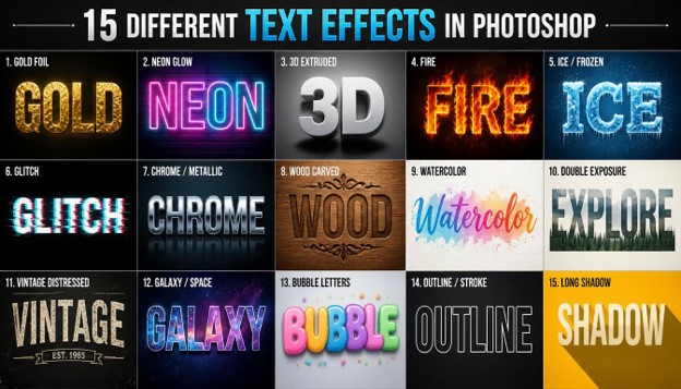
15 Best Text Effects in Photoshop: Easy Tutorials for Beginners (2026)
Typography can make or break a design. Whether you’re building a poster, a YouTube thumbnail, a social media banner, or a logo, the right lettering style pulls the eye in and sets the mood before anyone reads a single word. That’s exactly why so many designers search for Text Effects in Photoshop — they’re one of the fastest ways to turn plain type into something people stop scrolling for.
If you’re new to Photoshop, the idea of layer styles, blending modes, and smart objects can feel intimidating. The good news is that most professional-looking Text Effects in Photoshop only take a handful of steps once you know the right settings. In this guide, we’ll walk through 15 beginner-friendly tutorials, each broken into short, easy steps so you can follow along even if you’ve never opened Photoshop before.
By the end of this article, you’ll have a personal toolkit of Text Effects in Photoshop you can reuse on any project — from gold foil lettering to glitch text, neon signs, and 3D typography.
Why Learn Text Effects in Photoshop?
Before jumping into the tutorials, it helps to understand why designers rely so heavily on these techniques.
Good typography sells an idea in under two seconds. A movie poster, a game logo, or a product label often communicates its entire mood through lettering alone.
Learning Text Effects in Photoshop gives you a shortcut to that kind of visual impact without needing to draw anything from scratch. Every technique below uses layer styles, blend modes, and simple filters — no advanced illustration skills required.
Each section is short on purpose. Add short and concise paragraphs for better readability and UX, so you can skim, find the effect you want, and jump straight to it.
1. Gold Foil Text Effect

Gold foil lettering is one of the most requested Text Effects in Photoshop for wedding invitations, luxury branding, and greeting cards.
Steps:
- Type your text in a bold, thick font like Montserrat Black or Poppins Bold.
- Apply a Gradient Overlay using warm gold tones (from dark amber to bright yellow).
- Add a Bevel and Emboss layer style with a low depth and smooth technique.
- Add a subtle Drop Shadow to lift the letters off the background.
- Finish with a Pattern Overlay set to “foil texture” at low opacity for realism.
This is one of the simplest Text Effects in Photoshop because it only relies on the Layer Style panel — no external brushes needed.
Where to use it: Gold foil lettering works best on wedding invitations, luxury product packaging, and any design with a dark or cream-colored background that lets the warm tones stand out.
Common mistake to avoid: Beginners often make the gradient too flat. Add at least four color stops — dark brown, amber, bright gold, and a pale highlight — so the light appears to hit the letters unevenly, just like real foil.
2. Neon Glow Text Effect

Neon text is a favorite among beginners because it looks advanced but takes only minutes to create.
Steps:
- Choose a rounded, script-like font to mimic real neon tubing.
- Set the fill color to a bright pink, blue, or green.
- Add an Outer Glow layer style using the same color as the text.
- Duplicate the glow with a second, softer Outer Glow at a larger size.
- Place your text on a dark background so the glow pops.
This effect is beginner-friendly because Photoshop’s built-in glow settings do most of the heavy lifting.
Where to use it: Neon text suits nightlife event posters, gaming channel branding, and bar or restaurant signage graphics.
Common mistake to avoid: Skipping the second, larger glow layer is the biggest mistake beginners make. A single glow looks flat, while two stacked glows at different sizes create the soft light bloom that sells the neon illusion.
3. 3D Extruded Text Effect

3D lettering adds depth and works great for headlines, YouTube thumbnails, and game titles.
Steps:
- Type your text and convert it to a Smart Object.
- Go to the 3D menu and choose “New 3D Extrusion from Selected Layer.”
- Adjust the extrusion depth in the Properties panel.
- Rotate the object slightly for a dynamic angle.
- Add lighting from the 3D panel to create realistic shading.
This is one of the more advanced Text Effects in Photoshop, but Photoshop’s 3D tools make it approachable for beginners.
Where to use it: 3D extruded lettering is a strong choice for movie title cards, YouTube thumbnails, and app splash screens where you want the headline to feel physical and dimensional.
Common mistake to avoid: Rendering at low quality settings makes edges look jagged. Always switch the render mode to “Ray Traced Final” before exporting so the shading and reflections look smooth.
4. Fire Text Effect

Fire text is dramatic and works well for movie posters, gaming logos, and event banners.
Steps:
- Type your text in a bold font and duplicate the layer.
- Apply the Wind filter (Filter > Stylize > Wind) rotated vertically.
- Use Liquify to push the top edges upward like flames.
- Add a Gradient Map with red, orange, and yellow tones.
- Set the blend mode to Screen and layer in a fire texture overlay.
Fire is one of the more detailed Text Effects in Photoshop, but following the steps in order keeps it manageable.
Where to use it: Fire text fits horror and action movie posters, gym or fitness branding, and gaming thumbnails that need a high-energy, dramatic feel.
Common mistake to avoid: Applying the Wind filter only once often looks weak. Run it two or three times, alternating direction slightly, so the flame edges look layered instead of flat and uniform.
5. Ice / Frozen Text Effect

The frozen look pairs perfectly with winter campaigns and fantasy-style designs.
Steps:
- Type your text in a strong, geometric font.
- Apply a blue-to-white Gradient Overlay.
- Add Bevel and Emboss with a “Chisel Hard” technique for a crystalline look.
- Overlay an ice texture image and set the blend mode to Screen.
- Add small white specks using the Spatter filter to mimic frost.
Of all the Text Effects in Photoshop on this list, this one relies most on a good texture image, so choose a high-resolution ice or frost photo.
Where to use it: The frozen look works well for winter sale banners, fantasy game logos, and holiday greeting cards with a cool color palette.
Common mistake to avoid: Using a warm-toned frost texture breaks the illusion. Stick to blue-white or gray-blue textures so the temperature of the image matches the temperature of the gradient.
6. Glitch Text Effect

Glitch text is popular in gaming, tech, and streaming graphics.
Steps:
- Type your text and duplicate the layer twice.
- Change one duplicate’s channel to red-only and offset it slightly left.
- Change the second duplicate to cyan-only and offset it slightly right.
- Add random rectangular selections and shift them horizontally for a “torn” look.
- Finish with a light Noise filter for texture.
This is a fast, fun entry into Text Effects in Photoshop because there’s no painting or texture work involved — just layer offsets.
Where to use it: Glitch text is a natural fit for gaming channel intros, tech product launches, and cyberpunk-style album covers.
Common mistake to avoid: Offsetting the channels too far apart makes the text unreadable. Keep the shift between three and eight pixels so the glitch reads as intentional rather than broken.
7. Chrome / Metallic Text Effect

Chrome text works well for retro branding, car logos, and 90s-inspired designs.
Steps:
- Type your text in a rounded, bold font.
- Apply a Gradient Overlay with alternating light gray, white, and dark gray stripes.
- Add Bevel and Emboss with high depth for a reflective edge.
- Add an Inner Shadow for extra dimension.
- Finish with a subtle Drop Shadow underneath.
Metallic styles are consistently among the most searched Text Effects in Photoshop, largely because they look complex but are built entirely from gradients.
Where to use it: Chrome lettering suits automotive branding, retro band merchandise, and any design channeling a 1990s or early-2000s aesthetic.
Common mistake to avoid: Using only two gradient shades looks flat instead of reflective. Add at least five alternating light and dark stops to mimic the way real chrome bounces light unevenly.
8. Wood Carved Text Effect

This rustic style suits cafe menus, farmhouse branding, and handcrafted product labels.
Steps:
- Place a wood texture image as your background.
- Type your text and set the fill to 0% opacity.
- Add Bevel and Emboss with the “Chisel Hard” technique.
- Add an Inner Shadow to simulate a carved groove.
- Add a Pattern Overlay using the wood texture so the letters blend into the surface.
This is a great effect for practicing how layer styles interact with textures rather than flat colors.
Where to use it: Wood carved text is ideal for cafe menus, farmhouse or rustic branding, and handmade product labels where a natural, handcrafted feel matters.
Common mistake to avoid: Forgetting the Inner Shadow step leaves the text looking like a sticker instead of a carving. That shadow is what creates the illusion of a groove cut into the surface.
9. Watercolor Text Effect

Soft, painterly lettering is ideal for wedding stationery, greeting cards, and lifestyle brands.
Steps:
- Type your text in a clean, readable font.
- Place a watercolor texture image above the text layer.
- Right-click the texture and choose “Create Clipping Mask.”
- Adjust the texture’s Hue/Saturation to match your brand colors.
- Add a soft Drop Shadow for gentle depth.
This is one of the easiest Text Effects in Photoshop for beginners since it only requires a clipping mask and one texture image.
Where to use it: Watercolor lettering fits wedding stationery, floral branding, and lifestyle blog headers where a soft, handmade feel is the goal.
Common mistake to avoid: Using a watercolor texture that’s too uniform makes the effect look like a plain color fill. Choose a texture with visible brush strokes and uneven edges for a more authentic painted look.
10. Double Exposure Text Effect

Double exposure text blends a photo directly into the lettering for a cinematic look.
Steps:
- Type your text in a bold, thick font.
- Place a photo (like a landscape or portrait) above the text layer.
- Create a Clipping Mask so the photo only shows inside the letters.
- Adjust the photo’s contrast and add a black-and-white adjustment layer.
- Add a soft Gaussian Blur at the edges for a dreamy transition.
Among all Text Effects in Photoshop, this one is especially popular on Instagram and Pinterest because of its artistic, editorial feel.
Where to use it: Double exposure text works well for travel brand headers, music album art, and editorial magazine covers that want a cinematic, story-driven tone.
Common mistake to avoid: Choosing a photo with too much detail can make the letters unreadable. Pick images with clear silhouettes, like a single mountain or a tree line, so the letterforms stay legible.
11. Vintage Distressed Text Effect

Distressed lettering fits band merch, retro posters, and denim or leather branding.
Steps:
- Type your text in a serif or slab-serif font.
- Place a grunge or paper texture above the text and Clipping Mask it.
- Lower the layer’s opacity so worn spots show through the letters.
- Add a Color Overlay in a faded sepia or cream tone.
- Add slight rotation and a paper background for an aged feel.
This effect proves that Text Effects in Photoshop don’t have to look shiny or futuristic — plenty of trending styles lean vintage instead.
Where to use it: Distressed lettering suits band merchandise, denim or leather product tags, and retro travel posters with a worn, well-loved feel.
Common mistake to avoid: Over-distressing the text can make it unreadable at a glance. Keep the core letterforms mostly intact and concentrate the wear and texture around the edges instead.
12. Galaxy / Space Text Effect

Space-themed text works well for gaming channels, sci-fi posters, and music covers.
Steps:
- Type your text in a bold, wide font.
- Place a galaxy or nebula photo above the text and Clipping Mask it.
- Boost saturation and contrast on the galaxy layer.
- Add small white dots using a soft round brush for extra stars.
- Add an Outer Glow in purple or blue for a cosmic edge.
This is a favorite among the Text Effects in Photoshop community because the results look far more advanced than the actual steps required.
Where to use it: Galaxy text is a strong pick for sci-fi movie posters, astronomy content, and music covers with a dreamy, otherworldly mood.
Common mistake to avoid: Skipping the saturation boost leaves the galaxy texture looking dull inside the letters. Push the vibrance up noticeably so the nebula colors read clearly at a small size.
13. Bubble Letters Text Effect

Playful, rounded bubble text is great for kids’ brands, party invites, and casual social posts.
Steps:
- Type your text in a thick, rounded font (or use a bubble-letter font).
- Add Bevel and Emboss with a smooth, high-gloss technique.
- Add a Gradient Overlay in bright, candy-like colors.
- Add a small white highlight shape on each letter for a glossy shine.
- Finish with a soft Drop Shadow underneath.
This is one of the most beginner-friendly Text Effects in Photoshop, since the whole look comes from just two layer styles.
Where to use it: Bubble letters are perfect for children’s brands, birthday party invitations, and playful social media posts aimed at a younger audience.
Common mistake to avoid: Forgetting the small highlight shape on each letter is the most common miss. That tiny white shine is what sells the glossy, balloon-like finish.
14. Outline / Stroke Text Effect

Outlined text is minimal, modern, and extremely versatile for logos and posters.
Steps:
- Type your text and set the fill opacity to 0%.
- Add a Stroke layer style, choosing a color and width that fits your design.
- Set the stroke position to “Outside” for a cleaner edge.
- Optionally add a second, thinner inner stroke in a contrasting color.
- Place the text over a bold background image or solid color.
This is the simplest entry on the list and a great starting point if you’re brand new to Text Effects in Photoshop.
Where to use it: Outlined text works well for minimalist logos, streetwear branding, and any design that needs to sit cleanly over a busy photo background.
Common mistake to avoid: Setting the stroke width too thin at large sizes makes it disappear when scaled down. Preview the design at its smallest intended size before finalizing the stroke weight.
15. Long Shadow Text Effect

Long shadow text is a flat-design classic, popular in app icons and minimalist posters.
Steps:
- Type your text in a bold, geometric sans-serif font.
- Duplicate the text layer and fill the duplicate with a darker shade.
- Use Free Transform to stretch the duplicate diagonally behind the original.
- Lower the shadow layer’s opacity slightly for a soft flat effect.
- Keep the background simple so the shadow reads clearly.
This wraps up our list of the best Text Effects in Photoshop for beginners — from realistic textures to flat, modern design styles.
Where to use it: Long shadow text suits app icons, flat-design posters, and minimalist portfolio headers where a clean, modern aesthetic matters most.
Common mistake to avoid: Stretching the shadow at an inconsistent angle across multiple letters breaks the flat-design illusion. Use Free Transform once on the whole text layer, not letter by letter, to keep the angle uniform.
Why These Text Effects in Photoshop Work So Well Together
Looking at all fifteen techniques side by side, a pattern emerges. Every single one of these Text Effects in Photoshop relies on the same small toolkit: layer styles, clipping masks, gradients, and a handful of filters. Once you’re comfortable with those four building blocks, you can mix and match them to invent entirely new looks.
For example, combining the gold foil gradient technique with the outline effect’s stroke settings can produce a completely new “gold outline” style. Or you could take the neon glow’s Outer Glow setting and apply it to the galaxy text for a glowing cosmic effect. This is really the biggest lesson beginners take away from practicing Text Effects in Photoshop: the tools are reusable, even if the final results look completely different.
Another reason these techniques work so well is that Photoshop keeps every layer style live and editable. Unlike effects baked directly into pixels, you can revisit a Bevel and Emboss setting weeks later and tweak the depth, angle, or color without redoing the whole effect from scratch. That non-destructive workflow is part of what makes practicing Text Effects in Photoshop so much less stressful for beginners than people expect.
How to Choose the Right Text Effect in Photoshop for Your Project
With fifteen options to pick from, choosing the right Text Effects in Photoshop for a specific project can feel overwhelming at first. A simple way to narrow it down is to think about mood, audience, and background before you even open Photoshop.
Start with mood. Every effect on this list carries an emotional tone. Fire and glitch text feel aggressive and high-energy, which suits gaming or action content. Watercolor and gold foil feel soft and elegant, which suits weddings or lifestyle brands. Matching the mood of your Text Effects in Photoshop choice to the mood of your project is the single biggest factor in whether a design feels “right.”
Think about your audience next. A children’s brand will almost always benefit more from bubble letters or bright neon than from a distressed vintage look. A luxury skincare brand, on the other hand, will lean toward gold foil, chrome, or a subtle outline effect. Ask who’s going to see the final design before deciding which Text Effects in Photoshop technique to apply.
Finally, consider the background. Some effects, like neon glow and fire, need a dark background to read properly. Others, like outline and long shadow, work best on a light or photo-based background. Testing your chosen Text Effects in Photoshop style against the actual background you plan to use will save you from having to redo the effect later.
A quick decision checklist:
- Formal or luxury project → Gold Foil, Chrome, or Outline
- Playful or casual project → Bubble Letters, Neon Glow, or Long Shadow
- Nature or handmade brand → Watercolor, Wood Carved, or Vintage Distressed
- Tech, gaming, or sci-fi project → Glitch, Galaxy, or 3D Extruded
- Bold, high-impact headline → Fire, Ice, or 3D Extruded
Once you’ve narrowed your options down using this checklist, go back to the matching tutorial above and follow the steps in order. Because every technique in this guide uses short, numbered steps, you shouldn’t need more than 10–15 minutes per effect once you’re comfortable with the Layers panel.
Tools and Shortcuts That Speed Up Every Text Effect
A few Photoshop tools show up again and again across these Text Effects in Photoshop tutorials. Getting comfortable with them will make every future project faster.
The Layer Style panel (double-click any layer) is where Bevel and Emboss, Gradient Overlay, Outer Glow, Stroke, and Drop Shadow all live. Almost every effect in this guide touches this panel at least once.
Clipping Masks (Alt/Option-click between two layers) let you contain a texture or photo inside your text shape, which is the backbone of the watercolor, double exposure, galaxy, and wood carved effects.
Smart Objects (right-click a layer > Convert to Smart Object) protect your text from becoming permanently pixelated when you apply filters like Liquify, Wind, or 3D extrusion. Always convert to a Smart Object before running a filter on text.
The Gradient Tool and Gradient Editor are used in more of these Text Effects in Photoshop tutorials than any other tool, from gold foil to chrome to ice. Spend ten minutes getting familiar with adding and adjusting color stops, and every future tutorial will move faster.
Learning these four tools well is really the fastest path to mastering Text Effects in Photoshop as a whole, since nearly every advanced technique is just a creative combination of the same basic building blocks.
Before You Start: A Simple Photoshop Setup Checklist
A little preparation before opening any tutorial saves a lot of frustration later. Here’s a short checklist worth running through first.
Check your canvas size. Start with a document at least 1920 by 1080 pixels for web graphics, or larger if you’re designing for print. Working too small makes fine details like bevels and glows look chunky when you scale up later.
Set your color mode. Use RGB for anything going online, and CMYK only if the final file is headed to a printer. Switching modes after finishing a design can shift your colors unexpectedly, so it’s best to decide upfront.
Organize your layers early. Name each layer as you create it — “Text,” “Texture,” “Glow,” and so on — rather than leaving everything as “Layer 1,” “Layer 2.” This becomes especially helpful once you start combining multiple effects on one project.
Keep a folder of textures and gradients. Several tutorials in this guide call for outside images, like wood grain, grunge paper, or galaxy photos. Building a small personal library of high-resolution textures means you’ll never be stuck mid-tutorial searching for the right file.
Save incrementally. Use File > Save As with a version number (v1, v2, v3) every time you try a new variation. This makes it painless to go back a step if an effect doesn’t turn out the way you expected.
None of these steps take more than a minute or two, but together they make every tutorial in this guide noticeably smoother to follow.
Common Beginner Mistakes to Avoid
A few mistakes show up again and again when beginners are just getting started, regardless of which effect they’re trying. Watching out for these will save you time across every project.
Flattening the file too early. It’s tempting to merge all your layers once a design looks finished, but this makes it impossible to go back and adjust a color or shadow later. Keep your layers separate and only flatten a copy when you’re ready to export.
Ignoring the font choice. The steps matter, but the font you start with matters just as much. A thin, delicate font will never look convincing with a heavy 3D extrusion, and a chunky display font will look clumsy with a delicate watercolor treatment. Match the font weight to the effect before you begin.
Skipping the preview at export size. A design can look stunning zoomed in at 100%, then fall apart once shrunk down to a thumbnail or business card size. Always zoom out and check your work at the actual size it will be viewed.
Overusing filters. More isn’t always better. Stacking five different filters on one text layer often muddies the result instead of improving it. Most of the effects in this guide use two or three filters at most — resist the urge to add extra “just in case.”
Keeping these simple habits in mind will make every future design project, not just these fifteen tutorials, turn out cleaner and more professional.
Quick Tips for Better Results
- Always work on a duplicate layer so your original text stays editable.
- Convert text to a Smart Object before applying filters like Liquify or Wind.
- Use high-resolution textures (2000px or larger) so your Text Effects in Photoshop stay sharp when exported.
- Save your finished layer styles as presets so you can reuse them instantly on future projects.
- Export a PNG with a transparent background if you plan to reuse the text elsewhere.
Frequently Asked Questions
- What are Text Effects in Photoshop? Text Effects in Photoshop are styles and techniques — like glow, 3D, gold foil, or fire — applied to type using layer styles, filters, and blending modes to make lettering more visually striking.
- Are Text Effects in Photoshop hard to learn for beginners? No. Most of the effects in this guide use Photoshop’s built-in Layer Style panel, which means no drawing skills or plugins are required. A few, like fire or galaxy text, take slightly more steps but are still beginner-friendly.
- Which Photoshop version do I need for these tutorials? Any recent version of Photoshop (CC 2020 or newer) supports every technique in this article, including the 3D extrusion tools and Liquify filter.
- Can I apply these Text Effects in Photoshop to a logo? Yes, but for logos it’s best to keep the design simple and scalable. Outline, gold foil, and bevel-based effects tend to work best for branding since they stay legible at small sizes.
- Do I need special fonts for these effects? Not necessarily. Bold, thick fonts like Montserrat, Poppins, or Bebas Neue work well for most effects. Script fonts suit the neon effect, while serif fonts fit the vintage and wood-carved looks best.
- How do I save a text effect so I can reuse it later? Right-click the text layer in the Layers panel and choose “Copy Layer Style.” You can then paste it onto any new text layer, or save it as a style preset from the Styles panel.
- Why does my text effect look pixelated when exported? This usually happens when the canvas resolution is too low or a texture image was stretched beyond its original size. Always start with a canvas of at least 1920px wide and use high-resolution textures.
- What’s the easiest effect to start with? The Outline/Stroke effect and the Bubble Letters effect are the two easiest Text Effects in Photoshop for absolute beginners, since both rely on just one or two layer style settings.
- Can I combine multiple Text Effects in Photoshop on the same text layer? Yes. Layer styles stack, so you can combine a Gradient Overlay from the gold foil effect with a Stroke from the outline effect on the same layer to create a custom hybrid look.
- How long does it take to learn all 15 Text Effects in Photoshop? Most beginners can comfortably work through all 15 tutorials in this guide over a single weekend, spending roughly 15–20 minutes per effect including experimentation.
Final Thoughts
Mastering Text Effects in Photoshop doesn’t require years of design experience — it just requires following the right steps in the right order. Start with the simpler techniques like the outline or bubble letter effect, then work your way up to more advanced looks like fire, galaxy, or 3D extrusion.
With these 15 tutorials in your toolkit, you now have a full library of Text Effects in Photoshop to pull from for any project, whether it’s a poster, a thumbnail, a logo, or a social media post. Practice each one a few times, save your favorite layer styles as presets, and you’ll be creating scroll-stopping typography in no time.
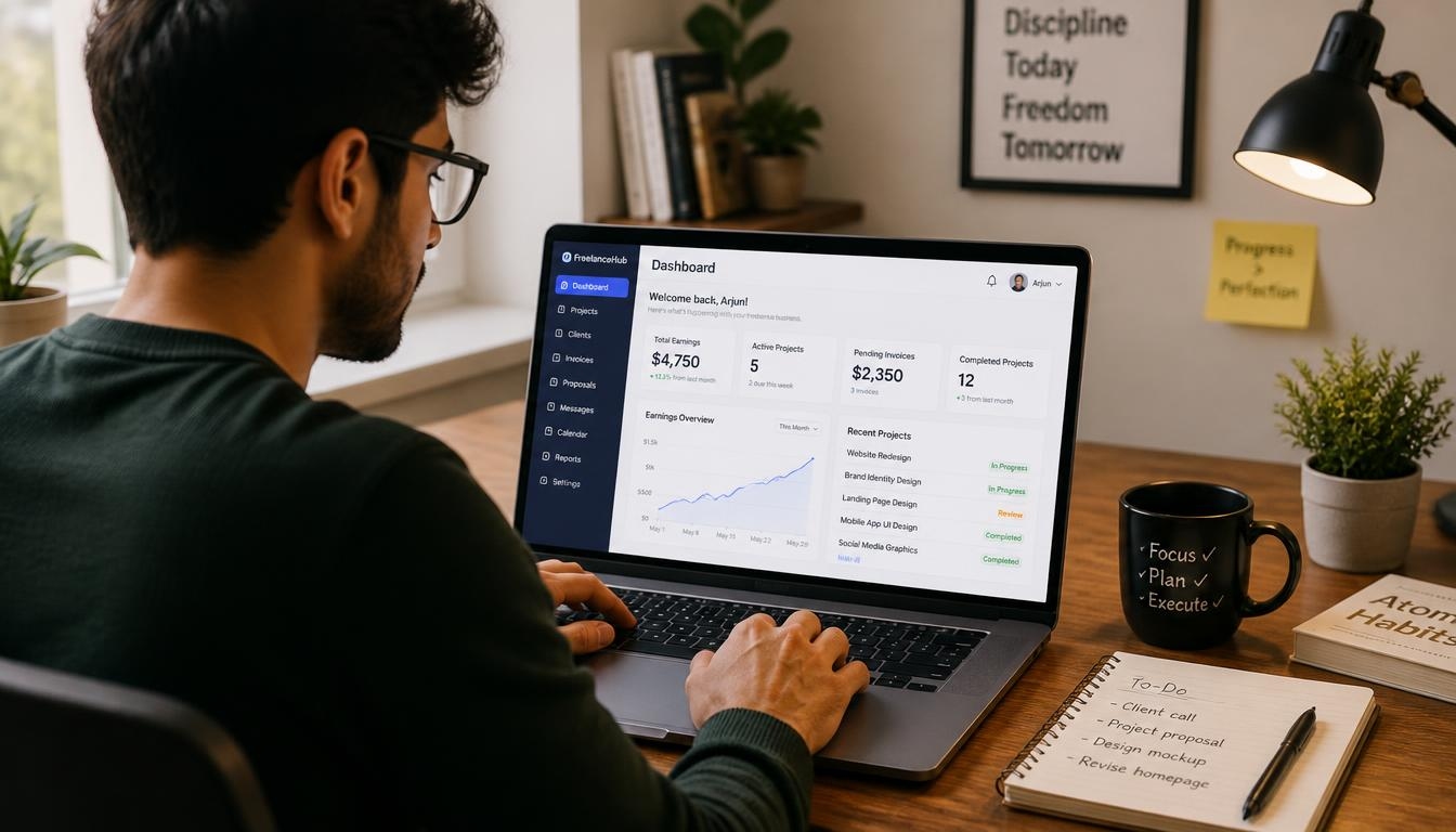
Upwork Guide for Beginners: How to Stand Out in a Competitive Freelance Market
Starting a freelance career is exciting, and it can also feel overwhelming. You have a skill and you want to earn online, so Upwork looks like the obvious place to begin. Then you log in and see thousands of freelancers competing for the same jobs.
That is exactly why you need this Upwork Guide for Beginners. It walks you through every step, from creating your account to landing your first client.
Here is the good news. Beginners win jobs on Upwork every day. They do it by being specific, professional, and strategic, not by being the cheapest.
In this Upwork Guide for Beginners, you will learn how the platform works, how to build a profile clients trust, how to write proposals that get replies, and how to price your work with confidence.
Whether you are a designer, writer, developer, virtual assistant, or marketer, this Upwork Guide for Beginners applies to you. Bookmark this Upwork Guide for Beginners and return to it as you build your account.
Upwork Guide for Beginners: What Is Upwork and How Does It Work?
Upwork is one of the largest freelance marketplaces in the world. Businesses post jobs, freelancers send proposals, and the client chooses someone to hire.
The platform handles contracts, messaging, time tracking, and payments in one place. That protection is a big reason clients and freelancers trust it.
Every effective Upwork Guide for Beginners starts with this basic flow.

How Clients Hire on Upwork
Clients usually hire in two ways:
- They post a job and review the proposals they receive.
- They search freelancer profiles and invite people directly.
Both routes depend on your profile and your proposals. That is why the rest of this Upwork Guide for Beginners focuses on them.
Hourly vs. Fixed-Price Contracts
Hourly contracts pay for the time you track. They suit ongoing work where the scope may change.
Fixed-price contracts pay a set amount, often released in milestones. They suit clear, well-defined projects.
As a beginner, fixed-price jobs are often easier to win. The client knows the total cost upfront, so there is less perceived risk. Hourly work can come later, once you have reviews.
How Upwork Makes Money
Upwork earns through service fees and by selling Connects, the credits you spend to send proposals.
Fee structures and Connect prices change over time. Always check Upwork’s current pricing page before you set your rates.
Then build the fee into your price so you do not accidentally undercut yourself.
Why Upwork Feels So Competitive for New Freelancers
Let’s be honest: Upwork is crowded. A popular job can attract dozens of proposals within hours. A trustworthy Upwork Guide for Beginners should tell you that clearly.
New freelancers usually face three problems:
- No reviews. Clients see an empty profile and feel the risk.
- No Job Success Score. There is no track record to point to yet.
- Limited Connects. Every wasted proposal costs you something.
Experienced freelancers have an edge, but they also have weaknesses. Many send copy-and-paste proposals. Many reply slowly. Many ignore the details of the job post.
You can beat them on relevance, speed, and clarity.

The mindset shift behind this Upwork Guide for Beginners is simple. You do not need to beat everyone. You only need to be the clear best fit for one specific type of client.
Step 1: Choose a Niche That Clients Pay For
The biggest mistake in any Upwork Guide for Beginners is skipping niche selection. Saying “I do everything” sounds like “I specialize in nothing.”
Combine Skill, Demand, and Interest
Ask yourself three questions:
- What can I do well right now?
- What are clients actively paying for?
- What can I enjoy doing every day?
Next, browse Upwork job listings. Search your skill and look at jobs posted in the last week. Note the repeated requests, the budgets, and the tools clients mention.
This shows you real demand, not guesses.
Examples of Beginner-Friendly Niches
Narrow your offer until it sounds specific:
- Instead of “graphic designer,” try “logo designer for fitness brands.”
- Instead of “writer,” try “blog writer for SaaS startups.”
- Instead of “assistant,” try “virtual assistant for real estate agents.”
A narrow focus makes your proposals feel relevant. It also helps the platform match you to the right jobs.
Validate Before You Commit
Check how many freelancers offer the same service. Look at typical hourly rates and project budgets.
If you see steady job posts and healthy pay, you have a workable niche. This research is the foundation of the whole Upwork Guide for Beginners process.

Step 2: Create Your Account the Right Way
Setting up an account takes about 20 minutes, but small choices here matter a lot.
- Use your real name. Clients hire people, not usernames.
- Use a professional email address.
- Choose your category and skills carefully.
- Complete every profile section.
- Verify your identity when asked.
Upwork reviews new profiles before approval. Rejections usually come from incomplete or inconsistent information, so be honest and thorough.
Never create multiple accounts. It breaks the platform’s rules and can get you suspended.
Following this Upwork Guide for Beginners from day one protects your account in the long run. Think of account setup as the first chapter of your Upwork Guide for Beginners journey.

Step 3: Build a Profile That Wins Clients
Your profile is your sales page. Clients decide in seconds whether to read your proposal or move on.
A strong profile is the heart of any Upwork Guide for Beginners.
Use a Professional Photo
Choose a clear, friendly, well-lit headshot with a plain background. Look at the camera and smile naturally.
A good photo builds trust before you say a word.
Write a Specific Title
Your title is the most-seen text on your profile. Make it specific.
“Freelance Logo Designer | Brand Identity for Small Businesses” beats “Designer” every time.
Include the main term clients type into search.
Craft an Overview That Sells
Write short paragraphs. Start with the client’s problem, not your life story.
A simple structure works well:
- Hook: Name the problem you solve.
- What you do: Describe your service in one or two lines.
- Proof: Share a result, a skill, or relevant experience.
- Process: Explain how you work.
- Call to action: Invite clients to message you.
Avoid empty phrases like “hardworking team player.” Show, don’t claim.
Profile tip from this Upwork Guide for Beginners: read your overview out loud. If it sounds like everyone else, rewrite it.
Choose Skills That Match Your Niche
Add relevant skills so the platform can match you to jobs. Remove skills that do not fit your niche.
Focus beats variety.
Show a Portfolio
Beginners have no reviews, so your portfolio is your proof. Add three to six strong samples.
No client work yet? Create sample projects, redesign a real brand concept, or share past work from another job.
For each sample, explain the problem, your solution, and the result.
Add Education, Tests, and Certificates
List relevant courses, degrees, and certificates. They add credibility when your work history is short.

Every item above is a trust signal. Together, they make a beginner look professional. That is the core idea of this Upwork Guide for Beginners.
Step 4: Write Proposals That Get Replies (Upwork Guide for Beginners)
Proposals are where most beginners lose jobs. A good proposal in this Upwork Guide for Beginners is short, specific, and focused on the client.
Read the Job Post Twice
Read it once for the overall picture. Read it again for details, tools, and screening questions.
Clients often hide a keyword or instruction to test who actually reads. Follow every instruction.
Use the 5-Part Proposal Formula
- Hook: The first two lines appear in the preview. Mention the client’s specific problem.
- Proof: Add one or two lines of relevant experience.
- Plan: Outline your approach in two or three simple steps.
- Question: Ask one smart question that shows you have thought about the project.
- Call to action: Invite a short chat or call.
Sample Proposal
Hi [Name], you need a logo that makes your new gym feel energetic but trustworthy. I’ve designed brand identities for two fitness startups, and I’d start with three concept sketches based on your target audience. Quick question: do you already have brand colors in mind? I’m available to chat today if you’d like to talk through ideas.
Short. Clear. Client-focused.
Proposal Mistakes to Avoid
- Starting with a long self-introduction
- Using the same copy-and-paste text for every job
- Ignoring screening questions
- Dropping too many links
- Talking about price before showing value
Speed Matters
Apply early. Many clients review the first proposals they receive.
Turn on job notifications so you can respond quickly. Proposal tip: the best Upwork Guide for Beginners advice is to apply early and personalize every message.

If you remember only one lesson from this Upwork Guide for Beginners, remember this: a proposal is about the client, not about you.
Step 5: Understand and Use Connects Wisely
Connects are credits you spend to send proposals. Most proposals cost a few Connects, and you can buy more when you run out.
The cost can vary by job, so always check the number shown before you apply.
Do Not Waste Them
Apply only to jobs that match your niche. Skip posts that are vague, have an enormous number of proposals, or come from clients with no payment history.
Check Client Quality First
Before sending a proposal, review the client’s details:
- Is payment verified?
- What is their total spend?
- What is their hire rate?
- What do freelancers say in their reviews?
A good client is worth more than a good job post.
Track Your Results
Keep a simple spreadsheet with the job, Connects spent, whether you got a reply, and whether you were hired. Review it weekly.
Tracking results is a habit every Upwork Guide for Beginners reader should build. A disciplined Upwork Guide for Beginners approach treats Connects as a marketing budget, not a lottery ticket.

Step 6: Win Your First Job (Upwork Guide for Beginners)
The first job is the hardest, and this Upwork Guide for Beginners treats it as a special mission. Once you have one review, everything gets easier.
Start With Small, Low-Risk Projects
The smartest Upwork Guide for Beginners strategy is to start with small projects. A short, successful job is worth more than a big one you struggle to finish.
Small projects also let clients test you without a big commitment.
Target Clients Who Welcome New Freelancers
Look for job posts that mention “entry level” or “new freelancers welcome.” These clients are open to talent without a long history.
Also watch for clients who have hired beginners before. Their past contracts often show it.
Offer a Clear Starter Deliverable
Make it easy to say yes. Offer a clearly scoped first deliverable, such as one logo concept, one article, or one cleaned spreadsheet.
Keep the scope, timeline, and price written down inside Upwork before you start.
Be Ready for Interviews
When a client replies, answer fast. Speed signals reliability.
Prepare for interviews the way this Upwork Guide for Beginners recommends: reply within minutes, ask two or three clarifying questions, and confirm the scope, timeline, and price.

Step 7: Deliver Great Work and Collect Five-Star Reviews
Great delivery is the secret engine of every Upwork Guide for Beginners success story. Reviews build your reputation, and your reputation brings better clients.
Deliver More Than You Promise
Meet your deadline. Send progress updates. Add one small, helpful extra, such as a source file, a short guide, or a quick tip.
These small touches make clients remember you.
Understand Your Job Success Score
Your Job Success Score reflects how satisfied clients are with your work over time. Badges and score rules can change, so check Upwork’s Help Center for the latest details.
A smart Upwork Guide for Beginners plan protects this score by setting clear expectations before work begins.
Ask for the Review
When the project ends, thank the client and politely ask for honest feedback. Keep it short and friendly.
That small step turns this Upwork Guide for Beginners into real results.

Step 8: Set Your Rates (Pricing in the Upwork Guide for Beginners)
Pricing confuses almost every reader of an Upwork Guide for Beginners. Charge too little and you attract bad clients. Charge too much and you get no replies.
Research Your Market
Look at freelancers in your niche with similar experience. Compare their rates and the budgets on job posts.
Your goal is to sit in a competitive range, not at the bottom.
Start Competitive, Then Raise Your Rates
Here is a rule of thumb from this Upwork Guide for Beginners: start at a competitive rate, then raise it after you collect a few positive reviews.
Each good review is proof that you are worth more.
Account for Fees and Time
Include platform fees, taxes, software costs, and revision time in your price. If you forget them, your real hourly income will be lower than you think.
Use Fixed-Price Packages
For repeatable services, define simple packages:
- Basic: A smaller scope with fewer revisions
- Standard: Your most popular option
- Premium: A larger scope with extras
Clear packages make decisions easier for clients.
Use Milestones
Break larger fixed-price projects into milestones. This protects both sides and makes payment smoother.
Good pricing is the finishing touch of any Upwork Guide for Beginners strategy.

Step 9: Communicate Like a Professional
Communication wins repeat clients, and every Upwork Guide for Beginners should stress it. Many clients forgive small mistakes but never forgive silence.
Reply Quickly and Clearly
Try to respond within a few hours during business days. Use short sentences, simple words, and clear next steps.
If you are unavailable, say so and give a time you will reply.
Set Expectations Early
Confirm the scope, deadlines, number of revisions, and what you need from the client. Write it down in the contract or message thread.
Clear expectations prevent most disputes.
Handle Scope Creep
If a client asks for extra work, respond politely: “Happy to help. That is outside our current scope, so here is a quick quote for the addition.”
Share Bad News Early
If you will miss a deadline, tell the client as soon as you know. Offer a new date and a solution.
Clients respect honesty far more than excuses.
Keep Everything on the Platform
Keep your messages, contracts, and payments inside Upwork. Following this Upwork Guide for Beginners keeps you protected if a disagreement ever happens.
Professional communication is a skill you can practice, and this Upwork Guide for Beginners gives you the starting point.

Step 10: Avoid Common Beginner Mistakes and Scams
Even a careful reader of an Upwork Guide for Beginners can make mistakes. The key is learning from them quickly.
Common Mistakes
Avoid these errors from the Upwork Guide for Beginners playbook:
- Sending generic, copy-and-paste proposals
- Underpricing to win jobs
- Taking communication or payment off the platform
- Ignoring red flags in a client’s history
- Overpromising and under-delivering
- Spamming Connects on jobs that are a poor fit
- Leaving your profile incomplete
- Ignoring client feedback
Red Flags and Scams
Scams are rare compared with real jobs, but knowing the signs is part of any safe Upwork Guide for Beginners.
Be cautious if a client:
- Asks you to move to WhatsApp, Telegram, or email right away
- Asks you to pay a fee to start work
- Sends a link to download software or open an unknown file
- Asks for sensitive personal documents outside the platform
- Offers unrealistic pay for very simple work
- Pushes you to start before a contract is active
If something feels wrong, stop, and report the message to Upwork.
Protecting yourself is one of the most important lessons in this Upwork Guide for Beginners.

Upwork Guide for Beginners: How to Grow Beyond Your First Clients
Growth is the advanced chapter of this Upwork Guide for Beginners. Once you have a few reviews, your goal changes from winning any job to winning the right jobs.
Turn Clients Into Repeat Clients
Repeat clients are the most profitable clients. You already know their needs, and they already trust you.
After each project, suggest a logical next step. Offer a monthly retainer or a follow-up service.
Raise Your Rates Gradually
Increase your rate as your reviews and results grow. Do it in small steps so your proposals keep winning.
The long-term goal of any Upwork Guide for Beginners is higher income with fewer, better clients.
Specialize Even Further
The more specific your expertise, the less you compete on price. Become known as the person for one clear result.
Build Your Own Brand
Keep a professional website and portfolio of your own, while always following Upwork’s terms. A strong personal brand supports your reputation everywhere.
A profitable freelance business is the natural result of following this Upwork Guide for Beginners consistently.

Upwork Guide for Beginners Checklist
Use this quick Upwork Guide for Beginners checklist before you send your next proposal:
- ☐ My niche is clear and specific.
- ☐ My profile photo, title, and overview are complete.
- ☐ My portfolio shows three to six relevant samples.
- ☐ I read the job post twice.
- ☐ I checked the client’s payment status and history.
- ☐ My proposal starts with the client’s problem.
- ☐ I answered every screening question.
- ☐ My price covers fees and my time.
- ☐ I plan to keep all communication on the platform.
Save this Upwork Guide for Beginners checklist and review it every week.
Final Thoughts on the Upwork Guide for Beginners
Standing out on Upwork is not luck. It is the result of clear choices, and this Upwork Guide for Beginners has shown you what those choices look like.
You learned how the platform works, how to pick a niche, how to build a profile, and how to write proposals. Each step in this Upwork Guide for Beginners builds on the last.
Remember the main points of this Upwork Guide for Beginners: choose a specific niche, build a trustworthy profile, write client-focused proposals, price fairly, and deliver excellent work.
Take action today. Open your profile and apply one idea from this Upwork Guide for Beginners before you close this page.
Then apply another tomorrow. Small, steady improvements add up quickly.
Share this Upwork Guide for Beginners with a friend who is starting out, and come back whenever you need a refresher.
Upwork Guide for Beginners FAQs: Frequently Asked Questions
Is Upwork good for beginners?
Yes. Many new freelancers find their first clients there. Following an Upwork Guide for Beginners helps you avoid the common mistakes that slow people down.
What is the first step in the Upwork Guide for Beginners?
The first step in the Upwork Guide for Beginners is to choose a specific niche, then build a complete, professional profile around it.
How much does it cost to start on Upwork?
Creating a profile is generally free, but sending proposals uses Connects, and service fees apply when you earn. Prices change, so check Upwork’s current pricing page and plan your budget as the Upwork Guide for Beginners suggests.
How long does it take to get the first job using the Upwork Guide for Beginners?
It varies by niche, profile quality, and how consistently you apply. Some beginners land a job in days, while others need a few weeks. Apply consistently and improve your proposals as taught in this Upwork Guide for Beginners.
Can I follow the Upwork Guide for Beginners without experience?
Yes. You can use sample projects, personal projects, and relevant learning to build a portfolio. The Upwork Guide for Beginners shows you how to present that work professionally.
How many proposals should a beginner send?
Quality matters more than quantity. Send a few well-tailored proposals to good-fit jobs instead of many generic ones. The Upwork Guide for Beginners approach is to learn from each reply and refine your next message.
Is it safe to work with clients outside Upwork?
It is not recommended for beginners. Upwork’s terms limit moving work or payments off the platform, and you lose its protections. The safest Upwork Guide for Beginners advice is to keep everything inside the platform.
How can the Upwork Guide for Beginners help me stand out among thousands of freelancers?
Choose a narrow niche, write a specific profile, and send personalized proposals fast. The Upwork Guide for Beginners formula works because most competitors skip these basics.
Does the Upwork Guide for Beginners work for every skill?
The core principles apply to almost any service, including design, writing, development, marketing, and virtual assistance. Adjust the examples to fit your skill, and follow the same Upwork Guide for Beginners steps.
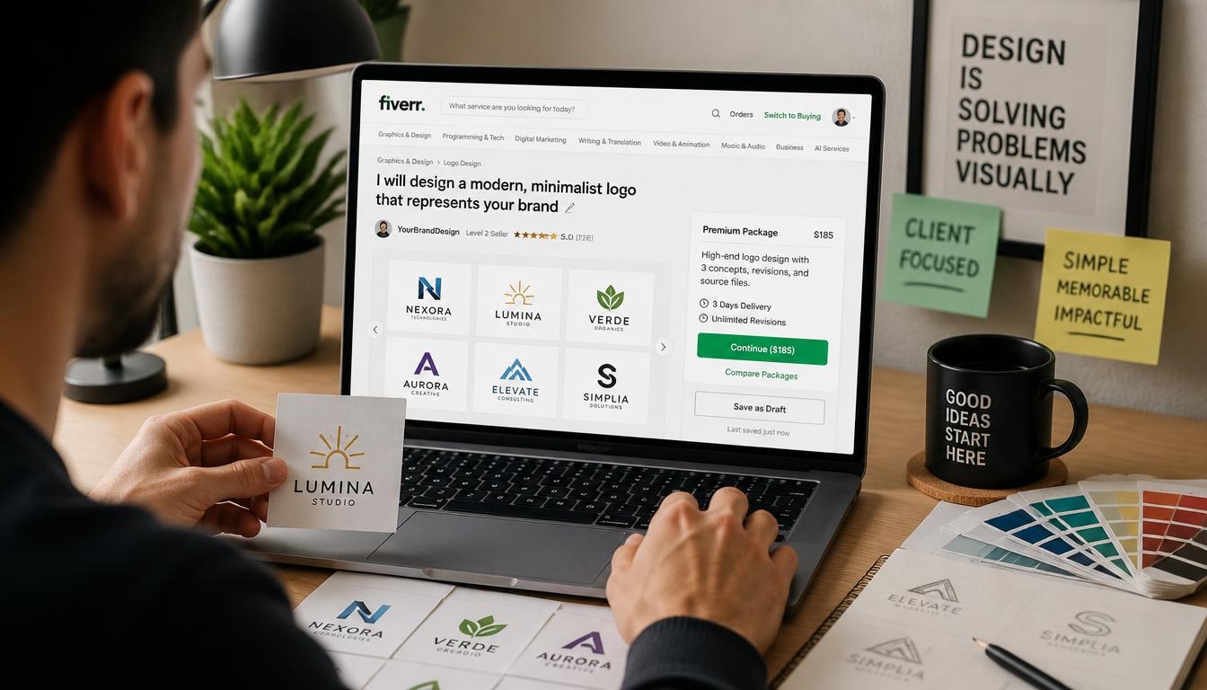
How to Create a Fiverr Gig That Attracts More Graphic Design Clients
Introduction
Thousands of designers join Fiverr every month. Most of them wait for orders that never come.
The problem is rarely talent. The problem is presentation. A well-built Fiverr gig turns a casual browser into a paying client in seconds.
In this guide, you will learn how to create a Fiverr gig that attracts more graphic design clients. We will cover research, titles, pricing, images, descriptions, and ongoing optimization.
Whether you design logos, social media posts, or full brand kits, the same principles apply. A strong Fiverr gig is clear, specific, and built around what buyers actually search for.
Let us start with the foundation.
Why a Well-Built Fiverr Gig Matters for Graphic Designers
Fiverr works like a search engine. Buyers type a request, and the platform ranks listings that match.
Your Fiverr gig is your storefront, your portfolio, and your sales pitch on a single page. If it fails to impress quickly, buyers move on.
A polished Fiverr gig does three jobs. It ranks in search, earns clicks, and converts visitors into orders.
Designers with optimized listings often enjoy steady orders while others struggle with zero impressions. The difference is strategy, not luck.
Treat every Fiverr gig as a small business page. Invest time in it, and it can work for you around the clock.

Step 1: Research the Market Before You Build Your Fiverr Gig
Do not start with design samples. Start with research.
Open Fiverr and search for your service. Try phrases such as “logo design,” “brand identity,” or “social media graphics.”
Study the top ten results. Note their titles, prices, thumbnails, and review counts. This shows what buyers already respond to.
Look for patterns. Do top sellers offer fast delivery? Do they use before-and-after images? Do their packages show clear differences?
Then look for gaps. If most sellers offer generic logos, perhaps nobody serves a specific niche like fitness brands or tech startups.
Your goal is not to copy. Your goal is to build a Fiverr gig that fills an unmet need or delivers something better.
Analyze Competitor Reviews
Read the reviews on top listings. Buyers often reveal what they loved or disliked.
Praise for fast replies tells you what to match. Complaints about unclear communication show where you can shine.
Reviews are free market research. Use them.
Find Your Niche
A clear niche makes your Fiverr gig easier to rank and easier to sell.
Instead of “I do graphic design,” try “I design minimalist logos for coffee shops.” Specific offers feel safer to buyers.
Pick a niche using three factors: your skills, buyer demand, and competition. The sweet spot is where all three meet.
Strong niche examples include:
- Minimalist logo design for startups
- Social media templates for small businesses
- Packaging design for food brands
- Brand style guides for freelancers
- YouTube thumbnails for content creators
Popular Graphic Design Ideas to Consider
If you are unsure what to sell, start with proven categories. Each can become its own Fiverr gig.
Logo design remains the biggest category. Businesses always need a visual identity, and many buyers want quick, affordable options.
Social media design is another strong choice. Brands need consistent posts, stories, and banners every week.
Brand style guides appeal to higher-budget clients. They pay for structure and long-term consistency.
Packaging, book covers, and infographics are smaller markets with less competition. They can reward specialists.
Choose the idea that fits your strengths, then shape one Fiverr gig around it before you add more.
Understand Buyer Intent
Buyers search with a goal in mind. Someone typing “modern logo for bakery” wants a finished logo, fast.
Match your Fiverr gig to that intent. Use the words buyers use, not industry jargon.

Step 2: Choose the Right Keywords for Your Fiverr Gig
Keywords connect your offer to buyer searches. Without them, even a beautiful listing stays invisible.
Start with Fiverr’s search bar. Type a service phrase and watch the autocomplete suggestions. These come from real buyer searches.
Collect five to ten phrases with clear buyer intent, such as “professional logo design” or “business card design.”
Choose one main keyword for each Fiverr gig. Then add supporting keywords naturally in the title, description, and tags.
Where to Place Keywords
Fiverr reads several parts of your listing. Place keywords where they matter most:
- The title
- The first lines of the description
- Your search tags
- Package names
- FAQ answers
Never stuff keywords. Awkward text hurts both ranking and trust. Write for humans first.
Use Long-Tail Phrases
Long-tail keywords are longer, more specific phrases. They face less competition and convert better.
For example, “vintage badge logo design” is easier to win than “logo design.” A focused Fiverr gig can capture these smaller searches quickly.
Once you gain reviews, expand toward broader terms.

Step 3: Write a Title That Makes Your Fiverr Gig Stand Out
Your title is the first thing buyers read. It must be clear and keyword-rich.
Fiverr titles start with “I will.” Keep that format, then describe the result you deliver.
Weak: “I will do graphic design.” Strong: “I will design a modern minimalist logo for your business.”
See the difference? The second title names the deliverable, the style, and the audience.
Title Writing Tips
- Put the main keyword near the start
- Be specific about the result
- Avoid all caps and odd symbols
- Stay within Fiverr’s character limit
- Speak to the buyer’s goal
Test different wording over time. Compare impressions and clicks to learn what works.
A sharp title makes your Fiverr gig easier to find and more tempting to click.

Step 4: Pick the Best Category and Tags for Your Fiverr Gig
Categories tell Fiverr where your listing belongs. The wrong placement means the wrong audience.
For most designers, the main category is Graphics & Design. Then choose a subcategory such as Logo Design, Social Media Design, or Brand Style Guides.
Select the subcategory closest to your main service. Do not choose a popular one just because it is crowded.
Use All Five Tags
Fiverr allows up to five search tags. Use every one of them.
Mix broad and specific tags. For example: logo design, minimalist logo, business logo, brand identity, modern logo.
Tags work like extra keywords. They help your Fiverr gig appear in related searches.
Complete Service Attributes
Fiverr also asks for details like file formats, style, and industry. Fill in every field.
Buyers use these filters to narrow results. If you skip them, your Fiverr gig may be filtered out.

Step 5: Build Smart Pricing Packages
Fiverr offers three tiers: Basic, Standard, and Premium. Use all three.
Packages guide buyers toward a decision. They also raise your average order value.
Basic Package
Keep Basic affordable. It should deliver a simple result, such as one logo concept with one revision.
This is your entry point. It lets new clients try your work with low risk.
Standard Package
Standard is where most buyers land. Add more concepts, extra revisions, and a source file.
Price it so the jump in value feels obvious.
Premium Package
Premium is for serious clients. Include brand guidelines, social media kits, or unlimited revisions.
Even if few buyers choose it, Premium makes Standard look like a better deal.
Pricing Strategy for New Sellers
New sellers should price competitively. Without reviews, trust is low.
Start slightly below the market average. After five to ten reviews, raise prices gradually.
Avoid pricing too low. Very cheap offers attract difficult clients and signal low quality.
Your Fiverr gig should communicate value, not desperation.
Set Realistic Delivery Times
Delivery time affects both ranking and buyer confidence. Fast delivery attracts urgent clients, but rushed work hurts quality.
Add a small buffer to every estimate. If you deliver early, buyers feel pleasantly surprised. If you often deliver late, your rating suffers.
Offer faster delivery as a paid extra for clients on tight deadlines.
Add Gig Extras
Extras let you earn more per order. Offer fast delivery, extra revisions, source files, or additional concepts.
Many clients add extras without hesitation. A well-planned Fiverr gig can double its order value this way.

Step 6: Design Images That Make Your Fiverr Gig Irresistible
Images decide whether buyers click. You are a designer, so your visuals must impress.
Fiverr lets you upload up to three images, one video, and PDF documents. Use every slot.
Create a Strong Thumbnail
The first image is your thumbnail. It appears in search results beside dozens of competitors.
Use a clean layout, bold text, and your best work. Show the result, not the process.
Add a short headline such as “Modern Logo Design” directly on the image. Keep the text large enough to read on a phone.
Choose colors that stand out in the search grid. Avoid clutter.
Apply Basic Design Principles
Use hierarchy, contrast, and white space. Limit yourself to two fonts. Align elements carefully and let one focal point lead the eye.
These basics help thumbnails read clearly at a very small size.
Test your images by shrinking them. If the message still reads, you are on track.
Show Variety in Your Gallery
Your second and third images should prove range. Show different styles, industries, or deliverables.
Consider a before-and-after image, a package overview, or a mockup of your work on real products.
Mockups matter. A logo on a shirt or storefront feels real and helps buyers imagine their own brand.
Follow Fiverr Image Rules
Use the recommended dimensions and avoid watermarks from other platforms. Do not include contact details.
Only upload original work. Plagiarized samples can get your account removed.
Great visuals can lift the click rate of any Fiverr gig.

Step 7: Write a Description That Turns Visitors into Buyers
Your description is where you close the sale. Write it clearly and keep it skimmable.
Open with a strong hook that speaks to the client’s problem. For example: “Need a logo that makes your business look professional from day one?”
Then explain what you offer and how it helps. Use simple words and short sentences.
Use a Proven Structure
A reliable structure keeps your description organized:
- A hook that names the problem
- A short intro about you and your skills
- What the buyer receives in each package
- Your process, step by step
- Why clients should choose you
- A clear call to action
Focus on Benefits, Not Just Features
Features describe what you do. Benefits explain why it matters.
Instead of “I provide three revisions,” say “You get three revisions so the final design feels exactly right.”
Benefits speak to emotion. Buyers purchase outcomes, not task lists.
Add Your Keyword Naturally
Mention your main keyword in the first two sentences. Then repeat related phrases a few times.
Do not force it. A natural, readable Fiverr gig description performs better than a stuffed one.
Use a Simple Description Template
Here is a template you can adapt:
Need a standout logo that makes your brand look professional? You are in the right place. I create clean, modern designs for startups and small businesses. With this Fiverr gig, you receive original concepts, quick communication, and files ready for print and web. Choose a package, send your brand details, and I will start right away. Message me first if you have questions.
Notice the structure: hook, offer, benefit, and call to action. Customize it so your Fiverr gig sounds like you.
End with a Clear Call to Action
Tell buyers what to do next. For example: “Message me before ordering and let’s discuss your project.”
An invitation lowers the barrier and starts a conversation.

Step 8: Add a Short Video to Strengthen Your Fiverr Gig
A video can build more trust than any text. It lets buyers see your work and hear your voice.
Keep it between 30 and 75 seconds. Introduce yourself, show samples, and explain how you work.
You do not need expensive gear. A phone, good light, and a quiet room are enough.
Screen recordings also work. Show how a logo comes together in Illustrator or Photoshop.
Use a Simple Video Outline
Open with your name and specialty. Show two or three samples. Explain your process in three steps. Finish by inviting buyers to message you.
Add captions so people can watch without sound. Many buyers browse on mobile in public places.
A good video makes your Fiverr gig feel more personal and professional.

Step 9: Use Your Portfolio to Back Up Your Fiverr Gig
Buyers want proof. Your portfolio is that proof.
Select five to ten of your best pieces. Quality beats quantity.
Show projects that match your niche. A logo designer should not fill the gallery with unrelated flyers.
If you have no client work yet, create practice projects. Design logos for fictional brands and present them professionally.
Present Work with Context
Add short captions explaining the problem, your approach, and the result.
Case-style presentation shows thinking, not just pixels. It reassures serious buyers.
Keep Your Portfolio Fresh
Update samples regularly. Old styles can make a Fiverr gig look outdated.
Remove weaker pieces as better ones arrive.

Step 10: Add FAQs and Requirements to Your Fiverr Gig
FAQs answer questions before buyers ask them. They also add keyword-rich content.
Include questions about revisions, file formats, delivery time, and commercial rights.
Example: “What files will I receive?” Answer: “You will receive PNG, JPG, and vector files, depending on your package.”
Set Clear Requirements
Requirements help you collect information after the order. Ask for the brand name, color preferences, style references, and target audience.
Clear requirements save time and reduce revisions. They also help your Fiverr gig look organized.
Avoid long questionnaires. Five to seven questions are enough.

Step 11: Communicate Like a Professional
Fast replies matter. Fiverr tracks your response rate and response time, and buyers notice them.
Reply within a few hours when possible. Use a friendly, confident tone.
Handle Pre-Order Messages
Many buyers send questions before ordering. Treat each one as a sales opportunity.
Answer clearly, ask about their project, and suggest the best package. Personal attention converts browsers into buyers.
Prepare saved replies for common questions. Fiverr offers a quick-response feature for this.
Manage Expectations
Be honest about timelines and limits. Never promise what you cannot deliver.
If a request goes beyond your package, explain it politely and offer a custom offer. Boundaries protect your time and your ratings.
Build Long-Term Relationships
Repeat clients are the most profitable. Save their brand details, deliver consistently, and check in after projects finish.
Offer discounted bundles for ongoing work such as monthly social media graphics. Loyal clients also refer friends, which brings free, high-quality leads.
Great communication turns one order into long-term work, and that growth starts with a trustworthy Fiverr gig.

Step 12: Deliver Great Work and Earn Reviews for Your Fiverr Gig
Reviews are the strongest trust signal on the platform.
Deliver on time, or earlier when you can. Late delivery harms your level and ratings.
Exceed expectations in small ways. Include an extra file format, a quick mockup, or a thank-you note.
Ask for Feedback Politely
After delivery, thank the client and invite an honest review. Do not beg or pressure.
A short, kind message is enough. Satisfied clients usually respond.
Handle Negative Feedback Gracefully
Not every order goes perfectly. If a buyer is unhappy, listen first.
Offer reasonable revisions and stay calm. Public responses to reviews should be professional and brief.
One difficult review will not ruin a strong Fiverr gig if the rest of your record is solid.

Understand Seller Levels and Grow Your Fiverr Gig Faster
Fiverr rewards consistent sellers with levels. Each level can bring perks such as higher visibility and more room to grow.
Requirements usually involve completed orders, earnings, ratings, response rate, and delivery rate. Because criteria can change, check Fiverr’s official page for current details.
Focus on the habits behind the levels. Reply fast, deliver on time, and keep clients happy.
Progress feels slow at first. Yet every completed order strengthens your Fiverr gig and your seller profile.

Step 13: Promote Your Fiverr Gig Beyond the Platform
Fiverr search brings traffic, but outside promotion can accelerate growth.
More views and orders can improve your ranking signals. Share your listing where your audience spends time.
Use Social Media
Post your designs on Instagram, Behance, Pinterest, and LinkedIn. Add a link to your Fiverr gig in your bio.
Share process videos and short tips. Educational posts build trust and attract followers who become clients.
Start a Blog or Website
A simple website or blog can bring search traffic from Google. Write guides about design topics your clients care about.
Link back to your Fiverr gig from relevant articles.
Join Communities
Participate in design groups and forums. Offer advice without spamming.
Follow each platform’s rules. Helpful members earn attention naturally.

Step 14: Track Performance and Optimize Your Fiverr Gig
Optimization never ends. Check your analytics regularly.
Review impressions, clicks, orders, and conversion rate. Each number tells a story.
Read the Numbers
Low impressions suggest keyword or category problems. Many impressions but few clicks point to weak titles or thumbnails.
Many clicks but few orders mean the description, pricing, or portfolio needs work.
Make One Change at a Time
Change a single element, then wait a couple of weeks. This shows what caused any shift.
Keep a simple log of edits and results. Over time, you will learn what your audience prefers.
Revisit Pricing and Packages
Raise prices after you gain ratings and a steady order flow. Add extras that clients request often. Retire options nobody picks.
Create Multiple Listings
Once your first listing succeeds, open more. Each additional Fiverr gig can target a different keyword, niche, or service.
Examples include logo design, business cards, social media kits, and brand guidelines. Several focused listings capture more searches than one general offer.
Do not clone listings. Fiverr discourages duplicate content, so write each Fiverr gig from scratch.

Fiverr Gig Ranking Factors: What the Algorithm Rewards
Fiverr does not publish its exact formula, but the patterns are clear.
Relevance comes first. Titles, tags, and descriptions must match what buyers search for.
Performance follows. Click-through rate, conversion rate, and order completion all matter.
Seller quality counts too. Response time, delivery rate, and reviews influence visibility.
Recent activity helps as well. Active sellers who update listings and complete orders tend to stay visible.
A new Fiverr gig starts with limited data, so be patient. Consistent effort builds momentum over the first few months.

Common Mistakes to Avoid When Creating a Fiverr Gig
Many designers repeat the same errors. Avoid these traps:
- Choosing a vague service that targets everyone
- Using low-quality or stolen samples
- Stuffing keywords into the title and description
- Ignoring messages for hours or days
- Underpricing so heavily that quality suffers
- Copying another seller’s text word for word
- Never updating the listing after launch
Vague services are the biggest trap. “I do everything” sounds like “I specialize in nothing.” Pick a lane and own it.
Low-quality samples come next. Buyers judge in seconds, and weak visuals end the conversation.
Slow replies cost orders. Many buyers message several sellers at once and hire whoever answers first.
Each mistake can quietly hold back a promising Fiverr gig.
Fix them early and your growth will feel much smoother.

A Simple 30-Day Launch Plan for a New Gig
Launching with a plan keeps you consistent. Here is a simple roadmap for a new Fiverr gig.
Week 1: Research and Build
Study competitors, choose your niche, and write your listing. Prepare your images and video.
Week 2: Publish and Promote
Go live and share your Fiverr gig on social media and with your network. Reply to every message quickly.
Week 3: Review and Adjust
Check impressions and clicks. Adjust the thumbnail or title if needed. Keep delivering great work.
Week 4: Collect and Expand
Request reviews, update your portfolio, and plan your next Fiverr gig.
Repeat this cycle every month. Small, steady improvements beat big, rare overhauls.

Quick Checklist Before You Publish Your Fiverr Gig
Run through this list before you hit publish:
- Your niche is clear and specific
- The title includes your main keyword
- All five tags are filled
- Three packages are set with clear differences
- Thumbnail and gallery images look sharp on mobile
- The description is skimmable and benefit-focused
- FAQs and requirements are complete
- Portfolio samples are original
If every box is checked, your Fiverr gig is ready to meet its first buyers.

Final Thoughts on Building a Fiverr Gig That Wins Clients
Creating a successful listing is a mix of research, design, and persistence.
Start with a clear niche. Choose keywords wisely, write a strong title, and build tiered packages. Support everything with great visuals and a trustworthy description.
Then keep improving. Communicate well, deliver quality, and gather reviews.
A great Fiverr gig does not appear overnight, but every improvement compounds.
Take action today. Open your dashboard, apply these steps, and launch your next Fiverr gig with confidence.

Frequently Asked Questions About Creating a Fiverr Gig
How many Fiverr gigs can I create at once?
Most sellers can run up to seven active listings, though limits may change with your seller level and platform updates. Check Fiverr’s current rules. Each Fiverr gig should target a different service or keyword.
How long does it take for a new Fiverr gig to get orders?
It varies widely. Some designers land an order within weeks, while others need a couple of months. Strong keywords, sharp visuals, and active promotion speed things up. Patience and steady optimization matter for every new Fiverr gig.
What is the best price for a graphic design Fiverr gig?
There is no single best price. Research competitors in your niche and start slightly below the average if you have no reviews. Raise prices as your ratings grow.
Do I need a video for my Fiverr gig?
Video is optional, but it often builds trust. A short, clear introduction can set your listing apart from similar offers.
How can I rank my Fiverr gig higher in search?
Use relevant keywords, a strong thumbnail, clear packages, fast replies, and on-time delivery. Collect reviews and promote your listing to increase views and orders.
Should I copy top sellers’ Fiverr gigs?
No. Study them for ideas, but write original text and use original samples. Copying risks penalties and weakens your brand.
How do I get my first client on Fiverr?
Offer competitive pricing, answer messages quickly, and share your Fiverr gig on social media. You can also invite friends or past contacts to try your service.
What file formats should I deliver?
Common formats include PNG, JPG, PDF, SVG, AI, and EPS. Offer source and vector files in higher packages.
How many revisions should I offer?
One or two in the Basic package and more in Standard and Premium is a common approach. Define revisions clearly so clients know what to expect.
Is Fiverr worth it for graphic designers?
For many designers, yes. It is a practical way to find clients without cold outreach. Success depends on your niche, quality, and consistency. A focused Fiverr gig can become a reliable income source.

7 Freelance Graphic Design Mistakes That Can Cost You Clients
Landing your first few clients feels amazing. Keeping them is a different story.
Many talented designers lose work, not because their art is weak, but because of avoidable habits. Small mistakes in communication, pricing, and process quietly push clients away.
If you run a Freelance Graphic Design business, every client relationship is an asset. One lost client means lost income, lost referrals, and lost momentum.
The good news is that these problems are fixable. Once you know what to look for, you can protect your reputation and build a steady pipeline.
In this guide, you will learn seven common Freelance Graphic Design mistakes and exactly how to avoid them. Each section includes practical steps you can apply this week.
Whether you are new to Freelance Graphic Design or have years of experience, you will probably spot at least one habit that needs attention. Let’s get into it.
Why Mistakes Matter So Much in Freelance Graphic Design
Clients rarely complain out loud. They simply stop replying, choose another designer, or never refer you to a friend.
That silence is expensive. Studies of small business behavior consistently show that winning a new customer costs far more than keeping an existing one.
In Freelance Graphic Design, your service is the product. Clients judge you on creativity, but also on reliability, clarity, and how easy you are to work with.
Think of every project as a job interview for the next one. That mindset is powerful in Freelance Graphic Design. Each email, invoice, and file delivery tells the client whether you are a safe long-term choice.
Fixing the seven mistakes below will help you look more professional, earn better rates, and keep clients coming back.

Mistake 1: Skipping the Client Brief and Discovery Process
The fastest way to waste time is to start designing before you understand the project. That is true across all Freelance Graphic Design work.
Many beginners in Freelance Graphic Design are so eager to impress that they open their software the moment a client says yes. The result is usually a wrong direction and endless revisions.
What This Mistake Looks Like
A client sends a short message: “Need a logo for my bakery, something modern.” You reply with a quote and start sketching.
Weeks later, the client says the design feels cold, because they wanted a warm, family-style brand. You never asked who their customers were.
Why It Costs You Clients
Without a clear brief, you are guessing. Guessing leads to missed expectations, and missed expectations lead to unhappy clients.
Revision rounds multiply. Your profit shrinks, your patience wears thin, and the client starts doubting your skills.
Professional Freelance Graphic Design depends on strategy first and visuals second. A client who feels understood trusts you more.
How to Fix It
Create a simple discovery questionnaire and send it before every project. Keep it short so clients actually complete it.
Include questions like these:
- What does your business do, and who is your ideal customer?
- Which three words describe your brand personality?
- Which competitors or brands do you admire, and why?
- Where will the design be used, such as print, web, or social media?
- What is the deadline, and who approves the final design?
Follow up with a short call if answers are vague. Ten minutes of conversation can save ten hours of rework.
Also ask the client to share examples they like and dislike. Visual references reveal taste much better than adjectives.
Finally, summarize the brief in writing and ask the client to confirm it. This one habit protects both sides.

A Real-World Example
Imagine two designers who receive the same request for a bakery logo. The first starts designing immediately and sends three random concepts. The second sends a questionnaire, learns that the owner wants a cozy, handmade feel, and delivers one focused concept.
The second designer wins the project and a long-term client. This simple difference explains why discovery matters so much in Freelance Graphic Design.
Clients do not remember how many hours you spent. They remember whether you understood them.
Questions Worth Asking Every Time
Some questions uncover hidden expectations. Ask about budget range, brand values, and past design experiences. Ask what success looks like in six months.
These answers shape your creative decisions and help you justify your choices later. They also show that your Freelance Graphic Design process is organized and thoughtful.
If a client refuses to answer, explain that the brief protects their budget. Most will cooperate once they see the benefit.
Quick Takeaway
Never design blind. A strong brief is the foundation of every successful Freelance Graphic Design project and the easiest way to prevent revision headaches.
Mistake 2: Underpricing Your Work (or Not Knowing Your Worth)
Pricing is where many designers struggle most. Charging too little feels safe, but it often backfires. In Freelance Graphic Design, pricing mistakes are a common reason talented designers quit.
What This Mistake Looks Like
You quote a very low price to win the job. The client says yes immediately, which should be a warning sign.
Soon you are working long hours for a rate that barely covers your software subscriptions, taxes, and time.
Why It Costs You Clients
Low prices attract clients who value cheap work. These clients tend to demand more revisions, pay late, and leave when they find someone cheaper.
Underpricing also signals low confidence. Serious businesses often assume that a very low quote means low quality.
In Freelance Graphic Design, burnout is a real risk. When you are underpaid, you rush, your quality drops, and clients notice.
How to Fix It
Start by calculating your real costs. Add up software, equipment, internet, taxes, health expenses, and unpaid time for admin work.
Then decide the income you want. Divide that figure by the number of billable hours you can realistically work.
Here are practical ways to set prices with confidence:
- Use project-based pricing for clearly defined work like logos and brochures.
- Use hourly or retainer pricing for ongoing support and unclear scopes.
- Offer three packages, such as Basic, Standard, and Premium, so clients can choose.
- Raise your rates every six to twelve months, especially when your skills grow.
Do not apologize for your price. State it calmly and explain the value, including the outcome, the process, and what is included.
Clients pay for results, not hours. A logo that helps a business look trustworthy is worth far more than the time spent drawing it.

A Simple Pricing Example
Suppose you want to earn a modest monthly income and can realistically bill 80 hours each month. Divide your target by those hours, and you get your true hourly rate.
Many beginners skip this math, then wonder why Freelance Graphic Design feels exhausting. A little arithmetic can reveal that your current prices are far too low.
How to Talk About Price Confidently
When a client says your quote is too high, do not rush to discount. Ask which part of the project concerns them most.
Offer to adjust the scope instead of the price. Remove a deliverable, reduce the number of concepts, or extend the timeline. This keeps your rate intact and respects the client’s budget.
Confident pricing conversations are a core skill in Freelance Graphic Design, and they get easier with practice. Over time, you will attract clients who see your rates as fair.
Quick Takeaway
Fair pricing builds respect. Successful Freelance Graphic Design professionals price for value, protect their time, and attract clients who appreciate quality.
Mistake 3: Working Without a Contract or Clear Scope
A handshake and a friendly email are not enough. Without a contract, you are exposed. Every serious Freelance Graphic Design business needs written terms.
What This Mistake Looks Like
The client asks for a “small change.” Then another. Then a new version for Instagram, a banner for the website, and a brochure.
None of this was in the original quote, but nothing in writing says it was excluded. This problem is called scope creep.
Why It Costs You Clients
Scope creep creates resentment. You feel taken advantage of, and the client feels you are being difficult when you finally push back.
Disputes over payment, ownership, and deadlines can end the relationship overnight. In some cases, you may never get paid.
Contracts make Freelance Graphic Design safer and more professional. They show that you run a real business and respect the client’s investment.
How to Fix It
Use a simple written agreement for every project, no matter how small. It does not need to be filled with legal jargon.
A strong contract usually covers the following:
- A detailed description of deliverables and file formats.
- The number of included revision rounds.
- The timeline, milestones, and approval process.
- Total fees, deposit, and payment schedule.
- Ownership and usage rights after final payment.
- A clause for extra work, cancellations, and late fees.
Always request a deposit, commonly 30 to 50 percent, before starting. This confirms commitment and protects your time.
When the client asks for something outside the scope, respond politely. Say, “I’d be happy to help with that. Here is a quick quote for the additional work.”
This approach keeps the relationship friendly while protecting your income. If a project is large or complex, consider asking a lawyer to review your template once.

Contract Red Flags to Watch For
Some clients hesitate to sign anything. Others ask you to start work before agreeing on terms. Treat these moments as warning signs.
A client who respects your time will respect a contract. If someone pushes back on basic protections, consider whether the project is worth the risk in your Freelance Graphic Design business.
Payment Terms That Protect You
Use milestone payments for larger projects. For example, collect a deposit upfront, a second payment after concept approval, and the final payment before releasing source files.
Add a late fee to your invoices and state the due date clearly. Strong payment terms are one of the simplest ways to make Freelance Graphic Design sustainable.
Never hand over final files until payment is complete. This single rule prevents many headaches.
Quick Takeaway
A clear scope prevents arguments. In Freelance Graphic Design, the contract is your safety net, and good clients appreciate the clarity.
Mistake 4: Poor Communication and Slow Responses
Great design cannot save a project when the client feels ignored. In Freelance Graphic Design, silence is costly.
What This Mistake Looks Like
An email sits unanswered for three days. The client asks for an update, and you reply with a vague “working on it.”
Deadlines pass without warning. The client learns about delays only after asking.
Why It Costs You Clients
Most clients are not experts in design, so they judge you by how you communicate. Silence creates anxiety, and anxiety creates doubt.
Many clients say they would hire a slightly less talented designer who communicates well over a genius who disappears.
Reliable communication is a major competitive advantage in Freelance Graphic Design, because so many competitors fail at it.
How to Fix It
Set expectations from day one. Tell clients your working hours, your usual reply time, and your preferred communication channel.
Try these simple habits:
- Reply to messages within one business day, even if only to confirm receipt.
- Send a short progress update at each milestone.
- Warn the client early if a delay is possible, and offer a new date.
- Summarize calls in an email so decisions are documented.
- Keep all feedback in one thread or project tool to avoid confusion.
Use tools to stay organized. Project boards, shared folders, and proofing tools make feedback clear and traceable.
Be honest when problems appear. Clients forgive delays far more easily than surprises.
Tone matters too. Stay warm, concise, and professional, even when feedback feels harsh. A calm reply protects the relationship.

Setting Communication Boundaries
Being responsive does not mean being available at all hours. Share your working schedule and stick to it.
Clear boundaries make your Freelance Graphic Design services feel more professional, not less. Clients respect designers who manage their time well.
Handling Difficult Conversations
Sometimes you must deliver unwelcome news, such as a missed deadline or a request that exceeds the scope. Address it quickly and offer a solution.
Use a simple formula: state the issue, explain the impact, and propose the next step. This approach shows accountability and keeps trust intact.
Practicing honest communication will strengthen every part of your Freelance Graphic Design career, from small projects to large retainers.
Quick Takeaway
Communication is part of the service. Strong communicators turn one-time projects into long-term partnerships.
Mistake 5: Ignoring Your Portfolio and Personal Branding
Your portfolio is your sales page. If it is weak, outdated, or confusing, clients will move on within seconds. Freelance Graphic Design clients hire what they can clearly see.
What This Mistake Looks Like
Your website shows thirty random projects with no explanation. Some are school assignments, some are old, and some do not match the clients you want.
Your social profiles use different names, colors, and bios. Nobody can tell what you specialize in.
Why It Costs You Clients
Clients want proof that you can solve their kind of problem. A messy portfolio makes them unsure whether you can.
Generalists often compete on price, while specialists compete on expertise. A focused brand helps you charge more.
For Freelance Graphic Design, your own branding is the best demonstration of your skills. If your brand looks careless, clients assume your client work will too.
How to Fix It
Curate your portfolio. Show your best six to ten projects rather than everything you have ever made.
Turn each project into a short case study. Explain the client’s problem, your process, and the result.
Include these elements in each case study:
- The brief and goals.
- Your design decisions and why you made them.
- Before-and-after visuals or mockups.
- Measurable results, such as increased sales or engagement.
- A short testimonial from the client.
Choose a niche if you can, such as restaurants, startups, or healthcare. A clear niche makes marketing easier and referrals more likely.
Make sure your website loads fast, looks good on mobile, and includes a clear call to action. Add an easy contact form and an About page with your photo and story.
Keep your visual identity consistent across your portfolio, LinkedIn, Instagram, and Behance. Repeat the same name, tone, and style.

Where to Show Your Work
Do not rely on a single platform. Build your own website as a home base, then use social media and portfolio communities to drive traffic to it.
Share process posts, behind-the-scenes sketches, and client wins. These show how you think, which matters as much as the final design in Freelance Graphic Design.
Positioning Yourself Clearly
Write a one-sentence statement describing who you help and how. For example: “I design clean, friendly branding for local cafes and bakeries.”
A clear message helps search engines, social algorithms, and potential clients understand you. It also makes your Freelance Graphic Design services easier to recommend.
Update your portfolio at least twice a year, and remove work that no longer reflects your standard.
Quick Takeaway
Treat your portfolio like a product. A focused, professional presence helps Freelance Graphic Design clients choose you with confidence.
Mistake 6: Not Setting Revision Limits and Feedback Rules
Unlimited revisions sound generous, but they quietly destroy profit and relationships. This is a classic Freelance Graphic Design trap.
What This Mistake Looks Like
A client keeps asking for small tweaks: move the logo left, try another blue, make the text bigger, then bring back the first version.
Each round takes time, yet your fee stays the same. After the tenth round, you dread opening their emails.
Why It Costs You Clients
Endless revisions drain energy. You may start to resent the client, and the work quality suffers.
Clients may also feel stuck in a loop where nothing is ever finished. Projects drag on, and satisfaction drops for everyone.
Structure is essential in Freelance Graphic Design. Without it, feedback turns into opinion battles instead of progress.
How to Fix It
Include a fixed number of revision rounds in every proposal, commonly two or three. Explain that extra rounds are billed at your hourly rate.
Guide the feedback process, too. Ask clients to collect all comments from every stakeholder and send them together.
Teach clients how to give useful feedback:
- Refer to the project goals instead of personal taste.
- Be specific about what to change and why.
- Prioritize the biggest issues first.
- Avoid sending contradictory comments from different people.
Present your work with confidence. Explain your reasoning, so the client understands why you chose certain colors, fonts, and layouts.
Share work in stages, such as sketches, rough concepts, and final polish. Early approval prevents big changes at the end.
When a client goes beyond the agreed rounds, stay polite. Offer a fair quote and let them decide. Most reasonable clients understand.

Building a Feedback Process
Create a simple feedback form or checklist for clients. Include fields for what they like, what they would change, and how important each change is.
Structured feedback saves time and reduces emotional reactions. It also makes your Freelance Graphic Design workflow predictable.
When Clients Give Conflicting Feedback
If several people comment on one design, ask the main contact to consolidate and prioritize. Never try to satisfy every opinion at once.
Remind everyone of the original goal. A design succeeds when it solves the problem, not when it pleases every person in the room. Teaching this idea is part of being a professional in Freelance Graphic Design.
Quick Takeaway
Boundaries protect creativity. Limited revisions and guided feedback keep Freelance Graphic Design projects efficient and enjoyable.
Mistake 7: Neglecting Follow-Ups, Delivery, and Client Retention
Many designers disappear the moment the final files are sent. That is a missed opportunity. Retention is where Freelance Graphic Design income becomes stable.
What This Mistake Looks Like
You email a zip file, say “Thanks!” and move on. The client opens the files and finds missing fonts, confusing names, and no guidance on usage.
Months later, they need new materials, but they do not remember your name, so they search for a new designer.
Why It Costs You Clients
Poor delivery leaves a bad last impression, and the last impression is what clients remember.
Without follow-up, you lose repeat business and referrals. Repeat clients are cheaper to serve and usually pay better.
Strong retention is the secret behind sustainable Freelance Graphic Design careers. A handful of loyal clients can support a full income.
How to Fix It
Deliver files in an organized folder with clear names. Include versions for web, print, and social media where relevant.
Add a short style guide or usage notes. Explain logo spacing, color codes, and recommended fonts.
Consider including a final checklist:
- Final files in the formats promised in the contract.
- Source files, if they are part of the agreement.
- Font licenses or links.
- A one-page brand guide.
- An invoice with clear payment instructions.
Send a thank-you message and ask for a testimonial. Positive reviews are powerful social proof for future clients.
Follow up after two or four weeks. Ask how the design is working and whether they need anything else.
Stay in touch gently. Share a useful tip, a seasonal offer, or a new case study every few months.
Offer retainers for ongoing needs like social graphics, newsletters, and presentations. Retainers provide predictable income and deeper partnerships.
Ask satisfied clients for referrals. A simple “Do you know anyone who could use a designer?” can bring in your next project.

Turning Clients Into Advocates
Happy clients often forget to recommend you unless you ask. Make it easy by sending a short message with a link to your testimonial page or review profile.
Offer a small thank-you for referrals, such as a discount on their next project. Referral programs are low-cost marketing for Freelance Graphic Design professionals.
Creating a Client Care Routine
Set reminders in your calendar to check in with past clients. A simple quarterly message can keep you top of mind.
Mention a recent project, share a relevant idea, and invite them to reach out if they need help. This routine makes Freelance Graphic Design feel more like a partnership than a transaction.
Quick Takeaway
The relationship does not end at delivery. In Freelance Graphic Design, follow-up turns satisfied clients into repeat customers and referral partners.
Warning Signs a Client Is About to Leave
Clients rarely announce that they are unhappy. They show it through small changes in behavior.
Watch for slow replies, shorter messages, or sudden requests for discounts. Notice when a client stops sharing new projects or starts asking about your competitors.
Another sign is vague feedback such as “It just doesn’t feel right.” This often means the original goals were never clear.
Act early. Schedule a quick call, ask what is not working, and listen without defending yourself. Many problems in Freelance Graphic Design can be solved with one honest conversation.
Send a short check-in survey after each project. Ask clients to rate communication, quality, and timing from one to five, and invite comments.
Review these responses regularly to spot patterns. If several clients mention the same issue, you have found a process problem worth fixing.
Treat every warning sign as free consulting. Strong Freelance Graphic Design businesses learn from small signals before they become lost contracts.

How to Recover After Losing a Client
Even careful designers lose clients sometimes. What matters is how you respond.
Start by staying professional. Thank the client for the opportunity, deliver any remaining files, and settle the final invoice politely.
Then ask for honest feedback. A short message such as “I’d love to learn how I could improve” can reveal useful lessons.
Do not take criticism personally. In Freelance Graphic Design, every lost project is data that helps you refine your process.
Review the project from start to finish. Was the brief unclear? Was the price mismatched? Did communication slip at a key moment?
Write down what you learn and update your templates. Over time, your Freelance Graphic Design system becomes stronger and your losses become fewer.
Finally, leave the door open. Some clients return months later when their needs change, and a gracious exit makes that much more likely.
A 30-Day Action Plan to Fix These Mistakes
Reading advice is easy. Applying it is what changes your income. Use this simple plan to improve step by step.
Week 1: Discovery and pricing. Create your client questionnaire and calculate your true hourly rate. Update your price list and package options. These two changes alone can transform your Freelance Graphic Design results.
Week 2: Contracts and scope. Write or refine your contract template and your revision policy. Prepare a standard deposit invoice. Strong paperwork makes Freelance Graphic Design calmer and safer.
Week 3: Communication and portfolio. Set your working hours and reply rules. Then rewrite two portfolio projects as case studies with clear goals and results.
Week 4: Delivery and follow-up. Build a delivery folder template and a short style guide. Write a thank-you email and a testimonial request. Schedule check-ins with your past clients.
At the end of the month, review your progress. You will likely notice smoother projects and more confident conversations.
Keep refining the system every quarter. Consistent small upgrades are how Freelance Graphic Design careers grow into reliable businesses.

Tools That Make Professional Work Easier
The right tools reduce mistakes and save time. You do not need expensive software to get started.
Use a proposal and invoicing tool to send professional quotes and track payments. Add e-signature software so clients can approve contracts in minutes.
A project management board helps you track tasks, deadlines, and feedback. A proofing tool lets clients comment directly on your designs, which keeps revisions organized.
Cloud storage with shared folders makes delivery simple. Template libraries for emails and contracts save hours every month.
Choose a small set of tools you will actually use. A simple system you follow beats a complex system you ignore.
When your tools support your process, Freelance Graphic Design becomes more efficient, and you can focus on creative work.

Common Myths About Freelance Graphic Design
Some beliefs quietly hold designers back. Let’s clear up a few of them.
Myth 1: Talent alone wins clients. Talent opens the door, but reliability keeps it open. Clients in Freelance Graphic Design value process as much as creativity.
Myth 2: Lower prices win more work. Low prices win the wrong work. Premium Freelance Graphic Design clients look for confidence and clarity.
Myth 3: Contracts scare clients away. Professional clients expect them. A contract makes Freelance Graphic Design feel safe for both sides.
Myth 4: Marketing is only for beginners. Even busy designers need steady visibility. Successful Freelance Graphic Design businesses market all year.
Myth 5: Saying no is bad for business. Saying no to bad-fit projects protects your time for better ones. Smart Freelance Graphic Design professionals choose clients carefully.
Replacing these myths with better habits will make your Freelance Graphic Design business calmer and more profitable.
Your Final Pre-Project Checklist
Before you accept any new project, run through this short list:
- Is the brief written and confirmed?
- Does the price reflect the true workload?
- Is the contract signed and the deposit paid?
- Are revision rounds and deadlines clear?
- Do you know how and when you will communicate?
If you can answer yes to all five, your Freelance Graphic Design project is set up for success.
Print this list or save it in your project template. Repeating it every time turns good intentions into a reliable Freelance Graphic Design routine.
Why Fixing These Mistakes Pays Off
Every improvement you make compounds over time. Better briefs reduce revisions, and better pricing increases income.
Clear contracts protect your cash flow, and consistent communication builds trust. A strong portfolio brings in higher-quality leads.
Together, these upgrades change how clients see you. You stop looking like a hobbyist and start looking like a trusted partner in Freelance Graphic Design.
That shift lets you raise rates, choose better projects, and work with less stress. It is the difference between chasing work and being chosen.
Long-term success in Freelance Graphic Design comes from systems, not luck. Build yours one habit at a time.
Bonus Tips to Build a Stronger Freelance Business
Avoiding mistakes is only half the equation. You also need habits that attract better clients.
Here are a few extra ideas:
- Systemize your workflow with templates for proposals, invoices, and emails.
- Keep learning new tools, trends, and design principles.
- Track your time to understand which projects are profitable.
- Network with other designers, copywriters, and developers.
- Ask for feedback after each project and improve your process.
Automation helps too. Scheduling tools, invoicing software, and project dashboards give you more time to design.
Remember to look after yourself. A rested, healthy designer produces better work and communicates better. Self-care is part of sustainable Freelance Graphic Design.
Over time, these habits make Freelance Graphic Design more stable, profitable, and enjoyable.

Conclusion
Losing clients is rarely about talent. It is usually about process, pricing, and professionalism. In Freelance Graphic Design, those three things decide who thrives.
Let’s recap the seven mistakes: skipping the brief, underpricing your work, working without a contract, communicating poorly, ignoring your portfolio, allowing endless revisions, and neglecting follow-up.
Each one is fixable with simple systems. You do not need to change everything overnight.
Pick one mistake to tackle this week. Perhaps you will write a discovery questionnaire, or update your contract template.
As you improve, you will notice happier clients, smoother projects, and better income. That is the real reward of professional Freelance Graphic Design.
Clients remember how you make them feel. Treat them with clarity, respect, and reliability, and they will return with new projects and send friends your way.
Start applying these lessons today, and watch your reputation grow.
Frequently Asked Questions (FAQs)
- What is the biggest mistake in Freelance Graphic Design?
The most damaging mistake is starting without a clear brief. Misunderstood expectations cause revisions, delays, and frustrated clients. A short discovery process prevents most of these problems.
- How much should I charge for Freelance Graphic Design services?
Your rate depends on your experience, niche, and market. Calculate your expenses and desired income first, then set project-based or hourly prices that reflect your value. Review your rates regularly.
- Do I really need a contract for small projects?
Yes. Even small jobs can lead to payment disputes or scope creep. A simple one-page agreement covering deliverables, revisions, payment, and ownership is enough.
- How many revisions should I include?
Two or three rounds are standard for most projects. Clearly state this in your proposal and charge for additional rounds so your time stays protected.
- How can I find better clients as a freelancer?
Build a focused portfolio, choose a niche, and share case studies. Ask for referrals, use professional networks, and communicate clearly. Quality clients are attracted to confident, reliable designers. That is the heart of successful Freelance Graphic Design.
- How do I keep clients coming back?
Deliver organized files, follow up after the project, and offer ongoing support. Retainers, helpful check-ins, and fast communication encourage repeat business. These habits keep Freelance Graphic Design work steady.
- Is Freelance Graphic Design a good career?
It can be. It offers flexibility and strong earning potential when you price correctly, market yourself well, and maintain professional systems.
-

 Graphics Design3 years ago
7.Exploring the Importance of Color Theory Charts
-

 Graphics Design1 year ago
Top 10 Best Graphic Design Tools for Beginners in 2025 (Free & Paid)
-

 Graphics Design2 years ago
10 Stunning Gradient Design Trends You Need to Know in 2024
-

 Graphics Design1 year ago
15 Freelance Graphic Design Tips to Boost Your Career in 2025
-

 Graphics Design2 years ago
29.Retro Design Is Making a Comeback in Modern Spaces
-

 Graphics Design1 year ago
Best Laptops for Graphic Designers – 2025 Buying Guide
-

 Graphics Design2 years ago
2025 Logo Design Trends: What’s In, What’s Out?
-

 Graphics Design3 years ago
15.The Importance of Effective Flyer Design in Marketing
Pingback: Adobe Illustrator Tutorial for Beginners: 25 Powerful Skills to Master in 2026 - The Designing Fashion