
Graphics Design
Adobe Firefly for Beginners: Complete Guide to AI Design in 2026

Adobe Firefly for Beginners: Complete Guide to AI Design in 2026
If you have ever stared at a blank canvas wishing you had a design team on standby, this guide on Adobe Firefly for Beginners is exactly what you need. Adobe Firefly has become one of the most talked-about AI creative tools of 2026, and it is no longer just a novelty for tech enthusiasts. It is now a genuine production tool used by marketers, students, small business owners, YouTubers, and professional designers alike. This complete Adobe Firefly for Beginners guide walks you through everything from account setup to advanced generative features, so you can start creating stunning visuals today, even if you have never opened a design app in your life.
By the end of this Adobe Firefly for Beginners article, you will understand exactly how the platform works, which plan suits your needs, how to write prompts that actually produce great results, and how Firefly fits into the wider Adobe Creative Cloud ecosystem. Let’s get started.
What Is Adobe Firefly?
Adobe Firefly is Adobe’s family of generative AI models built directly into Creative Cloud. Unlike many AI image generators that exist as standalone apps disconnected from real design workflows, Firefly was designed from day one to slot into tools that millions of creators already use, including Photoshop, Illustrator, Premiere Pro, and Adobe Express. For anyone following this Adobe Firefly for Beginners guide, the most important thing to understand is that Firefly is not a single tool but an entire suite of AI-powered capabilities: text-to-image generation, generative fill, generative expand, text effects, generative recolor for vectors, and, as of 2026, expanded video and 3D generation tools.
Adobe trained Firefly primarily on Adobe Stock images, openly licensed content, and public domain material, which is a major selling point for professionals who need commercially safe assets. This is one of the biggest reasons brands and agencies trust Firefly over some competitor tools, and it is a detail every beginner should know early in their Adobe Firefly for Beginners journey.

Why Adobe Firefly for Beginners Guides Matter in 2026
The design landscape has shifted dramatically. In 2026, AI-assisted creativity is not optional for many careers; it is expected. Employers, clients, and social media algorithms all reward fast, high-quality visual content. That is precisely why so many people are searching for a reliable Adobe Firefly for Beginners resource. Firefly lowers the barrier to entry for high-quality design work, letting anyone with a decent idea and a bit of patience produce assets that once required years of training in traditional software.
Another reason Adobe Firefly for Beginners searches have spiked is Adobe’s continuous rollout of new features throughout 2025 and into 2026, including more realistic human generation, improved lighting control, and deeper integration with Firefly Boards for moodboarding. Beginners who start now are getting in early on a tool that is only going to become more central to creative workflows going forward.
Getting Started: Creating Your Adobe Account
The first practical step in any Adobe Firefly for Beginners journey is setting up your account. Firefly is accessible through a free Adobe ID, which you can create in a couple of minutes using an email address or an existing Google or Apple account. Once your account is active, you can access Firefly directly through firefly.adobe.com, or through the Firefly panel embedded inside Photoshop and Illustrator if you already subscribe to Creative Cloud.
Free accounts come with a monthly allowance of generative credits, which is more than enough for a beginner to experiment with text-to-image generation, generative fill, and text effects. As you progress through this Adobe Firefly for Beginners guide, you will notice that credits are the currency that powers every generative action, so understanding how they work early on will save you frustration later.

Understanding the Adobe Firefly Interface
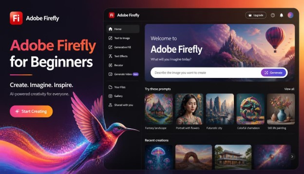
When you first log in, the interface can feel a little overwhelming, but once you understand the layout, it becomes second nature. The homepage is organized into modules: Text to Image, Generative Fill, Generative Expand, Text Effects, Generative Recolor, and newer additions like Firefly Video and Firefly 3D. Each module has its own dedicated workspace with a prompt bar, style controls, and a gallery of your generation history.
For anyone working through an Adobe Firefly for Beginners tutorial for the first time, the left-hand sidebar is where you will spend most of your time adjusting settings such as aspect ratio, content type (photo, art, or graphic), and reference images. On the right side, you will find generated results displayed as a grid, typically four variations per prompt, which you can download, edit further, or send directly into Photoshop for refinement.

Text to Image: Your First Adobe Firefly for Beginners Project
The Text to Image tool is usually the first feature new users try, and it is a perfect starting point for anyone following an Adobe Firefly for Beginners approach. You simply type a description of what you want to see, and Firefly generates four image options within seconds. For example, typing “a cozy coffee shop interior with warm lighting and wooden furniture, photorealistic” will produce a set of realistic interior shots you can use for blog posts, mockups, or social content.
The key skill to develop here is prompt writing. Vague prompts produce vague results. Specific prompts that include subject, setting, lighting, mood, and style consistently outperform short, generic ones. This is one of the most repeated tips across every serious Adobe Firefly for Beginners resource because it genuinely makes the biggest difference in output quality. You can also adjust the “Content Type” toggle between Photo, Art, and Graphic to steer the overall aesthetic before you even submit a prompt.
Generative Fill: Editing Like a Professional
Generative Fill is arguably Firefly’s most impressive feature, and it deserves a dedicated section in any Adobe Firefly for Beginners guide. Available inside Photoshop and on the Firefly web app, Generative Fill lets you select a portion of an image and either remove unwanted elements, replace them, or add entirely new objects that blend seamlessly with the existing scene, matching lighting, shadows, and perspective automatically.
Imagine you have a product photo with a distracting background object. With Generative Fill, you simply select that object with the lasso or marquee tool, type a short instruction like “remove,” and Firefly intelligently reconstructs the background as if the object was never there. Beginners often use this feature to clean up product photography, extend backgrounds for social media banners, or swap out elements in a composition without needing advanced photo manipulation skills.

Generative Expand: Extending Your Canvas Intelligently
Generative Expand solves a problem every designer has faced: an image that is the wrong aspect ratio for the platform you need. Instead of cropping and losing important content, Generative Expand uses AI to intelligently extend the edges of an image, filling in new background detail that matches the original scene convincingly. For someone working through an Adobe Firefly for Beginners curriculum, this tool is invaluable when repurposing a single hero image across Instagram, YouTube thumbnails, website banners, and print materials, all of which require different dimensions.
To use it, open an image in Photoshop, select the Crop tool, drag the canvas boundary outward in the direction you want to expand, and let Firefly fill in the gap. The results are often so seamless that viewers cannot tell where the original photograph ends and the AI-generated portion begins.
Text Effects: Turning Words into Art
Text Effects is a playful but genuinely useful part of the Firefly suite, letting you type a word or short phrase and apply AI-generated textures, materials, and styles to it instantly. Think flaming letters, crystal typography, leafy green text, or metallic chrome lettering, all generated from a simple prompt. Many people discovering Adobe Firefly for Beginners content online first get hooked on Firefly specifically because of how fun and immediate Text Effects feels.
This feature is particularly popular among content creators designing YouTube thumbnails, event posters, and social media headers, where eye-catching typography can make or break click-through rates. You control the font, the effect style, and even background transparency, making it simple to export a polished text graphic in under a minute.

Generative Recolor: A Game-Changer for Vector Work
If you work with vector graphics in Illustrator, Generative Recolor is a feature you will come to rely on constantly. It allows you to take an existing vector illustration and generate entirely new color palettes based on a text prompt, such as “autumn sunset tones” or “pastel spring colors,” without manually adjusting a single swatch. This is a huge time-saver for beginners who are still learning color theory, since Firefly does the heavy lifting of producing harmonious palettes automatically.
Anyone serious about mastering Adobe Firefly for Beginners techniques inside Illustrator should spend real time experimenting with Generative Recolor, because it dramatically speeds up the process of creating multiple branded variations of the same illustration for different campaigns or seasonal content.
Adobe Firefly Video: The 2026 Breakthrough
One of the biggest updates covered in every updated Adobe Firefly for Beginners resource this year is Firefly’s expanded video generation capability. In 2026, Firefly Video allows users to generate short video clips from text prompts, extend existing footage, apply generative camera movements, and even change backgrounds within existing video clips using the same generative technology that powers image editing.
For beginners, this opens up entirely new creative possibilities without needing a full production crew. You can generate atmospheric B-roll, create motion graphics backgrounds, or extend a static shot into a few seconds of subtle camera movement. While video generation still requires more credits and processing time than image generation, the quality improvements throughout 2025 and 2026 have made it genuinely usable for real projects, not just experiments.

Firefly Inside Photoshop, Illustrator, and Express
A defining strength that every Adobe Firefly for Beginners guide should emphasize is how deeply Firefly is woven into the broader Creative Cloud ecosystem rather than existing as an isolated app. Inside Photoshop, you get Generative Fill and Generative Expand built directly into familiar tools like the selection and crop tools. Inside Illustrator, Generative Recolor and Text to Vector Graphic tools appear right in the properties panel. Inside Adobe Express, Firefly powers templates, background removal, and one-click design generation aimed specifically at non-designers and small business owners.
This integration means that once you understand the basics through an Adobe Firefly for Beginners approach on the standalone web app, those same skills transfer directly into professional-grade software, making your learning curve far shorter than switching between unrelated tools.
Writing Better Prompts: The Core Skill for Every Beginner
No Adobe Firefly for Beginners guide would be complete without a deep dive into prompt writing, since it is genuinely the single most important skill for getting great results. A strong prompt generally includes four elements: the subject, the setting or background, the lighting or mood, and the style or medium. For example, instead of typing “a dog,” try “a golden retriever puppy sitting in a sunlit meadow, soft natural lighting, photorealistic style.”
Beginners following this Adobe Firefly for Beginners advice should also experiment with negative direction by specifying what to avoid, adjusting the aspect ratio to match their intended platform, and using reference images through the “Match” style feature to guide color and composition. Small adjustments in wording often produce dramatically different outputs, so treat your first few prompts as drafts rather than final attempts.

Adobe Firefly Pricing Plans Explained
Understanding pricing is a practical necessity in any Adobe Firefly for Beginners guide, since generative credits determine how much you can actually create each month. Adobe offers a free tier with a limited monthly credit allowance, ideal for casual experimentation. Above that sits the Firefly Standard and Firefly Premium plans, which unlock significantly higher credit limits, priority generation speed, and access to the latest models as soon as they are released.
For users who already subscribe to Creative Cloud plans like the Photography plan or the All Apps plan, Firefly credits are often bundled in automatically, meaning many beginners already have access without realizing it. Before committing to a paid plan, it is worth using the free tier extensively to understand your typical monthly usage, since credit consumption varies significantly depending on whether you are mostly generating images, videos, or using generative editing features inside Photoshop.
Common Mistakes Beginners Make with Adobe Firefly
Even with a strong Adobe Firefly for Beginners foundation, new users tend to repeat a handful of avoidable mistakes. The first is writing overly short, vague prompts and expecting professional results. The second is ignoring aspect ratio settings before generating, which leads to unnecessary cropping later. The third is not exploring the style and lighting presets available in the sidebar, which can dramatically improve output quality with almost no extra effort.
Another common mistake is generating dozens of variations without refining the prompt in between, which burns through credits quickly without meaningfully improving results. A better approach, and one worth remembering throughout your Adobe Firefly for Beginners learning process, is to generate a small batch, study what worked and what did not, then adjust your prompt deliberately before generating again.

Adobe Firefly vs Other AI Design Tools
A question that comes up constantly in Adobe Firefly for Beginners communities is how Firefly compares to tools like Midjourney, DALL-E, or Google’s image generators. The honest answer is that each tool has strengths. Midjourney often produces more stylized, artistic results out of the box. DALL-E integrates tightly with ChatGPT for conversational prompt refinement. Firefly’s biggest advantages are commercial safety, since it is trained on licensed content, and its deep integration into professional design software that millions of creatives already use daily.
For beginners specifically, Firefly’s advantage is workflow continuity. You are not just generating a random image; you are generating an asset that flows directly into a real editing pipeline where you can refine, extend, recolor, and export it for actual use, whether that is a business, a client project, or a personal portfolio.
Content Credentials and Ethical AI Use
Adobe has placed heavy emphasis on transparency through Content Credentials, a system that attaches metadata to Firefly-generated content indicating it was created or edited with AI. This matters increasingly in 2026 as platforms and regulators push for clearer AI disclosure standards. Every Adobe Firefly for Beginners guide should touch on this because it affects how and where you can use your generated content, particularly for commercial clients who may have specific disclosure requirements.
Because Firefly is trained on licensed and public domain data, Adobe offers IP indemnification for enterprise customers using generated content commercially, a detail that has made Firefly a preferred choice for agencies and larger brands compared to tools with murkier training data origins.
Practical Project Ideas for Beginners
The best way to internalize everything covered in this Adobe Firefly for Beginners guide is to apply it to real projects. Try designing a set of Instagram carousel graphics using Text Effects and Generative Recolor for consistent branding. Create a blog header image using Text to Image, then extend it to a wide banner format using Generative Expand. Clean up a product photo using Generative Fill before listing it on an online store. Each small project builds practical muscle memory that reading alone cannot provide.
As you complete a few of these projects, you will notice your prompt-writing instincts sharpening naturally, which is ultimately the real goal behind any Adobe Firefly for Beginners learning path.
Other beginner-friendly project ideas worth trying include designing a set of matching social media avatars for a personal brand, generating seasonal email newsletter headers, creating simple explainer graphics for a small business website, and producing a handful of short atmospheric video clips using Firefly Video for use as background loops on a landing page. Each of these projects reinforces a different combination of Firefly’s tools, which is exactly how real fluency develops throughout an Adobe Firefly for Beginners learning path. Rather than treating each module in isolation, try combining two or three tools within a single project, since real-world design work almost always requires this kind of layered, iterative workflow rather than a single one-shot generation.

Accessibility and Ease of Use for Non-Designers
One underrated aspect worth highlighting in any Adobe Firefly for Beginners guide is just how accessible the platform is for people with zero design background. Unlike traditional software that requires understanding layers, blend modes, and vector paths before producing anything usable, Firefly’s prompt-based approach means a small business owner, a student, or a hobbyist blogger can produce professional-looking visuals on their very first session. The interface uses plain language throughout, avoiding the jargon-heavy menus that often intimidate newcomers to design software.
This accessibility is also reflected in Adobe Express, where Firefly powers simplified, template-driven workflows aimed squarely at beginners who want quick results without a steep learning curve. For anyone who found this Adobe Firefly for Beginners guide because they felt overwhelmed by Photoshop in the past, starting with Express and gradually moving into the full Firefly web app or Photoshop’s Generative Fill is a gentler, more encouraging path forward.
Tips to Speed Up Your Adobe Firefly Learning Curve
To move faster through the Adobe Firefly for Beginners stage, keep a personal prompt library of phrases and styles that consistently produce good results for you. Study the community showcase inside Firefly for inspiration and to reverse-engineer effective prompt structures. Pair Firefly with basic Photoshop skills like layering and masking so you can combine AI-generated elements with your own manual edits for a more polished final result.
It also helps to follow Adobe’s official release notes, since new features and model updates roll out frequently, and staying current means you will be using the most capable version of the tools at all times rather than relying on outdated workflows.
Step-by-Step First Project Walkthrough for Adobe Firefly for Beginners
To make this Adobe Firefly for Beginners guide as actionable as possible, let’s walk through a complete first project from start to finish. Suppose you want to create a promotional banner for a small bakery. Start by opening the Text to Image module and typing a detailed prompt such as “a rustic bakery display with fresh croissants and bread loaves, warm morning light, shallow depth of field, photorealistic.” Generate four variations, then pick the one with the composition closest to what you imagined.
Next, bring that image into Generative Expand to widen it into a horizontal banner format suitable for a website header. Once the canvas is expanded, use Generative Fill to remove any distracting elements, such as an awkwardly placed price tag or a stray object in the background. Finally, open Text Effects in a separate tab to create a stylized headline reading “Fresh Daily,” and layer that text over your banner in Photoshop. Within twenty minutes, following this Adobe Firefly for Beginners workflow, you will have produced a polished, on-brand banner that would normally require hours of manual photo editing and stock photo licensing.

Troubleshooting Common Adobe Firefly Issues
Even the most careful Adobe Firefly for Beginners workflow occasionally runs into hiccups, and knowing how to troubleshoot them saves a lot of frustration. If your generated images look blurry or low quality, check whether you selected the correct content type, since “Art” and “Graphic” settings render very differently than “Photo.” If Generative Fill produces mismatched lighting or an obviously artificial edge, try selecting a slightly larger area around the object so Firefly has more surrounding context to work with.
Running out of credits mid-project is another common beginner frustration. Keep an eye on your credit balance in the account dashboard, and consider batching your generations into focused sessions rather than generating dozens of one-off variations throughout the day. If a specific prompt keeps producing results that miss the mark, break it down into smaller pieces, generate a simpler version first, then progressively add detail. This iterative approach is one of the most underrated skills in any Adobe Firefly for Beginners toolkit and will save you both time and credits in the long run.
Building a Portfolio with Adobe Firefly
Once you feel comfortable with the core tools, it is worth thinking about how to showcase your work. Many people who start with an Adobe Firefly for Beginners mindset eventually use their generated and edited projects to build a design portfolio, whether for freelance work, a personal brand, or a job application. Focus on a consistent theme across five to ten pieces, such as social media templates for a fictional coffee brand, or a set of book cover concepts, since curated, cohesive collections make a far stronger impression than a random assortment of unrelated images.
Document your process alongside the final results. Showing a client or employer the original prompt, the intermediate edits made with Generative Fill or Recolor, and the final polished output demonstrates not just that you can operate Firefly, but that you understand design thinking, which is ultimately what clients and employers are paying for. This kind of transparency is increasingly valued as AI-assisted design becomes mainstream, and it is a habit worth building early in your Adobe Firefly for Beginners journey.

The Future of Adobe Firefly Beyond 2026
Looking ahead, Adobe has signaled continued investment in 3D generation, more advanced video editing capabilities, and deeper personalization features that let Firefly learn a brand’s specific visual style over time. For anyone starting their Adobe Firefly for Beginners journey today, this means the skills you build now, particularly around prompt writing and generative workflow thinking, will remain relevant and increasingly powerful as the underlying models continue to improve.
Conclusion
Adobe Firefly has matured into one of the most practical, versatile AI creative platforms available in 2026, and there has never been a better time to start learning it. This Adobe Firefly for Beginners guide covered everything from account setup and interface basics to advanced features like Generative Fill, Generative Expand, Text Effects, Generative Recolor, and the newer Firefly Video tools. With consistent practice, thoughtful prompt writing, and a willingness to experiment across the different modules, you can go from complete beginner to confident AI-assisted designer in a matter of weeks. Bookmark this guide, revisit the sections most relevant to your projects, and start creating.
Frequently Asked Questions
Is Adobe Firefly free to use for beginners? Yes, Adobe offers a free tier with a monthly generative credit allowance, which is more than enough for beginners to explore Text to Image, Generative Fill, and Text Effects before deciding whether to upgrade to a paid plan.
Do I need Photoshop experience to use Adobe Firefly? No prior experience is required. The web-based Firefly app is fully accessible to complete beginners, though basic Photoshop or Illustrator familiarity does help you get more out of the deeper integrations.
Can I use Adobe Firefly images commercially? Yes, images generated with a paid Firefly plan are generally cleared for commercial use, and Adobe offers IP indemnification for enterprise customers, since Firefly is trained on licensed and public domain content.
How many credits does Adobe Firefly give free users each month? Adobe periodically adjusts the exact free credit allowance, so it is best to check your account dashboard directly for the current monthly limit, which typically resets each billing cycle.
What is the difference between Firefly Standard and Firefly Premium? Firefly Premium generally offers a higher monthly credit allocation, faster generation speeds, and earlier access to new features compared to the Standard plan, making it better suited for frequent or professional use.
Can Adobe Firefly generate video content? Yes, as of 2026 Firefly Video allows users to generate short video clips from text prompts, extend existing footage, and apply generative background changes, expanding well beyond its original image-only capabilities.
Is Adobe Firefly better than Midjourney for beginners? It depends on your goals. Firefly’s biggest advantages for beginners are commercial safety and seamless integration into Photoshop, Illustrator, and Express, while Midjourney is often preferred for highly stylized artistic outputs.
How do I write better prompts in Adobe Firefly? Include the subject, setting, lighting, and style in your prompt, and be as specific as possible. Vague one-word prompts rarely produce strong results compared to detailed, descriptive prompts.
Does Adobe Firefly work on mobile devices? Yes, Firefly is accessible through a mobile browser and through Adobe Express’s mobile app, allowing beginners to generate and edit content directly from a smartphone or tablet.
What file formats can I export from Adobe Firefly? Generated images can typically be exported as JPEG or PNG files, and when used within Illustrator or Photoshop, you can save your work in native formats like AI or PSD for further editing.
How long does it take to learn Adobe Firefly as a beginner? Most people following a structured Adobe Firefly for Beginners approach can become comfortable with the core tools, including Text to Image and Generative Fill, within a few days of regular practice, though mastering prompt writing and advanced workflows may take a few weeks longer.
Can Adobe Firefly replace a professional designer? Not entirely. Firefly dramatically speeds up production and lowers the skill barrier for many tasks, but professional designers still bring strategic thinking, brand consistency, and refined taste that most Adobe Firefly for Beginners users continue to develop over time through practice.
Is an internet connection required to use Adobe Firefly? Yes, since Firefly’s generative models run on Adobe’s servers rather than locally on your device, an active internet connection is required whenever you generate or edit content, whether through the web app or inside Photoshop and Illustrator.
Where can I find inspiration for Adobe Firefly prompts? The Firefly community showcase, Adobe’s official tutorials, and design inspiration platforms are great starting points. Studying successful prompts from other Adobe Firefly for Beginners users is one of the fastest ways to improve your own prompt-writing skills.

Vector Illustration for Beginners: Create Clean Artwork Step by Step
Introduction: Why Vector Illustration Is the Perfect Starting Point
Vector illustration is one of the most useful creative skills you can learn today.
Logos, icons, posters, stickers, app graphics, and website art all rely on it. The reason is simple. Artwork built this way stays sharp at any size.
If you have ever zoomed into a photo and watched it turn blurry, you already know the problem. Vector illustration solves it. Instead of tiny colored squares, a vector file stores shapes as math. A design can sit on a business card or stretch across a billboard without losing quality.
Many beginners worry that they need natural drawing talent. You do not. You build artwork from circles, rectangles, and curves, and the software handles the hard part. Patience matters far more than a steady hand.
In this guide, you will learn how vector illustration works, which tools to use, and how to create clean artwork step by step. By the end, you will have a repeatable process that works for any project.
This article is written for complete beginners, students, bloggers, hobbyists, and small business owners. No previous experience with vector illustration is required.
Here is what you will learn:
- What vector illustration is and how it differs from raster art
- The best beginner-friendly software
- The core building blocks: anchor points, paths, and shapes
- A nine-step workflow from first sketch to final export
- Common mistakes and quick tips for faster progress
- Answers to frequently asked questions
Each section below is short and focused, so you can read from top to bottom or jump straight to the step you need.
What Is Vector Illustration?
Vector illustration is digital artwork created from mathematical paths instead of pixels.
Each path is defined by points, lines, and curves. The software calculates how to draw them, so the result is always crisp.
Think of it like a connect-the-dots drawing. You place the dots, and the computer joins them with perfectly smooth lines.
Those shapes can be filled with color, outlined with strokes, or blended with gradients. Every element stays editable. You can change a color, move a shape, or resize anything at any time.
Professionals use vector illustration for branding, packaging, infographics, editorial art, character design,
Key Features of Vector Illustration
- Scalable: resize artwork to any dimension with no loss of quality
- Editable: every shape, color, and line can be changed later
- Lightweight: files are usually small and easy to share
- Versatile: suitable for print, web, video, and mobile screens
- Clean: crisp edges that suit modern flat and minimal styles
These strengths explain why vector illustration dominates logo and icon design.
Vector vs Raster: What Is the Difference?
Raster images, such as photos, are made of pixels. Vector artwork is made of paths.
A raster file has a fixed resolution. Enlarge it too much and the pixels become visible. A vector file has no fixed resolution, so it scales forever.
| Feature | Vector | Raster |
| Built from | Paths, points, and curves | Pixels |
| Scaling | Unlimited, stays sharp | Limited, becomes blurry |
| Typical file size | Small for simple art | Grows with resolution |
| Best for | Logos, icons, illustrations | Photos, painted textures |
| Common formats | SVG, AI, EPS, PDF | JPG, PNG, WEBP |
| Editing | Move and reshape objects | Edit pixel by pixel |
Neither type is better in every case. Photos belong in raster formats. Logos, icons, and illustrations belong in vector. Learning vector illustration lets you produce graphics that stay professional on every screen and every printer.

Popular Styles of Vector Illustration
Vector art comes in many looks. Knowing them helps you choose a direction before you start.
Flat Illustration
Flat style uses solid colors, simple shapes, and no heavy shadows. It is the easiest style for beginners and the most common on websites and apps.
Line Art and Icons
Line art relies on strokes rather than fills. It works well for icon sets, outlines, and minimal brand marks.
Isometric Illustration
Isometric art shows objects from a tilted angle without perspective distortion. It suits infographics, maps, and technology graphics.
Character and Mascot Design
Characters are built from simple shapes such as circles and rounded rectangles. This style of vector illustration is popular for brand mascots, children’s books, and games.
Gradient and Semi-Realistic Art
This approach adds smooth color blends and soft highlights for depth. It takes more practice, so save it for later in your learning journey.

Why Learn Vector Illustration as a Beginner?
Starting with vector illustration gives you a strong creative foundation. Here is why it is such a smart first step.
It Is Forgiving
Every shape is editable, so mistakes are easy to fix. Nothing is permanent. You can nudge a point, change a color, or undo a step without starting over.
It Builds Valuable Skills
Shape building, color theory, and composition all transfer to other design fields. Many designers begin with vector illustration and later move into branding, UI design, or motion graphics.
It Can Earn Money
Businesses constantly need logos, icons, social media graphics, and print designs. Skilled beginners can offer these services as freelancers or sell artwork on stock and print-on-demand platforms. Vector illustration is a practical skill with real market demand.
It Works Everywhere
Vector files open in most design programs and export to SVG for websites. The same artwork can go on a T-shirt, a banner, or a mobile app.

Best Software for Vector Illustration
The right tool makes learning smoother. Every program below handles the basics well.
Adobe Illustrator
Illustrator is the industry standard and the most popular choice among professionals. It offers powerful tools, plenty of tutorials, and wide file compatibility. It is a subscription product.
Affinity Designer
Affinity Designer is known for a clean interface and strong performance. Check the maker’s website for current pricing and licensing, because these terms can change.
Inkscape
Inkscape is free and open source. It is an excellent choice if you want to learn vector illustration without spending money.
CorelDRAW
CorelDRAW has a long history in print, signage, and apparel design. It suits users who like a traditional desktop workflow.
Figma
Figma runs in the browser and is popular for interface design and icons. It is handy for simple vector work and for team collaboration.
How to Choose
Pick one program and stay with it for at least a month. Jumping between tools slows progress. The principles of vector illustration stay the same in every app, so your skills transfer easily.

What You Need Before You Start Vector Illustration
- A computer or tablet that runs your chosen software
- A mouse or, better, a graphics tablet for smoother curves
- A notebook and pencil for rough sketches
- Reference images for inspiration (check usage rights)
- A color palette website for quick color ideas
You do not need expensive gear to begin vector illustration. A basic laptop and a free program are enough.
The Core Building Blocks of Vector Illustration
Before the step-by-step workflow, you need to understand a few basic parts. Every piece of vector illustration is built from the same small set of elements.

Anchor Points
An anchor point marks a position on the canvas. Think of it as a pin on a map. Points control where a line starts, bends, and ends.
Paths and Segments
A path is a line that connects anchor points. It can be open, like a wavy line, or closed, like a circle. The piece between two anchor points is called a segment.
Bézier Curves and Handles
Smooth curves come from Bézier curves. Each curved point has two handles. Dragging a handle changes the angle and depth of the curve. This is the secret behind every smooth shape in vector illustration.
Short handles create tight curves. Long handles create gentle, sweeping curves. Practice moving them until it feels natural.
Fills and Strokes
A fill is the color inside a shape. A stroke is the outline. You can use one, both, or neither. Most flat artwork uses fills only, while icons often use strokes only.
Shapes and Shape Tools
Rectangles, ellipses, polygons, and stars give you fast starting points. Combining them is how most beginners create their first vector illustration.
Layers
Layers keep objects organized, like transparent sheets stacked on top of one another. Put the background on the bottom layer, the main subject in the middle, and the details on top.
Artboards
The artboard is your canvas. Set its size to match your final use, such as a square for social media or a wide rectangle for a banner.
Pathfinder and Boolean Operations
These tools merge, subtract, or intersect shapes. Unite two circles to make a cloud. Subtract a circle from a square to make a crescent. Boolean tools let you build complex forms from simple ones, which is the heart of clean vector illustration.

Quick Reference Table
| Term | What it does |
| Anchor point | Marks a position on a path |
| Segment | Connects two anchor points |
| Handle | Controls the direction and depth of a curve |
| Fill | The color inside a shape |
| Stroke | The outline of a shape |
| Layer | Organizes objects in stacking order |
| Artboard | Defines the working canvas |
Keep this table nearby while you practice. These terms appear in every vector illustration program. Master these basics and vector illustration becomes far less intimidating.
Step-by-Step Vector Illustration Workflow for Beginners
Now for the practical part. This nine-step process works for almost any project. We will use a simple coffee cup as the running example.
Here is the full workflow at a glance:
- Choose a simple subject and gather references
- Sketch your idea on paper
- Set up your artboard and workspace
- Build the main shapes
- Refine with the Pen tool
- Apply a color palette
- Add strokes, gradients, and details
- Organize layers and add shading
- Check, clean up, and export
Follow the steps in order. Each one builds on the last.
Step 1: Choose a Simple Subject and Gather References
Pick something simple. A coffee cup, a plant, a house, or a piece of fruit works well. Avoid complex scenes at first.
Collect two or three reference images. Note the basic shapes you see. A cup is a rounded rectangle, an ellipse for the rim, and a curved handle.
This small bit of planning saves hours later in any vector illustration project.

Step 2: Sketch Your Idea on Paper
Draw a rough sketch with a pencil. It does not need to be neat. A sketch settles proportions, layout, and style before you open the software.
Take a photo or scan of the sketch. You will trace it digitally in a later step.
Many professionals still begin vector illustration on paper because ideas flow faster with a pencil.
Step 3: Set Up Your Artboard and Workspace
Create a new document. Choose a size that fits the final use. A square of 1200 by 1200 pixels is a good start for web and social media.
Use RGB color mode for screens and CMYK for print. Name the document clearly and save it right away.
Place your sketch on its own layer. Lower its opacity to around 30 percent and lock the layer so it does not move.
Turn on rulers and smart guides. These help you align shapes precisely.
A tidy setup is the quiet foundation of professional vector illustration.

Step 4: Build the Main Shapes
Now start creating. Use the rectangle, ellipse, and rounded rectangle tools to block out the major forms.
For the cup, draw a rounded rectangle for the body and an ellipse for the opening. Make the handle from a ring: draw one ellipse, then subtract a smaller ellipse from it.
Work from big shapes to small shapes. Do not worry about details yet.
Hold Shift while dragging to create perfect circles and squares. Use the alignment tools to center objects.
Shape-based building is the fastest way to learn vector illustration, and it produces a clean result without advanced skills.
Beginner tip: Use as few anchor points as possible. Fewer points create smoother curves and cleaner files.
Take your time with these first steps. Good vector illustration is built on solid foundations.
Refining and Coloring Your Vector Illustration
Step 5: Refine with the Pen Tool
Basic shapes get you far, but the Pen tool unlocks custom forms. It lets you draw any outline you can imagine.
- Click once to place a corner point.
- Click and drag to create a smooth curve.
- Click the first point again to close the path.
- Use the Direct Selection tool to adjust points and handles.
Place anchor points at the extremes of a curve, such as the top, bottom, left, and right. This keeps curves smooth with fewer points.
The Pen tool feels awkward at first. That is normal. Every vector illustration artist went through the same learning curve.
Spend ten minutes a day tracing simple shapes like a heart, a leaf, a cloud, and a wave. This habit builds control quickly.

Step 6: Apply a Color Palette
Color gives artwork its personality. Limit yourself to three to five main colors.
Start with a base color, then add one accent color, plus a lighter and darker version of each. This simple formula creates harmony without effort.
- Analogous: neighbors on the color wheel, calm and cohesive
- Complementary: opposites on the wheel, bold and energetic
- Monochromatic: one hue in several tones, clean and modern
Use the Swatches panel to save your palette. Then you can recolor the entire artwork in seconds.
Check contrast too. Convert the artwork to grayscale to see whether light and dark areas still read clearly.
A strong palette is half of any vector illustration.
Step 7: Add Strokes, Gradients, and Details
Strokes, gradients, and small details add polish.
Strokes. Keep line weight consistent. Use round caps and joins for a friendly look.
Gradients. Use subtle blends between two close colors. Match the angle to your light source.
Details. Add small touches such as steam rising from the cup, a simple pattern, or a bright highlight. Steam is just a wavy open path with a thick, rounded stroke.
Details are what turn a basic vector illustration into polished artwork.
Resist the urge to add too much. Clean artwork is about restraint.
Understanding Light Direction
Choose one light source, such as the top left. Place highlights on the side facing the light and shadows on the opposite side. Consistent lighting is a hallmark of strong vector illustration.
Mini Exercise
Try this before moving on. Draw a simple leaf with the Pen tool, fill it with a green gradient, and add a lighter vein with a stroke. It takes about fifteen minutes and gives you a taste of a complete vector illustration.
Finishing and Exporting Your Vector Illustration
Step 8: Organize Layers and Add Shading
A well-organized file is easier to edit. Name each layer clearly, such as background, cup, steam, shadow, and highlights.
Group related shapes. Lock layers you are not using. Delete hidden or stray objects.
For shading, duplicate a shape, fill it with a darker tone, and clip it inside the original shape. Flat shapes in lighter and darker tones are the simplest approach, and they export cleanly everywhere.
Neat files are a mark of professional vector illustration, and they save time during revisions.
Step 9: Check, Clean Up, and Export
Before you export, run through this checklist:
- Zoom in to 400 percent and inspect edges for gaps or overlaps
- Remove stray points and unused swatches
- Convert text to outlines if you share the file with others
- Switch to outline view to spot hidden problems
- Save a master editable file in your program’s native format
Then choose the right export format:
| Format | Best for |
| SVG | Websites, icons, and scalable web graphics |
| PNG | Social media and transparent backgrounds |
| JPG | Quick previews and photo-style sharing |
| Print, review, and sharing with clients | |
| AI or EPS | Professional handoff and print workflows |
Always keep the original editable file. You can export many versions from one master file, which is a major advantage of vector illustration.
Name exported files clearly, for example coffee-cup-illustration.svg. Descriptive file names also help your artwork get found when you publish it online.
Common Mistakes in Vector Illustration
Every beginner makes a few predictable errors. Here are the most common ones and how to fix them.
- Too many anchor points. Redraw the path with fewer points for smoother curves.
- Skipping the sketch. Even a rough sketch prevents proportion problems.
- Using too many colors. Stick to a palette of three to five main colors.
- Messy layers. Name and group layers as you go, not at the end.
- Inconsistent stroke widths. Pick one or two weights and reuse them.
- Poor alignment. Use smart guides and the alignment tools.
- Overusing effects. Heavy drop shadows and glows can make artwork look dated.
- Forgetting to save the editable file. Exported images cannot be edited like the original.
Spot these early and your vector illustration improves quickly.
How Long Does It Take to Learn?
Most beginners can finish a simple flat vector illustration within the first week of practice. Comfortable use of the Pen tool usually takes a few weeks of regular practice. Progress depends on consistency, not talent.
Tips to Improve Your Vector Illustration Skills Faster
Progress comes from steady habits. These tips help you improve without burning out.
- Practice daily. Fifteen to thirty minutes of vector illustration practice builds muscle memory faster than one long weekly session.
- Recreate simple icons. Copying existing designs is a classic way to learn how shapes fit together.
- Learn keyboard shortcuts. Even five shortcuts speed up your workflow noticeably.
- Study other artists. Browse portfolios and notice how each vector illustration is built from basic shapes.
- Save your palettes. Build a personal library of color combinations you like.
- Ask for feedback. Share your work in design communities and listen to suggestions.
- Finish what you start. A completed simple piece teaches more than ten abandoned complex ones.
Beginner Project Ideas
Not sure what to make next? Try one of these small projects:
- A set of five flat icons, such as a house, a phone, a cloud, a star, and a heart
- A simple landscape with hills, a sun, and a few trees
- A sticker pack of fruit and plants
- A pattern made from repeating shapes
- A mascot built from circles and rounded rectangles
A Simple 30-Day Practice Plan
Here is a simple plan to build momentum in your first month of vector illustration.
| Week | Focus | Practice project |
| Week 1 | Shapes, alignment, and Pathfinder | Five simple icons |
| Week 2 | Pen tool and curves | Heart, leaf, cloud, and wave |
| Week 3 | Color palettes and gradients | A flat fruit and plant set |
| Week 4 | Full composition | A small scene or sticker pack |
Frequently Asked Questions About Vector Illustration
What is vector illustration in simple words?
Vector illustration is artwork made from paths and shapes instead of pixels. It can be resized without losing quality.
Is vector illustration hard for beginners?
No. Starting with basic shapes makes it approachable. Most beginners create clean artwork within days. The Pen tool takes the longest to master.
Do I need to know how to draw?
Not necessarily. You can build many styles from circles, squares, and lines. Drawing skills help, but they are not required to start.
What is the best software for beginners?
Adobe Illustrator is the industry standard. Inkscape is free. Affinity Designer, CorelDRAW, and Figma are strong alternatives. Choose the one that fits your budget and goals.
Which file format should I use?
Use SVG for websites, and AI, PDF, or EPS for print and professional handoff. Export PNG or JPG for quick sharing. Always keep a master editable file.
Can I make money from vector illustration?
Yes. Artists sell logos, icons, stickers, patterns, and custom artwork. Freelance platforms, stock marketplaces, and print-on-demand stores are common starting points.
How is vector illustration different from graphic design?
Illustration focuses on creating original artwork. Graphic design arranges text, images, and layouts to communicate a message. The two skills often overlap.
Can I turn a photo into a vector?
Yes, with auto-trace features. Results vary, and manual redrawing usually gives cleaner shapes. Auto-tracing works best for simple, high-contrast images.
How long does it take to learn?
Basic skills take a few weeks of regular practice. Developing a personal style takes months. Consistency matters more than speed.
Can I draw on a tablet?
Yes. Several apps support vector drawing on tablets, and a stylus makes drawing feel natural.
Is vector illustration good for logo design?
Absolutely. Logos must look sharp on business cards, websites, and signs. That is exactly what vector illustration provides.
Do I need a graphics tablet?
No. A mouse is enough for shape-based work. A tablet helps with freehand lines later.
Conclusion: Start Your Vector Illustration Journey Today
Vector illustration is a skill anyone can learn with the right process. You now know what it is, which tools to use, and how to move from a sketch to a clean, export-ready file.
Remember the key points: start with simple shapes, use few anchor points, limit your colors, keep layers organized, and always save an editable master file.
The best way to improve is to begin. Open your software, pick a simple subject, and follow the nine steps in this guide. Your first piece will not be perfect, and that is fine. Each project makes the next one better.
Bookmark this guide, share it with a friend who wants to learn, and come back whenever you need a refresher.
Graphics Design
Modern Logo Design in Illustrator: Build a Clean and Memorable Brand Identity (2026)
Modern Logo Design in Illustrator: Build a Clean and Memorable Brand Identity (2026)
Every strong brand starts with a simple mark that people recognize in a second. In 2026, Logo Design in Illustrator is still the most trusted way to create that mark. Adobe Illustrator gives you sharp vector shapes, precise typography and flexible color control in one workspace.
This guide walks you through logo design in Illustrator from the first idea to the final export. You will learn the tools, the workflow and the design rules that professionals use every day. Every section is short and practical, so you can follow along and apply each step right away.
Whether you are a beginner or a freelancer who wants a cleaner process, this tutorial will help you build a logo that looks professional and stays memorable. Let’s get started.
Why Illustrator Is the Industry Standard for Logo Design

Illustrator is built on vector graphics. A vector is a shape defined by math, not by pixels, so it stays sharp at any size. That is exactly what a brand needs. This is the first reason logo design in Illustrator remains popular with agencies and freelancers.
A logo might appear on a tiny app icon in the morning and on a giant billboard by night. With Logo Design in Illustrator, the same file works for both. You never lose quality when you scale up or down.
Illustrator also gives you tight control over anchor points, curves and alignment. You can fix a single curve without redrawing the whole mark. Smooth edits like this make logo design in Illustrator faster and more flexible. This precision is hard to match in raster tools.
Another big advantage is compatibility. Printers, web developers, packaging suppliers and sign makers all accept vector files. When you deliver an Illustrator file, nobody has to ask for a better version.
Finally, Illustrator connects with the rest of the Adobe ecosystem. You can move artwork into Photoshop, InDesign, After Effects or Adobe Express in a few clicks. That makes logo design in Illustrator a smart choice for designers who build full brand systems, not just one-off marks.
If you are choosing a main tool for brand work, Illustrator is the safest long-term investment. Clients expect it, and the skills you learn will stay useful for years.
Logo Design Trends to Know in 2026

Trends should guide your thinking, not control it. Still, understanding what is current helps you build a logo that feels fresh and relevant. Treat these trends as a toolbox for logo design in Illustrator, not a rulebook.
Minimalism with personality. Clean shapes and generous white space remain popular. The best minimal logos still carry one clever detail, such as a hidden shape or a unique cut.
Flexible and adaptive marks. Brands now live on phones, wearables, social avatars and screens of every size. Designers build logos that simplify automatically for small spaces.
Bold, friendly typography. Rounded sans-serif and custom lettering help brands feel approachable. Many wordmarks use slightly adjusted letter shapes to feel unique.
Geometric construction. Circles, grids and consistent angles create balance. This style is perfect for logo design in Illustrator because Illustrator makes geometry easy.
Gradients used with restraint. Soft gradients are back, but smart designers always prepare a flat version too. A logo must work in one color before it earns a gradient.
Motion-ready design. More logos are designed with animation in mind. Separate shapes and clean layers make it easier to animate later.
Notice the pattern: simple, flexible and thoughtful. Even as styles change, those three qualities keep a logo useful. They are the foundation of every successful logo design in Illustrator project in 2026.
Research and Brand Strategy Before You Open Illustrator

Great Logo Design in Illustrator starts before the first shape. A logo without strategy is just decoration. Take time to understand the brand first. Research makes logo design in Illustrator more purposeful and easier to defend.
Start with a short client questionnaire. Ask what the business does, who it serves and what makes it different. Ask which three words describe the brand personality.
Next, study the audience. A children’s education brand needs a different feel than a law firm. Age, culture and buying habits all influence shape, color and tone.
Then review competitors. Collect ten logos in the same industry and look for patterns. If every competitor uses blue and a globe, you have a chance to stand apart.
Write a one-page creative brief that includes:
- The brand name and tagline
- Target audience
- Brand personality keywords
- Preferred and restricted colors
- Where the logo will appear most often
This brief becomes your reference during the project. When a client asks for changes later, you can point back to the goals you agreed on.
Good strategy saves hours of revisions. It also keeps logo design in Illustrator focused on business goals. It also helps you explain your design choices with confidence.
Sketching Ideas and Building a Moodboard

Do not rush to the computer. Sketching is the fastest way to explore ideas, and it keeps you from relying on the first thing Illustrator suggests.
Grab paper and draw at least twenty small thumbnails. Keep them rough. The goal is quantity, not beauty. Fast sketching is the best warm-up for logo design in Illustrator. Try symbols, monograms, wordmarks and combinations.
Look for ideas that can be described in one sentence. If you can say it simply, people can remember it simply.
After sketching, build a moodboard. Collect colors, textures, typography samples and logos that match the brand personality. Tools like Pinterest or Adobe Capture work well.
Circle the three strongest sketches. Ask yourself these questions:
- Is it simple enough to draw from memory?
- Does it still work in one color?
- Does it fit the brand personality?
Scan or photograph your best sketches. You will bring them into Illustrator as a guide for tracing and rebuilding. This hybrid approach makes logo design in Illustrator faster and more intentional.
Setting Up Your Illustrator Workspace and Artboards

A clean setup makes the whole project smoother. Open Illustrator and create a new document using the Print or Web preset, depending on your client needs.
Set the color mode to RGB for digital use. You can create a CMYK copy later for print. Working in RGB first gives you brighter, more flexible colors.
Create an artboard of about 1000 by 1000 pixels. A square canvas keeps your thinking focused on the mark instead of the layout.
Now organize your workspace:
- Open the Layers panel and name each layer clearly
- Turn on Smart Guides from the View menu
- Enable the Pixel Grid or a custom grid for alignment
- Open the Align, Pathfinder and Properties panels
Place your scanned sketch on a separate layer. Tracing sketches is a classic step in logo design in Illustrator. Lower its opacity to around 30 percent and lock it. This is your tracing guide.
Finally, save the file right away. Use a clear name like brand-name-logo-v1.ai. Good file habits are part of professional logo design in Illustrator, and they protect you from lost work.
Essential Tools for Logo Design in Illustrator

You do not need every tool in Illustrator. A small set handles most logo work. Master these first.
Pen Tool (P). The Pen Tool creates precise paths and curves. Use as few anchor points as possible. Fewer points mean smoother curves and cleaner files.
Shape Tools. Rectangles, ellipses, polygons and rounded shapes are the building blocks of many modern logos. Hold Shift to keep proportions equal.
Shape Builder Tool (Shift + M). This tool lets you merge, subtract and divide overlapping shapes by dragging across them. It is one of the most powerful features for logo design in Illustrator.
Pathfinder Panel. Unite, Minus Front, Intersect and Exclude help you combine shapes with exact results. Use them to cut shapes out of each other.
Direct Selection Tool (A). Move individual anchor points and handles to refine curves. Small adjustments often make the biggest difference.
Align and Distribute. Perfect spacing is a sign of quality. Align objects to each other or to the artboard in one click.
Type Tool (T) and Create Outlines. Add text, adjust it, then convert it to shapes when you are ready to customize letters.
Live Corners and Width Tool. Round corners non-destructively and vary stroke width for more expressive lines.
Practice each tool on a simple exercise. Short drills make logo design in Illustrator feel natural. For example, build a leaf using two circles and the Intersect option. Small drills like this build speed.
Step-by-Step: Build a Logo From Scratch

Let’s walk through a simple example. Imagine a brand called “Northwind,” a small outdoor gear company. We want a clean mark with a mountain and a wind curve.
Step 1: Block out the main shape. Use the Polygon Tool to create a triangle. Scale it so the base sits on a clear grid line. This will be the mountain.
Step 2: Add a second peak. Duplicate the triangle, reduce its size and overlap it with the first. Use the Shape Builder Tool to merge the shapes into one clean silhouette.
Step 3: Create the wind curve. Draw an arc with the Pen Tool or Ellipse Tool. Turn the stroke into a shape using Object, then Expand. Cut it through the mountain with Minus Front.
Step 4: Refine the details. Use the Direct Selection Tool to fix any rough corners. Check that gaps are consistent. Equal spacing makes shapes feel intentional.
Step 5: Add the wordmark. Type “Northwind” with a clean sans-serif font. Adjust letter spacing, called tracking, until the word feels balanced.
Step 6: Combine the symbol and text. Place the icon above or beside the wordmark. Try both layouts and compare them.
Step 7: Start in black and white. Before adding color, make sure the design works in a single color. This is the strongest test in logo design in Illustrator.
This process is repeatable. Every logo you build will follow the same flow: shapes, refinement, typography, then color. Use this flow as a template for any logo design in Illustrator project.
Choosing Typography That Fits the Brand

Type carries a huge part of a brand’s personality. A thin serif feels elegant. A bold rounded sans feels friendly. A condensed face feels strong and modern.
Start with three to five font candidates. Type the brand name in each and compare them side by side. Pick the one that matches the personality keywords from your brief. Type choice is a major part of logo design in Illustrator.
Limit yourself to one or two typefaces in a logo. More than that becomes messy. If you use two, make sure they contrast clearly, such as a bold headline with a light supporting line.
Always check licensing. Many fonts are free for personal use but not for commercial work. Adobe Fonts is a safe option for most Illustrator users.
Then customize. Convert the text to outlines and adjust individual letters:
- Fix awkward gaps through manual kerning
- Round or sharpen corners to match your symbol
- Connect letters when it improves the shape
- Trim a stem or add a cut for a unique detail
These small edits turn a standard font into custom lettering. That is where professional logo design in Illustrator separates itself from template work.
Finally, test readability. Shrink the wordmark to about 100 pixels wide. If the letters blur together, increase spacing or choose a sturdier font.
Working With Color and Gradients

Color creates emotion fast. Blue suggests trust. Green suggests growth. Orange feels energetic. Black feels premium. Match color psychology to the brand, but do not follow it blindly. Color decisions shape how people feel about logo design in Illustrator results.
Use a limited palette. Most successful logos rely on one to three colors. This keeps the brand easy to reproduce across channels.
In Illustrator, build your palette in the Swatches panel. Name each swatch clearly, such as “Primary Blue” and “Accent Orange.” Consistent naming helps developers and printers later.
Check contrast. Place your logo on white, black and a mid-gray background. If it disappears, adjust the tone. Accessibility matters, and a high-contrast mark is more readable.
You can also use the Recolor Artwork feature to test alternative palettes in seconds. This is a great way to show clients several directions.
When using gradients, keep them subtle. Two nearby hues usually look better than a rainbow. Always create a flat-color backup version for print and small sizes.
Do not forget print. Convert your final colors to CMYK and compare them with the RGB version. Some bright screen colors shift when printed. Adjust them until both feel consistent.
Strong color choices make logo design in Illustrator more powerful because the logo feels alive without becoming complicated.
Grids, Geometry and Visual Balance

Balanced logos feel calm and trustworthy. Grids and geometry are the secret behind that feeling.
Start with a basic grid. In Illustrator, go to Preferences and set a grid with subdivisions. Snap shapes to it for consistent alignment.
Many iconic logos use circles. You can build a circular guide system by drawing overlapping circles and using them to define curves and proportions. Then hide the guides when you are finished.
Use consistent angles. If one corner is rounded at 20 degrees, keep similar corners the same. Repeating a rule gives the logo a unified feel.
Pay attention to optical balance. Mathematical centering is not always visually correct. A triangle, for example, looks lower than it is, so nudge it slightly upward.
Negative space is another strong tool. Look for hidden shapes in the gaps between elements. A clever use of empty space makes a logo memorable.
Zoom out often. View your design at 25 percent and squint at it. If one area feels heavy, adjust the weight or spacing.
These habits are what make logo design in Illustrator feel crafted instead of random.
Creating Logo Variations

One logo rarely fits every space. Modern brands need a small system of variations.
Primary logo. The main horizontal or vertical version used on websites and documents.
Stacked logo. A compact arrangement for square spaces such as social profiles.
Icon or symbol only. Perfect for app icons, favicons and tiny placements.
Wordmark only. Useful when the symbol is already well known or space is wide.
One-color versions. Black, white and a single brand color for stamps, embroidery and watermarks.
Create each variation on its own artboard in the same Illustrator file. This habit keeps logo design in Illustrator files neat and easy to hand over. Name them clearly. This keeps everything organized and easy to export.
For small sizes, consider a simplified version. Remove fine details, thicken thin lines and increase spacing. Responsive logos work better on tiny screens.
Set clear space rules too. A good guideline is to leave empty space equal to the height of a key letter around the logo. This prevents crowding by other design elements.
Variations show clients that you think beyond one pretty mark. They are also a standard part of professional logo design in Illustrator deliverables.
Choosing the Right Logo Type: Wordmark, Symbol or Monogram

Before you finalize a concept, decide which logo type fits the brand. Each type solves a different problem, and the choice shapes the whole logo design in Illustrator process.
Wordmark. The brand name is the logo. This works well for short, distinctive names. Custom letter spacing and a few edited letters can make it unique.
Lettermark or monogram. Initials form the logo. This is ideal for long names, such as professional firms or institutions. Illustrator makes it easy to align and merge letters into one shape.
Pictorial symbol. A simple icon represents the brand. It needs more brand awareness to work alone, so pair it with text for new companies.
Abstract mark. Geometric shapes express an idea without showing a literal object. This type is flexible, but it needs a strong concept behind it.
Combination mark. A symbol and wordmark work together. It is the safest option for most startups because the name and icon build recognition together.
Emblem. Text sits inside a badge or crest. It feels traditional, so use it carefully because small details can blur at tiny sizes.
Ask which type will work in the brand’s most important placement. If the main use is a social avatar, an icon or monogram is strong. If the main use is signage, a clear wordmark may be better.
Choosing early keeps logo design in Illustrator focused and prevents wasted time on directions that will not fit.
Logo Design in Illustrator for Different Industries

Every industry speaks a different visual language. Understanding it helps you adapt your logo design in Illustrator approach for each client.
Technology. Clean geometry, bright accent colors and modern sans-serif fonts signal innovation. Keep the mark simple so it works as an app icon.
Food and beverage. Warm colors, friendly curves and hand-drawn touches create appetite and comfort. Make sure the logo also works on packaging and menus.
Fashion and beauty. Elegant serif or thin line typography suggests refinement. Generous spacing and a restrained palette often feel premium.
Health and wellness. Soft greens, blues and rounded shapes communicate care and calm. Avoid sharp, aggressive angles.
Finance and legal. Stable shapes, deep blues and structured type build trust. Monograms and emblems work well here.
Education and kids. Bright colors, playful shapes and readable fonts attract attention. Keep the design simple so it still feels professional.
Always balance industry expectations with originality. If everyone in a category looks the same, a thoughtful change in color, shape or typography will help your client stand out.
Study how top brands in each field use space and color, then apply those lessons in your own logo design in Illustrator projects.
How to Turn Logo Design in Illustrator Into a Career or Side Income

Once you can build a polished mark, you can turn the skill into income. The demand for clear, flexible branding keeps growing, and logo design in Illustrator is a skill clients understand and value.
Start with a focused portfolio. Show five to eight strong projects, even if some are concept brands. Present each one with the problem, the process and the final result.
Show your process, not only the end result. Sketches, grids and variations prove that your work is intentional.
Create a simple package structure. A basic option may include one concept and a few revisions. A premium option may add variations, guidelines and social media assets.
Price based on value, not only on time. A logo helps a business look trustworthy, so explain the outcome you deliver.
Find clients through freelance platforms, local business groups and social media. Share short case studies that show your thinking.
Always use a contract. Define the number of revisions, delivery formats and payment schedule before work begins.
Keep learning as well. Follow design communities, study new brand launches and keep practicing logo design in Illustrator every week. Consistent growth turns a side project into a reliable creative career.
Testing Your Logo Before Delivery
A logo that looks great on a large monitor can fail in real life. Testing is the step many beginners skip, and it is where good logo design in Illustrator becomes reliable.
Start with the size test. Shrink your logo to 32 pixels, then 16 pixels. Can you still recognize the shape? If not, simplify the symbol.
Next, try the blur test. Apply a heavy blur or step back from your screen. A strong logo keeps its basic silhouette even when details disappear.
Then run the one-color test. Convert the design to black and white. If key shapes merge or vanish, rebuild the contrast.
Now check different backgrounds. Place the logo on light, dark, photographic and colored surfaces. Note where readability drops, and prepare a reversed version if needed.
Finally, show it in context. Build simple mockups of a website header, business card, social avatar, packaging label and signage. Mockups help clients imagine the brand in real life. Presenting mockups is a smart habit in logo design in Illustrator.
Ask for outside feedback as well. Show the logo to three people without explanation and ask what it makes them think. Their first reaction is valuable data.
Testing takes only an hour, yet it can prevent expensive reprints and awkward revisions.
Exporting Final Files
Clean exporting is the final technical step in logo design in Illustrator. Clients usually need several formats, and each one has a purpose.
- Your editable master file. Keep it safe and well organized.
SVG. The best format for websites. It is lightweight, scalable and crisp on every screen.
PDF. Ideal for sharing with printers and for client review. It preserves vector quality.
EPS. An older vector format still requested by some print vendors.
PNG. A raster format with transparent background, perfect for presentations and social platforms.
JPG. Useful for quick previews, but it has no transparency.
Before exporting, clean your file. Remove hidden layers and unused swatches. Outline any text so fonts do not break on another computer. Expand strokes when needed.
Use Export for Screens in Illustrator to output multiple sizes and formats at once. Choose 1x, 2x and 3x scales for PNG files, and enable SVG for web use.
Organize deliverables in folders such as Color, Black, White, Web and Print. Add a short readme file with usage notes.
A well-packaged delivery looks professional. Clean exports show that your logo design in Illustrator workflow is mature. It also reduces back-and-forth emails after the project ends.
Building Simple Brand Guidelines
A logo becomes a brand identity when people use it consistently. Brand guidelines make that possible.
You do not need a fifty-page book. A clean two to four page document in Illustrator can do the job for most small businesses.
Include these essentials:
- Logo versions: Primary, stacked, icon and one-color
- Clear space: The minimum empty area around the logo
- Minimum size: The smallest size for print and screen
- Color codes: HEX, RGB and CMYK values
- Typography: Headline and body fonts with usage notes
- Do and don’t examples: Show incorrect stretching, recoloring or crowding
Use multiple artboards to build each page. Export the result as a PDF so the client can share it easily.
Keep language simple. People should understand the rules in a minute. The more usable the guide is, the more consistently the brand will appear.
Guidelines also protect your work. When a client’s team follows them, the final design stays as good as you intended. For professionals offering logo design in Illustrator as a service, this extra deliverable adds real value and justifies higher pricing.
Common Mistakes to Avoid
Even experienced designers repeat a few predictable errors. Avoid these and your logo design in Illustrator will improve quickly.
Too much detail. Complex illustrations fall apart at small sizes. If a detail cannot be seen at 32 pixels, remove it.
Following trends blindly. A trendy effect may look outdated in two years. Build on timeless principles and add trends carefully.
Using too many fonts or colors. Restraint creates confidence. Choose fewer elements and use them well.
Ignoring the brand story. A beautiful mark that does not reflect the business will not connect with customers.
Skipping the black-and-white test. If the design relies on color to work, it is not ready.
Poor path quality. Too many anchor points, overlapping paths and rough curves create messy files. Clean paths make every later edit easier.
Copying existing logos. Even accidental similarity can cause legal trouble. Research before finalizing and keep your process documented.
Weak file delivery. Missing formats and confusing names frustrate clients. Package files with care.
Review this list at the end of each project. It will sharpen your logo design in Illustrator skills over time. A quick checklist can save you from avoidable mistakes.
Workflow Tips and Shortcuts
Speed matters, especially when you work with clients. A few habits can make logo design in Illustrator far more efficient.
Learn the core shortcuts:
- V: Selection Tool
- A: Direct Selection Tool
- P: Pen Tool
- M: Rectangle Tool
- L: Ellipse Tool
- Shift + M: Shape Builder Tool
- Ctrl or Cmd + G: Group objects
- Ctrl or Cmd + Shift + O: Create outlines
Use layers wisely. Keep sketches, guides, symbol, text and color tests on separate layers. A clear structure helps you find anything instantly.
Save versions as you go. Use names like v1, v2 and final-v3. If a client prefers an earlier direction, you can return to it easily.
Take advantage of libraries. Store colors, symbols and favorite shapes in Creative Cloud Libraries for future projects.
Try the newer generative tools carefully. Adobe’s AI features can help explore color variations or quickly test concepts. Still, treat them as assistants. Your own judgment, sketches and strategy should drive the final mark.
Finally, practice weekly. Redesign a famous logo for fun, or create a made-up brand each month. Consistent practice is the fastest route to mastering logo design in Illustrator.
Final Logo Checklist Before You Send the Files
A short checklist keeps every project consistent. Run through it before you send anything to a client, because careful logo design in Illustrator is built on small details.
- The concept matches the creative brief and brand personality
- The logo is simple enough to draw from memory
- Paths use as few anchor points as possible
- Spacing, alignment and curves are consistent
- The design works in black and white
- Small sizes stay readable at 32 and 16 pixels
- Fonts are licensed and converted to outlines
- Color values are saved in HEX, RGB and CMYK
- All variations sit on named artboards
- Export folders and file names are clear
Take five extra minutes to open each exported file. Check the SVG in a browser, the PNG on a dark background and the PDF in a viewer. Catching a problem now is far easier than fixing it after the client has published the logo.
If everything passes, you can deliver with confidence. Repeating this checklist turns logo design in Illustrator into a calm, predictable process instead of a last-minute scramble.
Conclusion
Building a modern brand mark is a mix of strategy, craft and testing. The tools matter, but your decisions matter more.
Start with research and sketches. Build simple shapes with precision. Choose type and color with purpose. Test the design in real situations. Then deliver clean files and clear guidelines.
That is the complete process behind professional logo design in Illustrator. Follow it on every project and your work will look sharper, feel more consistent and earn client trust.
Open Illustrator today and try the example from this guide. Practice logo design in Illustrator daily and progress will come fast. Build the mountain mark, then create your own concept. Each project will make you faster and more confident.
With patience and practice, logo design in Illustrator can become one of your most valuable creative skills.
FAQs About Logo Design in Illustrator
- Is Illustrator good for logo design?
Yes. Illustrator is the industry standard for vector artwork. It is the top choice for logo design in Illustrator because shapes stay sharp at every size. It lets you create logos that stay sharp at any size, which is essential for branding.
- How do I start a logo design in Illustrator?
Begin with research and sketches on paper. Then create a square artboard, place your sketch as a guide and build the shapes with the Pen, Shape and Shape Builder tools.
- What size should a logo artboard be in Illustrator?
A 1000 by 1000 pixel artboard works well for most projects. Because the logo is vector, you can scale it larger or smaller without losing quality.
- Should I use RGB or CMYK for logo design in Illustrator?
Start in RGB for digital use and create a CMYK version for print. Always compare both versions so the colors stay consistent.
- Which file formats should I deliver to clients?
Deliver AI, SVG, PDF, EPS and PNG files at minimum. Include color, black and white versions so the client is ready for web and print. Complete files make logo design in Illustrator projects feel professional.
- Can beginners learn logo design in Illustrator quickly?
Yes. Beginners can learn the basics in a few weeks by practicing simple shapes, the Pathfinder panel and the Pen Tool. Steady practice matters more than speed. Anyone can start logo design in Illustrator with basic shapes.
- Should I convert text to outlines in a logo?
Yes, once the design is final. Outlining prevents font problems on other computers and lets you customize individual letters. Keep an editable copy as backup. This is standard practice in logo design in Illustrator.
- How many colors should a logo have?
Most strong logos use one to three colors. A limited palette is easier to remember, cheaper to print and more flexible across platforms. Color restraint is key in logo design in Illustrator.
- Can I use AI tools for logo design in Illustrator?
Yes, as helpers for ideas and color exploration. However, original strategy, careful refinement and human judgment should shape the final logo.
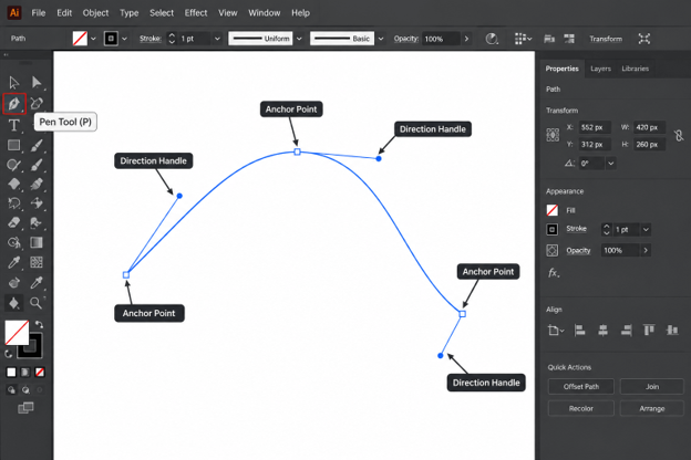
Illustrator Pen Tool Guide: How to Master It Step by Step (2026)
If you have ever tried to draw a smooth curve in Adobe Illustrator and ended up with a wobbly mess, you are not alone. The Pen Tool is the most powerful tool in the program, and it is also the one that frustrates beginners the most.
This Illustrator Pen Tool Guide will change that. You will learn every part of the tool in plain language, from your first click to advanced path editing.
By the end, you will be able to draw logos, icons, and illustrations with clean, professional vector paths. No guesswork, no shortcuts that fall apart later. That is the promise of this Illustrator Pen Tool Guide.
Whether you are a student, a freelance designer, or a business owner creating your own branding, this Illustrator Pen Tool Guide gives you a repeatable system. Follow it in order, practice each step, and the tool will start to feel natural. The Illustrator Pen Tool Guide is built for exactly that.
What Is the Pen Tool in Illustrator?

The Pen Tool is a drawing tool that creates vector paths. A path is a line or shape built from mathematical points rather than pixels.
Because paths are mathematical, they scale to any size without losing quality. This is why the Illustrator Pen Tool Guide matters for professional work. A logo drawn with the Pen Tool looks equally sharp on a business card and on a billboard.
You can find the tool in the toolbar on the left side of the screen. Its keyboard shortcut is the letter P.
Every Illustrator Pen Tool Guide starts with this basic idea. You place points, and Illustrator connects them with lines or curves. Your job is to control where the points go and how the curves bend.
The Pen Tool works in two modes. You can click to make sharp corners, or click and drag to make smooth curves. Mastering the difference between those two actions is the heart of this entire tutorial.
Why Mastering the Pen Tool Matters
Many Illustrator tools are quick and easy, such as the Rectangle Tool or the Ellipse Tool. So why spend time learning something harder?
The answer is control. Control is the main reward of the Illustrator Pen Tool Guide. The Pen Tool lets you draw any shape you can imagine, not just the ones Illustrator provides.
Here is what you gain when you learn it properly:
- Custom logo design. Unique marks need custom shapes, and custom shapes need the Pen Tool.
- Clean tracing. You can trace sketches, photos, and hand-drawn artwork with precision.
- Fewer anchor points. Skilled users draw smoother shapes with fewer points, which means lighter files and easier edits.
- Professional results. Clients and employers can instantly tell the difference between careful path work and auto-generated shapes.
Treat the Illustrator Pen Tool Guide as an investment. The hours you spend now will save you far more time on every future project.
Setting Up Your Workspace

Before you draw anything, a few small settings will make learning much easier.
Create a Practice Document
Go to File > New and choose a standard size such as A4 or 1920 x 1080 pixels. Pick RGB for screen work or CMYK for print work.
Set Fill and Stroke Correctly
When learning, turn the fill off and use a visible stroke. A black stroke with no fill lets you see every segment clearly.
Select the Pen Tool, then set the fill to none and the stroke to black. Set the stroke weight to 2 pt for easy viewing.
Turn On Smart Guides
Press Ctrl + U on Windows or Cmd + U on Mac. Smart Guides show you helpful hints such as “anchor” and “path” when your cursor lands on the right spot.
Show the Grid
Press Ctrl + ‘ on Windows or Cmd + ‘ on Mac to display the grid. A grid helps you place points evenly while you practice. A tidy setup makes the Illustrator Pen Tool Guide easier.
Open the Properties Panel
Choose Window > Properties. This panel shows the options you need most, and it saves you from hunting through menus.
With these settings in place, the rest of this Illustrator Pen Tool Guide will be much easier to follow.
Anchor Points, Segments, and Handles Explained
Before you click anything, you need to understand the three building blocks of every path.
Image suggestion: an annotated diagram labeling an anchor point, a segment, and two direction handles.
Anchor Points
An anchor point is a small square that marks a position on the path. Think of it as a pin holding the line in place. Keep this image in mind through the rest of the Illustrator Pen Tool Guide.
There are two main types. A corner point creates a sharp angle. A smooth point creates a flowing curve.
Segments
A segment is the line between two anchor points. It can be straight or curved depending on the points at each end. Segments are central to the Illustrator Pen Tool Guide.
Direction Handles
Direction handles are the thin lines with round dots that appear when you drag. They control how a curve leaves and enters an anchor point.
The length of a handle controls how wide the curve is. The angle of a handle controls the direction of the curve. Handles are the most important concept in the Illustrator Pen Tool Guide.
Understanding these three parts is the foundation of this Illustrator Pen Tool Guide. Almost every mistake beginners make comes from not understanding what the handles are doing.
How to Draw Straight Lines
Straight lines are the easiest place to start. They teach you how clicks create points before you add the complexity of curves.
Step 1: Select the Pen Tool
Press P or click the Pen Tool in the toolbar. Step one of the Illustrator Pen Tool Guide is always selecting the right tool.
Step 2: Click to Place the First Point
Click once on the artboard. You will see a small anchor point appear. Every Illustrator Pen Tool Guide exercise begins with this single click.
Step 3: Click to Place the Second Point
Move your cursor and click again. Illustrator draws a straight segment between the two points. This simple action is the base of any Illustrator Pen Tool Guide.
Step 4: Hold Shift for Perfect Angles
Hold Shift while you click, and the line snaps to 45-degree angles. This is perfect for drawing exact horizontal, vertical, and diagonal lines.
Step 5: End the Path
To finish an open path, press Enter or click on the Pen Tool in the toolbar again. You can also hold Ctrl or Cmd and click on an empty area.
Practice drawing a zigzag, a star, and a simple house shape. Straight-line work builds the muscle memory you need for the next section of this Illustrator Pen Tool Guide.
How to Draw Curves

Curves are where most people get stuck. The secret is simple: click and drag instead of just clicking. This one idea unlocks the whole Illustrator Pen Tool Guide.
Step 1: Click and Drag the First Point
Click on the artboard to place the starting point, but do not release the mouse. Drag in the direction you want the curve to go, then release.
You will see two handles appear. They point in opposite directions from the anchor.
Step 2: Click and Drag the Second Point
Move your cursor to where the curve should end. Click and drag again, this time pulling in the direction the path should continue.
A smooth curve will appear between the two points.
Step 3: Adjust While You Draw
If the curve looks wrong, press Ctrl + Z or Cmd + Z and try again. Do not be afraid to redo it many times. Redoing is a normal part of any Illustrator Pen Tool Guide.
The Golden Rule of Curves
Place your anchor points at the extremes of the curve. These are the highest, lowest, leftmost, and rightmost points.
Use as few points as possible. Fewer points is the golden thread of the Illustrator Pen Tool Guide. A simple circle needs only four anchor points. Beginners often use ten or more, which makes the shape bumpy.
Handle Length Matters
Short handles create tight curves. Long handles create wide, gentle curves. Handle control is a signature skill from the Illustrator Pen Tool Guide. A good rule is to drag about one-third of the distance to the next anchor point.
This one habit improves almost every Illustrator Pen Tool Guide exercise. When your curves look lumpy, the handles are usually too long, too short, or pointing the wrong way.
Combining Corner and Curve Points
Real shapes use both sharp corners and smooth curves. A heart, a leaf, and a speech bubble all need both.
Going from a Curve to a Corner
After drawing a curve, you need to remove the outgoing handle before placing a sharp corner. Hold Alt on Windows or Option on Mac and click directly on the last anchor point.
This collapses the handle on one side. Your next segment will now start fresh instead of continuing the curve.
Going from a Corner to a Curve
This is simpler. Place a corner point with a normal click, then click and drag at the next point to start a curve. Mixing both is the real test of the Illustrator Pen Tool Guide.
Practice Shape: The Leaf
Draw a leaf with two curved sides that meet at sharp tips. Start at the bottom tip, curve up the left side, make a corner at the top, then curve down the right side and close the path.
This is one of the best exercises in the entire Illustrator Pen Tool Guide because it forces you to switch between point types.
Practice Shape: The Heart
A heart has two curved lobes, one sharp point at the bottom, and a dip at the top. Use four anchor points and adjust the handles until the shape feels balanced.
Do not worry if your first attempts look rough. Everyone’s early hearts are lopsided. Keep going with the Illustrator Pen Tool Guide and they will improve.
Closing Paths and Working with Open Paths

A path can be open or closed. An open path has two loose ends, like a line. A closed path forms a complete loop, like a circle.
How to Close a Path
Move your cursor over the first anchor point. A small circle appears next to the Pen icon. Click once, and the path closes.
Only closed paths can hold a fill color evenly. If your shape will not fill properly, check whether the path is really closed.
How to Continue an Open Path
Select the Pen Tool and hover over the end point of an open path. Click on it, and you can keep drawing from that point. This trick is a handy part of the Illustrator Pen Tool Guide.
How to Join Two Open Paths
Select both end points with the Direct Selection Tool, then press Ctrl + J on Windows or Cmd + J on Mac. Illustrator joins them into one path. Joining paths is a useful skill in any Illustrator Pen Tool Guide.
Understanding open and closed paths is a core lesson in this Illustrator Pen Tool Guide, because logos, icons, and lettering all depend on them.
Editing Paths After You Draw Them

Nobody draws a perfect path on the first try. Professional designers draw quickly and then refine. Editing is just as important as drawing in any Illustrator Pen Tool Guide.
The Direct Selection Tool
Press A to switch to the Direct Selection Tool. Click an anchor point to select it, then drag it to a new spot. Click and drag a handle to reshape the curve.
The Add Anchor Point Tool
Press + to add a point on a segment. Use it when a curve needs more control. Add points only where needed, because extra points create lumpy results.
The Delete Anchor Point Tool
Press – to remove a point. Illustrator will adjust the curve to flow smoothly through the remaining points. This is the best fix for overly complicated paths.
The Anchor Point Tool
Press Shift + C to switch to the Anchor Point Tool. Click a smooth point to turn it into a corner. Click and drag on a corner point to turn it into a smooth point.
This tool also lets you move one handle without moving the other, which is vital for shapes that have a curve on one side and a flat edge on the other.
Simplify a Messy Path
Choose Object > Path > Simplify. Illustrator reduces the number of anchor points while keeping the overall shape. Use the slider carefully so you do not lose important detail. Simplify is a favorite of those who master the Illustrator Pen Tool Guide.
A cleaner path is easier to edit, easier to animate, and easier to hand off to other designers. This is why every serious Illustrator Pen Tool Guide teaches editing along with drawing.
Essential Pen Tool Shortcuts

Shortcuts turn a slow workflow into a fast one. Learn these and you will work twice as quickly. Speed is a big benefit of the Illustrator Pen Tool Guide.
| Action | Windows | Mac |
| Pen Tool | P | P |
| Direct Selection Tool | A | A |
| Selection Tool | V | V |
| Anchor Point Tool | Shift + C | Shift + C |
| Add Anchor Point | + | + |
| Delete Anchor Point | – | – |
| Constrain to 45 degrees | Shift | Shift |
| Remove one handle | Alt + click | Option + click |
| Temporarily use Direct Selection | Ctrl | Cmd |
| Join paths | Ctrl + J | Cmd + J |
| Undo | Ctrl + Z | Cmd + Z |
You do not need to memorize everything today. Start with P, A, Shift, and Alt or Option, then add the rest over time. This is the fastest way to apply the Illustrator Pen Tool Guide.
Keep this table nearby while you work through the Illustrator Pen Tool Guide, and shortcuts will soon become second nature.
Pen Tool vs Curvature Tool
Illustrator also includes the Curvature Tool, shortcut Shift + `. Many beginners wonder whether it can replace the Pen Tool.
How the Curvature Tool Works
You click to place points, and Illustrator automatically creates smooth curves between them. There are no handles to manage. To make a corner, you double-click a point.
When to Use the Curvature Tool
It is excellent for quick, organic shapes and for beginners who feel overwhelmed by handles. It is a friendly way to build confidence.
When to Use the Pen Tool
The Pen Tool gives you far more control. For logos, technical illustrations, and precise tracing, it is the industry standard.
Which Should You Learn First?
Learn the Pen Tool. Once you understand it, the Curvature Tool becomes easy. The reverse is not true. Remember this advice from the Illustrator Pen Tool Guide.
That is why this Illustrator Pen Tool Guide focuses on the Pen Tool, while treating the Curvature Tool as a helpful bonus.
Tracing Images with the Pen Tool

Tracing is the best way to practice, and it is also a real professional skill. Every Illustrator Pen Tool Guide should include it. Designers trace sketches, photos, and old logos every day.
Step 1: Place Your Image
Choose File > Place and select your reference image. Resize it so it fills most of the artboard.
Step 2: Dim and Lock the Layer
Open the Layers panel and double-click the image layer. Set the opacity to about 40 percent, then click the lock icon. This stops you from moving the image by accident.
Step 3: Create a New Layer
Add a new layer above the image. Draw all your paths on this layer so your work stays organized.
Step 4: Trace the Main Shapes First
Start with large, simple shapes. Place anchor points at the extremes of each curve, as you learned earlier.
Step 5: Add Detail Last
After the main shapes are done, add smaller details such as eyes, highlights, and textures. Patience is the secret of the Illustrator Pen Tool Guide.
Step 6: Choose Colors
Once the outlines are clean, remove the strokes and apply fill colors. Use the Swatches panel to keep your palette consistent.
Tracing may feel slow at first. Within a few projects, you will notice that your speed and accuracy improve dramatically, which is the whole point of this Illustrator Pen Tool Guide.
Common Mistakes and How to Fix Them

Every learner makes the same handful of mistakes. Knowing them in advance saves a lot of frustration. Consider this list the practical heart of the Illustrator Pen Tool Guide.
Mistake 1: Using Too Many Anchor Points
Beginners add points everywhere. The result is a bumpy, hard-to-edit path. The Illustrator Pen Tool Guide solves this problem with a simple rule.
Fix: Use fewer points and place them at curve extremes. Delete extras with the Delete Anchor Point Tool.
Mistake 2: Handles That Are Too Long
Long handles create wide, floppy curves that overshoot the shape.
Fix: Shorten the handles to about one-third of the distance between points.
Mistake 3: Forgetting to Remove a Handle
You draw a curve, then click for a corner, and the next segment curves unexpectedly.
Fix: Hold Alt or Option and click the last anchor point to remove the outgoing handle before you continue.
Mistake 4: Not Closing the Path
The shape will not fill, or the stroke looks broken at the start point.
Fix: Hover over the first point until the small circle appears, then click.
Mistake 5: Working Without Zooming In
Tiny placement errors become obvious later. Zoom in with Ctrl and + or Cmd and + for detailed sections.
Mistake 6: Giving Up Too Early
The Pen Tool feels awkward for almost everyone at first. Progress comes from steady practice, not talent.
Fixing these six problems will improve your results more than any other change you make while following this Illustrator Pen Tool Guide.
Practice Exercises

Reading is not enough. You must practice with your own hands. The Illustrator Pen Tool Guide works best when you practice each step. Here is a simple plan you can follow. It fits the Illustrator Pen Tool Guide perfectly.
Week 1: Straight Lines and Corners
Draw a zigzag, a star, a triangle, and a house. Use Shift to keep angles exact.
Week 2: Basic Curves
Draw a wave, a circle with four points, an S-curve, and a spiral. Focus on handle length.
Week 3: Mixed Shapes
Draw a leaf, a heart, a cloud, and a teardrop. Practice switching between corner and curve points.
Week 4: Real Projects
Trace a simple logo, a hand-drawn sketch, and an icon. Compare your results with the original and fix any lumpy sections.
Spend 20 to 30 minutes a day. Short, regular practice beats one long weekend session every time. That is the best advice any Illustrator Pen Tool Guide can give. This schedule turns the Illustrator Pen Tool Guide into a real skill rather than just something you read.
Pro Tips for 2026

Once the basics feel comfortable, these tips will help you work like a professional. Treat them as the advanced chapter of the Illustrator Pen Tool Guide.
- Use the Contextual Taskbar. Recent versions of Illustrator show helpful options right next to your selection, saving you trips to the menus.
- Draw with a tablet. A pen tablet makes drawing curves feel more natural, though a mouse works fine.
- Name your layers. Clear names such as “outline” and “details” make complex files easy to manage.
- Use Outline Mode. Press Ctrl + Y or Cmd + Y to see only the paths. This reveals extra points and messy joins.
- Use Pathfinder wisely. Combine simple shapes with Pathfinder, and use the Pen Tool only for the custom parts.
- Save often. Illustrator files can grow large, so save frequently and keep backups.
- Study great work. Look at logos and illustrations by professionals and ask yourself where they placed their points.
Always check the latest Illustrator release notes, because Adobe regularly adds features that can speed up path work. Staying current is a quiet advantage that strengthens any Illustrator Pen Tool Guide.
Troubleshooting Pen Tool Problems
Sometimes the tool does not behave the way you expect. Here are the most common issues and quick solutions. Think of it as the support desk of the Illustrator Pen Tool Guide.
The Pen Tool Draws a Fill Instead of a Line
Your fill is turned on. Set the fill to none and the stroke to a visible color before drawing.
I Cannot See My Path
The stroke may be white or set to none. Select the path and change the stroke color.
Clicking Adds Points to the Wrong Path
If an existing path is selected, the Pen Tool may continue it. Deselect everything with Ctrl + Shift + A or Cmd + Shift + A before starting a new shape.
My Curves Look Jagged
Zoom in and check for too many points or mismatched handles. Use Simplify or delete extra anchors.
The Cursor Does Not Look Like a Pen
Caps Lock can change the cursor to a crosshair. Turn it off and the normal Pen icon returns.
Keep this list handy while you work through the Illustrator Pen Tool Guide, because these small issues cause most of the confusion new users face.
Using the Pen Tool for Logo Design

Logo design is where the Pen Tool earns its reputation. A logo must look perfect at every size, and only clean vector paths can do that.
This part of the Illustrator Pen Tool Guide shows a simple workflow you can reuse for any brand project.
Start with a Sketch
Draw rough ideas on paper first. Scan or photograph your best sketch and place it in Illustrator on a locked layer.
Build Shapes from Simple Parts
Look at the sketch and break it into basic forms such as circles, lines, and curves. Draw each form with as few points as possible.
Keep Curves Consistent
Good logos have a consistent feel. If one curve is tight and another is wide, the mark looks uneven. Compare handle lengths across the whole design.
Check the Design in Outline Mode
Press Ctrl + Y or Cmd + Y to see the raw paths. Look for stray points, overlapping segments, and tiny gaps.
Test at Small and Large Sizes
Zoom out to see how the logo looks at the size of a favicon. Then scale it up to check the details. Clean paths will hold up in both cases.
Save Multiple Versions
Export your logo as SVG, PNG, and PDF. SVG keeps the vector quality, which is the main benefit of everything you learn in this Illustrator Pen Tool Guide.
Many clients ask for a logo that works on websites, packaging, and signs. The Pen Tool makes that possible with a single file.
Quick Recap of the Whole Process

Here is a short summary you can save for later. It condenses the entire Illustrator Pen Tool Guide into a simple checklist.
- Set the fill to none and the stroke to a visible color.
- Press P to select the Pen Tool.
- Click to place corner points and hold Shift for exact angles.
- Click and drag to create smooth curve points.
- Place anchor points at the extremes of each curve.
- Keep handles about one-third the distance to the next point.
- Hold Alt or Option to remove a handle before a corner.
- Close the path by clicking the first anchor point.
- Refine with the Direct Selection and Anchor Point tools.
- Delete extra points and check your work in Outline Mode.
If you remember only these ten steps, you already understand the core of the Illustrator Pen Tool Guide.
Why This Method Works
Many tutorials throw dozens of tips at you at once. That approach feels productive, but it rarely sticks.
This Illustrator Pen Tool Guide works because it follows a clear order. You learn the parts, then the clicks, then the curves, then the editing, and finally the real projects.
Each step builds on the one before it. That is how the Illustrator Pen Tool Guide keeps you moving forward. When something goes wrong, you can look back and find exactly which step needs more practice.
The method also keeps your files clean. Fewer points, consistent handles, and organized layers mean you spend less time fixing and more time creating.
Designers who follow a structured Illustrator Pen Tool Guide tend to improve faster than those who learn by random experimentation. Structure removes the guesswork and keeps your motivation high.
Who Should Use This Guide
This tutorial is useful for several kinds of learners.
- Complete beginners who have never opened Illustrator.
- Graphic design students who need a reliable reference for assignments.
- Freelancers who want to offer logo and icon design services.
- Small business owners who want to create their own branding.
- Photoshop users who are moving into vector work.
No matter your background, the Illustrator Pen Tool Guide is designed to meet you at your level and carry you to confident, professional path work.
Frequently Asked Questions (FAQs)
What is the Pen Tool in Illustrator used for?
The Pen Tool is used to draw precise vector paths, including straight lines, curves, and complex custom shapes. Designers use it for logos, icons, illustrations, and tracing.
Is the Pen Tool hard to learn?
It feels difficult at first because of the handles. With a clear method and about a month of regular practice, most people become comfortable. A good Illustrator Pen Tool Guide makes the process much smoother.
What is the shortcut for the Pen Tool in Illustrator?
Press P to select the Pen Tool. Press Shift + C for the Anchor Point Tool and A for the Direct Selection Tool. These shortcuts appear throughout the Illustrator Pen Tool Guide.
How do I make a curve with the Pen Tool?
Click and drag instead of clicking once. The drag creates handles that control the curve. Place points at the extremes of each curve and keep handles about one-third of the distance to the next point.
How do I remove a handle while drawing?
Hold Alt on Windows or Option on Mac and click directly on the last anchor point. This removes the outgoing handle so you can draw a sharp corner next.
What is the difference between the Pen Tool and the Curvature Tool?
The Curvature Tool creates smooth curves automatically with no visible handles. The Pen Tool offers full manual control. Most professionals prefer the Pen Tool for precision work.
How many anchor points should a path have?
As few as possible. Fewer points create smoother curves and cleaner files. A circle needs only four points. This rule is the backbone of the Illustrator Pen Tool Guide.
Can I use the Pen Tool for logo design?
Yes. Most professional logos include custom paths drawn with the Pen Tool. Following a structured Illustrator Pen Tool Guide helps you build logos that look sharp at every size.
How long does it take to master the Pen Tool?
Most learners feel confident in two to four weeks of daily practice. True mastery comes with real projects over several months. The Illustrator Pen Tool Guide gives you a clear path to follow.
Is the Pen Tool the same in Photoshop?
The tools work in a very similar way, so skills transfer easily. Learning the Illustrator Pen Tool Guide helps with Photoshop too. Illustrator creates vector paths, while Photoshop uses them mainly for shapes and selections.
Conclusion
The Pen Tool rewards patience. Nothing in the Illustrator Pen Tool Guide is out of reach. Once the idea of anchor points, segments, and handles clicks into place, you will draw with confidence and speed.
Start with straight lines, move on to curves, and then combine both. Edit your paths carefully, use shortcuts, and practice a little every day.
Return to this Illustrator Pen Tool Guide whenever you feel stuck, and use the practice plan to keep improving. Every professional designer began with the same wobbly curves you are drawing today. Trust the Illustrator Pen Tool Guide and keep practicing.
Open Illustrator, press P, and draw your first shape right now. Your next logo, icon, or illustration is only a few clicks away. Bookmark this Illustrator Pen Tool Guide and share it with anyone who is learning vector design.
-

 Graphics Design3 years ago
7.Exploring the Importance of Color Theory Charts
-

 Graphics Design1 year ago
Top 10 Best Graphic Design Tools for Beginners in 2025 (Free & Paid)
-

 Graphics Design2 years ago
10 Stunning Gradient Design Trends You Need to Know in 2024
-

 Graphics Design1 year ago
15 Freelance Graphic Design Tips to Boost Your Career in 2025
-

 Graphics Design2 years ago
29.Retro Design Is Making a Comeback in Modern Spaces
-

 Graphics Design1 year ago
Best Laptops for Graphic Designers – 2025 Buying Guide
-

 Graphics Design2 years ago
2025 Logo Design Trends: What’s In, What’s Out?
-

 Graphics Design2 years ago
15.The Importance of Effective Flyer Design in Marketing