
Graphics Design
How AI Graphic Design Is Changing the Future of Creative Work


How AI Graphic Design Is Changing the Future of Creative Work
The creative industry is experiencing an unprecedented evolution. For decades, AI Graphic Design relied strictly on the mastery of complex software, years of technical training, and manual execution. However, the emergence of fundamentally disrupted this paradigm. Today, artificial intelligence is no longer just a futuristic concept or a niche tool for tech enthusiasts; it has become a core driver of modern visual culture.
From generating instantaneous concept art to automating repetitive layout tasks, AI Graphic Design is redefining how brands communicate, how agencies operate, and how creators approach their daily workflows. This shift brings both immense opportunity and profound existential questions for the creative community. Is artificial intelligence replacing the human artist, or is it liberating creators from mundane tasks to focus on pure strategy and imagination?
To understand the full scope of this transformation, we must explore how AI Graphic Design works, its tangible impacts on the creative industry, the ethical boundaries surrounding machine-generated art, and what the future holds for human designers navigating this brave new digital landscape.
The Genesis and Evolution of AI Graphic Design

To appreciate where we are today, we must look at how quickly AI Graphic Design transformed from rudimentary pixel generation to sophisticated, photorealistic composition. Early iterations of machine-learning art were largely abstract, often producing distorted imagery that required massive compute power for minimal aesthetic output.
However, the introduction of Generative Adversarial Networks (GANs) and later, advanced diffusion models, completely changed the trajectory of AI Graphic Design. These systems were trained on massive datasets of images, art history, typography, and layout principles. By learning the mathematical relationships between words and visual elements, tools utilizing AI Graphic Design technology unlocked the ability to translate simple text prompts into complex visual assets within seconds.
Today, AI Graphic Design encompasses much more than just text-to-image generation. It integrates deeply into the workflows of UI/UX layout creation, automated vector scaling, intelligent color palette generation, and content-aware photo manipulation. What began as a novel tech experiment has matured into an industrial-grade creative engine that influences everything from digital billboards to mobile app interfaces.
How AI Graphic Design Works Behind the Scenes

At its core, AI Graphic Design relies on deep learning algorithms that analyze and synthesize patterns. Unlike a human designer who draws inspiration from personal experiences, museums, or mood boards, an AI Graphic Design system draws inspiration from billions of data points.
When a user types a prompt into an AI Graphic Design platform, the software doesn’t simply copy and paste existing images from the internet. Instead, it references its neural network to understand what concepts like “minimalist,” “cyberpunk,” or “art deco” actually mean in terms of geometry, contrast, and color theory. The AI Graphic Design engine then generates an entirely new image from scratch, refining random noise into a coherent structural composition that aligns with the user’s intent.
Furthermore, predictive AI Graphic Design tools can analyze user behavior on websites to automatically adjust layout elements, button placements, and visual hierarchies in real-time. This branch of AI Graphic Design blends data science with aesthetic intuition, allowing for hyper-personalized visual experiences that adapt to the viewer’s preferences instantly.
Empowering Creators: The Core Benefits of AI Graphic Design

The rapid adoption of Graphic Design across creative agencies and freelance ecosystems is driven by several distinct advantages. Rather than hindering the creative process, these systems act as massive force multipliers for those who learn to master them.
1. Unprecedented Speed and Efficiency
The most obvious benefit of AI Graphic Design is the elimination of time-consuming, repetitive tasks. In traditional workflows, resizing assets for twenty different social media formats, removing backgrounds from product photos, or color-correcting a massive catalog could take days. With Graphic Design automation, these tasks are completed in milliseconds, allowing design teams to fulfill demanding production schedules without burning out.
2. Democratization of Visual Expression
Historically, bringing a complex visual concept to life required technical proficiency in vector drawing, spatial composition, and rendering software. Graphic Design lowers the barrier to entry, enabling entrepreneurs, writers, and small business owners to articulate their visions visually without needing an enterprise-level budget. This democratization ensures that great ideas aren’t bottlenecked by a lack of technical drafting skills.
3. Hyper-Personalization at Scale
Modern marketing demands tailored content for highly specific audience segments. Graphic Design enables dynamic content creation, where a single master concept can be spun into thousands of localized, culturally relevant variations automatically. Through AI Graphic Design, brands can test variations of imagery, typography, and layouts simultaneously to see what resonates best with different demographic subsets.
4. Overcoming the “Blank Canvas” Syndrome
Every creator dreads the stagnation that comes with staring at a blank screen. AI Graphic Design serves as an exceptional brainstorming companion. By generating dozens of variations based on a vague conceptual phrase, Graphic Design gives professionals an immediate foundation to critique, alter, and build upon, drastically shortening the ideation phase of a project.
Redefining the Role of the Human Designer
A common narrative surrounding AI Graphic Design is the fear of total automation leading to widespread displacement of human workers. While it is true that entry-level production roles are shifting, the demand for human ingenuity has never been higher. The role of the designer is evolving from a technical executor to a creative director.
Traditional Workflow: Ideation ➔ Manual Drafting ➔ Iterative Execution ➔ Final Asset
AI-Augmented Workflow: Ideation ➔ AI Prompting & Curation ➔ Human Refinement ➔ Final Asset
In an era where anyone can generate a pretty picture using AI Graphic Design, the value of a design no longer lies solely in its execution. Instead, value is found in the strategy, emotional resonance, brand consistency, and cultural context behind the visual. A human professional understands why a certain color palette connects with an audience on a psychological level, whereas an AI Graphic Design algorithm only knows that those colors statistically complement each other.
Therefore, the most successful creatives of tomorrow will not be those who fight against AI Graphic Design, but those who integrate it into their toolkits. By leveraging AI Graphic Design to handle production mechanics, human designers free up cognitive bandwidth to focus on brand storytelling, user psychology, and high-level creative direction.
Major Pillars of AI Graphic Design Technology

To truly understand how deeply Graphic Design has integrated into the creative pipeline, we must examine the specific modalities where it operates. It is not a monolithic technology, but rather a collection of specialized applications.
Generative Layout and UI/UX

Designing web interfaces and mobile applications requires strict adherence to usability guidelines, grid systems, and responsiveness. Modern AI Graphic Design tools can take a text-based wireframe description and instantly output fully coded, responsive user interfaces. These AI Graphic Design frameworks automatically calculate ideal padding, typography scales, and contrast ratios to ensure accessibility compliance right out of the box.
Automated Typography and Branding
Choosing the right typeface is critical to a brand’s voice. Specialized AI Graphic Design systems analyze a company’s mission statement, target industry, and emotional tone to recommend or generate entirely unique typefaces. Additionally, AI Graphic Design engines can instantly generate cohesive brand style guides, mapping out brand hierarchies, logo placements, and iconography sets based on minimal baseline inputs.
Vector Asset Generation
For a long time, generating clean, scalable vector graphics was a major hurdle for artificial intelligence, as neural networks naturally excel at pixel-based raster imagery. However, recent breakthroughs in AI Graphic Design allow for the direct generation of mathematical vector paths. This means AI Graphic Design can now produce logos, icons, and scalable illustrations that can be infinitely resized without losing quality, matching the exact technical requirements of professional print and digital media.
AI Graphic Design in Branding, Marketing, and Advertising
The corporate world has embraced AI Graphic Design with open arms, primarily because it directly addresses the modern demand for infinite content streams. Marketing campaigns that previously required months of coordination can now pivot in real-time based on live data feeds, thanks to agile AI Graphic Design workflows.
Consider a global retail brand launching a seasonal campaign. By using AI Graphic Design, their marketing team can automatically generate localized visual assets tailored to the weather patterns, regional subcultures, and trending aesthetics of hundreds of cities simultaneously. The core brand guidelines remain locked in place by the AI Graphic Design framework, ensuring absolute brand consistency while maximizing local relevance.
Furthermore, A/B testing has reached hyper-sophistication. Instead of testing two human-designed banners, conversion rate optimization specialists can use AI Graphic Design to generate and deploy hundreds of micro-variations of a single landing page layout, analyzing micro-interactions to permanently optimize the visual real estate for higher engagement.
The Ethical Challenges of AI Graphic Design
No discussion about Graphic Design is complete without addressing the immense ethical, legal, and social hurdles that accompany its rapid rise. Because these systems learn by synthesizing vast repositories of human-created data, they exist in a legally complex grey area.
Copyright Infringement and Data Provenance
Many AI Graphic Design models were trained on publicly available internet data without the explicit consent, compensation, or attribution of the original creators. This has led to intense pushback from the global art community. When an AI Graphic Design tool produces an image “in the style of” a living freelance illustrator, it directly competes with that artist using their own intellectual property against them.
Intellectual Property Ownership of AI Output
Another unresolved legal question is who actually owns the copyright of an image generated by AI Graphic Design. Is it the software developer who built the algorithm? Is it the user who typed the prompt? Or is the output completely uncopyrightable and part of the public domain? Courts worldwide are currently grappling with these questions, making businesses cautious about using unverified AI Graphic Design assets for proprietary commercial purposes.
Deepfakes, Misinformation, and Visual Manipulation
The sheer realism achievable by modern AI Graphic Design tools presents significant societal risks. The ease with which bad actors can synthesize hyper-realistic deceptive imagery, forged historical documents, or non-consensual altered photos means that public trust in visual media is deteriorating. As AI Graphic Design becomes more powerful, the industry must develop robust watermarking standards and cryptographic provenance protocols to verify authentic human media from synthetic creations.
Best Practices for Integrating AI Graphic Design into Professional Workflows
For agencies and independent creators looking to adopt AI Graphic Design without compromising their creative integrity or legal standing, a balanced framework is necessary.
- Use AI for Ideation, Not Final Output: Treat AI Graphic Design as an ultra-fast mood board creator. Use it to explore conceptual directions, color schemes, and compositions, but execute the final client-facing deliverables manually or through verified, legally clean toolsets.
- Opt for Ethical AI Models: Prioritize AI Graphic Design tools that are trained exclusively on licensed stock libraries or public domain data where creators have been fairly compensated or given opt-out mechanisms.
- Focus on Custom Refinement: Never present a raw, unedited piece of Graphic Design output as a finished product. Inject human craft, custom typography, vector refinement, and conceptual polish to elevate the asset into something distinctly unique.
- Maintain Transparency with Clients: Clearly outline in your creative contracts how and when Graphic Design tools are utilized in your production pipeline. Transparency builds long-term professional trust.
The Future of Creative Work in an AI-Driven World
As we look toward the horizon, the trajectory of Graphic Design points toward complete, multi-modal integration. We are moving away from isolated tools where a user inputs text to get a single image, and toward holistic, real-time creative operating systems.
In the near future, an architect or interior designer might use Graphic Design to mock up a spatial environment, which instantly generates the branding assets, the wayfinding signage, the web interface, and the promotional video campaign all in one unified, interconnected workflow. The barriers between different creative disciplines—such as graphic design, 3D modeling, filmmaking, and copy editing—will continue to blur.
Ultimately, AI Graphic Design will not kill human creativity; it will amplify it. By taking over the heavy lifting of manual execution, it challenges humanity to dream bigger, think more critically, and push the boundaries of what visual storytelling can achieve. The future of creative work belongs not to the machine alone, nor to the traditionalist who rejects progress, but to the hybrid creator who masterfully guides technology with human empathy, intent, and soul.
Frequently Asked Questions About AI Graphic Design
What is AI Graphic Design exactly?
AI Graphic Design refers to the application of artificial intelligence, machine learning algorithms, and deep neural networks to assist, automate, or completely generate visual assets, layouts, typography choices, and overall creative design compositions.
Will AI Graphic Design completely replace human graphic designers?
No, it will not replace human designers entirely, but it is radically changing their job descriptions. While basic production roles are shifting to automation, high-level strategy, human empathy, emotional branding, and conceptual thinking still require a human touch that cannot replicate.
Can I legally copyright imagery generated by AI Graphic Design?
Legal frameworks vary by country, but in many major jurisdictions, purely machine-generated outputs cannot be copyrighted because they lack human authorship. However, if a designer significantly alters, edits, or integrates the output into a larger, complex human-created piece, that final composite may be eligible for copyright protection.
Which are the most popular AI Graphic Design tools available today?
Prominent platforms include Midjourney and Stable Diffusion for concept generation; Adobe Firefly, which is built directly into Photoshop and Illustrator with an emphasis on commercial safety; and platforms like Canva and Figma, which utilize integrated features to automate layouts, copywriting variations, and photo editing.
How can traditional graphic designers start learning AI Graphic Design?
The best way to start is by experimenting with prompting techniques in generative tools, exploring the integrated AI features within standard industry software like Adobe Creative Cloud, and studying how to use automated layout assistants to speed up daily workflows. Embracing these systems early builds a massive competitive advantage.
Creative Pattern Design Techniques to Transform Simple Shapes into Prints
Every great print begins with something small. A circle. A triangle. A wavy line. With the right approach, these humble forms can become repeating artwork that decorates fabric, wallpaper, packaging, stationery, and phone cases.
That transformation sits at the heart of pattern design. It blends art, math, and patience. It also rewards curiosity more than raw drawing talent.
In this guide, you will learn creative pattern design techniques that turn simple shapes into professional prints. We will cover tools, repeat types, scale, color, texture, seamless tiles, and file preparation.
If you have ever wondered how artists create those effortless, endlessly repeating surfaces, you are in the right place. Each section includes practical steps you can try right away.
By the end, you will have a clear workflow for building your own pattern design projects from scratch. You will also know how to avoid the mistakes that make prints look amateur.
Whether you are a beginner or a working illustrator, strong pattern design skills can open new creative and income opportunities. Let us start with the fundamentals.
What Is Pattern Design and Why Does It Matter?

The history of repeating ornament is long. Ancient builders carved geometric tiles into temples, and weavers have repeated motifs on cloth for thousands of years. Today the same instinct lives on in digital tools.
Modern pattern design simply uses new tools for an old human habit. Software lets you test a repeat in seconds instead of weeks.
You do not need a formal degree to begin. Curiosity, observation, and regular practice matter far more. Study the prints around you and ask why they work.
Over time, your eye will sharpen, and strong pattern design will feel more intuitive with every project you finish.
Pattern design is the craft of arranging motifs so they repeat in a pleasing, continuous way. A motif can be a flower, a dot, a geometric form, or an abstract brushstroke.
A pattern is simply a unit repeated across a surface. That unit is called a tile or a repeat. When the tile joins itself with no visible seams, the result is called seamless.
The main goal is rhythm. Your eye should travel across the surface without hitting awkward gaps or heavy clumps.
Pattern design is everywhere. Look at your clothes, your bedsheets, your coffee mug, or the wrapping paper on a gift. Someone planned each repeat with care.
For creators, pattern design is also a strong income path. Surface design licensing, print on demand, and stock marketplaces all reward people who can make appealing repeats.
Brands benefit as well. A signature print makes packaging memorable and builds recognition faster than a logo alone.
Learning the basics of pattern design gives you a foundation for every technique in this article.
Why Simple Shapes Are the Best Starting Point

Consider how little a classic polka dot print contains. One circle, one spacing rule, and two colors. Yet it has stayed fashionable for generations.
Mid-century atomic prints and Memphis style graphics also lean on basic geometry. They prove that simple forms never go out of style.
When you limit your vocabulary of forms, you focus on arrangement instead. That shift is the real lesson of pattern design.
It also makes your work easier to scale into collections. A set of matching prints built from the same shapes feels like a family, and a family of prints is a powerful way to present pattern design to buyers.
Beginners often believe they must draw complex illustrations first. The opposite is true.
Simple shapes are easy to control. They scale cleanly, rotate predictably, and combine in countless ways.
Think of a child building with blocks. A few forms create an entire city. Pattern design works the same way.
Shapes also keep your files light. Vector circles, squares, and triangles stay sharp at any print size, from a tiny label to a giant wall mural.
Another benefit is speed. You can test ten layouts in the time it takes to draw one detailed flower.
Finally, simple shapes train your eye. You learn spacing, balance, and contrast without distraction from fine detail.
Many iconic prints rely on a single basic form. Polka dots, stripes, checks, chevrons, and herringbone all prove the point. Strong pattern design often looks effortless because it is built on clarity.
Essential Tools and Setup for Pattern Design

Before you open a new file, organize your workspace. Create folders for sketches, tiles, exports, and mockups. A clean structure prevents lost files later.
Learn a few shortcuts in your chosen software. Duplicate, align, group, and transform commands will save hours.
Many beginners ignore the preview tools. Take advantage of live repeat previews, because they show seams and gaps instantly.
Consider saving a starter template with your favorite tile sizes and color modes. A ready template turns pattern design into a faster, calmer process.
If you are on a budget, free tools can still produce professional pattern design results when paired with strong ideas.
You do not need expensive gear to start. A computer and a free trial of good software are enough.
Vector software is the most popular choice. Adobe Illustrator offers a dedicated pattern tool that previews repeats live as you work. Affinity Designer and Inkscape are solid alternatives.
Raster software suits painterly textures. Photoshop and Procreate let you build hand-painted motifs with brushes.
Many artists combine both. They draw shapes in a vector app, then add texture in a raster app.
A drawing tablet helps with organic shapes but is not mandatory. A mouse works perfectly well for geometric work.
Useful extras include a color palette generator, a mockup template library, and a notebook for sketching ideas.
Set up your artboard with care. Choose a square tile such as 3000 by 3000 pixels, or a size that matches your print target. Work in CMYK for physical print and RGB for screens.
Good tools support your pattern design workflow, but ideas matter more than software.
Understanding Repeat Types in Pattern Design

Repeat types also affect how a product looks when cut and sewn. A half-drop repeat may flow beautifully across a dress, while a block repeat might look stiff on a curved surface.
Think about the final object before you choose. A mug wraps around a cylinder. A tote bag is flat. A phone case has tight edges.
Keep notes on which layout works best for each product. This habit builds your professional instincts.
Smart repeat choices are a hallmark of mature pattern design.
When clients see that you plan for the product, they trust your pattern design skills even more.
A repeat is the rule that decides how your tile spreads across a surface. Choosing the right one shapes the mood of the final print.
Block Repeat
This is the simplest option. Tiles line up in straight rows and columns like a grid.
It feels orderly and stable. It works well for checks, dots, and geometric prints.
Half-Drop Repeat
Each column shifts down by half the tile height. This hides the grid and creates a natural flow.
It is a favorite for wallpaper and fabric because it looks more organic than a block repeat.
Brick Repeat
This is similar to the half-drop but shifts sideways, like bricks in a wall. It suits wide, horizontal motifs.
Mirror Repeat
Motifs flip across an axis to create symmetry. It produces kaleidoscope, damask, and ornamental effects.
Tossed Repeat
Motifs scatter at different angles with no visible grid. It feels playful, casual, and spontaneous.
Learning these five layouts gives your pattern design extra range. One shape can look formal in a block repeat and relaxed in a tossed one.
Try placing the same circle into all five layouts. The difference will surprise you.
Build a Shape Library for Faster Pattern Design

Think of your library as a living collection. Each time you finish a project, add new shapes that worked well and delete those you never use.
Name your shapes clearly. A label such as small-arc or fat-leaf will save you from endless searching.
You can also build small groups, such as a flower made of three petals and a circle. Treat each group as a single unit in future layouts.
Sharing a library with a team helps keep style consistent across a brand.
Over time, a personal library becomes the signature of your pattern design and a major shortcut for every new pattern design brief.
Professionals keep a library of reusable motifs. It saves hours on every project.
Start by drawing twelve to twenty basic forms. Include circles, half circles, triangles, squares, arcs, leaves, drops, and zigzags.
Vary the proportions. Make tall ovals, fat ovals, thin rectangles, and chunky squares.
Add a few hand-drawn forms too. Slightly imperfect shapes bring warmth that perfect geometry lacks.
Save everything as symbols or swatches. Then you can edit one master shape and update the whole print at once.
Organize your library by theme. Useful folders include geometric, botanical, abstract, and retro.
A tidy library speeds up every pattern design project because you begin with proven pieces instead of a blank page.
One more tip: limit yourself to three or four shapes per print. Restraint creates cohesion, and cohesion sells.
Technique 1: Play With Scale for Visual Rhythm

Scale decisions also depend on viewing distance. A scarf is seen up close, so delicate shapes can shine. A feature wall is seen from across the room, so bold shapes work better.
Create a quick test by printing your tile on plain paper. Pin it to a wall, step back, and look again. Problems with scale show up fast.
You can also use the squint test. Blur your eyes and watch for blobs that dominate or areas that feel empty.
Thoughtful scale choices separate hobby pattern design from commercial pattern design, so give this step real attention.
Scale is your most powerful tool. Mixing sizes creates hierarchy, and hierarchy guides the eye.
Use one large hero shape, a few medium supporting shapes, and many tiny fillers. This three-tier approach keeps the viewer moving across the surface.
Avoid making every shape the same size. Uniform scale looks flat and mechanical.
Try a loose ratio of 3:2:1. Large shapes dominate, medium shapes support, and small shapes fill the gaps.
Zoom out often. A layout that works up close may look busy from a distance. Check it at thumbnail size.
Scale also changes how a print fits a product. Small repeats suit shirts, socks, and packaging. Large repeats suit wallpaper, curtains, and bold bags.
Mastering scale lifts any pattern design from amateur to polished.
Technique 2: Rotate, Reflect, and Build Radial Motifs

Mixing rotation with reflection opens up even more ideas. Take a simple quarter circle and rotate it four times to form a full circle. Reflect a leaf across a vertical line and you have a tidy symmetrical motif.
Keep a record of the angles that please you. Many artists settle on a few favorite angles and reuse them across collections.
Be careful with random rotation. Too much randomness can look messy, while a gentle limit keeps order.
Understanding these transformations is a major step forward in pattern design, and it will help you build unique motifs for any pattern design project.
Rotation adds energy. A row of identical triangles feels static. Turn them at different angles and they begin to dance.
Try rotating shapes in fixed steps such as 15, 30, or 45 degrees. Fixed steps keep order while adding variety.
Reflection builds symmetry. Duplicate a shape, flip it, and join the halves to create hearts, butterflies, and flower-like forms.
Radial repeats are another favorite. Rotate one shape around a center point to form a rosette. Then use that rosette as a brand new motif.
This trick turns a humble petal into a mandala. It is one of the quickest ways to make pattern design feel rich and complex.
Use your software’s transform tools to speed things up. Rotate with copies, then repeat the transformation until the circle closes.
Technique 3: Layer and Overlap With Transparency

Layering also works well with outlines and textures inside shapes. Place a tiny dot grid inside a large circle, then overlap it with a plain triangle. The simple contrast creates a fresh and modern feel.
Another idea is to stack shapes in a repeating order. Large shape at the back, medium shape in the middle, small shape on top. This builds a tidy rhythm.
Use a limited palette so the overlaps stay harmonious. Too many colors make transparent areas look muddy.
Layered effects can transform basic pattern design into something that feels custom, and they let you extend one pattern design into a full collection.
Overlapping shapes create new shapes where they meet. This is the secret behind many modern prints.
Set overlapping shapes to multiply mode or lower their opacity. Colors blend and produce fresh tones for free.
Layer big soft shapes under small sharp ones. The contrast adds depth without extra detail.
Try a stroke-only shape over a filled shape for a lively offset effect. Slight misalignment gives a charming risograph look.
Keep an eye on file complexity. Too many transparent layers can cause trouble at the printer. Flatten or expand effects when you finish.
Done well, layering gives pattern design a three-dimensional feel using only flat forms.
Technique 4: Use Negative Space Wisely

Negative space also helps a print work at different sizes. When gaps are generous, motifs stay readable even when reduced for small products.
Some of the world’s most memorable prints use very little ink. A few bold shapes on a plain field can feel confident and calm.
Try placing the same motif at two densities. One version with tight spacing, another with airy spacing. Compare the mood.
Learning to value empty space is a mark of mature pattern design, and it will improve your pattern design in every collection you create.
The empty areas between motifs matter as much as the motifs themselves. Artists call this negative space.
Aim for consistent gaps. Uneven gaps create rivers of white that distract the eye.
Try a reversed approach. Fill the background with color and let the shapes appear as cutouts.
Negative space can also form secondary shapes. Arrange circles so the spaces between them form diamonds or stars.
This hidden layer rewards close viewers and impresses clients.
Treat gaps as part of your composition, and your pattern design will breathe.
Technique 5: Build a Strong Color Palette for Pattern Design

Color psychology can guide your choices. Blue often feels trustworthy and calm. Yellow feels energetic. Green suggests nature and balance. Pink can feel soft or bold depending on its shade.
Think about your audience. A baby product needs gentle tones, while a streetwear brand may want strong contrast.
Seasonal trends matter too. Check color forecasts, but keep your personal taste in the mix.
Name your palettes and store them for reuse. A saved palette is a quick starting point for your next pattern design, and a smart way to keep your pattern design collections consistent.
Color decides mood in seconds. Soft pastels feel calm, while bright primaries feel joyful.
Start with three to five colors. More than that can overwhelm a simple shape.
Use the 60-30-10 rule. Sixty percent background, thirty percent main motif color, and ten percent accent.
Borrow palettes from nature, vintage posters, or photographs. Color pickers can extract harmonious swatches in seconds.
Test your print in grayscale. If the shapes still read clearly, your contrast is healthy.
Create alternate colorways as well. Buyers love choices, and three versions multiply the value of one pattern design file.
Remember print limits. Neon and very saturated tones may shift when converted to CMYK. Always proof before you finalize.
Technique 6: Add Texture and Handmade Touches

Texture can also be layered over the whole tile. Place a subtle paper grain above the shapes and lower the opacity until it whispers rather than shouts.
Before you merge layers, keep the texture on its own layer. This way you can adjust or remove it for different products.
Remember to repeat the texture seamlessly. A grain overlay that is not tiled correctly will show visible seams.
Combining clean geometry with tactile elements gives pattern design a special charm, and it helps your pattern design feel human in a digital world.
Perfect vector edges can feel cold. Texture adds soul.
Apply grain, halftone dots, or brush-edge effects to your shapes. Scan real paper, watercolor, or ink stamps for authentic texture.
Cut paper collage is a fun method. Cut shapes from colored paper, scan them, and arrange them digitally.
Linocut and block printing also translate well. Carve a simple shape, stamp it, and scan the result.
Keep texture subtle inside seamless tiles. Heavy texture can reveal the repeat edges.
A little imperfection makes handmade pattern design stand out in a crowded market.
Technique 7: Mix Grid and Organic Placement

One helpful trick is the offset grid. Place shapes on a grid, then shift every second row slightly. The result feels ordered but never rigid.
Another trick is to use random scatter tools, then manually clean up collisions. Automation gives you speed, and your eye provides taste.
Study natural patterns for inspiration. Leaves on a branch, pebbles on a beach, and ripples on water all show organized randomness.
Observing nature trains your instincts and improves your pattern design, which in turn makes your pattern design feel alive.
Grids give control. Organic placement gives life. Great prints often mix both.
Start with a loose grid to place shapes evenly. Then nudge individual shapes by small amounts.
Another method is scatter and fill. Place large shapes first, then add medium ones where gaps feel heavy.
Use guides and alignment tools for geometric prints. Use freehand placement for botanical looks.
Whichever you choose, avoid obvious clusters and straight lines. The viewer should not spot the repeat.
Balanced placement is the quiet skill behind professional pattern design.
How to Create a Seamless Tile in Pattern Design

Some software offers automatic seamless tools. Illustrator’s pattern editor, for example, lets you edit a tile while the surrounding repeat updates in real time. This is a huge time saver.
If you use a raster program, apply an offset filter that shifts the image by half its width and height. Then paint over the seams in the middle and offset again to confirm.
Keep a backup of your original tile before testing seams. A safe copy protects your hard work.
Mastering seamless tiles is the technical backbone of pattern design, and once you learn it, every pattern design idea becomes easier to build.
A seamless tile repeats with no visible edges. It is essential for fabric and wallpaper.
Here is a reliable method you can follow.
First, create a square artboard. Second, place your shapes inside it. Third, make sure any shape crossing an edge continues on the opposite edge.
Duplicate the shape and move it by exactly the tile width. The overflow now appears on the other side.
Next, crop with a clipping mask, or let your software’s pattern tool handle the math automatically.
Test the tile by arranging nine copies in a three by three grid. Look for seams, gaps, and unwanted lines.
Check for tangents too. Shapes that barely touch the edge can create awkward points.
Finally, export a clean tile and save the editable source file.
Many beginners rush this step. Spend time here and your pattern design will look professional on any product.
From Pattern Design to Print: Preparing Your Files

Think about color profiles when you export. Screens use light, while printers use ink, so colors may shift. Request a printed sample whenever possible and compare it to your screen.
Include a repeat guide with your files if you sell to manufacturers. A simple diagram showing how the tile repeats prevents confusion.
Offer different file formats for different buyers. A layered file, a flat PNG, and a vector version cover most needs.
Clear communication turns pattern design into a smooth business, and professional files help your pattern design earn repeat clients.
Now comes the exciting part. Your repeat becomes a real product.
For fabric, match the repeat size to printer requirements. Services such as Spoonflower publish exact dimensions and resolution guidelines.
For wallpaper, use larger repeats. A width of about 24 inches is common.
For packaging, check die lines and safe zones before you place key motifs.
Print on demand sites usually accept PNG files at 300 DPI. Make your file large enough for the biggest product you plan to offer.
Always create mockups. Show your print on tote bags, mugs, pillows, and notebooks. Mockups help buyers imagine the result.
Name files clearly and keep a color reference sheet. Future you will be grateful.
Good file preparation protects your pattern design from costly printing mistakes.
Common Mistakes to Avoid

Another mistake is forgetting the product. A print that looks stunning on screen may feel overwhelming on a large sofa or too faint on a small label.
Many creators also skip feedback. Show your work to friends, mentors, or online groups before you publish it.
Overediting is a risk too. Sometimes a print is finished, and extra details only make it worse. Learn when to stop.
Every mistake is a lesson. Keep notes on what you learn, and your pattern design skills will improve faster, because honest review is the engine of growth in pattern design.
Even skilled artists slip up. Watch for these common problems.
Too many motifs is the first. Stick to a limited set so the print feels unified.
Ignoring spacing is the second. Crowded areas and empty holes break the rhythm.
Visible repeats are the third. Rows or columns that pop out reveal the grid.
Weak contrast is the fourth. Shapes that blend into the background disappear at small sizes.
Skipping tests is the fifth. Always view your print at real size and as a tiny thumbnail.
Copying trends blindly is the sixth. Trends help, but a personal style sells for longer.
Avoiding these traps will strengthen every pattern design you make.
A Simple Step-by-Step Workflow You Can Follow Today

You can adjust the workflow to match your style. Some artists begin with color, and others begin with shapes. Neither approach is wrong.
Add a short review step at the end. Ask yourself whether the print has a clear focal point, balanced spacing, and strong contrast.
Keep a project log with dates and notes. Over time you will see which steps take longest and which ones you can speed up.
A written process turns pattern design from a mystery into a skill, and it gives beginners a map for pattern design that they can trust.
A repeatable process saves time and reduces stress. Use this workflow for each new print.
Step one is choosing a theme. Think of a mood, a season, or a product, such as a summer scarf or a kids notebook.
Step two is drawing three or four basic shapes. Keep them simple.
Step three is picking a color palette of three to five shades.
Step four is arranging the shapes with your preferred repeat type.
Step five is building the seamless tile and testing it in a three by three grid.
Step six is refining scale, spacing, and contrast. Zoom in and out often.
Step seven is exporting the file and creating mockups.
Run this routine a few times and it becomes second nature. Your pattern design speed will grow with every project.
Practice Ideas to Sharpen Your Skills

Try a themed collection challenge. Choose a theme such as ocean, desert, or kitchen. Create three coordinating prints: a main print, a smaller secondary print, and a simple filler. This is how professional collections are structured.
You can also explore constraint challenges. Use only two shapes, only three colors, or only straight lines. Constraints push you toward clever solutions.
Keep a sketchbook. Even quick doodles can inspire future pattern design ideas.
Regular practice is the fastest route to better pattern design, and every small experiment adds to your confidence.
Skill grows through repetition. Try a few small challenges.
Make a one-shape challenge. Create five prints using only a circle.
Try a one-color challenge. Use a single hue with light and dark tints.
Take a thirty-day challenge. Produce one small tile each day and share the results.
Recreate a favorite print from a shop or museum. Study how the original handles scale and spacing, then make your own version.
Join online communities and ask for feedback. Fresh eyes spot problems quickly.
These exercises keep your creative muscles active and give you a rich portfolio over time.
How to Share and Sell Your Prints

Think about your target audience when you pick marketplaces. Wedding stationery buyers look for different styles than children’s apparel brands. Match your prints to the right shoppers.
Use social media to show your process. Time-lapse videos of a shape becoming a seamless print are popular and build trust.
Collect email addresses so you can announce new releases. Loyal fans often become your best customers.
If you promote your work online, write helpful content about pattern design on your website to bring more visitors.
Once you have a few strong prints, share them. Build a simple portfolio website and post on social platforms.
Marketplaces like Creative Market, Etsy, and Spoonflower let you sell digital files or physical goods.
Licensing is another path. Brands pay for the right to use your artwork on their products.
Show prints in context. Buyers respond better to a mockup of a pillow than a flat tile.
Write clear titles and descriptions with helpful keywords. Good search terms bring steady traffic.
Be patient. Consistent uploads and steady improvement build a following over time.
Conclusion
Simple shapes hold surprising power. With careful scale, rotation, layering, color, and texture, a circle can become a signature print.
The key is practice. Build your shape library, learn the repeat types, and test every tile before you export.
Keep your paragraphs of ideas short, your palettes focused, and your layouts balanced. Those habits separate polished work from rushed work.
Now it is time to open your software and play. Start with one shape and let your next pattern design grow from there.
Frequently Asked Questions About Pattern Design
What software is best for beginners?
Adobe Illustrator is a top choice because its pattern tool previews repeats live. Affinity Designer and Inkscape are budget-friendly options. Procreate works well if you prefer drawing on a tablet.
How many shapes should I use in one print?
Three to five is a healthy range. Fewer shapes create a clean, cohesive look. You can add tiny filler elements for richness without making the print feel crowded.
What is a seamless pattern?
A seamless pattern is a tile that repeats in every direction without visible edges or breaks. It is vital for fabric, wallpaper, and wrapping paper.
Which repeat type should I choose?
It depends on the mood. Block repeats feel orderly, half-drop repeats feel natural, mirror repeats feel formal, and tossed repeats feel playful. Test a few before you decide.
What size should my tile be for print?
Many print on demand services prefer PNG files at 300 DPI. Check the specifications of each platform, and make the tile large enough for the biggest product.
Do I need to know how to draw?
No. Geometric shapes can be built with basic tools. Drawing skills help with organic motifs, but many successful prints use only circles, lines, and triangles.
How do I choose colors that work together?
Start with three to five colors and use the 60-30-10 rule. Borrow palettes from photographs or nature, then test your print in grayscale to confirm strong contrast.
Can I sell prints made from simple shapes?
Yes. Many best-selling prints use basic forms. Sell digital files, licensed artwork, or physical products through marketplaces and your own website.
How long does it take to learn this craft?
You can make your first seamless tile in an afternoon. Building a personal style takes months of steady practice, so keep creating and keep learning.
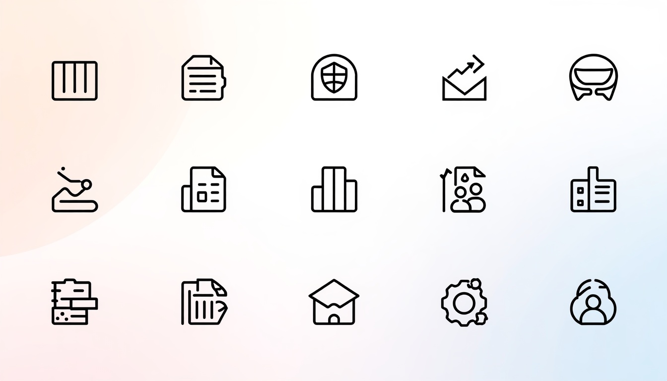
15 Icon Design Tips to Make Your Icons Look Clean and Professional
Icon Design are everywhere. They sit on your phone screen, inside your favorite apps, across websites, and on every dashboard you use at work. A single small symbol can tell people what to do without a single word.
That is why icon design matters so much. A clean icon builds trust in seconds. A messy one makes your whole product feel unfinished.
Whether you are a beginner or an experienced designer, good icon design is a skill you can learn step by step. It does not require magic talent. It requires clear thinking, steady practice, and a few reliable rules.
In this guide, you will learn 15 practical icon design tips that make icons look clean, consistent, and professional. Each tip is simple, and you can apply it today in Photoshop, Illustrator, Figma, or any other design tool.
You will also find a FAQ section at the end that answers the most common questions about icon design.
Let’s start.
1. Start With a Clear Purpose

Before you open any design tool, ask one question: what should this icon say?
Every strong icon has one job. It should communicate a single idea quickly. A magnifying glass means search. A trash can means delete. A house means home.
When you skip this step, you end up with a decorated shape that confuses people. Good icon design always starts with purpose, not decoration.
Write the meaning of your icon in one short sentence. For example, “This icon tells users they can download a file.” If you cannot explain it in one sentence, the idea is too complicated.
Next, think about who will use it. A banking app needs calm, trustworthy symbols. A kids’ game can use playful and rounded shapes. Your audience shapes every choice you make in icon design.
Also consider where the icon will live. An icon inside a toolbar has different needs than an app icon on a home screen. Knowing the context saves hours of rework later.
Finally, collect a few references. Look at how popular apps solve the same problem. Do not copy them. Study why their icons work, then build your own version. This habit will sharpen your icon design skills faster than any course.
2. Keep It Simple

Simple icons win. They are easier to read, easier to remember, and easier to scale.
Remove every detail that does not support the main idea. If an icon still makes sense after you delete a line, delete it.
Think about how small icons really appear. On a phone, many icons are only 24 by 24 pixels. Tiny details turn into blurry noise at that size.
Here is a quick test. Shrink your icon to the smallest size it will ever appear. Can you still recognize it? If not, simplify it.
Beginners often add shadows, gradients, and extra outlines to look impressive. In reality, restraint looks more professional. The best icon design feels effortless because nothing is wasted.
Try the squint test too. Step back from your screen and squint your eyes. The shape should still be clear. If it melts into a blob, the silhouette needs work.
Use fewer shapes, fewer lines, and fewer colors. Three simple shapes are usually enough to express an idea. This is the core principle behind every clean icon design system.
Simplicity does not mean boring. It means every element earns its place. Once you master this idea, your icon design work will instantly look more polished.
3. Use a Consistent Grid

A grid is the invisible skeleton of a professional icon. It keeps every shape balanced and aligned.
Most designers start with a square canvas such as 24 by 24 or 48 by 48 pixels. They then mark a live area inside it and leave a small padding around the edges.
Keyline shapes help too. These are basic circles, squares, and rectangles that guide the size of your artwork. A circle icon should usually be slightly larger than a square icon so both feel equal in weight.
Without a grid, icons in the same set look uneven. One feels huge, and the next feels tiny. Users may not notice why, but they will sense that something is off.
Set up your grid once and reuse it for every icon. In Photoshop, you can create a guide layout. In Illustrator or Figma, you can build a reusable template. Strong icon design depends on this kind of repeatable structure.
Pixel alignment matters as well. Place straight lines on whole pixels so they stay sharp on screen. Half-pixel lines look fuzzy and cheap.
Grids might feel strict at first. However, they actually free you to focus on creativity. When the structure is solved, you can spend your energy on the idea. That is why every serious icon design team uses one.
If you are unsure where to start, download a free grid template from a popular design system and study how its keylines work. Copying the structure of a grid is fine, because the grid is a tool, not the artwork itself.
4. Maintain Consistent Stroke Weight

Stroke weight is the thickness of the lines in your icon. Keep it the same across the whole set.
If one icon uses a 2 pixel line and another uses a 3 pixel line, the set looks messy. Choose one weight and stick with it. Common choices are 1.5, 2, or 2.5 pixels on a 24 pixel grid.
Also keep your corners consistent. If you use rounded corners on one icon, use them on all. Mixing sharp and soft corners is a common mistake in beginner icon design.
Line ends matter too. Decide whether your strokes end with round caps or flat caps, then apply that rule everywhere.
Be careful when you scale an icon. A scaled stroke changes thickness, and your weight rules break. In Illustrator, use the option to scale strokes carefully, or convert strokes to outlines only after the size is final.
Consistent stroke weight also helps with brand identity. When all icons feel like they come from one family, your product looks well planned. That kind of care defines professional icon design.
Try placing your whole icon set on one screen and comparing them side by side. Any icon that looks darker or lighter will stand out right away. Fix it before you export.
Remember that small decisions add up. Thickness, corners, and caps may seem minor, yet together they create the clean look people associate with great icon design.
5. Choose a Style and Stick With It

There are many icon styles. Outline, filled, flat, glyph, duotone, 3D, and hand-drawn are just a few.
Pick one style for each project and use it everywhere. Mixing a filled icon with an outline icon in the same menu looks accidental.
Outline icons feel light and modern. Filled icons feel bold and clear. Flat icons are friendly and simple. Each style sends a different message.
Match the style to your brand. A law firm may prefer thin, serious outlines. A fitness app may prefer thick, energetic shapes.
Some interfaces use two styles on purpose. For example, an outline icon may show the normal state, while a filled icon shows the selected state. That works because the rule is clear and consistent.
When you plan your icon design project, write a short style guide. List the stroke weight, corner radius, grid size, and fill rules. Share it with your team so everyone follows the same standards.
A style guide also makes future updates easy. New icons will match old ones without guesswork. This is how big companies keep their icon design systems tidy for years.
Even a one-page guide is enough to start. Add a few examples of correct and incorrect icons so new team members understand the rules in seconds.
6. Use Color Wisely

Color adds meaning, but too much color adds noise.
Start with one main color and one accent. This keeps your icons clean and easy to scan. Many professional sets even begin in a single color and add more later.
Think about color meaning. Red often signals danger or deletion. Green suggests success or go. Blue feels calm and trustworthy. Yellow warns or highlights.
Cultural meaning matters too. A color that feels lucky in one country may feel negative in another. Research your audience before you decide.
Contrast is critical. Your icon must stand out clearly from its background. Use a contrast checker and aim for at least a 3 to 1 ratio for graphics, based on accessibility guidelines.
Never use color as the only way to share meaning. Some users have color vision differences. Pair color with shape or a label so everyone can understand.
Test your icons in both light and dark mode. A dark blue icon may disappear on a black background. Prepare alternate versions when needed.
Smart color choices make icon design more accessible and more attractive. When in doubt, go simpler, because restrained palettes are a hallmark of professional icon design.
7. Use Familiar Metaphors for Quick Recognition

People understand icons by memory. They have seen a gear for settings, an envelope for mail, and a bell for notifications thousands of times.
Use these familiar metaphors whenever possible. Creativity is great, but clarity comes first.
Imagine a user searching for the settings page. If your icon is a clever abstract shape, they will hesitate. If it is a gear, they will click instantly.
That said, avoid outdated symbols. A floppy disk for save is still common, yet many younger users have never seen one. Think about whether your metaphor still makes sense today.
When no standard symbol exists, combine two simple ideas. For example, a cloud plus an arrow works well for upload. Test the result with real people.
A quick test is easy. Show your icon to five people without a label and ask what it means. If most of them guess correctly, you are on the right track.
Good icon design respects what users already know. It does not force them to learn a new language. Recognition beats originality in everyday icon design, so save the bold experiments for your logo or illustrations.
8. Make Icons Pixel Perfect

Pixel perfect icons look crisp on every screen. Blurry edges make even a great idea look amateur.
Pixel perfection means your shapes align with the pixel grid. Straight lines should land on whole pixels. Rounded shapes should use sensible radii.
Work at the actual export size when possible. In Photoshop, turn on snap to pixels. In Illustrator, enable pixel preview and align to pixel grid. In Figma, keep your coordinates as whole numbers.
Check different screen densities. A phone with a high-resolution display shows more detail than an older monitor. Export icons at 1x, 2x, and 3x so they stay sharp everywhere.
Vector formats such as SVG scale cleanly, but you should still check the smallest size manually. Sometimes a vector looks perfect large and falls apart small.
Do a final zoom check. View your icon at 100 percent and at 400 percent. Look for odd gaps, uneven curves, and stray points. Fix these small flaws before delivery.
Attention to detail separates beginner icon design from professional icon design. It takes extra time, but clients and users notice the difference even if they cannot explain it. Practice builds speed, and soon pixel checks become a natural part of your icon design workflow.
9. Pay Attention to Visual Balance

Balance makes an icon feel stable. An unbalanced icon feels like it might tip over.
Visual weight is how heavy an element looks, not how big it is. A solid black circle feels heavier than a thin outline of the same size. Spread the weight evenly across your canvas.
Optical alignment often matters more than mathematical alignment. A triangle centered perfectly by numbers can look off-center because its weight sits low. Nudge it until it looks right to your eye.
The same idea applies to play buttons, arrows, and circles. Round shapes need to be slightly larger than squares to feel equal in size. Trust your eyes, then confirm with the grid.
Negative space is part of balance. The empty areas around and inside your icon shape how people read it. Leave enough breathing room, and avoid cramming details into corners.
A helpful trick is to flip your icon horizontally. Mistakes in balance become obvious when the image looks new. You can also view it in grayscale to focus on shape instead of color.
Balanced work is a trademark of strong icon design. Many beginners ignore optical adjustments, yet those tiny tweaks separate average icon design from refined, premium results. Over time, you will build an instinct for it, and your icon design decisions will become faster and more confident.
10. Use Rounded Corners With Purpose

Corner style changes the personality of your icons. Sharp corners feel precise and serious. Rounded corners feel friendly and approachable.
Choose a corner radius and apply it everywhere. A common choice is 2 pixels on a 24 pixel grid. Larger radii create a softer look, while smaller radii feel more technical.
Keep inner and outer radii related. When two curved lines run side by side, the inner curve should be smaller than the outer one. This keeps the spacing even and avoids a pinched look.
Do not round everything automatically. Some shapes, such as a document corner or a ruler, need sharp edges to feel real. Decide which parts need softness and which need structure.
Match your icon corners to your interface. If your buttons and cards use large rounded corners, your icons should echo that language. Harmony across the whole design makes a product feel premium.
Modern operating systems also use rounded shapes for app icons. Apple and Google both give clear guidelines on container shapes. Following them helps your app look native on each platform.
Thoughtful corner choices raise the quality of any icon design. When your corners, strokes, and spacing all follow one logic, your icon design looks intentional instead of random. It is a small step that delivers a big visual payoff in icon design.
11. Create Enough Spacing and Padding

Space is the quiet hero of clean icons. Crowded icons are hard to read, and cramped sets feel stressful.
First, check the padding inside each icon canvas. Leave a safe margin around the artwork so nothing touches the edge. On a 24 pixel canvas, 2 pixels of padding is a common rule.
Next, check the gaps between lines inside the icon. Keep them at least as wide as your stroke weight. Narrow gaps fill in at small sizes and ruin the shape.
Then look at the space around icons in your layout. Give each icon enough room to breathe. Placing icons too close to text or to each other makes the interface feel busy.
Touch targets matter on mobile. A tappable icon should have a hit area of at least 44 by 44 pixels, even if the visible icon is smaller. This keeps your design usable and comfortable.
Spacing also affects labels. When you pair an icon with text, keep the gap consistent, such as 8 pixels. Align the icon and the text on the same center line.
Great icon design is not only about the drawing itself. It is also about how the drawing sits in its environment. Designers who understand this idea create icon design that works in real products, not just in a portfolio. Remember that icon design is always part of a bigger layout.
12. Make Your Icons Accessible

A professional icon works for everyone. Accessibility is not an extra feature. It is part of good design.
Start with contrast, as covered earlier. Then think about size. Very tiny icons are hard to see for people with low vision. Keep important icons large enough, and allow scaling where possible.
Add text labels whenever you can. An icon with a word beneath it removes all doubt. This is especially useful for rare actions or unfamiliar symbols.
For screen readers, add alternative text or aria labels. A button with only a trash can image should be announced as “Delete”. Without that label, blind users hear nothing useful.
Avoid relying on animation alone. Motion can help, but some people disable it or cannot see it. Support it with a static state change.
Test with real tools. Try a color blindness simulator, a screen reader, and keyboard navigation. Small fixes now prevent big complaints later.
Accessible icon design also tends to improve user satisfaction, because people can understand and use your interface with less effort. When you treat accessibility as part of icon design, you reach a wider audience and show real professionalism. Teams that value inclusive icon design stand out in a crowded market.
13. Design Icons as a Cohesive Set

A single icon rarely lives alone. Most projects need a full set, and the set must feel like one family.
Start by listing every icon you need. Group them by category, such as navigation, actions, files, and social. This helps you spot gaps and avoid duplicates.
Design the most important icons first. Use them to set the style rules. Then build the rest around those rules.
Keep the level of detail equal. If one icon has fine details and another is bare, the set feels uneven. Aim for the same visual density across all icons.
Name your files clearly. Use a naming system such as arrow-left, arrow-right, and arrow-up. Clear names save time for developers and for you.
Review the full set often. Place all icons in a grid and look for outliers. Compare size, weight, style, and corner treatment. Replace anything that does not match.
Version control helps when your set grows. Keep a master file, and document each change. Teams that do this avoid chaos as the library expands.
Strong icon design thinks in systems, not in single pieces. A cohesive set builds trust and recognition for your brand. The best icon design teams treat their library like a product that grows and improves over time.
14. Test Icons at Different Sizes and Backgrounds

An icon that looks perfect in your design tool may fail in the real world. Testing protects you from surprises.
Check small sizes first. Preview your icon at 16, 24, and 32 pixels. See whether the main shape and the details survive.
Then check large sizes. Some icons look thin or empty when scaled up. You may need a special large version with more detail.
Try different backgrounds. Test white, black, gray, colored, and photo backgrounds. Make sure the icon stays visible and attractive everywhere it appears.
Place your icon in a real mockup. Put it into the actual app screen or website header. Context reveals problems that a plain canvas hides.
Run quick user tests. Ask people to find a feature using only icons. Watch where they hesitate. Their confusion tells you what to improve.
Collect feedback from other designers and developers too. Fresh eyes catch mistakes you stopped seeing. Treat feedback as a tool, not a threat.
Testing turns good icon design into reliable icon design. It also builds your confidence, because you know your work holds up. Over time, regular testing becomes a core habit in your icon design process.
15. Export in the Right Formats

Great work deserves proper delivery. The wrong file format can ruin an excellent icon.
SVG is the best choice for most web and app icons. It is lightweight, sharp at any size, and easy to style with code. Use it whenever possible.
PNG works when you need fixed sizes or when SVG is not supported. Export multiple sizes, such as 1x, 2x, and 3x, for different screens.
ICO files are used for favicons and some Windows apps. ICNS files are used for macOS app icons. Always check the platform guidelines before you export.
Optimize your files. Clean SVG code by removing hidden layers and unused metadata. Smaller files load faster, which helps both users and website performance.
Name layers and files clearly. Use consistent names and folders so developers can find everything quickly. A tidy handoff earns trust.
Finally, include a simple readme or style note. Explain the colors, sizes, and usage rules. This small step prevents misuse later.
Delivery is the last step of icon design, but it matters as much as the first sketch. Careful exports show that you care about the whole icon design process, from idea to final file.
Best Tools for Icon Design

The right tool makes icon design faster and more enjoyable. You do not need expensive software to start, but you should pick one that fits your workflow.
Adobe Illustrator is the industry standard for vector icons. It offers precise control over shapes, strokes, and grids, and it exports clean SVG files.
Figma is popular for interface work. It is free to begin with, runs in the browser, and lets teams collaborate on the same icon library in real time.
Adobe Photoshop can also create icons, especially when you want pixel-level control or textured styles. Use shape layers so your work stays editable and sharp.
Free options include Inkscape, Affinity Designer, and Canva. Each one can handle simple icon design projects very well.
Whichever tool you choose, learn its pen tool, shape tools, alignment options, and export settings. Mastering these basics matters more than owning the newest app. Strong skills make any tool work for your icon design goals.
Common Icon Design Mistakes to Avoid

Even experienced designers repeat a few common errors. Avoid these and your work will improve immediately.
Too much detail is the most frequent problem. Small icons cannot hold complex drawings.
Inconsistent style is the second. Mixed stroke weights, corner shapes, and fill types make a set look unprofessional.
Poor metaphors confuse users. Do not use a symbol that most people will not recognize.
Ignoring context causes trouble. An icon that works on a white page may fail on a dark banner.
Skipping tests is risky. Always check readability at small sizes and on real devices.
Copying other work is harmful. Use inspiration, but create original shapes. Original work protects you legally and builds your reputation as a designer.
Fix these mistakes and you will see a quick jump in the quality of your icon design. Keep a checklist near your desk, and review every project against it. Over time, careful habits make clean icon design feel natural.
Conclusion
Clean and professional icons are not an accident. They come from clear purpose, simple shapes, consistent grids, balanced spacing, and careful testing.
In this guide, you learned 15 practical tips to improve your icon design. You also saw which tools to use and which mistakes to avoid.
Start small. Pick two or three tips and apply them to your next project. Then add more as your confidence grows.
Practice is the fastest teacher. Redraw popular icons from memory, build a small set of 20 icons, and ask for feedback. Each round will sharpen your eye.
Remember that icon design is about communication. The goal is to help people understand and act quickly. When you keep the user first, your icon design will always look clean, clear, and professional.
Ready to improve your skills? Open your design tool, set up a grid, and create your first icon today.
Frequently Asked Questions About Icon Design
What is icon design?
Icon design is the process of creating small, simple symbols that represent actions, objects, or ideas in a digital interface. Good icon design helps people understand an interface at a glance.
What is the best size for icons?
There is no single best size. Common grid sizes are 16, 24, 32, and 48 pixels for interface icons, and much larger artboards for app store icons. Always design on a grid and test at the smallest size.
Which software is best for icon design?
Adobe Illustrator and Figma are the most popular choices because they use vectors. Photoshop, Inkscape, and Affinity Designer also work well for icon design.
How many colors should I use in icon design?
Use as few as possible. One main color and one accent are enough for most projects, and many sets begin in a single color. Fewer colors keep icon design clean and easy to scan.
How do I make my icons look professional?
Use a grid, keep the stroke weight and corner radius consistent, choose one style, and test at small sizes. Professional results come from consistency more than from fancy effects.
Is icon design a good career?
Yes, it can be. Every app, website, and software product needs icons, so demand is steady. Many designers combine icon design with UI design, branding, or illustration to grow their income and skills.
Which file format is best for icons?
SVG is best for most websites and apps because it is small and sharp at any size. Use PNG for fixed sizes, ICO for favicons, and ICNS for macOS app icons.
How can I improve my icon design skills?
Practice daily, study well-made icon libraries, redraw icons from memory, and ask for feedback. A small project such as a 20-icon set will improve your icon design faster than reading alone.
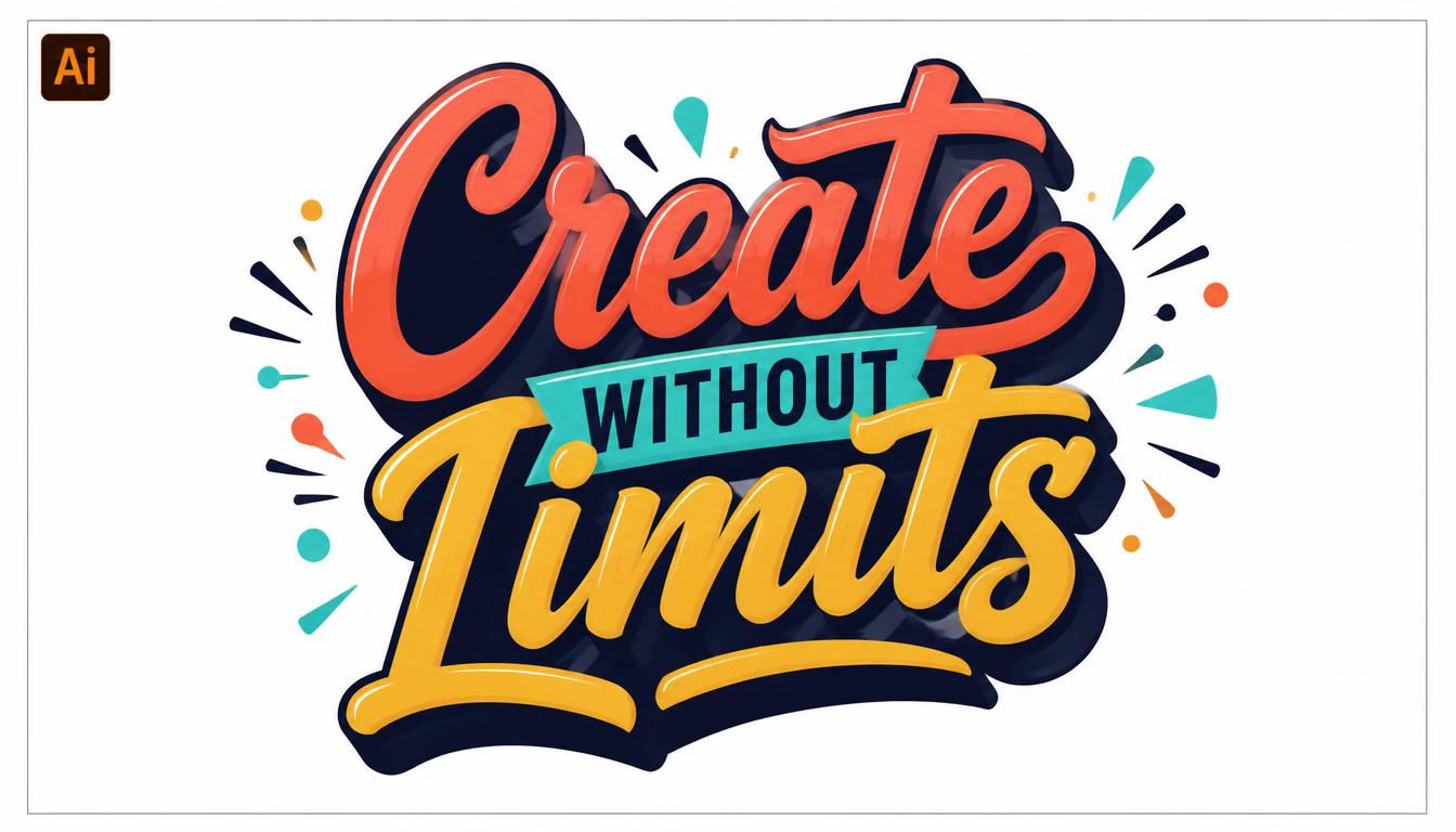
Master Typography in Illustrator: From Basic Text to Creative Lettering
Great design often starts with great words. Whether you are building a logo, a poster, or a social media graphic, the way you handle type decides if people stop and read or keep scrolling.
That is why learning typography in Illustrator is one of the smartest skills a designer can build. Adobe Illustrator gives you precise control over every letter, line, and curve.
This guide takes you from basic text to creative lettering. Each section is short, practical, and written for beginners and intermediate designers alike.
By the end, you will understand typography in Illustrator well enough to create layouts that look polished, professional, and original.
You will learn how to:
- Use every major type tool with confidence
- Control spacing, alignment, and hierarchy
- Pair fonts like a professional designer
- Turn plain text into custom lettering
- Export your work for web and print
Let’s get started.
Why Typography in Illustrator Matters

Typography is more than picking a nice font. It is the art of arranging type so it is readable, attractive, and meaningful.
Illustrator is a vector program. That means your letters stay sharp at any size, from a business card to a billboard.
Strong typography in Illustrator gives you three big advantages.
- Scalability. Vector letters never blur or pixelate, no matter how far you enlarge them.
- Precision. You can adjust spacing, size, and alignment down to tiny fractions of a point.
- Flexibility. Text stays editable until you decide to convert it into shapes.
Compared with raster programs, Illustrator treats letters as objects you can reshape endlessly. This makes typography in Illustrator ideal for logos, packaging, posters, and brand identity work.
Many professional designers also use it to build custom lettering from scratch. We will cover that later in this guide.
Good type also builds trust. Clean, balanced text makes a brand look reliable, while messy text makes even great ideas look careless.
If you want your designs to stand out, mastering typography in Illustrator is a skill worth your time.
Understanding Type Anatomy Before You Start

Before you open Illustrator, learn the vocabulary. Knowing the parts of a letter helps you make smarter choices.
Here are the key terms:
- Baseline: The invisible line letters sit on
- X-height: The height of lowercase letters like “x”
- Cap height: The height of capital letters
- Ascender: The part of a letter that rises above the x-height, like in “h”
- Descender: The part that drops below the baseline, like in “p”
- Serif: The small strokes at the ends of letters
- Counter: The enclosed space inside letters like “o”
Why does this matter? Every adjustment in the Character panel changes one of these elements. Good typography in Illustrator begins with understanding what you are adjusting.
Next, learn the main font categories.
Serif fonts feel traditional, trustworthy, and elegant. Sans-serif fonts feel modern, clean, and friendly. Script fonts feel personal and artistic. Display fonts are bold, decorative, and best for headlines.
Knowing these groups makes typography in Illustrator much easier, because you can match the font to the mood of your project.
Setting Up Your Document for Type

A clean setup saves time. Start by choosing File > New and picking a preset that fits your project.
Use RGB for screens and CMYK for print. Set your units to points or pixels, depending on your output.
Next, open the Typography workspace. Go to Window > Workspace > Typography. It places the most useful type panels within easy reach.
Turn on guides and smart guides next.
- Press Ctrl+R (Cmd+R on Mac) to show rulers
- Drag guides onto your artboard for margins
- Use View > Smart Guides for automatic alignment
Margins matter more than most beginners realize. Text that crowds the edge of an artboard looks cramped and unprofessional.
Also check your font list. Illustrator can show fonts from Adobe Fonts, which gives you thousands of licensed options inside your account.
A thoughtful setup makes typography in Illustrator faster and far less frustrating. Spend two minutes preparing and you will save twenty later.
Finally, save your file early. Use File > Save As and keep the .ai format so your text stays editable.
Meet the Type Tools

Illustrator offers several type tools. Each one has a clear purpose.
Press T to select the Type Tool. Hold the tool icon to see the others in the flyout menu.
The Type Tool creates basic text. Click once and start typing.
The Area Type Tool places text inside a shape. It is perfect for paragraphs in boxes or custom outlines.
The Type on a Path Tool makes text follow a curve or line.
The Vertical Type Tool stacks letters from top to bottom. It is popular in some languages and in creative layouts.
The Touch Type Tool lets you move, rotate, and scale single letters while keeping the text live.
Point Type vs. Area Type
Point type starts when you click once. The text keeps growing in one line until you press Enter. Use it for headlines, logos, and short labels.
Area type starts when you click and drag a box. The text wraps inside the box automatically. Use it for body copy and longer text.
Choosing the right tool is the first real decision in typography in Illustrator. Pick point type for short, bold statements and area type for readable paragraphs.
A small red plus sign on a text box means overflow. Some of your text is hidden, so enlarge the box or shorten the copy.
Mastering the Character Panel

The Character panel is your main control center. Open it with Window > Type > Character or press Ctrl+T (Cmd+T on Mac).
Here is what each setting does.
Font family and style. Choose the typeface and weight, such as Regular, Bold, or Italic.
Font size. Sets the height of your text in points.
Leading. Controls the space between lines.
Kerning. Adjusts the space between two specific letters.
Tracking. Adjusts spacing across a whole word or selection.
Vertical and horizontal scale. Stretches letters, though you should use this sparingly.
Baseline shift. Raises or lowers selected characters.
Rotation. Tilts individual characters.
Beginners often overuse scaling. Stretching a font distorts the shapes the type designer carefully crafted. If you need a wider look, choose a wider font instead.
A good starting point for body text is a size between 10 and 14 points, with leading about 120 percent of the font size.
Learning the Character panel is the heart of typography in Illustrator. Almost every professional adjustment starts here, so practice with it often.
Using the Paragraph Panel for Better Layouts

If the Character panel controls letters, the Paragraph panel controls blocks of text. Open it with Window > Type > Paragraph.
Here are the main tools.
- Alignment: Left, center, right, and justified options
- Indents: Control how far text sits from the box edge
- Space before and after: Adds breathing room between paragraphs
- Hyphenation: Breaks long words at the line end
Left alignment is the safest choice for body text. It is easy to read because each line starts in the same place.
Center alignment suits short headlines, invitations, and quotes. Avoid it for long paragraphs, because the uneven starting points slow readers down.
Justified text can look neat, but it often creates ugly gaps between words. Use it carefully and check for “rivers” of white space.
Turn hyphenation off for headlines. Broken headline words look awkward and distract from your message.
Mastering paragraph settings completes your toolkit for typography in Illustrator. Together with the Character panel, it lets you control both tiny details and the big picture.
Choosing and Pairing Fonts Like a Pro

Font choice shapes how people feel about your design. A rounded sans-serif feels friendly, while a sharp serif feels formal.
Start by asking one question: what mood should this design create?
Then follow these simple pairing rules.
Contrast works. Pair a serif headline with a sans-serif body, or the other way around.
Limit your fonts. Two typefaces are usually enough. Three is the maximum for most projects.
Stay in one family when unsure. A single family with multiple weights is a safe, elegant choice.
Avoid near matches. Two similar fonts look like a mistake rather than a choice.
Reliable pairs include a bold geometric sans-serif headline with a classic serif body, or an elegant script accent with a clean sans-serif for details.
Illustrator makes testing easy. Select your text, then use the font menu and scroll with your arrow keys to preview each option live.
Smart font pairing is a major part of typography in Illustrator because it affects every other decision you make afterward.
Check licenses too. Some free fonts are only free for personal use, so confirm before using them in client work or commercial projects.
Building Visual Hierarchy With Type

Hierarchy tells readers what to read first, second, and third. Without it, a layout feels like noise.
You can create hierarchy using five simple tools.
- Size: Larger text attracts attention first
- Weight: Bold text feels more important than light text
- Color: High-contrast colors stand out
- Spacing: White space isolates key ideas
- Position: Items at the top or center get noticed first
A classic structure uses three levels. The headline is large and bold. The subheading is medium and lighter. The body text is small and simple.
Try the squint test. Step back from your screen and squint. If you can still tell what matters most, your hierarchy works.
Consistency is just as important. Use the same styles for the same types of content throughout your design.
Illustrator helps with this through Character Styles and Paragraph Styles. Open them from the Window > Type menu, create a style once, and apply it with a single click.
Strong hierarchy turns average typography in Illustrator into professional work. Readers should never have to guess where to look next.
Kerning, Tracking, and Leading Explained

Spacing separates amateur text from polished text. Three controls matter most.
Kerning
Kerning adjusts the gap between two individual letters. Some pairs, like “AV” or “To,” look too loose by default.
Place your cursor between two letters and press Alt + Left or Right Arrow (Option on Mac) to adjust. You can also type a value in the Character panel.
Choose Optical kerning for automatic, visually balanced results. Choose Metrics to use the spacing built into the font.
Tracking
Tracking changes the space across several letters at once. Increase it for small uppercase text, which feels more open and elegant.
Decrease it slightly for large headlines, where default spacing can look too loose.
Leading
Leading is the vertical space between lines. Tight leading makes text feel dense and bold. Loose leading feels airy and easy to read.
Press Alt + Up or Down Arrow to adjust it quickly.
For logos and wordmarks, manual kerning is essential. It is one of the most noticeable details in typography in Illustrator, and clients often sense bad spacing even if they cannot explain why.
A useful trick is to rotate your text upside down. This helps you judge spacing without reading the words.
Creating Text on a Path

Type on a path adds energy to your layouts. It is a favorite technique for badges, seals, and creative headlines.
Follow these steps:
- Draw a path using the Ellipse Tool, Pen Tool, or Curvature Tool
- Select the Type on a Path Tool from the Type flyout
- Click on the edge of your path
- Type your text
You can slide the text along the path using the small bracket at the start. Drag the center bracket across the line to flip the text to the other side.
Open Type > Type on a Path > Type on a Path Options for more control. You will find effects such as Rainbow, Skew, 3D Ribbon, Stair Step, and Gravity.
For a classic circular badge, put text on the top of a circle and a second line on the bottom. Use baseline shift to keep both lines evenly spaced from the center.
Keep your curves gentle. Tight curves squeeze letters together and make them hard to read.
If letters look uneven around a bend, adjust kerning by hand. This kind of finishing touch is what makes typography in Illustrator look professional rather than automatic.
Turning Text Into Outlines

Outlining converts live text into vector shapes. Once outlined, you can edit each letter like any other drawing.
Select your text and choose Type > Create Outlines. The shortcut is Shift + Ctrl + O (Shift + Cmd + O on Mac).
After outlining, you can:
- Move anchor points with the Direct Selection Tool
- Cut or merge letters using Pathfinder
- Fill letters with gradients, patterns, or images
- Combine letters with custom shapes
There is one important warning. Outlined text can no longer be edited with the Type Tool. Always keep a copy of your live text on a hidden layer.
Outlining is also useful for sharing files. When you outline text, the font no longer needs to be installed on another computer. Printers often ask for this.
Be aware that outlining removes hinting and some font features. For small body text, keep it live whenever possible.
The ability to outline is what turns standard typography in Illustrator into true custom lettering. It opens the door to endless creative possibilities.
Using OpenType Features, Glyphs, and Variable Fonts

Modern fonts hide powerful extras. You just need to know where to look.
The Glyphs Panel
Open Window > Type > Glyphs to see every character in a font. You will find swashes, ligatures, symbols, and alternate letters.
Double-click any glyph to insert it into your text.
The OpenType Panel
Open Window > Type > OpenType to turn features on or off. Common options include standard ligatures, discretionary ligatures, stylistic alternates, and fractions.
Ligatures join letter pairs like “fi” so they do not collide. They make text look smoother and more refined.
Variable Fonts
Variable fonts contain a range of weights, widths, and slants in a single file. Illustrator gives you sliders to fine-tune each one.
Instead of choosing between Regular and Bold, you can pick any weight in between.
Variable fonts are exciting because they reduce file clutter and allow very precise adjustments. They also help you match type styles perfectly to a layout.
Exploring these features adds depth to your typography in Illustrator. Many designers never discover them, so using them gives your work a subtle edge.
Adding Creative Text Effects

Once you know the basics, you can start experimenting. Typography in Illustrator offers many ways to transform type.
Warp Effects
Choose Effect > Warp to bend text into arcs, flags, waves, and more. The text remains editable, which makes it great for quick experiments.
Envelope Distort
Choose Object > Envelope Distort > Make with Warp, Mesh, or Top Object. This lets you shape text to fit almost any form.
Gradients and Fills
Live text can take solid colors easily. For gradients on live text, use the Appearance panel to add a fill and apply the gradient there. For more control, outline the text first.
Strokes and Shadows
Add an outline stroke for bold, sticker-style text. Place the stroke behind the fill in the Appearance panel so the letters stay crisp.
A soft drop shadow adds depth, but keep it subtle. Heavy shadows look dated quickly.
Blends and 3D
The Blend Tool creates smooth transitions between shapes. Typography in Illustrator also supports 3D effects such as extrude and bevel for dimensional lettering.
Use effects with restraint. Too many at once overwhelm the message. Good typography in Illustrator uses effects to support readability, not to hide poor type choices.
Creating Custom Lettering Step by Step

Lettering is different from typography. Typography in Illustrator uses existing fonts, while lettering means drawing each letter yourself.
Here is a simple workflow.
Step 1: Sketch Your Idea
Start with pencil and paper. Draw rough versions of your word with different styles, weights, and flourishes.
Step 2: Bring It Into Illustrator
Scan or photograph your sketch and place it with File > Place. Lower its opacity and lock the layer.
Step 3: Start With a Base Font
Many designers type the word in a similar font and outline it. This gives clean letter structures to modify.
Step 4: Redraw and Refine
Use the Pen Tool, Curvature Tool, or Pencil Tool to trace your sketch. Fewer anchor points create smoother curves.
Step 5: Adjust Shapes
Use the Direct Selection Tool to pull handles and reshape curves. Make stems consistent in thickness and keep curves smooth.
Step 6: Combine and Connect
Open Window > Pathfinder or use the Shape Builder Tool (Shift + M) to merge, cut, and join shapes.
Step 7: Fine-Tune Spacing
Adjust each letter by hand. Since your lettering is no longer live text, you control spacing by moving shapes directly.
Step 8: Add Color and Detail
Finish with gradients, textures, highlights, and shadows. Keep your palette limited for a bold, cohesive look.
This process teaches you how to combine typography in Illustrator with real illustration skills. It takes practice, but the results are completely unique.
Start with simple words and short projects. Lettering is a skill that improves with repetition, and each project makes the next one easier.
Over time, your custom pieces will mix drawing skill with deep knowledge of typography in Illustrator, which is exactly how professional lettering artists work.
Using Color and Contrast for Readable Type

Color can make or break your text. Poor contrast is one of the most common design problems.
Follow these guidelines.
- Use dark text on light backgrounds, or light text on dark backgrounds
- Avoid placing text over busy images without an overlay
- Limit your palette to two or three main colors
- Test your design in grayscale to check contrast
For accessibility, aim for a contrast ratio of at least 4.5:1 for body text. Many free online checkers can test this for you.
Be careful with colors that look similar in brightness, such as red on green. They vibrate and are hard to read, and they are difficult for some color-blind viewers.
Add a semi-transparent shape behind text placed on photos. This simple trick keeps words readable without ruining the image.
Smart color choices make typography in Illustrator accessible to every reader, and accessibility is always good design.
Common Typography Mistakes to Avoid

Even experienced designers slip up. Watch for these frequent errors.
Using too many fonts. Stick to two or three typefaces for a cohesive look.
Ignoring hierarchy. If everything is bold and large, nothing stands out.
Stretching fonts. Distorted letters look amateur. Pick a font in the right width instead.
Poor line length. Lines with more than about 75 characters tire the eye. Aim for 45 to 75.
Tight leading. Crowded lines are hard to read, especially in small sizes.
Low contrast. Gray text on a light background may look stylish, but it frustrates readers.
Forgetting to proofread. A typo can ruin an otherwise perfect design.
Using all caps everywhere. Capitals are fine for short headings but tiring in long text.
Here is a quick fix for most problems: simplify. Remove extra fonts, effects, and colors until the message is clear.
Avoiding these mistakes will quickly improve your typography in Illustrator, even if you change nothing else.
Review every project with fresh eyes before sending it. A short break often reveals issues you missed.
Exporting Your Typography for Web and Print

When your design is finished, choose the right export format.
For the web: Use File > Export > Export As and choose PNG, JPEG, or SVG. SVG keeps text sharp and files small.
For print: Save as a PDF using File > Save As and choose Adobe PDF. Select a high-quality print preset and include bleed if needed.
For sharing editable files: Use File > Package to collect fonts and linked images in one folder. Check your font license first, as not all fonts allow sharing.
Before exporting, run through this quick checklist:
- Proofread all text
- Check for missing fonts
- Outline text if the printer requires it
- Confirm your color mode matches your output
Preview your work at 100 percent zoom to check small text. Details that look fine when zoomed out can show problems up close.
A reliable export process protects the effort you put into typography in Illustrator and makes sure your work looks right everywhere.
Practice Projects to Build Your Skills

Reading helps, but practice makes progress. Try these projects, ordered from easy to advanced.
- Quote poster: Practice hierarchy and font pairing
- Business card: Work with small text and tight layouts
- Event flyer: Combine headlines, body text, and details
- Logo wordmark: Focus on kerning and custom letter shapes
- Badge design: Use type on a path for circular text
- Custom lettering piece: Sketch, trace, and refine a full word
Set a small goal, such as one project per week. Save your files and compare your early work with later work. The improvement will motivate you.
Study designs you admire too. Look at posters, packaging, and book covers, and ask why the type works. Then try recreating similar layouts for practice.
Joining design communities can help as well. Sharing work invites feedback, and feedback speeds up learning.
Consistent practice is the fastest way to grow your skills in typography in Illustrator. Even twenty minutes a day adds up quickly.
Keep a folder of favorite font pairings and layouts. This personal library becomes a handy reference for future jobs.
Frequently Asked Questions (FAQs)
- How do I add text in Adobe Illustrator?
Select the Type Tool by pressing T, click on your artboard, and start typing. Click and drag instead to create a text box for paragraphs.
- How do I change fonts in Illustrator?
Select your text, open the Character panel, and choose a new font from the dropdown. You can also use the font menu in the Properties panel.
- How can I convert text to outlines?
Select the text and go to Type > Create Outlines, or press Shift + Ctrl + O (Shift + Cmd + O on Mac). Keep a live copy in case you need edits later.
- What is the difference between kerning and tracking?
Kerning adjusts the space between two letters. Tracking adjusts the space across a group of letters or an entire word.
- How do I make text follow a curve?
Draw a path, choose the Type on a Path Tool, click the path, and type. You can slide the text along the line using the bracket handles.
- Is Illustrator better than Photoshop for text design?
For logos, lettering, and scalable graphics, yes. Illustrator uses vectors, so text stays sharp at any size, while Photoshop is mainly raster-based.
- How can I make my text easier to read?
Use good contrast, clear hierarchy, comfortable line length, and generous leading. Stick to a small set of fonts and use left alignment for body text.
- What is the best way to learn typography in Illustrator?
Start with the basic tools, then practice with small projects every week. Study designs you like and rebuild them to understand how professionals work.
- What file format is best for exporting text-based designs?
Use SVG or PDF for sharp, scalable results. Use PNG for web graphics that need a transparent background.
- Can I use any font for commercial work?
No. Always check the font license. Adobe Fonts are licensed for many commercial uses, but free fonts from other sites may have restrictions.
Conclusion
Type is the voice of your design. When it is handled well, people understand your message faster and trust your brand more.
You now know how to use the type tools, control spacing, build hierarchy, pair fonts, create text on paths, and turn letters into custom artwork.
Remember that great results come from small, careful decisions repeated over many projects.
Open Illustrator today, pick one project from the list above, and start practicing. With patience and curiosity, you will soon master typography in Illustrator and create designs that look professional, original, and unforgettable.
-

 Graphics Design3 years ago
7.Exploring the Importance of Color Theory Charts
-

 Graphics Design1 year ago
Top 10 Best Graphic Design Tools for Beginners in 2025 (Free & Paid)
-

 Graphics Design2 years ago
10 Stunning Gradient Design Trends You Need to Know in 2024
-

 Graphics Design1 year ago
15 Freelance Graphic Design Tips to Boost Your Career in 2025
-

 Graphics Design2 years ago
29.Retro Design Is Making a Comeback in Modern Spaces
-

 Graphics Design1 year ago
Best Laptops for Graphic Designers – 2025 Buying Guide
-

 Graphics Design2 years ago
2025 Logo Design Trends: What’s In, What’s Out?
-

 Graphics Design2 years ago
15.The Importance of Effective Flyer Design in Marketing