Graphics Design
45.Scalable Vector Graphics (SVG)

Scalable Vector Graphics (SVG)
Introduction
The Scalable Vector Graphics (SVG) is the XML based image format that is used for creation of two dimensional graphics. SVG is a high-level format with features that are virtually universal and provides a whole range of advantages over raster formats such as PNG, JPEG, and GIF. SVG for instance enables the designers and developers to design graphics that are high quality, scalable and interactive, and it scales well regardless the size passed to it.
This article is an introduction on the basics of SVG, discussing on the topics above mentioned, the benefits of SVG, how it is used and even the pros and cons of implementing it, the syntax of SVG, and how the use of SVG is already a necessity in web development and graphic design.
Understanding Vector Graphics
But first, it is necessary to know what vector graphics are and what they are different from raster graphics.
Vector Graphics and Raster Graphics

Scalable Vector Graphics (SVG) are worked upon a basic concept of shape like line, curve, circles, and polygons with the help of mathematical calculations. These shapes rely on a coordinate-based raster and can be scaled indefinitely without reduction in either quality or efficiency. This makes the vector graphics suitable for designs that are most likely to be resized frequently or to be used in other aspects such as logos, icons and illustrations among others.
Raster graphics, on the other hand, are build up from pixels that form a continuous raster whose cells hold the color values. Stretching the raster picture beyond the given resolution leads to degradation of the image and it just becomes pixelated or blurred. There are several types of raster formats including PNG, JPEG, GIF etc which are ideal for photo images and images with high degree of details.
Scalable Vector Graphics (SVG), being an example of the vector format, eliminates many drawbacks connected to the use of raster images and is highly appreciated by Web designers, developers, and artists.
Advantages of SVG
![]()
Scalable Vector Graphics (SVG) has several distinct advantages, which are followed below, that have made it suitable to be used widely in web development and design.
1. Scalability
Another major aspect that make SVG so powerful, as also makes it very flexible, is the scalability factor. SVG graphics can be resized to any dimension because they are calculated applied mathematical equations and formulas. This makes SVG perfect for responsive design, In responsive design, elements have to change according to the changing screen size and resolution requirements.
For instance, an Scalable Vector Graphics (SVG) logo can be smoothly displayed both in tiny mobile device’s viewport and on the large desktop’s one. I can cite scalability of graphics as a highly valuable feature in the today’s world where any given content can be viewed across multiple devices and screen sizes without the need for redesigning the graphics to fit the screen size as it used to be in the past.
2. Lightweight and Efficient
Scalable Vector Graphics (SVG) files are, in general, a lot smaller in comparison with raster images, particularly when using graphics like icons, logos, and illustrations. This format is also very efficient for use on the Web since the file is in SVG format with the use of XML markup, the file size can easily be reduced by ridding the code of any unnecessary characters such as comments, or spaces.
Further, the SVG images are compressible with GZIP and it in turn results in smaller file size enhancing the load time of the webpage. It can increase greatly the overall performance of the site, more precisely, it can improve the mobile responsiveness and the search engine positioning.
3. Accessibility and SEO Benefits
Scalable Vector Graphics (SVG) are text based which make it possible for the search engines to crawl and index the content in the SVG file. This is because it gives a chance to enhance the features of a website’s accessibility as well as its SEO.
The use of descriptives and metadata within the SVG code helps the developers to integrate the graphics and make it readable for the screen readers bringing the screen reader experience closer to the overall user experience. SVGs also accommodate titles, descriptions and ARIA roles which make it easier for disabled people to access the contents.
4. Interactivity and Animations
Compared to other vector formats, Scalable Vector Graphics (SVG) performs interactivity and animations without problems, which makes it proper to employ for designing intriguing and dynamic Web content. When used with CSS or JavaScript or SMIL [Synchronized Multimedia Integration Language], SVG allows the creation of graphical objects that have a reaction to such things as clicks and hovers, and other changes.
Scalable Vector Graphics (SVG) the animations which are produced by using SVG are usually more smooth and less time taking as compared to the other techniques which are used to produce animations such as raster images. This involves the application of SVG that has been categorized under the DOM, which makes it possible to be programmed under HTML element for easy incorporation into websites and applications.
5. Easy Editing and Customization
This is because SVG is a text format that means that it can easily be edited in a text editor as well as in the vector graphic design tools like Adobe Illustrator, Inkscape, Sketch among others. It means, using svg code, designers and developers can change the shapes, colors, style and etc. , practically without starting from the beginning.
Another advantage of using Scalable Vector Graphics (SVG) is the feature of graphics that it is easily programmable to join the graphics. Just like any other HTML elements, SVG can also be customized using JavaScript or CSS during the development process; this makes it possible to change an SVG asset attribute such as color, size or position at runtime in response to user input or certain conditions.
SVG Syntax and Structure
Scalable Vector Graphics (SVG) are written in XML and so they are just a set of tags and attributes that define the structure and looks of the SVG graphic. Now it’s time to pay more attention to some of the fundamental constituents that are involved in an SVG file.
1. Basic Structure
An Scalable Vector Graphics (SVG) file begins with an <svg> tag, which denotes the graphic is contained in the SVG file. Within this tag you can put other tags that help to describe shapes, text and other items that can be shown within the page. Here’s a simple example:
“`xml
<svg width=”200″ height=”200″ xmlns=”http:2 “ …and data about the audience viewing those pages, while expecting others to load the SVG content from the Web using a URL such as <ahref=“http://www. w3. org/2000/svg”>
It is done in cascading style sheets using elements as <pre> <circle cx=”100″ cy=”100″ r=”50″ fill=”red” />
</svg>
“`
Here the shape drawn is a red circle with 50 pixels radius, centered in axes 100, 100 at an SVG canvas of 200 by 200 pixels. The `xmlns` attribute refers to the XML namespace for SVG, which is necessary for the correct display of the content.
2. Common SVG Elements
Scalable Vector Graphics (SVG) offers a rich set the elements for the rendering of shapes and paths. ] Some of the most commonly used elements include:Some of the most commonly used elements include:
<rect>: Defines a rectangle.
<circle>: Defines a circle.
<ellipse>: Defines an ellipse.
<line>: Gives the meaning of a straight line.
-<polygon>: Describes a geometrical figure that is enclosed, it has more than three sides.
-<path>: Describe a geometry that may be quite intricate by utilizing points, curves or lines.
Here’s an example that demonstrates a few of these elements:Here’s an example that demonstrates a few of these elements:
“`xml
<svg width=”200″ height=”200″ xmlns=”http:xmlns=”http://www. w3. org/2000/svg”
It is a rectangle shape with a position of x=10 and y=10, width of the rectangle is 50 and height of the rectangle is 50 and color of the rectangle is blue.
There are two shapes in this picture: The first one is a circle with the coordinates of the center (cx, cy) equal to 150 and the radius (r) equal to 30 The second one is filled with the green color.
This can be depicted by the following line on the chart: <line x1=”10” y1=”150”x2 Fig. : 190″ y2=”150” Stroke: black” Stroke-Width: 2”.
Here below is the xml code: < > <polygon points=”50,160 90,200 10,200” fill=”purple” />
</svg>
“`
In this example we have drawn a rectangle of blue color, a circle of green color, a black line, and a polygon of purple color within SVG canvas.
3. Styling SVG with CSS
Like HTML elements, SVG elements may also be styled using CSS. By using `style` attribute you can enter the styles directly into the SVG code, but you can also link an external CSS file.
Here’s an example of inline CSS styling in SVG:

“`xml
<svg width=”200″ height=”200″ xmlns=”http://www.w3.org/2000/svg”>
<circle cx=”100″ cy=”100″ r=”50″ style=”fill: orange; stroke: black; stroke-width: 4;” />
</svg>
“`
Here in this case, using inline CSS a black stroke of thickness 4 pixels is used to border the orange circle.
Use Cases of SVG
It is sufficiently versatile to be used on icons and logos and as simple illustrations and animations. It is now time to review the most apparent application fields of SVG within web design and development.
1. Logos and Icons
Scalable Vector Graphics (SVG) is ideal to be used on logos and icons since these are usually shrunk or expanded and placed in different areas. With SVG how logos and icons can be produced in such a way that these will be very flexible and appear crisp regardless of their size whether it is used in a website, in an application or in printed materials for marketing purposes.
Most of the icon sets that are found in the current web developments include SVG as the base image format so that developers can easily manipulate the icons to match their intended designs.
2. Data Visualization
Scalable Vector Graphics (SVG) thus, the primary purpose of using SVG largely relates to the creation of charts, graphs and any other form of data portrayal. Libraries like D3. js and Chart. js uses SVG to develop exact unique visualizations which are available to be incorporated into different applications. Because they do not sacrifice quality in any way, SVG are perfect for displaying data that need to be resized depending on the size of the presentation field.
3. Illustrations and Infographics
Scalable Vector Graphics (SVG) illustrations and infographics are still another example of use cases for SVG. Designers have the possibility to create sophisticated illustrations that will be adjusted to any piece of equipment and display size and resolution. SVG also allows putting text in a simple and flexible format of text Rather the use it to create simple illustrations that can be animated in a dynamic way so as to create more engaging illustrations.
4. Interactive Web Elements
The key application of Scalable Vector Graphics (SVG) is in the development of dynamic web based objects including buttons, menus, and other forms of animation. When SVG is used with CSS and JavaScript, one can be able to design and develop the interfaces that will enable the users to interact with the computer in real time. Being capable to use in conjunction with HTML and DOM, SVG is an effective tool for improving interactivity of webpage or web application.
5. Responsive Design
As seen, SVG is very essential in the development of responsive design since it has scalability. Similar to web page that require alterations for every screen size, Scalable Vector Graphics (SVG) guarantee that elements on the visual side of the website will not lose their quality no matter the device used. Responsive design that involves SVG enables developers to eliminate image files sized at different resolutions and therefore minimizing the overall website’s complexity.
Conclusion
Scalable Vector Graphics (SVG) artist and web developers can attest to the usefulness of the Scalable Vector Graphics (SVG) in web design. Due to its scalability, easy portability, positive effects on accessibility, and ability to support interactivity and animation, it is an ideal choice for generating qualitative graphics that would have a good performance.
Graphics Design
Top 10 Exciting Graphic Design Tips Every Beginner Must Know
Top 10 Exciting Graphic Design Tips Every Beginner Must Know
Introduction
Graphic design tips for designer combines visual elements including typography together with photography and illustration and layout technique designs to deliver messages effectively. Good design involves beyond esthetics since it solves problems visually. The creative field of design often proves to be daunting for anyone starting their journey in this domain. Graphic design educates at a basic level through persistence allowing learners to enjoy a fulfilling journey. Every beginner needs this detailed tutorial which presents the ten most thrilling Graphic Design Tips designed to make learning and invention progress rapidly. These Graphic Design Tips provide essential structures that enable you to achieve design success both in your professional career and personal portfolios and recreational art.
1. Every aspiring designer must understand the core principles of design

The foundation of all compelling designs needs strong comprehension of basic design principles first. Graphic design tips the foundation of any strong design is built through the successful application of balance, contrast, alignment, repetition, proximity, hierarchy and the correct utilization of white space. The feeling of cohesiveness comes from using balance to design effective work. Importance boosting occurs through contrast since it makes essential elements prominent for better viewer focus. Profiler alignment structures the graphic design tips layout while continued repetition adds organizational consistency. Elements placed close to each other in visual space become related to one another. Through white space an artist gives their composition space to breathe thus creating visual clarity. These fundamental Graphic Design Tips supply beginners with essential knowledge of how effective and artistic design functions work. Mastering these principles will lead to improved design layout decisions together with enhanced creative capability.
2. Master Typography
Design elements but typography delivers the most important details that people usually overlook. The selection of the right visual text design requires more than selecting font style since it must enable easy reading together with visual appeal and alignment with general design elements. Your design success depends on selecting proper font combinations along with distinct visual ranks and the appropriate use of leading, kerning, tracking which are key elements of Graphic Design Tips. Project coherence requires beginners to restrict their use of fonts to two or three maximum for each project. Your message perception will drastically change through strategic implementation of weight and size options within font types. Investing your time in studying typography enables both attractive presentation and purposeful clear communication in your designs.
3. Choose the Right Color Palette

Visualization with colors transcends aesthetic choice because they express both emotional resonance and cultural values. Among all Graphic Design Tips for beginners mastering color theory together with its psychological aspects stands as the essential building block. Your projected intents determine whether complementary and analogous or triadic color schemes will build harmony or create contrast. Uniform color selection helps both present your brand image and communicate your message to your audience. Utilization of Adobe Color, Coolors and Color Hunt tools enables users to find and test suitable color palettes. Accessibility-oriented design must be the main consideration while maintaining enough visual contrast for text readability. Your users will experience better site interactions along with appropriate emotional reactions because of the correct implementation of color in your design.
4. Keep It Simple and Clean
Clarity is key in communication. The principle behind design states that fewer elements generally produce superior results. New designers frequently make their output appear disorganized through excessive artistic embellishments in their work. Graphic Design Tips reveal simplicity as the most powerful and simplest principle for design practice. Every element which does not deliver messaging value must be removed from the design. Transformations in design both enhance user-friendliness and boost content readability thus creating improved user satisfaction levels. Your essential elements will become more prominent when placed amidst generous areas of empty space. A simple design approach demonstrates deliberate focus through its well-made purposeful structure.
5. Use Grid Systems
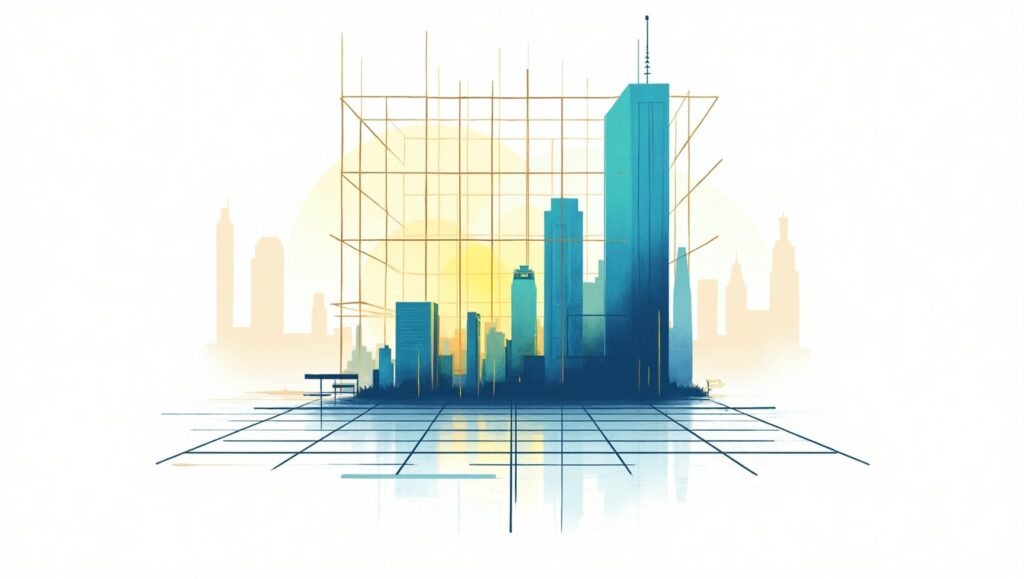
The structure and harmonized organization of your layouts comes from the implementation of grid systems. Every element in your design benefits from proper organization through grid systems which creates consistent and balanced presentations. The implementation of grids enhances professional appearance in all output formats including websites and posters with business cards. The hidden lines work together to maintain proper alignment as well as keep all elements symmetrical while following proportions. Many new designers fail to incorporate grids into their work which is among the most important yet fundamental graphic design tips at their level. The design tools Adobe XD, Figma, and Illustrator come with pre-installed grid components that provide assistance for your design organization. A grid system works properly when it produces results which are both easier to understand and attractively designed.
6. Get Comfortable with Design Software
Tools you select for work have equivalent importance to your design methods. Knowledge of professional design software acts as a fundamental requirement for designers who want to develop their career. The professional standard in design industry uses Adobe Creative Suite along with its core components which include Photoshop Illustrator and InDesign. The budget-conscious designer has multiple excellent tool options available between GIMP, Canva, Figma and Affinity Designer. Beginners should spend their time on these platforms for developing their proficiency and assurance to handle design projects. Online tutorial study along with sample work experience and project challenges provide exceptional strategies to develop graphic design software abilities. Learning how to handle tools creates freedom through better implementation of your ideas.
7. Incorporate Visual Hierarchy
The design composition of elements develops visual hierarchy through strategic importance-based organization. Every design requires specific elements which must appear more dominant to direct viewer attention. You can construct a clear flow by applying different elements of size contrast and position and color choice and alignment purposes. The primary text needs strong bold typefaces that stand out followed by supporting text with delicate typefaces. The use of these tips from Graphic Design creates a clear understanding of messages that prevents any confusion among viewers. When hierarchy is missing in design the overall composition becomes difficult to follow and disorderly. Hierarchical organization systems enhance both route navigation and streamlines communication processes between users.
8. Use High-Quality Images and Graphics

Any design becomes less effective when using poor-quality images because low-resolution pictures diminish the entire work. Your project requires high-resolution sharp images which should remain faithful to your branding along with the project’s overall mood. Vector file types provide scalability for logos or other icons while maintaining high clarity. Select images that demonstrate genuine authenticity instead of default stock pictures. Unsplash together with Pexels and Freepik are websites that provide extensive collections of fee-based assets and free options. The below Graphic Design Tips function as fundamental elements for achieving professional appearance in every design. Design consistency across image quality and color applications as well as visual elements strengthens your designs while it helps your audience develop confidence in you.
9. Seek Feedback and Revise

Design is an iterative process. Most initial drafts served as foundation for better creatio.ns Find willing supporters in your friends or seek help from designers on online communities to receive helpful critique about your work. Users can gain valuable insights through the online communities of r/design_critiques at Reddit and the Discord groups. Always keep an open mind while listening to feedback because you must prepare yourself to revise repeatedly. Every beginner must learn how to accept feedback properly because it represents fundamental growth in graphic design practice. The more times you revise your work the more excellence you approach. You should view feedback as an advancement chance instead of a failure.
10. Keep Learning and Stay Inspired

Design is both exceptionally broad and consistently evolving. Your relevance depends on your ability to remain innovative through constant education and learning. Become a subscriber of leading designers on YouTube along with online course enrollment and regular Behance and Dribbble portfolio exploration of top designers combined with daily blog reading. Being exposed to new styles along with techniques and trends creates continuous creativity. A perpetual trait of graphic design knowledge is always remaining curious. Your love for ongoing education should stay active because you will discover fresh things such as typefaces and motion graphics and advanced software tools. The environment around you contains abundant inspiration which you need to transform into your original approach.
FAQs
Starters in graphic design must understand which tips will prove most essential for their learning journey.
Your most important Graphic Design Tips consist of mastering design fundamentals together with typography and layout while selecting proper colors and utilizing high-quality images and maintaining regular practice of your art.
What would be the suitable software for an entrance-level graphic designer?
Your first steps as a beginner should be Adobe Photoshop and Illustrator alongside InDesign. The free and cost-efficient graphic design options include Canva as well as GIMP along with Figma and Affinity Designer. Learning the tools to proficiency will enable you to apply the Graphic Design Tips with better effectiveness.
The basic question is this: What strategies exist for developing my graphic design abilities?
Regular practice along with participation in online design communities and seeking expert guidance and accepting constructive criticism from both communities and industry professionals will help you advance. Daily application of different Graphic Design Tips will enhance your design abilities.
White space stands out as a vital element in design since it provides vital breathing space for designs to stand out.
White space provides space for breath by improving focus which makes elements easier to recognize in design work. White space remains one of the great Graphic Design Tips because it balances design appearance and enhances readability.
Which approaches can I use to build my unique design approach?
Testing multiple styles alongside tool testing and designer examinations and personal appeal assessments will lead to style development. Active practice with implemented custom Graphic Design Tips throughout time will forge a distinctive creative identity for you.
Conclusion
Virtuosity in graphic design requires more than a short time to develop. Achieving mastery in this field demands continual effort and innovative thinking together with fundamental knowledge understanding. The collection of top 10 exciting Graphic Design Tips serves as a foundation to support beginner users in their progress toward stability. Mastering design principles and typography while developing your style requires experimentation with color and tools and receiving feedback since these elements lead to designer confidence. Utilizing these same Graphic Design Tips in numerous projects leads to the creation of striking and effective designs which are both visually appealing and impactful. Your strength in visual design grows while you maintain your passion for designing because each new design adds more depth to your practice.
Graphics Design
10 Unique Sources of Creative Design Inspiration You Haven’t Tried Yet
10 Unique Sources of Creative Design Inspiration You Haven’t Tried Yet
Creative design inspiration journeys into endless creativity but require new sources of inspiration for Creative Design during occasional moments. Your creative design inspiration process can result in remarkable achievements by exploring sources beyond typical ones regardless of your professional role as graphic designer web developer or fashion creator. Your experience on Pinterest together with Behance and Dribbble remains beneficial yet restricts your creative thinking because it focuses mainly on popular trends. This article presents a list of 10 uncommon yet effective Creative Design Inspiration sources which may be new to you.
1. Nature’s Hidden Wonders
The microscopic world of nature serves as one of the most incredible creative design inspirations although few people have truly explored it. Watching the complex leaf patterns and tree bark textures and symmetrical patterns in snowflakes enables designers to generate new innovative design concepts. Observing sunset colors and cloud patterns together with the structural arrangement of rock layers reveals unforeseen design ideas to you.
Moving closer to nature through macro photography of flowers and water droplets alongside insects produces exceptional design pattern references showing fine details. Natural approaches to Creative Design Inspiration produce unique design ideas which conventional designs do not typically display.
2. Historical Artifacts and Vintage Ephemera

History contains numerous artistic ideas that inspire design creativity.Companionเดิม Design projects benefit from a nostalgic innovative look when designers use items like old newspapers, postcards and product labels from various past decades.
The study of old artistic movements becomes possible by visiting museums together with archives and flea markets. Creative design inspiration contemporary designs of Art Nouveau Bauhaus and Victorian architecture provide valuable source material to modern creative projects. Restoring such historical features enables designers to develop modern designs that emphasize permanent value.
3. Abstract and Surrealist Photography

Photography functions as Creative Design Inspiration through standard image practices and surrealist and abstract photographs drive design creativity to its peak. Playing with lighting together with reflections and distorted perspective permits you to produce disturbing images that provoke innovative thinking.
You should test different photography techniques such as motion blur and double exposure as well as infrared photography to generate remarkable otherworldly images. The simple combination of black-and-white tones during an experiment leads you to view shapes, forms and shadows with fresh perspective. Your design quality will improve remarkably when you observe abstract photographic techniques or create experimental photographs.
4. Experimental Typography in Street Art

Many designs heavily depend on typography which you can easily discover through studying street art and graffiti. Since it deviates from standard typefaces street typography provides expressive and raw elements together with unpredictable characteristics which enable traditional design parameters to break.
Explore your city by photographing the written signage along with public murals as well as protest signs. Various spontaneous local creations use storytelling mechanisms as their core component. Street typography serves as a suitable option for creative design inspiration when making a logo or brand project.
5. Music Visualization and Sound Waves
Only a small percentage of designers recognize sound as an unexplored source for design creativity although music shares a strong relationship with design concepts. The combination of sound waves with frequency patterns and music-based color selection leads to fresh design ideas.
Audio-to-visual conversion tools include spectrograms and waveform visualizers among their functions. Using this type of functionality enables you to make expressive posters and album covers along with digital visualizations that display sound elements. Creating designs based on music enables your work to capture emotional intensity alongside rhythmic qualities which standard techniques cannot transmit.
6. Dreams and Subconscious Imagery
Dream images consist of peculiar symbols that produce original ideas for designers to use as Creative Design Inspirations. Writing down your dreams in a journal allows you to record distinctive images that your subconscious develops.
The diverse nature of dream elements together with their spontaneous connections gives rise to abstract illustrations and product designs or user interface elements. Salvador Dalí and René Magritte incorporated dreamlike visual elements similar to surrealism so you could adopt their approach in designing your upcoming project through your dream inspiration.
7. Science and Mathematics in Design

Mathematics together with science appear unconventional as Creative Design Inspiration sources although they present significant potential for design innovation. Creative designers find widespread value in nature-based Fibonacci sequences and fractals along with geometric patterns because they adapt these elements for their designs.
The golden ratio functions as a mathematical rule which generates elegant dimensional relationships. The design philosophy finds its optimal use in website layouts as well as logo developments and fashion illustrations. New design work benefits by introducing elements derived from molecular structures and fluid dynamics and astronomy.
8. Children’s Drawings and Naïve Art

The clearest creative design inspirations often appear in basic places. The drawings of children represent natural unadulterated self-expression which exists beyond standard design principles. The creative freedom of children in using colors and proportions and storytelling helps people discover their own artistic liberation.
Artists along with designers use childlike spontaneous techniques in their work to achieve professional growth. To overcome design blockages start your drawing with childlike freehand methods by using crayons combined with spontaneous doodles and random colors.
9. Unusual Cultural Festivals and Traditions
Each culture selects special holidays for celebration which include extravagant costumes along with decorative schemes and theatrical displays. Creative Design Inspiration manifests through these events which present extraordinary bold color schemes and intricate design patterns together with significant meaningful symbols.
The Day of the Dead celebration in Mexico presents itself through lively skull artwork while Japanese Tanabata festivities display elegant paper artwork. Your academic research into cultural traditions enables you to integrate powerful cultural elements into your projects while pushing your creative brainstorming.
10. Artificial Intelligence and Algorithm-Generated Art
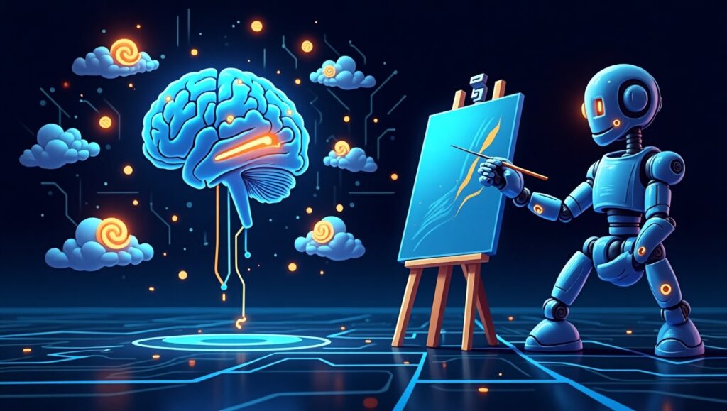
Technology advances from artificial intelligence combined with algorithms create significant changes in the field of design. Human designers can use platforms such as Deep Dream, Runway ML and generative art to generate visuals which merge their creativity with the analytical skills of machines. The unexpected results which AI produces function exceptionally well as inspirational material for creative design work.
Experimenting with AI-generated designs will help you find unexpected aspects which can be developed into original designs. Treating artificial intelligence as an aesthetic enhancement rather than creative replacement gives diverse opportunities to design thinking.
Frequently Asked Questions (FAQs)
What methods do I have to integrate these resources into my daily design workflow? Spend one week each month selecting a brand new source for investigation. Develop notes based on your inspiration sources and construct mood boards prior to attempting smaller test projects that will lead to large design implementations.
Non-designers may effectively use these sources for generating design inspiration. A: Absolutely! The Creative Design Inspiration platform benefits writers and photographers as well as entrepreneurs to strengthen their branding and marketing content together with storytelling strategies.
Because exploring these inspirations requires any kind of specialized or costly equipment. A: Not at all! The inspirations demand only observation combined with curiosity and experimental approaches.
Does failing to find inspiration from these sources make you feel hopeless? A: No. If these inspirations do not spark ideas for you then try mixing and matching different sources or taking a break to come back with new perspectives. Each person faces inspiration in different ways. Combine different sources or simply step away for a while before reviewing the sources with different perspective.
Which strategies can I use to protect originality within my designs which incorporate these sources? You should analyze all delightful aspects of original elements before you transform them into your special creative interpretation.
The use of these distinctive sources will allow you to improve your creative output and produce innovative design work that distinguishes itself in your industry. Happy designing!
Graphics Design
Modern Graphic Design Trends That Will Dominate In 2025
Modern Graphic Design Trends That Will Dominate In 2025
Introduction
Modern graphic design trends profession transforms continuously because innovation from technology and cultural developments and radical creative processes drive its transformation. The year 2025 will witness modern graphic design trends achieving their highest levels of dynamism and immersion and user-focused characteristics. Designers need to maintain their position of relevance because AI advancements combine with 3D visuals sustainable designs and personalized experiences to lead design trends in 2025.
The article provides a glimpse into what the upcoming visual creative domain in 2025 will look like by examining present modern graphic design trends. Success in design creation and engagement depends on knowledge of these trends no matter if you work as a modern graphic design trends or a business operator or a marketer.
1. The Rise of AI-Powered Design Tools

AI currently reshapes the modern graphic design trends industry so its expansion will intensify by 2025. AI platforms optimize design operations by performing time-consuming workflows while generating professional-quality artwork alongside enabling designers to test innovative design aesthetics.
The implementation of artificial intelligence revolutionizes graphic design practice
- The usage of AI tools Runway ML alongside Adobe Sensei enables designers to produce intricate visual content with reduced manual labor.
- Machine learning systems examine current design patterns to design ideal layouts.
- Modern graphic design trends use of artificial intelligence technology enables the creation of automated art that illuminates large corporate platforms including branding and social media and marketing initiatives.
Balancing AI with Human Creativity
Modern graphic design trends aItechnology helps work processes move faster but human imagination cannot be replaced by any system. A perfect design results from the effective merge of AI automated systems with human creative intuition to produce authentic and emotionally engaging visual sequences.
2. 3D and Immersive Design

The market demand for modern graphic design trends in 3D steadily increases because businesses and brands require interactive and visually interesting content.
The Growth of 3D Elements in Design
- The modern design field increasingly incorporates 3D elements because these elements have become standard features in web development and branding as well as product packaging work.
- Modern graphic design trends add realistic visual cues through texturing effects and lighting and depth elements to make their designs more comprehensive.
- Three applications namely Blender, Cinema 4D and Adobe Dimension simplify 3D design accessibility for artists.
Digital graphics are evolving because of immersive experiences implemented by designers.
Modern graphic design trends 3D technology allows brands to show interactive products through virtual reality presentations and animated marketing content. Businesses predict 2025 will witness this trend gaining its place at the forefront due to business focus on delivering engaging digital experiences.
3. Minimalist and Clean Aesthetics

The approach of keeping design simple continues to be a leading modern graphic design trend because it proves enduring throughout different times.
The Power of Simplicity in Design
- The extra space in minimalist layouts lets viewers focus on important features.
- Modern graphic design trends appearance of simplicity enables better user experiences through solutions that facilitate easy navigation while remaining easily readable.
- White space distribution follows a deliberate plan to construct equilibrium between design elements.
Examples of Effective Minimalist Design
- The branding approach of Apple concentrates on developing straightforward designs with clear elements.
- Modern graphic design trends Google implements its user interface design with a neat minimalist method.
- Luxury brands incorporate minimalistic design elements to demonstrate both elegance and sophisticated appearance.
4. Bold Typography and Experimental Fonts

Modern graphic design trends design with typography has evolved beyond functional purposes since it now functions as an essential visual factor.
Trends in Variable Fonts and Kinetic Typography
- Dynamic italics components found in variable fonts grant designers real-time control over multiple font characteristics such as style and weight and width.
- Moving typography provides animated text elements as a way to produce interesting motion graphics effects.
- Modern graphic design trends market sees large and oversize font styles controlling visual content in websites and social media platforms and digital advertising.
Best Practices for Using Bold Fonts
- The combination of expressive typography should appear with basic minimalist design elements.
- Modern graphic design trends clear fonts can be achieved through the selection of proper combinations between typefaces.
- Creators should try using gradient effects alongside 3D formatting to achieve contemporary designs.
5. The Return of Retro and Nostalgic Design

Modern graphic design trends restore retro elements by uniting dated style principles with current style guidelines.
Most designers choose vintage styles because of their growing appeal
- Pretentious design elements activate emotional responses and provide a recognizable feel.
- Styles with vintage elements and fonts that use old-school designs combine to produce warm design approaches that personalize the look.
- The use of retro design elements helps brands gain visibility among many digital competitors.
Tools for Creating Nostalgic Designs
- Canva and Photoshop offer retro-style filters.
- The vintage brush set as well as textural elements can be found in Illustrator.
- Digital assets for classic design aesthetics are available through RetroSupply Co website.
Conclusion
The future of modern graphic design trends approaches 2025 with modern elements that highlight innovation combined with sustainability along with superior user experience. The future of graphic design holds excitement and dynamism based on tools powered by AI as well as 3D immersive visuals and minimalist categories alongside bold typography together with sustainable design practices.
The industry demands adaptation to emerging trends from designers who want to maintain their creative originality in their work. The combination of enhancing technologies with experimental design elements allows you to generate visual experiences which present meaningful connections to contemporary audiences.
Frequently Asked Questions (FAQs)
- What rudiments define graphic design trends in our current modern era of 2025?
The key design trends in 2025 consist of AI-powered design tools along with 3D graphics and minimalism and bold typography as well as sustainable design and augmented reality followed by inclusive design.
- AI technologies serve as essential factors that influence current graphic design trends.
Design automation through AI technology allows users to produce artwork and locate optimized design solutions while needing human input for creative expression.
- The reason behind minimumism’s ongoing popularity in modern graphic design trends remains unknown.
Users experience better interactions when minimalism applies because it eliminates noise elements while featuring essential visual features thus establishing itself as a classic and functional design pattern.
- Design professionals need which available tools for generating 3D and immersive artwork?
Designers seeking realistic interactive 3D graphics should consider utilizing the 3D design platforms Blender, Cinema 4D and Adobe Dimension.
- Modern graphic design trends present opportunities which businesses can leverage for their success.
Modern business marketing receives benefits from design trends because the latest trends enable branding improvements and better customer engagement alongside visually sophisticated materials creation.
-

 Graphics Design1 year ago
7.Exploring the Importance of Color Theory Charts
-

 Graphics Design12 months ago
15.The Importance of Effective Flyer Design in Marketing
-
 Graphics Design1 year ago
14.Mastering the Art of Print Design: Tips and Tricks
-
 Graphics Design1 year ago
13.Exploring the Latest Trends in Photo Editing Software
-

 Graphics Design10 months ago
29.Retro Design Is Making a Comeback in Modern Spaces
-

 Graphics Design7 months ago
10 Stunning Gradient Design Trends You Need to Know in 2024
-
 Graphics Design1 year ago
1.The Transforming Power of Typography on Graphic Design
-
 Graphics Design1 year ago
8.The Evolution of Vector Graphics Software


Aroma Sensei
October 25, 2024 at 7:13 am
Aroma Sensei Good post! We will be linking to this particularly great post on our site. Keep up the great writing
Leandro Tabon
October 26, 2024 at 7:51 am
I really like your writing style, superb info , appreciate it for putting up : D.