
Graphics Design
The Art of Less: How to Master Minimalist Design in 2024


The Art of Less: How to Master Minimalist Design in 2024
The trend of minimalist design has been gradually acting up in the last one decade, but in 2024 have turned multidimensional. The real environment and the virtual environments, both are overcrowded and minimalism supplies a solution in order to shrink these overcrowded environments. Minimizing non-essential facets of any structure increases its focus to the bare needs, therefore providing a soothing effect. If you are asking yourself ways on how to perfect this art in 2024, you are welcome.
Outline of the Article:
- Introduction: What do we mean by Minimalist Design?
- Minimalist Design – Learn from This
- Why people still follow Minimalism in 2024
- Essentials of Minimalism Design
- Whitespace: Power of Space
- Simplicity: Less is More
- Functionality: Form Follows Function
- Balance and Symmetry
- Technology in Today’s Minimalist Design
- Implication of AI & Automation
- Sustainability Meets Minimalism
- Minimalist Design in Other Areas of Specialisation
- Interior Design
- Web Design
- Graphic Design
- Product Design
- Dumb Ideas of Minimalism
- Over-simplification
- Lack of Personality
- Ignoring Functionality
- Steps to Learn with When Switching to Minimalism in Designing
- Declutter Your Design Process
- Prioritize Essentials
- Incorporate Timeless Elements
- Color Palette in Minimalism
- The Rise Of The Murky Palettes
- The Role of Contrast
- Typography in Minimalist Design
- Minimalist Design for Businesses
- The Reasons Brands are Turning to the Art of Simple Design
- Some of the examples of minimalist brands include;
- The Future of Minimalist Design: So What to Expect?
- Conclusion: Getting Ready for the Art of Less in 2024
- FAQs
Introduction: What do we mean by Minimalist Design?
Minimalism is a concept that has to do with subtraction, The non-essential elements are left out in order to bring out the bare essentials. Whether it is a webpage, a product or the interior space of a house, minimalism is the idea of maximizing simplicity, clarity, and functionality. Of course it is not about coming up with lifeless or clinical spaces; it is about the decisions one wants to make. Each of them and every detail has its own function and that is why the outcome is nothing but clean and meaningful layout.
Minimalist design in 2024 is far from being only the aesthetic experience of the spaces but it has also a psychological impact. It provides silence when otherwise the world is full of noise.
Minimalist Design – Learn from This

Minimalism as a style dates back to the middle of the twentieth century concentric with other such movements as Bauhaus which bore the slogan’ form follows function. ‘Although minimalism as a style of design has developed with today’s technological propensity and sensibility, and have adopted them. Due to advancing technologies in the use of the internet, social media sites have extended the aesthetic experience of minimalism, extending it both virtually and physically.
Why people still follow Minimalism in 2024

In the period of informativeness and consumer oriented society, minimalism remains a part of culture that is inspiring and needed. Its relevance in 2024 is based on such factors as environmentalism, mental health, and optimization. This principle of “less but better” has been adopted by people and the same applies to design. In other words, minimalism is a kind of design that avoids creating complexity thus leading to less decision fatigue and harmony.
Essentials of Minimalism Design
Whitespace: Power of Space
Negative space—or whitespaces—are one of the mainstay of minimalist design. It provides ventilation aspect and also openness to the design of the whole project. Whitespace is used by designers in 2024 for improving the readability, for concentrating the public’s attention, and for establishing the feeling of calmness.
Simplicity: Less is More
As it was mentioned, Minimalism is based on the concept of simplicity. What this means is that there is a reduced use of elements in the Ardno_consultancy Website, but those used are highly selected. It can be as simple as having lesser colors, shapes, words with the aim of eliminating clutter and noise that pollute a layout.
Functionality: Form Follows Function
Organsisational minimalism is very utilitarian in its approach. It is pertinent to state that without basic functionality then concept does not exist because everything inside of the design has a point. Indeed, in 2024, this principle is even more relevant regarding the trends such as user-centered design. Consequently, the user is at the center of any product design and in digital platforms as well.
Balance and Symmetry
The key theory associated with minimalism is the balance and symmetry in the items that are designed. Indeed the appearance may be simple and almost plain but it has to be purposeful and balanced. It is also possible to make use of asymmetry to produce tension but the approach should not be done blindly resulting in failure of balance.
Technology in Today’s Minimalist Design

Implication of AI & Automation
In particular, the emergence of artificial intelligence (AI) has affected the development of minimalist design in 2024. Automation helps the designer to eliminate unnecessary and time-consuming steps, to concentrate on the creation of the user-centered experience and to eliminate complexities that do not enhance the user experience. Technology renders tools such as Artificial Intelligence assist in the elimination of complex structures which in turn lead to more organized and clean designs.
Sustainability Meets Minimalism
In today’s world, conservation of resources has become very significant and so does the application of minimalism in design. Inasmuch as it cuts short the materials to be used, aiming at longer life-span of the products and elimination of digital noise, it echoes the principles of minimalism. 2024 studies minimalism by primarily focusing on the promotion of the responsible consumption of products and resources.
Minimalist Design in Other Areas of Specialisation

Interior Design
In interior design minimalism means little ornament, straight lines, empty spaces and the predomination of practical needs. Basic colours and minimalistic furniture are soothing to the eyes and are preferred in today’s hectic life.
Web Design
The trends in web design have gone a notch higher to embrace minimalism; a situation where there is simple navigation, neat arrangement, and lots of spaces. Simplicity in website layout helps to improve users’ interactions by eliminating many elements, which can interfere with intended actions or content.
Graphic Design
Minimalism in graphic design therefore entails use bold visuals, minimal direct coloration and selective typography. This is ideal for branding since the message is passed on easily to the audience without availing too much information at once.
Product Design
Minimalism in product design is therefore the ability to come up with products that are as beautiful as they are useful. Consider Apple’s designs – they are minimalistic, clear, and easy to navigate – all the characteristics of minimalist design.
Dumb Ideas of Minimalism
Over-simplification
The biggest mistake is to make a product of its minimalistic design to a point where it would feel bare or even unfinished. This means that although minimalism eliminates the complexity, it also works around purpose. It is important not to overdo to extent to which it is removed as this make whole design look very bare.
Lack of Personality
Another drawback is that cold designs often become a characteristic of such interior designs. However, one should not think that this is plain and that there is no character left in a minimalist design.
Ignoring Functionality
Certain designers who decide to create minimalist furniture pay too much attention to how it looks like and forget that minimalism is all about form. In other words, design that may appear very beautiful in approach but lacks functionality is not minimalism.
Steps to Learn with When Switching to Minimalism in Designing

Declutter Your Design Process
Eliminate as many wastes as possible in the current process including the following wastes in the design process. Simplify processes and prioritise the important. This will assist you to develop elegant designs, which are both functional and potent.
Prioritize Essentials
As can be seen minimalist design does not allow for any the inclusion of any non-essential features. When considering design and implementing each part or component, ask yourself, is this useful and required or not?
Incorporate Timeless Elements
The design style that is considered for an organization must be free from adoption of any specific era. It is better not to get carried away by trends that are fleeting and opt for timelessness such as sleek lines, light colours and uncomplicated shapes.
Color Palette in Minimalism
The Rise Of The Murky Palettes
As per the architectures of 2024, there will be a minimum use of stringent colors, and the designing will be simple. Soft greys, earthly neutrals and warm whites mean that it’s simple, elegant, fresh and light, but none of them are too overpowering.
The Role of Contrast
Contrast is a very important factor that is used in minimalist designs. It can make a focus on certain aspects and add perspectives in layout which is otherwise merely linear. Consider such examples as black font on the white background or a bright accent item in a predominantly neutral shade.
Typography in Minimalist Design
Typography has a key role in minimalist design paradigm. Fonts that are delivered with simple lines are usually applied in an attempt to enhance the legibility as well as tidiness of the text. For the year 2024, what is being observed is that there is a shift to virtually skeletal fonts and even more minimization with respect to the legibility of the same.
Minimalist Design for Businesses
The Reasons Brands are Turning to the Art of Simple Design
Minimalism is seemingly becoming a popular theme since it helps in developing unique branding to the products. For instance, we have simple logos that can be easily recalled, and they also well in transformation across interfaces and outputs.
Some of the examples of minimalist brands include
Currently, there are a lot of brands that can be considered minimalistic, and Apple, Nike, and Muji have become perfect examples. Most people would identify their designs easily and they have adopted simplicity as their working tactic making them giants in their respective fields.
The Future of Minimalist Design: Introduction What to expect?
Thus, further development of the Minimalism trend in 2024 and beyond will be conditioned by the progress in technology, adherence to and the embrace of sustainability, as well as customer simplification. This means that there will be even more integrated designs with user-focused features that pay attention to the aspects of aesthetics as well as functionality. Virtual and augmented reality could also be a new avenue for minimalism in websites or any other computer graphical interface.
Conclusion: Getting Ready for the Art of Less in 2024
Skeuomorphism is not just a trend, but a concept that carries out the idea of the minimalist design approach which is characterized by clarity, functionality and simplicity. As we advance further into 2024, people are increasingly paying their attention to the art of ‘less’. In other words, it is not a goal to create ‘pretty’ designs – instead it is a goal to make designs that make a difference, are timeless and not just aesthetically attractive but functional.
FAQs
- Based on this discussion, what can be said about minimalism and how is it different from other minimalistic design?
Minimalist design is a concept that is characterized by the exclusion of any features which are not directly relevant, thus highlighting
- Are personal project possible in minimalism?
Absolutely! Minimalism also introduced the concept of clarity where unnecessary elements can be taken out to make the project even better, whether it is a personal website, a home interior and even more ideas.
- Answer: Should minimalist design be employed in every brand’s design strategy?
However, in general, it does perfectly align with brands that appreciate simplicity and modernity in designs such as tech brands, wellness brands to mention just but a few.
- What can I do to make my minimalist design not be too plain?
Also try to add some contrast, texture, and subtle personality with typography, for colors or other unique details that will make the design not look like dull or boring.
- What are the Nordic resources for minimalist Internet site design?
Application software such as Webflow, Figma, and Adobe XD are also ideal when it comes to minimalism as these platforms have streamlined features, and flexibility in the design connections.
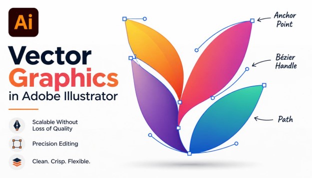
Vector Graphics in Adobe Illustrator: 15 Essential Techniques for Better Designs
Vector graphics in Adobe Illustrator power modern branding, icons, packaging, and illustration. Almost every professional logo you see today started life as a vector file.
If you have ever stretched a logo and watched it turn blurry, you already know why vector art matters. Vectors are built from math rather than pixels, so they stay sharp at any size, from a tiny favicon to a giant billboard.
This guide covers 15 essential techniques that will improve how you work. Each one is practical, easy to apply, and useful whether you are a complete beginner or a growing designer who wants cleaner results.
Learning vector graphics in Adobe Illustrator takes practice, but the right habits shorten the learning curve. These techniques will help you produce cleaner, faster, and more professional work.
What Are Vector Graphics in Adobe Illustrator?
Vector graphics are images made from points, lines, curves, and shapes. Each element is defined by a mathematical formula rather than a grid of colored pixels.
That is why vector artwork scales without losing quality. A business card logo and a billboard can come from the exact same file.
Vector graphics in Adobe Illustrator are built from paths. A path is a line or curve connected by anchor points, and the direction handles on those points control how the curve bends.
Raster programs like Photoshop work with pixels, which suits photos and detailed textures. Illustrator suits logos, icons, typography, and illustrations that need to stay crisp everywhere.

Understanding this difference makes every technique below easier to learn. It also helps you decide when Illustrator is the right tool and when it is not.
1. Master the Pen Tool
The Pen Tool (P) is the most important tool for vector graphics in Adobe Illustrator. Almost every custom shape begins with it.
Click to place a corner point. Click and drag to create a smooth curve with direction handles.
Beginners often struggle because they place too many points. Aim for the fewest points that still describe the shape.
A useful rule is to place anchor points at the extremes of a curve, where it changes direction. This gives you smoother and more predictable results.
Practice by tracing simple shapes like circles, hearts, and leaf outlines. Within a few sessions, the handles start to feel natural.
Hold Shift while clicking to constrain lines to 45-degree angles. Hold Alt (Option on Mac) to adjust one handle independently of the other.

Strong pen skills are the foundation of everything else in this list.
2. Use Anchor Points Sparingly
Fewer anchor points mean smoother curves and smaller files. This principle separates clean vector work from messy work.
Too many points create bumps and kinks that are hard to edit. They also make your artwork heavier and harder to share.
Select a path and use Object > Path > Simplify to reduce points automatically while keeping the shape. You can also use the Smooth tool, hidden under the Pencil tool, to clean up rough paths.
When you review your work, view it in Outline mode (Ctrl/Cmd + Y). This reveals messy paths and stray points right away.
Delete unneeded points with the Delete Anchor Point tool (minus key). Convert sharp corners to curves with the Anchor Point tool (Shift + C).

Clean paths are the mark of professional vector graphics in Adobe Illustrator.
3. Build Complex Shapes with the Shape Builder Tool
The Shape Builder Tool (Shift + M) lets you combine and subtract shapes by dragging across them. It is faster and more intuitive than drawing everything by hand.
Start by overlapping basic shapes like circles, rectangles, and triangles. Select them all, choose the tool, and drag across the areas you want to merge.
Hold Alt (Option on Mac) and click a region to delete it. This makes cutting holes and notches simple.
Many popular logos are built this way. A few circles and squares can become a bird, a flame, or a letterform.
This technique is one of the fastest ways to produce vector graphics in Adobe Illustrator without advanced pen skills. Combine it with grids and guides, covered later, for precise geometric designs.

Once you get comfortable, you will reach for this tool constantly.
4. Combine Shapes with the Pathfinder Panel
The Pathfinder panel (Window > Pathfinder) offers precise control over how shapes interact. It is a reliable companion to the Shape Builder Tool.
The main options are Unite, Minus Front, Intersect, and Exclude. Each produces a different result from the same overlapping shapes.
Unite merges shapes into one silhouette. Minus Front cuts the top shape out of the one beneath it.
Intersect keeps only the overlapping area. Exclude removes the overlap and keeps everything else.
Hold Alt (Option) when clicking these buttons to create compound shapes. Compound shapes stay editable, so you can move the original pieces later.
This non-destructive approach is helpful when working with vector graphics in Adobe Illustrator for clients who request revisions. Use Pathfinder for repeatable results and Shape Builder for fast, visual work.

Knowing both tools gives you flexibility on any project.
5. Organize with Layers and Clear Naming
Good organization saves hours. Complex artwork can contain hundreds of objects, and without structure it becomes unmanageable.
Open the Layers panel (F7) and create layers for logical groups, such as background, icons, text, and guides. Rename each layer with a clear label. “Layer 14” tells you nothing, but “Left wing” does.
Lock layers you are not editing to avoid accidental changes. Hide layers to focus on one area.
Use groups (Ctrl/Cmd + G) to combine related objects. Double-click a group to enter isolation mode and edit its contents safely.
Teams especially benefit from tidy files. Developers and other designers can open your vector graphics in Adobe Illustrator and understand them immediately.

An organized file is a faster and more professional file.
6. Work Precisely with Grids, Guides, and Smart Guides
Precision turns decent artwork into polished artwork. Illustrator offers several tools to keep elements aligned.
Turn on the grid with Ctrl/Cmd + “. Enable Snap to Grid under the View menu to lock points to grid intersections. Drag guides from the rulers (Ctrl/Cmd + R) to mark margins, centers, and alignment lines.
Smart Guides (Ctrl/Cmd + U) show helpful hints as you move objects. They reveal alignment, spacing, and angles in real time.
Many icon designers build on a pixel grid, such as 24 by 24 units. This keeps strokes crisp when the icon appears at small sizes.
Use the Align panel to distribute objects evenly. These habits make your vector graphics in Adobe Illustrator look balanced and intentional.

Precision is invisible when done well, but always noticed when missing.
7. Manage Color with Global Swatches and Color Groups
Color consistency defines brand identity. Illustrator’s swatches help you manage it efficiently.
Create a swatch by dragging a color into the Swatches panel. Check the Global option, and every object using that swatch updates when you edit it. Change one swatch, and the entire design follows.
Organize related colors into color groups. A brand palette might include primary, secondary, and neutral groups.
Use the Color Guide panel to explore harmonies like complementary, analogous, and triadic schemes.
Always choose the right color mode. Use RGB for screens and CMYK for print. Set it under File > Document Color Mode.
Smart color management is central to professional vector graphics in Adobe Illustrator, and it makes recoloring for different campaigns painless.

Plan your palette early and your design stays consistent.
8. Create Depth with Gradients and Freeform Gradients
Gradients add dimension, lighting, and mood. Illustrator offers several ways to apply them.
Linear and radial gradients are the basics. Open the Gradient panel (Ctrl/Cmd + F9), then click the gradient bar to add color stops. Press G to use the Gradient Tool directly on your artwork.
Freeform gradients let you place color points anywhere on an object. They create soft, organic blends without hard geometry. Use Points mode for scattered color spots, or Lines mode for blends that follow a path.
Subtle gradients often look better than dramatic ones. Keep color stops close in hue for a refined result.
Gradients can also apply to strokes, which opens creative options for lines and outlines in vector graphics in Adobe Illustrator.

Use gradients with restraint and your designs gain polish without losing clarity.
9. Handle Typography with Type on a Path and Outlines
Text is often the heart of a design. Illustrator treats type as vector, so it can be shaped creatively.
Use the Type on a Path tool to wrap text along a curve or circle. This is perfect for badges, seals, and emblems.
Before sending a logo or print file, convert text to outlines (Ctrl/Cmd + Shift + O). This turns letters into shapes and prevents font problems on other computers.
Outlined text can be edited like any other path. You can tweak individual letters, merge them, or cut them apart.
Pay attention to kerning and tracking. Spacing between letters affects readability and the overall feel of the design. Good type choices strengthen vector graphics in Adobe Illustrator, especially in logo work.

Treat letterforms as shapes and your typography becomes more distinctive.
10. Convert Raster to Vector with Image Trace
Image Trace converts bitmap images into editable vectors. It is useful for digitizing sketches, old logos, and scanned artwork.
Place your image, select it, and open Window > Image Trace. Choose a preset such as Black and White Logo, 3 Colors, or High Fidelity Photo.
Preview the result and adjust the threshold, paths, and corners. Fewer paths usually give cleaner output. Click Expand to turn the trace into editable paths.
Start with a high-contrast, high-resolution image for the best outcome. Blurry sources produce messy traces.
Always clean up after tracing. Remove stray points, smooth rough edges, and simplify where possible.
Image Trace is a fast bridge between hand-drawn sketches and finished vector graphics in Adobe Illustrator.

Use tracing as a starting point, then refine for quality.
11. Add Character with the Width Tool and Custom Brushes
Strokes do not have to be uniform. The Width Tool (Shift + W) lets you vary stroke thickness along a path.
Drag outward from any point on a stroke to make it thicker or thinner. Save a custom width profile from the Stroke panel to reuse it later.
Brushes expand your options further. Illustrator includes calligraphic, art, scatter, and pattern brushes.
The Blob Brush Tool (Shift + B) lets you paint filled vector shapes, much like drawing with a marker. Overlapping strokes of the same color merge automatically.
These tools bring warmth and personality to vector graphics in Adobe Illustrator, which can sometimes feel too rigid.

Variation in line weight adds energy and a human touch.
12. Save Time with Symbols and Graphic Styles
Repetition is common in design. Symbols and graphic styles let you reuse elements while keeping them linked.
Create a symbol by dragging artwork into the Symbols panel. Edit the original, and every instance updates. This is ideal for repeated icons and map markers.
Graphic styles save a set of appearance attributes, such as fills, strokes, and effects. Apply them to any object in one click.
The Appearance panel is where these attributes live. This non-destructive approach lets you change a drop shadow or stroke later without redrawing anything.
Teams that standardize styles keep their vector graphics in Adobe Illustrator consistent across large projects.

Reusable assets reduce errors and speed up revisions.
13. Use Clipping Masks and Opacity Masks
Masks let you hide parts of artwork without deleting them. This keeps your work editable and safe.
A clipping mask uses a shape to crop the objects beneath it. Place the shape on top, select both, and press Ctrl/Cmd + 7. Release it anytime with Ctrl/Cmd + Alt + 7.
Opacity masks give you softer control. Black hides, white reveals, and gray creates partial transparency. This is excellent for fades, reflections, and subtle lighting.
Using masks well makes your vector graphics in Adobe Illustrator flexible and easy to revise. Nothing is permanently lost.

Hide, do not delete, and you will always have options.
14. Experiment Quickly with Recolor Artwork
Recolor Artwork lets you change an entire palette in seconds. It is perfect for testing variations and client requests.
Select your artwork and choose Edit > Edit Colors > Recolor Artwork. A panel shows every color used in the selection. Drag color stops to shift hues, or apply colors from a library or color group.
Recolor works especially well when your artwork uses global swatches. Seasonal versions, dark mode versions, and print versions all become simple.
This feature shows how powerful vector graphics in Adobe Illustrator can be for rapid iteration. A single file can become dozens of variations.

Fast experimentation leads to better design decisions.
15. Export Correctly for Web, Print, and Development
A great design is only useful if it exports correctly. Different uses require different formats.
SVG is the standard for websites. It is lightweight, scalable, and styleable with code. Use PNG for transparent raster images, JPG for photos, and PDF for print. Keep the original AI file as your master.
The Export for Screens panel (Ctrl/Cmd + Alt + E) lets you export multiple artboards and sizes at once.
Before exporting, check for stray points, hidden layers, and unneeded objects. Convert text to outlines when fonts might be missing.
Proper export is the final step in working with vector graphics in Adobe Illustrator, and it protects the quality you worked to create.

Always test your exports on the real platform before delivery.
Why Vector Graphics in Adobe Illustrator Matter for Designers
Clients rarely ask for a single size. They want a logo on a website header, a mobile app icon, a printed brochure, a vehicle wrap, and a social media avatar.
A vector file handles all of these from one source. You do not need to rebuild the artwork for every use, which saves time and keeps the brand consistent.
Vector graphics in Adobe Illustrator also produce small file sizes for simple artwork. A clean icon can weigh only a few kilobytes, which helps websites load faster.
Editing is another major advantage. You can change a color, move a single point, or resize one shape without damaging the rest of the design.
Printers and sign makers prefer vector files too. They can cut, engrave, and print directly from your paths with perfect accuracy.
This is why agencies, freelancers, and in-house teams all rely on vector graphics in Adobe Illustrator for brand work. Learning it opens doors to logo design, packaging, apparel, and UI projects.

If you want a career in graphic design, strong vector skills are a clear advantage.
Setting Up Your Document for Vector Graphics in Adobe Illustrator
A good project starts with the right document settings. Mistakes here can cause problems later that are hard to fix.
Go to File > New and choose a preset that matches your output. Print, Web, and Mobile presets each set sensible defaults for size and color mode.
Pick the correct units. Use pixels for screens and millimeters or inches for print.
Add bleed to print documents, usually 3 mm, so artwork extends past the trim edge. This avoids white slivers after cutting.
Create separate artboards for variations such as a horizontal logo, a stacked logo, and an icon-only version. Multiple artboards keep everything in one file.
Turn on the preview options you need, such as Pixel Preview for screen work. This shows how vector graphics in Adobe Illustrator will appear when rasterized.

Five minutes of setup can save hours of rework.
Understanding Fills, Strokes, and Appearance
Every vector object has a fill and a stroke. The fill colors the inside, and the stroke outlines the edge.
Use the Stroke panel to control weight, caps, corners, and alignment. Rounded caps and corners give a friendly look, while sharp ones feel more technical.
You can align strokes to the center, inside, or outside of a path. Inside and outside alignment is useful for closed shapes like circles and rectangles.
Dashed lines and arrowheads are also available in the Stroke panel. They help with diagrams, maps, and technical illustration.
When you need a stroke to behave like a shape, use Object > Path > Outline Stroke. This converts it into a filled path you can combine and edit.
Mastering these basics makes all vector graphics in Adobe Illustrator more predictable. It also makes the later techniques in this guide easier to use.
Small details in stroke settings often separate amateur work from polished work.
Vector Graphics in Adobe Illustrator for Logo Design
Logos are the most common use of vector artwork. A good logo must look great at any size and in any color.
Start with sketches on paper. Choose the strongest idea, then rebuild it digitally using basic shapes and the Pen Tool.
Design in black and white first. If the logo works without color, it will be easier to adapt later.
Test your logo small. Shrink it to the size of a favicon and check whether it is still readable.
Provide a full set of files when you deliver. This should include AI, SVG, PDF, and PNG versions, plus color and monochrome variations.
Many designers build every logo as vector graphics in Adobe Illustrator because the format is trusted by printers, developers, and clients alike.
Simple, memorable shapes beat complicated ideas almost every time.
Vector Graphics in Adobe Illustrator for Icons and UI Design
Icons need consistency. The same stroke weight, corner radius, and visual style should appear across the whole set.
Build icons on a fixed grid, such as 24 by 24 pixels. Keep a safe area inside the grid so shapes do not touch the edges.
Use simple geometry. Circles, rounded rectangles, and straight lines are easy to align and easy to read.
Preview icons at actual size using Pixel Preview. Adjust points so lines land on whole pixels for sharp edges.
Export icons as SVG so developers can use them in code. Keep the markup clean by removing unused layers and hidden objects.
Teams building design systems rely on vector graphics in Adobe Illustrator to keep icon libraries organized. Naming each artboard clearly also makes batch exports easier.
Consistency is the secret to icon sets that feel professional.
Vector Graphics in Adobe Illustrator for Illustration and Packaging
Illustrators use vector tools to create flat art, character designs, posters, and editorial pieces. The clean look suits modern branding.
Packaging designers use Illustrator to create dielines, which show where a box folds and cuts. Artwork is then placed precisely within those lines.
Patterns are another strong use. Select artwork and choose Object > Pattern > Make to build seamless repeating tiles.
You can apply patterns to packaging, fabric, wallpaper, and websites. Because they are vectors, they stay sharp at any scale.
Textures can be added using vector shapes, noise effects, or clipped raster grain. Use them sparingly to keep files light.
These creative uses show how flexible vector graphics in Adobe Illustrator really are. One tool covers branding, print, and digital work.
Think of Illustrator as a complete toolbox for visual communication.
Best Practices for Beginners Learning Vector Graphics in Adobe Illustrator
Start small. Draw simple objects like a coffee cup, a house, or a leaf before attempting complex scenes.
Learn the Selection tool (V) and the Direct Selection tool (A) first. Knowing the difference saves a lot of confusion.
Use the Undo shortcut freely. Ctrl/Cmd + Z is your friend while learning.
Follow one tutorial at a time and recreate it from scratch afterward. Repetition builds muscle memory.
Save your work often and keep backups. Cloud storage or an external drive protects against crashes.
Join design communities to share work and get feedback. Honest critique speeds up improvement.
Be patient. Everyone finds vector graphics in Adobe Illustrator awkward in the first few weeks.
Consistent practice beats occasional long sessions.
Recommended Workflow from Idea to Final File
A repeatable workflow keeps projects on track. Here is a simple process that works for most jobs.
First, gather references and write a short brief. Know the audience, the use cases, and the style you want.
Second, sketch several ideas quickly. Do not worry about quality at this stage.
Third, build the chosen idea with basic shapes. Refine with the Pen Tool, Pathfinder, and Shape Builder.
Fourth, add color, type, and details. Check contrast and readability at small sizes.
Fifth, review in Outline mode, clean up paths, and organize layers. Then export the right formats.
Following this order keeps vector graphics in Adobe Illustrator projects efficient. It also reduces the number of revisions clients request.
A clear process turns creative work into reliable work.
Helpful Resources for Vector Graphics in Adobe Illustrator
Adobe’s built-in tutorials inside the Discover panel are a good starting point. They guide you step by step within the app.
YouTube has thousands of free lessons on every tool covered in this guide. Look for creators who show full projects from start to finish.
Design blogs and forums offer tips, templates, and critiques. Reading how others solve problems expands your toolkit.
Practice challenges, such as daily icon or logo prompts, keep your skills active. They also build a strong portfolio.
Finally, study great vector work. Collect examples you admire and analyze how they use shape, color, and spacing.
Combining these resources will accelerate your progress with vector graphics in Adobe Illustrator.
Keep learning, keep practicing, and keep building your portfolio.
Troubleshooting Common Illustrator Problems
Even with good habits, problems appear. Knowing the fixes keeps you moving instead of getting stuck.
Curves look lumpy. This almost always means too many anchor points or handles that are not aligned. Delete extra points, then adjust the remaining handles so they sit along the direction of the curve.
Strokes look thicker or thinner after resizing. Open Preferences and check the Scale Strokes & Effects option. Turn it on if you want line weights to resize with the artwork, or off if you want them to stay fixed.
Colors look dull in print. The document is probably in RGB. Switch to CMYK under File > Document Color Mode, then review the colors again, since bright screen colors often shift.
You cannot select an object. Check whether the layer is locked or the object is inside a group, clipping mask, or symbol. Unlock layers, use isolation mode, or choose Object > Unlock All.
The file is slow or huge. Look for unused swatches, extra brushes, embedded images, and thousands of tiny points. Use File > Save As, remove unused items, and simplify complex paths.
Text changes on another computer. The fonts are missing on that machine. Convert the text to outlines before sending, or package the file with its fonts through File > Package.
Exported SVG looks different in the browser. Effects such as blurs and some blend modes may not export cleanly. Expand effects first, keep shapes simple, and test the SVG in the browser before delivery.
Shapes will not merge. Open paths cannot be combined like closed shapes. Join the end points with Ctrl/Cmd + J, or redraw the shape as a closed path, then try Pathfinder again.
Solving these issues quickly builds confidence. It also shows clients that you understand the technical side of design, not only the creative side.
Keep a short checklist of these fixes near your desk until they become automatic.
Common Mistakes to Avoid
Even experienced designers make errors. Knowing the common ones helps you avoid them.
Using too many anchor points is the most frequent issue. It leads to lumpy curves and heavy files.
Ignoring color modes causes problems. A design made in RGB may print with dull colors.
Forgetting to outline strokes before scaling can distort line weights. Working without layers creates chaos on large projects.
Avoiding these habits will improve your vector graphics in Adobe Illustrator right away.
Tips to Improve Your Vector Workflow
Small changes in habit add up to big gains in speed and quality.
Learn keyboard shortcuts for your most-used tools. Selection (V), Direct Selection (A), Pen (P), and Shape Builder (Shift + M) cover most needs.
Practice by recreating existing logos and icons. Studying how others build shapes teaches proportion and structure.
Keep a library of reusable swatches, symbols, and brushes. Save versions frequently so you can return to earlier stages.
Consistent habits make your whole vector workflow feel faster and more enjoyable over time.
Frequently Asked Questions (FAQs)
What are vector graphics in Adobe Illustrator?
They are images made from mathematical paths, points, and curves instead of pixels. Because of this, they scale to any size without losing sharpness.
Is Adobe Illustrator good for beginners?
Yes. Start with basic shapes, the Shape Builder Tool, and simple Pen Tool practice. Free tutorials and templates help a lot.
What is the difference between vector and raster graphics?
Vector graphics use paths and stay sharp at any size. Raster graphics use pixels and become blurry when enlarged.
Which file format is best for vector graphics?
AI is best for editable master files. SVG is best for websites, and PDF or EPS works well for print.
How do I make my vector designs look more professional?
Use fewer anchor points, a consistent color palette, grids and guides, and organized layers.
Can I convert a photo or sketch into a vector?
Yes. Use Image Trace, then clean up the result afterward for the best quality.
How long does it take to learn vector graphics in Adobe Illustrator?
You can learn the basics in a few weeks with regular practice. Mastery takes longer.
Do I need a drawing tablet to work in Illustrator?
No. A mouse works fine for Pen Tool and shape-based work. A tablet is optional.
Conclusion
Strong vector skills come from understanding a handful of core techniques and using them consistently.
From the Pen Tool and Shape Builder to masks, gradients, and clean exports, each method adds precision and efficiency to your work.
Start with two or three techniques and practice them on small projects. With steady practice, vector graphics in Adobe Illustrator will become one of the most valuable skills in your design toolkit.
Adobe Illustrator Tutorial for Beginners: 25 Powerful Skills to Master in 2026
If you have been searching for an Adobe Illustrator tutorial that explains everything in plain language, this guide is built for you.
Adobe Illustrator is the industry-standard vector graphics software. Designers use it for logos, icons, illustrations, typography, packaging, and social media graphics. Marketers, students, and small business owners use it every day too.
This Adobe Illustrator tutorial covers 25 practical skills in a logical order. Each skill builds on the one before it, so you can follow along step by step and see real progress.
By the end of this Adobe Illustrator tutorial, you will understand the interface, draw with precision, work with color and type, and export professional files. Let’s get started.
Why Learn Illustrator in 2026?

Design demand keeps growing, and vector skills are among the most valuable you can have. Vector graphics scale to any size without losing sharpness, which is why they are the standard for logos and branding.
Any quality Adobe Illustrator tutorial will tell you that the fundamentals matter more than flashy effects. In 2026, Illustrator also includes AI-powered features that speed up repetitive work. Learning the basics first makes those tools far more useful.
Following a structured Adobe Illustrator tutorial saves you weeks of trial and error. Instead of guessing, you learn the right workflow from day one.
What You Need Before You Start
You need a computer that can run Adobe Creative Cloud and an Illustrator subscription or free trial. A mouse works perfectly well. A drawing tablet is optional.
Every skill in this Adobe Illustrator tutorial works on both Windows and Mac. Keyboard shortcuts are the only difference: use Ctrl on Windows and Cmd on Mac.
Keep Illustrator updated, because menus can shift slightly between versions. Everything in this Adobe Illustrator tutorial applies to recent releases.
How to Use This Guide
Work through the skills in order. Open Illustrator, follow each step, and practice on a real file.
Do not rush. Spend 15 to 20 minutes on each skill, and save your practice files so you can see how far you have come.
25 Powerful Skills to Master
Skill 1: Understand the Workspace and Interface

Every Adobe Illustrator tutorial starts with the workspace, and for good reason. Knowing where things live saves hours later.
The toolbar sits on the left, the Properties panel on the right, and the artboard in the center. The Essentials workspace is the best choice for beginners.
Spend ten minutes clicking through the panels. If you get lost, go to Window > Workspace > Reset Essentials.
Skill 2: Create and Set Up Artboards

Artboards are the canvases you design on. This Adobe Illustrator tutorial recommends setting the size, units, and color mode before you draw anything.
Press Ctrl/Cmd + N to create a new document. Choose a preset such as Web, Print, or Mobile, or enter a custom size.
You can add multiple artboards to a single file. This is perfect for logo variations, social media sets, or multi-page layouts.
Skill 3: Use the Selection and Direct Selection Tools

Selecting objects correctly is the foundation of everything else. In this Adobe Illustrator tutorial, you will use two tools constantly.
The Selection Tool (V) moves and resizes whole objects. The Direct Selection Tool (A) edits individual anchor points and path segments.
Hold Shift to select several objects at once. Press Ctrl/Cmd + Shift + A to deselect everything.
Skill 4: Draw Basic Shapes

Shapes are the building blocks of vector art. Many professional logos start as simple circles, squares, and triangles.
Use the Rectangle, Ellipse, Polygon, and Star tools to create shapes. Hold Shift to keep proportions equal, and click on the artboard to enter exact dimensions. This Adobe Illustrator tutorial encourages you to build a small icon from shapes alone.
Live corners let you round edges by dragging the small circle widgets on a shape.
Skill 5: Master the Pen Tool

The Pen Tool (P) is the most powerful tool in Illustrator, and the one beginners fear most. Any serious Adobe Illustrator tutorial must cover it.
Click to create straight segments. Click and drag to create smooth curves with handles.
Practice by tracing a simple shape or a printed image. Place as few anchor points as possible, because fewer points create smoother curves.
Skill 6: Use the Pencil and Curvature Tools

If the Pen Tool feels hard, the Curvature Tool (Shift + `) is a friendly alternative. Click to place points and Illustrator creates smooth curves automatically.
The Pencil Tool (N) lets you draw freehand lines. It works especially well with a tablet.
Many designers mix all three tools. This Adobe Illustrator tutorial suggests you try each one and keep the one that feels natural.
Skill 7: Work with Layers

Layers keep your artwork organized. Without them, complex files quickly become messy.
Open the Layers panel from Window > Layers. Create separate layers for background, shapes, text, and details, and name each one clearly.
Lock layers you are not editing. A well-organized file is one habit every Adobe Illustrator tutorial should teach early.
Skill 8: Apply Fill and Stroke

Fill is the color inside a shape, and stroke is the outline. Together they define how every object looks.
Use the Properties panel or the toolbar to change each one. Press Shift + X to swap fill and stroke quickly.
In the Stroke panel, adjust weight, caps, corners, and dashed lines. This part of the Adobe Illustrator tutorial is simple, but you will use it in every project.
Skill 9: Use Color Swatches and Color Modes

Color choices make or break a design. Illustrator offers two main modes: RGB for screens and CMYK for print.
Create swatches for your brand colors so you can reuse them consistently. Drag colors into the Swatches panel to save them.
The Adobe Illustrator tutorial rule here is simple: choose the color mode first, because converting later can shift your colors.
Skill 10: Create Gradients

Gradients add depth and modern style. Select an object, open the Gradient panel, and click the gradient preview.
Add color stops by clicking beneath the slider. Drag stops to change how colors blend, and switch between linear, radial, and freeform types.
Use gradients with care. This Adobe Illustrator tutorial recommends two or three harmonious colors for a polished look.
Skill 11: Work with Typography

Text is a core part of most designs. Select the Type Tool (T), click the artboard, and start typing.
Use the Character panel to adjust font, size, tracking, and leading. Choose fonts that match the mood of your project, and limit yourself to two typefaces.
Good typography is a skill worth practicing daily. Every strong Adobe Illustrator tutorial emphasizes readability first.
Skill 12: Type on a Path and Outline Text

The Type on a Path Tool lets text follow a curve or shape. It is great for badges, seals, and circular logos.
Draw a path, then click it with the Type on a Path Tool and type your text. Drag the bracket handles to slide the text along the line.
When your design is final, use Type > Create Outlines to convert text into shapes. This Adobe Illustrator tutorial advises doing it on a copy so your original stays editable.
Skill 13: Align and Distribute Objects
Precise alignment separates amateur work from professional work. The Align panel does the hard work for you.
Select several objects and click align left, center, right, top, or bottom. Use distribute options to space them evenly.
You can also align to the artboard. This Adobe Illustrator tutorial calls the Align panel one of the most underrated time-savers.
Skill 14: Use the Shape Builder Tool

The Shape Builder Tool (Shift + M) combines and cuts overlapping shapes in a natural, visual way.
Select overlapping shapes, choose the tool, and drag across the sections you want to merge. Hold Alt/Option and click to delete a section.
With this one tool you can create complex logos from simple circles and squares. It is a favorite of many logo designers.
Skill 15: Use the Pathfinder Panel

The Pathfinder panel offers precise ways to combine shapes: Unite, Minus Front, Intersect, and Exclude.
Unite merges shapes into one. Minus Front cuts the top shape out of the bottom one, which is perfect for creating holes and cutouts.
Experiment with each option on simple shapes. This Adobe Illustrator tutorial recommends learning Pathfinder alongside the Shape Builder Tool.
Skill 16: Master Transform Tools

Transform tools let you rotate (R), scale (S), reflect (O), and shear objects. They are essential for symmetrical designs.
Double-click a tool to enter exact values. Use Alt/Option while transforming to create a copy instead of moving the original.
Press Ctrl/Cmd + D to repeat the last transformation. This trick creates radial patterns in seconds.
Skill 17: Use Clipping Masks
Clipping masks hide parts of artwork outside a chosen shape. They are perfect for placing images or patterns inside shapes.
Place the shape on top of your artwork, select both, and press Ctrl/Cmd + 7. The artwork now appears only inside the shape.
You can release the mask anytime. Every complete Adobe Illustrator tutorial includes this non-destructive technique.
Skill 18: Use the Appearance Panel and Effects
The Appearance panel shows every fill, stroke, and effect applied to an object. You can stack several fills and strokes on one shape.
Go to Effect to add drop shadows, blurs, glows, and more. Because effects are live, you can change or remove them anytime.
Keep effects subtle. This Adobe Illustrator tutorial prefers clean design over heavy decoration.
Skill 19: Create and Use Brushes

Brushes add hand-drawn character to vector artwork. Illustrator includes calligraphic, art, scatter, bristle, and pattern brushes.
Open the Brushes panel, pick a style, and draw with the Paintbrush Tool (B). You can also create custom brushes from your own shapes.
Try the Blob Brush Tool for painting filled shapes. It is a fun way to bring illustration into your Adobe Illustrator tutorial practice.
Skill 20: Convert Images with Image Trace

Image Trace turns raster images, like photos or sketches, into editable vector art.
Place an image, select it, and click Image Trace in the Properties panel. Choose a preset such as Black and White Logo or 6 Colors, then click Expand to edit the paths.
Clean source images give the best results. This Adobe Illustrator tutorial recommends high-contrast sketches for beginners.
Skill 21: Create Symbols and Patterns

Symbols let you reuse an object many times and update all copies at once. They are great for icons and repeated elements.
Patterns fill shapes with repeating designs. Select your artwork and choose Object > Pattern > Make to open the pattern editor.
Adjust tile type and spacing until the repeat looks seamless. This Adobe Illustrator tutorial skill is useful for textiles, wallpapers, and packaging.
Skill 22: Use Guides, Grids, and Smart Guides
Guides help you place elements precisely. Drag from the rulers (Ctrl/Cmd + R) to create them.
Turn on Smart Guides with Ctrl/Cmd + U. They show alignment hints, distances, and anchor points as you move objects.
Enable the pixel grid for web graphics so edges stay crisp. Precision is a recurring theme in this Adobe Illustrator tutorial.
Skill 23: Use the Blend Tool and Gradient Mesh
The Blend Tool (W) creates smooth transitions between two objects, in shape and color. It works well for flowing lines and 3D-looking effects.
Choose Object > Blend > Make, then adjust the steps in Blend Options. The Gradient Mesh Tool adds realistic color shifts across an object.
These tools are more advanced. Come back to them after you finish the first 20 skills in this Adobe Illustrator tutorial.
Skill 24: Save Time with Libraries, Actions, and Shortcuts
Speed comes from smart habits. Creative Cloud Libraries store colors, logos, and graphics that sync across your devices and Adobe apps.
Actions record repeated steps so you can play them back with one click. Learning a handful of keyboard shortcuts also makes you much faster.
Start with V, A, P, T, and M. Add a new shortcut each week, and your workflow will quickly improve.
Skill 25: Save, Export, and Share Your Work
Your design is only useful if you can share it correctly. Save a working copy as .AI to keep layers and editability.
Use File > Export > Export As for PNG, JPG, or SVG, and Save as PDF for print. Export for Screens lets you create multiple sizes at once.
Always keep the original .AI file. Finishing with clean exports completes your Adobe Illustrator tutorial journey.
Common Mistakes Beginners Make
Many beginners add too many anchor points, ignore layers, or mix color modes. These small errors cause big problems later.
Another common mistake is skipping practice. Watching an Adobe Illustrator tutorial is helpful, but real skill comes from making your own projects.
Finally, do not copy fonts and colors randomly. Follow a simple system so your designs stay consistent, just as this Adobe Illustrator tutorial recommends.
A Simple 30-Day Practice Plan
Week one: focus on skills 1 to 6. Create a simple icon set using shapes and the Pen Tool. Following this Adobe Illustrator tutorial daily will build confidence.
Week two: practice skills 7 to 13. Design a business card with color, type, and alignment.
Week three: tackle skills 14 to 20. Build a logo with the Shape Builder Tool, then trace a sketch with Image Trace. Use your Adobe Illustrator tutorial notes to stay on track.
Week four: complete skills 21 to 25. Make a pattern, a small poster, and export everything properly.
Final Thoughts on Your Adobe Illustrator Tutorial Journey
You now have a roadmap of 25 powerful skills. This Adobe Illustrator tutorial gave you the foundation to create logos, icons, and illustrations with confidence.
Remember that mastery is built through consistent practice. Revisit this Adobe Illustrator tutorial whenever you need a refresher on a tool.
Open Illustrator today and start with Skill 1. Bookmark this page so you can return to it often.
Keep creating, stay curious, and enjoy the process. Your next great design is only a few clicks away.
Frequently Asked Questions (FAQs)
How long does an Adobe Illustrator tutorial take to complete?
Most beginners finish the basics in two to four weeks with 30 to 60 minutes of daily practice. Reaching an advanced level takes several months.
Is Adobe Illustrator hard for beginners?
It can feel overwhelming at first because of the many tools. With a clear Adobe Illustrator tutorial like this one, you learn one skill at a time and progress quickly.
Can I learn Adobe Illustrator for free?
Yes. Adobe offers a free trial, and there are many free resources online. Following this Adobe Illustrator tutorial during your trial period is a great way to start.
What is the best Adobe Illustrator tutorial for beginners?
The best Adobe Illustrator tutorial is one that is structured, practical, and updated. Look for guides that teach core tools first and include hands-on exercises, just like this Adobe Illustrator tutorial does.
Which tool should I learn first?
Start with the Selection Tool and basic shapes, then move to the Pen Tool. Mastering the Pen Tool opens the door to almost every other technique. For a more guided Adobe Illustrator tutorial path, follow the skills in order.
Do I need a drawing tablet?
No. You can complete every step in this Adobe Illustrator tutorial with a mouse. A tablet helps with freehand drawing but is not required.
What is the difference between Illustrator and Photoshop?
Illustrator creates vector graphics that scale infinitely. Photoshop edits pixel-based images such as photos.
How often should I practice?
Practice a little every day. Short, consistent sessions beat occasional long ones, so follow an Adobe Illustrator tutorial step by step and build a small project each week.
25 Amazing Photoshop Tips to Improve Your Designs and Fix Common Problems
Every designer hits the same walls in Adobe Photoshop. Edges look jagged, colors feel flat, files grow huge, and simple edits take far too long. The good news is that most of these problems have quick fixes.
This guide shares 25 practical Photoshop tips that help you work faster, design cleaner, and rescue projects that seem broken. Whether you are a beginner or a working professional, these Photoshop tips fit almost any workflow.
Each tip is short, actionable, and easy to test. You can read the article from top to bottom or jump straight to the problem you need to solve today.
Bookmark this page, because the best Photoshop tips are the ones you return to again and again.
Why Photoshop Tips Matter for Every Designer
Photoshop is deep. Even after years of use, most designers touch only a small part of what it can do.
Learning the right Photoshop tips saves hours every week. It also raises the quality of your work, because you spend less time fighting the software and more time making creative decisions.
Good habits like organizing layers, working non-destructively, and using shortcuts compound over time. Small Photoshop tips often create the biggest gains.
Below, the tips are grouped into five sections: workspace and workflow, selections and masks, retouching and color, design and typography, and export and automation.
Workspace and Workflow
1. Customize Your Workspace and Save It

A cluttered workspace slows you down. Go to Window > Workspace and choose a preset that matches your task, such as Photography, Graphics and Web, or Motion.
Then drag panels where you want them and save the layout with Window > Workspace > New Workspace. You can now reset it any time with a single click.
Many designers overlook this among Photoshop tips, yet it removes friction from every project. A tidy workspace also reduces eye strain during long sessions.
Keep only the panels you use daily, such as Layers, Properties, and Adjustments. Everything else can stay hidden until you need it. Building a workspace around your habits is one of the easiest Photoshop tips to apply today.
2. Learn Essential Keyboard Shortcuts

Shortcuts are the fastest way to speed up your work. Instead of hunting through menus, you trigger tools and commands in a fraction of a second.
Start with the basics. Ctrl/Cmd + J duplicates a layer, Ctrl/Cmd + T opens Free Transform, and Ctrl/Cmd + Z undoes your last step. Add Ctrl/Cmd + Alt/Option + Shift + E to stamp all visible layers into a new one.
Ask any veteran and they will name shortcuts as the most valuable of all Photoshop tips.
Learn five new shortcuts each week and practice them until they feel natural. You can also build custom keys under Edit > Keyboard Shortcuts. Over a month, these tiny Photoshop tips will noticeably shorten your editing time.
3. Use Smart Objects for Non-Destructive Editing

Resizing a normal layer again and again slowly destroys its quality. Each scale-down throws away pixels that you cannot get back.
Right-click a layer and choose Convert to Smart Object. Photoshop now stores the original data, so you can scale, rotate, and warp freely without losing sharpness.
Smart Objects also keep filters editable. Apply Gaussian Blur or Sharpen, and you can adjust or hide the filter later.
Among all Photoshop tips for quality control, this one prevents the most regret. Use it for logos, photos, and mockups.
If you place images with File > Place Embedded, they become Smart Objects automatically. That single habit is one of the smartest Photoshop tips for keeping projects flexible.
4. Use Adjustment Layers Instead of Direct Edits

Applying Brightness or Hue changes directly to pixels is permanent. Adjustment layers give you the same result with full control.
Click the half-black circle icon at the bottom of the Layers panel and choose an adjustment such as Curves, Levels, or Vibrance. Each one comes with its own mask, so you can paint the effect exactly where you want it.
You can lower the opacity, change the blend mode, or delete the layer whenever you like. Nothing in your original image is harmed.
Of all Photoshop tips for color work, this is the one professionals rely on daily. Repeat it on every project and your edits become far easier to revise.
Stacking several subtle adjustments usually looks better than one strong edit. These Photoshop tips reward patience.
5. Organize Layers With Names, Colors, and Groups

A file with 150 layers named “Layer 47” is a nightmare. Good organization saves you and your clients time.
Double-click a layer name to rename it. Press Ctrl/Cmd + G to group selected layers, and right-click to assign a color label such as red for text and blue for backgrounds.
Use groups for sections like Header, Content, and Footer. Collapse them when you are not working on them so the panel stays readable.
It may not sound exciting, but organization is one of the most underrated Photoshop tips. Handing off a clean PSD makes you look professional.
Search layers by name using the filter bar at the top of the Layers panel. Combined with naming, these Photoshop tips let you find any element in seconds.
Selections and Masks
6. Master Select Subject and the Object Selection Tool
Cutting out objects used to take forever. Today Photoshop can detect your subject with one click.
Choose Select > Subject and Photoshop uses AI to outline the main object. For more control, use the Object Selection Tool, draw a rough box around what you want, and let it snap to the edges.
Hold Shift to add to a selection and Alt/Option to subtract from it. Then refine with the Quick Selection Tool.
Selections are the foundation of compositing, and these Photoshop tips make them painless. Practice on photos with clear contrast first.
Once you feel confident, try complex images with hair or fur. Combining several Photoshop tips, such as Select Subject followed by Select and Mask, gives excellent results.
7. Refine Edges With Select and Mask

Rough cutouts are the biggest giveaway of a poor edit. Select and Mask helps you fix halos, jagged edges, and messy hair.
With a selection active, click Select and Mask in the top options bar. Use the Refine Edge Brush on hair and fuzzy edges, and adjust Smooth, Feather, and Shift Edge for a natural blend.
Turn on Decontaminate Colors to remove the colored fringe left from the old background. Output to a new layer with a layer mask for the safest workflow.
This is one of those Photoshop tips that turns an amateur cutout into a professional one. Take a minute to view your result on different backgrounds, both light and dark.
Using such Photoshop tips consistently will make your composites believable.
8. Use Layer Masks Instead of the Eraser
The Eraser tool deletes pixels forever. A layer mask hides them instead, and you can bring them back at any time.
Select a layer and click the Add Layer Mask button. Paint with black to hide areas, paint with white to reveal them, and use soft gray for partial transparency.
Press X to swap between black and white while painting. Use a soft brush for gentle transitions and a hard brush for crisp edges.
Non-destructive editing is a recurring theme among Photoshop tips, and masks are its best example. Every professional retoucher relies on them.
Try gradients on masks to blend two photos smoothly. These practical Photoshop tips instantly improve composites, shadows, and fades.
9. Use Clipping Masks for Clean Design Effects

A clipping mask makes one layer appear only inside the shape of the layer below it. It is perfect for placing photos inside text or shapes.
Place an image above a text or shape layer, then right-click it and choose Create Clipping Mask, or press Ctrl/Cmd + Alt/Option + G. The image now fills only the shape.
You can move the image around to choose the best crop, and the shape stays perfectly sharp. Add adjustment layers above and clip them too, so they affect only that one layer.
Designers love this trick for posters, thumbnails, and social graphics. It ranks high among Photoshop tips for creative layouts.
Try it with textures on lettering. Small Photoshop tips like this add polish with almost no effort.
10. Remove Distractions With Content-Aware Fill

Stray wires, people, or trash can ruin a great photo. Content-Aware Fill removes them and rebuilds the background automatically.
Draw a selection around the object with the Lasso Tool, expand it by a few pixels, then go to Edit > Content-Aware Fill. Check the green sampling area in the preview and adjust it if needed.
Output to a new layer so the edit stays reversible. For tiny blemishes, the Remove Tool or Spot Healing Brush is faster.
Removing distractions is among the most requested Photoshop tips from beginners. Results improve when your selection has a bit of breathing room around the object.
If the first attempt looks repetitive, try again with a different sampling area. Practicing these Photoshop tips builds confidence quickly.
Retouching and Color
11. Heal Blemishes With the Healing Brush and Clone Stamp
Skin blemishes, dust spots, and small flaws are easy to fix if you use the right tool for each job.
Use the Spot Healing Brush for small isolated marks. For larger areas or textured surfaces, use the Healing Brush, hold Alt/Option, and sample a clean area nearby.
The Clone Stamp is better when you need an exact copy of pixels. Always retouch on a separate empty layer and set the tool to Sample: Current & Below.
These are classic Photoshop tips for portrait work, and they keep skin looking natural instead of plastic. Keep brush hardness low and zoom in to about 100 percent.
Subtle edits beat heavy ones. Following these Photoshop tips prevents the over-smoothed look that clients dislike.
12. Fix Dull Colors With Curves

Flat, low-contrast images are one of the most common problems in digital photos and designs. Curves is the most powerful fix.
Add a Curves adjustment layer and pull the line into a gentle S-shape. Lift the highlights slightly and lower the shadows to add contrast without clipping detail.
You can also edit the Red, Green, and Blue channels separately to correct color or create a mood. Click the small hand icon to adjust tones directly on the image.
Learning Curves is one of the best Photoshop tips for anyone serious about color. It takes practice, but it rewards you with total control.
Keep adjustments small at first. Regular use of these Photoshop tips will train your eye to see tonal balance.
13. Use the Camera Raw Filter for Quick Enhancements
Even if your image is a JPEG or a flattened design, you can use the Camera Raw Filter. It gives you Lightroom-style sliders inside Photoshop.
Convert your layer to a Smart Object, then choose Filter > Camera Raw Filter. Adjust Exposure, Highlights, Shadows, Texture, and Clarity in one panel.
The masking tools inside Camera Raw let you brighten only the sky or the subject. Because you used a Smart Object, you can reopen the filter whenever you want.
This is one of the most efficient Photoshop tips for a quick, polished finish. It combines many separate edits into one place.
Add a subtle vignette or a bit of grain to finish. These beginner-friendly Photoshop tips can transform an average photo in minutes.
14. Correct Color Casts With the Gray Eyedropper
Indoor lighting often gives photos an unwanted yellow, green, or blue tint. Fixing it takes about ten seconds.
Add a Curves or Levels adjustment layer and pick the middle eyedropper, the gray point. Click on something in the image that should be neutral gray or white, and the tint disappears.
If the result is too cold or too warm, use Photo Filter or Color Balance to fine-tune it. Compare with the original by toggling the layer’s visibility.
Accurate color builds trust, especially in product photos. These Photoshop tips are essential for e-commerce and portrait work.
Try a few different sample points until it looks right. Practicing such Photoshop tips will make your images look consistent across a whole set.
15. Add Depth With Dodge and Burn

Dodging brightens and burning darkens. Together they shape light, add dimension, and make subjects stand out.
Create a new layer, fill it with 50 percent gray, and set the blend mode to Soft Light. Paint with a soft white brush at low opacity to lighten, and black to darken.
Use a flow of 5 to 10 percent and build the effect slowly. This method is fully reversible because the effect lives on its own layer.
Retouchers consider this one of the most artistic Photoshop tips in the entire program. It can sculpt faces, products, and landscapes.
Zoom out often to check the overall balance. When you master these Photoshop tips, your images will feel more three-dimensional.
16. Sharpen Smartly With the High Pass Filter
Standard sharpening filters can create ugly halos. High Pass sharpening keeps edges crisp and natural.
Duplicate your layer and convert it to a Smart Object. Go to Filter > Other > High Pass and set the radius between 1 and 3 pixels. Then change the blend mode to Overlay or Soft Light.
You can lower the opacity or add a mask to sharpen only the important areas, such as the eyes or product details.
This is a favorite among photographers and one of the most reliable Photoshop tips for final touches. Always sharpen at the end, after resizing.
If the image starts to look crunchy, reduce the radius. Repeating these Photoshop tips on every export improves clarity across your portfolio.
17. Reduce Noise in Low-Light Photos

Grainy photos are a common problem when shooting in low light. Photoshop offers a strong built-in fix.
Convert the layer to a Smart Object, then choose Filter > Noise > Reduce Noise. Increase Strength and Reduce Color Noise until the grain fades, then bring back detail with the Preserve Details slider.
For RAW-quality results, try Camera Raw’s Denoise feature in recent versions. It uses machine learning to clean noise while keeping textures.
Fixing grain quickly is among the most helpful Photoshop tips for event and night photography. Do not push the sliders too far or the image will look waxy.
Apply noise reduction before sharpening. Following these Photoshop tips in the right order gives the cleanest finish.
18. Use Generative Fill to Extend or Change Images
Generative Fill uses AI to add, remove, or replace content based on a text prompt. It is available in recent versions of Photoshop.
Make a selection with the Lasso or Marquee Tool, click Generative Fill in the contextual bar, and type what you want, such as “clear blue sky.” You can also leave the prompt empty to remove an object.
It is also great for extending a canvas. Use the Crop Tool to drag the edges outward, then click Generate to fill the new space.
Every generation creates a separate layer, so you can compare variations. Many creators now count this among the most exciting Photoshop tips.
Always review results at full size for odd details. Used carefully, these modern Photoshop tips can save hours of manual work.
Design and Typography
19. Use Character and Paragraph Styles for Consistent Text

Consistent text makes a design look professional. Styles let you apply the same formatting to many text layers at once.
Open Window > Character Styles and Paragraph Styles. Format a text layer the way you like, then click the plus icon to save it as a style. Apply it to other text layers with one click.
If you later edit the style, every layer using it updates automatically. That is a big time saver on brochures, menus, and web layouts.
Careful typography is one of the quiet Photoshop tips that separates polished layouts from rushed ones. Limit yourself to two or three fonts.
Adjust tracking and leading for readability. These simple Photoshop tips help your text look clean and intentional.
20. Align Perfectly With Guides, Smart Guides, and Grids

Misaligned elements are an instant sign of amateur work. Photoshop has several tools to keep everything neat.
Turn on View > Show > Smart Guides to see pink lines when objects align or share equal spacing. Drag guides from the rulers, or use View > New Guide Layout to create columns and margins.
Use the Align options in the top bar to line up selected layers, and Distribute to space them evenly. Turn on Snap so objects lock to guides.
Layout precision is one of the most practical Photoshop tips for web and print design. It creates balance and a clear visual hierarchy.
Leave generous white space between sections. These layout Photoshop tips make your designs easier to read and more attractive.
21. Create Depth With Layer Styles and Blend Modes

Layer Styles add shadows, strokes, glows, and gradients without permanent changes. Double-click a layer to open the Layer Style dialog.
Use Drop Shadow with low opacity and a large blur for a soft, realistic shadow. Add a subtle Gradient Overlay to give flat shapes some dimension.
Blend modes change how layers interact. Multiply darkens, Screen lightens, Overlay adds contrast, and Color applies hue. Cycle through them with Shift + plus or minus to see the effect live.
These are creative Photoshop tips for text effects, buttons, and lighting. Avoid overdoing them, since heavy effects can look dated.
Copy a style to other layers by right-clicking and choosing Copy Layer Style. Mastering these Photoshop tips will give your designs a modern, professional finish.
22. Design Logos and Icons With Vector Shapes

Pixels blur when scaled up, but vector shapes stay sharp at any size. That makes them ideal for logos, icons, and buttons.
Use the Rectangle, Ellipse, and Custom Shape tools with the mode set to Shape. Combine shapes with Path Operations, such as Unite, Subtract, and Intersect, to build unique forms.
Use the Pen Tool for custom curves. Keep paths simple, with as few anchor points as possible.
Working with vectors is one of the smartest Photoshop tips for anyone creating brand assets. You can also paste shapes from Illustrator as Smart Objects.
Export final logos as SVG or PNG for different uses. Applying these Photoshop tips keeps your branding crisp on screens and in print.
23. Save Time With Swatches and Creative Cloud Libraries

Using the same brand colors and assets across projects is easy with libraries. They keep everything in one shared place.
Open Window > Libraries and create a new library. Drag colors, character styles, logos, and graphics into it. They sync across Photoshop, Illustrator, and other Adobe apps.
You can also share a library with teammates so everyone uses the same approved assets. Save frequently used colors in the Swatches panel and organize them into groups.
Consistency builds brand recognition, which makes this one of the most business-friendly Photoshop tips. It also removes guesswork when picking hex codes.
Name your library items clearly. Small organizational Photoshop tips like these save minutes on every single project.
Export and Automation
24. Export Sharp Images With the Right Settings

Blurry exports and huge files frustrate clients. The right settings solve both problems.
Use File > Export > Export As for web images. Choose JPG for photos, PNG for graphics with transparency, and WebP for smaller files. Keep quality between 70 and 85 percent for a good balance.
Check your document size before exporting. For web, 72 PPI is enough, while print usually needs 300 PPI. Convert to sRGB so colors appear correctly in browsers.
Getting exports right is among the essential Photoshop tips for anyone who publishes online. Faster pages also help your website rank better.
Always zoom to 100 percent to check quality. Following these practical Photoshop tips prevents last-minute surprises.
25. Automate Repetitive Work With Actions and Batch

If you repeat the same steps on many images, let Photoshop do the work. Actions record your steps and replay them with one click.
Open Window > Actions, click New Action, and perform your edits while recording. Stop recording, then run the action on other files. To process a whole folder, use File > Automate > Batch.
Try actions for resizing, watermarking, sharpening, or applying a signature color grade. You can also use Image Processor to convert many files to JPG.
Automation is one of the most powerful Photoshop tips for busy professionals. It turns an hour of clicking into a few seconds.
Test your action on a single image first. These time-saving Photoshop tips are perfect for bloggers, photographers, and agencies.
Common Photoshop Problems and Quick Fixes
Even with great habits, problems pop up. Here are the most common ones and the fast solutions.
- Photoshop is running slowly: Increase the RAM allocation in Preferences > Performance, clear the cache, and merge or rasterize unused layers.
- Jagged edges on selections: Use Select and Mask, and add a small feather of 0.5 to 1 pixel.
- Blurry text or images: Check your document resolution and avoid scaling raster layers. Use Smart Objects.
- Colors look different after export: Convert to sRGB and check that your monitor is calibrated.
- File is too large: Delete hidden layers, flatten a duplicate copy, and save a compressed version for sharing.
Knowing a few troubleshooting Photoshop tips prevents panic when deadlines are close. Most issues come from settings, not from your skills.
Save a checklist of these fixes near your desk. Experienced designers use such Photoshop tips as a quick reference during busy projects.
Final Thoughts on Photoshop Tips
You now have 25 useful ways to work faster, edit smarter, and solve everyday design problems. You do not need to learn everything at once.
Pick three Photoshop tips from this list and use them on your next project. Once they feel natural, add three more.
Consistent practice is what turns these Photoshop tips into real skill. Over time, your designs will look cleaner, your files will stay organized, and your edits will take less time.
Remember that Photoshop rewards curiosity. Experiment, break things, and use the Undo command freely.
Keep this guide handy and share it with fellow designers. The more you apply these Photoshop tips, the more confident and creative you will become.
Frequently Asked Questions (FAQs)
What are the best Photoshop tips for beginners?
Start with layers, layer masks, and adjustment layers. Learn a handful of keyboard shortcuts, and use Smart Objects so your edits stay reversible. These basics support almost everything else you will do in the program.
How can I make Photoshop run faster?
Close unused documents, allocate more RAM in Preferences, and clear your cache regularly. Keep layer counts under control by merging or grouping layers. Using Smart Objects wisely and saving to a fast drive also helps.
What is the difference between a layer mask and the Eraser tool?
The Eraser permanently deletes pixels, while a layer mask only hides them. With a mask, you can paint white to bring the content back. That is why professionals prefer masks for nearly all edits.
How do I fix blurry images in Photoshop?
Use Filter > Sharpen > Smart Sharpen or the High Pass method for mild blur. Make sure you are not enlarging a small image too far. Sharpening cannot fully restore detail that was never captured, so start with the best source file available.
Are these Photoshop tips useful for professional designers too?
Yes. Many of these Photoshop tips, such as non-destructive editing, styles, and automation, are used daily by professionals. Even experts benefit from revisiting the fundamentals to work faster and stay consistent.
Which file format should I use to export from Photoshop?
Use JPG for photographs, PNG when you need transparency, and WebP for smaller web images. Choose PDF or TIFF for print. Always save a layered PSD copy so you can make changes later.
-

 Graphics Design3 years ago
7.Exploring the Importance of Color Theory Charts
-

 Graphics Design1 year ago
Top 10 Best Graphic Design Tools for Beginners in 2025 (Free & Paid)
-

 Graphics Design2 years ago
10 Stunning Gradient Design Trends You Need to Know in 2024
-

 Graphics Design1 year ago
15 Freelance Graphic Design Tips to Boost Your Career in 2025
-

 Graphics Design2 years ago
29.Retro Design Is Making a Comeback in Modern Spaces
-

 Graphics Design1 year ago
Best Laptops for Graphic Designers – 2025 Buying Guide
-

 Graphics Design2 years ago
2025 Logo Design Trends: What’s In, What’s Out?
-

 Graphics Design2 years ago
15.The Importance of Effective Flyer Design in Marketing
Kami Doyan
October 26, 2024 at 7:44 am
When I originally commented I clicked the -Notify me when new comments are added- checkbox and now each time a comment is added I get four emails with the same comment. Is there any way you can remove me from that service? Thanks!
Maxwell Feuerberg
November 15, 2024 at 4:25 am
Some really rattling work on behalf of the owner of this website , utterly outstanding subject matter.