Typography Graphic Design
4.The Ultimate Guide to Typography Design
The Ultimate Guide to Typography Design
Here’s an overview:
- 1. Typography as a Design Introduction
• 2. Learning the basics principles of typography.
• 3. Selection of the SuitableTypeface
• 4. Typography and web design.
• 5. The function of typography in Print Design.
• 6. Hierarchy is a crucial element in the typography.
• 7. The Color and Its Role in Typography
• 8. Typography and branding.
• 9. Methods for Bettering the Typography Competencies
• 10.Feet of the Type Design
1. Typography as a Design Introduction
The ultimate guide to typography design art of textual design is a critical aspect of any visual communication. One of the key characteristics of an effective designer is the choice of suitable fonts, spacing, and layout that suit the message he or she wants to present. The selection of fonts which typography design involves exceeds a simple choice of typeface; it comprehends classification of text styles, legibility, and the overall look of the text.
The ultimate guide to typography design is not complete unless one understands basic terminology. Among various terms, kerning, leading, and tracking are the ones which a designer must know by rote. Kerning is the term used for adjusting the space between individual characters, the distance between lines of text is measured in leading, and tracking is the spacing controller for characters in the block of text.
The next thing to learn is to grasp the font categories, as well. Serif typeface produces “formality and traditions”, but the word meaning for “sans-serif font” is “modern and clean”. Script fonts have elegance and personality, so they are fantastic for differentiating from others, while display fonts get you noticed when you need to come up with headlines or branding materials.
The key is in the typography design—hierarchy. This creates an influence on the reader, while indicating the most significant or interesting information and an attractive flow. Through shifting font sizes, weights and styles, I have generated a pace that puts the text into a neat structure.
Typeface design is not all about beauty, but it is also a prominent factor in user interface (UX). Effective selection of a typography style will help readers to assimilate and digest the intended content. Whether for print or for digital, consider the typography. If you do, this will raise the overall design and make your audience talk about it in the future.
2. Learning the basics principles of typography.
The ultimate guide to typography design is an important part of graphic design that the message can get across by a proper usage of it. The role of a designer is inextricably linked with the knowledge of typography for it is a key factor to have designs that are both visual and readable. undefined
- Hierarchy: The ultimate guide to typography design A hierarchy is set out to maintain the priority of what is meant in the text. Through variations of font size, weight and style, you can help the reader to navigate through your piece of work and put forth the relevant information.
- Alignment: The ultimate guide to typography design Alignment provides clearity and order. You can choose left, right, center as well as justified alignment, but you have to remain consistent in order to sustain a professional look.
- Contrast: The ultimate guide to typography design Contrast is a primary aspect for attracting viewers attention and emphasizing significant items in an artistic piece. Make contrasting fonts, sizes, weights, and colors to specific area of the text stand out using them.
- White Space: The ultimate guide to typography design white space, also called negative space, is the space between design elements like images and words. It makes text easy to read, and maintains the balance of the composition. Also, it helps to draw the reader’s attention to significant parts.
- Consistency: Typography consistency serves to develop a recognisable visual identity and adds continuity across the whole design product. Harmony consists of the fonts, dimensions, and distances. Keep them consistent for harmony.
- Readability: The core objective of typography is to make a written text easily readable. Make sure that the optimum font type, the size and the line spacing are used to correspond the content and the audience.
- Typography Terminology: Understand what typography is and its basics like serif, sans-serif, kerning, leading, tracking, and the x-height. Knowledge of these terms will enable you to speak and write clearly with the designers you work with and your clients.
The ultimate guide to typography design By learning these principles of typography, you have a chance of putting your designs at a higher level and you would be able to communicate clearly what you want your audience to know.
3. Selection of the Suitable Typeface
The ultimate guide to typography design importance of typeface selection is highlighted by the ability to communicate the message in the right manner. undefined
- Define your purpose: When choosing the typeface, stop and think what is the goal of your design. The ultimate guide to typography design tone the author is going to use can be serious, ironic, or educational. This will ultimately save you time because you won’t need to go over all the listings.
- Consider readability: A certain font may be beautiful and enticing, but if it’s not easy to read, it undermines the very objective of the typeface. Never sacrifice readability in coventry for aesthetics.
- Stick to a limited number of fonts: When you use too many different fonts, it results in a disordered design. i.e., the more fonts you use, the messier the design. Narrow down your option to two or three fonts for effective typeface style.
- Pay attention to contrast: A contrast between typefaces, for example, will create an interesting design. Use two contrasting typefaces that are both strong and delicate to achieve a maximum effect.
- Test the typeface: The ultimate guide to typography design Typeface testing has to be done in different sizes on various devices so as not to lose readability and aesthetics across various devices.
- Consider your audience: Conceive of how your design may look from those who are observing it. Different audience segments may be inclined to certain styling, so customize your choice of typeface to reflect this.
- Stay consistent: Select unique font everywhere and make it a background of your whole design to make it look uniform.
The ultimate guide to typography design Understand that font you will select for your design puts the tone of your message and the style can as well influence the perceptions of your viewers. Allow enough time to choose the right one for you which presents your information in a manner that you would want it to be presented.
4. Typography and web design.
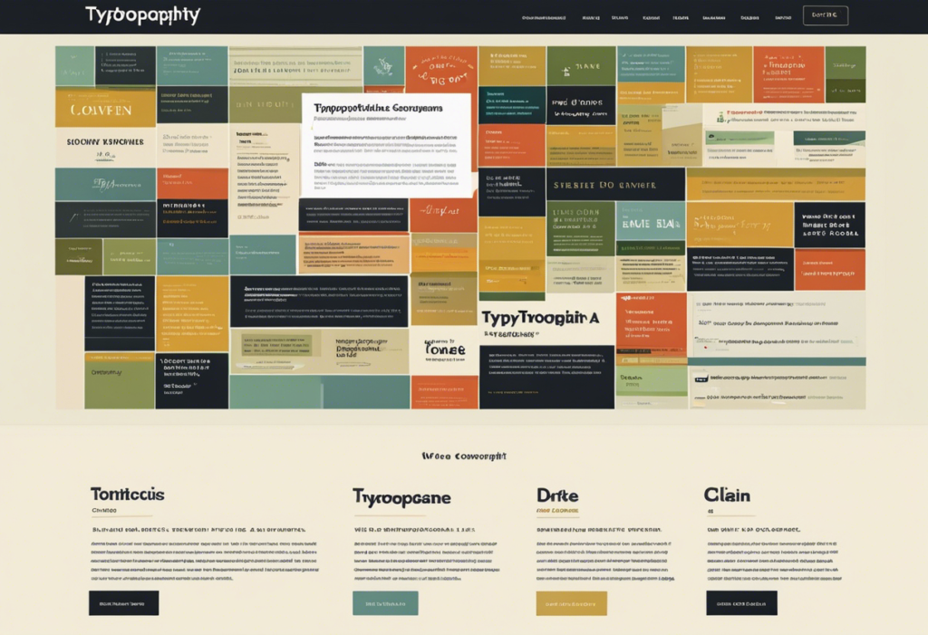
I am of the opinion that The ultimate guide to typography design is a particularly important factor in a website design. undefined
- Choosing the Right Fonts: The ultimate guide to typography design Although I am paying attention to readability and compatibility issue, I still choose fonts for my website. The key to this is choosing fonts that are easy to read and get the brand message across to the target audience.
- Font Pairing: The ultimate guide to typography design Combining and choosing fonts is the art that can make the website look really cool. In most cases I match a serif and a sans-serif font for contrast, making certain that they look good in corresponding, but also remaining readable.
- Font Size and Hierarchy: By using different font sizes for the hierarchical aspects, we can help the viewer to focus the attention and add visual depth. In an attempt to create a sense of order and importance, I make sure to utilize both bigger fontsizes for headings and smaller ones for the body text.
- Whitespace and Line Height: Exact spacing of words and line height are crucial for improving readability. I pay keen attention to the matter of text line spacing in order to provide an easy reading experience for users.
- Responsive Typography: The ultimate guide to typography design It is relevant to discuss the way fonts affect different screen sizes. By using relative units like percentages and ems I can always ensure that text scaling works on all sizes of devices, allowing for readability and keeping the visuals appealing.
- Typography and Branding: The ultimate guide to typography design can greatly communicate the brand identity. I pay attention to choosing typefaces that well represent the brand’s image and brand value, which, in that way, support brand recall with the consistent font selections.
- Accessibility: I take good care of accessibility by selecting text fonts with good readability and having appropriate color contrast between the background and the text. This aids the users having difficulties with vision to read the content.
The ultimate guide to typography design Integrating these principles into my webpage creation has allowed me to produce websites that look appealing visually and are ‘user-friendly’ to visitors by accurately conveying content.
5. The function of typography in Print Design.
The ultimate guide to typography design is one of the vital elements of print design as it creates a style and gives a personality to a printed document. undefined
- Font Selection: However, readability and legibility are the pivotal factors when it comes to font choice for print design. Options for fonts that are preferably simple and easy to read, particularly for body texts. The print body is usually well-read in the serif font and the text longer than any other.
- Hierarchy: It is necessary to create a clear structure in print design that will draw the attention of the viewer to the content of the material. Changes in font size, weight, and style can be used for differentiating headings, subheadings and main text sections. This pattern of subordination brings order to a piece of writing and facilitates its comprehensibility.
- Alignment: The proper placing of text is essential in print design to produce a finished product which is clean and professional looking. Whatever, align to the left, right, center, or justify the text, pay attention to consistency, which can achieve visual harmony. Correctly positioned textual pieces links different sections of the material in accordance with the visual cue.
- Spacing and Line Length: Check out all the text spacing: line spacing and around each text element. Appropriate line spacing is key in improving the readability but it is also necessary to pay attention on the line length so as to avoid awkward line breaks and to make overall visual appearance better. Spacing in the right proportions among the lines makes reading bearable to the audience.
- Contrast and Color: Use contrast and color effectively in print design, which will make the reader focus on important information and generate enough visual interest. A balance between text and graphics will improve readability in the text. Some colors used selectively can call attention to crucial details or create a particular mood. Pay attention to the color selection to make sure that it is legible and supports accessibility.
Implementing the underlined The ultimate guide to typography design concepts into your print design projects will make your printed materials reach aesthetical heights and become more effective.
6. Hierarchy is a crucial element in the typography.
The role of hierarchy in The ultimate guide to typography design is immense. It sets the pace for the reader so that he is well able to go through the message. To achieve this, I put forward hierarchy so that I can decide on the best solution, promote the clear view of my information, and improve the readability. undefined
- Heading Levels: I tend to regulate the flow of content by using the different heading levels accordingly to create clarity and organization. I give the main headings higher hierarchy levels and lower hierarchy levels to the subheadings for having a visual hierarchy to help the reader to go through the article in a sequential way.
- Font Sizes: Differentiating between font sizes should be introduced in order to create hierarchy. This way, the font that is listed larger attracts more attention and usually highlights the headings or the critical information. Not rarely, smaller fonts are used in cases of more significant less significant texts.
- Font Weights: When it comes to depth, the variation of font weights including using bold or italic styling could be good. Needed texts are represented by bold fonts as they are the most suitable for headings or emphasis, but regular weights express the body text.
- Color Contrast: Choosing a color contrast can enable the introduction of hierarchy by displaying particular elements as more prominent. I make colors in headings or the important information to be contrasted so that it will be highlighted and create visual distinction.
- Spacing: The space successfully accomplishes this with proper spacing between the elements, including individual lines of text, paragraphs, and sections. Such a sufficient whitespace will separate levels of information leading to better readability.
The ultimate guide to typography design cannot handle well if arranged improperly because this can affect the readability and visual appeal of a text. Organized heading levels, font sizes, weights, color contrast, and spacing can be utilized for the purpose of making the readers navigate through the content seamlessly as well as assuring that the design is neat.
7. The Color and Its Role in Typography
The ultimate guide to typography design Typeface designing is typically not just about the selection of fonts on the contrary color has its own role of communicating through messages. When selecting the color for typography, a few important factors need to be considered to ensure that the designs remain readable and eye-catching.
Incorporating Colour Psychology
Colour psychology is one of the important aspects in The ultimate guide to typography design because different colors are as strong as our thoughts and that they bring different messages. I can get deeper in figuring out and using colors that work with the message I desire to send. For instance, blue represents credibility and professionalism, which makes it an appropriate option for corporate communications, on the other hand, red is a sign of danger and passion, and therefore it could be an excellent choice for advertising.
Contrast for Legibility
Text-background contrast is the key element that ensures good readability. I take care traffic of colour contrast ratios which makes text readable. Those colours with high contrast, such as black text on a white background, improve the readability particularly of those people with visual impairments.
Consistency Across Platforms
The ultimate guide to typography design Ensuring colour consistency across multiple devices is an important factor of brand identity for customers. I have also mastered the skill of creating the proper colours for print or digital media to be consistent with the brand identity. With the help of Pantone swatches, we can assure appropriateness of colours from various different mediums.
Employing Colour to Organize Multiple Layers
The ultimate guide to typography design Colour can be used for typographic hierarchy by applying it to titles in different colours, as well as subheadings and paragraphs. This visible indicator leads the reader through the text irrelevancy hierarchy, which in turn improves the readability and understanding of the text. In doing this, I combine colours together yet, make sure they will emphasize the structure of the text.
Accessibility Considerations
The ultimate guide to typography design most important thing in a type design is the inclusiveness – the colour choice of also influences the accessibility factor. I use appropriate colour contrasts that are understandable to individuals with colour deficiencies so the readers won’t have any problem reading the text.
Experimenting with Colour Combinations
The ultimate guide to typography design Unique colour combinations can be one of the trending solutions for typography designs. I work with harmonizing, analogous or triadic colour schemes in order to make my art piece turns out beautiful. We can also evaluate colour stands for the art.
8. Typography and branding-The Ultimate Guide to Typography Design
Or branding, The ultimate guide to typography design is one of the most important elements that help in showcasing face and voice of the brand. Here are some key points to consider when using typography in branding.Here are some key points to consider when using typography in branding:
- Consistency is Key: Punctual and consistent Font application to all items in brand colors contribute to the effective brand identity building. Select your fonts that accurately depict your brand identity and make them the same everywhere; this includes all the platforms and forms.
- Reflect Brand Values: The typography should be consistent with the brand, it is necessary to pick the message while selecting the target audience. Such as, a font which is modern and straight forward will be more right for a tech company, whereas a brand which is more traditional and classy, may require a more elegant font.
- Legibility is Essential: See font selection is certainly user-friendly from different media and sizes Many popular fonts that look good in large formats may not be legible in a small device, like a mobile screen. One should take the versatility into consideration when selecting fonts to represent their brand image.
- Hierarchy and Emphasis: Select different weights, cases, and sizes of your specific typography to bring hierarchy and clear up the message in the materials of branding. In this way, the viewer’s eye is directed to the main point and accompanied to get the viewers’ attention.
- Avoid Trends: However, it would be a tempting situation to use the most modern fonts, but it is very essential to choose the ones which have enough life and will be able to keep up the trends of many years. Implementing classical and traditional typefaces will ensure you a long brand life.
- Custom Typography: The ultimate guide to typography design A customized branding experience will be a result when you take a step further and invest in the brand’s original typeface which is purposefully designed to identify your brand. These customer stories demonstrate the exceptional service your brand provides and ensure that your brand is quickly recognizable with a distinct visual identity.
The ultimate guide to typography designUnderstanding them and seeing them to your advantage in your branding efforts is the way how to get the most out of the power of typography .
9. Methods for Bettering the Typography Competencies
Typography is among the most fundamental building block of designing, for it played a core role in the interpretation of the content and the visual appearance of a work. undefined
- Study Different Fonts: The ultimate guide to typography design Know the differences between various fonts, such as serif vs. sans-serif fonts, and get to know how to use each font according to its character.
- Practice Hierarchy: The ultimate guide to typography design Experiment with font sizes, weights, and styles to create an interesting hierarchy that leads to the distinguished contents.
- Pay Attention to Spacing: The ultimate guide to typography design Absolutely, letters spacing, words spacing and lines spacing play important role in readability. Make modifications with the leading and kerning as needed.
- Understand Alignment: Acquire knowledge on the available text alignment formats (left, center, right, and justified) and make a selection that is most suitable for your layout.
- Use Contrast: Apply contrasts by changing font style, font size, and color so the main points are emphasized.
- Limit Fonts: The ultimate guide to typography design Limit the number of used fonts to at most three in a design, thus, bringing more unity and not distracting the readers unnecessarily.
- Consider Legibility: Give the first place in importance to clarity rather than to originality. Lay emphasis on the readability of the text in particular for longer sections of a text.
- Seek Inspiration: If you are out of ideas, look for inspiration in typography book, websites, and design pieces. Go through what has been done well and find ideas to use in your own work.
- Get Feedback: Consider inviting other people to review your screens for feedback on the typography. The analytical skills developed by constructive criticism can also enable you to enhance and continue developing as a designer.
The ultimate guide to typography design Adopting these principles and employing them consistently through constant practice will improve your typographical skills and let you to create designs that are visually pleasing and easy to read.
10.Feet of the Type Design
With the fast development of typography design, I believe the future is there to be explored and new things to be innovated. undefined
- Variable Fonts: Variable fonts are a revolutionary technique in typography design by letting designers to focus on more broadness and creativity in their font styles. They empower the designers to make changes in weight, widht, slant, and so on to the font file. Through the use of these technologies it becomes possible to bring the typography into the state of the art, adaptive, and reactive system.
- Augmented Reality (AR) and Virtual Reality (VR): Along with the advent of AR and VR technologies, typography design extends into areas that are not as common as screen design in 2D shapes and sizes. Designers can now bring into being totally experiential and interactive typographical moments in the virtual world thus making the walls of the typography field beyond breaking point.
- Artificial Intelligence (AI) in Typography: AI is nowadays employed in various types of project (including typography design). AI-assisted tools, can be used to explore and create fonts, guess trends and even make typefaces that meet a particular need. The transformation of typography as a result of the integration of AI are ready to make the area not the same as it is today.
- Mixed Media Typography: The typography is no longer confined to the traditional text format and has been diversified by mixing it with other elements such as images, animations and videos. Print media typography diversity gives a designer an opportunity to narrate through its visual design and to make an unforgettable user experience. A trend can be expected to go on changing and developing with time.
- Sustainable Typography: On the rising trend of a sustainable design that exploits environmental-friendly practices, typography designers are currently looking for a way to decrease the negative impact on nature their design might have. This covers environmental adaptation of materials, balancing the font production processes, and rendering eco-friendly solutions.
As a conclusion, the position of writing designs is optimistic and many prospects for innovation and creativity remain ahead. Through the acceptance of the current tech, trendsetting and sustainable strategies,
Graphics Design
1.The Transforming Power of Typography on Graphic Design
The Transforming Power of Typography on Graphic Design.
The transforming power of typography on graphic design, that is, the craft or discipline of organizing the type to visualize the language and make it readable, holds a prime place among all the design elements in the complex fabric of graphic design. It oversteps the boundaries of being a combination of letters and words, and in the end it becomes a power that creates the visual environment, passes the ideas, makes the emotions arise and sets up the brands. Visual communication’s fabric weaves typography into a vessel for both the transmission and the catalyst of meaning as it builds bridges of understanding between creators and their audience. On this comprehensive investigation, we embark on a mission to identify the various functions of typography in graphic design.
Understanding Typography:
The Historical Lens
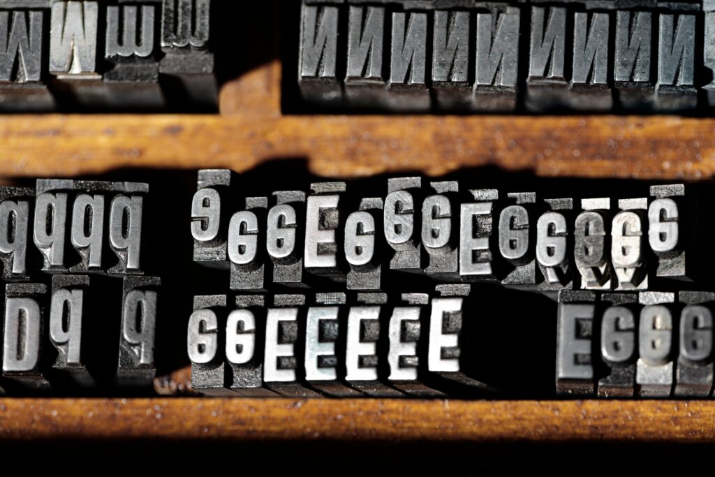
Understanding the typographic consideration in the The transforming power of typography on graphic design can be performed by understanding the background of typography. The beginning of typography can be traced back to the turn of ancient civilizations when scribes laboriously carved symbols onto clay tablets, papyrus rolls, and stone slabs which eventually evolved into the earliest forms of written language. With the invention of the movable type in the 15th century by Johannes Gutenberg, typography undergoes a significant transformation providing massive opportunities for the dissemination of knowledge as well as the spread of ideas since the Renaissance era.
The transforming power of typography on graphic design ran in parallel with the improvement of the printing technologies; this resulted in the development of individual typefaces, printing styles, and graphic movements. Starting from the ornate serif typefaces of the Baroque and continuing through the minimalist sans-serif fonts of the Bauhaus movement, typography has not only mirrored but also has left a very deep mark on historical graphic design, graphically referring to changing tastes, ideas and culture.
Visual Hierarchy and Composition Understanding in Art
The transforming power of typography on graphic design At its core, typography is a visual language—a means of organizing information, guiding the viewer’s gaze, and conveying meaning with precision and clarity. The domain of graphic design encompasses the ethical role of typography that is to create visual hierarchy, which is the key principle guiding the text elements arrangement, taking into account their importance mutually.
Designers can imply this order by using various ways like font size, weight, color, and style, as if they are the one who orchestrate a symphony of typographic elements, where the viewer is the one that follows and seeing there is still a harmonious relationship between form and function. Headlines shout with their typographical features, which are big, expressive and bold, while body text instead communicates by adopting subtle fonts for more readability and comprehension. Through retaining the principles of symmetry, proportion, and rhythm, an artist creates the ones that convey not only precision and consistence, but also successfully go beyond the walls of language in order to form a powerful link with the audience.
The Brand Conviction and Recognition of Brand.
In branding and marketing the ‘arena’, where The transforming power of typography on graphic design has developed to serve the purpose of marking the identity and personality of a brand. Coca Cola’s curly script and Apple’s classic clean line are just two examples of how typography provides a visual fingerprint, a mark that encapsulates brand identity and positions it against competitors.
The typeface chosen, letterforms and The transforming power of typography on graphic design props are not merely the questions of aesthetics. They are the quest of an enterprise for a meaning through which its ethos, goals and values are reflected. Serifs typography resonates the concept of tradition, sophistication and authority, while sans-serif typography conveys modernism, simplicity and accessibility. The designers achieve the goal one by unifying the visual lexicon throughout the game in all the channels of communication from the logo and a package to ads and digital platforms. As a result, consumers develop brand identity and trust to the brand that becomes a lasting symbol of culture and meaning.
Creating Atmosphere and the Release of Feelings With the Help of Typography

The transforming power of typography on graphic design as an inherent characteristic shares the ability to raise various emotions, moods and even from viewer’s standpoint eliciting a visceral response. Every single face type develops its own particular temperament and owns a selected set of handwriting features, meanings, and historical extras. Serif fonts are those which invoke a traditional and elegant aura along with the nostalgic feeling of classical calligraphy. Sans-serifs fonts were born for the modernity, simplicity and clarity, and they are the typical representation of technological progress and innovative ideas. Script typefaces impose a feeling of daydreaming, love, and spur of the moment, and dishing up gentle swoops and embraces that briskly skip above the line, and follow its rounded contour miraculously and easily.
By the way The transforming power of typography on graphic design use it and the effect, they give to the design, the work start to have depth, and the emotional meaning behind the words is what’s being reflected. Be it the mournful elegance of memorial plaques, the witty amusements of children books or the clean-cut of a high end brand, typography always bridges the gap between the readers and the designed graphics by serving as unvoiced narrators, leaving the viewers on a journey of revelation as they delve into the hidden meanings of every patiently crafted letter and serif.
Prioritizing Readability and Accessibility
The transforming power of typography on graphic design Striking a balance between a fascinating range of typographic choices should be the responsibility of designers, whose primary concern remains the readability and accessibility of the lettering. By the same token, readable legible fonts are not an extravagance – they are a sovereign right for everybody no matter age, background or handicap, so they can access information, workout their ideas and be a part of the universal knowledge sharing process.
Aspects like font size, line spacing, and line length alongside good color contrast are of utmost importance and can impact the readability positively and, therefore, lead to a great user experience across various platforms and devices. As we live in the digital age where digital presence is ubiquitous, and people are overloaded with so much information, designers are obliged to embrace inclusive design principles, and to take the lead in making accessible typography that breaks the barriers and make a just, and fair society in the end.
The Future of Typography:
A Highway of Creativity and Innovation-The Transforming Power of Typography on Graphic Design
We are at the beginning of a new age of graphic design, therefore the take-off of The transforming power of typography on graphic design concept truly is one that has numerous boundless dreams and chance within it. This transformation of The transforming power of typography on graphic design manifestations goes through many stages –from dynamic web typography and responsive design to sophisticated augmented reality experiences- the typography continues to modify and adapt itself to the challenges of the digital world.
While technology re-defines and re-draws the boundaries of creativity and invention, the transforming power of typography on graphic design designers become masters of a tool with power to express themselves, social critique and change culture. For every single press and punctuation mark, they enable to take the very meaning that is elsewhere abstract and convert it to the language that everyone can understand and sympathize with.
The transforming power of typography on graphic design On the road of creativity typography is not only a language, but also a universal language capable of overcoming the cultural and linguistic gaps that divide us. Typography is, thus, not just a language but also a bridge for us to build a community that conjoins our pursuit of beauty, truth, and meaning.
Conclusion:
Observing the Longevity of Typography in Historic Architecture
In the huge design tapestry, the thread of typography stands out like a pillar of light—it is a herald of our path, a guide to our journey, an inspirer of our collective imagery. From ancient monks copying manuscripts to modern font-artists of the digital revolution, to typography this is a testament to human ingenuity, skillfulness and creativity which remains throughout ages to be.
As time moves on and we are faced with the intricacies of an increasingly global environment, let us acknowledge the moments when typography unfolds its magic power to decorate our common visual landscapes. Let us be in acclamation of those who have done the pioneering, who have set up the innovations, and who have established the principles for the next generations of designers to explore, experiment, and change.
Such as the long standing relationship between the visual and the functional typography takes us on a voyage of discovery which beyond time and space is an exploration as well as a course of enlightenment. Through the luminous talent of graphic design.
-

 Graphics Design2 years ago
7.Exploring the Importance of Color Theory Charts
-

 Graphics Design9 months ago
Top 10 Best Graphic Design Tools for Beginners in 2025 (Free & Paid)
-

 Graphics Design2 years ago
10 Stunning Gradient Design Trends You Need to Know in 2024
-

 Graphics Design9 months ago
15 Freelance Graphic Design Tips to Boost Your Career in 2025
-

 Graphics Design2 years ago
29.Retro Design Is Making a Comeback in Modern Spaces
-

 Graphics Design11 months ago
Best Laptops for Graphic Designers – 2025 Buying Guide
-

 Graphics Design1 year ago
2025 Logo Design Trends: What’s In, What’s Out?
-

 Graphics Design2 years ago
15.The Importance of Effective Flyer Design in Marketing

