
Graphics Design
18.Key Elements to Consider in Packaging Design

Key Elements to Consider in Packaging Design
Here’s an overview:
- Introduction
- Importance of Packaging Design
- Key Ingredients in Packaging Design
- Packaging Attributes of Effective Design
- Case Studies
Introduction-Key Elements to Consider in Packaging Design

Key elements to consider in packaging design a packaging design has several factors that pull potential customers and are expressing the brand in the truest sense. Among the issues to examine are the essential aspects of good package designing which should not only provide aesthetic beauty but also perform their functions satisfactorily.
Purpose and Brand Identity: The first task of packaging design is understanding the intentions of the products and recognizing the brands. I make sure that the package not only conveys the brand values and image but also make them congruent to get a uniform appearance.
Target Audience: Key elements to consider in packaging design the primary step in design programming is to define the target audience. Making the design resonate with their preferences and tastes is essential. This includes the ability to interpret the demographics and psychographics of the target market, which are in turn used in the packaging process to attract the attention of the target market.
Functionality: Key elements to consider in packaging design first of all, the function becomes the main thing in packaging design. I focus on the packaging should not only look good but also shouldfulfill its purposes such as protecting the product anda adding to the user experience.
Materials and Sustainability: Careful choice of the appropriate materials define sustainable packaging design. To me, obtaining environment friendly materials with zero waste and at the same time maintaining the integrity and quality of the packaging is a priority.
Typography and Visuals: Key elements to consider in packaging design both typeface and imagery are very important in making a layout effective and informative. The brand is the main source of the design. I select fonts and graphics to support the brand and provide good readability.
Colors and Finishes: Key elements to consider in packaging design colors produce feelings and affect positively our spending intentions. I chose the colors and the finishes that predict the brand messaging and made an interesting package that has an eye-catching look on the shelf.
Legibility and Information: “Clear and concise information” is the main thing on a label. I always make sure all the relevant, legible, and momentous details are present which can be easily understood by consumer such as product information, instructions, and branding.
Key elements to consider in packaging design looking at these crucial aspects of packaging design help me in coming up with designs that are innovative and creative, not just aesthetic but also functional and suitable with brand’s identity and values.
Importance of Packaging Design
Key elements to consider in packaging design of course, I think the packaging design is very important because it has several virtually essential functions for any product. First and foremost, it has a fundamental impact on enabling consumers to locate and catch their attention. As a consumer myself, I can imagine people being impressed by the package design and this might lead to a buying decision. An impressive design and a package that stands out may have this remarkable ability to hook me on the shelf racks and make me take a closer look at it.
Key elements to consider in packaging design for instance, packaging lets the customer know some really fundamental facts about the product. From product information to usage calendar and ingredients list everything should be shown in a way that makes them easily understood by consumer. In my opinion, the simple and easy to understand packaging design is a considerable asset in developing consumers trust and assisting them in making the right choice.
Yet, importantly, sustainability packaging also serves as a medium of brand messages. Key elements to consider in packaging design the design, color themes and logos on the package can establish the brand identity and the values of the brand. If you want your product to be recognizable and your brand to have loyal consumers, put in the effort and get the packaging right. Consequently, from my observation, I now understand the package design potential in shaping brand perception and consumer behavior.
The other thing I want to mention is that key elements to consider in packaging design of products is another factor contributing to the protection of the merchandise during shipment and storage. A good design plan will stop the product from getting cracked or damaged early even before it gets to the end-customer. It, however, is an ingredient of the total consumer experience as well, since a properly prepared wrapping paper can improve the perception of product worthiness.
Taking these into account, I want to highlight the crucial point that adequate investment and effort into a suitable key elements to consider in packaging design strategy which involves the product, target audience and brand image is a must. Finally, I believe that although packaging is not only just a receptacle but a significant tool which can be use as a competitive advantage of products in the market.
Key Ingredients in Packaging Design

It is an integral part of product development process. There are several factors that I always keep in mind to make sure that the covered product draws customer’s attention and persuades them to buy it.
Brand Identity: To begin with, I must always achieve a good comprehension of the brand identity and the packaging design must fit in with the brand image. Consistency in the colors, fonts and overall look and feel of the brand is vital to maintain brand visibility.
Target Audience: The target audience of your product must always come to the fore while designing the package of the product which will attract the right demographic. It means realizing why they like each package and how it influences them.
Product Information: It is imperative to make a clear labeling of the important materials of the product on packaging. This is to help them understand what the product is, its benefits, how to use it, and any safety or regulatory information related to it.
Visual Elements: Key elements to consider in packaging design certain things like charts, pictures, and trademarks grab the attention of consumers visually. I specialize in crafting visually appealing designs that not only show time the product but also tend to appeal to the eye of prospective buyers.
Typography: Factors as typography and fonts choices are very important for readability and to show brand personality. I create texts that are easy to read and are consistent with the whole design idea of the project.
Materials and Sustainability: The right materials for packaging not only will give those a unique looking it will also helps sustainability. I contemplate eco-friendly fashion and eco-friendly wardrobe staples that reflect the brand’s green philosophy and eco-consciousness.
Practicality and Functionality: Key elements to consider in packaging design the design of packaging should not only be colorful and beautiful but also of a usable and working nature. I consider issues like ease of use, maximized storage and transportability, when thinking about design of packaging.
Differentiation: In the crowded market, it is necessary for the packaging to be shiny and pop up. I put all my energies into designing the wonderful and distinctive products which are different from others in the same market.
Therefore, any key elements to consider in packaging design should keep in mind these main components in order to produce not only attractive but also effective designs that clearly present the brand values and are accepted by the target audience.
Packaging Attributes of Effective Design
When designing for a packaging, there are some major ones that one must consider. All this is meant for the development of such key elements to consider in packaging design that not only improve the storage but also appeal to the target consumers and increase the overall brand experience.
Understand the Target Audience: Before we start a design process, it’s necessary to have an in-depth understanding of the target-audience. Take into account their own tastes, age and shopping habits to make the product packaging to match these consumer trends.
Brand Consistency: Key elements to consider in packaging design branding involvement necessitates ensuring brand consistency. You have got to ensure that the packaging matches up with the brand’s visual components like the colour palette, logo, and typography to have a consistent brand image across every touch point.
Functionality: Aesthetics are surely a major feature in package designing but function effectiveness should not be passed over. The packaging should be functional and simple to use, with the main importance being in ensuring that it secures the product from property damage during storage, transportation, and use.
Material Selection: Pick up the materials of packaging with care taking into account the characteristics like environment friendliness, durability, and cost-efficiency. When brands offer eco-friendly items, they can also depict their ecological responsibility.
Legibility and Information: Key elements to consider in packaging design to make sure all the text on the packaging and the product information, instructions and branding messages are clearly readable. Size, color and also position should be modified for simple reading.
Differentiation: In the market where there is fierce competition, packages need to be outstanding, and should be different from competitors. Through unique design elements, innovative shapes or special finishing touches exhibited on the shelves, a product may catch the eyes of consumers.
Regulatory Compliance: Comply with the regulations that relate to packaging, for instance, the laws on labeling, safety guidelines, and environmental regulations. Violating can cause legal problems and ruin the brand’s reputation.
Key elements to consider in packaging design through integrating these considerations into the packaging design method, I will generate packages which attract and inform customers on that very brand message and the product itself.
Case Studies
I find that looking at real-life examples of entertainment key elements to consider in packaging design can usually be very helpful especially if you need to know about the advanced techniques of the subject. Here are a few illustrative examples: Here are a few illustrative examples:
Case Study 1: Brand X has repacked themselves with bright colors and concise and effective label with product description. As a consequence, the income growth amounting to 20% was served in the first three months after the program was on the air.
Case Study 2: Firm Y switched their packaging materials to be eco-friendly in their quest for harmony with their sustainability goals. Moreover, this accomplishment consented the brand to an increased from the customers because there was a 15% increase in the brand loyalty.
Case Study 3: One of the methods Brand Z used was the focus group study. As a result, this study showed that sleek, minimalist packaging had a better response in the target demographic. This proved to be a very proactive marketing strategy which resulted in a 30% of market share increase.
These case studies, thus, underscore the significance of packaging design ingredients, and how they could propel the brand’s performance in multiple angles. Looking at the examples of existing real-life solutions can be a source of such limiting power in creating effective packaging in the future.
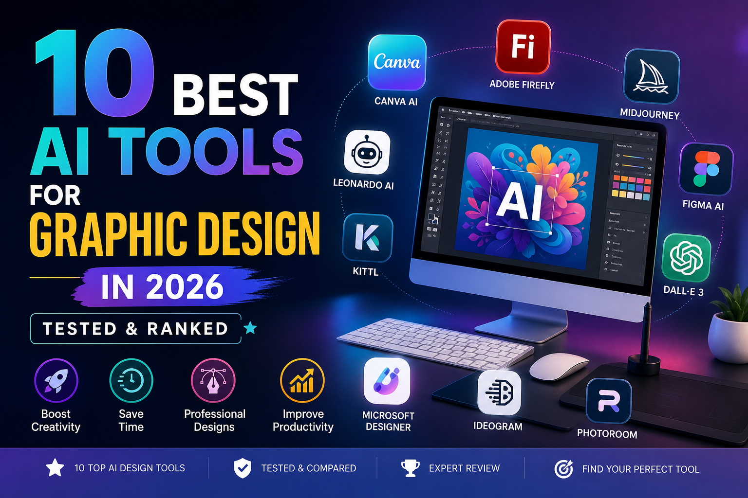
10 Best AI Tools for Graphic Design in 2026 (Tested & Ranked)
Artificial Intelligence has completely transformed the design industry. In 2026, graphic designers are no longer spending hours manually creating visuals — instead, they are leveraging powerful AI tools to automate workflows, generate ideas, and produce high-quality designs in minutes. The rise of AI-powered design platforms has made it easier for beginners, freelancers, and professionals alike to create stunning visuals without extensive technical skills.
In this comprehensive guide, we will explore the 10 Best AI Tools for Graphic Design in 2026. These tools are tested, ranked, and analyzed based on performance, features, ease of use, pricing, and real-world usability. Whether you are a beginner or an expert designer, this article will help you choose the best tool for your workflow.
Why 10 Best AI Tools for Graphic Design Are Essential for Designers in 2026
The demand for faster content creation has pushed designers toward AI-powered solutions. Today, AI tools can generate images, create layouts, remove backgrounds, and even design entire branding kits automatically.
According to recent industry insights, AI tools significantly reduce repetitive tasks such as resizing, editing, and generating design variations, allowing designers to focus more on creativity and strategy. (ToolChase)
This is why the 10 Best AI Tools for Graphic Design are becoming essential for anyone working in digital design, marketing, or content creation.
1. Canva AI (Magic Studio) — Best All-in-One Tool
Canva AI remains one of the 10 Best AI Tools for Graphic Design because of its simplicity and powerful features. It is perfect for beginners and professionals who want quick results.
Canva’s Magic Studio allows users to generate designs from text prompts, remove backgrounds, and even animate graphics instantly. With millions of templates and assets, it’s ideal for social media graphics, presentations, and branding. (tasarim.ai)
Key Features:
- Magic Design (AI-generated layouts)
- Text-to-image generator
- Background remover
- Drag-and-drop editor
Best For: Beginners and marketers
2. Adobe Firefly — Best for Professionals
Adobe Firefly is one of the most powerful tools in the 10 Best AI Tools for Graphic Design list, especially for professionals already using Adobe Creative Cloud.
It integrates seamlessly with Photoshop and Illustrator, offering generative fill, text-to-image, and advanced editing features. It is also trained on licensed data, making it safer for commercial use. (BuildPilot)
Key Features:
- Generative fill
- Style transfer
- Commercial-safe outputs
- Deep Adobe integration
Best For: Professional designers
3. Midjourney — Best for Creative Concepts
Midjourney is widely considered one of the 10 Best AI Tools for Graphic Design for generating high-quality artistic visuals.
Designers use it for mood boards, concept art, and creative exploration. Its ability to produce visually stunning images makes it a favorite among artists. (AI Tools Capital)
Key Features:
- High-quality image generation
- Style consistency
- Artistic rendering
Best For: Concept designers
4. Figma AI — Best for UI/UX Designers
Figma AI is a must-have in the 10 Best AI Tools for Graphic Design list for UI/UX professionals.
It helps designers generate layouts, automate design systems, and collaborate in real-time. It also integrates with plugins for enhanced productivity. (ToolChase)
Key Features:
- AI layout generation
- Real-time collaboration
- Design automation
Best For: UI/UX design
5. DALL·E 3 — Best for Beginners
DALL·E 3 is one of the easiest tools in the 10 Best AI Tools for Graphic Design category.
It allows users to generate images using simple text prompts, making it perfect for beginners who want quick results without technical knowledge. (AI Profit Labs)
Key Features:
- Text-to-image generation
- Easy prompt-based editing
- High-quality outputs
Best For: Beginners
6. Leonardo AI — Best Budget Option
Leonardo AI is among the 10 Best AI Tools for Graphic Design for those looking for affordability and flexibility.
It offers a free plan with daily credits and supports multiple design styles, including gaming assets and illustrations. (designshifu.com)
Key Features:
- Free plan available
- Multiple art styles
- Fast rendering
Best For: Budget users
7. Microsoft Designer — Best Free Tool
Microsoft Designer is a strong competitor in the 10 Best AI Tools for Graphic Design category, offering free AI-powered design features.
It allows users to create social media graphics, presentations, and marketing materials quickly using AI suggestions. (tasarim.ai)
Key Features:
- Free AI design tools
- Quick templates
- Easy interface
Best For: Free users
8. Kittl — Best for Typography Design
Kittl is one of the 10 Best AI Tools for Graphic Design known for its typography and logo design capabilities.
It provides advanced text editing tools and AI-powered design suggestions for branding projects.
Key Features:
- Typography tools
- Logo creation
- Vector editing
Best For: Branding designers
9. Ideogram — Best for Text-Based Designs
Ideogram stands out in the 10 Best AI Tools for Graphic Design for its ability to generate images with accurate text.
This makes it ideal for posters, ads, and social media content.
Key Features:
- Accurate text rendering
- AI-generated posters
- Creative layouts
Best For: Text-heavy designs
10. PhotoRoom — Best for Product Design
PhotoRoom completes the 10 Best AI Tools for Graphic Design list with its powerful product image editing features.
It is widely used for eCommerce and marketing visuals.
Key Features:
- Background removal
- Product mockups
- Batch editing
Best For: eCommerce
Comparison Table: 10 Best AI Tools for Graphic Design
| Tool | Best For | Pricing | Skill Level |
|---|---|---|---|
| Canva AI | All-in-one | Freemium | Beginner |
| Adobe Firefly | Professionals | Paid | Advanced |
| Midjourney | Concept art | Paid | Intermediate |
| Figma AI | UI/UX | Freemium | Advanced |
| DALL·E 3 | Beginners | Freemium | Beginner |
| Leonardo AI | Budget | Freemium | Intermediate |
| Microsoft Designer | Free tools | Free | Beginner |
| Kittl | Typography | Paid | Intermediate |
| Ideogram | Text design | Freemium | Intermediate |
| PhotoRoom | Product design | Freemium | Beginner |
How to Choose the Right AI Tool
When selecting from the 10 Best AI Tools for Graphic Design, consider these factors:
- Purpose: Social media, branding, UI/UX, or product design
- Skill level: Beginner vs professional
- Budget: Free vs paid tools
- Features: Automation, templates, integrations
Future of AI in Graphic Design
The future of design is heavily influenced by AI. Tools are becoming smarter, faster, and more intuitive. New advancements are focusing on automation, collaboration, and real-time editing.
However, AI is not replacing designers — it is enhancing their capabilities and allowing them to work more efficiently. (ToolChase)
Final Verdict
The 10 Best AI Tools for Graphic Design in 2026 offer something for everyone — from beginners to professionals. Tools like Canva AI and Adobe Firefly dominate the market, while Midjourney and Leonardo AI provide creative flexibility.
If you are just starting, go with Canva or DALL·E 3.
If you are a professional, Adobe Firefly and Figma AI are your best options.
Conclusion
The rise of AI has made graphic design more accessible than ever before. By using the 10 Best AI Tools for Graphic Design, you can create high-quality visuals, save time, and boost productivity.
Whether you are a freelancer, business owner, or content creator, these tools will help you stay ahead in 2026 and beyond.
Color Theory for Designers – A Beginner’s Guide to Smart Color Choices
Color plays a powerful role in graphic design. Whether you’re creating a logo, website, social media post, or t-shirt design, understanding color theory for designers helps you make smart, strategic decisions.
Color influences mood, brand perception, and even buying behavior. If you want your designs to look professional and communicate clearly, mastering color theory is essential.
In this beginner’s guide, you’ll learn the basics of the color wheel, color harmony, emotional color meanings, and the best tools to create stunning color palettes.
Why Color Theory Is Essential in Design
Color theory is the foundation of visual communication. It helps designers:
- Create visually balanced compositions
- Build strong brand identities
- Trigger emotional responses
- Improve readability and accessibility
- Increase conversions and engagement
For example, brands like use red to create excitement and energy, while uses blue to build trust and reliability.
When you understand color psychology and harmony, you design with intention—not guesswork.
The Color Wheel Basics
The color wheel is a circular diagram that organizes colors based on their relationships.
It was first developed by in the 17th century. The modern color wheel helps designers understand how colors interact with each other.
There are three main categories on the color wheel:
- Warm colors (Red, Orange, Yellow)
- Cool colors (Blue, Green, Purple)
- Neutral colors (Black, White, Gray, Brown)
Warm colors feel energetic and bold. Cool colors feel calm and professional.
Understanding the color wheel is the first step to mastering color harmony.
Primary, Secondary, and Tertiary Colors
1. Primary Colors
Primary colors cannot be created by mixing other colors.
- Red
- Blue
- Yellow
These are the base of all other colors.
2. Secondary Colors
Secondary colors are made by mixing two primary colors.
- Red + Blue = Purple
- Blue + Yellow = Green
- Red + Yellow = Orange
3. Tertiary Colors
Tertiary colors are created by mixing a primary and a secondary color.
Examples:
- Red-Orange
- Yellow-Green
- Blue-Purple
Using primary, secondary, and tertiary colors correctly helps create balanced and attractive designs.
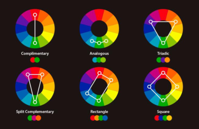
Color Harmony: Complementary, Triadic, and Analogous
Color harmony refers to combinations of colors that look pleasing together.
1. Complementary Colors
These are colors opposite each other on the color wheel.
Examples:
- Blue & Orange
- Red & Green
- Yellow & Purple
Complementary colors create high contrast and bold designs. Great for call-to-action buttons.
2. Triadic Colors
Triadic color schemes use three evenly spaced colors on the wheel.
Example:
- Red, Blue, Yellow
This combination creates vibrant and balanced designs.
3. Analogous Colors
Analogous colors sit next to each other on the color wheel.
Examples:
- Blue, Blue-Green, Green
- Red, Red-Orange, Orange
These create soft, harmonious, and natural-looking designs.
Choosing the right color harmony makes your design look professional and intentional.
Emotional Meaning of Colors
Color psychology plays a huge role in branding and marketing.
Here’s what common colors represent:
- Red – Energy, passion, urgency
- Blue – Trust, calm, professionalism
- Yellow – Happiness, optimism
- Green – Growth, health, nature
- Purple – Luxury, creativity
- Black – Power, elegance
- White – Simplicity, cleanliness
For example, luxury brands often use black and gold for a premium look. Eco-friendly brands prefer green to reflect sustainability.
Understanding emotional meaning helps designers choose colors that match the brand message.
Best Color Tools for Designers
Choosing the right colors becomes easier with professional tools.
1.
Coolors is a fast and easy color palette generator. You can lock colors and generate variations instantly.
2.
Adobe Color allows you to create palettes using color harmony rules like complementary, triadic, and analogous.
It also integrates smoothly with Adobe software like and .
These tools help you experiment and create professional color schemes quickly.
FAQ: What Are the Best Color Combinations?
There is no single “best” color combination. It depends on:
- Your target audience
- Brand personality
- Industry
- Cultural context
However, some popular combinations include:
- Blue & White (Clean and professional)
- Black & Gold (Luxury and premium)
- Purple & Yellow (Creative and bold)
- Green & Beige (Natural and organic)
The best approach is to test and refine your palette based on real design projects.
FAQ: Does Color Affect Conversions?
Yes, color significantly affects conversions.
Studies show that color can influence purchasing decisions and brand recognition. For example:
- Red creates urgency in sales banners
- Green encourages action (often used for CTA buttons)
- Blue builds trust on websites
Choosing the right call-to-action color can increase click-through rates and sales.
Conclusion: Practice Using Real Projects
Understanding color theory for designers is not just about learning rules—it’s about applying them.
Start practicing by:
- Redesigning a logo with different color harmonies
- Creating 3 social media posts using complementary colors
- Testing CTA button colors on your website
The more you experiment, the stronger your color instincts will become.
Smart color choices transform ordinary designs into powerful visual experiences.
Now it’s your turn—start creating with confidence! 🎨
Graphics Design
12 Expert Tips for Color Theory for Designers – A Beginner’s Guide to Smart Color Choices
12 Expert Tips for Color Theory for Designers – A Beginner’s Guide to Smart Color Choices
Introduction: Why Color Theory Matters in Design
Color theory for designers is one of the most powerful tools a designer has. Before you even read a word of text, color communicates mood, directs the viewer’s eye, and sets expectations. That’s exactly why understanding Color Theory for Designers – A Beginner’s Guide to Smart Color Choices is essential for anyone working in branding, web design, advertising, illustration, or UI/UX.
Color influences everything—attention, emotion, readability, and even conversion rates. When designers understand how colors relate, how they harmonize, and how they affect human psychology, their designs instantly become more polished, professional, and strategic.
Color theory for designers isn’t just artistic intuition; it’s a structured system of rules that designers rely on to make deliberate choices. Instead of guessing which colors “look good,” you’ll understand why they work. And once you master the basics, you can confidently create palettes that feel balanced, meaningful, and visually appealing.
Understanding the Color Wheel

The color theory for designers wheel is the foundation of color theory. It visually organizes colors in a circle, making it easy to understand how they relate and contrast.
Hue, Tone, Shade, and Tint
To use colors effectively, you need to understand these essential terms:
- Hue: The base color itself—red, blue, green, etc.
- Tone: Hue mixed with gray, resulting in softer, muted colors.
- Shade: Hue mixed with black, creating deeper, richer colors.
- Tint: Hue mixed with white, producing light, pastel versions.
These components help designers adjust mood and clarity. Soft tints feel gentle and friendly, whereas dark shades feel dramatic and bold.
Warm vs. Cool Colors

Warm colors—red, orange, yellow—bring energy and excitement. They draw attention quickly.
Cool colors—blue, green, purple—create calmness, trust, and relaxation.
Using warm and cool colors together can create visual balance, especially in user interfaces and branding.
Primary, Secondary, and Tertiary Colors

These groups form the backbone of the entire color wheel.
Primary Colors
- Red
- Blue
- Yellow
They cannot be created from other colors.
Secondary Colors
These are created by mixing two primary colors:
- Red + Blue = Purple
- Red + Yellow = Orange
- Blue + Yellow = Green
Tertiary Colors
Tertiary colors are formed when you mix a primary color with a secondary color. Examples include:
- Blue-green
- Yellow-orange
- Red-violet
Using These Groups in Branding
Primary color theory for designers often serve as core brand colors because they feel strong and memorable. Secondary and tertiary colors support the palette, adding dimension and flexibility for UI elements, icons, and backgrounds.
Color Harmony Fundamentals
Color harmony is about using colors in combinations that look pleasing and balanced.
Complementary Schemes
Complementary colors sit directly opposite each other on the color wheel. Examples include:
- Blue & Orange
- Red & Green
- Yellow & Purple
These pairs create high contrast, which is perfect for call-to-action buttons, posters, or impactful visual elements.
Triadic Palettes
A triadic palette forms a triangle on the color wheel—for example:
- Blue, Red, Yellow
- Purple, Orange, Green
Triadic schemes offer bold contrast while maintaining harmony.
Analogous Harmony
Analogous colors sit beside each other on the color wheel:
- Blue, Blue-Green, Green
- Red, Orange, Yellow
Analogous schemes feel calm and unified—great for backgrounds, illustrations, and user-friendly interfaces.
Psychological and Emotional Impact of Color

Color theory for designers influences human emotion across all forms of design.
Common Emotional Meanings
- Red: energy, urgency, passion
- Blue: trust, professionalism, reliability
- Yellow: optimism, creativity, cheerfulness
- Green: growth, calmness, environment
- Purple: luxury, imagination, spirituality
- Black: sophistication, strength, elegance
- White: simplicity, clarity, cleanliness
Understanding these meanings helps designers craft purposeful visual messages.
Cultural Interpretations
Color theory for designers don’t carry the same meaning in every culture.
For example:
- In the West, white symbolizes purity. In parts of Asia, it represents mourning.
- In China, red is a color of good fortune and celebration.
- In the U.S., blue often represents trust or corporate professionalism.
A designer must always consider cultural context when creating global products or branding.
Best Tools for Creating Color Palettes

Technology makes color exploration easier than ever.
Coolors
Color theory for designers is a fast, beginner-friendly palette generator. With just a click, you can lock colors, tweak brightness, and explore harmonious combinations.
Adobe Color
Adobe Color is designed for professionals. It offers:
- A digital color wheel
- Harmony suggestions
- Accessibility contrast checking
- Compatibility with Adobe Creative Cloud
This tool is perfect for branding, UI design, and large-scale visual projects.
Practical Tips for Designers to Choose Better Colors
- Start With One Base Color
Choose one color that represents the project’s mood. Build the palette around it using harmony rules.
- Consider Accessibility
Not all users see color the same way. Use contrast tools to ensure readability for people with low vision or color blindness.
- Limit Your Palette
Too many colors can overwhelm the viewer. Most branding systems use 3–5 main colors.
- Use Neutrals to Balance Your Palette
Whites, blacks, grays, and beiges provide breathing room around strong colors.
- Match Colors to Brand Personality
- Tech brands use blues for trust
- Eco brands lean toward greens
- Luxury brands prefer black, gold, or purple
FAQs
- What are the best color combinations?
Complementary and triadic combinations create the strongest visual impact, while analogous combinations create a pleasing, natural flow.
- Does color affect conversions?
Absolutely. High-contrast colors—especially for buttons—can dramatically improve user engagement and sales.
- Which tools help beginners learn Color theory for designers?
Coolors, Adobe Color, Paletton, and Canva’s palette generator are great.
- How can I pick colors for branding?
Focus on brand personality, target audience emotion, and industry standards. Start with a strong primary color.
- Are there colors designers should avoid?
Avoid extremely saturated combinations unless used sparingly for accents.
- How do I test color accessibility?
Tools like WebAIM and Adobe Color’s contrast checker help ensure your palette meets WCAG guidelines.
Conclusion: Practice Through Real-World Projects
Color theory for designers becomes easier the more you practice. Whether you redesign a homepage, create a logo, or experiment with advertisement layouts, real projects help you develop an intuitive understanding of color. The goal isn’t perfection—it’s learning to make intentional, smart choices that fit your message and audience.
The more you explore the color wheel, test harmony rules, and practice palette creation, the stronger your design skills will become.
-

 Graphics Design2 years ago
7.Exploring the Importance of Color Theory Charts
-

 Graphics Design12 months ago
Top 10 Best Graphic Design Tools for Beginners in 2025 (Free & Paid)
-

 Graphics Design2 years ago
10 Stunning Gradient Design Trends You Need to Know in 2024
-

 Graphics Design11 months ago
15 Freelance Graphic Design Tips to Boost Your Career in 2025
-

 Graphics Design2 years ago
29.Retro Design Is Making a Comeback in Modern Spaces
-

 Graphics Design1 year ago
Best Laptops for Graphic Designers – 2025 Buying Guide
-

 Graphics Design1 year ago
2025 Logo Design Trends: What’s In, What’s Out?
-

 Graphics Design2 years ago
15.The Importance of Effective Flyer Design in Marketing
binance h"anvisning
November 20, 2024 at 7:13 am
Can you be more specific about the content of your article? After reading it, I still have some doubts. Hope you can help me.
Muhammad Ubaid
November 22, 2024 at 1:38 pm
okay