
Uncategorized
Top 10 Typography Trends of 2025: Stay Ahead in Digital Design`

Top 10 Typography Trends of 2025: Stay Ahead in Digital Design
Typography trends of 2025 everything from Bad Fonts to Good Fonts is not merely the font that is to be used, it is all about typeface, about feeling, about grabbing attention and about… messaging. In this sense, if design trends continue to change, the typography domain in 2025 will introduce new untapped perspectives as well as different ways of an attractive appearance of digital matters. Here, we look at 10 typography trends that are predicted to dominate the digital design space in the coming year, making it easier for designers to make informed decisions about choosing the right styles for their projects.
1. Dynamic Variable Fonts: Using sports lettering technology, this Design brings Versatility Meets Functionality.
With increasing popularity for more functionality within the digital design sphere, variable fonts are something introduced typography trends of 2025. These fonts come in one typeface as an encouraging factor permitting fonts within a single file to be made lighter, bolder, and even more rigid than other fonts that do not support such flexibility. Standing for WPO, variable fonts cut down the amount of time your web pages take to load and offer both form and function, especially when dealing with multiple designs for the same platform, hence their importance in the construction of flexible digital interfaces.
Why It’s Popular
Typography trends of 2025 dynamic variable fonts are specifically praised for fluidity. And no limits on screen sizes and orientations are applied to them, which will give you an engaging experience when you are using a mobile device, or a tablet, or just a common PC.
Best Use Cases
- Responsive websites
- Interactive applications
- Digital advertisements
2. Minimalist Serif Revival: The combination of Traditional and Contemporary

Clean and elegant typography is enjoyed throughout typography trends of 2025 with the return of minimalism in the context of serif fonts. These fonts have both class and elegance and provide the timeless that may be a point of appeal to modern taste. While traditional serifs are heavy-set, having heavy thick and thin lines, outlines and a lot of embellishments, these contemporary serif texts have comparatively thinner strokes, and fewer deetings, and thus are ideal for a posh look.
Why It’s Popular
Typography trends of 2025 simplicity of the serifs in the choice is in between businesslike and friendly. Because of the refinement without ornamentation, these types are especially suitable for modern identification.
Best Use Cases
- Editorial websites
- Luxury brands
- Corporate presentations
3. Maximalist Typography: Bold, Big, and Beautiful

Of course, minimalism has a point and 2025 is also witnessing the emergence of the maximalist typography. This style uses large and loud fonts which take charge of screen size and demand an instant look. The trend often employs the use of bright colors with objects of irregular shapes and layers giving products lots of character that is easily noticed.
Why It’s Popular
Maximalist typography trends of 2025 is best described as a beloved and preferred concept since everyone loves that which is unconventional and non-conforming to conventional norms. It enables designer to really play with type and make a pretty unique statement just by typing.
Best Use Cases
- Event posters
- Social media graphics
- Landing pages
4. Handwritten and Script Fonts: AEGD: Personal Touch in the Digital Age
To quote UnZipped for typography trends of 2025 A human touch to the digital writing is being incorporated through handwritten and script fonts. Such fonts copy the original essence of handwritten texts and make a design look friendly, familiar, and welcoming. When it comes to brand naming, social media or website designing script fonts help footwear brands create a laid-back attitude.
Why It’s Popular
Typography trends of 2025 thanks to technology, the society became impatient when it comes to real communication. Handwritten fonts are organic and add personality to dull otherwise interfaces, it makes the layout look bespoke.
Best Use Cases
- Personal blogs
- E-commerce sites
- Creative portfolios
5. High-Contrast Fonts: When it comes to writing a scientific paper it is crucial to stay as close to the original purpose and idea as possible while also making sure that the message gets across loud and clear.
Many designers have praised the sharp contrasting fonts and those that have thinner and thicker margins distinguished in a dramatic manner because they offer easy to read characters. By typography trends of 2025, these fonts are popularly used in headings and call to actions since designers want to highlight particular items without the distraction of readability being affected.
Why It’s Popular
Typography trends of 2025 obviously, use of high contrast fonts attract attention and can be used to highlight specific pieces of text without over powering the rest of the remaining content in the webpage. They transpose the chasm between the formal and forceful quite deftly.
Best Use Cases
- Call-to-action buttons
- Headlines on webpages
- Print media
6. Layered and 3D Typography: Adding Depth and Dimension

Layered and 3D typography trends of 2025 is about illusion of depth of the type, as well as making it look more responsive to the viewer. It has become common to see shadows, gradients, layering techniques used on fonts to popping which in essence makes fonts better in the digital space.
Why It’s Popular
Typography trends of 2025 when it comes to VR and AR, 3D and layered typography are necessities which continue to be developed. This trend is manifested in the tendency of spatial web design and introduction of typography to the three-dimensional world.
Best Use Cases
- Virtual reality interfaces
- Gaming websites
- Interactive media
7. Gradient Typography: Vibrant and Eye-Catching

As seen in this article, gradient typography is a trend that will be quite prominent in 2025 because designers want to make the designs ‘pop’ while not overloading them. Gradations retain the two colors and make them run into each other in a subtle way that makes it perfect for digital designs. Together with simple graphic designs, gradient typography trends of 2025 adds an air of newness and contemporariness.
Why It’s Popular
Typography trends of 2025 this kind of gradients allow to make the text look more interesting and add some liveliness to the digital type, at the same time not harming the reader’s eyes with oppressive, bright color concentration.
Best Use Cases
- Technology brands
- Fashion websites
- Landing pages
8. Retro and Vintage Fonts: Nostalgia Meets Innovation
The good old fonts are back, as influenced by font of the seventies, eighties and nineties. Typography trends of 2025 refers to the reminiscence of things by making use of elements that evoke a familiar feeling to people, in the design of digital interfaces. Designers are now reviving these pixel fonts in newer avatars, incorporating them in modern design templates where they can provide a touch of vintage glory with modern designs.
Why It’s Popular
Those audiences who like things old school find the vintage font trend appealing. I think that it is a connection between the Past and the Present and it is a welcome relief when compared to today’s ultra modern styles.• Branding for lifestyle product• Promotion of ‘Throwback’ eventsng Depth and Dimension
Layered and 3D typography is all about creating visual depth and making type appear more interactive and engaging. Designers are utilizing shadows, gradients, and multi-layered effects to make fonts pop, resulting in a more immersive digital experience.
Best Use Cases
- Virtual reality interfaces
- Gaming websites
- Interactive media
9. Outline Fonts: Thin and barely noticeable Design Decision
Outline fonts are where only the outlines of characters are visible and cannot be used in a massive range of different digital designs. In 2025, outline fonts are preferred for the titles and headlines that are required to be less dominating yet provide contrast to structure of web page.
Why It’s Popular
Outline fonts are more contemporary, artistic and at the same time are easier to read than most other fonts. The products themselves – they are thin and glamorous, do not clutter a room decor and can easily fit into minimalist environment.
Best Use Cases
- Fashion websites
- Art galleries
- Modern portfolios
10. Animated Typography: Bringing Text to Life

Animated typography is quickly becoming a favorite as more designers seek dynamic ways to engage audiences. These animations range from subtle fades to elaborate movements, adding an interactive element to web pages and applications. When used thoughtfully, animated text can guide users’ attention and make content more memorable.
Why It’s Popular
Animation in typography trends of 2025 not only captivates viewers but also guides them through content. It’s effective for storytelling and emphasizes key information visually.
Best Use Cases
- Digital storytelling platforms
- Interactive presentations
- Web banners and ads
How Typography Trends in 2025 are Incorporation
Typography trends of 2025 need to be executed with much concern for the brand, the users and usability if they are to be effective. Here are some tips for applying these trends effectively in your design work:
Know Your Brand: Remember, the font should follow the organizational brand: light and friendly or serious and professional. Serif fonts can be more effective for a luxury brand while sans serif can work great for an artistic agency for example.
Prioritize Readability: It is never okay to use flashy or huge fonts if they cannot be easily read by the intended viewers. Due to the great number of different devices with different sizes, it is crucial to check fonts, and how they look on different devices.
Mix and Match Wisely: It is very important to constantly work with different styles of typography because you can achieve a lot in terms of interest or excitement simply by overlaying typography and avoiding the use of too many designs. Compliment the fonts with an outfit so that they do not clash.
Use Animation Sparingly: Typography trends of 2025 is quite popular at the moment; however, the use of this design feature should be moderate in order not to overwhelm users. Use it when giving emphasis on important info.
Conclusion
Typography trends of 2025 are rather versatile and cover such styles as brutalism, futurism, Sinclairism, Organic and Modest. These trends outline the general direction which digital design is going, and show that no matter how it develops, legibility, beauty, and usability are the key principles to consider when choosing fonts. The best possible means of achieving such goals is staying on top of these trends and designing visuals that will engage the audience and enhance the overall user experience.
FAQs
- Variable font: What are they, why are they important?
Open variable fonts are associated with variable font format that enables adjustments of one or many of the features of font such as weight, width, and slant within the same file type. They’re a must in responsive design because they are scalable across the display while offering optimal functionality.
- As much as typography trends are fascinating, with so many and variables, how does one select the right trend for my brand?
Look at the nature of your brand, the targeted clients and the overall goals of the brand. Categorized, minimalist fonts are best used in business-like environment, while the bold, maximalist fonts are best used in artistic environments where a statement is intended to be made.
- Can handwritten fonts be used for any kind of digital design?
These fonts are ideal for use in personal or low profile brands since they do not come close to professional or corporate settings. They add humanity but at the same time can be a source of adversely affecting the readability of big text chunks.
- Does stylised lettering have an impact on the speed of a site?
Absolutely, excessive use of animated features does negatively affect the websites’ usability, particularly, mobile usability. To achieve animation then one should consider using lightweight animations, the use of CSS effects.
- The difference between gradient fonts and regular colored fonts are?
Gradation fonts applies gradients with simple borders, where one color fades smoothly into another by a gradual change of shade. Of course gradients are more alive and dynamic than simple static colors, and they make typography more communicative.
50 Creative Logo Design Ideas for Modern Brands
Why Logo Design Matters More Than Ever
Logo Design ideas In today’s competitive marketplace, businesses fight for attention every second. Whether someone discovers your company through Google, social media, a website, or a product package, your logo is often the first thing they notice. That tiny visual symbol carries enormous responsibility. It communicates professionalism, personality, trust, and value before a customer reads a single word about your business. This is why businesses continue investing heavily in strong branding and innovative
Modern consumers make judgments within seconds. A well-designed logo can create instant credibility, while a poorly designed one may push potential customers away. Research and branding experts consistently emphasize that strong visual identities improve recognition and trust. Today’s brands also need logos that work across websites, mobile devices, social platforms, apps, packaging, and even AI-driven search experiences. Responsive logo systems and adaptable branding have become critical for modern businesses.
The best Logo Design Ideas are not simply attractive graphics. They are strategic assets designed to communicate a brand’s story. Think of a logo as the face of your business. Just as people remember faces, customers remember distinctive logos. A memorable design helps brands stay top-of-mind and encourages customer loyalty over time.
Understanding Modern Logo Trends
The landscape of logo design has changed dramatically in recent years. Businesses no longer create a single logo and use it everywhere without modification. Instead, modern brands build entire logo systems that adapt to different platforms and screen sizes. This shift has influenced many contemporary Logo Design Ideas, leading designers to prioritize flexibility alongside creativity. Responsive logos, simplified icon versions, and scalable designs are now considered best practices.
Another major trend is meaningful minimalism. Brands are moving away from unnecessary visual clutter and embracing cleaner designs that remain memorable. Minimal logos perform better on digital devices, load faster, and maintain readability across various formats. Yet simplicity alone is not enough. The most successful Logo Design Ideas combine simplicity with personality, creating a balance between elegance and uniqueness.
AI-powered design tools have also influenced branding. While AI can generate concepts quickly, businesses increasingly seek custom identities that feel authentic and distinctive. This has created a growing demand for logos that blend technology with human creativity. As a result, many of today’s best Logo Design Ideas focus on originality, storytelling, and emotional connection.
50 Creative Logo Design Ideas for Modern Brands
Minimalist Logo Design Ideas
- Single-line logos.
- Monogram logos.
- Negative-space logos.
- Geometric icons.
- Minimal wordmarks.
These Logo Design Ideas emphasize simplicity while maintaining strong recognition. Minimalist designs continue dominating because they work seamlessly across digital environments. Clean lines and thoughtful spacing create logos that feel modern and professional. Many global brands have simplified their logos over time because simplicity improves scalability and memorability.
Typography-Based Logo Design Ideas
![]()
- Custom lettering logos.
- Bold serif wordmarks.
- Handwritten signatures.
- Variable typography logos.
- Stretched font logos.
Typography-focused Logo Design Ideas allow brands to communicate personality through letters alone. A custom typeface can instantly differentiate a business from competitors. Strong typography often becomes the visual identity itself, reducing the need for additional symbols. Modern brands increasingly use unique fonts to avoid blending into the sea of generic sans-serif logos.
Geometric Logo Design Ideas
![]()
- Hexagon-based logos.
- Circular identity marks.
- Triangle-inspired symbols.
- Grid-based structures.
- Symmetrical patterns.
Geometric Logo Design Ideas provide balance, precision, and professionalism. Technology companies frequently use geometric forms because they suggest innovation and reliability. Adding subtle asymmetry or hidden meanings within shapes can make these logos even more memorable. Many successful brands rely on geometry to achieve timeless appeal.
Nature-Inspired Logo Design Ideas
![]()
- Leaf symbols.
- Mountain icons.
- Water-inspired designs.
- Organic curves.
- Earth-tone branding.
Nature-based Logo Design Ideas are especially effective for sustainable and wellness-focused brands. They communicate authenticity, growth, and responsibility. Modern consumers increasingly appreciate brands that demonstrate environmental awareness, making these concepts highly relevant today.
Vintage and Retro Logo Design Ideas
![]()
- Badge logos.
- Retro typography.
- Heritage-inspired emblems.
- Stamp-style marks.
- Nostalgic illustrations.
Vintage Logo Design Ideas blend trust and tradition with modern execution. They create emotional connections through nostalgia while maintaining contemporary usability. These logos work particularly well for coffee brands, clothing labels, craft businesses, and local businesses seeking authenticity.
Mascot Logo Design Ideas
![]()
- Friendly animal mascots.
- Cartoon characters.
- Brand ambassadors.
- Illustrated faces.
- Interactive digital mascots.
Mascot-based Logo Design Ideas are experiencing renewed popularity because they create emotional engagement. Brands increasingly use mascots to humanize digital experiences and improve customer connection. Mascots provide personality, making businesses feel approachable and memorable.
Abstract Logo Design Ideas
![]()
- Fluid shapes.
- Dynamic patterns.
- Abstract symbols.
- Motion-inspired marks.
- Artistic compositions.
Abstract Logo Design Ideas encourage creativity and uniqueness. Instead of representing something literally, these designs communicate emotions and values. They are ideal for innovative startups and creative agencies seeking distinctive identities.
Luxury Logo Design Ideas
![]()
- Gold-inspired monograms.
- Elegant serif logos.
- Crest-style identities.
- Premium black-and-white logos.
- Sophisticated emblem designs.
Luxury-focused Logo Design Ideas emphasize exclusivity and prestige. They often rely on refined typography, balanced spacing, and timeless design principles. Simplicity is especially important in luxury branding because it communicates confidence and sophistication.
Technology Logo Design Ideas
![]()
- Digital circuit symbols.
- AI-inspired icons.
- Futuristic gradients.
- Pixel-inspired logos.
- Dynamic motion logos.
Technology brands require Logo Design Ideas that communicate innovation. Modern tech logos increasingly incorporate adaptable elements, gradients, and responsive variations. Animated logos are also becoming popular as businesses seek more interactive branding experiences.
Creative Startup Logo Design Ideas
- Adaptive logo systems.
- Storytelling symbols.
- Hidden-message logos.
- Community-inspired branding.
- Hybrid icon-and-wordmark logos.
Startup-focused Logo Design Ideas should prioritize flexibility, memorability, and scalability. Since startups often grow rapidly across multiple channels, their logos must function effectively everywhere from social media avatars to large-scale advertising campaigns.
Common Logo Design Mistakes to Avoid
Even the best Logo Design Ideas can fail when executed poorly. One common mistake is overcomplicating the design. Excessive details may look impressive initially, but they often become unreadable at smaller sizes. Simplicity generally improves usability and recognition.
Another mistake is blindly following trends. While trends can inspire creativity, businesses should prioritize long-term brand identity over temporary popularity. A logo should remain effective for years rather than becoming outdated after a short period. Successful branding balances contemporary relevance with timeless design principles.
Many businesses also confuse branding with logo design. A logo is only one component of a broader brand identity. Colors, typography, messaging, and customer experience all contribute to how people perceive a business. A strong logo works best when supported by a cohesive brand strategy.
How to Choose the Right Logo Design Idea
Selecting the right Logo Design Ideas starts with understanding your audience. Ask yourself who your customers are, what they value, and how you want them to perceive your brand. A technology startup may benefit from futuristic concepts, while a luxury fashion brand might require elegant typography and refined aesthetics.
Brand values should also guide design decisions. Every visual element should reinforce your company’s mission and personality. Colors, shapes, typography, and symbols all communicate meaning. A carefully designed logo acts like a silent salesperson, continuously representing your business wherever customers encounter it.
Testing multiple concepts before finalizing a design is equally important. Gather feedback from customers, colleagues, and design professionals. Evaluate how the logo performs across websites, mobile devices, packaging, and social media. The most effective Logo Design Ideas remain recognizable and impactful regardless of where they appear.
Conclusion
Strong branding begins with exceptional Logo Design Ideas. As modern brands compete for attention across increasingly crowded digital environments, logos have become more important than ever. The best logos combine creativity, simplicity, adaptability, and strategic thinking. Whether you choose a minimalist wordmark, a geometric icon, a playful mascot, or a luxury monogram, your logo should reflect your brand’s personality and values.
The 50 Logo Design Ideas explored in this article provide inspiration for businesses of every size and industry. By focusing on originality, scalability, and audience connection, you can create a visual identity that stands out today and remains relevant for years to come.
FAQs
- What are the best Logo Design Ideas for startups?
Minimalist logos, responsive logo systems, typography-based designs, and hidden-message logos are among the most effective options for startups.
- Why are minimalist Logo Design Ideas so popular?
Minimalist designs are easier to recognize, scale effectively across digital platforms, and maintain clarity at all sizes.
- How many Logo Design Ideas should I explore before choosing one?
Most professionals recommend exploring at least 10–20 concepts before selecting the strongest direction.
- Are AI-generated Logo Design Ideas good for businesses?
AI tools can provide inspiration and quick concepts, but custom-designed logos often offer stronger originality and brand differentiation.
- How often should a company update its logo?
Most brands refresh their logos every 7–15 years, although subtle refinements are often more effective than complete redesigns.
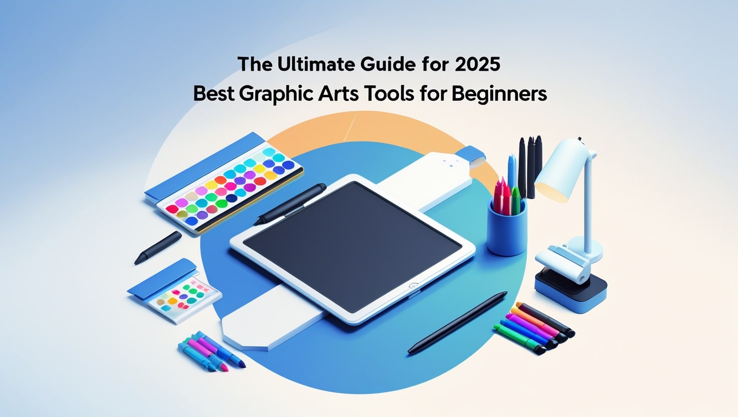
Best Graphic Arts Tools for Beginners – The Ultimate Guide for 2025
With the world of graphic arts tools always changing, starting out can feel very complicated. Newcomers to programming usually face a huge number of options when deciding on tools and platforms. This is why we’ve written this guide to teach you about the top graphic Arts tools for people just starting. Whether you want to become a digital artist, work in social media design or are just interested in making appealing content, you’ll find all the answers you need in this guide.
Graphic arts tools design has become available to anyone who wants to make something creative, with the right tools. Advancements in graphic Arts tools mean that now, you only require basic skills and affordable gear to kick-start your learning. So many options make it difficult to pick the right tool for your tasks. Let’s discuss each element of design in turn.
What Happens When You Use the Wrong Graphic Arts Tools
Great digital artworks are built using the proper tools from graphic arts tools. They act both like software and like tools for creating – your อันวุ่นเวือน, canvas and arena for exploring creativity. Appropriate tools will allow you to achieve your best without facing complicated designs or boundaries.
To help beginners, good graphic Arts tools must be simple to understand, cost little (or nothing) to use and increase in features as you improve. If you spend your time on the wrong tools, you might end up unhappy, tired out and exhausted. For this reason, it’s important to find the right graphic Arts tools right away if you want to succeed in the future.
1. Canva is a Simple Tool for Getting Graphic Art Done in a Short Time

Canva is possibly the simplest graphic Arts tool to use if you’re getting started. With drag and drop, you can easily design attractive websites. You can use Canva’s large selection of templates and graphics for social media, YouTube, business cards and flyers.
The Reasons Canva Is Different:
- You don’t need programming experience to begin
- Thousands of templates are already available for you to use.
- With cloud computing, staff can work together more easily.
- It is perfect for content on social media.
You don’t have to be an expert to make anything on Canva, whether you’re making an Instagram post or a presentation. It’s not necessary to be an expert – just have an idea and click a few buttons.
2. Adobe Photoshop is the most widely used graphic arts tool in the industry.

Adobe Photoshop should be included on any list of graphic Arts tools. At first glance, Photoshop looks like it will be difficult to use, but it allows you to do more than any other tool. The use of tablet apps extends from photo editing to digital painting and is valued by countless professionals.
Advantages of Adobe Photoshop:
- All the potential a robot can have
- A great community behind the project
- Regular improvements and additions to the platform
- Has great compatibility with other programs from Adobe.
Those just starting out should focus on learning layers, masks and brushes. You can take advantage of lots of free guides and videos.
3. The Best Vector Graphic Arts Tool Is Adobe Illustrator
Those who design logos, icons and other artwork that can be scaled should use Illustrator as their best vector-based graphic Arts tool. Even though it is included in Adobe’s Creative Cloud, this software is mostly for working on designs without losing their clarity when resizing.
Key Features:
Using a vector”></different styles, fonts and sizes, you can also create different kinds of icon designs.
- Photographic graphic arts tools
- Advanced management of typography is possible.
- Working with Photoshop is made simple.
Although learning Illustrator takes time, it is still one of the leading graphic arts tools for creating vector art.
4. GIMP is an open-source program for graphic design work.

GNU Image Manipulation Program (GIMP) is an excellent alternative to Photoshop and costs nothing. You can customize it how you like and it provides many functions similar to Adobe’s suite.
Why Newcomers May Find GIMP Useful.
- This app is available for free to use at any time.
- Community plugins and support are available in large numbers.
- The interface for Cleanzai is like Photoshop’s UI.
- It is compatible with every major type of operating system.
If you’re looking for powerful editing options and don’t want to spend much, GIMP is the answer.
5. Digital Artists Should Look to Procreate for the Power of the iPad
Procreate is a graphic arts tools created just for the iPad. Procreate provides a great way for beginners to use an Apple Pencil on a tablet.
Top Benefits Offered by Procreate:
- Smooth and fast sketching technology
- Control system that’s simple to use
- You simply have to pay once, then you own it.
- You are provided with many options to customize your brushes.
Many artists choose Procreate for everything they make such as comics and digital paintings. It’s a great fit for people just starting out with hand-drawn art.
6. The Software Krita is a Great Choice for New Artists

You won’t find professional drawing tools this good anywhere and they cost you nothing. Illustrators, comic book makers and concept artists find it extremely helpful.
What Makes Krita Stand Out
- Creators were the main focus in the design.
- You can fully customize all the brush tools in Photoshop.
- Animation elements are used in style.
- There are no charges for using it
You can use this graphic arts tools whether you are a professional or just starting out.
7. Affinity Designer is a Cheap Adobe Alternative
Affinity Designer is becoming popular because it provides quality tools at a cost that users only pay once. Its versatility comes from being able to do both vector and raster tasks.
Best Features:
- Prices that fit your budget
- A UI that moves quickly and is easy to use
- Frequent updates
- You can use it on macOS, Windows and iPad.
If you aren’t familiar with graphic design and don’t have an Adobe subscription, Affinity Designer is a great option.
8. The Graphic Arts field has CorelDRAW as its long-time expert.

The design industry recognizes CorelDRAW as being among the oldest. With every update, it has advanced to offer a complete suite of graphic Arts tools for all users.
The main reasons to work with CorelDRAW are listed below.
- Easy to use training process
- Advanced ways to design with vectors
- Online hands-on work and tutorials
- More community involvement
No other graphic tool matches the powerful position of lettering in print and on signs.
9. Pixlr – A simple and online graphic tool.
If you’re new to photo editing and don’t want to put software on your machine, Pixlr is a good choice. It works fast, is easy to use and includes tools that are strong enough for most people.
Why Pixlr is a Good Choice:
- You don’t need to install anything to use it
- Easy and organized layout
- All your data and files can be stored in the cloud.
- Tools that use AI
When making quick changes, Pixlr is a favorite online program for graphic Arts.
10. Inkscape provides all its functions for free as a vector graphic software.
Making scalable objects such as logos and banners is easy with the open-source application called Inkscape.
Important Features:
- Impressive SVG support
- It won’t be difficult for anyone just starting.
- There is an active group of developers involved in development.
- Free and available to access without payment
This is a preferred graphic Arts application for those creating vector graphics with limited spending power.
How to Choose Graphic Arts Tools As You Start
If you are starting out in graphic Arts, consider a few important points when picking tools.
- A user-friendly interface makes it simple to understand what’s happening.
- When community participation grows, there will be an increase in tutorials and solutions from users.
- You should begin with programs that don’t cost you anything or are not very expensive.
- Use Pocket on any device, anywhere you like.
- Try a tool that matches your learning process so you don’t feel overwhelmed.
All the graphic Arts tools discussed are particularly good in these areas which is why they are suited for new designers.
Use Free Online Resources to Better Your Learning

Use your graphic Arts tools together with online tutorials, courses and YouTube tutorials. Skillshare, Coursera and Udemy provide clear guidance on the majority of the tools discussed here.
With your graphic Arts tools becoming familiar, you are ready to experience advanced features, for instance, vector tracing, 3D rendering and animation. There is so much we can do with photography.
An overview of the top essential tools for starting in graphic arts
- Which tools should you start with if you’re just starting with graphic Art?
A simple way to edit graphics is with Canva, Pixlr or GIMP. With these tools, you don’t need to know anything about design before you begin creating.
- Are there free solutions available for graphic Arts?
Yes! For those looking for free graphic Arts tools, GIMP, Krita, Inkscape and Canva (no subscription required) are your best options.
- Which is the most effective graphic arts tool for doing digital painting?
Digital painting works best with Procreate and Krita as the tools. Both include a variety of paint brushes and respond very smoothly to touch.
- Is it possible to use graphic arts tools if I don’t have a graphic tablet?
Absolutely. Most of these tools are made for use with the mouse and keyboard, yet using a tablet can make your drawings easier.
- How much time does it take to learn graphic Arts tools?
It will be successful if you are dedicated. Practice regularly and you could become good at basic design within the first three months. Some features in advanced traffic speeds may take more time.
The Most Effective Graphic Arts Tools Lie Readily at Your Fingertips
Getting started with graphic design is easy and doesn’t have to be difficult. In 2025, people just learning graphic arts tools have a lot more options for creating, learning and sharing their work. People who enjoy working with raster, vector or AI in design will find options that suit them well.
Use different graphic arts tools to find the one that suits your style. Many tools allow users to test them for free, so don’t hesitate and explore what’s out there. Keep in mind, the software is only useful if you use your imagination.
Go for the graphic arts tools that fits your creative work the best. You are starting your artistic journey today.

Canva vs Adobe Photoshop – Which One is Better for Designers?
Designers today have wide-ranging tool options to create beautiful visual content because of the digital era. The design tools Canva vs Adobe Photoshop are the leading choices among all available options. All designers including novices and professionals seeking marketing content for their business must answer this pressing question: Canva offers better design solutions than Adobe Photoshop. You will understand better which tool satisfies your design requirements most by studying a comprehensive analysis between these two applications.
The decision between Canva vs Adobe Photoshop exceeds tool selection as it provides an opportunity to select your creative collaboration mode. Your design requirements along with skill level and design goals help determine whether Canva or Adobe Photoshop stands as the more suitable tool for your project. We will analyze all key aspects of Canva and Adobe Photoshop throughout this article through individual assessments of uniqueness and comparative breakdowns of features and usability alongside price structures and performance indicators.
The Origins of Canva vs Adobe Photoshop
The historical development of Canva vs Adobe Photoshop explains their contrasting features in modern times. Adobe Photoshop obtained its professional industry status immediately following its 1990 debut from creators Thomas and John Knoll. This platform functions as a comprehensive tool which provides users access to capabilities that span from picture handling to illustration creation and three-dimensional work and novice video modification.
Canva launched in 2012 as a user-friendly design platform which Melaine Perkins, Cliff Obrecht and Cameron Adams established to provide design access to all types of users. The web-based Canva platform made design accessible to users with no design experience who created professional-quality social media pictures along with marketing presentations without prior training. The comparison between Canva vs Adobe Photoshop needs to start from the basic understanding that these software tools arose to solve separate problems.
Ease of Use: Canva vs Adobe Photoshop

Anticipant differences exist between Canva and Adobe Photoshop because of their respective user-friendliness. The user interface of Canva has become famous because of its straightforward nature which users appreciate. Drag-and-drop operations simplify every task while new users can generate attractive designs in under minutes. The design process becomes simple because Canva provides users a diverse collection of templates and elements and fonts in its design arsenal.
Adobe Photoshop delivers extensive power through its features at the cost of steep learning complexity. To learn Photoshop completely one needs both significant amounts of practice and professional education and plenty of patience. Adobe Photoshop stands out with its high complexity level that delivers spectacular results but poses a remarkable challenge to new users. Ease of use between Canva and Adobe Photoshop determines the outcomes of the comparison particularly for novice users who require quick professional designs without demanding extensive training.
Users will experience different levels of design flexibility when examining Canva versus Adobe Photoshop
The discussion concerning Canva versus Adobe Photoshop includes flexibility as a core consideration. Due to its web application structure Canva enables users to modify pictures while adding text and filters and producing layouts without difficulty. However, Canva does have limitations. The design editing options in Canva remain simple compared to Photoshop and the application falls short of executing complex photo processing or manipulating numerous images or operating in three-dimensional space.
Adobe Photoshop, on the other hand, offers unmatched design flexibility. Photoshop delivers the best solution for users who want to modify pixel details and create realistic composites together with advanced capabilities that include masks and brushes and layers tools. Among Canva and Adobe Photoshop for design purposes total freedom comes exclusively from Adobe Photoshop.
In comparison to Adobe Photoshop Canva provides its services at different pricing levels.
Budget become a main factor in selecting between Canva and Adobe Photoshop. Canva offers a freemium model. Canva users get free access to a vast template collection along with fundamental design capabilities through its basic free version. The Canva Pro offering with brand kits, premium templates and expanded cloud storage functions can be accessed through a reasonable monthly or annual subscription.
The premium software product belongs to Adobe Photoshop. The Creative Cloud subscription model through Adobe costs in excess of what users pay for Canva premium options. Despite its cost, professional designers accept the price because Photoshop provides complete creative control as well as extensive features. The price of your subscription along with your feature requirements will dominate your choice between Canva and Adobe Photoshop.
An Evaluation of Characteristics Between Canva and Adobe Photoshop

The main overlap between Canva and Adobe Photoshop centers on the different features they provide.
Canva Features:
- Drag-and-drop interface
- Pre-designed templates
- Stock images and elements
- Animation tools
- Collaborative design
- Simple photo editing
Adobe Photoshop Features:
- Advanced photo manipulation
- Extensive layer control
- Professional typography tools
- 3D design capabilities
- Animation and video editing
Users maintain complete authority to edit color tones alongside performing complete retouching operations.
Collaboration Tools: Canva vs Adobe Photoshop

Comparing collaboration tools stands as an additional critical factor when choosing between Canva and Adobe Photoshop. Canva shines in collaboration. Real-time collaborative editing is available on Canva through which team members can comment on designs and work together at the same time. The feature proves extremely beneficial to marketing groups along with social media managers who require continuous brand consistency.
Photoshop supports collaborative work to some extent but it did not receive development as a tool designed for joint real-time editing between teams. Adobe requires extra steps through cloud documents to achieve real-time collaboration because their features remain inferior to Canva’s integrated capabilities.
When teamwork stands as your main requirement Adobe Photoshop meets with defeat in the Canva vs Adobe Photoshop contest.
Templates and Resources: Canva vs Adobe Photoshop

The comparison between Canva and Adobe Photoshop often focuses on templates as one of the significant factors. Canva includes an extensive collection of ready-made templates that cover Instagram posts and business cards among other items. People who want quick designs without initial building operations gain substantial benefits through this tool.
In the template department Photoshop shows a unique approach when compared to Canva. Advanced users tend to use intricate templates in their work. A design newcomer will most likely choose Canva as their tool in this Canva vs Adobe Photoshop battle due to its simple approach.
Offline Accessibility: Canva vs Adobe Photoshop

When it comes to accessing content offline these two applications follow different protocols within the Canva vs Adobe Photoshop comparison. The main operating basis for Canva exists as a cloud-based system. The complete features of the program demand an active internet connection when using its desktop application.
As a primarily desktop-focused program Photoshop operates without requiring any internet connection. Operating without internet makes editing your projects possible since these applications do not require a connection to work. This feature benefits users in remote locations. The offline usability advantage belongs to Photoshop as it stands against Canva in this comparison.
Collaboration Tools: Canva vs Adobe Photoshop
Comparing collaboration tools stands as an additional critical factor when choosing between Canva and Adobe Photoshop. Canva shines in collaboration. Real-time collaborative editing is available on Canva through which team members can comment on designs and work together at the same time. The feature proves extremely beneficial to marketing groups along with social media managers who require continuous brand consistency.
Photoshop supports collaborative work to some extent but it did not receive development as a tool designed for joint real-time editing between teams. Adobe requires extra steps through cloud documents to achieve real-time collaboration because their features remain inferior to Canva’s integrated capabilities.
When teamwork stands as your main requirement Adobe Photoshop meets with defeat in the Canva vs Adobe Photoshop contest.
FAQs About Canva vs Adobe Photoshop
- Intending to start with digital design would Canva or Adobe Photoshop provide the most suitable option?
When it comes to designing for novices the decision must be Canva because it stands above Adobe Photoshop. Everything about Canva is designed for accessibility through a simple interface combined with templates and easy-to-use drag-and-drop features.
- Regarding free use between Canva and Adobe Photoshop is Canva completely cost-free.
Canva provides users with a free version of the tool but Adobe Photoshop demands subscription-based access. Many users choose Canva over Adobe Photoshop because of its free version along with other deciding factors.
- Can Canva replace Photoshop?
The design requirements that fall within the basic or moderate category can be fulfilled through Canva instead of Photoshop. When dealing with professional detailed design requirements users still need to depend on Adobe Photoshop. The outcome of the Canva vs Adobe Photoshop analysis depends completely on your particular design requirements.
- The decision remains between Canva or Adobe Photoshop regarding their suitability as professional graphic design tools.
Complex professional projects require the use of Photoshop over Canva as the more suitable design tool. Adobe Photoshop offers exceeds Canva in terms of capability when creating advanced design products according to the Canva vs Adobe Photoshop comparison frame.
- The commercial utilization of Canva designs remains possible for users.
Change the third person verbalization to first person when possible. Users with Pro accounts can use Canva designs commercially. Always refer to licensing terms as you evaluate commercial purposes between Canva and Adobe Photoshop.
Conclusion: Canva vs Adobe Photoshop – Which One Wins?
The selection between Canva vs Adobe Photoshop depends solely on individual purposes. Social media users and marketers and personal creators should pick Canva because it enables them to create fast attractive designs for their projects. It’s quick, easy, and affordable. The professional designer seeking absolute control and maximum power should select Adobe Photoshop.
Different creative needs require different tools since one tool does not necessarily replace the other. Therefore the best decision might include using both tools simultaneously. Designers frequently choose to take advantage of both Canva and Photoshop services to achieve fast Canva workflow combined with Photoshop’s refined outcomes.
When evaluating the match between Canva and Adobe Photoshop you should select the tool that aligns with your artful tastes and project specifications combined with financial resources.
-

 Graphics Design2 years ago
7.Exploring the Importance of Color Theory Charts
-

 Graphics Design1 year ago
Top 10 Best Graphic Design Tools for Beginners in 2025 (Free & Paid)
-

 Graphics Design2 years ago
10 Stunning Gradient Design Trends You Need to Know in 2024
-

 Graphics Design12 months ago
15 Freelance Graphic Design Tips to Boost Your Career in 2025
-

 Graphics Design2 years ago
29.Retro Design Is Making a Comeback in Modern Spaces
-

 Graphics Design1 year ago
Best Laptops for Graphic Designers – 2025 Buying Guide
-

 Graphics Design1 year ago
2025 Logo Design Trends: What’s In, What’s Out?
-

 Graphics Design2 years ago
15.The Importance of Effective Flyer Design in Marketing
Levent su kaçağı tespiti
November 10, 2024 at 6:45 pm
Levent su kaçağı tespiti Gaziosmanpaşa su kaçağı tespiti: Gaziosmanpaşa’da su kaçaklarını modern cihazlarla tespit ediyoruz. http://storytellerspotlight.com/ustaelektrikci
temp mail
November 12, 2024 at 6:34 pm
“Such a refreshing read! 💯 Your thorough approach and expert insights have made this topic so much clearer. Thank you for putting together such a comprehensive guide.”
معدات وزن الشاحنات العراق
December 5, 2024 at 6:33 pm
Revolutionize your weighing needs with BWER, Iraq’s top provider of weighbridge systems, featuring unparalleled accuracy, durability, and expert installation services.